Last updated on September 3rd, 2025 at 04:27 am
The 1970s were a time of bold color choices and adventurous design, a decade that brought a vibrant palette into our homes. Today, these iconic hues are making a comeback, transforming modern spaces into warm, inviting sanctuaries. As we move towards the world of 2050, we miss the ambiance of the old home colors that were cozy and welcoming for our soul and mind.
If you’re looking to inject some nostalgia and vibrancy into your home, why not take a page from this innovative decade? With its unique blend of earthy tones and bold pops of color, the 70s color palette is making a comeback, offering both familiarity and unique charm for modern interiors.In this blog post, we’ll explore 11 irresistible 70s color palettes to help you create a stylish and inviting home.
Color trends come and go, but certain palettes have a timeless appeal that transcends decades. The 70s palette, with its earthy and vivid tones, resonates with today’s desire for spaces that evoke warmth, comfort, and personality. Emma J. Coleman, an interior designer known for her retro-inspired spaces, notes that “the 70s color palette is more than a trip down memory lane; it’s a celebration of individuality and bold design choices.”
“The 70s were all about experimentation and self-expression through color,” says interior designer Jane Collins. “Incorporating these shades into your home can instantly make a space feel more lively and personal.”
What Are 70s Colors?
The 1970s were famous for their vibrant and earthy color schemes. Colors like avocado green, harvest gold, and burnt orange were popular in fashion, home decor, and more. These hues are making a comeback, celebrated for their ability to add warmth and personality to any space.
Peacock Blue & Chestnut
Peacock Blue – A striking choice for an accent wall or statement furniture, infusing elegance and depth.
Chestnut – Incorporate this warm tone in wood finishes or decor pieces for a cozy touch.

Expert Insight: Emily Roller highlights that “peacock blue and chestnut can transform a space into a stylish retreat, balancing boldness with warmth.”
The pairing of peacock blue and chestnut creates a remarkable synergy, combining vibrancy with a rich, grounded elegance. Peacock blue, with its deep and alluring undertones, commands attention and instills a sense of luxury and sophistication. This striking hue injects a refreshing energy into spaces, making it an ideal choice for creating a captivating focal point.
Meanwhile, chestnut offers a warm, comforting presence, evoking a sense of timeless charm through its natural wood tones. Together, they cultivate an ambiance that is both inviting and refined, blending bold aesthetics with cozy, rustic appeal. Their interaction not only exudes a sense of artistry but also transforms any room into a serene and chic retreat, perfect for revamping modern interiors with a touch of vintage flair.
Terracotta & Wheat
Terracotta – Perfect for pots or decorative elements, adding warmth and a touch of earthiness.
Wheat – A light, neutral base for walls or larger furnishings, enhancing the natural beauty of terracotta.
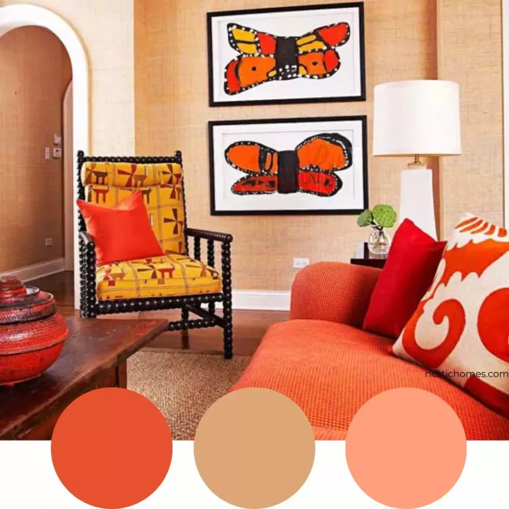
Expert Insight: John Davis explains, “this palette embodies the beauty of nature, creating a serene and balanced environment.”
The terracotta and wheat palette offers an understated elegance that truly embodies the splendor of the natural world. Terracotta, with its warm, reddish-brown hues, brings an inviting earthiness to any space, reminiscent of sun-kissed clay and ancient ceramic artistry. It pairs beautifully with wheat, a light, neutral tone that provides an airy, calming balance.
This combination exudes a serene simplicity, reflecting the effortless beauty found in nature’s most enduring landscapes. Together, they craft spaces that are peaceful yet richly textured, merging rustic warmth with gentle refinement to create an ambiance that feels both timeless and contemporary.
Mushroom Beige and Burgundy
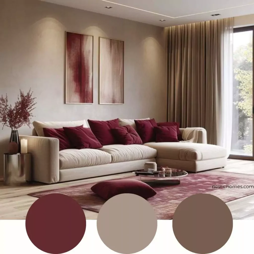
Perfect for those who prefer subtlety, mushroom beige provides a gentle backdrop from which you can bring in bolder colors like burgundy. This palette is ideal for those who want a touch of 70s flair without committing to very bright colors.
Mushroom beige and burgundy can serve as a sophisticated nod to 70s chic, balancing neutrality with boldness. The choice of mushroom beige as a background color creates a soothing canvas that allows the richness of burgundy to stand out without overwhelming the senses. This palette is particularly effective in spaces like living rooms or dining areas where an atmosphere of elegance and warmth is desired.
Johnathan Reed, a vintage interior consultant, emphasizes that “the key to successfully incorporating 70s palettes in modern design is to focus on blending bold and neutral elements, like mushroom beige and burgundy. This allows each color to complement and enhance the other, creating a balanced feel.” Opting for burgundy decorative accents like curtains or upholstered furniture against a mushroom beige wall helps create an impression of luxury and timelessness while subtly nodding to the dynamic style of the 70s.
Avocado Green and Burnt Orange
Avocado Green – A staple of the ’70s, this color is perfect for kitchen cabinets or upholstery, adding a touch of natural warmth.
Burnt Orange – Use this bold hue as an accent on walls or cushions to bring energy and vivacity to your room.

Expert Insight: According to interior designer Lisa Harmon, “Pairing avocado green with burnt orange creates a harmonious balance that is both vibrant and soothing.”
The beauty of the avocado green and burnt orange palette lies in its ability to evoke a sense of nostalgia while seamlessly blending into modern interiors. Avocado green, with its earthy and soothing undertones, offers a connection to nature, promoting a calm and grounded atmosphere. Meanwhile, burnt orange provides a lively contrast, symbolizing excitement and energy, which can uplift any space.
Together, these colors create a dynamic interplay that can transform a room into a warm, inviting haven. Their timeless appeal and versatility make them standout choices for those looking to inject retro charm with a contemporary twist.
Jade and Coral
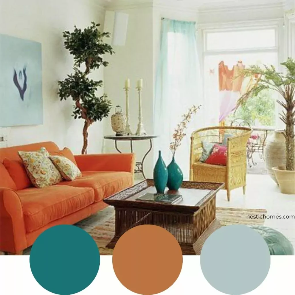
Jade’s mineral green and the soft warmth of coral hues complement each other beautifully. When used together, these colors introduce a sense of serenity combined with liveliness, making them an excellent choice for spaces like bathrooms or bedrooms where a balance of invigoration and relaxation is desired. According to design experts, using complementary colors like these can create a harmonious and balanced atmosphere.
They suggest pairing these tones with neutral shades to prevent the space from becoming overwhelming, and to use lighting that enhances the calming effect of the green while highlighting the warmth of the coral.
Harvest Gold and Cream
Harvest Gold – Perfect for kitchen appliances or accents, bringing a vintage yet timeless flair.
Cream – A neutral base for walls or large furniture, enhancing the vibrancy of harvest gold.
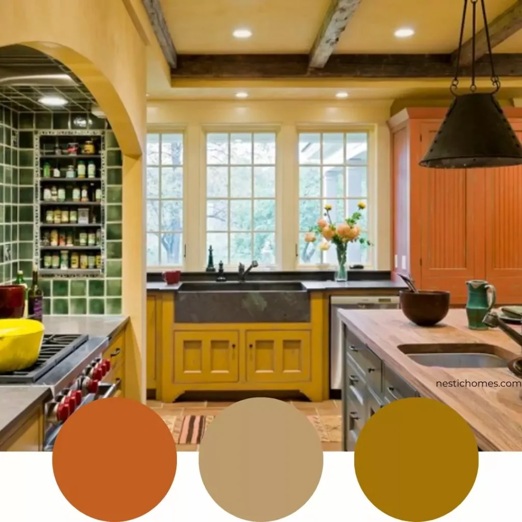
Expert Insight: “This combination evokes comfort and nostalgia, creating a welcoming environment,” notes designer John Davis.
The harvest gold and cream palette champions a delicate balance between vintage allure and contemporary refinement. Harvest gold, with its rich, warm tones, injects a sense of opulence and tradition, reminiscent of classic ’70s kitchens and living areas. Its boldness brings a touch of sunny elegance, making spaces feel vibrant and welcoming. Cream, with its soothing neutrality, acts as a gentle canvas that highlights the vibrancy of harvest gold.
This subtle, off-white hue enhances the room’s warmth and allows other design elements to shine, lending itself beautifully to both minimalist and maximalist aesthetics. Together, these colors evoke a sense of familiarity and coziness, appealing to those who appreciate a comforting, yet chic, interior atmosphere. The beauty of this palette lies in its ability to bridge past and present, offering timeless charm that is striking yet effortlessly elegant.
Deep Purple and Olive Green
Deep Purple – Use this dramatic shade for accent walls or statement pieces, adding luxury and depth.
Olive Green – Ideal for upholstery or decor, providing a calming and organic element.
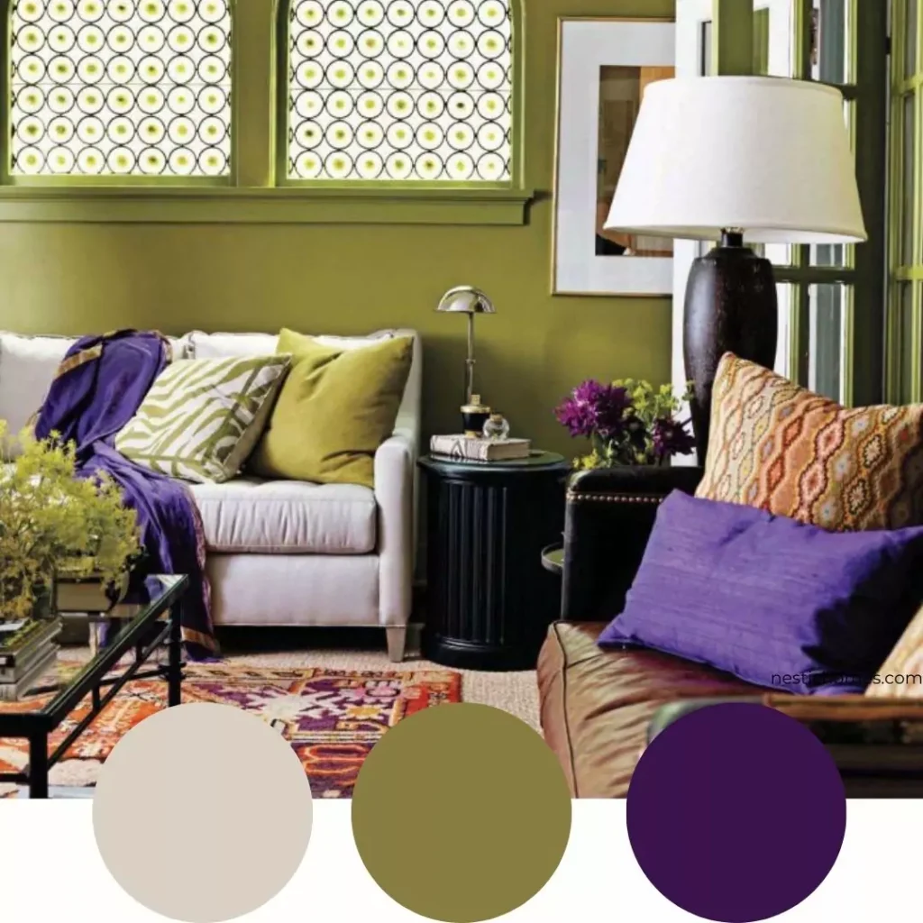
Expert Insight: “Deep purple paired with olive green is a sophisticated duo that exudes elegance and grandeur,” says Lisa Harmon.
The deep purple and olive green palette presents a visually stunning contrast that embodies sophistication and grandeur. Deep purple, with its rich, velvety hue, introduces an element of luxury and mystery, creating a focal point that intrigues and captivates. Its dramatic presence evokes a sense of regal elegance, perfect for making a bold statement within a space. In contrast, olive green brings a harmonious counterpart with its calming and organic tones. This earth-inspired shade infuses spaces with a peaceful and soothing ambiance, reminiscent of nature’s tranquility.
Together, deep purple and olive green create a refined and balanced aesthetic, where the opulent richness of purple is beautifully tempered by the grounding influence of green. This combination not only adds visual depth but also imparts a sense of timeless beauty, making it an ideal choice for those seeking to transform interiors into elegant sanctuaries brimming with character and charm.
Coral Pink and Slate Gray
Coral Pink – A playful touch for walls or accessories, injecting personality and charm.
Slate Gray – A versatile neutral for large surfaces, offering a sleek and modern contrast.

Expert Insight: Jamie Brooks states, “Coral pink and slate gray create a dynamic yet balanced palette, perfect for contemporary homes.”
The coral pink and slate gray palette offers an exquisite fusion of vibrancy and sophistication, making it an ideal choice for contemporary homes. Coral pink, with its cheerful and invigorating tone, introduces a lively personality to any space, creating a sense of playfulness and warmth. Its ability to captivate and energize is beautifully complemented by slate gray, a versatile neutral that grounds the palette with its sleek and modern flair. Slate gray provides a calming canvas that not only accentuates the dynamism of coral pink but also adds a touch of refinement and elegance.
Together, they craft a balanced and harmonious environment that is both captivating and chic, perfectly suited for creating spaces that are full of character yet effortlessly stylish. This combination transforms interiors into modern sanctuaries of elegance, where the energy of coral pink and the sophistication of slate gray coexist in perfect harmony.
Turquoise and Caramel
Turquoise – A refreshing choice for accents or smaller furniture, bringing energy and vibrancy.
Caramel – Incorporate this warm shade in wood finishes or textiles for a rich, comforting backdrop.

Expert Insight: “Combining turquoise with caramel creates a lively yet harmonious atmosphere,” notes Lisa Harmon.
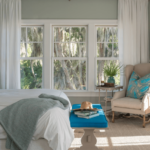
The turquoise and caramel palette, in its harmonious blend, unfurls a world of vibrant energy and soothing warmth. Turquoise, with its crisp and revitalizing hue, mirrors the clarity and expansiveness of clear skies and pristine waters, infusing interiors with a sense of freshness and vitality. This striking shade is the perfect antidote to monotony, enlivening spaces with a jolt of invigorating color that stimulates the senses and uplifts the spirit.
Meanwhile, caramel offers a luxurious contrast with its rich, toasty tones reminiscent of sunlit wood and golden landscapes. It envelops spaces in a warm embrace, providing a stable grounding that tempers the exuberance of turquoise. Together, these colors weave a tapestry of contrasts and complements, crafting environments that feel both dynamic and serene.
Fuchsia and Charcoal
Fuchsia – A bold choice for accents or statement furniture, adding drama and excitement.
Charcoal – Use this dark, neutral tone for larger surfaces, grounding the vibrancy of fuchsia.
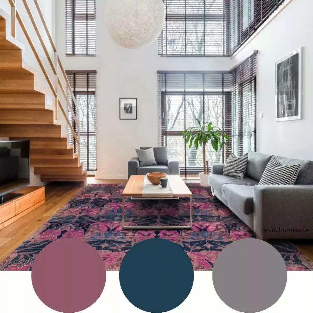
Expert Insight: “Fuchsia and charcoal create a striking contrast that is both modern and daring,” says Jamie Brooks.
Lavender and Ochre

Lavender’s gentle quality when paired with ochre yields a perfect retro palette for bedrooms or lounges that desire gentle transitions and a peaceful atmosphere. Lavender walls paired with ochre linens provide an enveloping sense of warmth.


