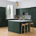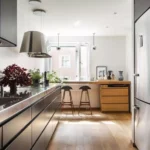
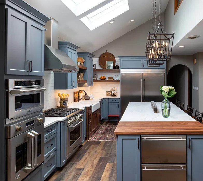
You must sure that you’ve learned a lot about the paint,its appearance,lrv I mean everything,so you don’t regret painting the cabinets. Blue-gray kitchen cabinet colors have become so popular as its fresh and homey too.
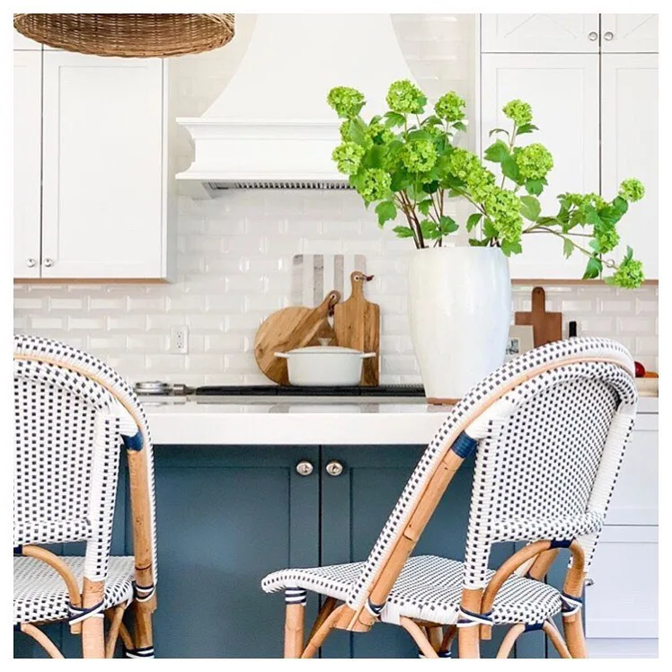
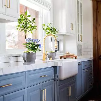
The best thing about them is that they complement every style like if you want modern, just add the touch of pop color with marble countertops and if you love to have the farmhouse touch ,use quartz countertops.
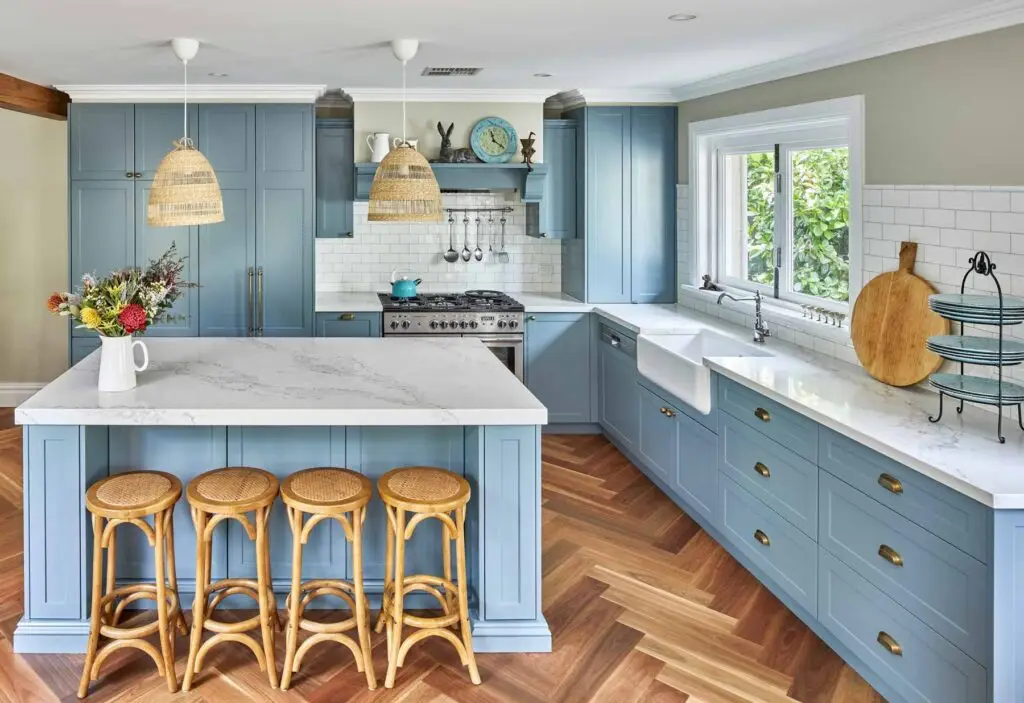
I personally, as an Interior stylist I recommend to pair them with a marble countertop. In this blog, I’ve covered everything that one needs to know before paint their cabinets, Like LRV, undertones, how it behaves under different lighting, the styles it suits, and whether it’s truly “blue-gray” also with TONS of real home kitchen images.
Best Blue Gray Kitchen Cabinet Colors
Sherwin Williams Blue Gray colors
Sherwin-Williams Hinting Blue (SW 6519)

LRV ≈ 68. A pale, cool blue with very little gray or warmth. It is light and airy, leaning toward a true light-blue (with only “a touch of gray”). In north-facing or dim light it can look crisp and silvery-bluish; in bright south/east light it reads a soft pastel blue.
This color pairs best with clean whites and grays and complements modern, minimalist, coastal or farmhouse styles. (Notably it has no yellow tint, making it cooler.) It’s more true-blue than gray overall, best when you want a bright, beachy cabinet.
RELATED BLOG
- 3 Popular Small Kitchen Layouts-Adviced By Experts
- 7 Popular Green Kitchen Cabinets Countertop and Hardware Ideas
Sherwin-Williams Notable Hue (SW 6521)
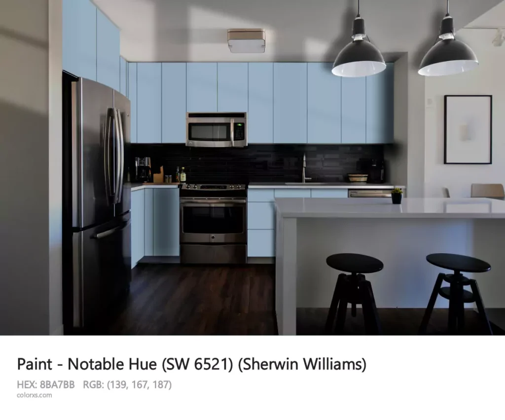
LRV ≈ 37.1. A rich mid-tone blue. Undertones are cool blue with a slight purple hint. In bright natural light it looks like a saturated mid-blue; in lower/north light it deepens to a duskier, grayer blue.
(WildFox notes it “appears deeper in low light, brighter in natural light”.) Ideal in contemporary or transitional kitchens – it creates a bold, sophisticated look (especially paired with marble, brass or crisp white trim).
This is more of a pure blue-gray (on the bluish side) that gives cabinets a vivid blue accent without green or yellow tones.
Sherwin-Williams Krypton (SW 6247)
LRV ≈ 52. A medium-light “atmospheric” blue-gray. Its cool slate-blue undertone gives a relaxing feel. Krypton stays balanced: in bright south or west light it looks like a true powder-blue gray, while in north or artificial light it can appear slightly deeper and grayer.
It works beautifully with crisp whites and neutrals. Versatile in style, Krypton suits both modern and transitional homes; krypton often used for cabinets or walls to impart a tranquil, “sky blue” vibe. This is a true blue-gray (the blue note is clear but grounded by gray).
Sherwin-Williams Blustery Sky (SW 9140)
LRV ≈ 22. A dusty medium blue with gray undertones. Undertones are purely blue (very little green or violet). Because of its low LRV, Blustery Sky reads much darker in dim north light (almost stormy gray-blue) and softens in bright southern light. It is noted for giving “calm and sophistication” to a space.
Suits both modern and traditional styles – e.g. a classic kitchen paired with warm wood floors or a modern white kitchen. Overall it’s a grayish blue (a true blue-gray) that brings depth without going teal or navy.
Sherwin-Williams Foggy Day (SW 6235)
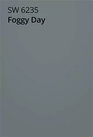
LRV ≈ 20. A moody gray-blue. Foggy Day has a slightly greenish undertone,that makes it cool and true grayish. It is relatively dark, so in northern light it can look almost charcoal-blue, but in bright light it warms up to a mid-blue gray.
Its “silvery” quality makes it ideal for contemporary or transitional kitchens; it pairs well with white or maple cabinetry accents, or brass hardware. I personally love this blue gray paint shade by Sherwin.
It’s more on the gray side of blue-gray (the green-lean gives it a subtle sage hint), but is still often categorized as a blue-gray shade.
Benjamin Moore Blue-Gray Colors
BM Normandy (2129-40)

LRV ≈ 21.7. A rich stormy blue with strong gray undertones. Normandy has a cool blue undertone that makes it feel like a deep blue-gray (almost navy-gray). In low light it can appear nearly black-blue, while in bright light it shows its hidden blue side.
(Mod&Mood notes it “isn’t truly dark, but on the darker end of mid-toned”.) It’s best in larger or south-facing spaces where enough light prevents it from looking flat.
BM Providence Blue (1636)
LRV ≈ 19.2. A deep slate blue with heavy gray and a hint of green. Providence Blue is a true “blue-gray” (per Kaitlin Madden: “rich, moody slate blue with a heavy dose of gray”).
In dim north-facing light it reads almost charcoal; in bright light it warms slightly. It’s very bold, so it’s often used for entire cabinets in moody farmhouse or modern kitchens as a statement, or as a dark island color.
BM Water’s Edge (1635, aka Van Courtland Blue)
LRV ≈ 30. A balanced medium blue-gray. Undertones lean slightly green but it generally reads as a neutral gray-blue. In all light conditions it stays mid-tone – not too dark or light. Water’s Edge is described as the “perfect balance of gray and blue”, so it’s very versatile. It looks classic “cottage blue”.
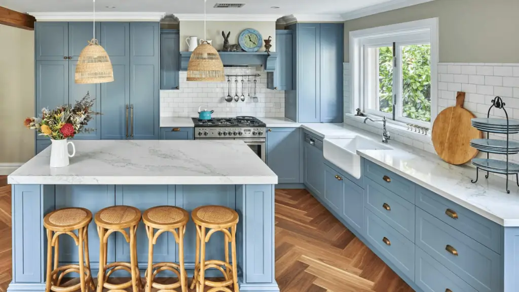
It works wonderfully in kitchens aiming for a relaxed farmhouse or coastal style: imagine it on lower cabinets with soft white uppers. It’s a genuine blue-gray (gray base with a blue cast) that never goes purple or teal.
BM Santorini Blue (1634)
LRV ≈ 44.7. A clean, crisp mid-tone blue with subtle gray. Undertones are cool blue-gray. Santorini is bright enough to work in a variety of lights – in sun it reads as a tranquil medium blue, in north or artificial light it can appear a bit bluer or grayer. (Painted Hinge warns it “becomes darker and flatter in rooms with limited light” and shifts under LED vs incandescent.)
Its “versatile” balance makes it a top choice for almost any style: modern, cottage, Mediterranean or transitional. Designers praise that it “fits most rooms” and stays true to a clean blue. Santorini is one of the most popular blue-grays because it truly sits between blue and gray.
BM Solitude (AF-545)
LRV ≈ 41.6. A soft muted blue-gray. As WildFox notes, it “leans predominantly toward a gray base with subtle blue and violet undertones”. In daylight its blue side comes forward (fresh and airy), while under warm light it looks cozier gray. With an LRV in the low 40s, Solitude brightens rooms without feeling too pastel. It pairs beautifully with whites and natural wood.
It is best for modern, Scandinavian or contemporary spaces (it feels very serene in bedrooms, bathrooms or cabinets). Overall it’s a true blue-gray that works like a neutral — just cool and calm.
Farrow & Ball Blue Gray (No. 91)
LRV ≈ 44. A muted mid-blue-gray from a classic UK palette. Its undertone is a mix of blue, green and black pigments. In bright light it appears a soft steely blue; in shadows or north light it drifts toward gray-green. Farrow & Ball describes it as a “cooler, more weathered version” of French Gray – in other words, a relaxed, antique blue-gray.
This makes Blue Gray ideal for historical, coastal or casual modern kitchens that want a lived-in, soothing look. It’s a true blue-gray with a slightly driftwood-gray vibe (it “gently shifts between blue and grey depending on the light”).
Behr French Colony (N480-4)
LRV ≈ 34. A silvery periwinkle-blue. Behr calls it “silvery-blue… versatile and timeless”. It actually has a muted gray quality with a hint of periwinkle (pinkish blue). In west/south light it looks a little bluer; in north or warm light, its gray side shows.
Its mid-tone nature (LRV 34) means it won’t go too dark in a shadowy room. Stylish and fresh, French Colony works well in transitional or cottage-style kitchens – it feels light and breezy against white trim. It is a true blue-gray, but with a soft purple-lean that can brighten a space.
Clare Set In Stone
LRV ≈ 33. A cool mid-gray with blue cast. Clare’s description: “strong, cool gray… with subtle blue undertones”. It remains fairly neutral in all lights, though in deep shade it can read more as charcoal gray and in bright sun you see the blue.
Set In Stone has a modern, clean feel – great for a contemporary or minimalist kitchen. It’s less obviously blue than a sky-blue; you’d call it gray with a hint of blue. (Clare even labels its undertone simply “Cool”.) Use it when you want a bold cabinet that’s definitely gray but avoids warm or beige tones.
Valspar Silver Moss (T686)
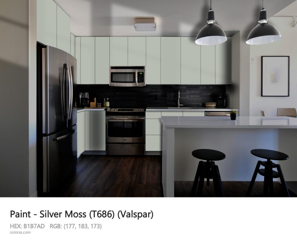
LRV ≈ 46.8. A soft greenish-gray. The listed RGB (#B1B8AF) shows it’s a pale gray with a green tint. Despite being in the gray family, Silver Moss has a subtle blue-green quality. In bright light, it looks like a calming misty gray; in north light it takes on a cooler green cast.
It’s more green-gray than true blue, but it is often included with blue-grays for its similar cool feel. It works in relaxed or modern kitchens (farmhouse, Scandinavian, Craftsman) that favor natural tones. This one is good,,,but ummmmmm ,,, I don’t like it that much.
Valspar A-List Blue (T673)
LRV ≈ 52.1. A light airy blue-gray in Valspar’s classic collection. Its undertone is cool (a true pale blue-gray). With one of the highest LRVs here, it stays relatively light even on cabinets. In north light it may look like a pale slate blue; in bright south/east light it takes on a sky-blue tint. Valspar describes it simply under “Gray” family with cool undertones.
It suits modern or coastal styles – for example, on an island or uppers where you want a hint of color but mostly a soft neutral. It reads as a very light blue-gray (almost pastel) that still clearly shows blue rather than green or purple.
Best amount all Blue-Gray Paints
Among these, Benjamin Moore Santorini Blue (1634) stands out as the most versatile blue-gray. With an LRV around 45 it’s neither too light nor too dark, and in designer tests it “fits most rooms”. Its cool-blue/gray balance adapts to both bright and dim spaces, and it complements a huge range of styles from coastal to modern farmhouse.
Being an expert in colors I love Santorini Blue “isn’t too light and not too dark… a balanced mid-tone with good depth,” that makes it very adaptable.
In short, Santorini Blue’s popularity and chameleon-like quality and its the best on my opinion if you are looking for something like blue gray kitchen cabinets.
| Color (Brand) | LRV | Undertones | Ideal Styles |
|---|---|---|---|
| SW Hinting Blue (6519) | ~68 | Cool, violet-blue | Modern, Minimalist, Coastal, Farmhouse |
| SW Notable Hue (6521) | ~37 | Cool blue (slight purple) | Contemporary, Sleek, Modern Kitchen |
| SW Krypton (6247) | ~52 | Cool slate-blue | Modern, Coastal, Transitional |
| SW Blustery Sky (9140) | ~22 | Blue-gray | Transitional, Traditional, Modern |
| SW Foggy Day (6235) | ~20 | Gray (slight green) | Contemporary, Transitional, Farmhouse |
| BM Normandy (2129-40) | ~21.7 | Deep blue-gray | Traditional, French Country |
| BM Providence Blue (1636) | ~19.2 | Gray (slight green) | Modern, Traditional |
| BM Water’s Edge (1635) | ~30 | Gray-blue (a bit green) | Cottage, Farmhouse, Classic |
| BM Santorini Blue (1634) | ~44.7 | Cool blue-gray | Versatile: Coastal, Modern, Farmhouse |
| BM Solitude (AF-545) | ~41.6 | Gray with blue/violet | Contemporary, Scandinavian, Spa-like |
| F&B Blue Gray (91) | ~44 | Cool blue-gray (green/black mix) | Classic, Coastal, Traditional |
| Behr French Colony (N480-4) | ~34 | Silvery blue (periwinkle) | Transitional, Coastal, Modern |
| Clare Set In Stone | ~33 | Cool gray with blue tint | Modern, Minimalist, Contemporary |
| Valspar Silver Moss (T686) | ~46.8 | Green-gray (cool) | Farmhouse, Craftsman, Scandinavian |
| Valspar A-List Blue (T673) | ~52.1 | Cool pale blue-gray | Modern, Coastal, Scandinavian |
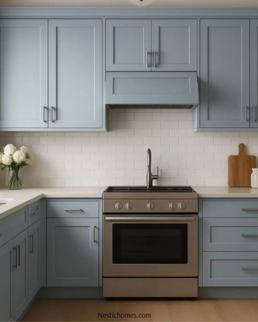
How to Pair Blue Gray Cabinets with Countertops
Marble Countertops with Light Blue Gray Cabinets
For a classic, timeless look, pair light blue gray cabinets with white marble countertops. The subtle veining in marble complements the softness of the cabinet color, creating a harmonious and elegant space.
Quartz Countertops for a Sleek Modern Look
Quartz countertops come in various shades that pair beautifully with blue gray cabinets. Opt for a white or light gray quartz for a sleek, contemporary aesthetic.
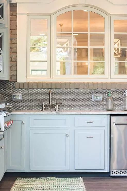
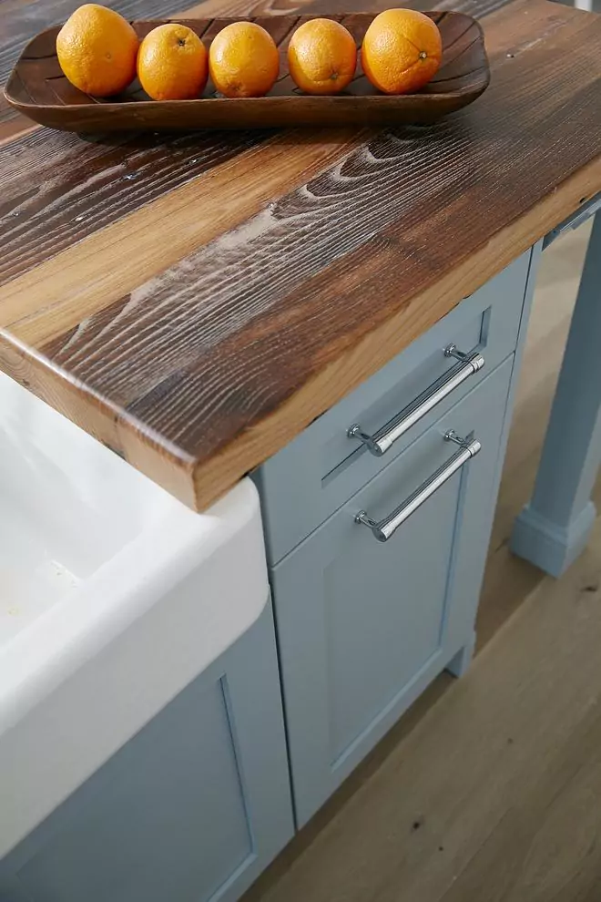
Wood Countertops for a Rustic Touch
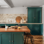
For those who love a rustic or farmhouse style, wood countertops are a fantastic pairing with blue gray cabinets. The warmth of wood contrasts nicely with the cool undertones of blue gray, creating a cozy, welcoming vibe.
Designing a Kitchen Around Blue Gray Cabinets
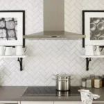
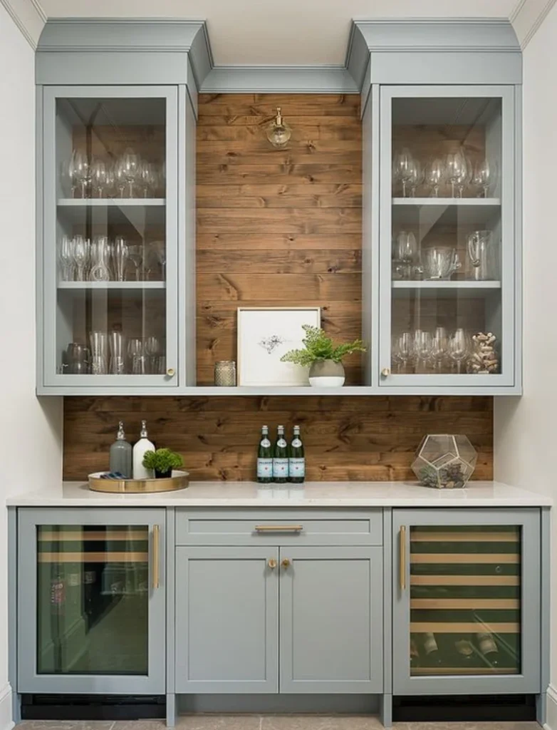
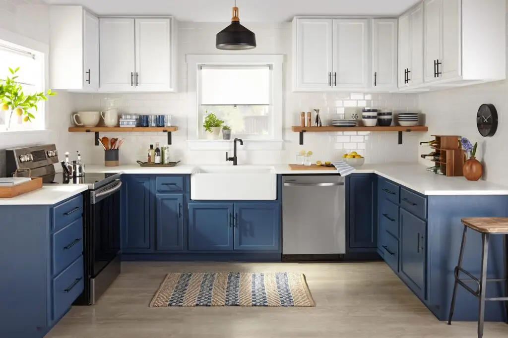
Choosing the Right Backsplash
Subway tiles, mosaic patterns, or even simple white backsplashes work great with blue gray cabinets, allowing the cabinets to stand out without overwhelming the space.
Floor Options to Match Your Cabinets
Neutral-toned floors like light oak or stone help to ground the cool tones of blue gray cabinets while adding warmth to the overall look.
Incorporating Accent Colors and Accessories
Add pops of color with accents like bright rugs, bar stools, or pendant lighting to inject personality into your blue gray-themed kitchen.