Last updated on August 14th, 2025 at 07:20 am
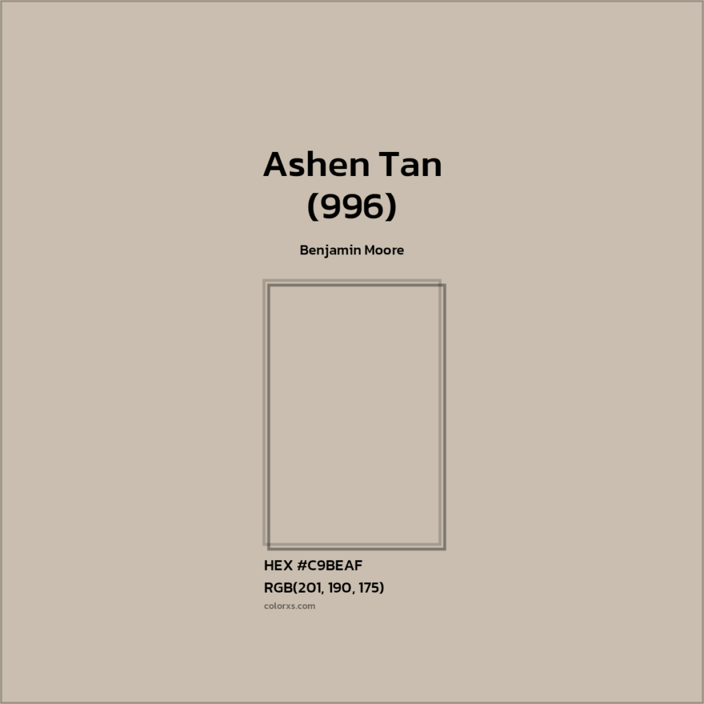
Ashen Tan (996) is a soft, warm beige-gray (“greige”) neutral. Benjamin Moore’s site calls it “an effortless neutral [that] brings just a blush of color into any space”.
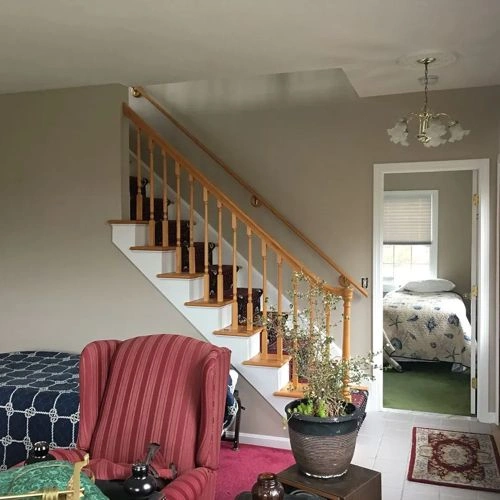
In practice, it appears as a medium-light beige with taupe/gray undertones and a faint rosy cast.In my opinion, Ashen Tan “is in between beige and gray,” giving it a grounded, calm feel.
And it has some gray and taupe undertones (some reviewers describe a “rosy taupe cast” in some lightning), which gives it perfect match with both warm and cool accents.
In this blog I will tell you about Ashen Tan 996 by Benjamin More, like its lrv,underotnes ,affects of lights ,in different weather,also application in different rooms.
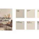
Hex of Ashen tan
Light Reflectance Value (LRV) of Ashen Tan
Ashen Tan’s official LRV is 50.72. Its a mid-range color, meaning it doesn’t too dark the space not too bright in lights; it reflects a moderate amount of light. (For comparison, pure white is 100 and black is 0.) With an LRV ~51, Ashen Tan will make a room feel softly lit – not as bright as a pale cream, but not dark either.
Appearance of Ashen Tan in Different Light

Ashen Tan mostly looks lighter and creamier in bright light; in fact, it can appear almost a warm off-white under strong daylight.
In warm artificial light (incandescent or warm LEDs), its beige/taupe tones reflect more, revealing more of the underlying gray/taupe character.
Under cool/artificial daylight (flourescent/LED), it resembles its daylight appearance. In low or mixed light, some find it takes on a cozier gray mood. In short, Ashen Tan shifts subtly through the day, so sampling in your room at different times is advised.
Suitability in Different Rooms
Ashen Tan’s neutrality makes it appropriate almost anywhere in the home. Its warm-beige tone feels cozy and inviting, so it’s often recommended as a backdrop in living spaces:
Bedroom

Reviewers find it “especially soothing” in bedrooms. It creates a calm, restful environment perfect for winding down. Pair with soft linens and warm lighting for a cozy retreat. Small bedrooms painted Ashen Tan can still feel open and serene thanks to its balanced tone.
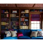
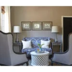
Living Room
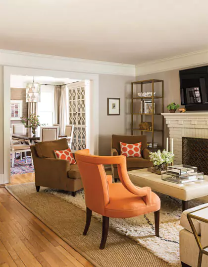
In living areas, Ashen Tan lends a “warm and inviting” neutrality. It won’t compete with furniture styles or artwork, yet adds depth and warmth to the walls. It adapts to both casual and formal decors. Opple House notes that this color keeps living rooms relaxed, and it “finds a way to fit right in” whether your style is modern or traditional.
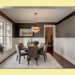
Kitchen & Cabinets
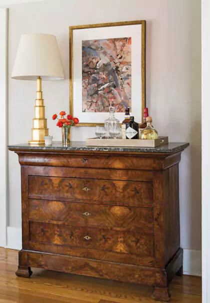
Though not explicitly in many sources, Ashen Tan is available in Benjamin Moore’s Kitchen & Bath formula (so it’s formulated for moisture-prone areas). As a cabinet or wall color in kitchens, it imparts a gentle beige warmth that complements wood tones and stone countertops. It works well with brass or black hardware and neutral backsplashes.
(For example, metal fixtures in brass, black, or chrome “add just the right contrast” to Ashen Tan.) Wood or neutral-tile floors ground the look (Opple notes it “ties together” with light/medium wood or cream tile).
Bathroom

In bathrooms, Ashen Tan can replace plain white or gray to create a spa-like warmth. It pairs nicely with white trim and tile. Under warm vanity lights, expect more of its beige-taupe character to show, so it feels cozy yet fresh. (Because it has moderate reflectance, it won’t make a small bathroom too dim.)
Ashen Tan works in almost any room. It’s clean and soft without feeling cold and not too bright, as I told you before its mid-range color, so it adapts its feel from active spaces (kitchens, living rooms) to quiet corners (bedrooms, hallways) alike.
RELATED BLOG
- SHERWIN WILLIAMS ACCESSIBLE BEIGE COLOR REVIEW
- TRICORN BLSCK BY SHERWIN WILLIAMS
- PALE OAK BY BENJAMIN MOORE
- GREEK VILLA VS ALABASTER
Coordinating Palettes for Ashen Tan
Because Ashen Tan sits between beige and gray, it plays well with a wide range of colors. Designers suggest building soft, bold, or muted palettes around it:
Soft Palette
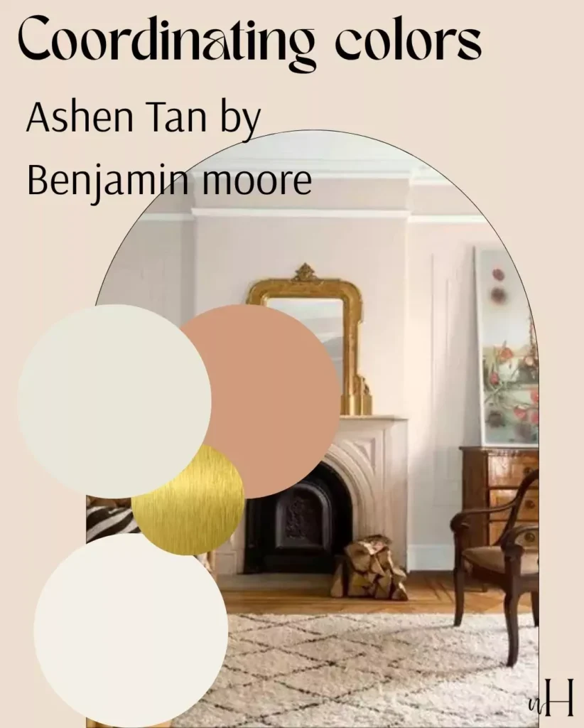
Pale neutrals and pastels work very best with Ashen Tan. For example, Benjamin Moore’s palette says Seapearl 961 (a pale blue) and Baker’s Dozen 1216 (a muted dusty pink) is perfect match with Ashen Tan.
According to me,soft ivory, light gray, or gentle sage-green accents will keep the look airy. Warm whites and light woods (oak, maple) also help the space feel calm and balanced.
Bold Palette
To create contrast, use saturated accent colors, that will not mix with rest but will create drama use deep navy, charcoal gray, forest green or even black trim will pop against Ashen Tan.
As I told you, it has both beige and gray undertones and its mid range color ,so you can use the bright side of colors as well as the darker side colors for bold feel.
Muted Palette
Earthy, mid-tone shades form a muted scheme. Like terracotta, olive, dusty rose, or warm gray accents. Natural materials (linen, wool) in soft tans or browns layer well. Opple suggests textures like warm-white or light-brown textiles, and warm wood floors to complement Ashen Tan. Overall, its versatility means warm tones (gold, brown) and cool tones (gray, blue) alike coordinate without clashing.
In short, Ashen Tan acts as a neutral bridge: it “matches well” with many colors, offering a warm base for light, muted, or even fairly vivid color schemes.
Comparison: Ashen Tan vs. Revere Pewter
| Characteristic | Ashen Tan (BM 996) | Revere Pewter (BM HC-172) |
|---|---|---|
| Undertones | Beige with subtle gray/taupe (rosy-taupe hints) | Greige (warm gray-beige) often with a mild greenish cast |
| LRV (Lightness) | 50.72 (medium-light tone) | 55.05 (slightly lighter) |
| Overall Look | Warm, earthy neutral; steadier/beigier | Balanced neutral; sits between warm & cool shades |
| Versatility | Very adaptable, cozy feel (good for bedrooms, living) | Extremely popular neutral (hallways, living, exteriors) |
| Typical Use | Becomes creamy in sun, taupey in shade | A “bridge” greige that can read warm or cool |
- Undertones: Ashen Tan leans slightly warmer with brown/taupe influence, whereas Revere Pewter is a classic greige with a hint of green. As Kylie Interiors notes, Revere Pewter “favors a mild green undertone” and can look muddy-green in many lights, whereas Ashen Tan stays more consistently beige-warm with only subtle gray shift.
- Lightness: Revere Pewter is a touch lighter (LRV ~55 vs. 51), so Ashen Tan will appear slightly richer/deeper on the wall.
- Versatility: Both are versatile “go-anywhere” neutrals, but Revere Pewter is famously a bridge between warm and cool, often chosen for mixing grays and earth tones. Ashen Tan adds a bit more warmth and depth, making it feel more cozy under warm light.
- In practice: Either can serve as a main wall color or trim, but Ashen Tan’s beige warmth makes it especially fitting where a gentler beige look is desired.
Close Matches in BM and SW
Benjamin Moore Equivalents: Ashen Tan’s formula is used under other names. It is the same color as Dufferin Terrace CC-456, Hot Spring Stones AC-31, and Annapolis Gray (PM-14/HC-176). If a Benjamin Moore fan deck or formula reference uses those names, they will match Ashen Tan exactly.
Sherwin-Williams Neighbors: Sherwin-Williams doesn’t have an official “Ashen Tan,” but similar warm greige colors exist. For example, SW 7036 Accessible Beige and SW 7515 Soft Suede are often cited as close counterparts (both are medium-light warm neutrals).
(Accessible Beige in particular is a popular SW greige.)
FAQ:
Do tan and gray go together?
Yes! Tan (beige) and gray often pair beautifully in neutral palettes. In fact, Ashen Tan itself blends tan and gray – it’s a greige.
“sits between beige and gray,” which means you can safely mix gray accents (like trim, fabrics, or furniture) with Ashen Tan walls.
A common approach is to combine a warm beige wall with cooler gray or blue accents for contrast. The two neutrals form a harmonious scheme, so tan and gray definitely go well together, especially with a color like Ashen Tan that inherently contains both.