
Last updated on August 18th, 2025 at 06:03 am
Chelsea Gray is timeless color,i mean it can be used everywhere, doesn’t matter you want it on your baby’s room, your bedroom, or either it living room,it can adjust with the vibe onlyIt is one of my favorite beige gray colors with refreshing feel,it works best if you use it with crisp white or pure white trim.
Chelsea Gray (SW 2850) is a versatile, medium-toned gray with a balanced mix of warm and cool undertones. It appears as a solid relaxing gray that works in many styles.
In this post Im sharing my experience with Chelsea Gray SW 2850 BEFORE-AFTER images and also real home images that i saw with my naked eyes.
What are the undertones of Chelsea Gray (SW 2850)?
Its undertones are complex, a faint hint of warm beige-brown and even greenish-yellow or blue in different lights. For example, Housekeepingbay lists pale yellow, light blue, light purple, mint, pale pink, lilac, and neutral gray among its undertones.
Chelsea Gray as a true gray that “leans slightly warm, with soft hints of beige and brown,” giving it a greige quality that warms up in bright light.
What is the LRV of Chelsea Gray (SW 2850)?
Depending upon the light Chelsea gray can be warmer or cooler, depending on your room aesthetic. Its LRV (Light Reflectance Value) is in the mid-40s: around 46–48%, making it a moderate gray that reflects a middling amount of light.
(A higher LRV would be a pale gray; Chelsea Gray’s value means it is noticeably darker than pale neutrals but not as dark as charcoal.)
In natural light, Chelsea Gray shifts with room orientation. In north-facing rooms (less direct sun) it tends to look cooler and more subdued, whereas in bright southern or western light it warms up and appears lighter or more vibrant.
Chelsea Gray “will appear cooler and crisper” in north-light and its warm greige undertones “become more prominent” in sunny south-facing rooms.
Under artificial light, the effect depends on bulb warmth: warm (yellow-tinted) bulbs bring out Chelsea Gray’s red/brown undertones, making it feel cozier, while cool (blue-tinted) bulbs emphasize any blue-gray tones for a sharper look.
This adaptability makes Chelsea Gray quite amazing; its character truly depends on lighting conditions.
Some other gray:
- Sherwin Williams Morning Fog (SW 6255)+Real Home Images
- Valspar Ashen Gray 6004-1C: Everything You Need to Know
- Review-Ashley Gray (HC-87) by Benjamin Moore-Why to Choose
Room Applications
Bedrooms & Living Rooms
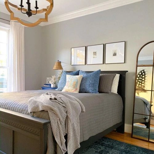
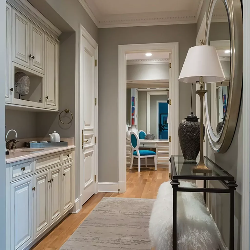
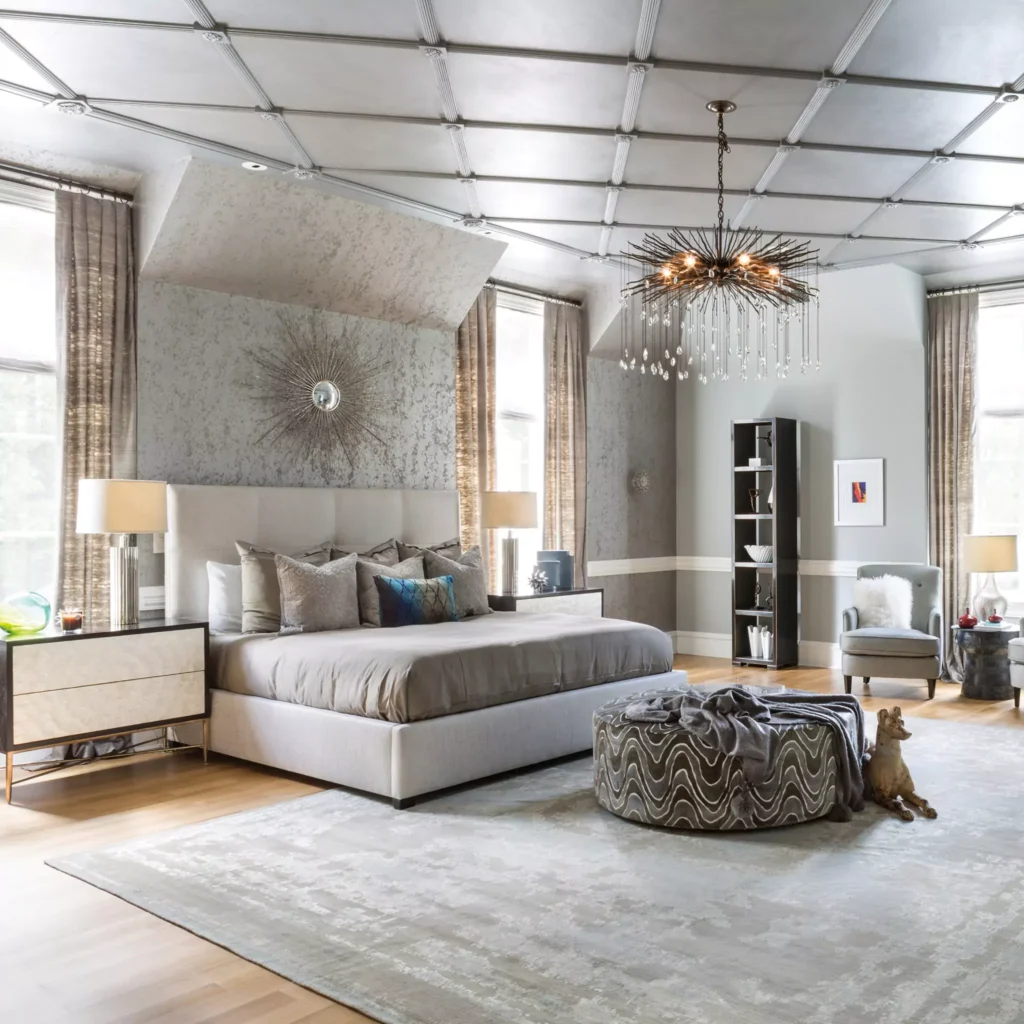
Chelsea Gray creates a calm, elegant backdrop for living areas and bedrooms. Without feeling cold it makes your room cozy and welcoming.
For example,it produces a “serene and stylish” feel when used on walls, and Housekeepingbay emphasizes it is especially effective at creating a cozy, sophisticated mood in bedrooms and living rooms.
Its depth can accentuate architectural details (molding, fireplaces) and works beautifully with light trim or linens. Paired with soft textiles and layered lighting, Chelsea Gray can make a bedroom or lounge feel both grounded and plush.
Kitchens & Bathrooms
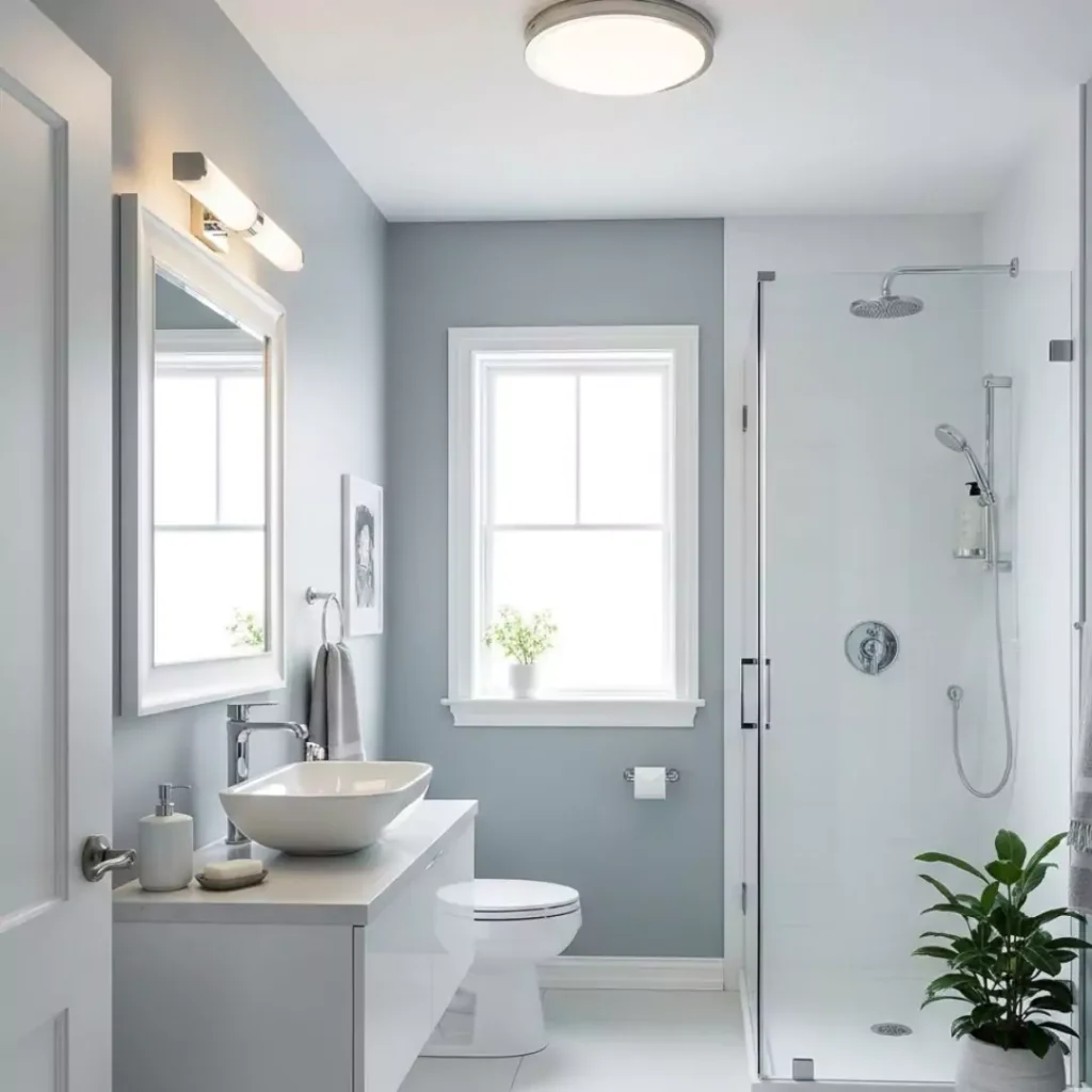
Chelsea Gray is a popular choice for cabinets and accent walls in kitchens and baths. Its mid-tone gray provides contrast against white countertops, backsplashes or fixtures while maintaining a clean, modern look.
This paint is a popular choice among homeowners as one of my friends also used this on her kitchen cabinets with some hexagonal tile backsplash,and in my opinion, its the best choice.
Chelsea Gray adds a “sleek, contemporary feel” in kitchens and bathrooms, especially when paired with white cabinetry or fixtures. It contrasts nicely with marble or quartz surfaces and metal hardware, making the space feel polished.
For cabinets specifically, the color’s warmth can prevent gray cabinetry from looking too sterile, while still offering drama.
Exterior Uses
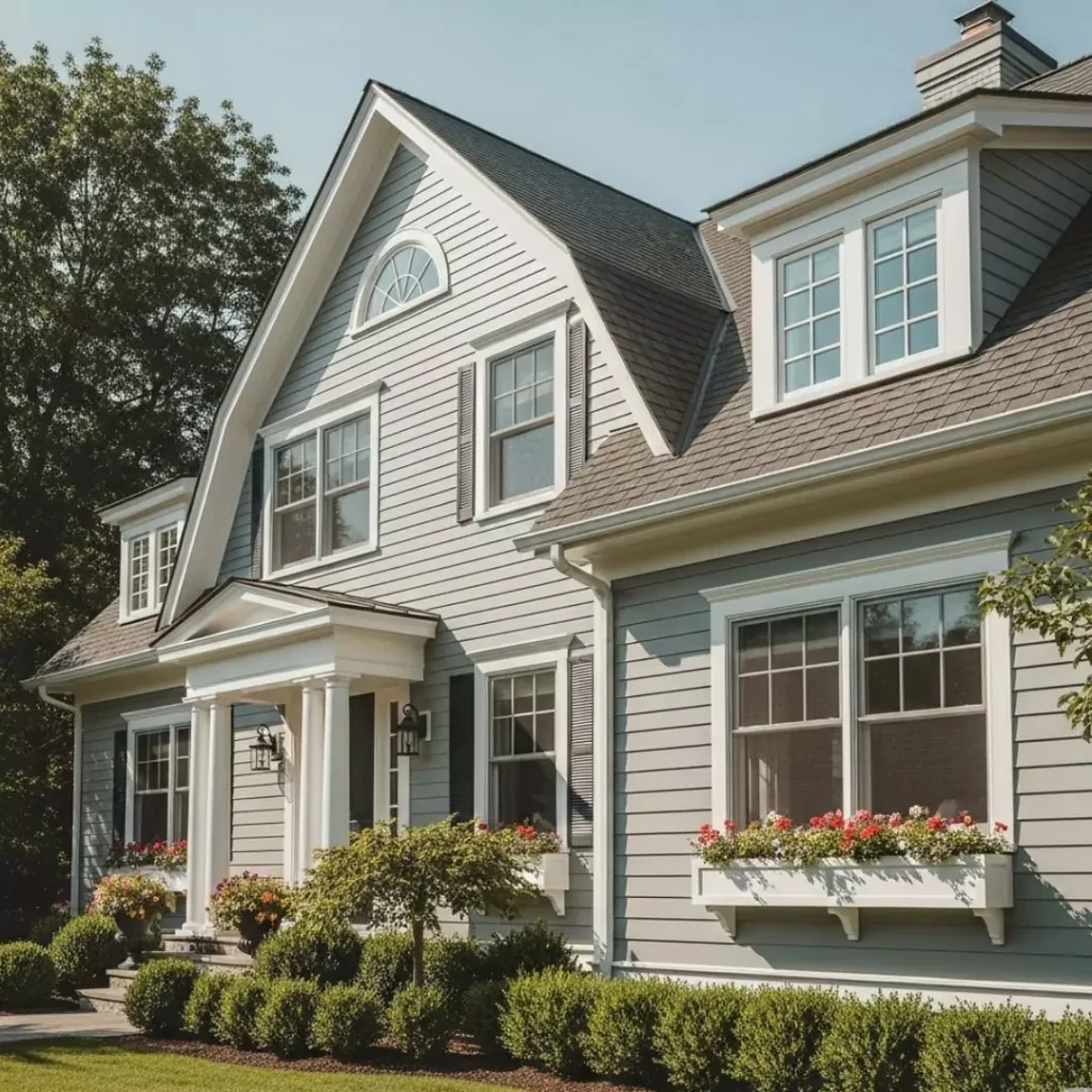
Chelsea Gray can also be used outdoors. It works well on home siding, trim, or shutters to create a bold, sophisticated curb appeal. WildFoxPainting suggests it as an exterior “standout” – for example, painting the front door or shutters in Chelsea Gray (with crisp white trim) gives charm and contrast.
The color brings depth to the exterior but make sure you are using the offwhite trim cuz offwhite is slightly warmer and will maintain the balance: used on furniture, pergolas or railings, it creates a cohesive look that ties exterior spaces together.
In sunny outdoor light, its warm undertones will glow, while its mid-tone value keeps details visible but you can use cool white to balance or if you want to keep the look cool in summers.
Coordinating Colors for Chelsea Gray (SW 2850)?
Chelsea Gray can go with a wide range of palettes, from soft neutrals to bold accents. One recommended coordinating palette is SW 2834 Birdseye Maple (a warm, light brown) and SW 7666 Fleur de Sel (a very light gray) alongside Chelsea Gray.
The warm brown of Birdseye Maple warms up the space, and the pale cool gray of Fleur de Sel keeps it airy. Broadly, design advice is to pair Chelsea Gray with warm whites, beiges and creams to soften its depth, or with deep charcoals and saturated hues for contrast.
For something cooler what i recommend people is to use Aquaverde ,Inky Blue and Aesthetic white ,this is perfect pallet for your summer interior and exterior.
Neutral & Soft Palette
For a gentle, cohesive look, you can mix Chelsea Gray with warm neutrals or pastels. Use creamy whites like SW Alabaster or Pure White, and beiges like SW Accessible Beige or Balanced Beige. Other beiges are Mink and Dovetaile.
Adding soft fabrics and accents in ivory or pale pastel tones will “soften the overall aesthetic” and add coziness. In other words, think of Chelsea Gray as the mid-tone anchor surrounded by lighter, warm neutrals for an understated palette.
Bold/Dark Accents
For drama, layer Chelsea Gray with darker or brighter accents. Rich charcoal or black trims (e.g. SW Iron Ore or Tricorn Black) provide a stark contrast that highlights Chelsea Gray’s warmth.
Alternatively, introduce a pop of color: deep navy (SW Naval) or muted green-gray (SW Evergreen Fog) work well as accent walls or furnishings.
Bright vs. Muted
Chelsea Gray is versatile enough to support both high-contrast and muted schemes. It “pairs well with both bright colors for a dynamic contrast and subtle tones for a more muted aesthetic,” as one design review notes.
In practice, you can use vibrant art or textiles for a lively room, or keep everything in subdued taupes and grays for a calm, monochromatic effect.
Chelsea Gray can be the base of either a bold or soft palette: it can “anchor a space without overpowering it,” both the palettes work beautifully for your room.
FAQ
What Sherwin-Williams color is similar to Chelsea Gray?
A commonly cited close match is Sherwin-Williams Classic French Gray (SW 0064), which is said to be very similar in tone. Another near-match is SW Dovetail (SW 7018). (These colors all fall in the mid-gray spectrum.) In other words, Sherwin-Williams’ own neutrals like Classic French Gray and Dovetail share the same balanced gray-vibe as Chelsea Gray.
What is the most used gray at Sherwin-Williams?
Agreeable Gray (SW 7029) holds that title. Design bloggers note that “Agreeable Gray is Sherwin-Williams’s most popular gray paint”. It has been the go-to warm gray for broad use in homes. (Other very popular SW grays include Repose Gray and Revere Pewter, but in terms of sheer popularity Agreeable Gray leads, likely due to its very mild beige undertone and versatile LRV.)
Is gray still in style for 2025?
Gray is not out overnight, but its dominance is waning in favor of warmer neutrals. Recent design trend reports say that the long-running era of cool grays is ending. For example, RealSimple magazine reports that “cool grays have been a go-to neutral for years, but as designers… have been guiding clients away from them,” predicting they’ll be “completely out of style” by 2025.
The recommendation is to shift toward greige, beige and warm neutral palettes. (Designer Kylie Mawdsley similarly notes that eight out of ten past color consults were gray, but now it’s only about two out of ten, as clients favor warm whites, creams and beiges instead.)
In short, gray is not verboten, but savvy designers now suggest using it as an accent or paired with warmer tones, rather than painting entire homes in cool gray. Warm-toned grays (like Chelsea Gray itself) or greiges will fare better than stark bluesy grays in 2025.
Chelsea Gray vs. Kendall Charcoal
A useful point of reference is Benjamin Moore Kendall Charcoal (HC-166) – a popular deep gray. Data comparisons show Chelsea Gray is much lighter. Plan-Home’s color analysis lists Chelsea Gray’s LRV at about 46.9% versus Kendall Charcoal’s 13.3%, making Chelsea Gray appear significantly lighter.
In fact, Chelsea Gray is a medium gray with a warm undertone, while Kendall Charcoal is a very dark neutral gray. The analysis notes Chelsea Gray “radiat[es] a lighter essence” and is “warm,” whereas Kendall Charcoal is darker and more neutral. Practically speaking, a wall in Chelsea Gray will look noticeably brighter and cozier than one painted in Kendall Charcoal.
(Both are in the gray family, but Chelsea Gray reads as a medium greige, whereas Kendall Charcoal reads almost charcoal-black in comparison.)


