Last updated on September 5th, 2025 at 01:37 pm
Sherwin-Williams Spalding Gray (SW 6074) is a medium-toned, warm greige (gray-beige) neutral. It is often described as a rich, versatile gray with subtle earthiness.
Spalding Gray balances warmth and coolness, giving it a “chameleon-like” quality:but if you ll ask me i will say its 80% warm.
Its taupe and warm gray character makes it suitable for both modern and traditional interiors alike, providing a cozy yet sophisticated backdrop for furnishings.
In this Blog I am sharing REAL HOME IMAGES that are using Spalding Gray by Sherwin-Williams.
I will share my personal experience with Sherwin Williams Spalding Gray ,its coordinate colors ,undertones and where it can show its best color.
Mink SW 6004 Sherwin Williams-Review After Use
Tony Taupe (SW 7038) Sherwin Williams-Honest Review
Undertones of Spalding Gray SW 6074
Spalding Gray’s undertones are predominantly warm. It has soft taupe and brownish-gray hints that prevent it from feeling cold.
In bright natural light the taupe undertones keep it feeling neutral, whereas in dimmer light or with warm bulbs the brown/golden side shows through, adding coziness.
Depending on lighting and surrounding colors, you may also perceive very faint gray-green or greige nuances.
Overall, Spalding Gray leans more warm (griege) than cool, giving it an inviting, slightly earthy feel.
Light Reflectance Value (LRV) Spalding Gray SW 6074
The Light Reflectance Value (LRV) of Spalding Gray is about 22 (actually 22.122).
This low LRV means it absorbs more light than it reflects, so Spalding Gray appears moderately dark on walls.
In practical terms, this makes it a cozy color in well-lit rooms, but it can make small or dim rooms feel more enclosed.
A higher LRV would brighten a space; Spalding Gray’s LRV tells us it will give a room a warm, enveloping quality rather than a bright one.
Appearance in Different Lighting Conditions
Spalding Gray can look quite different under various lights. Under cool fluorescent or LED light it tends to read cooler and deeper, emphasizing its gray aspects (making rooms feel calm and contemporary).
In warm incandescent or natural daylight, its brown-taupe undertones emerge more, softening the look and adding warmth.
For example, north-facing rooms (with cooler, indirect light) make it look darker and more muted, while south-facing rooms (warm bright sun) bring out its golden undertones and make it appear lighter.
Similarly, east-facing rooms will highlight its brightness in the morning, and west-facing rooms will intensify its richness in the afternoon.
Overall, Spalding Gray tends to soak up artificial light (making spaces feel cozy) and become lighter and more nuanced in strong natural light.
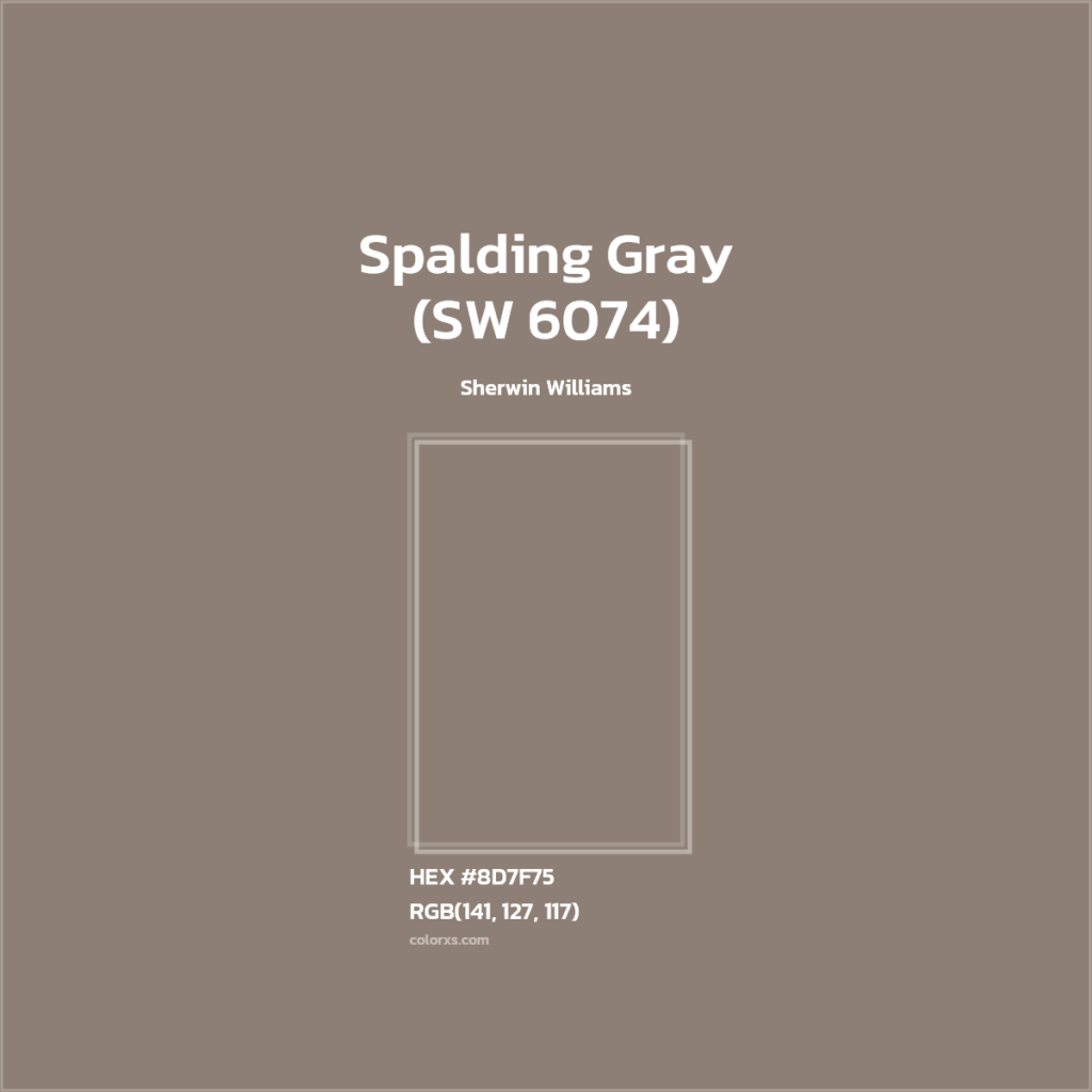
HEX Code Spalding Gray SW 6074
Sherwin-Williams SW 6074 Spalding Gray has a HEX code of #8D7F75. In digital design or paint-matching tools you would use #8D7F75 to approximate this color.
RGB Value of Spalding Gray SW 6074
The RGB values for Spalding Gray are R: 141, G: 127, B: 117. This means it is a balanced mix of red, green, and blue (with slightly more red and green than blue), consistent with its warm gray-brown character.
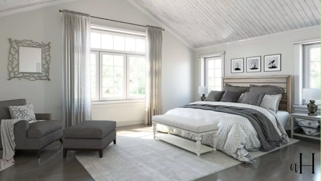
In the Bedroom
In a bedroom, Spalding Gray creates a serene, restful atmosphere. I recommend painting all walls in Spalding Gray and balancing it with crisp white bedding, plush textures, and muted earthy accents.
Its warm undertones pair beautifully with soft whites and warm woods, so it feels tranquil rather than stark.
For example, Spalding Gray walls with white trim and light wood furniture can turn a master or guest bedroom into a cozy retreat.
Because its LRV is moderate, Spalding Gray can make a large bedroom feel intimate; if the space is small, it’s best balanced with plenty of light bedding or wall art so it doesn’t feel too dark.
Manor House (SW 7505) Sherwin-Williams:Review with REAL HOME IMAGES
Intellectual Gray SW 7045 -Sherwin-Williams-My favo Gray
Spalding Gray SW 6074 Kitchen
Spalding Gray is a popular kitchen color. It works exceptionally well on cabinets as well as walls. In kitchens, it provides a modern yet classic alternative to white cabinets.
I suggest pairing Spalding Gray kitchen cabinets with white or marble countertops and warm metal hardware (like brass) for contrast. Its warmth complements natural wood shelves or butcher-block counters.
Even as a wall color, Spalding Gray gives kitchens a grounded, neutral feel that matches stainless appliances and backsplash tile.
It hides minor stains and fingerprints better than pure white, yet still brightens the room enough when balanced with lighter countertops and backsplashes.
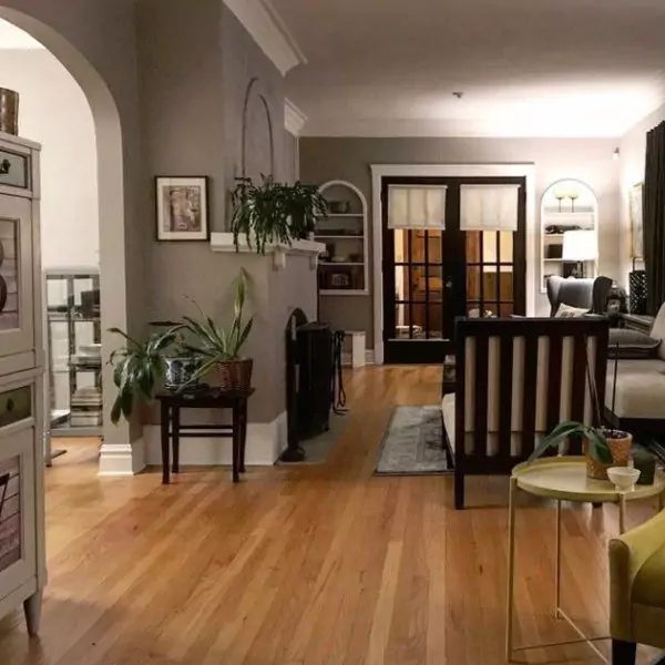
Spalding Gray SW 6074 Living Room
In living spaces, Spalding Gray sets a calming, inviting tone. When used on living room walls, its warmth helps the room feel cozy without being overpowering.
My client recommend me combining Spalding Gray with natural materials: for instance, rich wood floors or furniture and textured fabrics in creams or browns.
Metallic accents (such as brushed nickel or warm brass lighting) highlight its sophisticated neutrality.
A living room painted Spalding Gray will look contemporary yet comfortable – one designer notes its warm undertones “pair beautifully with natural wood furniture, textured fabrics, and metallic accents.”
Even with accent pillows or art in deep blues or greens, Spalding Gray remains a versatile backdrop.
Ashen Tan 996:Benjamin Moore-Reasons Why its PERFECT Choice
Review-Ashley Gray (HC-87) by Benjamin Moore-Why to Choose
In the Bathroom
In bathrooms, Spalding Gray creates a spa-like vibe when combined with crisp whites and light finishes. Its subtle warmth works nicely with white vanities, tubs, and sinks to prevent the space from feeling too sterile.
For example, many decorators suggest Spalding Gray walls or cabinetry alongside white marble or porcelain tile. Light-colored countertops and reflective fixtures (chrome or polished nickel) will brighten the room.
In a small bathroom, the moderate darkness of Spalding Gray can make it feel cozy; accent it with ample lighting and white trim to keep the space feeling open.
Overall, Spalding Gray in bathrooms feels elegant and clean rather than cold, thanks to its beige undertones.
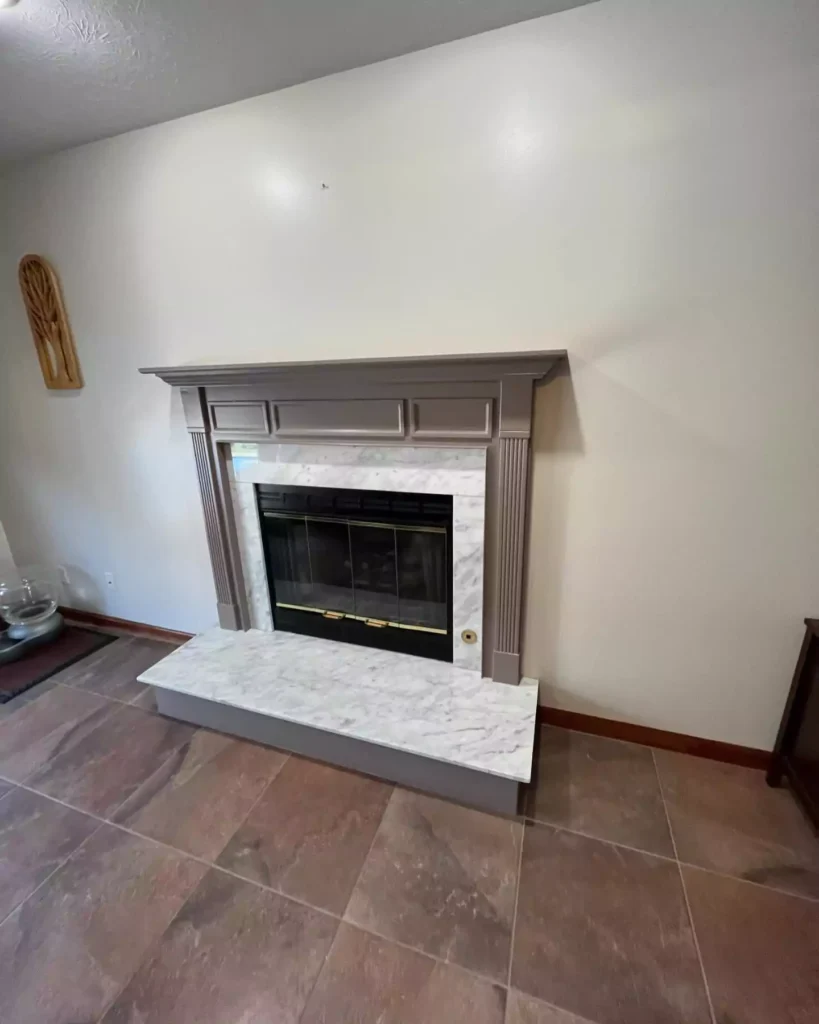
Spalding Gray SW 6074 Cabinets
Spalding Gray is often used on cabinetry and millwork throughout a home. On kitchen or bathroom cabinets, it provides depth without the heaviness of charcoal.
As a cabinetry color, Spalding Gray gives a modern-meets-traditional look – it’s a “timeless alternative to white” on cabinets. Designers frequently pair gray cabinets with white or light-stone countertops and simple hardware for contrast.
It is also used on built-in shelving or entertainment centers in living rooms.
The key is to surround Spalding Gray cabinets with lighter counters or backsplashes (and plenty of light) so they pop, while allowing the room’s metal accents or wood textures to shine against the neutral gray.
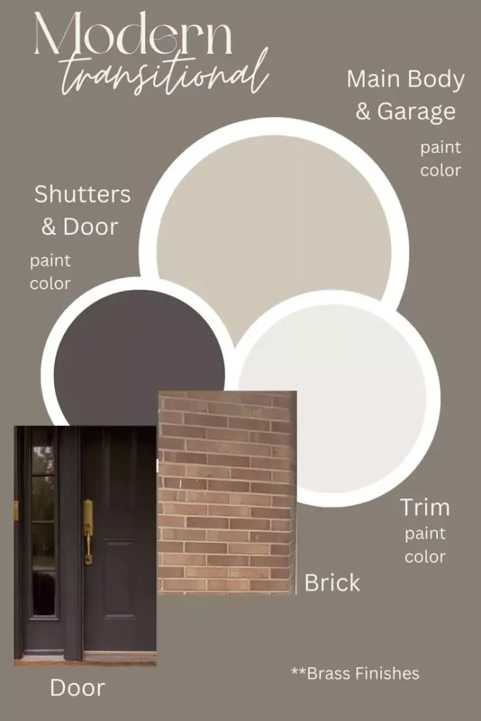
Spalding Gray SW 6074 Exterior
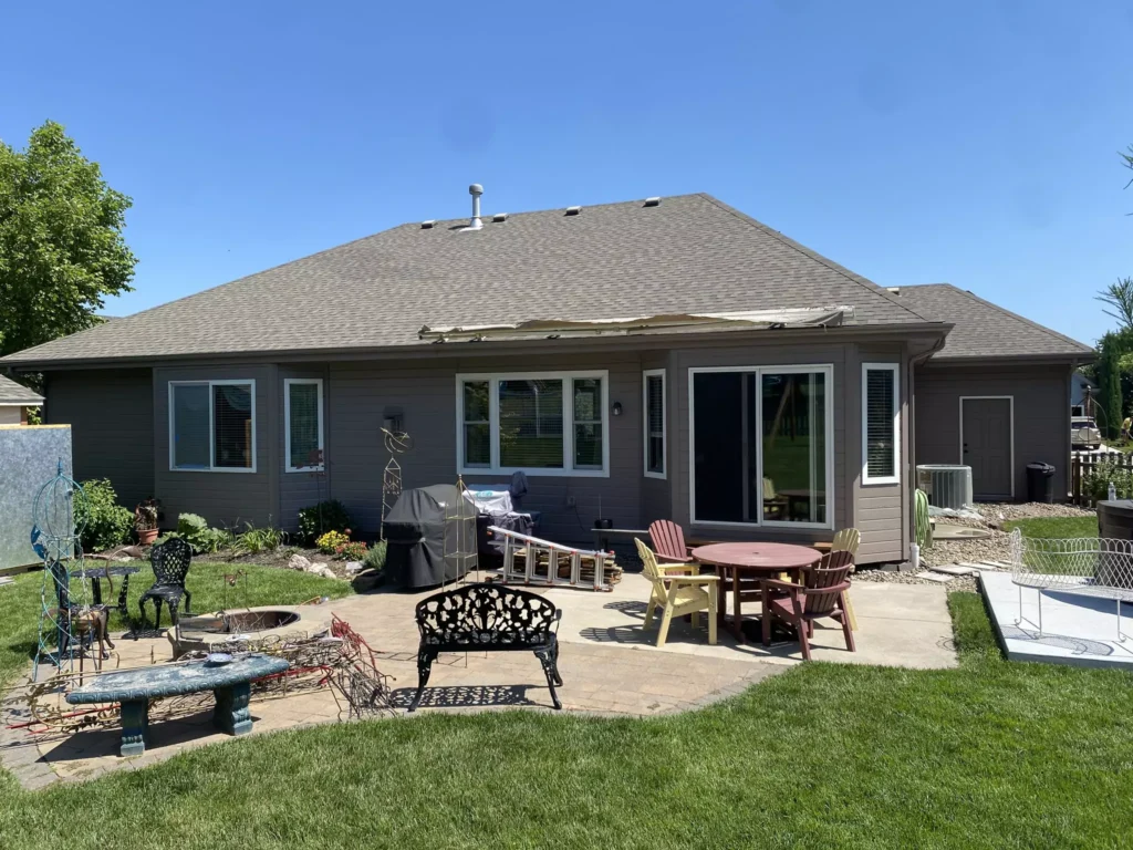
For exteriors, Spalding Gray offers a refined, classic look on siding or trim. Sherwin-Williams notes that it pairs well with crisp white trim and charcoal accents outside.
Many designers use it on exterior walls with bright white window frames and dark gray or black shutters/doors (such as Tricorn Black) to highlight architectural details.
Because it’s a neutral gray, it blends nicely with landscaping greens and brick or stonework. In shaded outdoor areas it looks like a warm, muted gray, while in sun it can take on a slightly taupey hue.
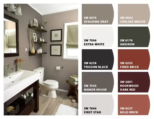
Coordinating Colors
Spalding Gray is very coordinating with both neutrals and accents.
It harmonizes with other grays, beiges, and even greens. Sherwin’s own palette suggestions pair it with lighter neutrals like Heron Plume (SW 6070) – an almost-ethereal pale gray – as well as deeper complementary colors like Jasper Stone (SW 9133), a muted green, and Rocky River (SW 6215), a deep blue-green.
In practice, designers often use soft whites and creams (for trim) and bold darks (for accents) alongside Spalding Gray.
For example, Alabaster (SW 7008, a warm white) is frequently recommended on trim to highlight its richness, while Tricorn Black (SW 6258) or Naval (SW 6244, a deep navy) are cited as striking accent choices.
Other popular partners include Repose Gray (SW 7015) or Accessible Beige (SW 7036) for adjacent walls to create a layered, tonal scheme. Overall, Spalding Gray acts as a flexible base that lets both gentle and vibrant colors stand out in a coordinated palette.
Soft Color Palette Coordination
For a soft, calming palette, pair Spalding Gray with light neutrals and muted pastels. Examples include creamy off-whites like Alabaster (SW 7008) on trim, warm beiges like Accessible Beige (SW 7036), or very pale blues/greens like Sea Salt (SW 6204) for accents.
These choices keep the overall look gentle and airy. For instance, soft grays like Repose Gray (SW 7015) on an adjoining wall will blend almost invisibly with Spalding Gray, creating a seamless feel.
Bold Color Palette Coordination
To make a bold statement, combine Spalding Gray with strong, saturated accents. Deep colors like Naval (SW 6244, a rich navy) or Tricorn Black (SW 6258) create high contrast against Spalding Gray and add drama.
Other bold options could include a jewel tone (emerald green, royal blue, or burgundy) on one accent wall or in large furniture pieces. Even a pop of warm color (such as a terracotta or mustard) would stand out dynamically.
In practice, designers use dark woods or black furniture and vibrant artwork alongside Spalding Gray to achieve a striking effect.
Just remember that because Spalding Gray is moderate in darkness, pairing it with very dark or vibrant hues demands good lighting and balancing neutrals (like bright white trim) to keep the space from feeling too heavy.
Muted Color Palette Coordination
A muted palette can be built from other soft neutrals and earthy tones.
Think of colors like Chateau Brown (SW 7510, a warm chestnut) or wood-inspired tans (Sherwin’s Teakwood) to bring subtle warmth.
Light grays such as Popular Gray (SW 6071) or Perfect Greige (SW 6073) complement Spalding Gray without much contrast, resulting in a very understated look.
Deeper muted grays like Chatura Gray (SW 9169) or Garret Gray (SW 6075) can be used on accent walls or upholstery to add depth while still remaining in a neutral family.
Overall, a muted scheme might include beige-grays, soft taupes, and gentle browns – colors that are “in the same family” as Spalding Gray.
This creates a harmonious, sophisticated effect perfect for spaces aiming for a quiet, cohesive look.


