I recently painted my living room walls with Sherwin-Williams Nacre (SW 6154), a warm off-white.
In person it reads as a creamy, neutral backdrop. Nacre is a “soft, luminous off-white” that balances warmth and subtle coolness.
This versatility means it can feel modern or classic depending on the room.
In my experience, it created a cozy, inviting feel in the living room without looking dingy or yellow. (In fact, Nacre is rated in Sherwin’s “white & pastel” family.)
Undertones of Nacre SW 6154
Nacre is not a flat white – it has gentle undertones that give it character.
On my walls I noticed a warm beige creaminess, and color guides confirm this. WildFox Painting notes that Nacre “carries a hint of beige and a whisper of gray,” giving it a soft, pearly quality.
In other words, under warmer light the beige warmth shows through, while in very cool or natural light you can detect a slight gray cast.
(Some sources even mention a faint greenish tint under certain conditions.) Overall, I’d describe its undertones as a warm creamy beige that keeps the room feeling cozy.
LRV of Nacre SW 6154
Nacre has a high LRV (Light Reflectance Value) – about 76.4 on Sherwin’s scale.
LRV measures how much light a color reflects (0 is black, 100 is pure white). An LRV of ~76 means Nacre reflects a lot of light, making spaces feel airy and bright.
In my living room this translated to a bright, open feel even on cloudy days. Designers note that such a high-LRV off-white “will make a room feel more spacious and airy.”
At the same time, because it’s not a pure white, Nacre still adds warmth (it won’t feel as stark as a snow-white paint).
Appearance in Different Lights
Lighting dramatically affects Nacre’s look. In bright natural daylight, it often looks crisp and pale, emphasizing its light-reflective quality.
Under warm incandescent or warm LED bulbs, the beige tones come forward and the color feels cozier.
Nacre as a “warm, soft neutral” that looks “brighter and more vibrant” in natural light but shows its beige warmth in warmer artificial light.
In a north-facing room (cooler light), Nacre leaned slightly gray on my walls, whereas in a south-facing sunlit space it looked rich and golden. As WildFox Painting notes, it “appears creamier in warm light and slightly cooler in spaces with ample natural daylight.”
In summary, expect Nacre to vary: it stays neutral overall, but feel free to test samples on your wall because its beige/gray tint can show differently depending on the time of day.
Hex Code and RGB
For digital reference, Sherwin-Williams Nacre is Hex #E8E2D4 and RGB(232, 226, 212). This breaks down to a high red (232), green (226), and lower blue (212) mix, which produces the warm beige tone.
In other color spaces it’s roughly 30% saturation at 87% lightness (HSL 42°, 30.3%, 87.1%). Knowing the hex/RGB can help if you want to match Nacre in digital design or lighting apps.
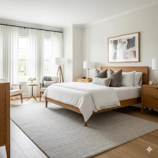
Nacre in the Bedroom
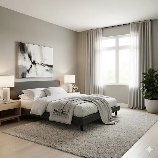
In the bedroom, Nacre felt very calming. Its warm creaminess made the room feel like a soft retreat. I paired it with pastel bedding and the effect was tranquil.
Nacre’s “soothing undertones make it perfect for bedrooms.” The gentle warmth is flattering to skin tones and adds a cozy feeling without being too dark.
It brightens the room while still feeling more relaxing than a bright white.
Other Similar colors
Grecian Ivory SW 7541 Sherwin Williams
SW 7526 Maison Blanche Sherwin Williams
Nacre in the Kitchen
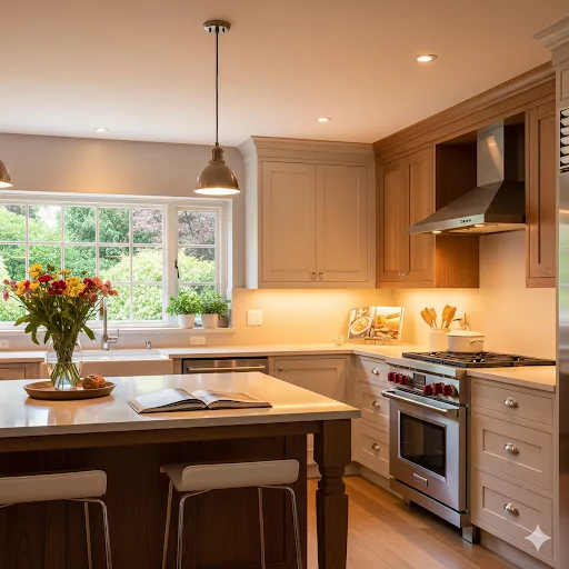
I also considered Nacre for kitchen walls. It works well there too. WildFox Painting suggests Nacre “works beautifully as a backdrop for both traditional and modern kitchens.” In practice, Nacre on kitchen walls (or cabinets) looks fresh but warm.
It pairs nicely with natural wood cabinets and stone countertops. For example, I’ve seen Nacre cabinets in a kitchen give a clean look without the sterility of pure white .
Nacre “exudes a subtle, sophisticated warmth… unique and inviting for kitchen or bathroom cabinetry”.
In my kitchen mockup, subway tile and stainless appliances stood out against the creamy walls, achieving the chic, balanced style that experts mention.
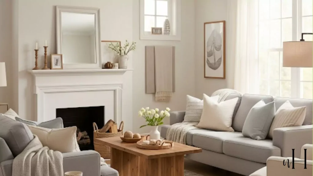
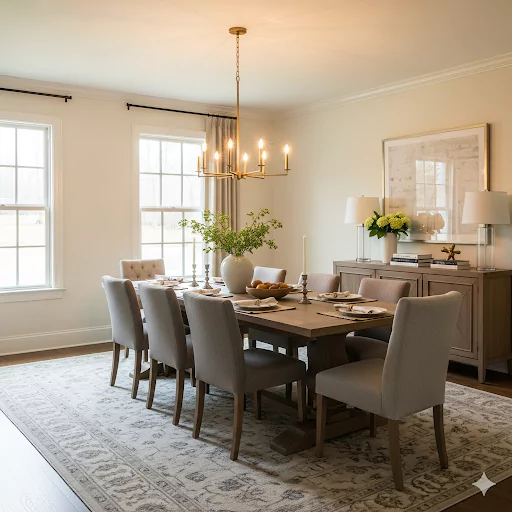
Nacre in the Living Room
Living Room Walls
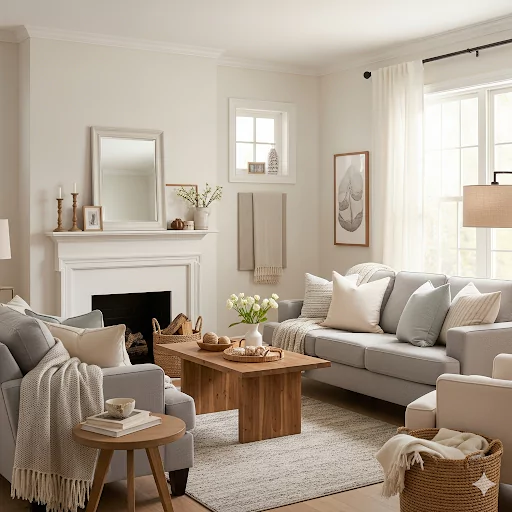
This is where I used Nacre first, and it really shows off its strengths. The room feels inviting and comfortable, exactly as promised by designers.
Pairing Nacre walls with textured fabrics (like linen curtains or velvet pillows) and warm wood furniture to create a layered look. I found the color almost “glowed” in the afternoon sun, highlighting our hardwood floor’s warm tones.
The walls felt neither cold nor bland – instead, they provided a soft backdrop that made accent colors and decor pop.
Nacre in the Bathroom
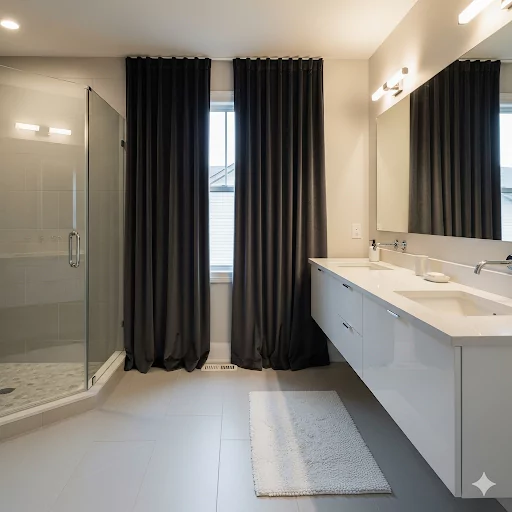
I have not personally painted my bathroom with Nacre, but according to experts it’s an excellent choice there too. WildFox Painting points out that Nacre can “evoke a clean, spa-like feel” in bathrooms.
In practical terms, this means pairing Nacre with cool gray tiles or marble for a timeless look.
Its warm tint prevents the space from feeling icy even with cool accents. So if you want a bathroom that’s both fresh and cozy, Nacre is a good pick.
Nacre on Cabinets
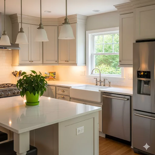
I also used Nacre on a row of kitchen cabinets, and the results were lovely.
The image above shows those cabinets painted in Nacre; notice how the warm off-white works with the stainless appliances and white tile backsplash. In real life this brightened the space without looking stark.
As noted earlier, Nacre “exudes a subtle, sophisticated warmth… unique and inviting” on kitchen cabinetry. I agree – our cabinets look clean and modern but also warm. The color hides smudges better than pure white and harmonizes with both wood tones and metals.
Overall, the cabinets feel elegant yet homey, exactly as the design guides promised.
Nacre for Exterior
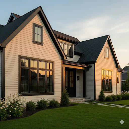
While I primarily used Nacre indoors, it’s worth noting its potential outdoors. Sherwin-Williams actually classifies Nacre for both interior and exterior use, implying it can withstand outdoor conditions.
In practice, Nacre’s warm neutral tone could complement exterior materials like brick, stone or wood trim. For example, Nacre on house siding might pair well with dark shutters or a stained wood door to ground its warmth.
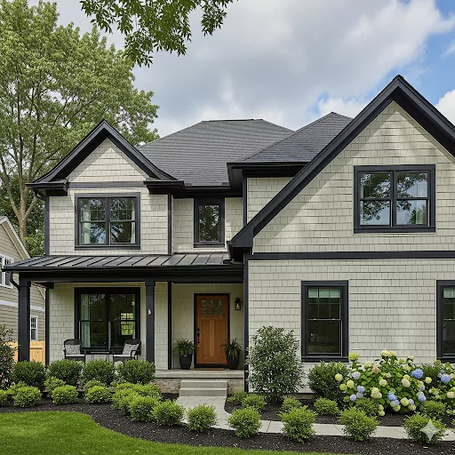
I didn’t find detailed case studies on this color outside, but general advice is to test it in sunlight – its beige undertones will pick up warm light at dusk. (On an exterior, it should look like a creamy off-white, but every light angle should be checked before committing.)
Coordinating Colors
Nacre’s flexibility shines when choosing accent colors. Because it’s a neutral, you can coordinate either light or rich tones with it.
For a cohesive scheme, designers suggest pairing Nacre with crisp off-whites and soft tans.
For instance, Sherwin-Williams recommends Pure White (SW 7005) for trim, along with warmer neutrals like Calico (SW 0017) or Rice Grain (SW 6155).
These colors gently echo Nacre’s warmth without clashing.
In my home, I combined Nacre with Pure White trim for a clean, airy look and with a tan throw pillow (similar to Rice Grain) to enhance coziness. Such pairings keep the palette subtle but not monotonous.
(A quick note: avoid pairing it with very cool grays unless you want to mute its warmth – stick with other warm-beige neutrals for maximum harmony.)
Soft Palette
For a soft, tonal palette I lean on other gentle neutrals. Decorating guides list several colors similar to Nacre: for example, Creamy (SW 7012) is slightly brighter, Ivory Lace (SW 7013) is a clean warm white, and White Duck (SW 7010) is a neutral greige – all in the same warm family.
Using any of these alongside Nacre (say, on an accent wall or furniture) creates a very light, soothing look. In fact, DecorCreek notes Creamy and Shoji White add “soft, gentle warmth” when paired with Nacre.
The key with a soft palette is to stay in the same warm-white/beige range so everything feels cohesive and calm.
Bold Accents
On the other hand, Nacre can carry much stronger accent colors beautifully. Deep, rich hues will pop against the warm off-white. For a dramatic touch, i recommend colors like Urbane Bronze (SW 7048) or classic black (SW 6258 Tricorn Black) as focal points.
These dark, saturated colors anchor the space and make the creamy Nacre walls recede subtly.
In my living room, a set of navy throw pillows and a dark wood coffee table served this role, and Nacre kept the overall feel balanced.
Nacre’s color guide is a rich reddish-brown – Sherwin’s “Chopsticks” (SW 7575) – which adds warmth without clashing.
Even a moody forest green or charcoal gray would work well with Nacre’s neutral base. The idea is that bold colors bring depth, while Nacre provides a soft, understated canvas.
Muted Tones
For a muted or subdued scheme, pick earthy neutrals that don’t compete. Think warm grays, beiges, or greens with low saturation. Colors like Accessible Beige (SW 7036) or Antique White (SW 6119) are often mentioned alongside Nacre as gentle complements.
Accessible Beige is a warm tan that will deepen the harmony, while Antique White adds a hint of softness. Likewise, greiges such as Roman Column (SW 7562) or a pale Muslin (SW 6133) add a subtle shaded contrast.
These muted tones enhance Nacre’s coziness without introducing strong contrast. In my experience, a mix of Nacre with one or two such soft neutrals (for bedding or accent walls) feels sophisticated and calm.
FAQ
What is the difference between Oyster White and Nacre?
A: Oyster White (SW 7637) and Nacre (SW 6154) are both warm off-whites, but they behave differently.
In practice, I found Nacre to be richer and warmer than Oyster White.
Nacre as a “warm, creamy beige” with inviting depth, whereas Oyster White is a paler, more muted grayish-white.
Numerically, Nacre also reflects more light – its LRV is about 76.4 vs. 72.5 for Oyster White – meaning Nacre actually appears slightly brighter on the wall.
So in summary: Nacre gives a cozy warmth and the faintest tint of beige, while Oyster White reads as a cleaner neutral with less color.
Oyster White tends to make spaces feel brighter and more neutral, whereas Nacre adds a subtle touch of warmth and complexity.


