Valspar Quiet Mint (5003-1A) is a pale sage-green paint with a serene, nature-inspired vibe. It’s described as a “light, sage green with a neutral undertone,” and technically Valspar notes it as a cool green (blue-tinged) shade.
This soft pastel green is airy and tranquil, making it a popular choice for calm, refreshing interiors. Quiet Mint has a high reflectivity – an LRV of about 68.8 – so it remains fairly bright under most lighting.
Undertones of Valspar Quiet Mint (5003-1A)
Quiet Mint’s undertones are a balance of green and blue. Design experts describe it as a “pale green hue with subtle blue undertones” that lend a cool, crisp quality.
The underlying green keeps it from feeling icy, giving a gentle, organic warmth along with the coolness. In practice, it may read as a true mint in cool light or a soft leafy green in warm light. (Valspar’s chip notes call the undertone “cool,” though everyday usage shows it as a well-balanced, neutral-green.)
LRV of Valspar Quiet Mint (5003-1A)
With an LRV of about 68.8 on a 0–100 scale, Quiet Mint reflects a lot of light (white is 100). This high LRV means the color keeps rooms feeling bright and open.
In comparison, pure white is 100 and true black is 0. A value near 69 is typical for a light pastel: it’s lighter than mid-tone greys but not as bright as pure white. This high reflectance helps Quiet Mint look luminous in daylight and stay fairly visible even in dimmer conditions.
Other colors that look like Quiet Mint
- Silvermist SW 7621 Sherwin Williams+REAL HOME IMAGES
- Sleepy Blue SW 6225 Sherwin Williams
- Krypton (SW 6247) Sherwin-Williams-My Review
- Morning Fog SW 6255 Sherwin Williams
In Different Lights
Quiet Mint can shift subtly under various light sources. In bright natural daylight (especially south-facing light), it appears crisp and pale, while north-facing light will soften it and emphasize its creamy-green warmth.
Under warm incandescent or yellow-toned LED bulbs, Quiet Mint may take on a faintly warmer, slightly beige tint, whereas cool-white LEDs will highlight its minty, blue-tinged character.
In low-light situations its cool-bluish quality actually helps a space feel “refreshing” rather than dull. (Design writers note its “cool blue undertones” can brighten dark rooms, especially if balanced with some warm accents.)
Overall, Quiet Mint stays fairly light under any lighting due to its high LRV, but test samples in your room’s specific light to see its exact shift.
Hex Code
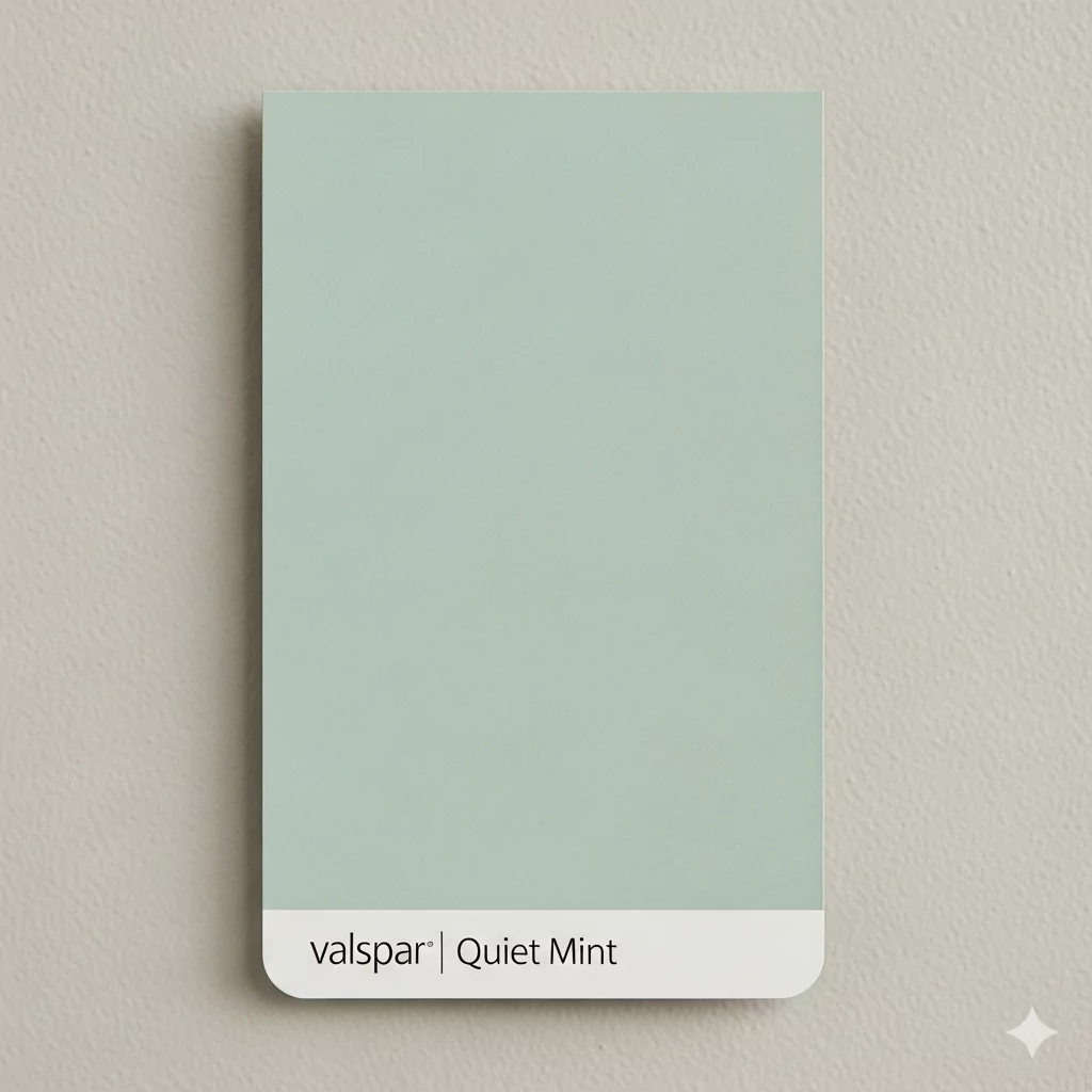
The official hexadecimal (HTML) code for Valspar Quiet Mint is #D5DAD0.
RGB
In digital RGB terms, Quiet Mint is (R=213, G=218, B=208). This means it’s made up of roughly 83% red, 85% green, and 82% blue on the 0–255 scale. (These digital values match its soft mint-green appearance on screen.)
Bedroom Valspar Quiet Mint (5003-1A)
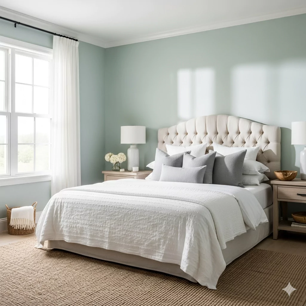
Quiet Mint creates a serene, spa-like bedroom. Its muted green-blue tint promotes restfulness and calm. On walls, it feels light and airy, making small bedrooms look larger and softer.
Pairing Quiet Mint with crisp whites and gentle grays reinforces a tranquil vibe: for example, white linens and pale-gray throw pillows give a “dreamy, spa-like” retreat feel. Complement it with natural textures to add warmth.
A soft, relaxing retreat – think coastal or modern-Scandinavian. Use white or pale-gray bedding and drapery, maybe a light wood bed frame.
Natural wood (e.g. light oak nightstands), linen or cotton bedding, woven wool or jute rugs. Matte white ceramic lamps or brushed-brass light fixtures add subtle warmth.
Calm, soothing, and restful. Quiet Mint + white/gray accents creates a peaceful, uncluttered atmosphere ideal for sleep.
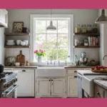
Valspar Quiet Mint (5003-1A) In the Kitchen
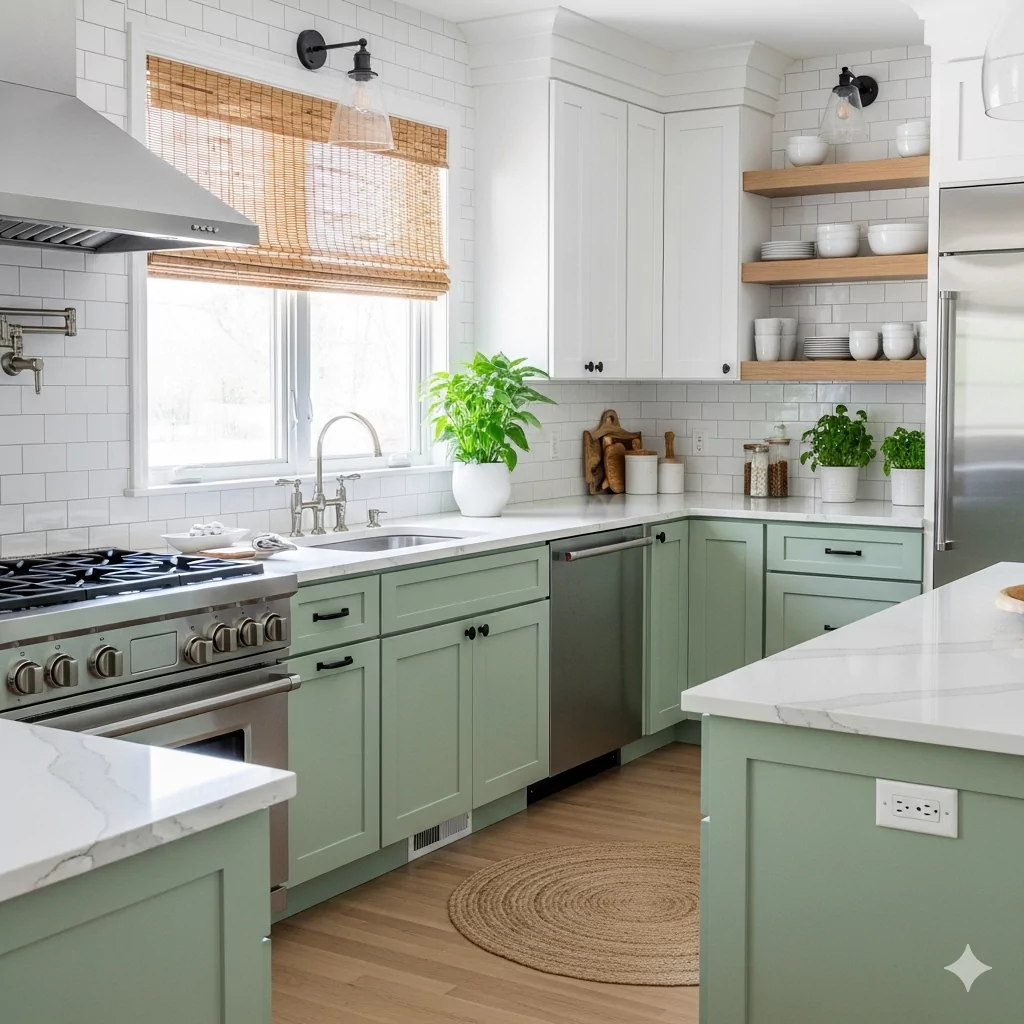
Quiet Mint on kitchen walls or cabinets brings a fresh, modern twist. The color makes a kitchen feel bright and clean, like a crisp limeade. In a contemporary or cottage kitchen, it energizes the space without being jarring.
Bright and airy. For example, paint lower cabinets or an island Quiet Mint and keep upper cabinets white. It suits modern farmhouse or coastal kitchens.
White or light-gray quartz/marble countertops and subway-tile backsplash for contrast. Pale wood or white cabinets, stainless steel or matte-black hardware, and natural-fiber elements (bamboo window shades, wood shelves).
Clean, uplifting, and invigorating. Quiet Mint makes the kitchen feel sunny and fresh, ideal for brightening the morning routine or adding a cheerful vibe to cooking.
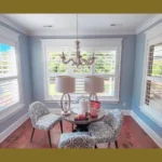
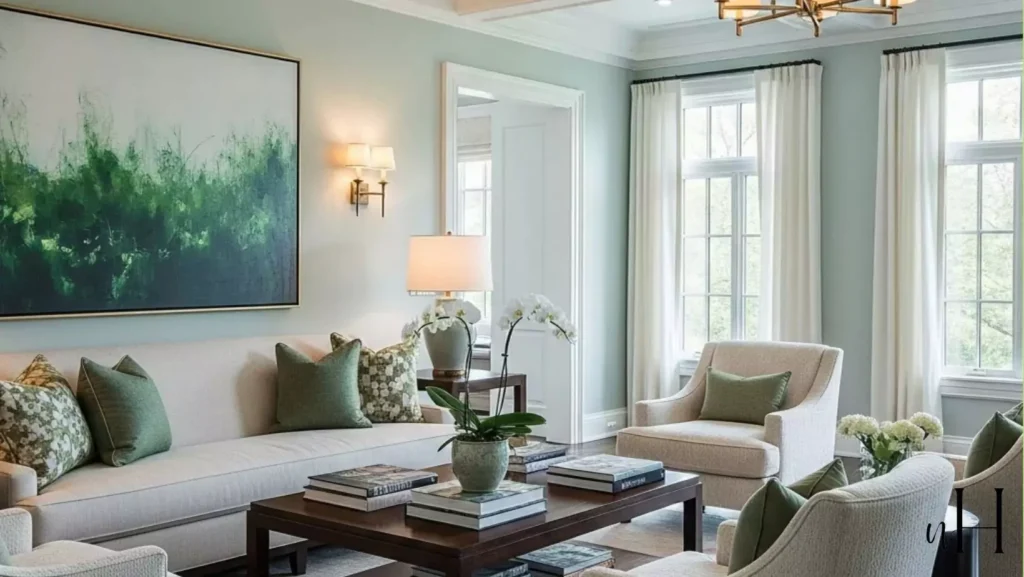
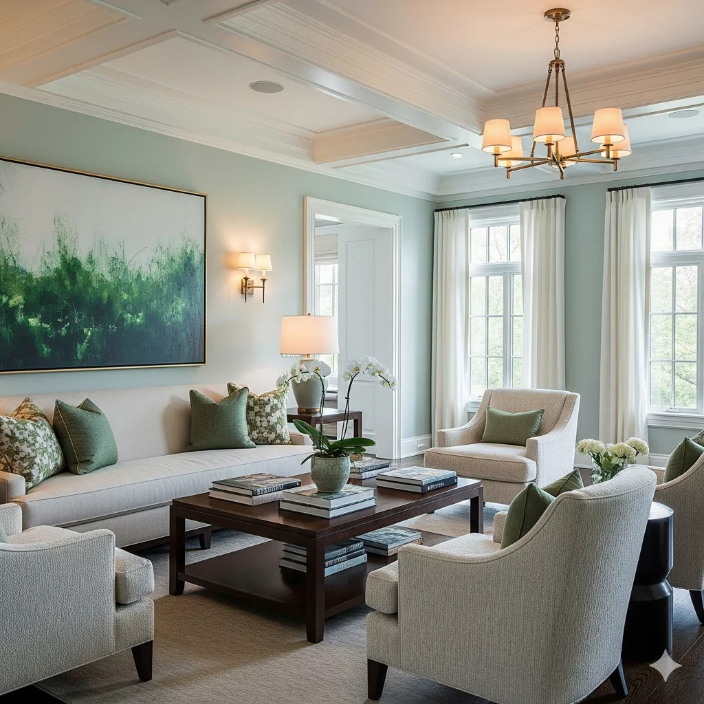
In the Living Room
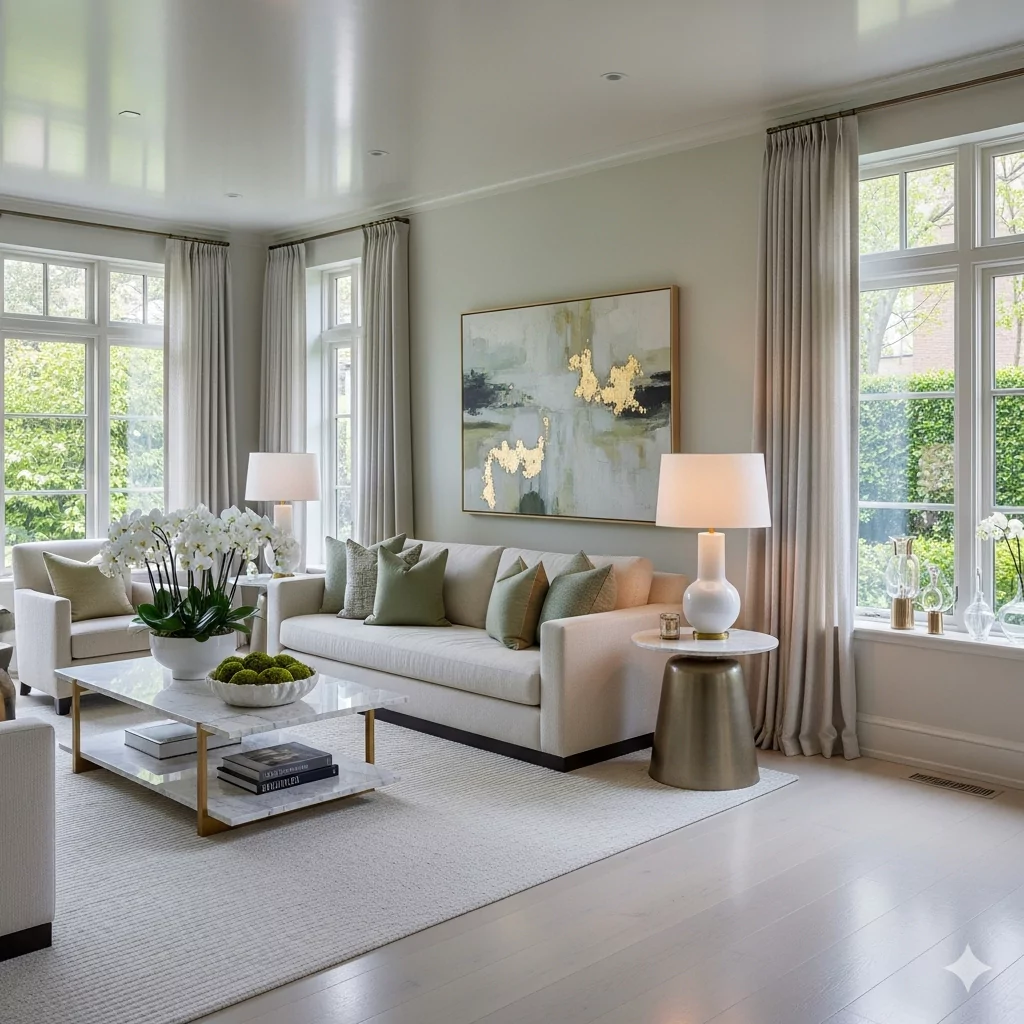
Quiet Mint walls create a serene, welcoming living area. The gentle green is elegant yet cozy; it softens bright daylight and works well with light neutrals. It pairs beautifully with natural wood and soft fabrics to keep the room warm and lived-in.
Casual yet refined. For example, use Quiet Mint on all walls for a unified feel. Furnish with light-colored upholstery (e.g. cream or pale gray sofas) and wood furniture. Add decorative accents in complementary pastels or metallics.
Linen or cotton slipcovers, a wool or cotton area rug, rattan or wicker baskets. Natural wood (oak or pine) coffee/side tables. Brass or gold photo frames and lighting add a touch of glam.
Relaxed and calming. The room feels airy and softly elegant. Quiet Mint fosters a cozy, homey vibe – perfect for unwinding or casual gatherings.
In the Bathroom
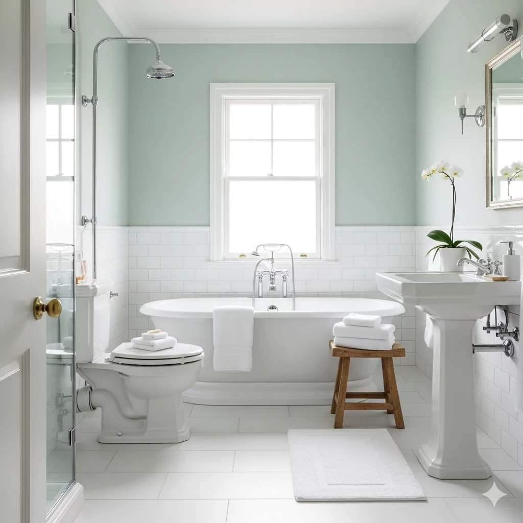
Quiet Mint gives bathrooms a spa-like, clean feeling. Its refreshing quality evokes water and foliage, so paired with white fixtures it feels crisp and rejuvenating. This is a go-to for a tranquil master bath or airy powder room.
Refreshing and bright. Paint all walls or just an accent wall Quiet Mint. It works well with white tile or pale stone.
Glossy white ceramic or subway tile, clear glass shower doors, and chrome or polished nickel fixtures. Include crisp white towels and perhaps a few plants (e.g. ferns or succulents) to enhance the natural vibe.
Clean, cool, and peaceful. The space feels like a light, airy spa – perfect for relaxing baths or revitalizing morning routines.
On Cabinets
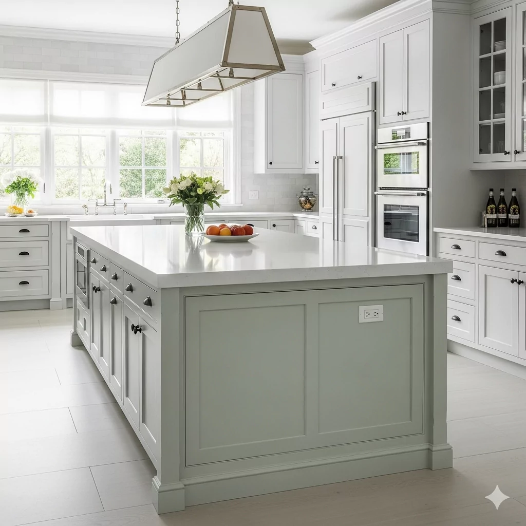
Quiet Mint also works beautifully on cabinetry (especially kitchen or bathroom cabinets). A set of Quiet Mint cabinets instantly refreshes the space without overpowering it. It’s a more creative alternative to plain white or gray.
Modern and crisp. For example, paint a kitchen island or bathroom vanity Quiet Mint and balance with neutral countertops and backsplashes. It suits both classic and contemporary cabinetry styles.
Matte or satin finish on cabinet faces. Pair with white quartz or butcher-block countertops. Use contrasting hardware like brass knobs or black pulls. If cabinets are Quiet Mint, keep walls or counters in neutral whites/creams so the color pops.
Uplifting and fresh. Quiet Mint cabinets give a space personality and brightness – the room feels airy and cheerful, yet grounded by neutral surrounds.
Valspar Quiet Mint On the Exterior
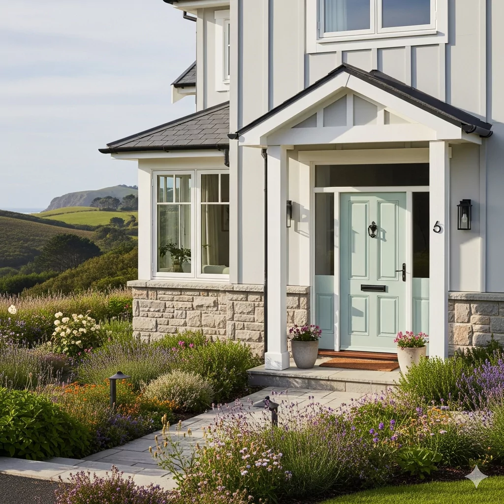
Quiet Mint can make for a charming exterior accent (on a front door, shutters, or even full siding) when balanced by neutrals. Its soft tone complements natural landscapes and creates a cottage- or coastal-house feel.
Subtle, nature-inspired. Use it on doors, trim, or siding against a pale gray or cream facade. It pairs well with white trim for a crisp look.
Natural materials like wood siding or stone foundation work beautifully with sage-green tones. For example, a Quiet Mint door with white trim and a stone porch looks fresh and inviting. Matte or eggshell exterior finish is recommended for moderate sheen.
Calm and inviting. The home feels peaceful and connected to the outdoors. Quiet Mint on the exterior suggests a relaxed, welcoming vibe – imagine a cottage in the woods or seaside.
Coordinating Colors of Valspar Quiet Mint
Quiet Mint harmonizes with a range of neutrals and accent hues. Valspar’s own palette suggests crisp whites and muted beiges alongside Quiet Mint.
For example, pairing it with a bright Ultra White (7006-24) or creamy Soft Candlelight (3005-6C) yields a fresh, airy scheme.
Soft grays like Valspar Gravity (4005-1B) or off-whites (e.g. “Swiss Coffee” 7002-16) are also classic accompaniments. Designers often balance Quiet Mint with either earthy neutrals or bold accents:
Soft Palette Suggestions
Light, airy neutrals and pastels. Ultra White (7006-24) or Swiss Coffee (7002-16) for clean whites; Soft Candlelight (3005-6C) for a pale warm beige; pale grays like Gravity (4005-1B); or other gentle pastels (e.g. a blush pink or muted lavender) for a sweet, understated mix.
Bold Palette Suggestions
For striking contrast, use deeper or brighter colors. Valspar’s Night View (5011-2) is a rich navy-blue that pairs beautifully with Quiet Mint. A golden accent like Spun Gold (3006-8B) adds warmth and vibrancy.
Other bold options include charcoal gray or black for contrast (e.g. slate-colored furniture) or even a deep emerald or teal for a jewel-toned scheme.
Muted Palette Suggestions
For a subdued, earthy look, use warm neutrals. Consider a warm beige like Faint Maple (3003-10B) or a soft taupe.
A deep muted brown or olive, such as Woodlawn Colonial Gray (6004-1A), adds depth. Valspar’s Light Patina (8004-28C) – a gray-green-beige – is another gentle complement. Overall, muted browns, greiges, and mossy greens work well for a nature-inspired palette.
Each of these coordinating colors can be used on trim, furniture, textiles or accent walls to complement Quiet Mint.
When choosing complements, consider the intended mood: soft palettes keep the feel tranquil, bold colors add drama or cheer, and muted earth tones ground the look in warmth and nature.