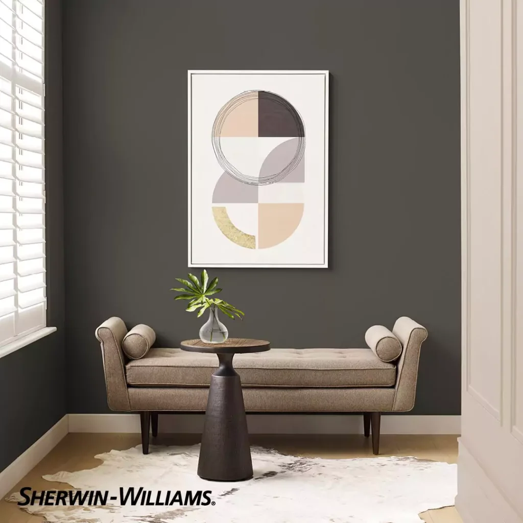
You are here sure you want something for an industrial,earthy or vintage look. There are many jet blacks but Urbane Bronze is matte with rustic grayish undertones. Iam sharing my experience with Urbane Bronze ,sharing what I observe with this paint.
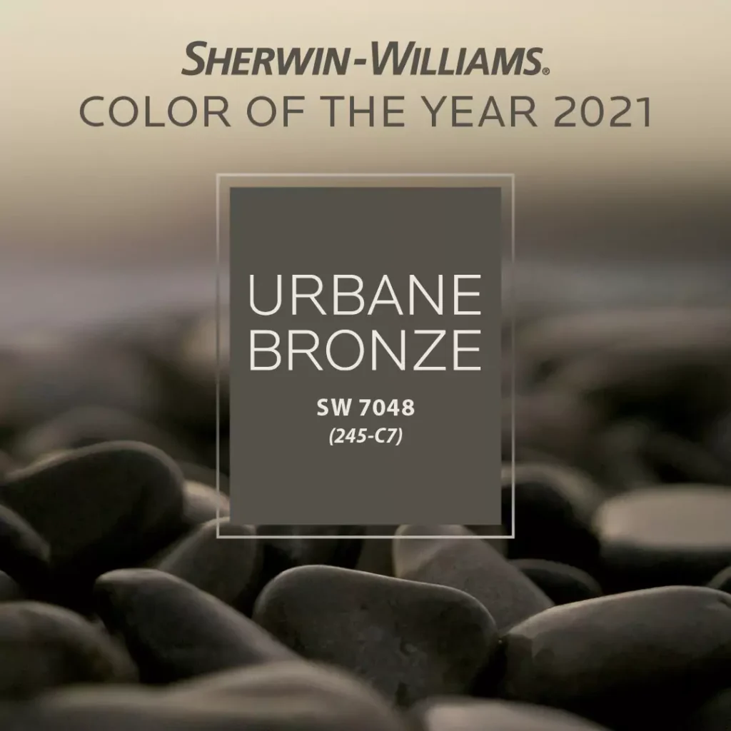
It was once Sherwin-Williams January 2021 Color of the Month. The company calls it a “bold neutral” that feels modern and calm.
In simple terms, think of Urbane Bronze as a strong mix of brown and gray, with a warm, cozy vibe. Perfect for your dark aesthetic mood with some cozy golden lights.
In this blog I am sharing everything about Urbane Bronze ,its undertones,feel , coordinating colors ,where to use ,and when not to use ,LRV and look in different lights.Now lets start…..!!!!!!!
10 Popular Sherwin-Williams Black Paint Colors for Every Space-2025
Undertones of Urbane Bronze (SW 7048)
This color has hidden hints (undertones) of other colors. It’s mainly brown-gray, but it also has a little green in it. In dim or north-facing light it looks more grayish; in bright or south-facing light it looks warmer and more brown-green. So depending on light and surroundings, you might notice it lean gray or green.
LRV of Urbane Bronze (SW 7048)
“LRV” is a number (0–100) that tells how light or dark a color is. Urbane Bronze has an LRV of only 8. That is very low, meaning this color is very dark. On a scale where 0 is pure black and 100 is pure white, Urbane Bronze (8) is closer to black. In fact, it can almost look black in some rooms because it doesn’t reflect much light.
In Different Lights
The way Urbane Bronze looks changes with light. In shady or low light it appears as a deep gray-brown. In bright sunlight or a south-facing room, the warm brown and green parts show more.
Outside in the sun, its greenish-brown tone really pops, giving a rich earthy feel. In direct sun, it can look like a warm chocolate color with a hint of green.
Other POPULAR black colors of Sherwin Williams:
- Porpoise SW 7047 Sherwin Williams
- Night Owl SW 7061 Sherwin Williams
- Black Fox SW 7020 Sherwin-Williams
- Honest Review-Iron Ore SW 7069 by Sherwin Williams
Hex Code
In digital design, Urbane Bronze’s hex code is #54504A. Think of a hex code as a special color ID used in computer graphics. The code #54504A means it is a dark shade (54 red, 50 green, 4A blue in hexadecimal). This code is exactly from Sherwin-Williams’ official data.
RGB
The RGB values for Urbane Bronze are R=84, G=80, B=74. RGB stands for red-green-blue, a way screens mix colors. Here it means the color is made from 84 parts red, 80 parts green, and 74 parts blue (on a scale of 0–255). This mix gives it that dark, warm brown-gray tone.
Urbane Bronze In a Bedroom
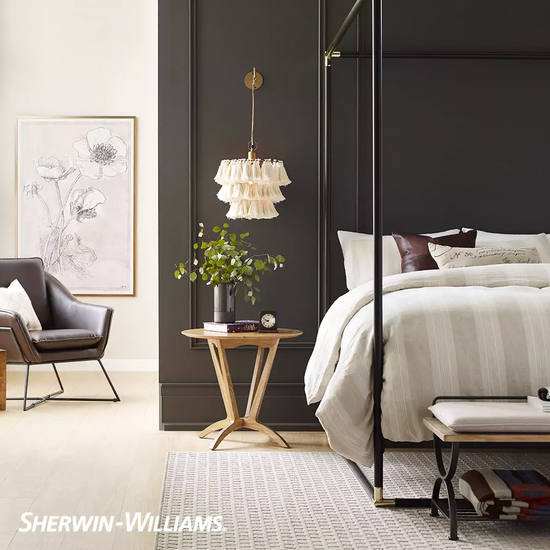
Urbane Bronze can make a bedroom feel like a cozy cave. If you paint walls (or even the ceiling) this color, the room becomes intimate and calm.
For example, one bedroom makeover painted everything Urbane Bronze and it looked moody but still comfortable. It adds personality without being too loud, making a bedroom feel warm and safe.
In a Kitchen
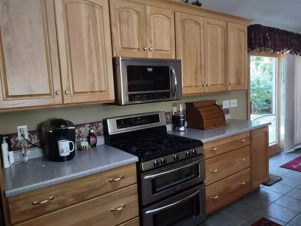
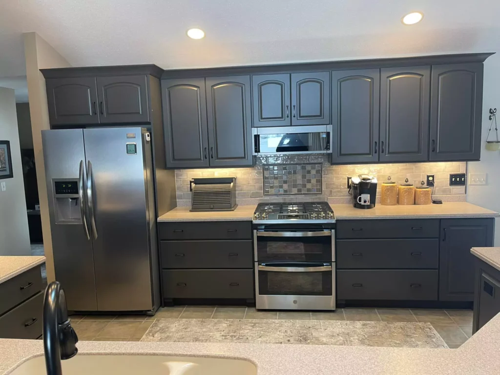
Using Urbane Bronze in a kitchen is bold and dramatic. People often paint kitchen islands or lower cabinets this color for contrast. It looks especially nice with white counters and a white backsplash.
For example, one kitchen had white walls and used Urbane Bronze on the island; the dark color made the island stand out against the light surroundings. It adds depth and a modern flair to the space.
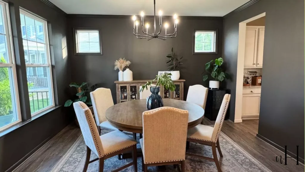
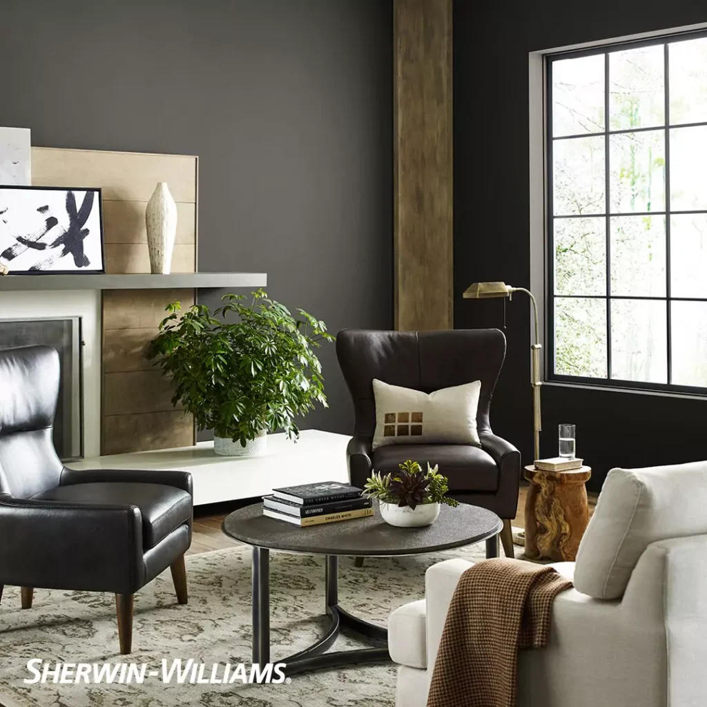
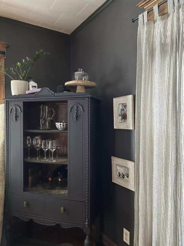
Urbane Bronze Living Room
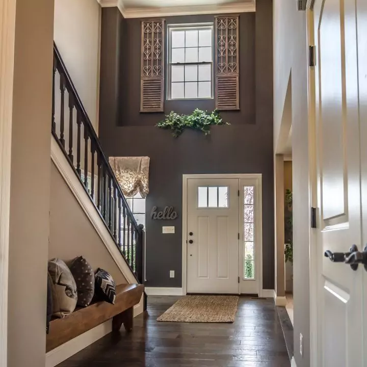
In living areas, Urbane Bronze works well on an accent wall or fireplace wall. It can warm up a neutral room and make it feel relaxing.
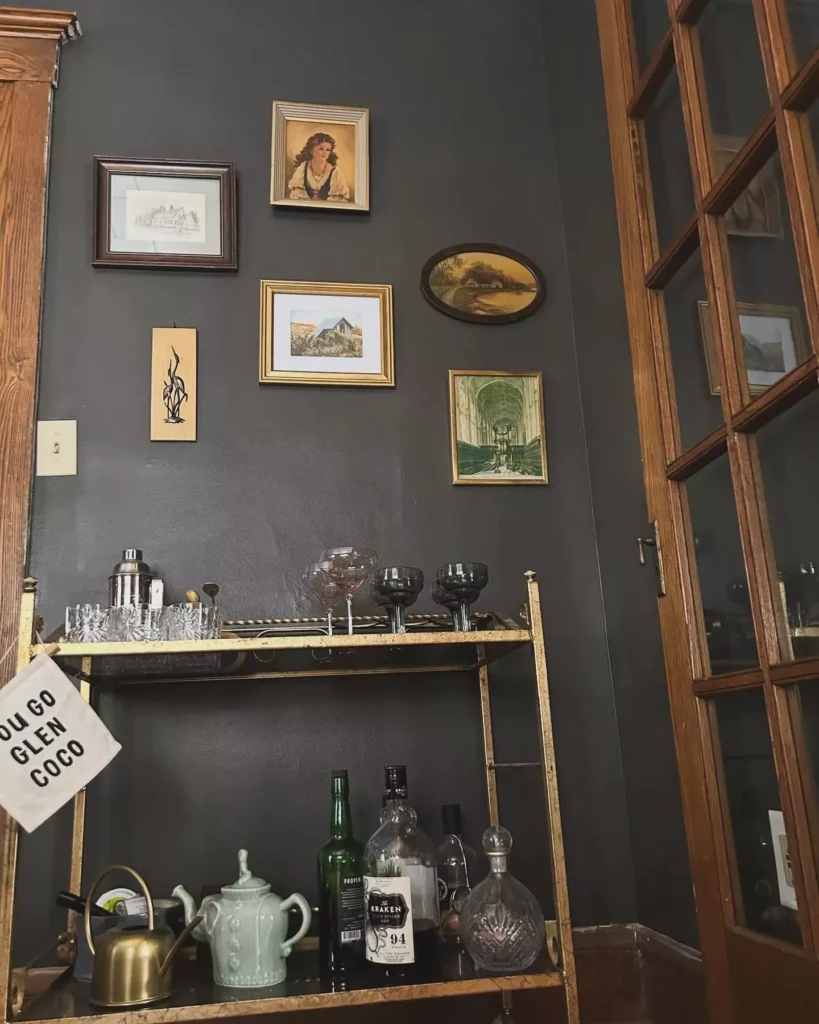
For instance, painting the TV wall or fireplace in Urbane Bronze can make the screen blend in and create a cozy focal point. With soft white trim or a light ceiling, the dark walls add drama and coziness at the same time.
In a Bathroom
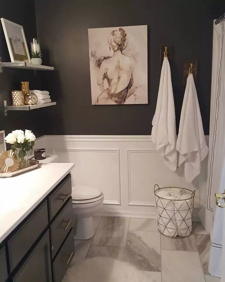
Urbane Bronze in a bathroom feels luxurious and spa-like. You can paint a vanity or walls this color, then pair it with lighter tiles and fixtures. For example, using Urbane Bronze on bathroom cabinets with brass or chrome hardware gave a “bright and moody” look. The dark brown gives richness, and it balances nicely with light counters and pale walls.
Cabinets with Urbane Bronze
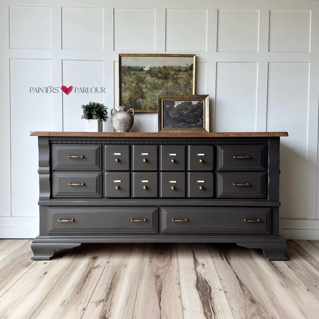
This color is popular on cabinets (like kitchen or bathroom cabinets, vanities, or built-in shelves). Painting cabinets Urbane Bronze makes them look rich and elegant. One design had an entire office built-in (shelves and desk) painted Urbane Bronze; it looked bold but still calm.
In bathrooms or kitchens, Urbane Bronze cabinets stand out as a dramatic accent, especially when other walls or countertops are light.
Exterior
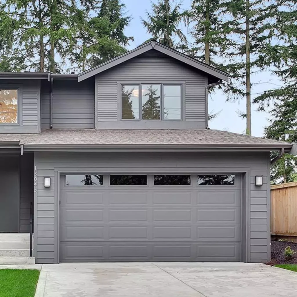
Outside the house, Urbane Bronze has great curb appeal. On shutters, doors, or siding it looks deep and earthy. In bright sunlight, its greenish undertone comes out, making it blend nicely with plants and trees.
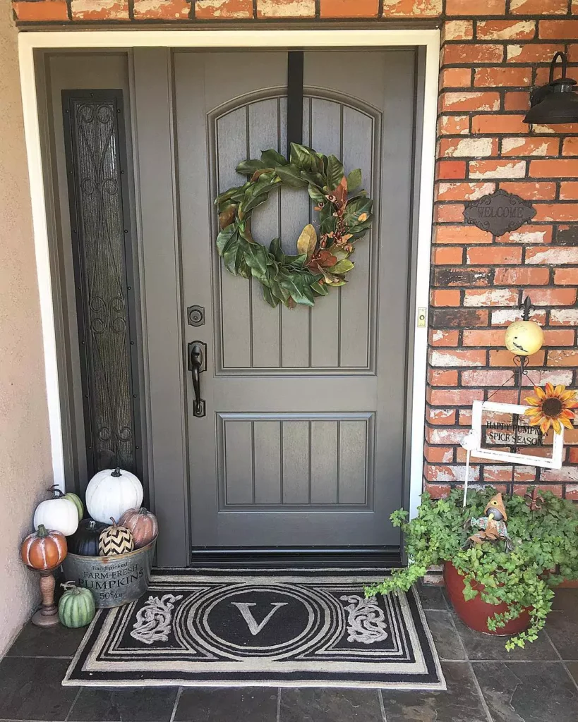
For example, using Urbane Bronze on exterior trim and a garage door created a warm contrast with brick walls and greenery. It feels organic and stylish as an exterior color.
Coordinating Colors
Colors that go well with Urbane Bronze are usually light and soft. Designers suggest pairing it with:
- Light warm grays: such as Agreeable Gray or Worldly Gray
- Off-whites or creams: for example, Shoji White or Alabaster
- Gentle greens: like Sea Salt or other pale sage greens
These lighter neutrals and soft tones complement Urbane Bronze without clashing. They keep the room from feeling too dark while letting Urbane Bronze be the star.
Soft Palette
For a soft, gentle palette, use pale and creamy colors:
- Shoji White (SW 7042): a warm off-white that balances Urbane Bronze
- Accessible Beige (SW 7036): a light warm beige that adds brightness
- Sea Salt (SW 6204): a light muted mint-green that is cool and calming
- Sleepy Blue (SW 6225): a pale blue-gray that feels soothing with the brown
Using these soft colors with Urbane Bronze creates a tranquil and inviting space.
Bold Colors
If you want a bolder contrast, try rich accent colors. One striking choice is “Earthen Jug” (SW 7703), a deep terracotta-orange. This warm rusty orange pops against the dark brown for a lively look. Other bold picks could be bright golds or dark teal, but make sure to balance them so the room still feels cozy.
Muted Colors
Muted, subdued colors also pair well. Think of gentle neutrals and grays:
- Repose Gray (SW 7015): a light gray with warm undertones
- Anew Gray (SW 7030): a medium warm gray that’s soft and calm
These muted grays let Urbane Bronze stay the focus while keeping the overall look understated and elegant.
FAQ
Urbane Bronze vs Iron Ore
Iron Ore is almost black (darker and cooler), while Urbane Bronze is lighter and more brown. Iron Ore has a very low LRV (6) so it looks near-black, whereas Urbane Bronze (LRV 8) shows more warmth. Urbane Bronze also has a greenish undertone that Iron Ore doesn’t show as much.
Urbane Bronze vs Black Fox
Both are warm browns, but Black Fox is a richer chocolate-brown without green. Urbane Bronze has gray and green hints, making it more versatile. Black Fox is a bit darker (LRV 7) and “chocolate-y,” while Urbane Bronze is slightly lighter with earthy green tones.
Urbane Bronze vs Porpoise
Porpoise (SW 7047) is a lighter gray-beige (LRV ~13) versus Urbane Bronze (LRV 8). Both have warm, earthy vibes, but Porpoise is more neutral-gray. Urbane Bronze is darker and cozier. In short: Porpoise is a softer mid-tone; Urbane Bronze is a deeper brown-gray.
Urbane Bronze vs Peppercorn
Peppercorn (SW 7674) is a dark gray-black with a cool feel. It’s lighter (LRV 10) and more gray/charcoal than Urbane Bronze. Urbane Bronze is warmer and brown, with a stronger green undertone. Peppercorn can look almost slate-gray, while Urbane Bronze reads as dark brown-green.
Urbane Bronze vs Tricorn Black
Tricorn Black (SW 6258) is nearly pure black (LRV ~3) compared to Urbane Bronze’s LRV 8. Urbane Bronze is much lighter and has warm brown/green tones. Tricorn Black is a true neutral black, so it appears much darker and cooler. In other words, Urbane Bronze is dark but not jet-black, while Tricorn Black is almost black.


