Field Khaki (code BXC-22) is a warm, neutral paint color from Behr. It looks like a soft tan with a bit of green.
In fact, “its an effortlessly elegant neutral paint color that strikes a perfect balance between warmth.” This means it feels cozy and calm.
You can use Field Khaki on walls anywhere to make spaces feel friendly and welcoming. It works both inside (like living rooms and bedrooms) and outside on the house, because it is a gentle, earthy color.
Field Khaki is not a bright yellow or pink; it is a subtle beige/green. Its undertones (the hidden colors inside it) are soft green and beige. I will talk more about those under “Undertones.”
In simple terms: Field Khaki is a gentle, warm beige with hints of green. It feels like a comfy, earthy blanket. It makes rooms feel cozy and inviting without being bold or flashy.
Undertones of Field Khaki
Field Khaki carries subtle green and beige undertones. This means if you look really closely, you see a little green mixed in with the beige.
The green is soft and natural, and the beige part is warm like sand. Together they make the color feel gentle and organic. Because of these undertones, Field Khaki can look slightly different in different rooms.
In a room with lots of natural light, the green side of Field Khaki can stand out more. In a darker room, the beige side comes out, making it look creamier and more tan.
Think of mixing playdough: a little green and a little tan swirl together. Field Khaki is like that swirl. It isn’t a flat color; it has depth.
Because of the green undertone, Field Khaki “works beautifully in both traditional and contemporary settings.” You can read that as: it fits with old-style wood furniture as well as modern metal pieces.
These undertones (green and beige) help Field Khaki be very versatile. If you already have some green plants or green cushions, Field Khaki will match nicely.
If you have beige or light brown wood furniture, it will match too. In a sentence: Field Khaki is a warm neutral with a touch of green, which makes it feel earthy and homey.
OTHER COLORS THAT LOOK LIKE Field Khaki Behr BXC-22
- Behr Perfect Taupe (PPU18-13)
- Driftwood 2107-40 Benjamin Moore
- Tony Taupe (SW 7038) Sherwin Williams
LRV of Field Khaki

Every paint color has an LRV, which stands for Light Reflectance Value. This is a number (from 0 to 100) that says how much light a color reflects.
Higher numbers mean the color is lighter and bounces more light, making a room brighter. Lower numbers mean it absorbs more light and looks darker.
For Field Khaki BXC-22, the LRV is 38.39. On the LRV scale, 0 is black (no light reflected) and 100 is pure white (all light reflected). An LRV of 38.39 means Field Khaki is a mid-tone neutral – not super dark, not super light. It reflects about 38% of light.
What this means in simple terms: Field Khaki will make a room feel medium-bright. It’s lighter than brown or dark gray, but darker than crisp white or pale cream. With an LRV of ~38, it won’t feel very dark, but it also won’t make a room as bright as white would. It’s similar to other warm tans or light browns in brightness.
Different Lighting
Field Khaki can look a bit different under various lights. Just like a shirt looks a different shade of blue outside vs. inside, paint changes too. The same paint on a wall can appear warmer or cooler depending on sunlight and lamps.
In bright daylight (like near a sunny window), Field Khaki will show more of its green undertone. The color might look a bit fresher and greener. In the morning or midday, the natural light makes the green hint pop.
In low or yellow light (like in the evening or with warm indoor bulbs), Field Khaki shows its beige/tan side more. Under soft or yellow light, the green fades a little and the warm beige dominates. This makes the room feel cozier.
Under fluorescent or cool lights, the green tint might appear slightly more gray.
In shade or on a north wall (less sunlight), it can look more taupe or grayish-beige.
In direct sunlight (evening glow or strong light), it can warm up and even pick up a golden tone.
In short: natural light brings out the green; soft light makes it more tan. So you might see Field Khaki as slightly olive-green in bright sun, and as warm beige by lamplight. Remember this when you pick it for a room, and try sample patches in different spots.
Hex Code
The hex code is a way to write a color in computer language (like how websites specify colors). For Field Khaki BXC-22, one source gives the hex code as #AFA690. (Sometimes you’ll see slight variations like #ACB494 in other sources, but official matching tools list #AFA690).
If you looked up #AFA690 on a color chart, you would see a medium light, slightly greenish tan – just what Field Khaki is. This code is often used in digital design or in paint apps to exactly match the paint.
RGB
RGB stands for Red-Green-Blue, which is how screens create colors. For Field Khaki:
One source says RGB (175, 166, 144). This means about 69% Red, 65% Green, 57% Blue.
Another source lists RGB (172, 180, 148), meaning slightly different mix.
These small differences come from different ways of measuring or displaying the paint color. They’re both in the same ballpark, giving that tan-green look.
To keep it simple: the RGB values show there is more red and green than blue in this color, which makes it a warm neutral. In exact terms, (175, 166, 144) means:
Red = 175 (medium-high),
Green = 166 (medium-high),
Blue = 144 (lower).
Field Khaki In Bedroom
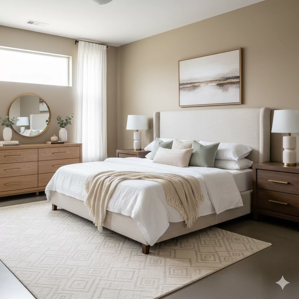
Field Khaki is a great bedroom color. It helps make a bedroom feel restful and cozy. In fact, the soft earthy tones of Field Khaki can promote restfulness. This means sleeping rooms painted in Field Khaki tend to feel calm.
One idea is to pair Field Khaki with white bedding and wood. For example, put white sheets or cream blankets on the bed, and use wooden furniture or floors. This accentuates the warm, tranquil vibe.
Because Field Khaki is neutral, you can add pops of color in a bedroom easily. A sage green throw pillow or a soft blue duvet can look nice against Field Khaki walls without clashing.
But even on its own, Field Khaki sets a gentle mood. It’s not too bright to keep you awake, nor too dark to feel dreary.
If your bedroom gets a lot of morning light, the greenish tint in Field Khaki can feel fresh as you wake up. If it’s a north-facing room (less sun), the warm beige nature of Field Khaki will make it feel like a cozy den. Many people find it a good compromise color for a bedroom because it adapts to time of day.
So in short: Using Field Khaki in a bedroom makes the space feel warm, natural, and soothing. It works with comfy white bedding, blankets in muted colors, and natural materials, creating a peaceful place to rest.
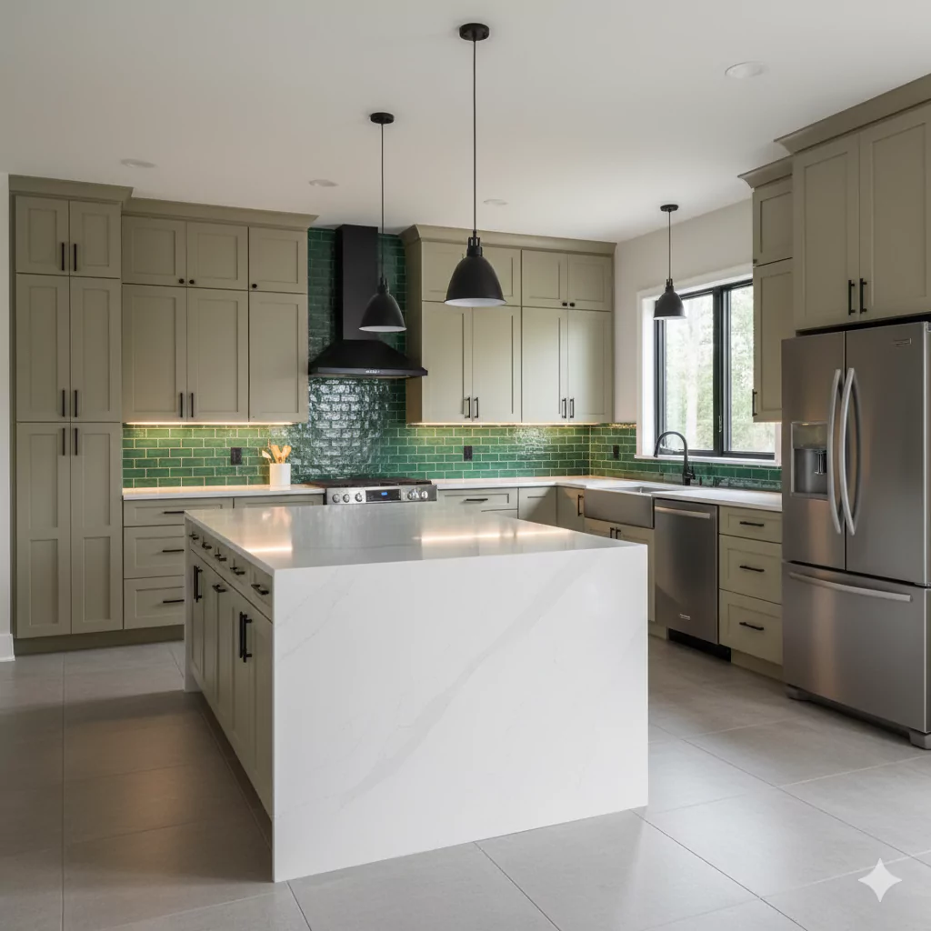
In Kitchen
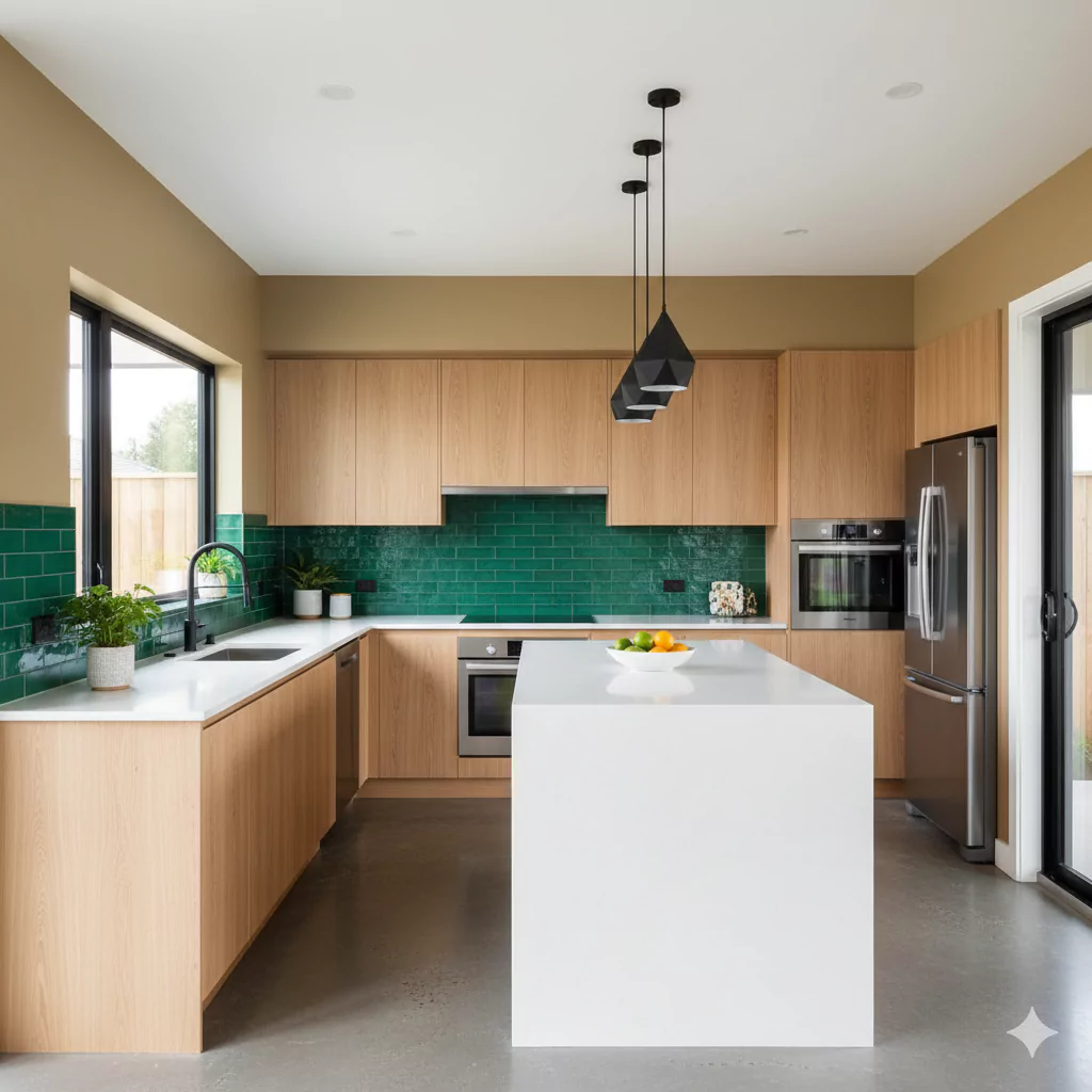
Field Khaki can also look very nice in a kitchen. It’s earthy and warm, which can make a kitchen feel inviting and lived-in. According to the Wild Fox blog, you can use Field Khaki on kitchen walls or even on the cabinets for a warm look.
For example, paint your lower cabinets Field Khaki and pair them with white subway tile backsplash and brass or gold hardware. The white tiles will brighten up the space (since Field Khaki is mid-toned) and the warm metal (brass) will match the warm undertones of the paint. This combination looks timeless and chic.
Alternatively, if you keep cabinets white, Field Khaki on the walls can still warm up the room. Kitchens often have a lot of “hard” surfaces (metal, stone, appliances), so a warm neutral wall color like Field Khaki can balance that hardness. It won’t be as stark as gray or white, but still fresh.
Field Khaki in a kitchen might bring out olive or moss undertones. If you have herbs or plants in your kitchen, they’ll look great against Field Khaki walls. Or if you have wood shelves and wicker baskets, Field Khaki complements those natural textures.
One thing to note is lighting: kitchens usually have bright light, so the green hint in Field Khaki might show more, giving the kitchen a lively feel. In any case, Field Khaki will make a kitchen feel cozy and traditional. It’s a popular choice for kitchens that want a homey feel rather than ultra-modern steel look.
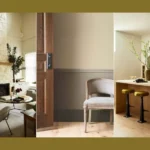
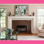
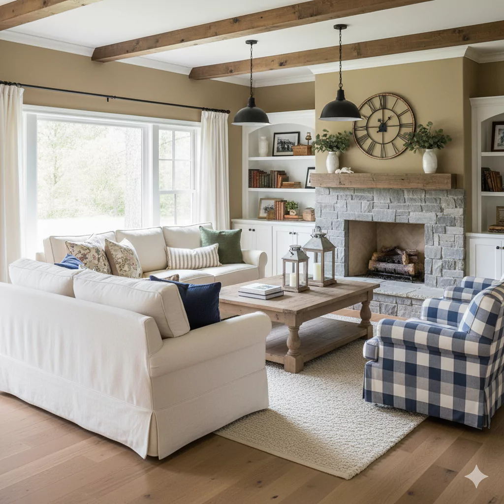
Field Khaki In Living Room
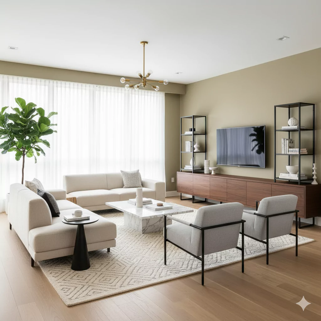
Field Khaki is excellent for living rooms. It offers a cozy yet sophisticated backdrop. This means the room feels warm and relaxed, but still stylish.
Because Field Khaki is neutral, you can use bright artwork or plants to brighten up the room. But even without bright pieces, just the warm wall color makes the living room feel like a gentle hug. It’s less boring than plain beige (because of the green tint) and less stark than white or gray.
If your living room has windows that let in a lot of light, Field Khaki will appear slightly more greenish by day, giving the room an airy, fresh feel. In the evening, it will read more as a rich tan, creating a snug atmosphere. Either way, people sitting in a Field Khaki living room often feel relaxed.
In short: Use Field Khaki on living room walls (or an accent wall) and add comfy cushions and blankets. It will look elegant and homey at the same time.
In Bathroom
We did not find any specific source about using Field Khaki in bathrooms. However, we can reason about it from what we know. Bathrooms often benefit from light or warm neutrals because they are usually small spaces and we want them to feel clean and bright.
Field Khaki is not too dark, so it could work in a bathroom to warm it up without making it tiny. If your bathroom has white fixtures (like a white sink and tub), Field Khaki on the walls would look soft and spa-like. You could add green towels or wooden shelves to match its undertones.
Because of its color, Field Khaki in a bathroom would likely make the space feel earthy and calm. Just be aware that if the bathroom has no windows or only cool lights, Field Khaki might look more beige than green. If it has warm lighting, the walls will feel cozy.
In summary, while we don’t have a specific citation for bathrooms, we can use Field Khaki much like other warm neutrals there. It should create a relaxing, warm feel in the bathroom, especially if paired with white or cream tiles and natural elements (like plants or wood) to complement its earthy tone.
Field Khaki In Cabinets
Field Khaki can even be used on cabinets. For example, kitchen cabinets or painted bathroom cabinets could be Field Khaki. As mentioned before, one idea is using it on kitchen cabinets with white backsplash.
If you paint cabinets Field Khaki, it adds warmth to the room. On a kitchen island or lower cabinets, it looks inviting and pairs well with wood floors or stone countertops. In an office or living room, a cabinet or bookshelf in Field Khaki would be a subtle pop of color (not too loud, but not bland).
The Wild Fox source specifically says you can use Field Khaki on cabinets for a warm vibe. So if you like that creamy green-beige, painting your cabinets this color is trendy. It’s less common than white or gray cabinets, so it feels a bit unique and homey at the same time.
Just make sure to use a good quality paint for cabinets. Field Khaki in satin or semi-gloss finish would be nice (easier to clean). The goal is: Field Khaki cabinets give an earthy, classic look, and pair them with brass or black hardware for contrast.
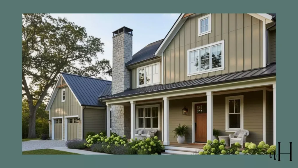
Exterior Field Khaki
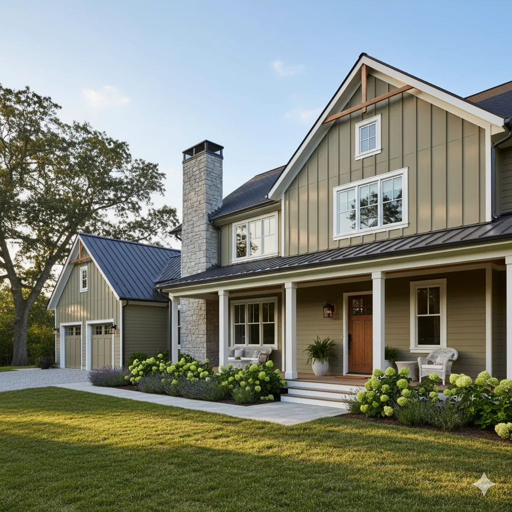
Field Khaki can also be used outside on your house. It is earthy and subtle, so it works well with nature (trees, stone, gardens). According to the color guide, Field Khaki “brings subtle sophistication to siding or trim.” This means a house painted Field Khaki looks elegant but not flashy. It blends with green lawns and wood.
On an exterior, Field Khaki’s undertones play nicely with the outdoors. In bright sun, it might look slightly olive-beige, matching well with plants. In shade, it will be a warm tan. Its LRV (38) means it is mid-tone – lighter than typical house browns, so it won’t absorb too much heat.
If you live in a wooded or rural area, Field Khaki is ideal because it won’t clash with trees. Even in the city, it can give a home a calm, welcoming look. You can pair it with white or cream trim for a clean outline. Or use a darker color (like deep green or brown) on shutters/doors for contrast.
Field Khaki is often used in what designers call “farmhouse” or “coastal” styles. For instance, a white deck railing or stone chimney would pop against Field Khaki siding.
Coordinating Colors of Field Khaki
Field Khaki goes with many other colors. Some colors that match nicely are:
Crisp Whites
A clean bright white (like Behr’s Ultra Pure White) looks great on trim or ceilings. It makes Field Khaki walls pop and gives a fresh look.
Soft Grays
Light gray (like Behr’s Silver Drop) can cool down the warmth a bit. Gray furniture or accent walls balance out the beige-green in Field Khaki.
Deep Greens
Rich greens (like Behr’s Vine Leaf) match the green undertone. They create a nature-inspired look. For example, a dark green sofa or green plants in the room will highlight the earthy side of Field Khaki.
Warm Wood Tones
Natural wood (oak, pine, walnut) works beautifully. Wooden floors or cabinets echo Field Khaki’s warm vibe. Think of a rattan chair or wooden table – they will look harmonious.
Accent Colors
If you want something bold, try mustard yellow (Behr’s Jackfruit) or dusty blue (Behr’s Marina Isle). A few pillows or a vase in these colors add a friendly pop against Field Khaki without overwhelming the space. Mustard, for example, is warm like Field Khaki, and dusty blue adds cool contrast.
These are just ideas from designers, but really any warm neutral or natural tone tends to look nice. For example, cream, tan, olive, or even a soft peach could all be used as accents. The key is that Field Khaki is very adaptable, so it pairs well with whites, woods, greens, and even some blues or yellows.
Soft Palette
A soft color palette means using light, gentle colors along with Field Khaki. Good soft-color ideas include:
Light Sage or Olive Green – A pale, muted green brings out Field Khaki’s earthy side. Think sage linen curtains or a light olive throw. This echoes the subtle green undertone.
Creams and Off-Whites – Soft ivory or creamy white walls or fabrics keep the room light and airy. They blend smoothly with Field Khaki. For example, cream pillows or a white area rug look great.
Pale Gray – A very light gray (almost white) can be added for a cooler neutral. This won’t overpower Field Khaki, just soften the space.
Blush or Peach – Very pale pink or peach accents can also work gently. They add a touch of warmth without shouting.
The idea is to keep everything low-key. Low-chroma (low-saturation) greens and neutrals highlight Field Khaki’s calm nature. A room with these colors will feel soft, gentle, and spa-like.
So, for a soft palette: Field Khaki on the walls, cream trim, sage cushions, pale gray throws, and maybe a touch of blush in accessories. This combination is soothing and balanced.
Bold Palette
On the other hand, you can use Field Khaki with bold accents for a lively look. Because Field Khaki is neutral, it can handle stronger colors without clashing. Bold palettes to try:
Navy or Deep Blue
Dark navy looks dramatic next to Field Khaki. A navy sofa, navy curtains, or even navy pillows will stand out beautifully. This combo feels modern yet grounded.
Mustard Yellow or Gold
Strong warm yellows bring energy to the room. Imagine a mustard rug or golden accents against Field Khaki walls. It pops without being too bright.
Burnt Orange or Terracotta
Rusty orange shades make Field Khaki feel extra cozy. Terracotta pots, pillows, or even a chair in orange add warmth.
Charcoal or Black
Adding black furniture, frames, or light fixtures against Field Khaki creates striking contrast. It makes the room more sophisticated.
This approach is for people who don’t want a totally soft space. Field Khaki becomes the “background” while bold colors bring personality.
Field Khaki (Behr BXC-22) is a warm, earthy neutral that mixes beige and soft green undertones. It has an LRV of 38.39, making it a medium-brightness shade that feels cozy yet not heavy. It adapts to different light, looking greener in sunlight and more beige in lamplight. Its hex code is #AFA690 and RGB around (175, 166, 144).
This versatile color works beautifully in bedrooms, kitchens, living rooms, and even on cabinets or exteriors. It pairs well with whites, grays, greens, wood tones, and can support either a soft palette (creams, sages, grays) or bold accents (navy, mustard, terracotta).
Whether you want a peaceful, spa-like retreat or a more lively and dramatic vibe, Field Khaki is a dependable choice. It’s both elegant and natural, a true “chameleon” neutral that blends into many styles and spaces.