Last updated on September 5th, 2025 at 01:40 pm
Without wasting time, Lemme tell you I will share my honest review with you, that’s how Anonymous SW 7046 works in different rooms, cuz I’ve seen this color in my family friend’s home, and mates. I’m sharing home images using Anonymous SW 7046, which are unfiltered and original.
Undertones of Anonymous SW 7046
Sherwin-Williams describes SW 7046 Anonymous as a warm, hazy neutral with gray-green undertones.
In practice, it’s very chameleon-like: depending on light and surroundings, Anonymous can pull slightly greenish or brownish, and even show hints of purple, pink or turquoise.
Design experts note that its undertones range from olive/green to faint purple or mint, meaning the color can shift subtly – appearing warmer (more beige/olive) in some rooms and cooler (more gray-green) in others.
These complex undertones give Anonymous depth and prevent it from reading flat: for example, pairing it with cool décor (blues/greens) brings out its subtle green cast, whereas warm accents (rusts/oranges) emphasize its brownish side.
OTHER DARK Griege/Beige COLORS
- Manor House (SW 7505) Sherwin-Williams Color Analysis with REAL HOME IMAGES
- Intellectual Gray SW 7045 -Sherwin-Williams
- Tony Taupe (SW 7038) Sherwin Williams-Perfect Taupe Color
LRV of Anonymous SW 7046
Anonymous has a low LRV (around 19–20), making it a relatively dark neutral. Sherwin-Williams data shows its LRV is about 19.6 (another source rounds it to 20).
In practical terms, this means Anonymous absorbs more light than most light neutrals. It won’t brighten a room like a white or light gray would; instead it adds depth.
Designers caution that the low LRV can make spaces feel darker if unlit, so adequate lighting is important. In general, the low reflectance gives Anonymous a cozy, grounded feel – it reads richer and more saturated than higher-LRV grays – so it’s often used to anchor a room rather than make it pop.
Appearance in Different Lighting Conditions
Lighting dramatically affects how Anonymous looks. In warm artificial light, the color tends to appear richer and browner, emphasizing its earthy warmth.
In natural light the effect depends on the orientation: north-facing rooms (cool, indirect light) make Anonymous look more muted and slightly cooler gray – a calm, sophisticated tone.
South-facing rooms (bright direct sun) bring out the warmth, making it look lighter and subtly golden-brown in daytime.
East-facing light casts a warm morning glow on Anonymous (softening its tone), shifting toward a cooler gray by afternoon. West light (late afternoon) deepens its green-brown tint.
In short, Anonymous “shifts like a chameleon,” appearing cooler/greener in shade and warmer/browner in bright sun. Because of this, it’s vital to sample the paint on your own walls and view it at different times of day.
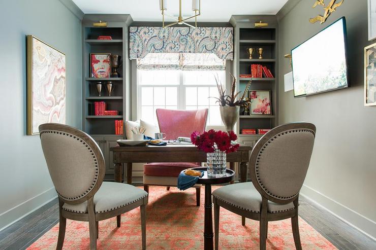
Anonymous SW 7046 in Bedrooms
Anonymous creates a restful, cocoon-like atmosphere in bedrooms. Its warmth makes a large, dark bedroom feel cozy and intimate, while still remaining neutral.
Designers recommend using it on all walls or as a feature wall behind the bed for a grounded, serene effect. Pair it with crisp off-white or cream bedding and warm wood furniture to balance its depth – for example, off-white linens, walnut nightstands and brass or bronze lighting all complement Anonymous beautifully.
The result is a “warm, restful palette” that feels calm rather than dreary. Because Anonymous is fairly dark, some homeowners use lighter trim or bedding to prevent the room from feeling too enclosed.
5 Sherwin Williams Paint Color Matches Minwax Gel Stain Coffee That Our Designers Swear By
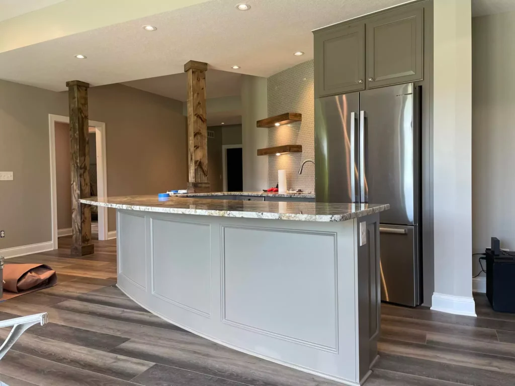
Use in Kitchens
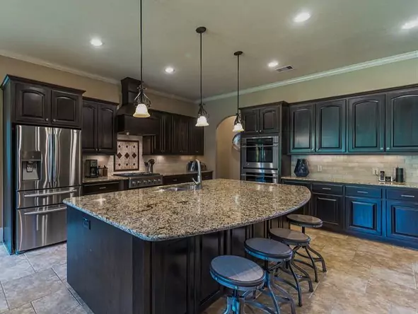
Anonymous adds rich contrast and depth in kitchens. It works exceptionally well on cabinetry or walls where you want a moody neutral base.
For example, painting kitchen cabinets in Anonymous creates a luxurious, modern look, especially when paired with light countertops and metallic hardware.
One designer notes that Anonymous “adds depth and contrast to kitchen cabinetry or walls,” complementing white quartz counters, natural wood accents and black or brass hardware.
Its muted tone keeps the room cozy without feeling too dark, especially if there’s good natural light. Because it’s darker, Anonymous is often balanced in kitchens by bright elements – for instance, white backsplashes or light flooring – to prevent the space from feeling too heavy.
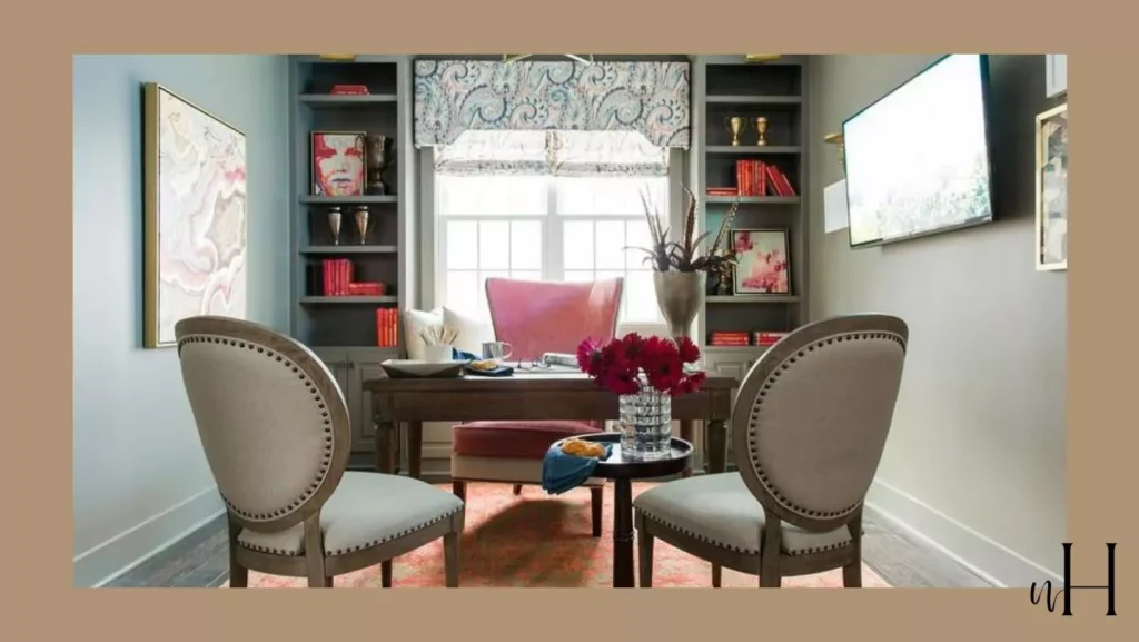
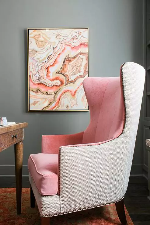
Use in Living Rooms
In living rooms, Anonymous creates a warm, inviting backdrop. Its depth makes the space feel enveloping and intimate.
It pairs naturally with both rustic and refined decor – think worn wood beams, leather furnishings or sleek metal accents – without dominating the palette. The rich neutral tone supports colorful furnishings or patterned fabrics, adding sophistication without stealing the show.
A homeowner notes that in living areas, “Anonymous offers a cozy, cocoon-like atmosphere,” working well with natural wood, metal and textured fabrics. Because it’s on the darker side for a wall color, it’s often used on an accent wall or with plenty of soft lighting. But on all four walls it can truly “ground” the space.
Accent pillows, rugs or art in lighter neutrals (ivory, blush, soft blues) look crisp against Anonymous, while deeper accent pieces (navy, emerald, burgundy) pop beautifully.
Use in Bathrooms
Anonymous lends a spa-like calm to bathrooms. Its earthy warmth and gray-green base create a serene, grounded feel that pairs beautifully with white or light gray fixtures.
Designers often use it on vanities, accent walls or even ceilings in baths for added depth. For example, one design guide suggests pairing Anonymous with white tile and matte black fixtures for a tranquil retreat.
Natural light brings out its greenish undertones, while in smaller or darker bathrooms you might offset it with a lighter ceiling or crisp white trim to keep the room from feeling too cave-like.
Because it’s moody yet neutral, it reads as sophisticated without feeling cold. Accents like plants, wood shelves, or warm metals (brass, gold) enhance its earthy quality, creating a balanced, relaxing bathroom palette.
Use on Cabinets
Anonymous is an excellent choice for cabinets and built-ins. Its rich tone makes painted cabinets (kitchen, bathroom vanities, or built-in shelving) look high-end and intentional.
Alia my roommate, notes that using Anonymous on kitchen cabinets adds “depth and contrast” especially when paired with light countertops and hardware. It also works on bathroom vanities, laundry room cabinets or office built-ins to provide a sophisticated neutral.
Because it can read almost black in low light, it often serves as an accent (e.g. island cabinets) or is balanced by brighter surrounding elements.
Housekeepingbay specifically calls out using Anonymous on kitchen cabinetry or even an accent wall. On exterior doors or shutters it similarly gives “statement” appeal – a dark, welcoming accent against lighter trim.
In short, Anonymous on cabinets or trim creates a bold yet elegant look, especially with high-contrast accents like white walls or marble countertops.
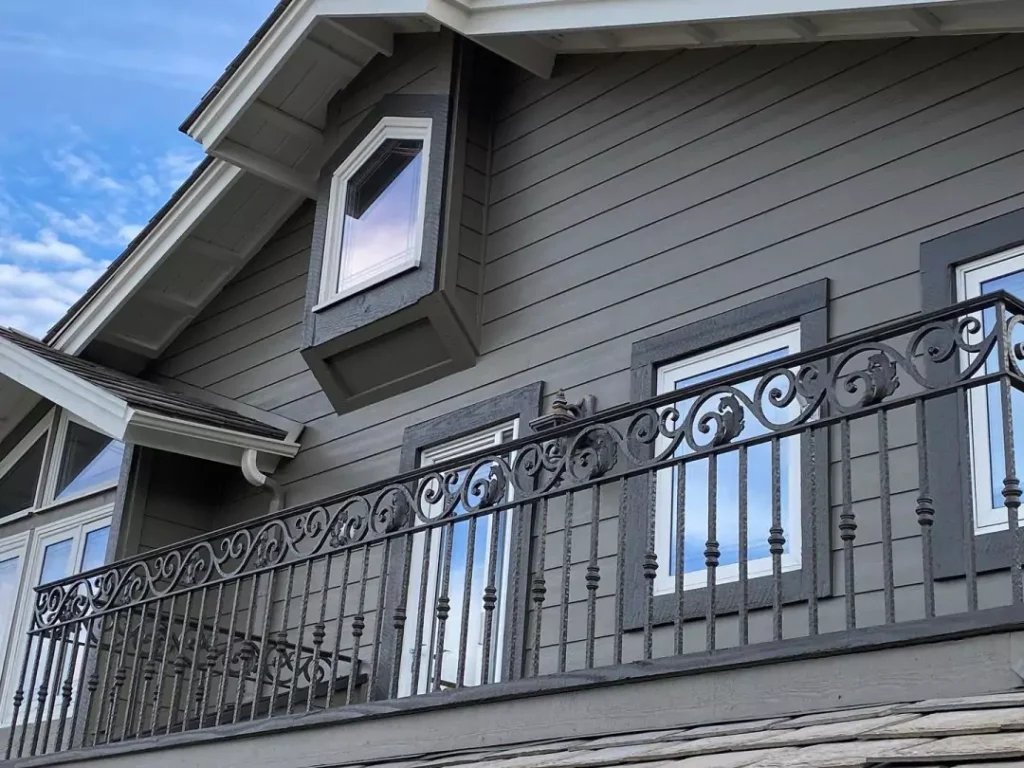
Use on Exteriors
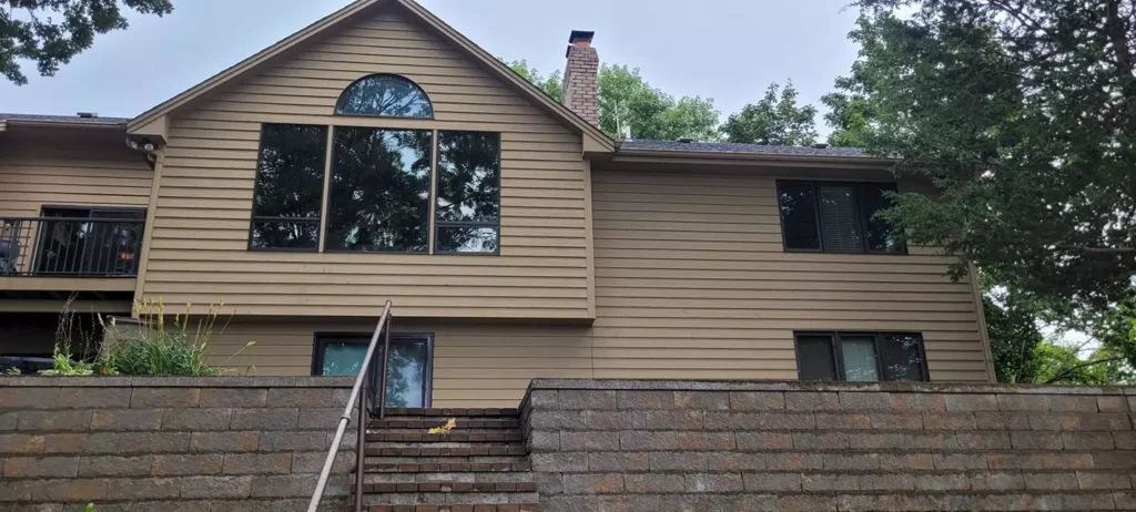
Yes – Anonymous is well suited for exteriors. Its warm gray-green tone adds curb appeal and architectural interest on siding, doors or shutters. Designers praise it as a “sophisticated and durable look” outside.
In bright sun it appears slightly brownish, while in shade it leans green-gray, which can lend a subtle richness to a home’s facade. It pairs beautifully with creamy white or bright white trim and natural stone.
For example, one guide notes it looks great on siding or front doors paired with “creamy white trim for a classic exterior”.
Another client notes it “enhances curb appeal” on doors/shutters because its neutrality suits many architectural styles.
In practice, homes with brick, stone or wood accents often use Anonymous to coordinate; it can complement greenery and landscaping. Just as indoors, its LRV of ~20 means it won’t reflect glaring sunlight, but it will maintain a clear identity as a deep warm gray on an exterior.
Coordinating Colors for Anonymous
Soft Palette
To keep things light and airy, pair Anonymous with soft neutrals. Warm off-whites and beiges create a gentle, tonal scheme.
For example, Sherwin-Williams Alabaster (SW 7008) is a creamy white that provides a soft contrast to Anonymous . Shoji White (SW 7042) or Oyster White (SW 7641) are greige-whites that harmonize well.
Another pairing is Muslin (SW 6133), a mellow warm beige – Sherwin’s designers even suggest pairing Anonymous with Muslin for an “earthy” look.
In practice, this soft palette might use Alabaster trim and curtains with walls of Anonymous, so the overall feel is bright but grounded. You might also add a muted accent like a pale sage or dusty blush for subtle color.
The key is sticking to low-contrast, warm tones so Anonymous remains the richest color in the room.
Bold Palette
For a more dramatic scheme, choose deep, saturated accents alongside Anonymous. A standout choice is Urbane Bronze (SW 7048) – a very dark brown-gray – which, when used on an accent wall or door, creates a bold, moody contrast.
You could also pair it with a rich navy, forest green or even a burnt orange for punchy color; for instance, a navy velvet sofa or emerald throw pillows pop against Anonymous walls.
Dark hardware or trim in matte black or bronze will also stand out. Urbane Bronze (the next darkest SW neutral after Porpoise) “enhances the richness of Anonymous for a dramatic, moody vibe”.
In a bold palette, Anonymous acts as a rich mid-tone, set off by one or two very dark or vibrant hues. This is ideal for a statement living room or study where you want a sophisticated, high-contrast look.
Muted Palette
Anonymous also works beautifully with earthy muted colors for a serene, nature-inspired palette.
Soft greens and blues that are slightly gray carry its warmth. For example, Sea Salt (SW 6204) – a gentle, muted aqua-green – complements the green undertones of Anonymous and adds a tranquil, coastal vibe.
Another good mate is Repose Gray (SW 7015), a light warm gray that provides a subtle, monochromatic contrast. Sage or olive-toned paints (like SW 6163 Grassland) also harmonize, picking up the olive hints in Anonymous.
Accents in mustard yellow or terracotta can add a muted warmth without clashing. In summary, a muted palette might use Sea Salt on an adjacent wall or pillows, Repose Gray for trim or furniture, and natural wood tones – all of which feels calm and cohesive with Anonymous’s earthy depth.
FAQ
What is the difference between Link Gray and Anonymous?
Anonymous (SW 7046) and Link Gray (SW 6200) are both warm gray neutrals, but Anonymous is darker and deeper, while Link Gray is lighter and airier.
In direct comparison, Anonymous “leans towards the darker side” with rich depth and subtle complexity, whereas Link Gray “presents a lighter, more neutral gray” that makes rooms feel more open.
Link Gray’s higher LRV (~20.6 vs 19.6) means it reflects more light and reads a bit brighter. In practice, Anonymous provides a more sophisticated, moody backdrop (good for accent walls or cozy rooms), while Link Gray gives a clean, bright backdrop (suiting minimalist or whole-room applications).
Is Anonymous a good exterior color?
Yes. Anonymous’s warm gray-green tone and moderate darkness make it an attractive, versatile exterior color. It holds up well in sunlight (appearing slightly brownish) and in shade (leaning green-gray), so it adds richness without seeming flat.
Designers note that it works on siding, trim, shutters or doors “enhancing curb appeal” when used outdoors. It pairs beautifully with bright white trim or natural stone to highlight architectural details.
Because it’s not as stark as pure gray or as bold as black, it adds character while blending with natural surroundings. In short, Anonymous is often recommended for exteriors: it looks sophisticated and welcoming, and fits many styles from Craftsman to contemporary.
Sherwin-Williams Anonymous vs Porpoise?
Porpoise (SW 7047) is deeper and more brown than Anonymous. It has a lower LRV (about 13 vs 20 for Anonymous), so Porpoise is significantly darker and more dramatic.
In comparison, Anonymous is a mid-dark warm gray-green. One design guide explains that Porpoise “is deeper and browner” and better suited for accents or bold trim, whereas Anonymous is “more versatile for full rooms”.
In practice, if you want a very dark charcoal-brown-gray, Porpoise will give you that. If you want a rich but slightly lighter and more neutral tone for all-over walls, Anonymous is usually the better choice.


