Valspar Ashen Gray 6004-1C might be your ideal neutral if you want cool and warm feel at the same time. This gray has taupe and green undertones offering a deeper, calming vibe for any space—whether you’re refreshing a bedroom, modernizing a kitchen, or updating bathroom cabinetry.
With a medium Light Reflectance Value (LRV) of around 39, Ashen Gray adds depth and character without making your room too dark and deeper.
In this guide, I’ll let you know how this elegant shade performs in different lights and settings, compare it to similar tones like Benjamin Moore’s Ashen Tan, and provide coordinating palettes for soft, bold, and muted design schemes. Plus I’ve also attached TONS OF REAL HOME IMAGES.
Ashen Tan 996:Benjamin Moore-Reasons Why its PERFECT Choice
Undertones and Light Reflectance Value (LRV)
Ashen Gray (6004-1C) has a cool undertone as it is from the neutral family. In practice, it feels like a soft greige: primarily gray with subtle green and taupe undertones that change with light.
It creates a perfect balance between warm and cool tones, as I told you guys about Benjamin Moore Ashen Tan ,so it never feels stark.
In bright, sunlit spaces the slight green cast can emerge, while in lower or warmer light the taupe‑brown warmth becomes more apparent. The official Light Reflectance Value is ≈39 (out of 100), meaning Ashen Gray is a medium‑dark neutral (it absorbs more light than lighter grays, so it will feel cozier in dim light).
Ashen Gray in Different Lighting Conditions
Ashen Gray is very adaptable. In bright natural daylight, its greenish-gray side often shows, giving walls a clean, fresh tone. In warm incandescent or low light, the warmer taupe‑beige undertone comes forward, making the color feel cozier.
Under cool white LEDs or cloudy daylight, Ashen Gray may look a bit more purely gray. In all cases it remains fairly balanced – Valspar’s “cool” undertone can make it feel more neutral than some warmer grays.
As with any paint, samples should be viewed at different times of day to see how the balance of gray/green/taupe shifts in your space.
Ashen Gray in different spaces
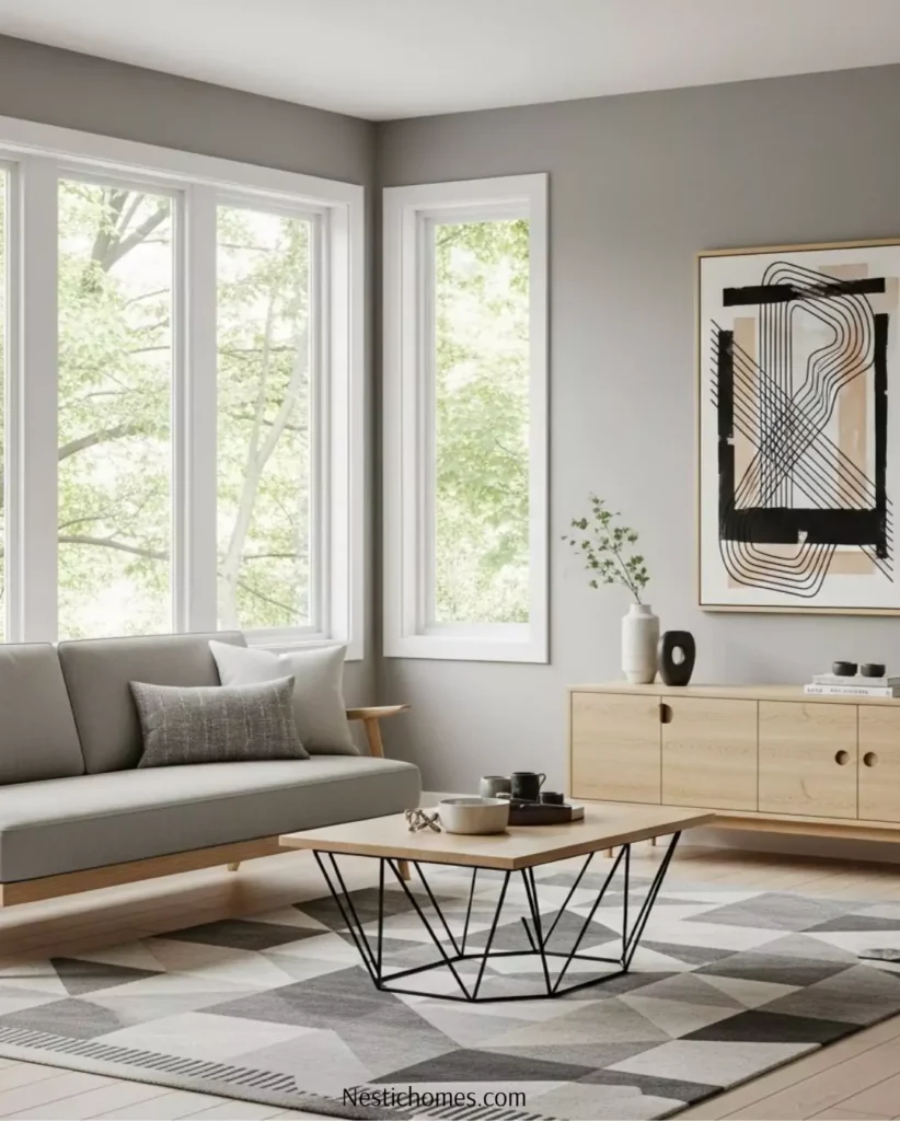
Living Rooms
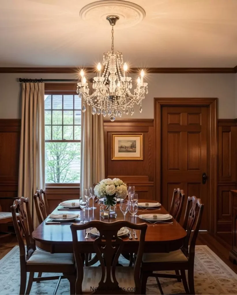
Ashen Gray walls gives a neutral backdrop. In living areas Ashen Gray offers a warm-yet-sleek look. Cream or beige furnishings and natural wood accents pair very well with ashen gray.
For example, rich leather or ivory sofas pop against it, and wood tones (oak, walnut) bring out its beige warmth.
According to Valspar advice, Ashen Gray “sets a sophisticated tone” in living rooms and complements cream furniture and warm woods. Overall, it’s versatile: works in both modern and traditional living spaces without clashing.
Bedrooms
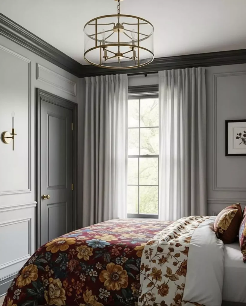
A calming gray-beige for restful bedrooms. In bedrooms Ashen Gray creates a soothing, peaceful atmosphere. For relaxation, its earthy tone provides peace. Use it on all walls, or as a feature wall behind the bed. It pairs beautifully with soft textiles (linen, velvet) in sage green, light blue or blush accents.
Creamy trim in your bedroom and light shades of bedding for a brighter look ,you can add some darker pillow or a console to create some depth.
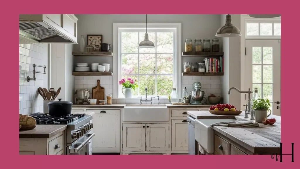
Kitchens
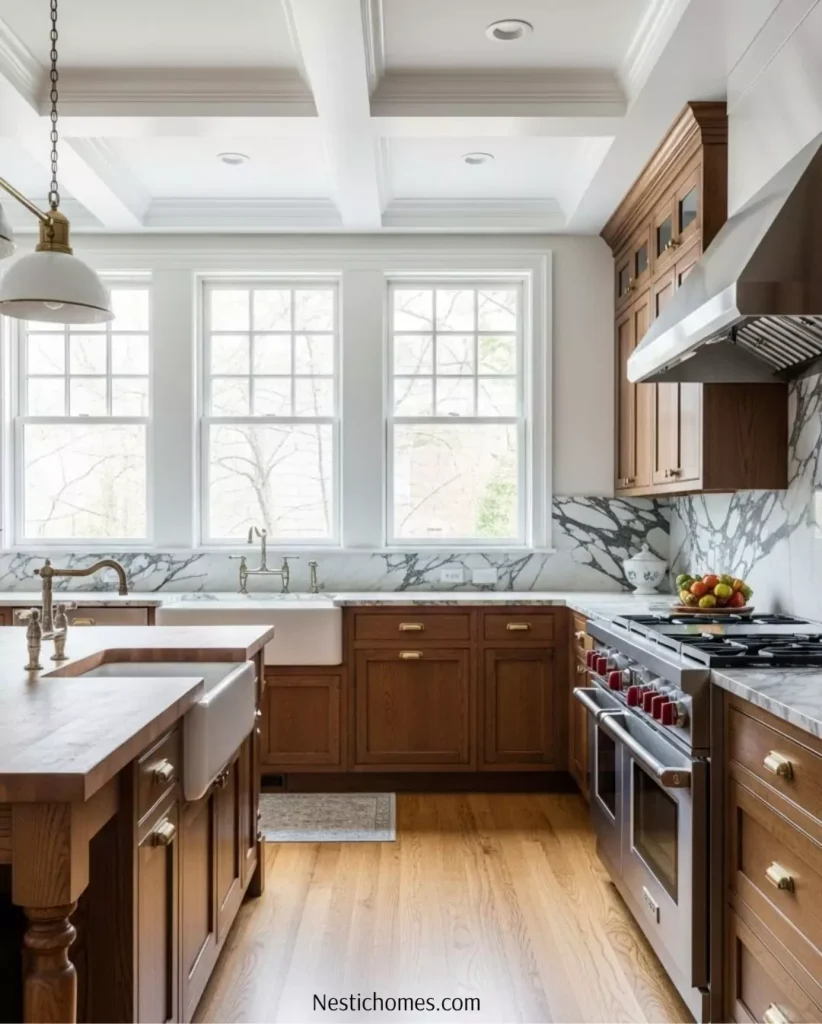
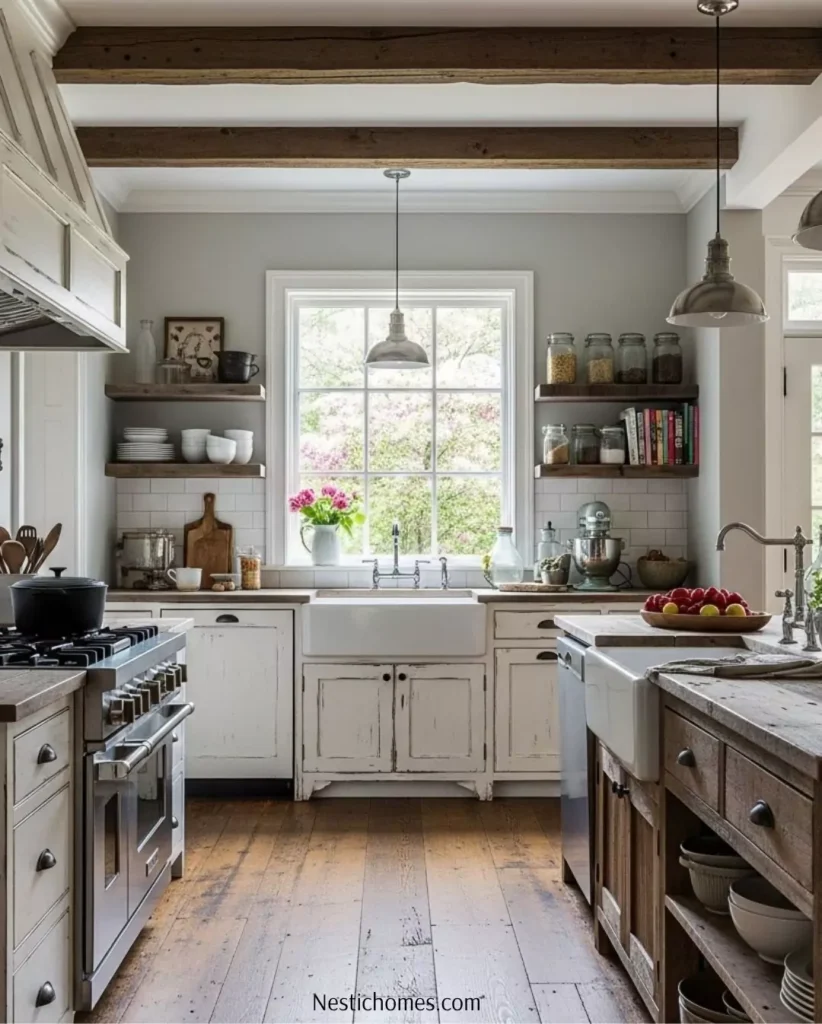
In kitchens, Ashen Gray offers a clean, and sleek look. It can be used on cabinets that create a modern and clean look. Valspar recommends pairing it with white cabinetry and brushed nickel hardware for contrast.
For example, in my opinion, for a crispy look, use Ashen Gray walls and white cabinets, which creates a modern aesthetic. Its medium LRV (≈39) means the room won’t look too dark if there’s good lighting; in fact, the gray undertone gives the feel of surfaces like stone countertops or stainless appliances to stand out.
Bathrooms
For a cool, clean gray that still has warmth, pair with bright white tile and silver fixtures (mirrors, faucets). The taupe undertones add just enough warmth to avoid a sterile feel.
Natural textures (wooden shelving, woven baskets, stone) create the earthy vibe. Valspar notes that in bathrooms Ashen Gray “creates a spa-like atmosphere” alongside crisp whites and natural accents. The semi-gloss or satin sheens often used in bathrooms will also help reflect light to counteract the darker LRV.
Cabinets (Kitchen or Bath)
Ashen Gray is also popular on cabinets. As a cabinet color it looks more elegant, for some traditional look wood touch like wooden countertops or marble for modern and clean look.
It’s especially effective on kitchen or bathroom cabinets when walls/trim are white. The cool undertone means it works with both warm woods and cool surfaces.
For a modern look, add matte black or brushed nickel hardware. (Valspar even offers this shade in semi-gloss, noting it’s “durable and exceptionally washable” for high-traffic rooms.) Overall, on built-ins Ashen Gray feels updated and grounded.
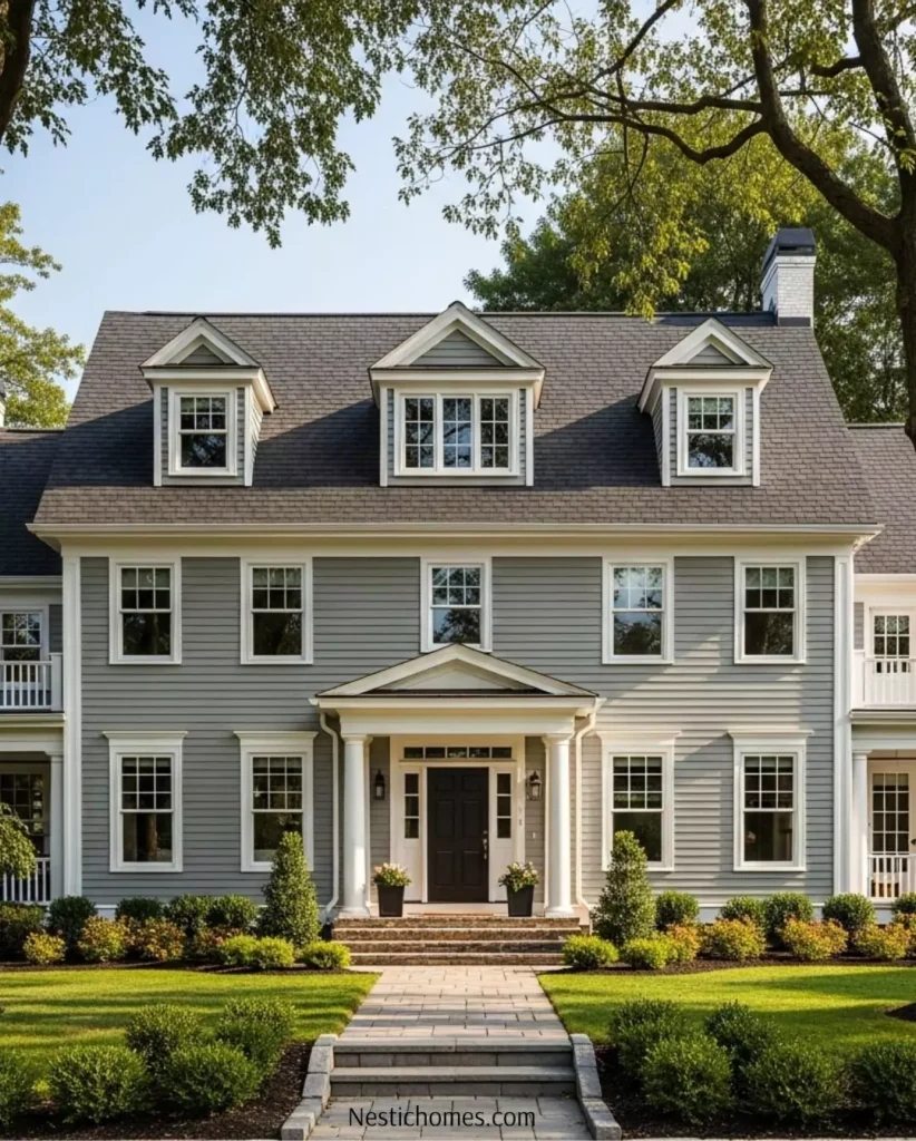
Valspar Ashen Gray 6004-1C on Exteriors
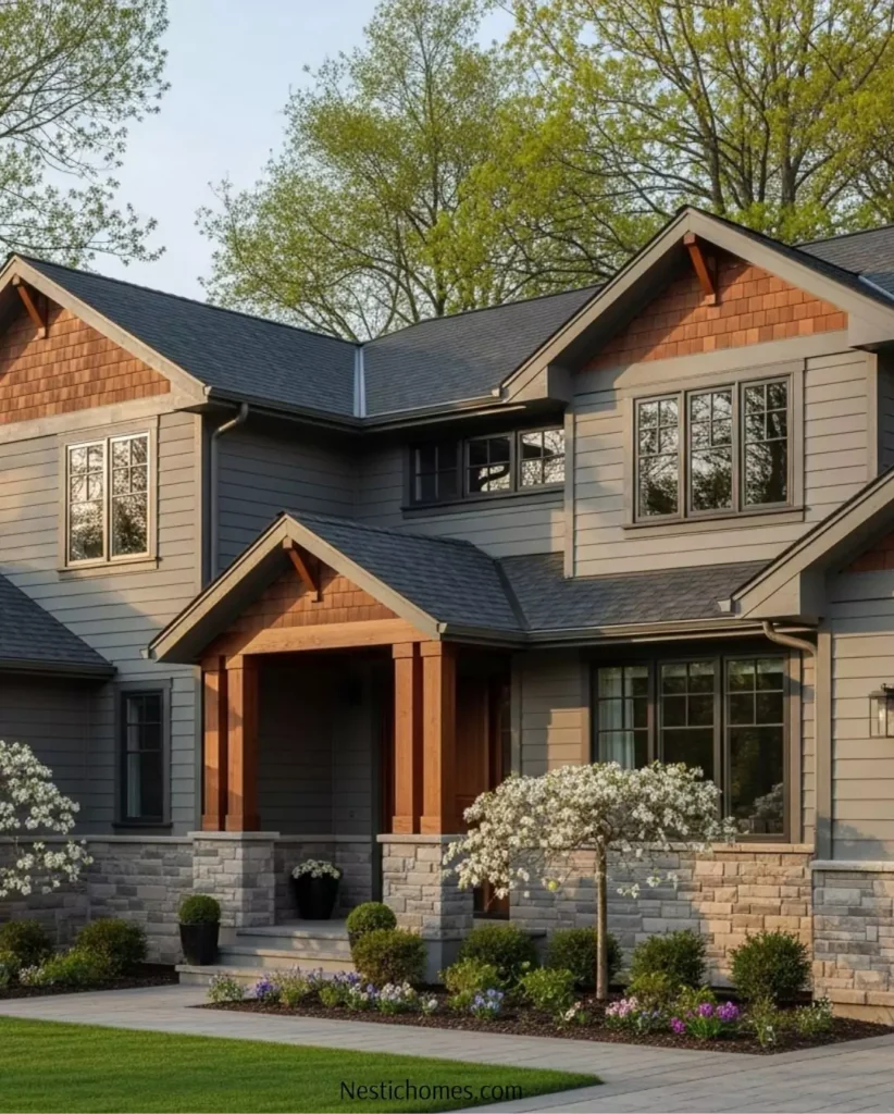
Ashen Gray isn’t just for interiors—it can create a lovely exterior too. With its balanced gray-taupe tone and medium depth, it’s a fantastic choice for neutral exterior that feels modern and traditional at the same time.
Curb Appeal & Style
On the exterior, Ashen Gray feels like a greige that can lean warm or cool totally depends on weather,shiny or cloudy day. In bright daylight, its gray base takes on a fresh, clean look, while in evening light or shade, its earthy undertones deepen, giving the home a cozy, inviting appearance.
It’s especially well-suited for:
- Traditional homes
- Modern farmhouse exteriors
- Transitional or coastal-style designs,but not that much I guess
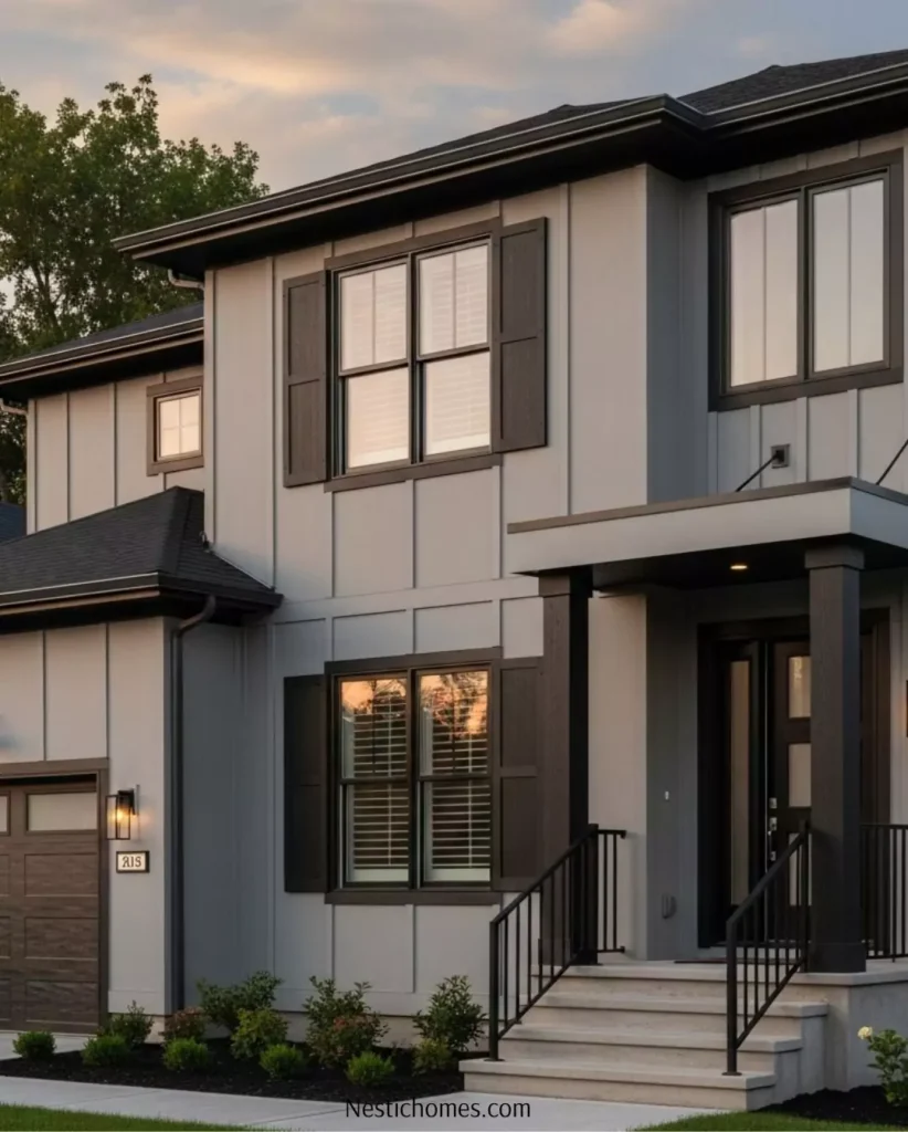
Pairing with Trim and Accents
Ashen Gray works beautifully with a variety of trim colors:
- Crisp white trim (like Valspar’s Du Jour or Ultra White) creates a classic, high-contrast look.
- Charcoal or black accents on shutters, doors, or railings add modern drama.
- Warm wood tones (like cedar or mahogany) enhance the subtle taupe warmth in Ashen Gray and give a rustic charm.
Best Materials & Textures
Ashen Gray looks stunning on:
- Lap siding or shiplap
- Brick or stone bases (especially with gray or brown undertones)
- Board and batten exteriors
- Stucco or fiber cement siding
Its mid-tone depth helps hide dirt and wear better than lighter grays, making it a practical as well as stylish option.
Roofing & Landscape Compatibility
Ashen Gray complements a wide range of roofing materials:
- Asphalt shingles in charcoal, brown, or weathered wood tones
- Slate or concrete tile in natural earth tones
- Metal roofing in matte black or bronze
In landscaping, it pairs seamlessly with both lush green surroundings and xeriscaped yards, offering flexibility for different climates.
Coordinating Color Palettes
Soft palette (light neutrals & pastels)
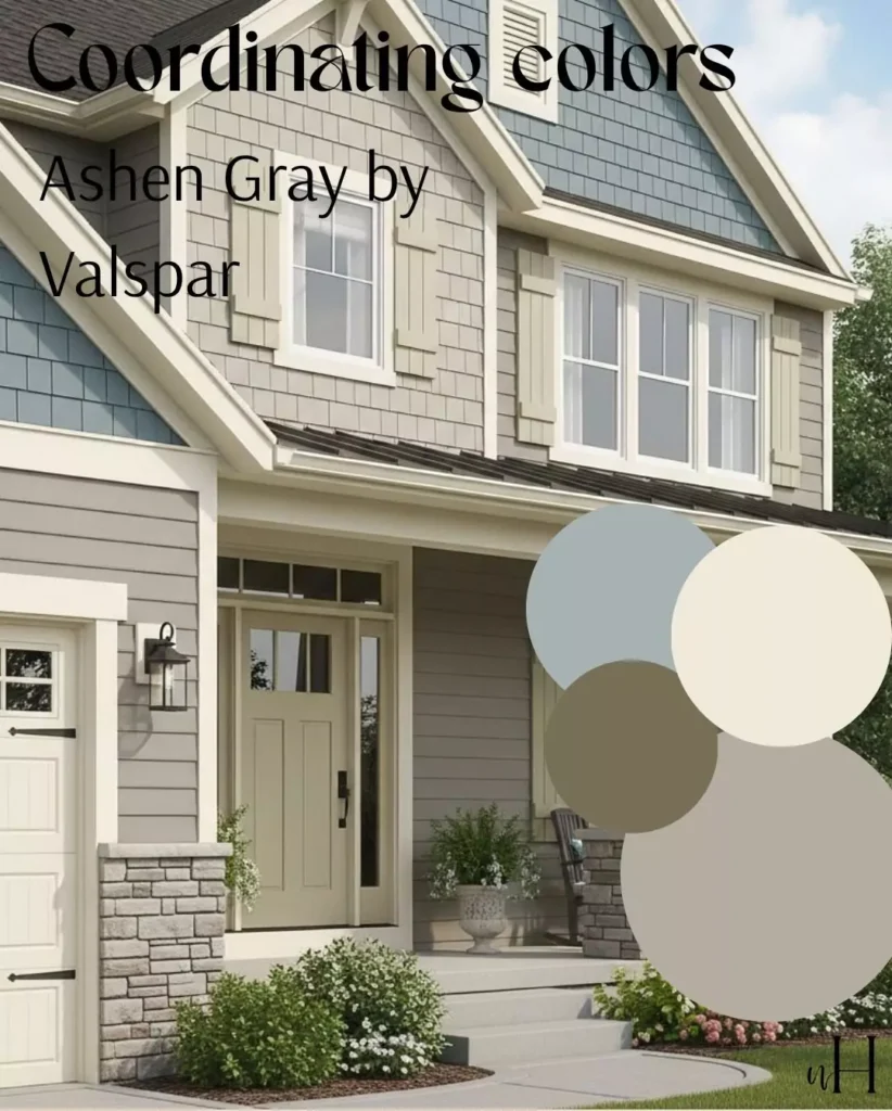
For a gentle scheme, pair Ashen Gray with warm off‑whites and pale hues. For example: #F3F2F0 (warm off-white), #DDD8D3 (pale greige), #B0A69A (Ashen Gray), #C6BFB7 (cream‑light), and #9AA4B0 (soft blue‑gray).
This creates an airy, cohesive look. (Valspar suggests warm whites like Swiss Coffee with Ashen Gray to brighten a room.)
Bold palette (rich contrasts)
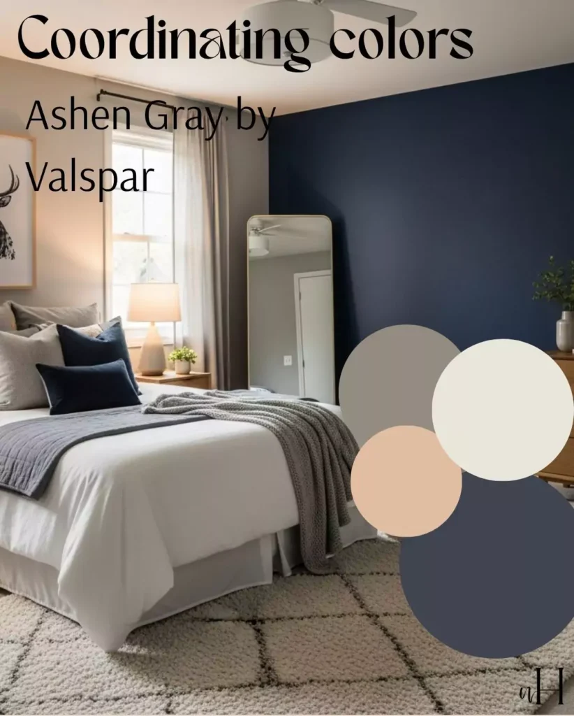
Combine Ashen Gray with deeper accent colors for drama. Examples: navy blue (#2E3A5F) or charcoal black (#393E46) for strong contrast; forest green (#2F5D50) or mustard yellow (#C49A6C) for pops of color.
You might use Ashen Gray on walls and add bold elements like a navy sofa, emerald green pillows, or dark wood furniture. Valspar’s guides note that Ashen Gray works with “rich browns” and “charcoal” accents to bring out its depth.
Muted palette (earthy, tonal colors)
Stick to adjacent, subdued colors for a harmonious scheme. For example: taupe brown (#8E806F), sage green (#A3B09A), slate blue (#6F7D8E), and antique gray (#C5CBD2), alongside Ashen Gray (#B0A69A).
These analogous, dusty hues complement the gray’s undertones. Ashen Gray with earth tones like greens and soft blues. This palette feels grounded and calming, with low-contrast tones that highlight texture.
Ashen Gray vs. Benjamin Moore Ashen Tan
Though their names are similar, Valspar Ashen Gray (6004-1C) and Benjamin Moore Ashen Tan (996) are totally different. Ashen Tan is a soft beige-greige (warm gray) with a gentle blush of color. Its LRV is about 50.7, so it’s lighter than Ashen Gray. In contrast, Ashen Gray is more obviously gray with cooler tint and has an LRV ~39 (darker, moodier).
Tone & Warmth: Ashen Tan leans warmer/beige and reads cozier and creamier in daylight. Ashen Gray is grayer/greener; it can look more neutral or even cool, especially in bright light. As Ashen Tan has mid range of lrv so it can be pair with cool and warm contrasts. Ashen Gray also adapts to light, but its cool family/green hue means it never pulls as yellow as Ashen Tan.
Usage: Ashen Gray is often used as a classic gray backdrop in living spaces, bedrooms, kitchens, etc. Ashen Tan is used similarly as a warm wall color; designers praise it for blending into the background while adding depth. However, because Ashen Tan is lighter, it will make a room feel brighter than Ashen Gray. In short, Ashen Tan is a warm-beige “greige,” whereas Ashen Gray is a cooler true-gray with subtle earthy undertones.
Ashen Gray Closest Equivalent Colors (BM & SW)
According to color‑match tools, the nearest equivalents are: Benjamin Moore Quicksand (CSP-200) and Sherwin-Williams Restoration (SW 7737). Quicksand is a warm taupey-beige gray (often compared to Ashen Tan), with soft neutral vibe.
Restoration (SW 7737, Meadow Trail) is a similar medium greige gray from Sherwin-Williams. Use samples of these if switching brands, but note small undertone differences. (For example, BM Quicksand has more beige warmth, and SW Restoration may lean slightly greener or brownish.)
FAQ
Q: Is Ashen Gray a warm or cool color?
It’s primarily a neutral gray, so it doesn’t skew strongly warm or cool. Valspar classifies it with a cool undertone, but many observe warm taupe hints. In essence, Ashen Gray is a balanced “greige” that can read either way depending on lighting.
Q: Where does Ashen Gray work best?
I guess in livingroom and bedroom,or where you want to add some mood and deeper look cuz its lrv makes it a bit dark. But its perfect for cabinets.
It performs especially well in spaces with good natural light (where its green tint is friendly) and cozy dim spaces (where its taupe warmth shows). It’s a popular choice for accent walls or entire rooms, and even on cabinets and trim.
Q: What colors pair well with Ashen Gray?
It works with both light and dark palettes,depends on your need ,but with dark or bold palette, it will look more dark rather than with bright palette. For a light, airy scheme, use warm whites or creams (e.g. Swiss Coffee) alongside it. For contrast, deep blues, greens, or chocolate browns make striking accents.
Soothing combinations include muted sage, dusty blue, or pale blush. Wild Fox’s guide specifically suggests warm whites (like Valspar Du Jour or Swiss Coffee) and earthy greens/blues as complements, and richer accents like charcoal or chocolate brown for depth.