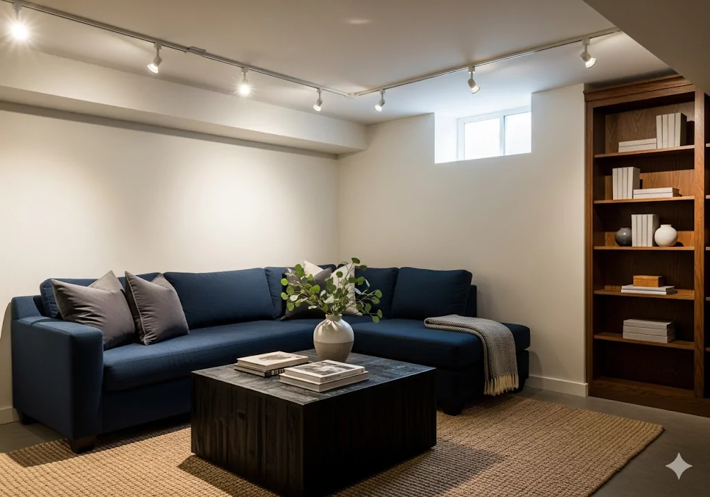
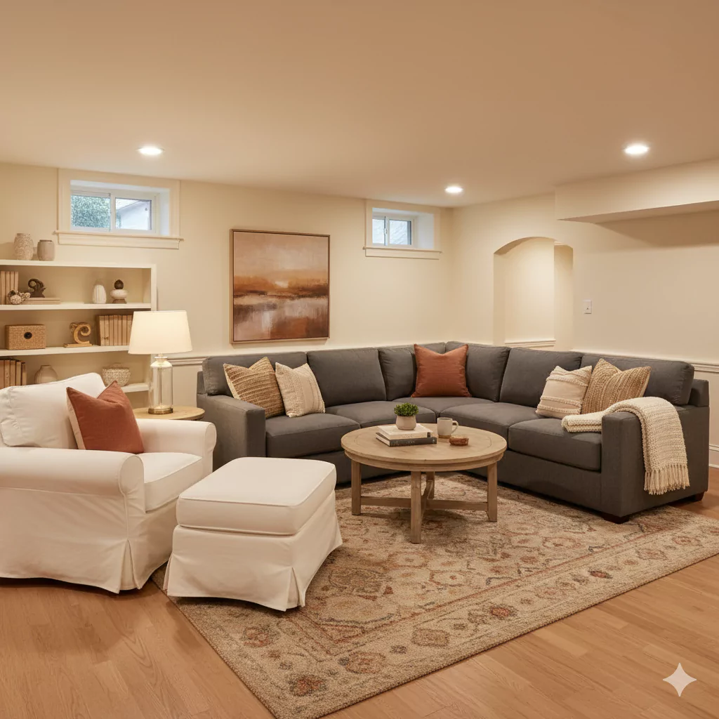
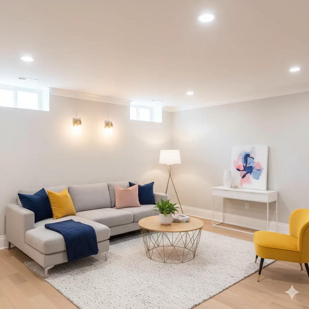
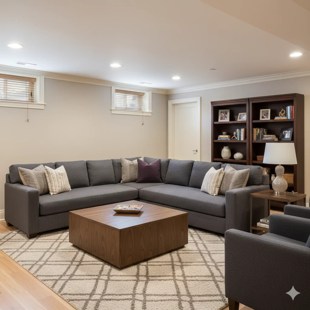
Basements often lack natural light, which can make them feel dark, closed-in, or even cave-like. The right paint colors play a huge role in transforming these spaces into bright, welcoming areas.
Light neutrals with warm undertones help bounce around what little light exists, while carefully chosen darker shades on accent walls can add depth and coziness.
Undertones matter even more in basements, since limited natural light exaggerates them—warm undertones can make a room feel inviting, while cool tones may risk looking flat or cold.
Seasonal changes also affect how these colors read, as artificial lighting and outdoor light shifts interact differently with paint hues.
Below are 22 of the best Basement Paint Color Ideas with notes on how each one works in dim spaces, the mood it creates, and how to pair it with trim and accents.
Benjamin Moore White Dove (OC-17)
A warm off-white with soft, creamy undertones. White Dove is “warm and easy” and won’t look stark even in very little light. Its slight creaminess helps reflect what light is available without looking cold.
Swiss Coffee vs White Dove:Dont Choose Wrong One For You
In a dim basement it will make the space feel fresh and airy, yet still cozy thanks to its warmth. Pair White Dove with a crisp bright white trim (e.g. Chantilly Lace) for a clean contrast. For accents, add in rich colors (navy, charcoal or wood tones) to anchor the space while keeping walls bright.
Sherwin-Williams Repose Gray (SW 7015)
A light neutral gray with warm undertones. Repose Gray technically has beige/taupe undertones with a hint of green, giving it a balanced warmth. It brightens a low-light room while feeling very natural and homey. This versatile gray can look almost different shades depending on light, but it won’t feel cold. The mood is fresh and modern yet comfortable.
IN CASE YOU’VE MISSED MY FULL REVIEW: Repose Gray SW 7015 Sherwin Williams-My Experience
According to design pros, Repose Gray looks great with crisp white trim for a clean, contemporary look. Accents in soft blues or sage, or even bold charcoal on furniture, will play nicely with Repose Gray’s subtle warmth.
Sherwin-Williams Creamy (SW 7012)
A soft warm white (an off-white with yellow undertones). As one reviewer notes, “SW Creamy is a warm white that will look white next to darker shades but will appear slightly yellow next to pure white”.
In a basement, Creamy will read as a bright warm white under normal conditions (it looks neutral under cool light). This makes it a perfect all-purpose white to lighten up a basement without making it feel chilly.
The feel is cozy but still open. Creamy “sparkles” with most colors; it looks beautiful paired with deep accent colors. For example, black (Tricorn Black) or charcoal trim/accents create a classic contrast. Warm wood tones or sage-green pillows can also complement Creamy’s mild warmth.
Benjamin Moore Ballet White (OC-9)
A light neutral white that is slightly deeper than a pure white. Ballet White is a blend of yellow-cream with a hint of gray, giving it subtle depth. This warmth helps the basement feel cozy without the dullness of a cool white.
Its gentle depth means it won’t wash out under artificial light, and it still reflects room light to keep things bright. For mood, Ballet White feels soft and inviting. It pairs beautifully with white or cream trim, and you can enliven the space with mid-tone wood furnishings or gentle accent colors (sage green, dusty blue or blush) to add interest without overpowering.
Behr Swiss Coffee (DC-45)
A warm creamy white (an off-white). This popular Behr color has an LRV of ~84, meaning it’s high-reflectance but definitely not stark. Swiss Coffee looks bright but has enough yellow undertone to feel cozy.
(In fact, in totally natural-light-deprived rooms like basements, its yellowish undertone can become noticeable.) Overall, it will lighten the basement walls while adding a gentle warmth, creating a snuggly atmosphere. The effect is a creamy, cottage-like vibe. Pair Swiss Coffee walls with matching or slightly lighter trim (you can even use Swiss Coffee on both walls and trim in different sheens).
11 Best Swiss Coffee Paint Color That I recommend My Clients
For accent, warm earth tones (beige, taupe, terracotta) will harmonize nicely, while crisp white furniture or charcoal accents will add contrast against the warm white walls.
Sherwin-Williams Heron Plume (SW 9172)
A warm greige with a subtle violet tint. Heron Plume is “a warm greige with violet undertones”. The warm beige base keeps the feel cozy, while the tiny hint of color makes the walls a touch lively without feeling cool. In dim light, its beige undertone helps the room feel snug, and it will look consistent in all seasons.
The mood is softly inviting. Use cream or off-white trim for a classic contrast, and you can introduce accents like muted greens or blues that pick up its undertones, or use natural wood finishes to echo its warmth.
Sherwin-Williams Natural Choice (SW 7011)
A pale warm taupe/beige. Natural Choice “reads very light when applied” and has a warm, sandy tone. It’s essentially a very light beige – it won’t cool off, so the basement won’t feel chalky. This neutrality makes it extremely versatile in low light.
11 Best Light Beige Paint Colors According to Interior Designers
The room will feel bright (“light enough to keep a basement space looking bright”) and consistently warm year-round. Natural Choice gives a sunny, optimistic feel to the space. It plays well with white or cream trim, and you can accent it with richer beiges, rust, or brown furniture for a cohesive palette.
Benjamin Moore Baby Fawn (OC-13)
A warm greige (gray-beige) named for its resemblance to a fawn’s coat. Baby Fawn’s beige warmth with gray undertones makes it very inviting. In a basement this color brightens the room better than a cool gray would, because its warm base counteracts any dinginess from low light. The result is a cozy, earthy feel.
Use Baby Fawn walls with white or off-white trim, and add contrast with deep accents like charcoal or forest green. This combination gives the room a lived-in warmth and avoids the “cave” effect that a cold color would create.
Behr Silver Drop (790C-2)
A very light gray with warm undertones. Silver Drop is often recommended for low-light spaces because it’s a soft, neutral gray that “pairs well with almost anything”. Its warmth (not pure cool gray) helps a dark room feel fresher and more modern, and its light value maximizes reflectance.
Silver Drop creates an airy backdrop without overt color.
The mood it imparts is clean and calm. Use white trim to frame it, and feel free to bring in any accent color for furniture or décor (yellow, navy, pink, etc.) since Silver Drop is so versatile. This neutrality prevents shadows from looking dull, and it makes the space feel bigger.
Sherwin-Williams Sea Salt (SW 6204)
A pale blue-green (often called a “quartz” color). Sea Salt is “a true mix between blue and green” that reads very soft. In natural light it’s quite fresh; in a basement it will look muted but serene. Think of it as bringing a spa-like calm into the space.
Because it’s light, it still reflects what little light there is, so the room feels open and tranquil. The mood is relaxed and coastal. It pairs beautifully with white trim and warm wood or wicker furnishings. For contrast, accents of navy or coral can energize the palette, or soft grays and greens will keep the vibe soothing.
Benjamin Moore Classic Gray (OC-23)
An off-white warm gray. Classic Gray is a very light greige – on the warmer side of gray – with an LRV near 75. It often reads almost like a creamy off-white. In a basement it will look bright and softly gray; in fact, it “gives a soft, easy contrast with white trim”.
It has subtle violet-pink undertones that add a delicate warmth. Mood-wise, Classic Gray is serene and understated. It generally looks best with crisp white trim (as Kylie notes, too much cream trim can clash). This color works well in creating an airy, elegant feel while still avoiding stark coolness.
Farrow & Ball Cornforth White (No. 228)
A mid-tone neutral gray. Despite its name, Cornforth White is not a bright white but a gentle gray. It is described as “an understated grey” and “neither too warm nor too cool”. This balanced tone makes Cornforth White very versatile – it adapts to the lighting, creating a calm, composed feel.
In a basement, it will soften the shadows and yield a “hushed and calming retreat” ambiance.
The mood is tranquil and sophisticated. F&B recommends pairing Cornforth White with its companion color Wevet (a very light gray) for trim. For accent, try dark charcoal or black trim for drama, or add wood tones and plants for warmth to complement its neutrality.
Benjamin Moore Collingwood (OC-28)
A greige (gray-beige) with a subtle violet undertone. Collingwood reads as a light, warm neutral. It “still reads as a warm neutral” despite the undertone. This softness makes it gentle on the eye in low light, yet it won’t feel icy.
However, Collingwood does need some light to bring out its warmth – in a pitch-dark basement it can seem flat. In moderately lit basements it gives a sophisticated, calming backdrop. Mood-wise, it’s serene and timeless.
Complement it with cream trim or use tone-on-tone neutrals for a relaxed look. Accent with rich wood or dark gray furnishings to ground the space.
Benjamin Moore Muslin (OC-12)
A warm beige with a hint of pink. Muslin is a soft, creamy beige – “warm beige with the slightest of pink undertones”. Its warm glow helps a dark basement feel comforting and cozy.
Because of its slight rosy cast, Muslin reads as a friendly off-white rather than a flat tan. It brightens the room by reflecting light, but the warm tone adds an inviting aura. For mood, think snug and easygoing.
Pair it with white or off-white trim and accents in deep blue or olive green for richness. A single accent wall or cozy textiles in a darker hue will pop against Muslin without making the room feel smaller.
Benjamin Moore Quiet Moments (1563)
A very pale gray with cool undertones of blue and green. Quiet Moments is described as “soft gray with undertones of both blue and green”.
It reads nearly white but has subtle color depth. In a basement, this shade reflects light while lending a spa-like calm. Its cool undertones give a refreshing feel, but it remains gentle enough not to feel cold. The mood is peaceful and tranquil.
Benjamin Moore Gray Wisp vs Quiet Moments-Which one is Right for You?
It pairs well with bold accents: for example, crisp white trim and pops of coral or navy in pillows or art can make Quiet Moments feel airy yet anchored.
Sherwin-Williams Snowbound (SW 7004)
A clean off-white with a faint gray cast. Snowbound is brighter and crisper than many warm off-whites. It will keep the basement looking light, but unlike a stark white it won’t feel clinical – the slight gray base means it can be “warmed up with warmer accent colours”.
Snowbound vs Pure White:Which One is Best For You?
The overall effect is bright and modern. With Snowbound, the mood is fresh and subtly sophisticated. Trim in a classic warm white or cream complements it well, and you might use colorful accents (black, wood tones, or muted jewel tones) to break up the lightness for visual interest.
Sherwin-Williams Origami White (SW 7636)
A softly creamy white. Origami White appears very white on walls but has just enough warmth to avoid harsh coolness. In a basement, it will maximize reflectance of any light, making the space feel expansive. Yet its cream undertone prevents it from looking sterile.
Mood-wise it’s clean and open. Pair Origami White with a crisp white or soft gray trim. For contrast, use deep colors sparingly: a navy accent wall or black furnishings will stand out sharply against it, adding sophistication without overwhelming the lightness.
Sherwin-Williams Cultured Pearl (SW 7626)
A warm cream with pinkish-purple undertones. Cultured Pearl is described as “a soft warm cream with lots of pinky-purple undertones”. Despite these lively tints, it reads as a mellow warm white (it “doesn’t read as cool”).
In a basement, this subtle color adds a hint of personality while keeping things bright. The mood it creates is gentle and elegant. Use white or very light trim for a refined frame, and introduce accents in natural wood or even pale blush/green decor to complement the undertones. This color works well in creating a softly feminine or classic feel.
Sherwin-Williams White Duck (SW 7010)
A creamy greige (blend of cream and gray). White Duck is described as a neutral cream with balanced undertones, a mix of greige and cream that’s “equal parts bright and cozy”. It brightens walls like a soft white but brings warmth that keeps a basement from feeling cold.
In fact, it was chosen by the reviewer for her own basement because it “adds cozy charm” without any visible yellow.
White Duck’s mood is friendly and polished. It works beautifully with warm wood trim or even medium-gray trim. Accents of dark green, terra cotta or navy complement it, or you can use crisp white cabinetry or molding to highlight its balanced warmth.
Sherwin-Williams Accessible Beige (SW 7036)
A warm greige (light beige). Accessible Beige has greenish-gray undertones but reads as a warm beige. It “is light enough to keep a basement space looking bright with enough pigment to bring warmth and color”.
In other words, it will reflect light well (keeping things bright) while lending a snug, inviting feel. The mood is comfortably neutral with a hint of color, so the room feels lived-in and warm, not washed-out.
My Review:Accessible Beige(SW 7036) by Sherwin-Williams- After Year of Testing
Pair it with white or cream trim, and consider accenting with earthy greens or deep blues to play off its undertones. This hue avoids the cave-like feeling that stark white would give, while still keeping the basement light and cheery.
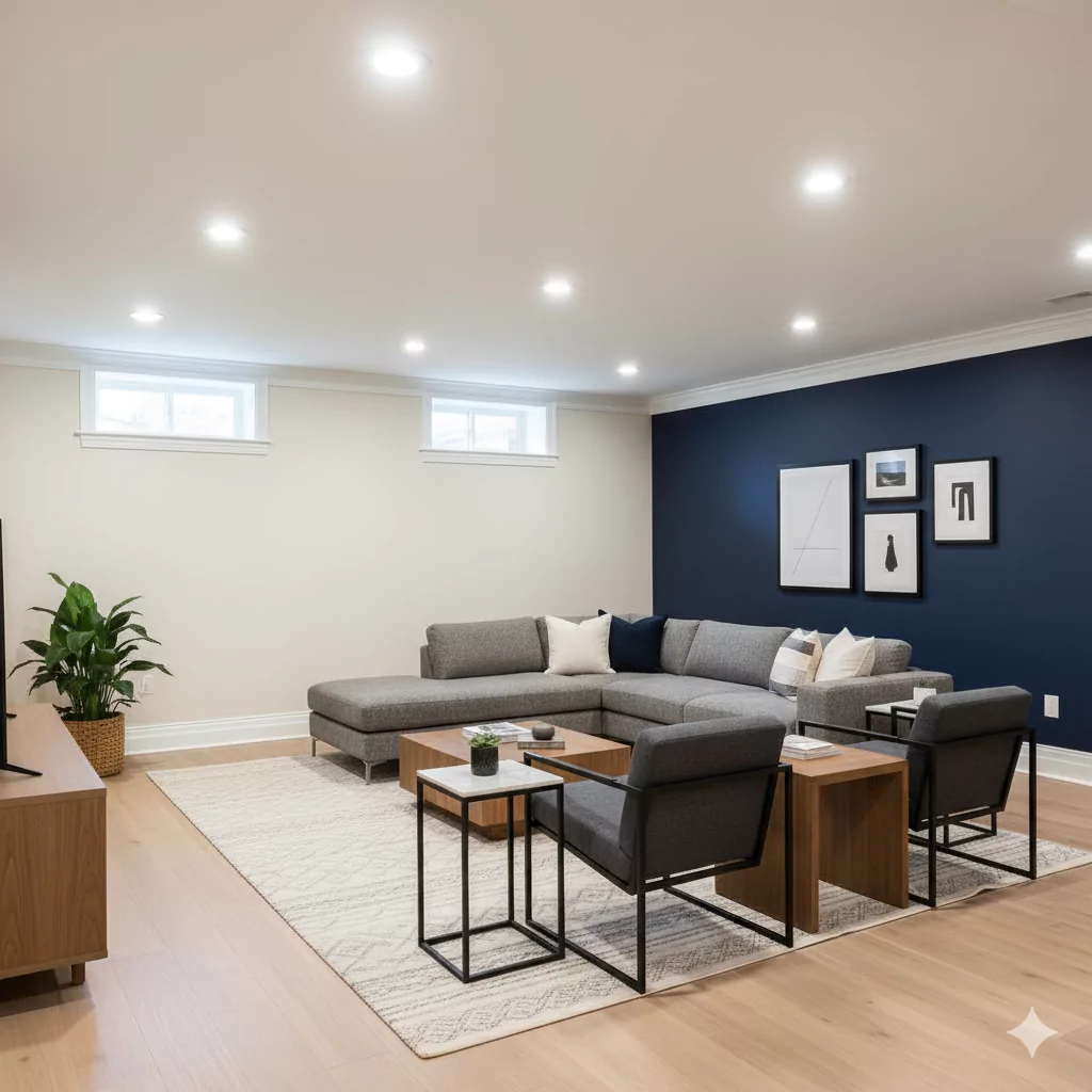
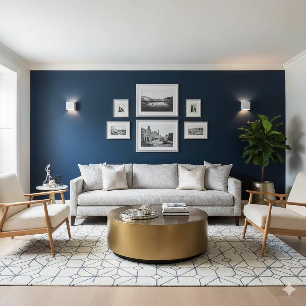
Benjamin Moore Hale Navy (HC-154)
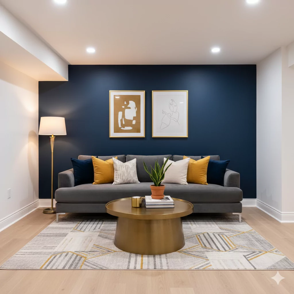
A deep navy blue. While most of our list is light, a few dark accents can add depth in a windowless space. Hale Navy is a rich, saturated navy that “is absolutely, positively blue” (with no greys or greens). When used as an accent wall or in furniture, it creates a sophisticated, cocooning effect.
According to design experts, in rooms without natural light you can afford a much stronger color to create an intimate, cozy space. In practice, Hale Navy on one wall will make the basement feel grounded and warm (especially under artificial lighting).
18 Blue-Gray Paint Colors by Sherwin-Williams & Benjamin Moore
It works beautifully against white or off-white trim, which will pop dramatically, and pairs well with brass or mustard-gold accessories for a lush contrast.
Sherwin-Williams Naval (SW 6244)
A nearly-black navy blue. Naval is an inky, very dark blue (almost black) that brings deep contrast. As with Hale Navy, using this color on an accent wall can transform a dark basement into an intimate, elegant retreat.
The effect is moody and luxurious – lamps and indirect light make the walls glow with depth. Design experts note that adding “stronger shades” in artificial-light spaces can actually make them feel vibrant rather than closed-in.
For trim, crisp white or even warm wood highlights look stunning against Naval. Keep furnishings lighter or metallic (silver, brass) so the space doesn’t become oppressive. A Naval accent paired with pale walls can make the basement both cozy and stylish.