Last updated on September 5th, 2025 at 01:39 pm
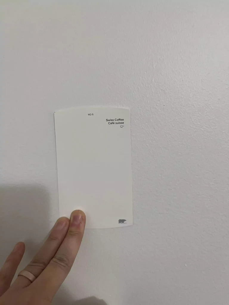
In this blog i will share REAL HOME IMAGES for Behr Swiss Coffee Paint color,that will be unfiltered.I will explain undertones ,lrv, coordinating colors, use in diffrent rooms.
What are the Undertones of Behr Swiss Coffee
Behr Swiss Coffee is a warm off-white. It contains yellow (cream) undertones balanced by a muted base, giving it a soft beige-creamy character. In practice the walls will read as a pale cream rather than a stark white.
“Swiss Coffee tends to look more beige than yellow, so you will never look at your walls and think a canary took up residence”.
Others confirm it has a “legit yellow hue, with a touch of orange” in its warm base, making it feel cozy and muted (not green- or gray-tinged).
11 Best Swiss Coffee Paint Color That I recommend My Clients
LRV of Behr Swiss Coffee
Swiss Coffee is a very light shade. Its LRV is about 84, which puts it firmly in the off-white range. At LRV 84 it reflects a high amount of light, so it will keep spaces bright without being a dazzling “pure” white.
In other words, it acts like a soft warm white: bright but gentle. Reviewers describe LRV 84 as “soft, warm white”.
Appearance in Different Lighting
Like many warm off-whites, Swiss Coffee “shape-shifts” under different light conditions. In bright sunlight (especially south-facing light) it will look very close to a true creamy white.
In cooler or dimmer north light, its warm undertones become more noticeable, giving the walls a gentle ivory or cream cast. It will never appear stark or bluish; instead it remains warm.
For example, on north-facing walls Swiss Coffee shows more of its creamy tint, whereas in bright southern light it reads closer to a pure white.
In artificial (tungsten) light it will lean warmer/yellow. Overall, lighting can make the color feel different, but it consistently stays a soft, warm off-white.
Natural Tan SW 7567 Sherwin-Williams-A Detailed Guide
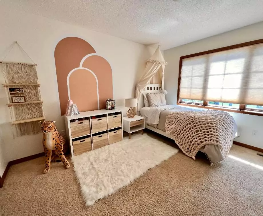
Behr Swiss Coffee In Bedrooms
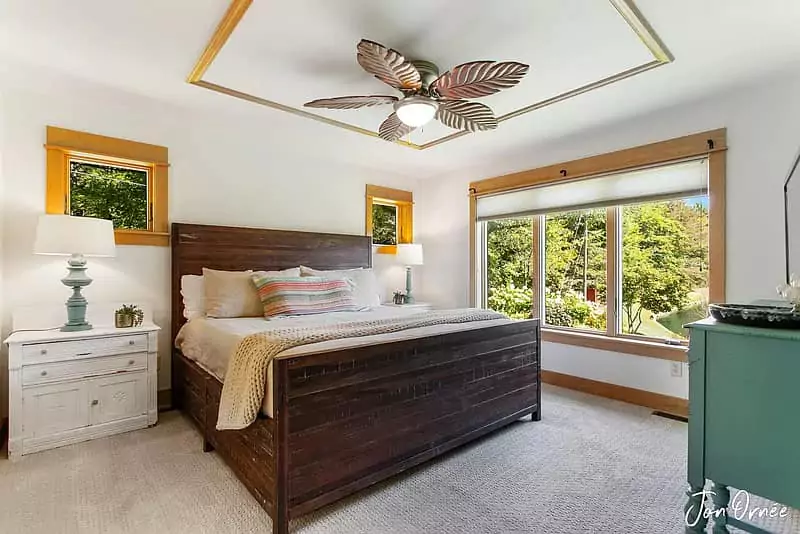
Swiss Coffee makes a bedroom feel cozy and warm. Its soft cream tone provides a tranquil backdrop that pairs well with both light and dark furnishings.
Because it is warm, it can make a bedroom feel inviting (especially against wood or beige decor).
It’s gentle enough to be restful but still brightens the space. In practice, designers find it works beautifully in well-lit bedrooms as a neutral canvas for bedding and decor.
One gallery notes using Swiss Coffee “as the main wall color, which acts as the perfect monochrome backdrop in this well-lit living room” – similarly in a bedroom it will serve as an understated warm base.
In short, Swiss Coffee is an excellent bedroom wall color when you want a soft, warm white.
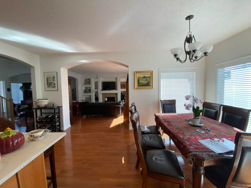
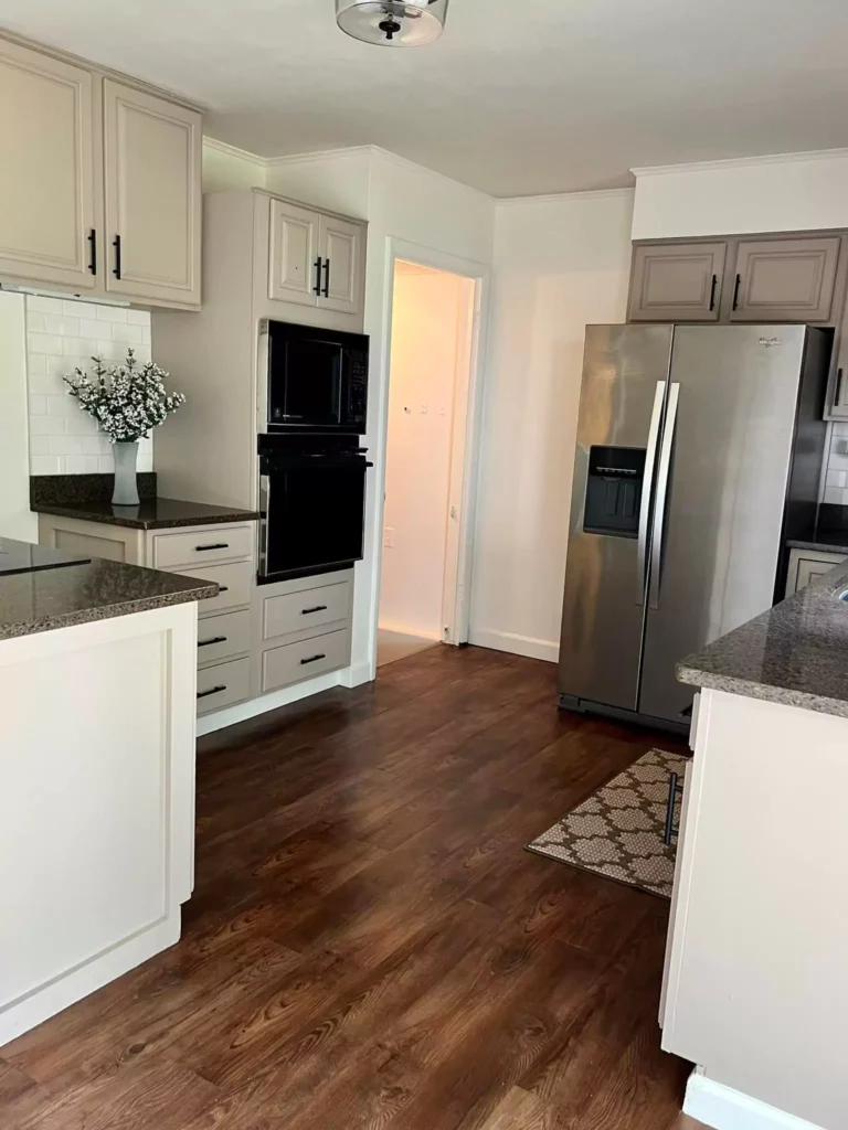
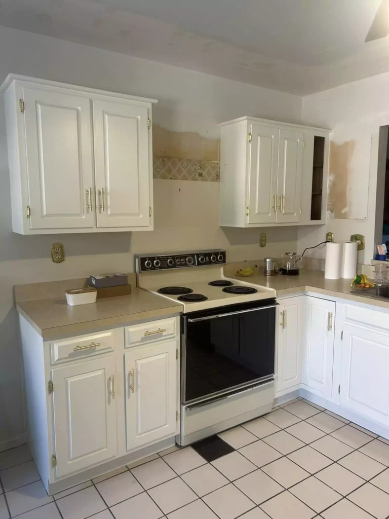
Behr Swiss Coffee In Kitchens

Swiss Coffee is popular in kitchens on walls or cabinets. It brightens the space while adding warmth.
In a kitchen with bright white trim or cabinetry, Swiss Coffee walls will provide a gentle contrast – it will read as a creamy white even next to crisp pure white cabinets.
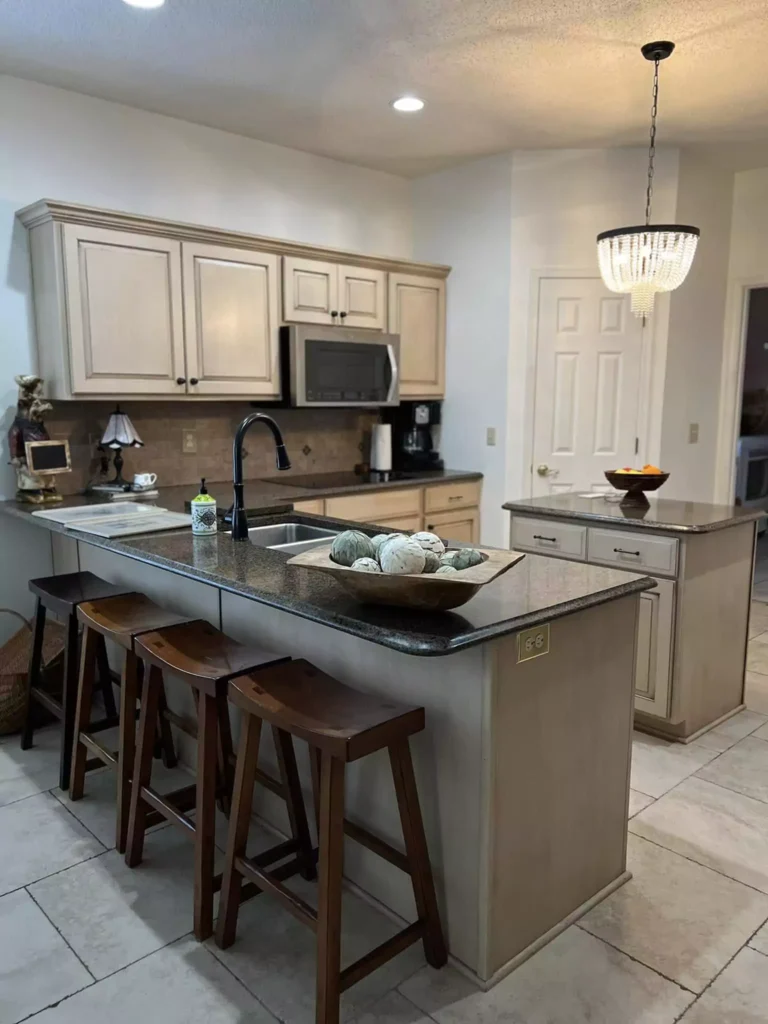
Warm overhead lighting in a kitchen (e.g. from incandescent bulbs or warm tile) can pull out a touch of its yellowy cream tone, but usually subtly so. Many recommend using it in eggshell or satin finish on walls, with semi-gloss on cabinets (for durability).
Overall, Swiss Coffee gives kitchens a clean, fresh look that isn’t cold or sterile.
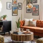
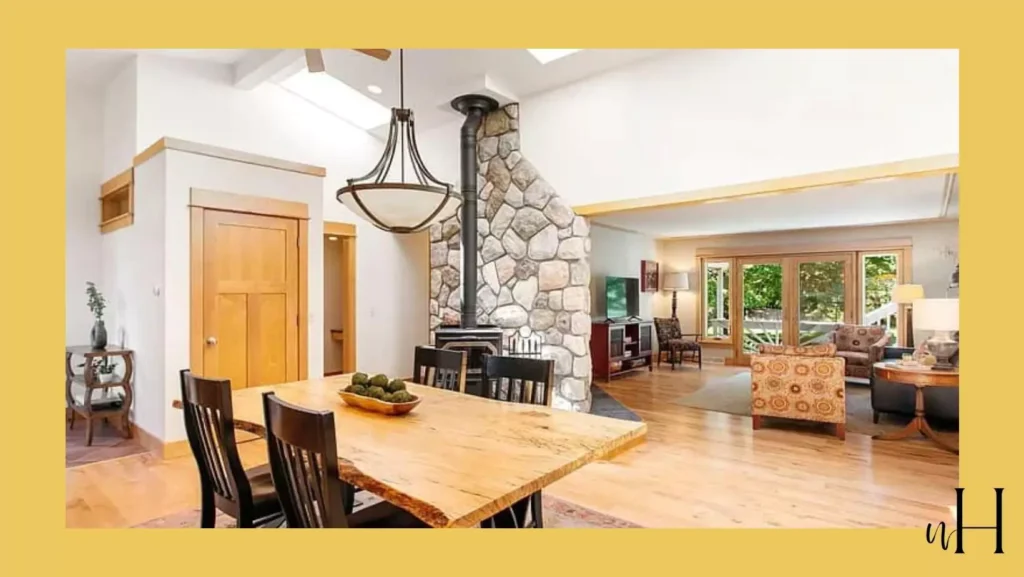
In Living Rooms
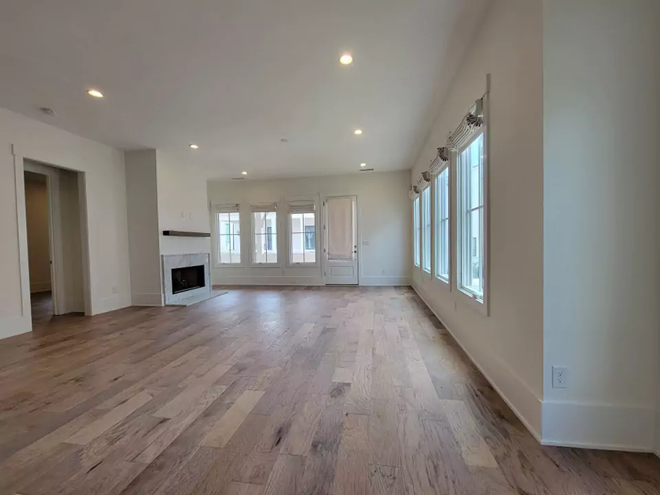
Swiss Coffee serves as a versatile base in living rooms. It provides a soft neutral backdrop that allows furniture and accents to stand out.
For example, Swiss Coffee living room as having a “Farmhouse feel” – the walls were very creamy but acted as a calm, monochromatic background for décor.
It won’t compete with colorful art or fabrics, yet it won’t feel flat or drab either because of its warm undertone.
In bright sunlight it can appear almost white (especially in very sunny rooms), while in more subdued light it reveals its warm creamy quality. Designers often pair Swiss Coffee living rooms with both cool and warm accent colors because it straddles a neutral line.
In Bathrooms
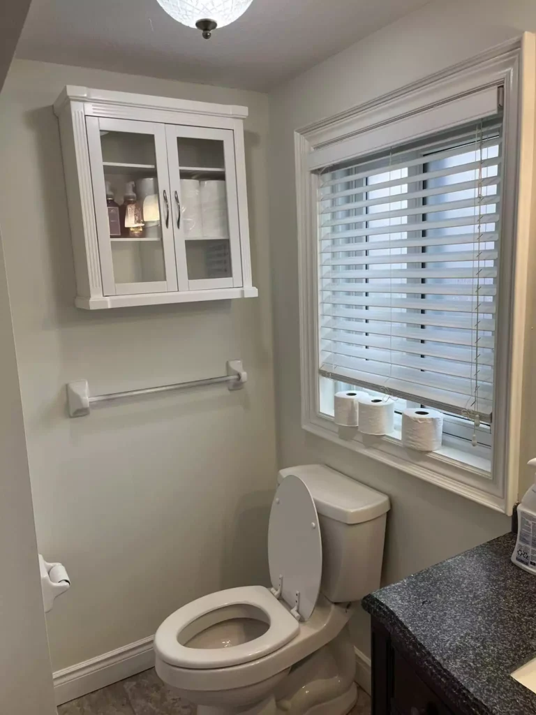
Swiss Coffee is equally suitable for bathrooms. Its warm, clean look works with a range of fixtures and tile.
In a bath or powder room, it creates a spa-like atmosphere that is softer than a stark white. (For high-moisture areas like showers or trim, satin or semi-gloss finish is ideal.) Because it is light, it helps small bathrooms feel larger.
Even if the room has cool gray tile or stone, Swiss Coffee will warm up the space without clashing. In general, it “can look incredible in any room of the house” – including bathrooms.
Behr Swiss Coffee On Cabinets and Trim
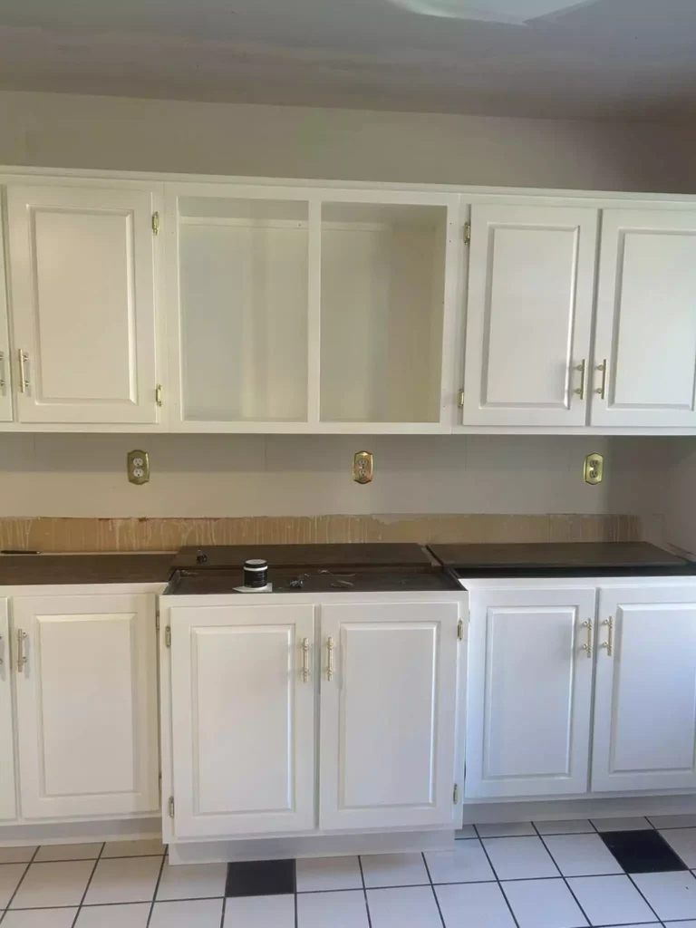
Swiss Coffee is often chosen for kitchen or bathroom cabinets and trim. Its warm tone adds creaminess that flat pure white trim lacks.Swiss Coffee “can look incredible… on trim and cabinets” and can be used almost anywhere.
Designers sometimes paint cabinets in this creamy off-white to complement darker countertops or walls, yielding a subtle warm contrast. (Just note, it is less crisp than ultra-white trims, so your trim or cabinetry will read as a soft cream.)
Overall, Swiss Coffee is a popular trim/cabinet white when you want an off-white look that isn’t glaringly bright.
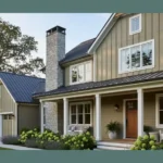
Exterior Use
Swiss Coffee is available as an exterior paint (sold in Behr’s exterior line). For example, the Behr Premium Plus exterior Semi-Gloss label for #12 Swiss Coffee lists it as akin to Sherwin-Williams’ Shell White.
This implies it’s a safe warm white for siding or trim. In practice, it gives homes a classic creamy-white façade. In bright sunlight it will look like a very soft warm white, while in shade it shows a gentle warm hue.
Because it has a bit more yellow-beige than some outdoor whites, it can soften the look of a home. (Some homeowners use it for old-world or farmhouse styles.) According to product info, Swiss Coffee resists fading and moisture outdoors, so it’s intended to hold up as an exterior color.
Coordinating Colors
Swiss Coffee pairs beautifully with a wide range of colors:
Warm neutrals: Cream, beige, taupe and soft grays. For example, Sherwin-Williams Alabaster or accessible beige grays complement it nicely. (One reviewer notes that SW Alabaster is a very close match to Swiss Coffee.)
Pastels: Gentle shades like blush pink, pale peach or powder blue create a soft, soothing palette with Swiss Coffee. For instance, pairing Swiss Coffee walls with blush-pink accents yields a warm, inviting look.
Earthy Tones: Olive greens, warm terracotta, or mustard yellows bring out its warm warmth. (A decorator suggests olive green and terracotta as cozy companions.)
Blues and Greens: Rich navy or teal provide dramatic contrast while still feeling modern. Deep blue accents (navy cabinets, charcoal couches) look striking against Swiss Coffee’s cream backdrop.
Accents and Metallics: Black or charcoal trim/walls for contrast, or brass/bronze hardware, can give a bold touch. Gold or copper accents catch the warmth of the paint. In general, Swiss Coffee “pairs well with almost any accent color” because of its neutrality.
Monochromes: A monochromatic beige scheme (cream rugs, off-white fabrics) is elegant. (Using darker beiges or soft whites nearby simply keeps the space feeling cohesive.)
Soft Palette: For a gentle “serene” scheme, pair Swiss Coffee with other light neutrals and pastels. Think creams, light grays, beiges, and dusty pinks or pale blues. This creates a calm, minimalist vibe.
For example, Swiss Coffee walls with ivory bedding, a light oak floor, and pale rose or sage textiles yields a soothing soft palette. This kind of palette highlights Swiss Coffee’s warmth without adding strong contrast.
Bold Palette: To make Swiss Coffee pop, use it with saturated accent colors. Strong navy, charcoal, emerald green, or deep terracotta can be dramatic alongside Swiss Coffee’s warmth.
In a living room with Swiss Coffee walls, try inky blue pillows and a rich walnut coffee table for a vibrant contrast. Swiss Coffee will appear very bright next to almost-black or jewel tones, grounding a bold palette while still offering warmth.
Muted Palette: For a more understated look, combine Swiss Coffee with muted mid-tones and earth tones. Greige, olive-gray, taupe, or soft teal (desaturated colors) will tone down the scheme.
For instance, Swiss Coffee with a muted sage-green accent wall and warm wood furniture makes a relaxed, natural palette. Similarly, pairing it with gray-beige (e.g. Sherwin’s Worldly Gray) or soft mustard yields a low-key, modern feel.
FAQ
Is Swiss Coffee white or beige?
Swiss Coffee is officially a “white” paint (an off-white), but it reads like a creamy beige. It is a warm white, not a cool bright white.
In practice the color looks more like a pale cream or beige-toned white rather than a stark pure white. In other words, it is technically white paint, but its yellow/beige tint makes it feel like a light beige-cream.
Which is warmer, White Dove or Swiss Coffee?
Both Behr Swiss Coffee and Benjamin Moore White Dove are warm off-whites, but Swiss Coffee tends to be slightly warmer (more yellow-cream).
According to color experts, Swiss Coffee has a bit lower LRV and picks up a touch more yellow than White Dove.
In side-by-side comparisons, Swiss Coffee appears a tad deeper and creamier, whereas White Dove is a hair brighter and a bit cooler. In short, you can expect Swiss Coffee to feel a bit warmer and more buttery, while White Dove is softer and more neutral by comparison.
Will Swiss Coffee look yellow?
It contains yellow undertones, so under some conditions (especially warm incandescent light) it can take on a very mild buttery cast. However, it won’t look like a bright yellow.
Most find that it reads as a warm cream or ivory, not an obvious yellow. As one paint blogger observes, “Swiss Coffee tends to look more beige than yellow”.
So unless the lighting is extremely warm, it won’t scream “yellow.” In bright neutral light it will appear off-white; only in dim or very yellow lighting will its creamy tint become more noticeable.
Does Swiss Coffee look gray?
No, Swiss Coffee does not have gray undertones. It is decidedly warm and beige-based. It will not appear gray; it lacks any blue or green undertone that would make it look cool.
Designers point out that Swiss Coffee’s undertones are yellow/cream (and even a slight orange), so it stays on the warm side.
(If you need a true grayish-white, colors like Behr’s Cotton Knit or Sherwin’s Passive would be more appropriate.)
When not to use Swiss Coffee?
Avoid Swiss Coffee if you actually want a crisp, “pure” white effect or a cool white space. For example, if your room already has a lot of beige or yellow elements, adding Swiss Coffee can feel overly warm.
Also skip it if your goal is a very modern, cool-toned palette. As one expert advises, “Avoid Swiss Coffee when you need a pure, clean white… or when you want a modern, cool-toned space without warmth”.
In very dark or tiny rooms, its warmth might feel a bit too cozy or yellowish, so in those cases a brighter white might work better.
What is one shade lighter than Behr Swiss Coffee?
A commonly cited lighter alternative is Behr Palais White (GR-W15). Palais White has an LRV of about 87, making it a touch brighter while still warm.
In fact, color experts describe Palais White as “like a lighter version of Behr’s Swiss Coffee with similar warmth”. If you want essentially the same creaminess but just a bit lighter/brighter, try Behr Palais White.
What colors are similar to Behr Swiss Coffee?
Several warm off-whites are in the same family. Sherwin-Williams’ Alabaster is very close in tone, as is Benjamin Moore’s Cloud White. (Kylie M. Interiors actually notes that Sherwin-Dover White is closest and SW Alabaster is another good match.)
Behr’s own Nano White is a cooler choice if needed. Other similar neutrals include BM Swiss Coffee (OC-45) itself, SW Creamy, and Behr Linen White. In general, look for off-whites labeled as “warm” or “creamy” – they will resemble Swiss Coffee’s gentle yellow-cream tone.
What is the Behr equivalent of Benjamin Moore’s Swiss Coffee?
Behr’s Swiss Coffee #12 is often treated as the closest match to Benjamin Moore’s Swiss Coffee (OC‑45), but they are not identical. Both are soft warm whites with very similar LRV (~84).
In comparison, Behr Swiss Coffee is just a touch lighter (higher LRV) and has subtly different undertones. According to a paint review, “they are both soft, warm off-whites… shockingly close (BM Swiss Coffee is 83.93, and Behr’s is 84!)”.
In practice, you’ll need swatches to tell them apart, but many users find them interchangeable for most purposes.
Comparison with Other Paints
Behr Blank Canvas vs. Benjamin Moore Swiss Coffee
Blank Canvas (Behr’s 2023 Color of the Year) is a neutral warm white (LRV≈84) with slight gray/brown undertones, whereas BM Swiss Coffee (OC-45) is warmer and creamier.
In side-by-side tests, Blank Canvas appears cleaner and more balanced, while Swiss Coffee feels a bit more yellow. In other words, Blank Canvas won’t feel as “buttery” as Swiss Coffee. Both colors are very similar in brightness, but Blank Canvas reads more neutral and Swiss Coffee more yellow/beige.
Behr Swiss Coffee vs. Benjamin Moore Swiss Coffee
These two Swiss Coffee colors (Behr #12 and BM OC-45) are remarkably similar. Both are soft warm off-whites with LRVs around 84.
The differences are very slight: BM’s Swiss Coffee is perhaps a hint deeper (LRV 83.93) and may carry an almost imperceptible green-gray tone in some lights, whereas Behr’s Swiss Coffee is minutely lighter. Overall, they behave almost the same.
Many sources emphasize that they are “not the same color, but… very similar – you need to swatch to tell them apart”.
Behr Swiss Coffee vs. Sherwin-Williams Greek Villa
SW Greek Villa (SW 7551) is a slightly creamier, more yellow-white than Swiss Coffee. According to color analysts, Greek Villa has warmer yellow-cream undertones, whereas Swiss Coffee’s undertones are a bit more subdued (Swiss Coffee can even show a hint of green-gray).
In practice, Greek Villa tends to look consistently warm in any light, while Swiss Coffee is a touch more neutral/complex. Swiss Coffee will appear a bit less yellow than Greek Villa.
(One reviewer characterizes Greek Villa as “notably warm with yellow/cream undertones” vs. Swiss Coffee’s more neutral warmth.)
Behr Swiss Coffee vs. Sherwin-Williams Alabaster
Sherwin Alabaster (SW 7008) is very close to Swiss Coffee, but with slightly less yellow. Both are warm off-whites, but Swiss Coffee usually reads a tiny bit richer or creamier.
Experts note that Alabaster has a faint gray-beige softness, while Swiss Coffee leans a tad more yellow. In side-by-side tests, Swiss Coffee can look just a hair deeper and creamier, whereas Alabaster is a bit cooler/whiter. Generally they are considered nearly interchangeable, though Swiss Coffee is slightly warmer.
Behr Swiss Coffee vs. Sherwin-Williams “Creamy” (7012)
Sherwin Williams 7012 Creamy (sometimes called “Swiss Coffee” in SW decks) is very similar in character.
According to technical comparisons, both paints are warm and have very close saturation, but Behr Swiss Coffee (#12) has a slightly higher LRV. For example, Plan-Home data shows Swiss Coffee’s LRV ≈84.5% vs. SW Creamy’s 81.0%. In plain terms, SW Creamy is a touch darker/more saturated, and Swiss Coffee is very slightly lighter. Visually they are nearly indistinguishable unless swatched side-by-side – both are warm whites.
Behr Swiss Coffee vs. Behr Palais White
Behr’s Palais White (GR-W15) is essentially a lighter version of Swiss Coffee. Palais White has an LRV around 87 and the same warm undertones. In fact, color experts say “Palais White is like a lighter version of Behr’s Swiss Coffee with similar warmth”.
So Swiss Coffee is one step deeper and warmer than Palais White; in a room painted Swiss Coffee, switching to Palais White would brighten the color slightly while keeping the same creamy tone.