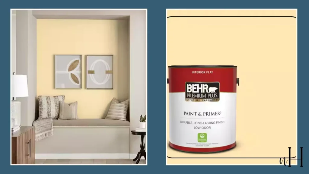
Behr Vanilla Ice Cream (P260-3) is a warm, creamy off-white paint with subtle yellow undertones. Not too yellow that stark the vibe.
Behr paints describes it as “a pure yellow with a sunny outlook”, and designers note that its balanced softness and warmth make it highly versatile.
Ive personally used it in my baby girl room ,and my complementry color was terracotta .I will share my experience with Behr vanilla ice cream paint.
Its LRV is 82 ,mean it’s a too-bright paint color with a pastel and soft touch of yellow.
This soft neutral brightens rooms and serves as a cozy backdrop in both traditional and contemporary interiors.
In practice it pairs beautifully with crisp white trim and natural wood tones to enhance its sunny, inviting character.
Behr Swiss Coffee 12 with 20+Real Home Images
Undertones of Behr Vanilla Ice Cream
Vanilla Ice Cream features gentle yellow undertones. These warm undertones give the paint a cozy, inviting feel—warmer than a stark white but still soft and neutral.
In daylight the yellow tint is evident, whereas in dimmer light it reads as a light cream. Importantly, this shade avoids looking too beige or golden, making it a balanced warm neutral.
Because of its undertone, it complements natural wood flooring and brass or gold accents, while a crisp white trim will keep the overall look bright.
What is the LRV of Behr Vanilla Ice Cream
Behr lists Vanilla Ice Cream’s LRV at about 82. LRV (Light Reflectance Value) measures the percentage of light a paint reflects; an LRV in the 80s means this color is very light.
In practical terms, an LRV around 82 indicates that Vanilla Ice Cream will bounce a lot of light, helping spaces feel open and airy. (For comparison, pure white paints are typically in the 90s, and anything above ~70 is considered “light” in appearance.)
With such a high LRV, this shade will keep most rooms luminous—even in moderate lighting—while its warm undertone prevents it from feeling clinical.
Appearance in Different Lighting Conditions
How Vanilla Ice Cream looks can shift depending on light. In north-facing rooms (soft, cool natural light), its yellow undertones will be more apparent, giving the walls a gentle warm glow.
In south-facing rooms with strong sunlight, the color will look brighter and can even appear a bit washed out under very intense light.
Under warm artificial lighting (incandescent or soft-white LED bulbs), the creamy yellow will deepen slightly and feel cozier. Conversely, under cool fluorescent or daylight-spectrum bulbs, its warmth will subdue and it may read more off-white or beige.
Overall, because of its high LRV, Vanilla Ice Cream will maintain a soft, luminous quality in most lighting, but testing a sample is recommended to see the effect of your specific light and time of day.
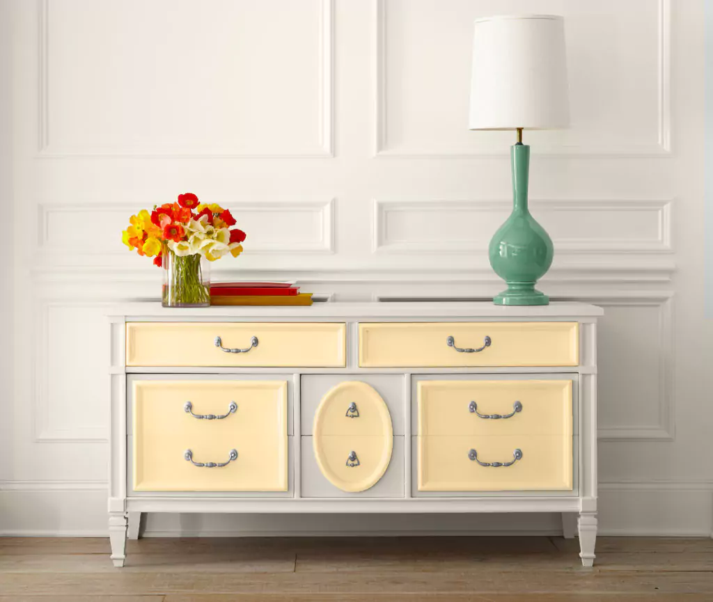
Behr Vanilla Ice Cream Use in Bedroom
In bedrooms, Vanilla Ice Cream creates a soothing, tranquil backdrop. Its warm cream tone feels calming and makes a room feel larger.
Designers often pair it with soft textiles and cool accent colors – for example, dusty blue, warm taupe, or blush pink bedding and pillows to enhance relaxation.
Wood or light-colored flooring complements the walls nicely, and crisp white trim keeps the look fresh.
Because of its neutrality, you can furnish a Vanilla Ice Cream bedroom in many styles: traditional rooms might use rattan or wood furniture, while modern bedrooms could add a pop of color with dark gray or teal accents.
Use in Kitchen
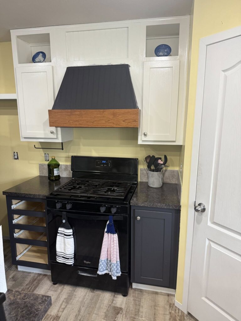
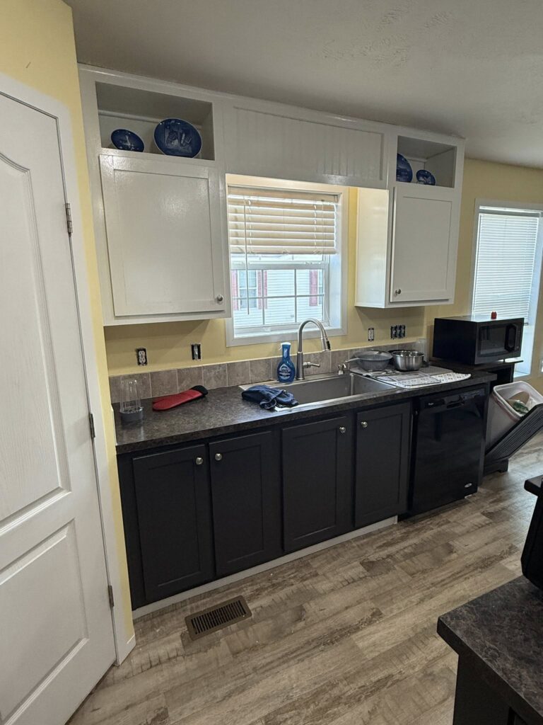
In kitchens and dining areas, Vanilla Ice Cream brings a fresh, cheerful feel. Its subtle yellow undertones pair beautifully with wooden cabinetry, brass hardware, and marble or light quartz countertops.
For example, it can be used on walls behind cherry or oak cabinets to warm the wood tones, or on upper walls with white lower cabinetry for a two-tone look. It also looks crisp against white subway tile backsplashes.
The color’s warmth complements both wood and stone surfaces: it softens the coolness of granite or stainless appliances while brightening darker wood.
White or very light gray trim and ceiling paint will keep the kitchen feeling bright; consider a warmer white (or even Vanilla Ice Cream itself) for cabinetry to create a unified, spacious look.
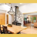
Use in Living Room
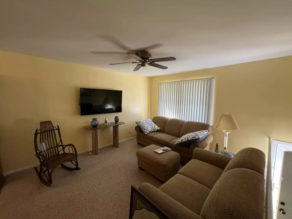
In living rooms and family rooms, Vanilla Ice Cream creates an open, airy atmosphere. Its light reflectance brightens the space, especially when balanced with ample natural light. The soft, creamy warmth works with wood or stone flooring and white or off-white trim to emphasize an inviting, cohesive look.
Because this color is fairly neutral, you can go bold or subdued with furnishings: both a bold color scheme (e.g. navy or emerald accents) or a muted scheme (beige and gray sofas) will work.
Designers often pair it with warm natural textures – think a jute rug, wooden furniture, or rattan accents – to enhance its cozy vibe. In any case, darker accent pillows, throw blankets or a feature wall in a contrasting tone can add depth against the light backdrop.
Use in Bathroom
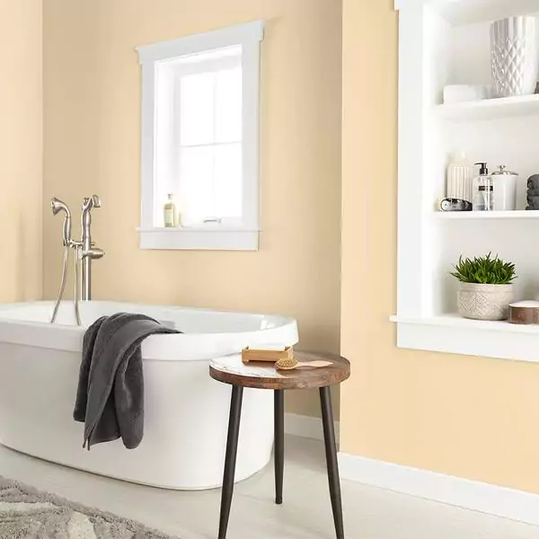
Vanilla Ice Cream lends a tranquil, spa-like feel to bathrooms. It looks especially good with crisp white fixtures or tile and natural materials. For example, white marble or ceramic tiles provide clean contrast, and wood or stone accents (vanity tops, shelving) emphasize the warm cream.
Under typical bathroom lighting the paint will read slightly warmer, so pairing it with cool-gray or white grout and trim keeps the space bright. Because of its brightness, it works well even in small bathrooms.
To enhance its airy character, use white or very light cabinetry and light-colored countertops; adding greenery (plants) and soft lighting will accentuate the fresh, open feel.
Use on Cabinets
Vanilla Ice Cream can be used on kitchen or bathroom cabinets for a bright, updated look.
On cabinets, its warm tone will make small kitchens feel larger and cozier. It pairs well with both natural and painted trim: for example, white trim or moldings will pop against it, while a darker accent (charcoal or navy island, black hardware) will give a modern contrast.
In a two-tone cabinet design, painting upper cabinets in Vanilla Ice Cream and lower cabinets in a deeper hue (gray or green) adds visual interest.
Its yellow undertones complement warm wood cabinets or brass hardware beautifully (as noted above). In general, for cabinet use keep metallic finishes either warm (brass/gold) or black to contrast the creamy walls.
Use on Exterior
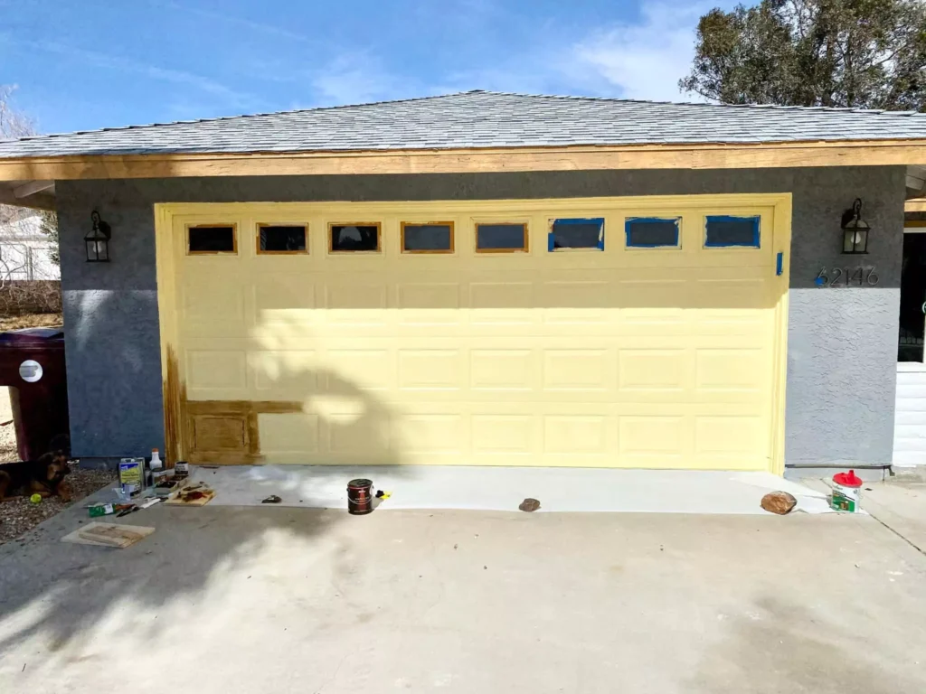
Vanilla Ice Cream can also be used on exteriors. In natural daylight its high LRV (around 82) means it will appear as a very light cream or pale yellow, making a house look bright and clean.
It works well on siding or trim, especially on traditional homes with natural materials (like stone or brick): the warm cream tone will soften red brick or blend with beige stone.
For exterior trim and accents, crisp white or off-white (to match trim) will look sharp, while a contrasting dark color (navy, forest green, or charcoal gray) on shutters or doors will create a classic focal point.
For example, a house with brick or gray stone might use Vanilla Ice Cream on the main walls with white trim and a navy door. Overall, Vanilla Ice Cream on an exterior provides a welcoming, sunlit appearance.


Coordinating Colors
Below are palette ideas that pair well with Vanilla Ice Cream, along with trim/accent suggestions:
Soft Palette: Use gentle, light neutrals to maintain an airy feel. Soft grays (e.g. Behr Silver Drop 790C-2, Dolphin Fin 790C-3) balance the warmth of Vanilla Ice Cream. Pale blues or blues with gray undertones (e.g. Blueprint S470-5 or Watery HDC-SP16) add a cool, calming touch.
Off-whites and creams (like Heavy Cream PPU5-10) for trim/ceilings keep everything bright. For accents, light blush pink or mint green can be used sparingly as soft pops of color.
Bold Palette: Choose deeper, saturated colors for dramatic contrast. Rich brown tones (e.g. Espresso Beans 830D-6, Chocolate Therapy N210-7) create a warm anchor against the pale walls. Jewel-tone accents – such as emerald or ruby – will energize the space without clashing.
Deep navy blue or forest green walls/trim also provide classic contrast (planhome.com notes navy and forest green pair beautifully with Vanilla Ice Cream). Black or charcoal gray furniture/hardware can also be used for a contemporary look.
In this palette, crisp white trim is often best to frame and highlight the bold hues and the warmth of the walls.
Muted Palette: Use earthy, toned-down colors for a cohesive, natural scheme. Muted greens (e.g. Sagebrush MQ6-24 or Scottish Isle MQ6-31) harmonize with the creamy warmth for an organic feel.
Warm taupes, beiges or light brown accents (think a burlap textile or limestone) will blend smoothly. Soft terracotta or dusty rose can be used as accent hues.
In a muted palette, trim can be a gentle off-white or very pale gray so it doesn’t distract from the warm neutral scheme.
Each palette above works well with Vanilla Ice Cream. For trim color, a crisp white is a safe and common choice to make the walls pop, but you can also coordinate with the chosen accent colors (for example, using a warm gray or the same deep navy as an accent wall or cabinetry).
Flooring and countertops should be considered: hardwood floors in natural or light stain will complement the warm cream tone, and stone or concrete countertops (in white, gray, or warm beige) will balance its warmth.
Natural light enhances Vanilla Ice Cream’s cheerfulness, so these coordinating palettes will all look their best in well-lit spaces.
ALL CREDIT TO OWNER OF THE IMAGES:MAIL @nestichomes@gmail.com