You know how much refreshing and spacious this paint feel ,OMG Benjamin Moore 281 Citronée is “a barely-there yellow that brings a fresh, sunny glow to a room”.
Designers note its “radiant and invigorating” quality, likening it to citrus groves and sunlit meadows.
Citronée belongs to Benjamin Moore’s Classic collection, a palette of time-honored colors, and its gentle warmth makes it versatile in many interiors.
Untold Aspects of Dover White SW 6385 Sherwin-Williams
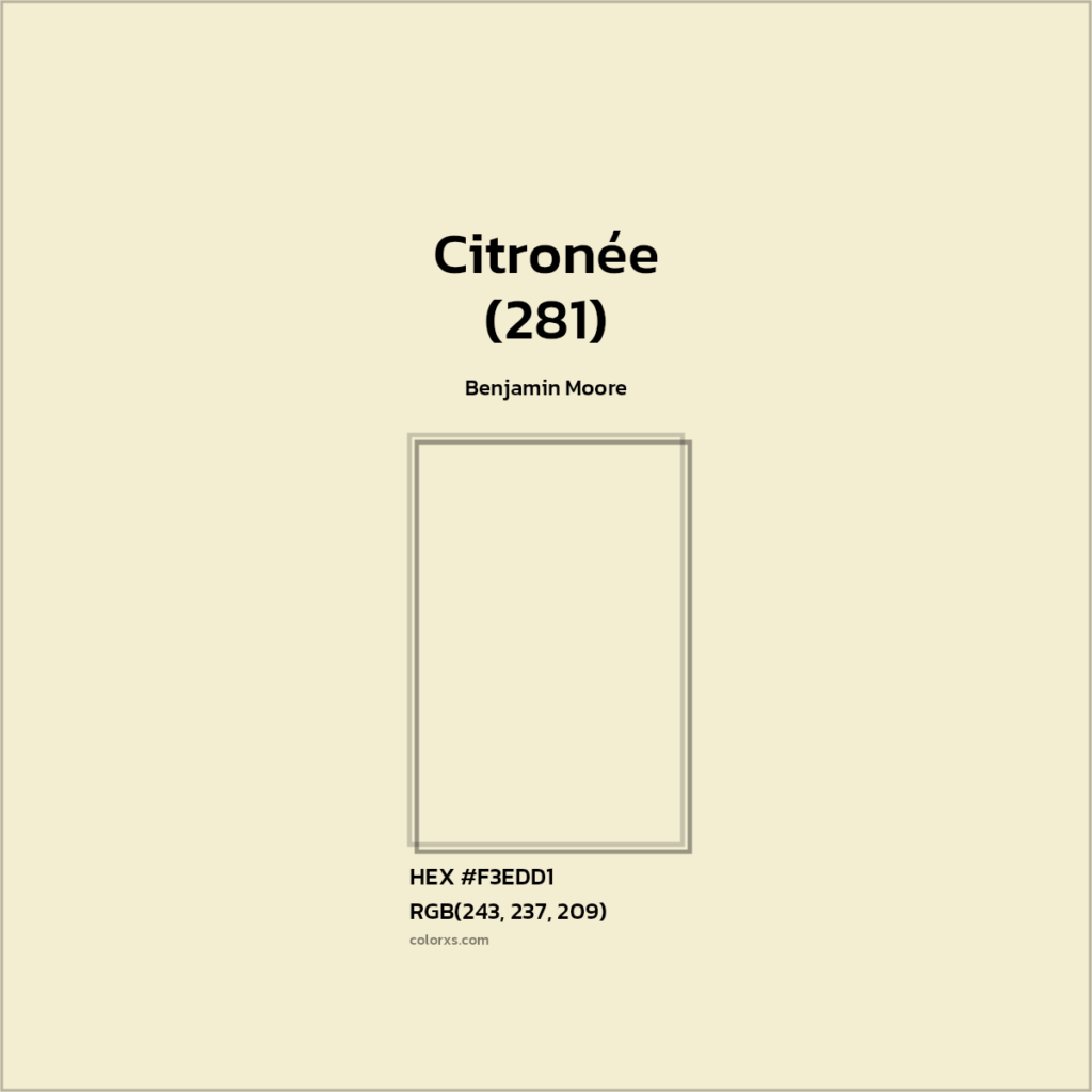
Undertones of Benjamin Moore 281 Citronée
Behr Vanilla Ice Cream P260-3:My Review
Citronée has subtle yellow-green undertones. It is essentially a creamy pastel yellow with a hint of green, giving it a soft chartreuse character.
As one of my friends12 explains, “Citronée is a harmonious blend of yellow and green, with soft undertones that lean toward a golden chartreuse”.
The yellow notes add warmth and brightness, while the green element grounds the color, evoking fresh spring foliage or zesty lemon peel.
These gentle undertones mean Citronée can shift in appearance depending on context: in bright light its lemony warmth is most apparent, while in softer light its greenish creaminess comes forward.
LRV (Light Reflectance Value) of Benjamin Moore 281 Citronée
Citronée is a very light-reflective color.
Its Light Reflectance Value (LRV) is 81.2 (where 0 is pure black and 100 is pure white). An LRV above 80 indicates that Citronée reflects a high percentage of light.
This means painted surfaces will appear very bright and airy.
In practical terms, Citronée will make rooms feel lighter and more spacious (higher LRVs tend to expand a space), but it will also show dirt more easily and may require touch-ups over time.
Behr Swiss Coffee 12:Review 20+Real Home Images
How it looks in different lighting
Citronée’s appearance can vary with lighting. In natural daylight or bright, cool LED light it looks like a fresh pale lemon, very crisp and cheery.
Under warm incandescent or low light, its green tint may become more noticeable and the yellow softens. One designer notes that in abundant daylight Citronée appears “sunnier,” whereas in dimmer or artificial light it looks more muted.
Because of its light LRV, Citronée generally brightens any space, but it’s wise to test it at different times of day.
For example, it can feel very vibrant and energetic in south-facing rooms, while on a cloudy day or under warm lamp light it has a cozy, buttery tone.
HEX Code
Citronée’s hexadecimal color code is typically given as #F3EDD1. This code represents the digital approximation of the paint color on screens and in design software.
(Some color databases list very similar values, e.g. #F4E9D0, but #F3EDD1 is often cited as the precise match to Benjamin Moore’s pigment formula.) The hex code is useful for planning paint pairings or ordering coordinating materials.
RGB values
In the RGB color model, Citronée corresponds to approximately RGB(243, 237, 209) (Red 243, Green 237, Blue 209). These high values reflect its light, pastel character.
(Some user lists slightly different nearby values – for example one match lists RGB 244, 233, 208 – but all agree it is a very pale, warm yellow.) These RGB figures can be used to preview the color on digital designs or to find complementary digital swatches.
Bedroom
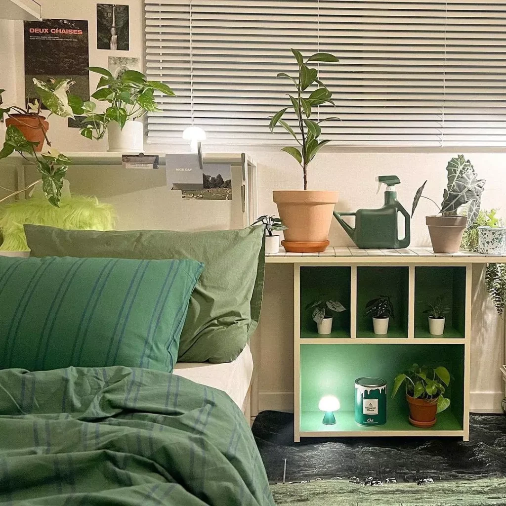
In a bedroom, Citronée adds gentle warmth and a soft sunshine glow. It can work as an accent wall or an all-over color.
For example, when paired with neutral bedding and light wood furniture, Citronée creates a “welcoming atmosphere that feels both fresh and stylish”. Designers often pair it with crisp whites or soothing grays in bedrooms to keep the mood calm.
Against a pale Citronée wall, white trim and natural textures (linen bedding, wood floors) will make the space feel bright and serene without being overly bold.
Kitchen
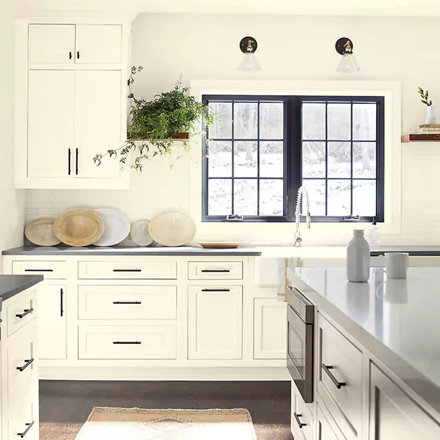
Citronée is popular in kitchens for its fresh, invigorating vibe. Its “citrus-inspired tones evoke freshness and vitality” in culinary spaces.
A common scheme is Citronée walls or backsplash with white cabinetry, which underscores the yellow’s cheerfulness. For example, pairing Citronée with white or cream cabinets and brass hardware creates a crisp, modern-farmhouse look.
It can also liven up an island or pantry cabinets – against darker counters or tiles Citronée brightens the room. Just be mindful: because it’s very light, Citronée may show scuffs on high-traffic kitchen surfaces, so a wipeable semi-gloss finish is practical.
Living Room
In living rooms, Citronée brings energy and light. It can be used on all walls for a sunlit effect, or as an accent wall to enliven the space.
Paired with neutral furniture and natural elements (wood, rattan, linen), Citronée “creates a welcoming atmosphere that feels both fresh and stylish”. For instance, a pale yellow Citronée room with a gray or beige sofa, light wood floor, and white trim feels cheerful yet grounded.
It warms up cool-grays or blues as accents (pillows, artwork) without overpowering them. Because of its high LRV, even larger living areas feel airy and open when painted in Citronée, making it a good choice in family rooms or parlors that need a bright uplifting tone.
Bathroom
Citronée can give bathrooms a spa-like freshness or a playful pop of color.
Used on all walls, it brings “an unexpected pop of color that feels invigorating” to the typically white fixtures. In a small powder room, Citronée pairs well with crisp white tiles and chrome fixtures for a clean, breezy feel.
Alternatively, for a more modern contrast, it looks striking with charcoal or dark gray accents.
For example, a vanity painted Citronée set against slate tiles will feel bold and contemporary. Its light tone also helps small bathrooms appear larger and brighter – at its best in east- or south-facing baths where morning or afternoon sun can enhance the yellow.
Cabinets
Citronée also works nicely on cabinets or built-ins. In a kitchen, painting lower cabinets or an island this pale yellow adds warmth while keeping the room feeling spacious.
It “pairs well with white cabinetry” in a mixed scheme – for instance, white uppers and Citronée lowers create a two-tone effect.
In a bathroom, a Citronée vanity against white walls/tiles is an unexpected but fresh choice. Because Citronée is so light, it provides a soft accent on shaker-style cabinets without looking garish.
For visual balance, designers often complement it with natural stone countertops and warm-metal hardware, which ground the color.
Exterior
Benjamin Moore’s official documentation actually notes that Citronée is “not recommended as exterior paint”. This caution likely reflects the fact that very light, tinted colors can show weathering quickly outdoors.
However, in practice Citronée is sometimes used on exterior accents: it makes a cheerful accent on front doors, shutters or trim. When used sparingly, Citronée “makes a bold statement on front doors” and “pairs beautifully with neutral siding, brick, or stone”.
For example, a cream or beige house with a Citronée front door has a sunny, welcoming curb appeal. (If used outdoors, choosing a quality exterior paint and occasional reapplication is wise to keep the color from fading.)
Coordinating Colors for Benjamin Moore 281 Citronée
Designers often pair Citronée with neutrals, earthy tones, or strong contrasts. Below are example palettes:
Soft palette
Chantilly Lace (OC-65) – a pure, crisp white. It provides a clean backdrop that lets Citronée’s warmth shine without competition.
Edgecomb Gray (HC-173) – a soft greige (beige-gray) that tempers the brightness of Citronée. It adds coziness and works as trim or an accent wall.
Additionally, Benjamin Moore suggests pairing Citronée with Cloud White (OC-130) or Pashmina (AF-100) for an ultra-soft, airy scheme. These off-white and creamy hues create a gentle, light-filled palette.
Bold palette
Hale Navy (HC-154) – a deep, rich navy blue. Used as an accent (e.g. on a feature wall or sofa), it creates a dramatic, modern contrast with Citronée.
Caliente (AF-290) – a vibrant, true red. Against Citronée’s pale yellow, it adds energy and depth, perfect for accent pillows or an accent chair.
These strong colors make Citronée pop. (For a different bold look, try a leafy green like Benjamin Moore Glazed Green or a turquoise like Beach Glass; Citronée’s yellow-green undertone harmonizes nicely with soft aqua-greens, as suggested by Benjamin Moore’s palette.)
Muted palette
Revere Pewter (HC-172) – a warm, mid-toned greige (gray-beige). It provides a subtle, sophisticated contrast while keeping the scheme calm.
Texas Leather (AC-3) – a rich, earthy brown. It brings out Citronée’s green undertone and adds a natural, grounded feel.
These muted earth tones harmonize with Citronée’s organic vibe. Other good options include a warm white (like Cloud White) or light olive-gray to gently balance Citronée’s cheerfulness without overwhelming it.


