Last updated on July 11th, 2025 at 05:29 am
Benjamin Moore’s Gray Wisp vs Quiet Moments is most confusing paint colors , i wqas confused too before searching the best option for me .You’re not alone. Both looks same but their undertone and lrv make them totally diffrent.
Despite belonging to the calming gray-blue family, each color has distinct qualities that can significantly alter the tone and design of a space. Quiet Moments’ richer, more reflective hue conveys volumes, while Gray Wisp’s gentle, airy overtones speak peace. Which one, nevertheless, is appropriate for your area?
I will tell you about appropriate room uses, and complementary color schemes of Benjamin Moore Gray Wisp vs. Quiet Moments.
After reading you can choose the best option for your space ,either you are planning to paint bedroom ,livingroom or hallway.
RELATED BLOG
- What Colors go Well with Sherwin Williams Tricorn Black?9 Paints Approved by Interior Designers
- 9 Reasons Shoji White Sherwin Williams Paint Color is Best For Small Spaces
Undertones and Base Hue
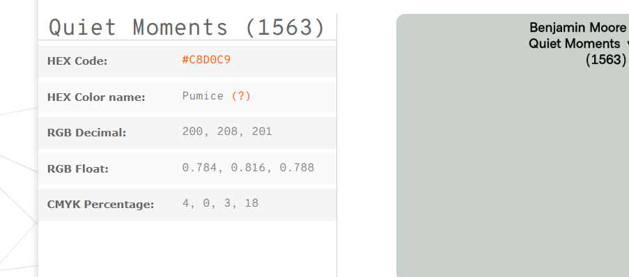
Gray Wisp is fundamentally a light gray with a green tint. Benjamin Moore officially markets it as a “light gray [that] gets its calm from a drop of aloe green”. In practice it looks like a misty blue-gray leaning toward sage. Paint experts describe it as a “soft blue-gray with green undertones” that reads as a muted aqua-gray in most rooms.
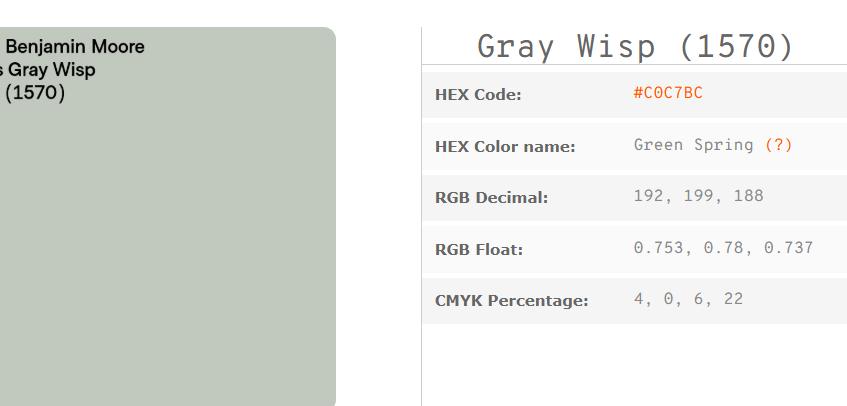
Quiet Moments is a pale blue-gray color. BM’s site calls it “a gentle mix of blue and gray”, evoking tranquility. Its green undertone is very subtle – Jenna Kate notes it has “a mix of blue and green, with gray undertones”, while Kylie Interiors points out that it tends more toward blue than green overall. In a cool-lit room Quiet Moments looks like a faded sky-blue; with warmer light it gains a faint teal cast.
Light Reflectance (LRV) of Gray Wisp and Quite Moments
According to Benjamin Moore, Gray Wisp’s LRV is 54.43, while Quiet Moments is 60.73. This means Quiet Moments is significantly lighter on the light-reflectance scale (a higher percentage reflects more light).
In easy words, Quiet Moments will make a room feel brighter and more open than Gray Wisp will. Gray Wisp’s mid-50s LRV is still fairly light, but rooms painted Quiet Moments will generally seem airier and require fewer coats to cover a wall.
Appearance in Different Lighting
Both colors change subtly with lighting. Gray Wisp “changes depending on the light—sometimes it feels more blue, other times it shows more green or gray”. Its green-blue character is so visible in bright light, while in shadow or artificial light it can soften into a cool gray.
Quiet Moments also shifts: In north- or east-facing (cool) light it appears more blue-gray, whereas in south-facing (warm) light it takes on a hint of green. In very bright sunlight Quiet Moments (with its high LRV) can look almost washed-out, so many experts recommend seeing it on your walls before committing.
Under warm incandescent bulbs Quiet Moments will emphasize its greenish side, while under cool LEDs it looks bluer. In practice, a north-facing room will accentuate the cool blue of both paints, and a sunlit south room will bring out any greeny warmth.
Recommended Uses
Where to use Gray Wisp (1570)
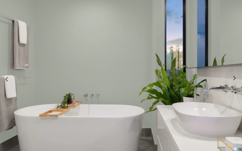
is often chosen for spaces needing a calm, neutral backdrop. It’s “a beautiful option for bedrooms, bathrooms, and any room where you want a peaceful atmosphere”.
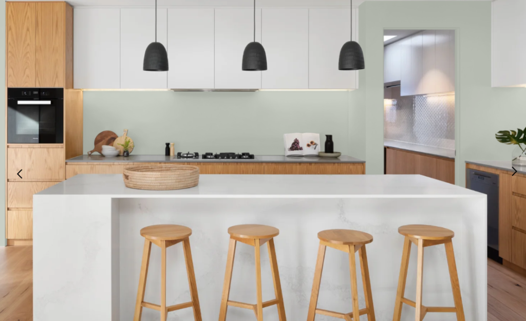
It has enough warmth to work with wood and woven textures, so it’s popular in living rooms and coastal cottages as well. Gray Wisp is also used on kitchen or bathroom cabinets – one home décor blogger even praises it on “walls, but also…on cabinets; it brings just enough color to feel interesting”. Because its undertone is green-tinged, designers often use it to balance warm wood floors or wicker accents.
Where to use Quiet Moments (1563)
is similarly used in restful areas. Many decorators recommend it for bedrooms and baths to evoke a spa-like calm. Its soft blue-green cast gives a coastal or “beachy” feel in bright rooms.
It’s also used on living room walls and even kitchen islands for a gentle pop of color. However, because it’s so light, Quiet Moments is seldom chosen for exterior siding or dark cabinets (it tends to look washed-out in very bright light).
In summary, both colors are most often used on walls in one or two rooms for a calming effect, rather than as bold accent pieces.
Coordinating Colors and Trim
Gray Wisp Coordinating Colors and Trim
It pairs nicely with soft neutrals and warm accents. Designers suggest creamy whites or light greiges for trim and neighboring walls (Benjamin Moore Dove Wing OC‑18 or even White Dove OC‑17).
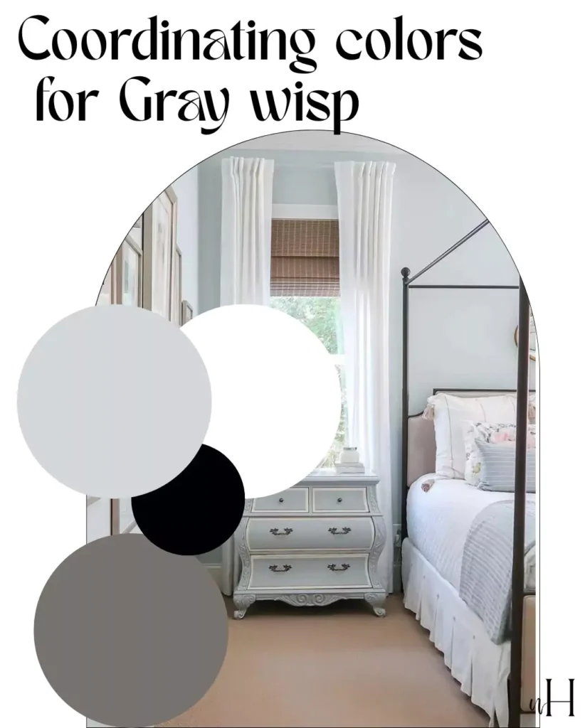
It also harmonizes with natural materials – light oak, bamboo, or seagrass complement its greenish tone. To liven a room, accent colors like navy blue, charcoal gray or deep forest green can be used in furniture or decor. Warm metals (brass or antique gold) and tan leather add a cozy touch to Gray Wisp’s cool base. In most cases white trim is used because its a perfect contrast with gray wisp.
Quite Moments Coordinating Colors and Trim
Paired with bright or off-white trim (e.g. Chantilly Lace OC‑65, Simply White OC‑117 or White Dove OC‑17) to keep the look clean and airy. Light grays and greiges (Sherwin Williams Agreeable Gray, BM Sea Salt 1564, etc.) also coordinate well, maintaining a soft palette.
For accent colors, soft yellow, coral or teal can add warmth and contrast. White or very pale trim is ideal, bright white trim with Quiet Moments to accentuate its cool hue. It totally depends on your style and maybe weather
Overall, Quiet Moments works with any decor that suits a “beachy” or spa-inspired theme (pale woods, wicker, linen fabrics, and brushed nickel/chrome fixtures).
Real-Life Examples
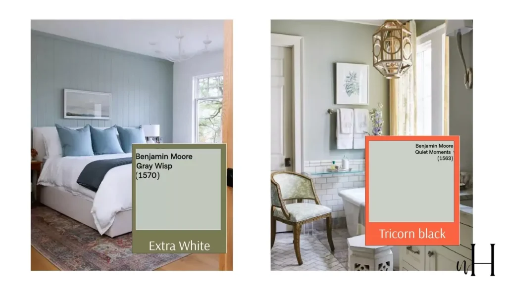
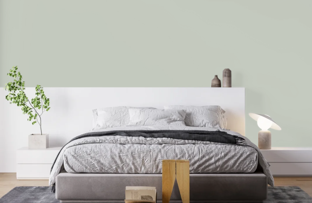
A bedroom using Gray Wisp on an accent wall. In this real-home shot, Gray Wisp reads as a soft green-gray that harmonizes with white bedding and warm wood trim. The color looks clean and calm – exactly as described by designers: a “fresh and gentle” neutral that is neither too cold nor too warm.
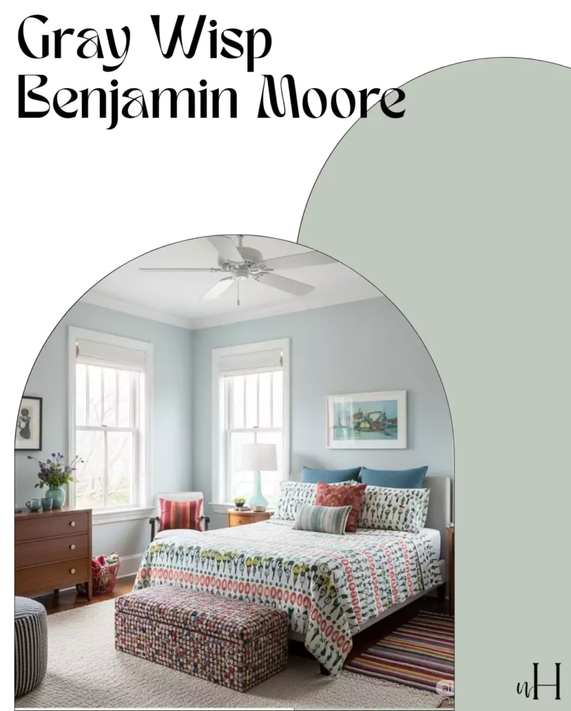
Notice how the bright natural light and white trim keep the room feeling open, and the greenish hint in the paint complements the natural wood door.
| Color | Modern | Traditional | Contemporary | Transitional |
|---|---|---|---|---|
| Gray Wisp | ✓✓✓ | ✓✓ | ✓✓✓✓ | ✓✓ |
| Quiet Moments | ✓✓ | ✓✓✓ | ✓✓ | ✓✓✓✓ |
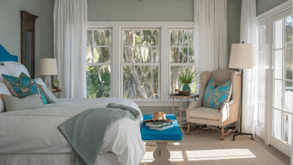
A master bedroom painted Quiet Moments. Here, the walls are Quiet Moments under bright daylight. The pale blue-gray appears almost white, lending an airy, serene feel. This matches descriptions of Quiet Moments as a “soothing blue-gray” that “radiates calmness”.
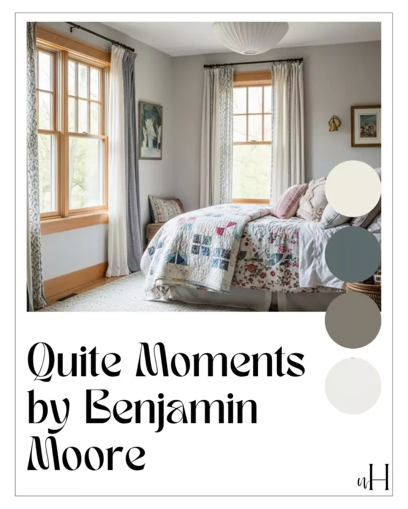
The photo also illustrates common trim usage: crisp white molding and bed linens emphasize the color’s muted tone. Designers often caution that in such bright light Quiet Moments can look very pale (almost washed out), which is why warm accents (the wooden stool and gold mirror frame) and white trim are used to balance the space.
Expert and User Impressions
Industry experts and bloggers praise both colors for their calming effects and versatility. Gray Wisp is frequently cited as an easy-to-live-with neutral. Opple House calls it “fresh and gentle without being too cool or too warm” and notes that it feels “light and airy” even when used wall-to-wall.
They report that it “blends well with many styles”, suiting everything from modern minimalism to cottage/farmhouse decor. Gray Wisp’s green undertone as a plus, saying it “stops the blue-gray part from feeling cold” in the space. In color‑trend roundups, Gray Wisp regularly appears among “best blue-gray” picks for its balanced neutrality.
Quiet Moments garners similar acclaim for serenity. Ring’s End Paint calls it “a soothing blue-gray” that creates a “tranquil” backdrop. Blogger Nikki’s Plate notes it’s “one of the most popular pale blue paint colors” right now, ideal for a bedroom’s calm ambiance.
She emphasizes that it “isn’t so striking” that it feels juvenile; instead it delivers a subtle coastal vibe. Quiet Moments as popular in spa-like, muted palettes, often comparing it favorably to other blue-greys (noting it’s slightly bluer than Sherwin-Williams Silver Strand, for example).
In surveys and forums, many homeowners say Quiet Moments makes rooms feel “peaceful” and “brighter” under daylight, while Gray Wisp is praised for being “warm but not yellow,” and easy to pair with wood and white trim. In short, both colors are celebrated for their gentle, calming effect and broad appeal in home decor.
Benjamin Moore Gray Wisp Bathroom
Benjamin Moore Gray Wisp Bedroom
Benjamin Moore Gray Wisp Cabinets
Benjamin Moore Gray Wisp Living Room
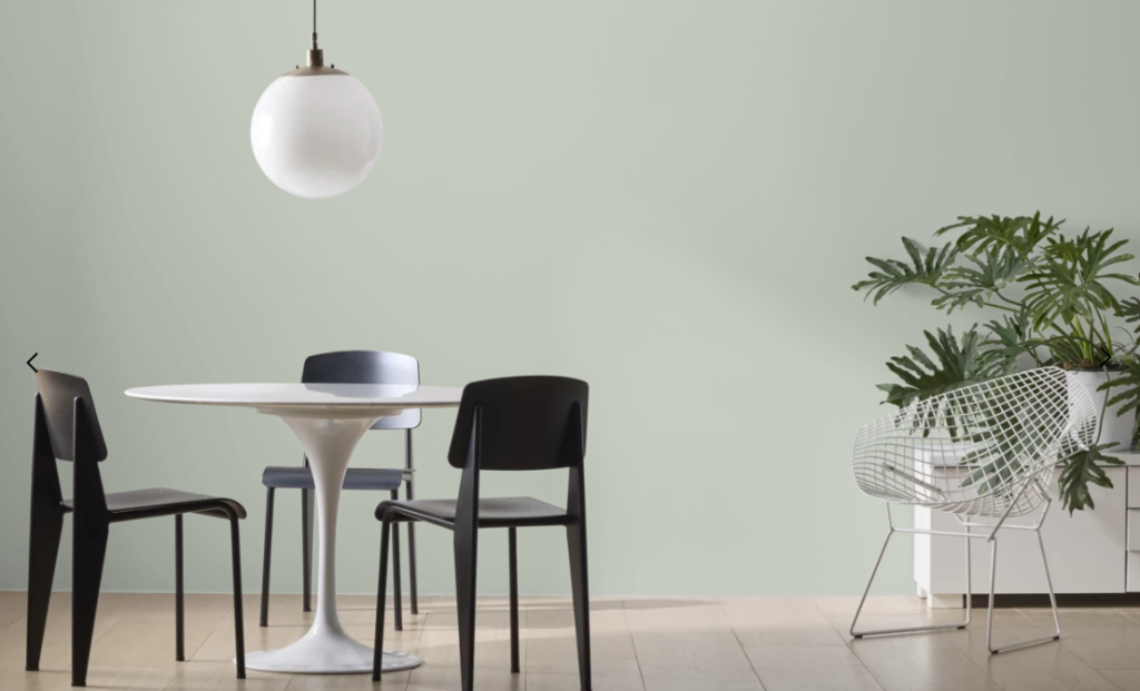
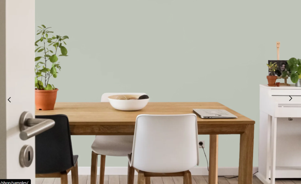
Benjamin Moore Gray Wisp Dining Room
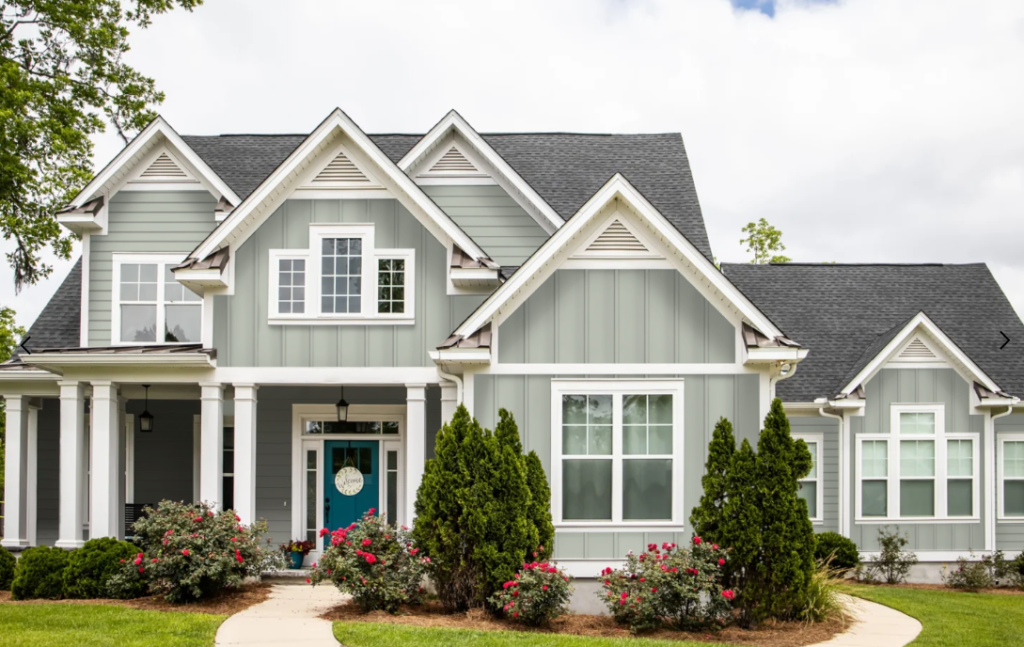
Benjamin Moore Gray Wisp Exterior