
Cerise (SW 6580) is a paint color from Sherwin-Williams. It is a warm, vibrant pink-red.Its “a captivating and vivacious shade” with playful charm. The name Cerise means cherry, and this color looks like a deep cherry pink.
It belongs to the red family of colors, so it feels rich and warm. Cerise is not a pale or soft pink – it is strong and bold. Because of this, Cerise makes a room feel lively and cheerful.
People often use it when they want a bright pop of color or an energetic mood in a space. For example, painting one wall Cerise can instantly add fun and warmth to a room.
Undertones of Cerise SW 6580
Each paint color can have hidden “undertones” – faint hints of another color inside it. Cerise’s undertone is a warm red. In other words, Cerise is a pink that has a bit of red mixed in. Sherwin-Williams describes it as a “warm, saturated pink with distinct red undertones.” This red tint makes Cerise look deeper and richer.
Mix a little red paint into pink; that red push is the undertone. The red undertone in Cerise makes it glow warmly rather than looking cool. Because of this hidden red, Cerise looks vibrant like a jewel. In everyday terms, when you see Cerise on the wall, you notice a strong pink color with a subtle reddish base. That is why Cerise feels very warm and lively rather than icy or pale.
LRV of Cerise SW 6580
LRV is a number that tells us how much light a color reflects – basically how bright or dark it is. White has an LRV of 100 (it reflects almost all light), and black has an LRV of 0 (it reflects none). Cerise has an LRV of about 9.6 (roughly 10%). This is very low on the scale, which means Cerise is a dark color. In simple terms, Cerise absorbs most light rather than reflecting it.
Because of this low LRV, a wall painted Cerise will look deep and bold. Dark colors like Cerise can make a room feel cozy or smaller because they absorb light. If you put Cerise in a room, it will not make the space bright, but it will give a warm, intimate feel. Designers note that such a low LRV places Cerise in the darker category of colors.
Mulberry Color by Benjamin Moore 2075-20
Appearance in Different Lighting
Cerise can change its look depending on the light. In bright natural light (like daylight), the red undertone in Cerise becomes very obvious. The color appears bright and lively, with a clear pink-red glow.
In dim or artificial light (like evening lamps), Cerise will look darker and more dramatic. For example, daytime sun might make Cerise look like a strong bubblegum pink, but at night under warm bulbs it can look like a deep rose-red. Because of this, it’s a good idea to test Cerise on a wall and watch it at different times of day. This way, you can see how the color shifts – sunny light brings out the pinkiness, while low light makes it look richer and deeper.
Hex Code
Every color has a hex code used in digital designs. Cerise’s hex code is #99324E. If you type “#99324E” into a color picker, you will see the exact Cerise shade. On a screen, it appears as a strong, warm pinkish-red. Keep in mind that screen colors can look a bit different from real paint on a wall. But #99324E is the official digital code for SW 6580 Cerise.
RGB
In digital color, RGB stands for Red, Green, Blue. Cerise’s RGB code is (153, 50, 78). This means Cerise is made of 153 parts red, 50 parts green, and 78 parts blue light.
The largest number is red, which is why the color is mostly red-pink. In plain terms, if you mix a lot of red light with some blue and a little green, you get Cerise. The high red value matches how Cerise looks: a rich red-pink shade.
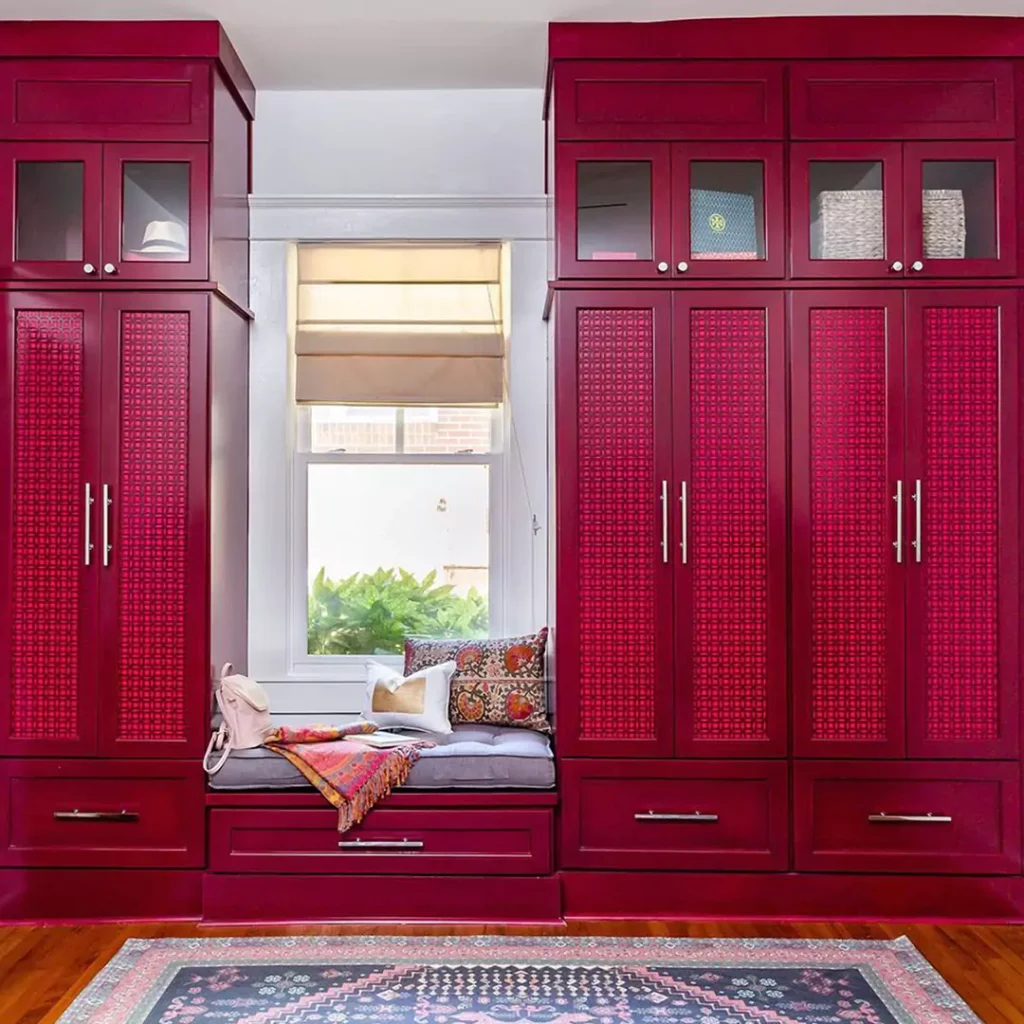
Cerise SW 6580 In the Bedroom
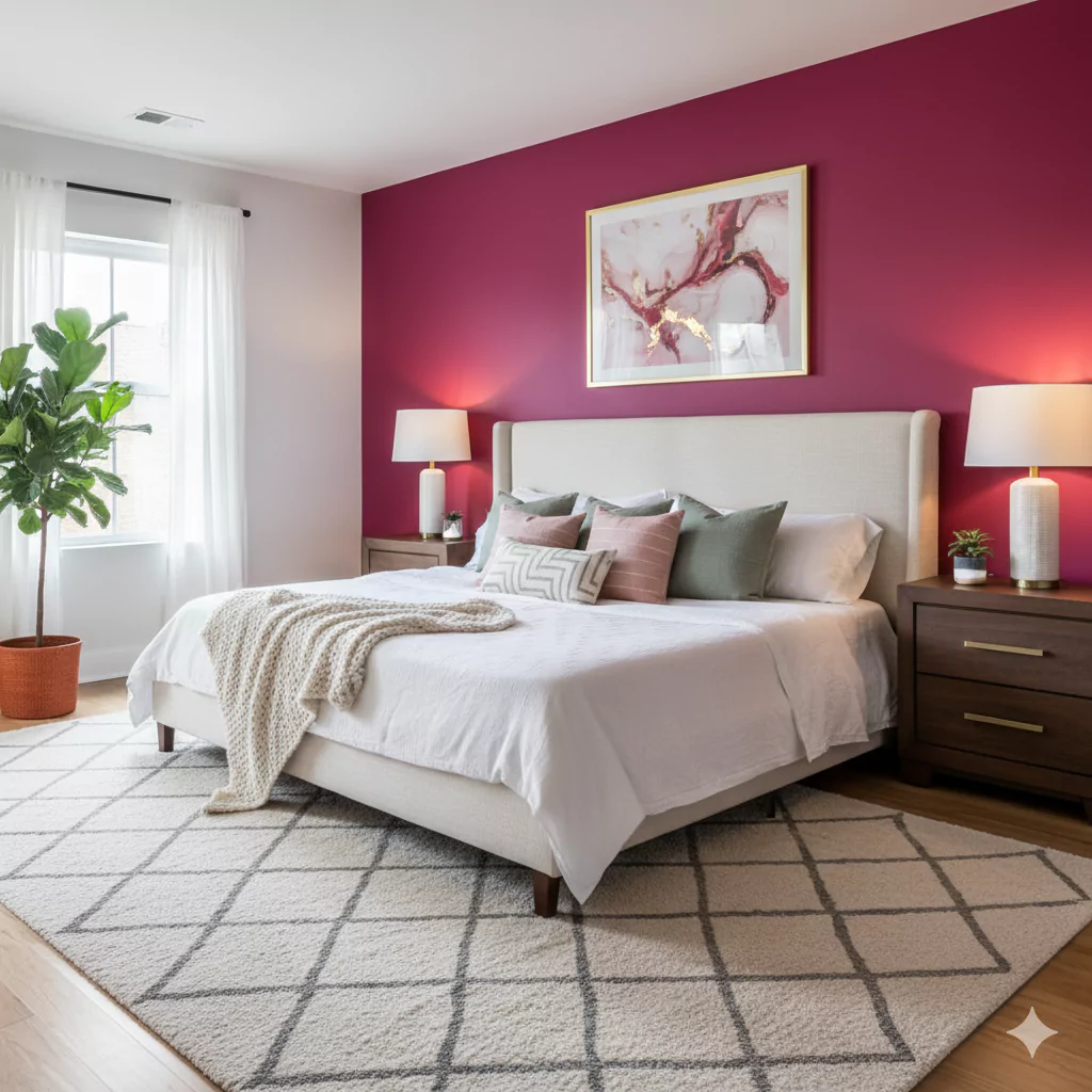
Cerise used as an accent wall in a bedroom. The warm pink-red makes the room feel cozy and lively. In a bedroom, Cerise adds warmth and energy. In the photo above, you see Cerise on one wall. It makes the space feel fun and inviting.
Using Cerise on just one wall (an “accent wall”) in a bedroom.
This way the color pops without overwhelming the whole room. For example, Cerise behind the bed can be a bold backdrop, while the other walls stay light. Cerise also works well in a child’s or teenager’s bedroom. Its playful, energetic nature gives a cheerful vibe. To keep things balanced, use white or light bedding and furniture. This light furniture plus the bright Cerise wall will make the room feel happy and cozy, not dark or small.
Cerise SW 6580 Kitchen
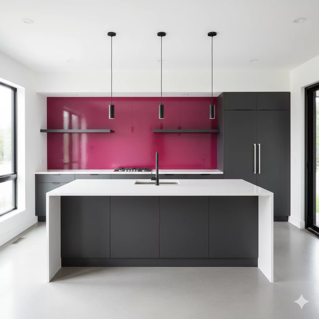
A kitchen with Cerise-colored cabinets. Painting cabinetry Cerise adds a retro, lively accent without covering all surfaces. Cerise can be fun in kitchens too, especially in small doses. The image above shows kitchen cabinets painted in Cerise. This gives the kitchen a bright, retro look. Cerise is often used on kitchen cabinets or trim rather than every wall.
Sherwin-Williams even notes that kitchen cabinets are a common place for bold reds like Cerise. Using Cerise on just the cabinets (with white walls or counters) makes the color pop without making the room too dark. It makes the kitchen feel lively and unique. To keep balance, pair Cerise cabinets with neutral colors around (white, gray, or wood finishes). This way the pink-red stands out as an accent and the space still feels open and fresh.
Living Room Cerise SW 6580
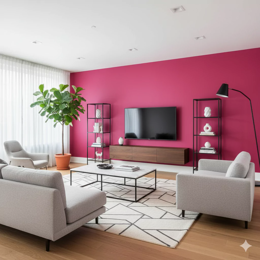
A living room with a Cerise accent wall. The pink-red wall adds warmth and excitement while the other walls stay neutral. In a living room, Cerise is usually an accent, not a wall-to-wall paint. The photo above shows one wall in Cerise behind the sofa. This creates a warm, energetic focal point. Experts say bright colors like Cerise work well on a single wall in living spaces.
The other walls are kept light (white, cream or soft gray), so the Cerise wall really stands out. This strategy makes the room feel vibrant but not overwhelming. A Cerise accent wall can make the living area feel lively and modern. Use light or neutral-colored furniture and curtains to balance the brightness. That way, Cerise adds style and flair without making the room feel dark.
Bathroom
Bathrooms are usually small, so using Cerise there requires care. A bathroom painted all Cerise might feel very cozy or even too dark because Cerise is deep and rich. A common choice is to use Cerise on just one area – for example, paint one wall or a vanity cabinet Cerise and keep the rest white or light tile. In a bathroom, a little bit of Cerise goes a long way.
With bright lighting and white fixtures, Cerise can bring warmth to a bathroom. For instance, a Cerise vanity or a strip of accent wall behind the mirror would look stylish. The key is to balance it with white or light gray surroundings so the pink-red doesn’t overwhelm the small space.
Cabinets
Beyond kitchens, Cerise can be used on other cabinetry or built-ins. As noted above, Sherwin-Williams highlights using bold reds on cabinets and shelves. You might paint a bathroom vanity, built-in shelves, or furniture Cerise for a statement look. For example, a Cerise-painted dresser or armoire becomes a focal point in a room.
In kitchens or bathrooms, Cerise cabinets paired with white countertops or walls give a retro and energetic feel. The picture above of the kitchen cabinets is an example. In any case, Cerise on cabinets should be matched with light or neutral surroundings to balance its intensity.
Exterior
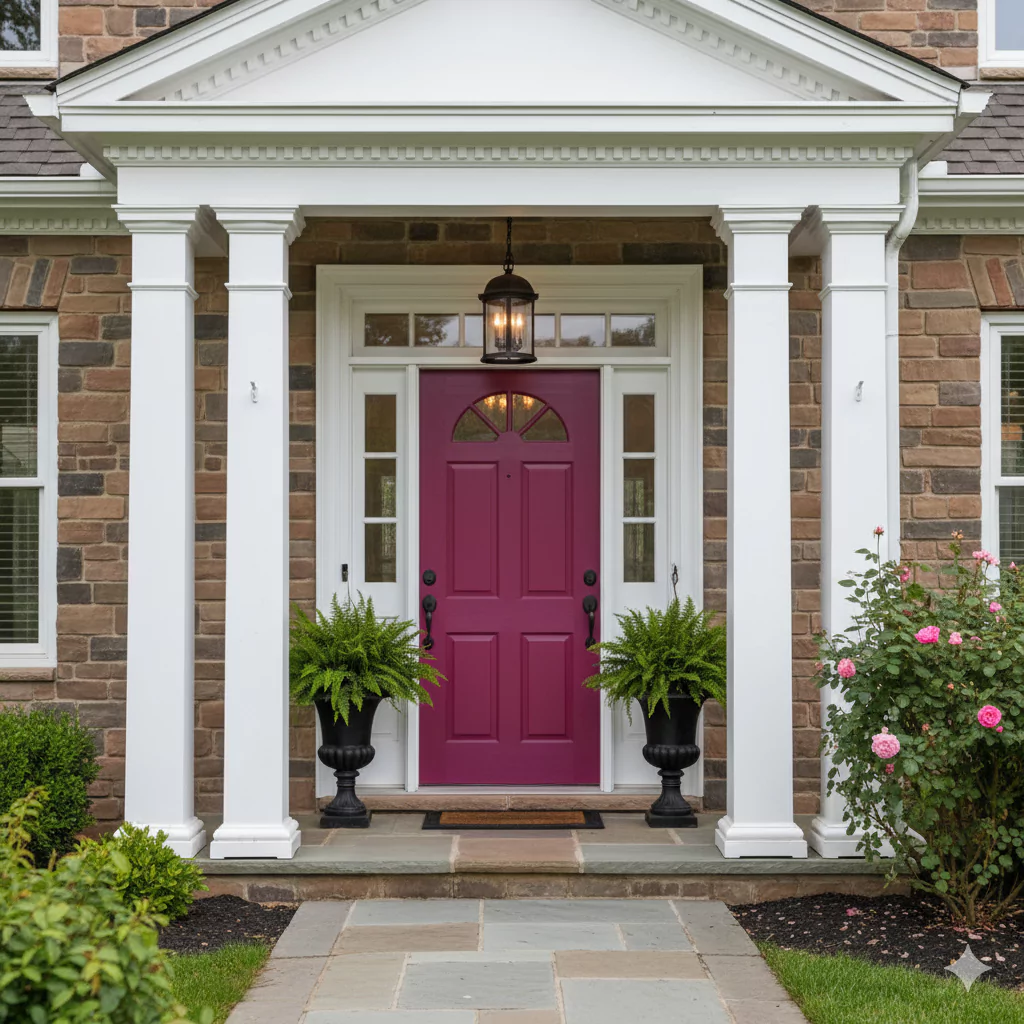
Cerise as an exterior accent. Here Cerise is used on house trim and a walkway, creating a fun pop against neutral walls. Using Cerise on the outside of a house can make a bold statement. The image above shows Cerise on an entry walkway and some trim of a modern home. Cerise is quite bright for exteriors, so it’s usually used as an accent color rather than on every wall.
For example, a front door, shutters, trim, or fence painted Cerise would stand out beautifully against a neutral (white, gray, beige) main color. This creates a fun, eye-catching look. Always pair Cerise with neutral siding or stone. That way, the pink-red highlights (like a Cerise door or porch trim) pop and give the home a lively, welcoming curb appeal.
Coordinating Colors of Cerise SW 6580
Cerise pairs well with several other hues. Here are some color ideas that work nicely with Cerise (all Sherwin-Williams examples):
Neutral Whites: Creams and soft whites let Cerise be the star. For instance, Shoji White SW 7042 or Alabaster SW 7008 create a calm backdrop so Cerise really shines.
Soft Grays: Light to medium gray walls can balance Cerise’s warmth. Dovetail SW 7018 or Repose Gray SW 7015 give a modern, subdued contrast.
Deep Darks: Dark colors make Cerise pop even more. Using Tricorn Black SW 6258 or Naval SW 6244 nearby will amplify Cerise’s richness. For example, a black trim or navy sofa against a Cerise wall can be dramatic and chic.
Earthy Greens: Muted green and sage tones complement Cerise beautifully. Think of greens like Evergreen Fog SW 9130 or Clary Sage SW 6178. These cooler, natural greens create a pleasing contrast and ground the pink-red.
Using these colors (neutrals, gray, black, green) will coordinate well and make Cerise feel part of a complete palette.
Soft Palette
For a gentle, soft look, pair Cerise with light, muted colors. Good choices include pale neutrals or pastels. For example, soft beige, warm gray, or a very light blush-pink will keep the vibe calm. A pale mint green or light sky blue can also softly balance the pink. These gentle colors make Cerise feel less intense. Picture Cerise trim or a small wall alongside walls of creamy white or light gray—this creates a soothing, pretty palette.
Bold and Muted Palettes
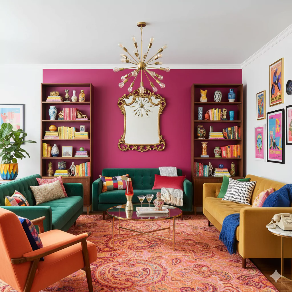
Bold Palette: Use strong, rich colors with Cerise for a dramatic effect. Deep jewel tones or blacks work well. For instance, pairing Cerise with black or navy blue adds bold contrast. Think of a Cerise room with an emerald-green couch or a black accent wall. Gold or mustard-yellow accents also make a lively, vibrant combination. The bold palette is bright and high-energy.
Muted Palette: Use soft, earthy tones to tone Cerise down. Muted greens (like sage or olive) and warm grays create a natural, calm scheme. For example, a Cerise accent chair with soft green throw pillows and light wood furniture gives a cozy, grounded feel. Beige, taupe, or clay-colored accents also mute the brightness. The muted palette feels more relaxed and subtle than the bold palette.
Each of these palettes changes the mood of Cerise. Bold contrasts emphasize its energy, while muted, soft tones make it feel more gentle. By choosing coordinating colors, you can match Cerise to the style you want, whether that’s playful and bright or calm and elegant.


