
Sherwin-Williams Divine White SW 6105 is a warm off-white with a subtle beige cast. Although marketed as a “white,” it reads more like a soft neutral beige.
Divine White has a gentle warmth and glow to interiors without feeling stark or cold.
If you ask me a perfect beige, then Divine White is perfect beige that dont much warm and cold.It’s balanced beige.
In this blog post i will share my experience with SW Divine White ,its undertones, light effect,also coordinate colors and use in different rooms.+ REAL HOME IMAGES.
11 Best Light Beige Paint Colors According to Interior Designers
Shoji White SW 7042 Sherwin-Williams:Review After 1 Year of testing
Undertones of Divine White
Divine White has beige and creamy undertones. It belongs to the yellow hue family, with a warm beige cast that lends a sun-kissed glow.
In balanced lighting Divine White reads as a soft, warm neutral (not a true white), but it can occasionally pick up very faint pinkish or peach tones due to its orange-leaning warmth.
Overall, the undertones are warm beige rather than pure yellow or pink.
11-Best Sherwin Williams Paint for Cabinets and Trim+Side by Side Comparison
LRV of Divine White
Divine White has a fairly high light reflectance – approximately LRV 72. This places it between the realms of off-white and very light beige.
While not as bright as the whitest paints (LRV ~80+), an LRV of ~72 means Divine White still reflects plenty of light and will lighten a room.
Compared to many warmer neutrals, its LRV is on the higher side, so it reads relatively light in most settings.
Effect of Lighting
Like many warm neutrals, Divine White’s appearance shifts with light. In cool north-facing or flat east light, Divine White retains warmth and helps balance the cold light, looking only mildly warm and “passive.”
In bright south or west sunlight, its warm tones are amplified: the paint appears warmer and more golden under strong yellow light. In evenly lit rooms, Divine White reads as a light warm beige.
However, if lighting is unbalanced (for example dim light on one side), Divine White can sometimes appear slightly peachy or flesh-toned.
In very low light its beige-beige undertones dominate and it never looks stark white. In short, Divine White will hold onto its warmth in any light, but appears brightest in balanced light and warmer in strong sunlight.
Untold Aspects of Dover White SW 6385 Sherwin-Williams
Hex Code
The hexadecimal color code for Divine White SW 6105 is #E6DCCD. This light, warm beige hex value corresponds exactly to Divine White’s formula.
RGB Values
In RGB terms (0–255), Divine White is (230, 220, 205). In normalized form that’s approximately (0.902, 0.863, 0.804).
The red (230) and green (220) components are high, with a slightly lower blue (205), reflecting its warm beige tone.
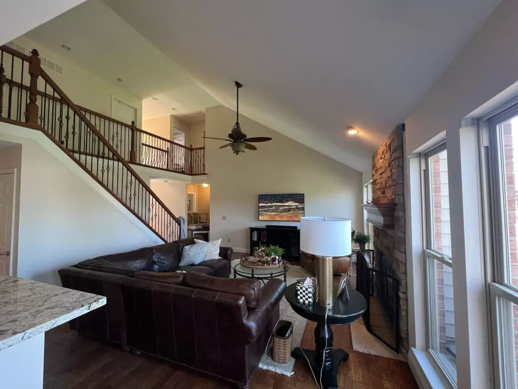
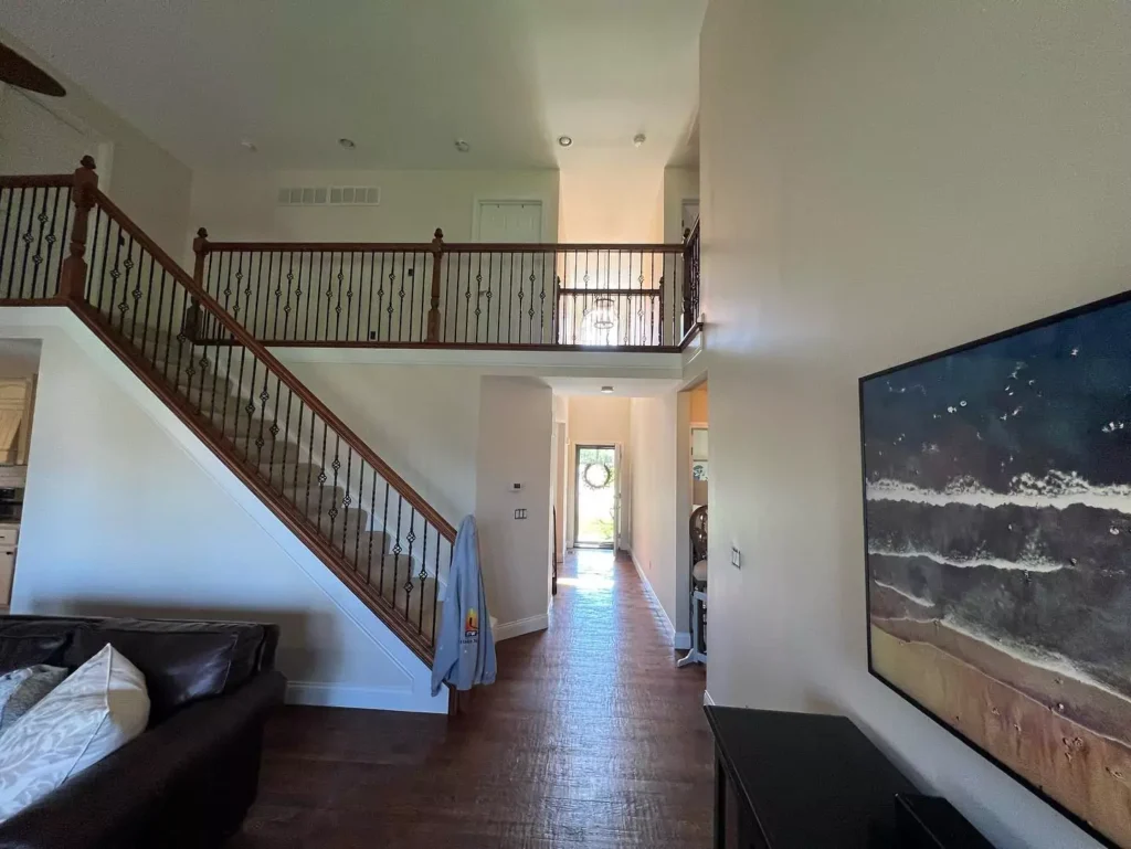
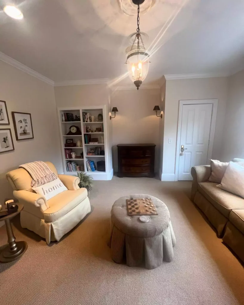
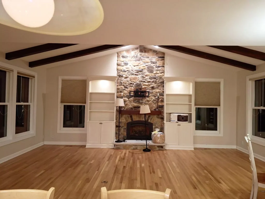
Divine White Living Room
Divine White makes living rooms feel cozy and welcoming. Its warm creamy beige tone adds soft color without making the space look dark or heavy.
In a living area Divine White walls create a light-filled, homey vibe: for example, paired with natural wood furniture and crisp white trim it yields a classic, inviting look.
Because it’s warm, Divine White particularly complements wood floors, stone fireplaces or warm accent colors in a living room.
In sum, Divine White on living room walls gives a gentle warmth that keeps the room bright yet cozy.
SW Divine White Bedroom
Divine White works well on bedroom walls, especially where a soft neutral backdrop is desired. It’s warm enough to feel soothing, so a Divine White bedroom feels calming and inviting. You can use Divine White on all walls in a well-lit or spacious bedroom.
For a more dramatic look, paint most walls Divine White and choose one wall (e.g. behind the bed) a darker accent color – this makes the room elegant yet still cozy.
In smaller or dimmer bedrooms, Divine White on every wall keeps the space from feeling too dark; its warmth also helps counteract any clinical feel from white bedding.
Overall, Divine White on bedroom walls produces an elegant, yet very livable ambience.
In the Bathroom
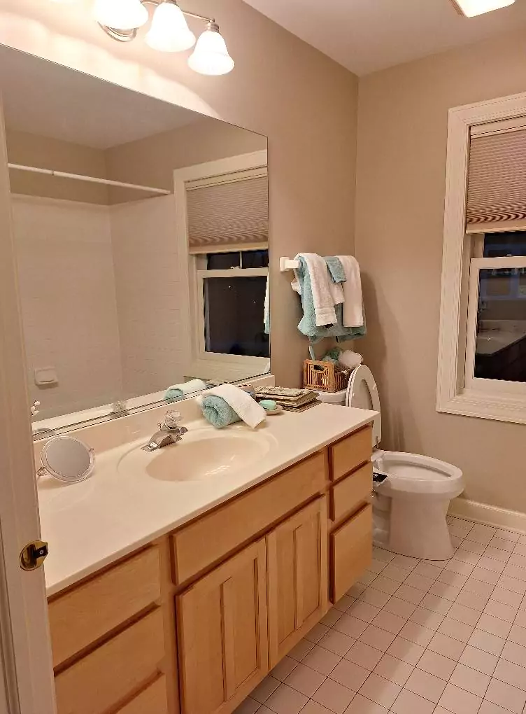
Bathrooms tend to be small or have cool lighting, so Divine White is best used in moderation. A popular choice is Divine White on cabinets, trim or vanity facing, rather than all four walls.
For example, painting the vanity or built-in drawers Divine White against otherwise white walls makes the space feel warmer and less sterile.
In a very large, sunlit bathroom you could use Divine White on an accent wall, but in tight, dark bathrooms it can look more saturated and even a bit pinkish.
In short, Divine White works as a softer accent in bathrooms – e.g. on cabinets or as one wall – to warm up the space without overpowering it.
In the Kitchen
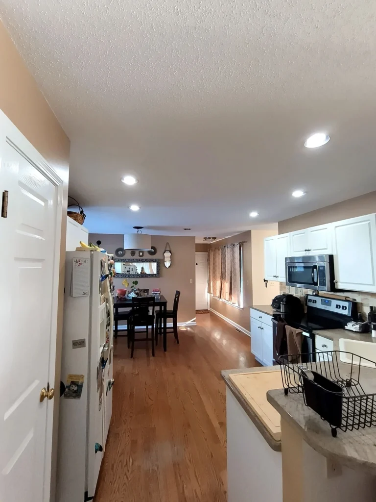
Divine White adds gentle warmth to kitchens without the heaviness of a true beige. It is often used on cabinets (see next section) or on walls to keep the kitchen feeling bright yet warm.
Because its warmth is subtle, Divine White will not make a kitchen feel “muddy” – it keeps the room light. It looks particularly good with natural stone countertops or light wood cabinets, as it ties in with those warm tones.
However, Divine White’s slight peachy undertone can become noticeable if paired with greenish elements (some green tiles or green countertop accents can make Divine White appear a bit peach).
In most kitchens, Divine White walls or cabinetry create a fresh, clean-feeling space that is warmer than plain white but still neutral enough to coordinate easily.
Divine White Cabinets
Divine White is a popular cabinet color, especially in kitchens. On cabinetry it provides just a hint of warmth so cabinets appear creamier than stark white.
For example, Divine White cabinets look clean and elegant alongside white or cream countertops and brass or black hardware.
Keep in mind, though, that Divine White on cabinets can appear slightly flesh-toned under certain lighting or if adjacent surfaces have greenish tones.
In general, Divine White cabinets will look bright and warm – they won’t make the kitchen feel heavy or dated.
When coordinating, many designers suggest pairing Divine White cabinets with crisp white or very pale trim to avoid too much yellowness.
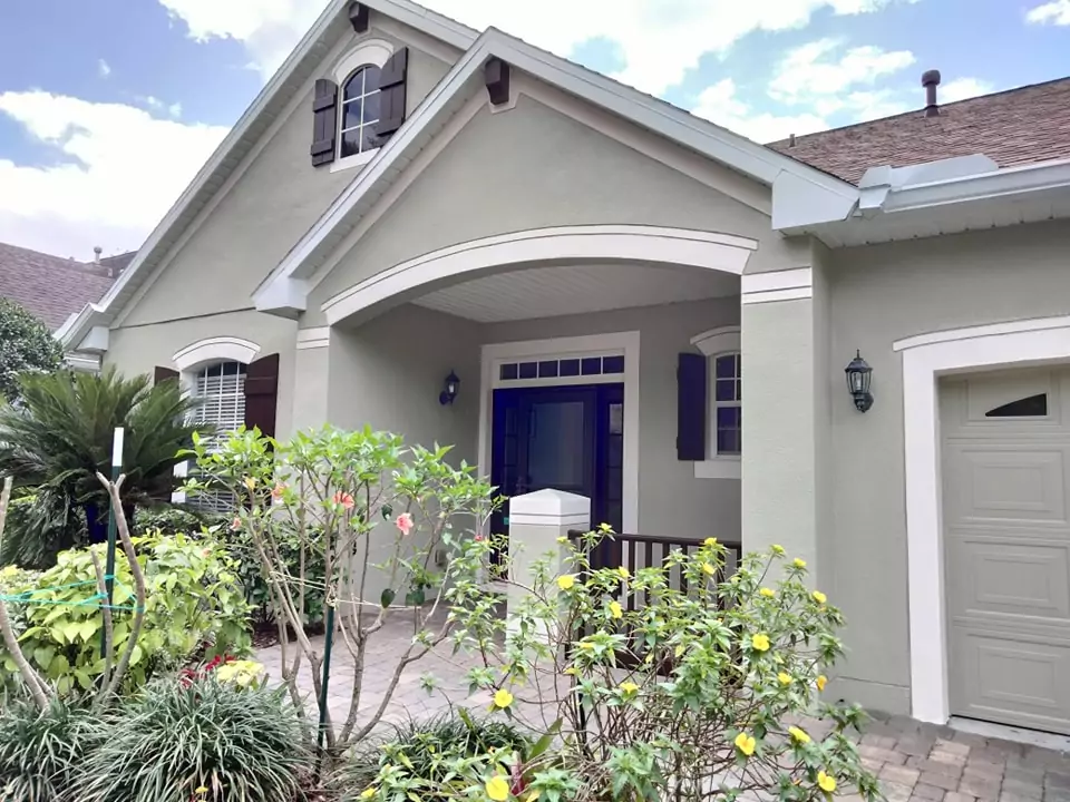
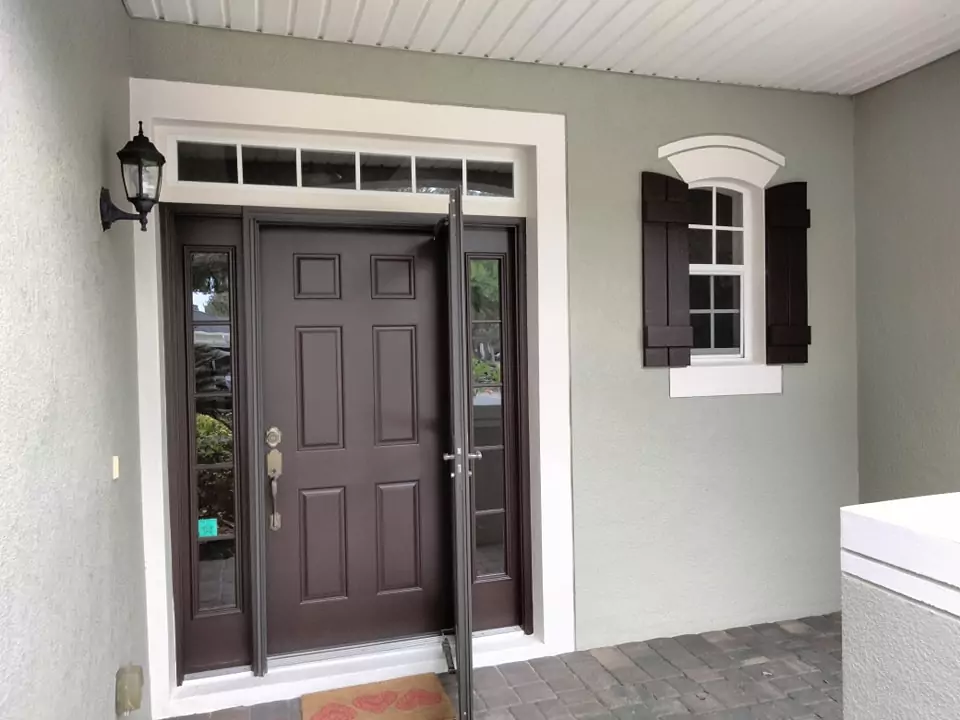
Exterior with SW Divine White
Divine White can be used on exteriors, but with caution.
In full sun its high reflectance makes it look almost pale cream – it lacks the depth to be a strong sunlight color.
If used on an exterior that is heavily shaded (e.g. a home with large trees or a covered porch), Divine White can appear as a soft creamy-beige (almost a warm tan) which is very pretty.
On an open, sunlit facade, however, Divine White will look much brighter than expected and may feel too washed-out.
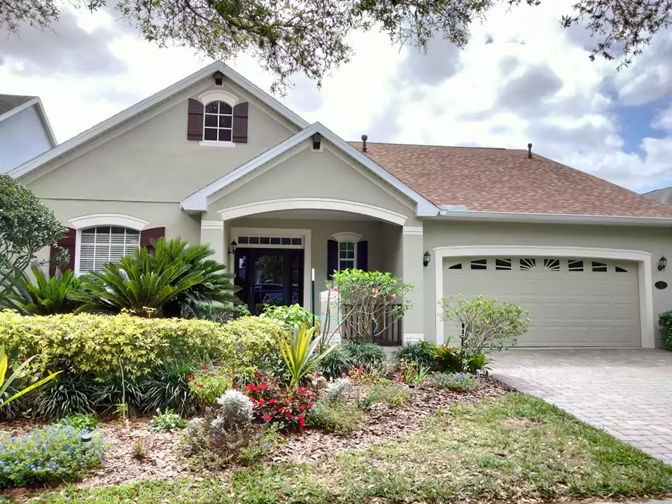
It tends to work best on exteriors in Mediterranean or stucco-style homes and pairs beautifully with terra-cotta roofs or brick accents. In summary, Divine White on the exterior yields a creamy beige look (in shade) but can lose its character in harsh sunlight.
Coordinating Colors of SW Divine White
Divine White’s warmth makes it versatile with many color mates
. For a monochromatic neutral palette, consider slightly darker beiges and tans with similar undertones – for example, Wool Skein (SW 6148) and Softer Tan (SW 6141) are warm earthy hues that layer nicely with Divine White.
As contrast accents, deeper colors work beautifully: a rich dark charcoal-brown like Urbane Bronze (SW 7048) provides dramatic contrast, and a soft muted green-gray like Sea Salt (SW 6204) adds a calm pop of color alongside Divine White.
For trim or millwork, a crisp, clean white such as Pure White (SW 7005) highlights Divine White’s warmth without introducing competing tones.
Other complementary tones include earthy khakis or camel shades (e.g. Relaxed Khaki, Camelback) and gentle blues or greens in mid-tone depth.
In practice, Divine White looks great when paired with warm neutrals (greiges, tans, soft greens) and dark accents (deep brown, navy, forest green) to balance its creaminess.
Soft (Muted) Color Palette
When building a soft, muted palette around Divine White, lean on gentle grays and subdued hues. Muted green-grays darker than Divine White create a serene effect.
Subtle greige paints with a hint of green (rather than golden beige) also pair well. Soft blue-grays in the medium tone range make nice calm accents without overwhelming Divine White.
Essentially, any dusty, earthy neutral that is darker than Divine White will blend into a tranquil, monochromatic scheme.
Bold Accent Colors
For a bolder look with Divine White, choose deeper jewel or earth tones. Dark emerald, hunter greens or deep teals make striking accent walls against Divine White’s warmth.
Rich chocolate or espresso browns and even a black (for trim or furniture) will create high contrast and a dramatic vibe. Deeper gray-greens and charcoal grays also serve as bold complements.
In short, strong, rich colors – especially medium-to-dark greens and browns – act as “wicked” accent hues that play off Divine White’s warm base.
Just be mindful that any cooler accent color should be darker than Divine White to avoid appearing out of place.
Frequently Asked Questions
What color is similar to Divine White?
Some off-white/beige paints from other brands are very close to Divine White. For example, Behr White Mocha, Benjamin Moore Cocoa Butter, Farrow & Ball Lime White, and Valspar Foxtrot are all noted to look much like Divine White.
(Within Sherwin-Williams, Creamy SW 7012 or Natural Choice SW 7011 have a similar feel but each differs slightly in lightness and hue.)
What is the difference between Natural Linen and Divine White?
Natural Linen (SW 9109) is noticeably darker and grayer than Divine White. Divine White’s LRV is about 72, whereas Natural Linen’s is lower (~66).
In practice, Divine White appears lighter and slightly more saturated, while Natural Linen looks deeper and more subdued. Both are warm off-whites, but Divine White will come across as brighter and more “glowing” compared to the richer, more muted Natural Linen.
Does Accessible Beige go with Divine White?
Yes, but with a contrast. Accessible Beige (SW 7036) is much darker (LRV ~58) and grayer than Divine White. Divine White (warm beige) will stand out as a lighter background next to the medium taupe of Accessible Beige.
They can be used together in a warm neutral scheme (for example, Accessible Beige walls with Divine White trim), but remember Accessible Beige is less saturated and noticeably deeper in tone.
What is the difference between SW Moderate White and Divine White?
Moderate White (SW 6140) is very close but slightly lighter than Divine White. Their saturation is similar, but Moderate White has a slightly higher value (LRV ~74 vs Divine’s ~72).
In other words, Moderate White reads a touch brighter/paler than Divine White, and both share the same warm-beige character.
What Sherwin-Williams paint color is like Benjamin Moore’s White Dove?
Sherwin fans often compare BM White Dove to Sherwin Cotton (a warm off-white) and Sherwin Alabaster (SW 7008). These two Sherwin whites have similar soft, warm undertones to White Dove.
(Other near-matches include Greek Villa SW 7551 and Pure White SW 7005, but Cotton and Alabaster are commonly cited as the closest SW equivalents.)
Is Swiss Coffee (BM) warmer than White Dove?
Swiss Coffee (Benjamin Moore OC-45) is very similar to White Dove but is slightly darker and a bit warmer.
Swiss Coffee has a lower LRV (~82 vs White Dove ~83) and tends to pick up a touch more cream/yellow (and even a hint of green) under light.
In practice, White Dove is brighter and a hair cooler, while Swiss Coffee can look just a shade “creamier” and warmer than White Dove.
Color Comparisons
Divine White vs. Creamy (SW 7012)
Both are warm, light neutrals but Creamy is lighter. Divine White’s hex is #E6DCCD (RGB 230,220,205) while Creamy is #EFE8DB (RGB 239,232,219).
Creamy has a higher LRV (about 81 vs Divine’s 72), so Creamy appears noticeably lighter and more neutral, whereas Divine is slightly deeper beige.
Creamy also is a bit more saturated, giving Divine White a subtly stronger warm cast.
Divine White vs. Natural Linen (SW 9109)
Divine White is lighter and more yellow-leaning. Divine White is hex #E6DCCD (RGB 230,220,205) versus Natural Linen #DFD3C3 (RGB 223,211,195).
Natural Linen’s LRV (~66) is lower than Divine’s ~72, so Natural Linen reads darker.
In summary, Natural Linen is a deeper, more muted beige, while Divine White is paler and brighter.
Divine White vs. Shoji White (SW 7042)
Shoji White is slightly lighter and cooler. Divine White has LRV ~72 and hex #E6DCCD, whereas Shoji White is around LRV 74 with a very slightly cooler tone. Divine White is more saturated, while Shoji White reads a bit grayer.
Both are warm off-whites, but Divine White will appear subtly more yellow-beige compared to the more subdued Shoji White.
Divine White vs. Alabaster (SW 7008)
Alabaster is much lighter and softer. Alabaster’s LRV is about 82 (vs Divine’s 72).
Divine White is a bit more saturated (warmer) and darker, whereas Alabaster reads almost a pure creamy white.
In practice Alabaster walls look brighter and more neutral, while Divine White retains a noticeably deeper beige tone.
Divine White vs. Natural Choice (SW 7011)
These two are very close. Their LRV values are nearly the same (around 72–73). Divine White is more saturated, so Natural Choice looks slightly more “worn-in” or gray by comparison.
Both share a warm undertone, but Divine White has a tad more warmth and contrast.
Divine White vs. Dover White (SW 6385)
Dover White is lighter and creamier. Dover White’s LRV is about 83, noticeably higher than Divine White’s 72.
This makes Dover White look brighter. Dover White has a subtle yellow tint, whereas Divine White looks more subdued beige.
In short, Dover White is a lighter, more cheerful creamy-white, while Divine White is deeper and more muted.


