Last updated on September 5th, 2025 at 01:40 pm
You must want REAL HOME IMAGES painted with Dover White paint ,that are unfilttered and real .
So in today’s blog post iam sharing Dover White paint color in real homes that obviously my clients love to have for a cozy and relaxing room.
I will share how it works in different lighting also in different rooms. Dover white LRV ,undertones and coordinating colors.
What are the Undertones of Dover White?
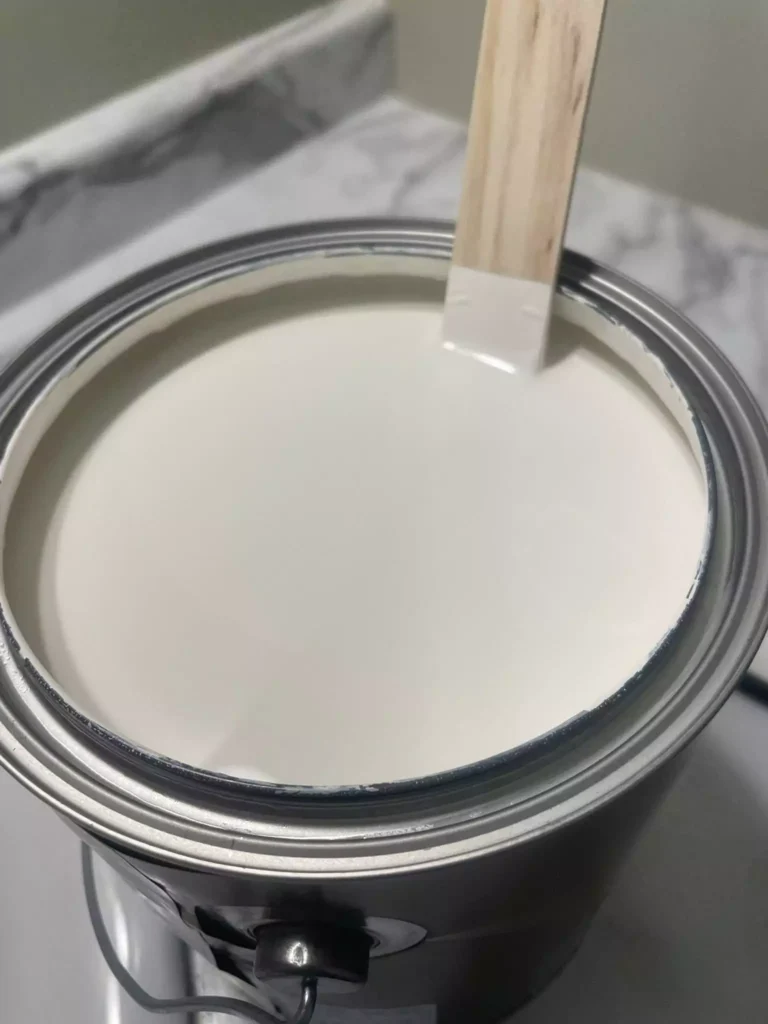
Sherwin-Williams Dover White is a warm, creamy off-white. Its base is warm (leaning toward yellow-beige) rather than cool.
As one of my clients notes, Dover White’s undertones “lean slightly toward yellow and beige,” giving it a soft, cozy character. In practice, Dover White’s golden-yellow cast is very noticeable – “Yellow, yellow, and… yellow” about its undertones.
This warmth makes Dover White feel inviting and reduces the starkness of a pure white, but it also means the color will visibly shift with lighting and nearby colors.
LRV of Dover White
The light reflectance value of SW Dover White is about 83%, placing it in the warm off-white category (not an ultra-bright white). This relatively high LRV means Dover White is light enough to keep rooms feeling open, yet not so bright as to be glaring.
In fact, one color consultant points out Dover White’s “LRV just over 82” – confirming the ~83 number – and calls it “white but not bright white,” noting it sits at the high end of the off-white range. In short, Dover White reflects plenty of light (LRV ~83) but retains warmth.
OTHER WHITE COLORS I USED IN DIFFERENT PROJECTS:
- Navajo White by Sherwin Williams(SW 6126)-My honest Review
- Frosty White (SW 6196) Sherwin Williams with 30+ REAL HOME IMAGES
- Sherwin-Williams Extra White vs Pure White: Which One is Right for You?
- How to Use Sherwin Williams Alabaster- Complete Review and Guide
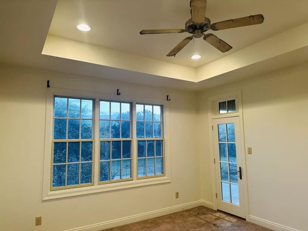
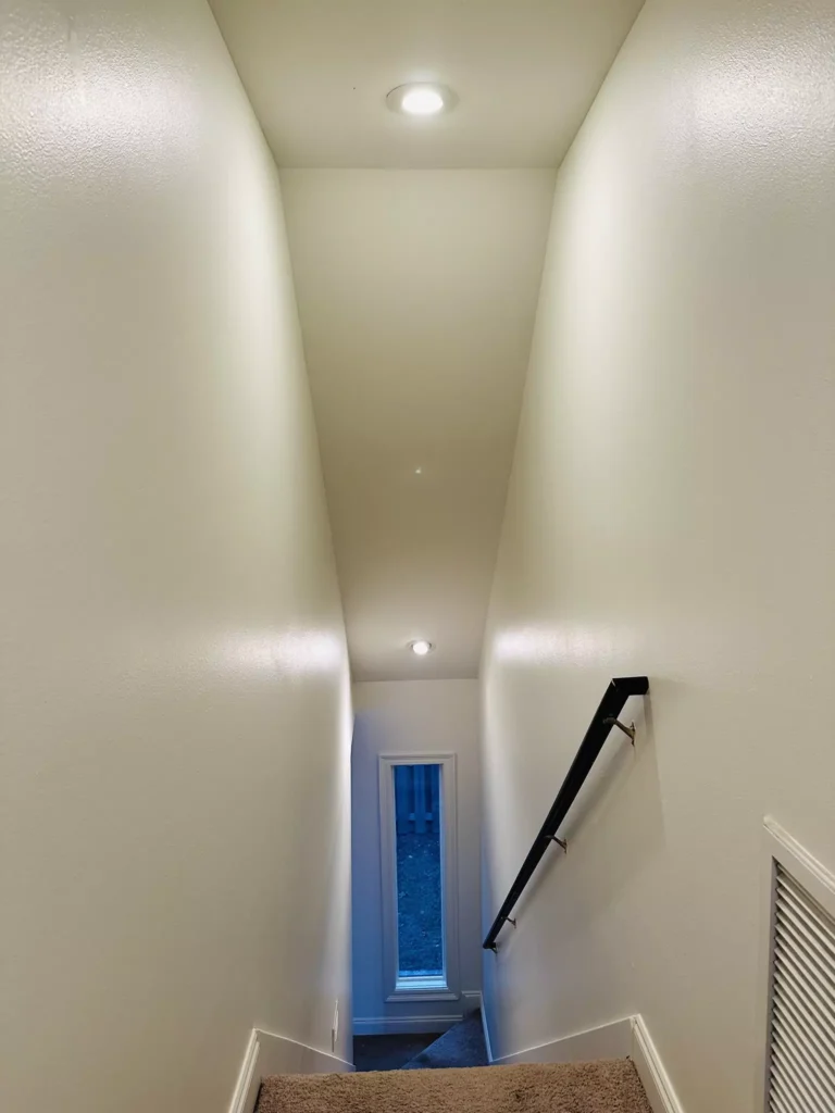
Appearance of Dover White in Different Lighting
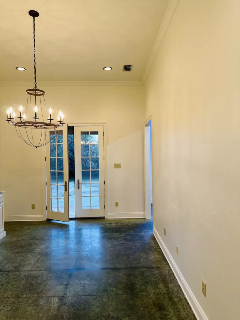
How Dover White reads in a room depends heavily on light. In bright natural light (especially south- or east-facing sunlight), its warmth comes forward: the color looks crisper and its yellow undertone becomes more apparent.
For example,Clara(my friend) observed that in sunlit rooms Dover White “appears brighter and crisper,” while in dimmer conditions “its warmth deepens,” creating a soft, cozy glow. Conversely, in north-facing or low-light spaces Dover White can look more creamy-neutral.
As Kylie m interior notes, “in north facing rooms, Dover White’s creaminess will be more prominent,” whereas in very sunny rooms its yellow “sunniness” is emphasized.
Overall, Dover White is quite “chameleon” – it can look like a very pale cream in shadow or a sunny white in direct light.
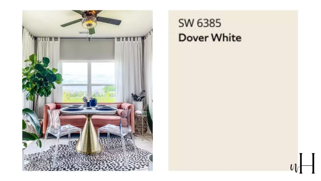
Dover White in Bedroom
When used on bedroom walls, Dover White creates a warm, tranquil atmosphere. Its soft yellow warmth makes spaces feel inviting rather than stark.
Designers often recommend Dover White for bedrooms (and living rooms) because its creamy softness keeps spaces bright without feeling cold. In a cozy, north-lit bedroom Dover White will register as a subtle, warm white, while in a bright, south-lit bedroom it will look more like a fresh, sunny white.
In either case, homeowners find it adds a gentle, homey feel to sleeping areas.
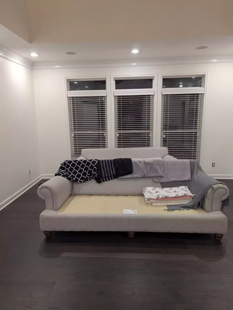
Living Room with Dover White
On living room walls, Dover White similarly offers a mellow, open feel. The color provides warmth underfoot and on furnishings, making living rooms feel cozy and welcoming.
I advise you, Dover White is a “perfect choice for walls in living rooms” because its creamy warmth “creates a cozy, inviting atmosphere” while still keeping the space light and airy.
Pairing Dover White walls with crisp white trim or natural wood tones accentuates the layered, subtle palette. In bright living rooms, the color reads clean and soft; in more shaded rooms its gentle warmth is more pronounced.
Dover White in Kitchen
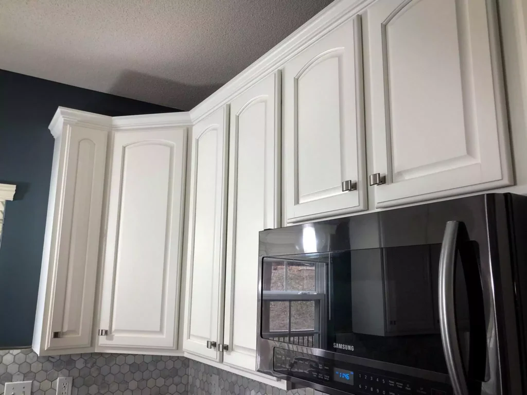
Sherwin-Williams Dover White is commonly used in kitchens, especially for cabinetry or walls. In well-lit kitchens Dover White maintains a light, fresh quality, but one must be careful: its yellow tint can be stronger under bright light.
For example, one color consultant cautions that Dover White can be “far too yellow for the average kitchen finish”, meaning it may look creamier than some homeowners expect. That said, Dover White cabinets are popular for achieving a soft, classic kitchen look.
It pairs well with both light and dark accents: for instance, Dover White cabinets create dramatic contrast next to black or dark granite counters, or blend seamlessly with lighter marble/quartz countertops for an airy feel.
When using Dover White in a kitchen, consider pairing it with neutral backsplashes or warm-wood elements. If the space is very bright, Dover White’s yellow cast becomes more evident, so balancing it with cooler hardware (e.g. stainless knobs, black island) can help neutralize the warmth.
Overall, Dover White can work beautifully in kitchens, but it’s wise to test it: under fluorescent or south-facing light it will appear warmer, while under softer or north light it looks more subdued.
Bathroom
In bathrooms, Dover White’s high reflectance and warm tone can help small or dark spaces feel fresh and clean. Even in a bathroom with little natural light, Dover White will “brighten it up” rather than feeling dingy.
Its LRV of ~83 means it bounces back a lot of light, keeping the room luminous. At the same time, its warmth prevents the space from feeling cold or sterile (as a pure white might).
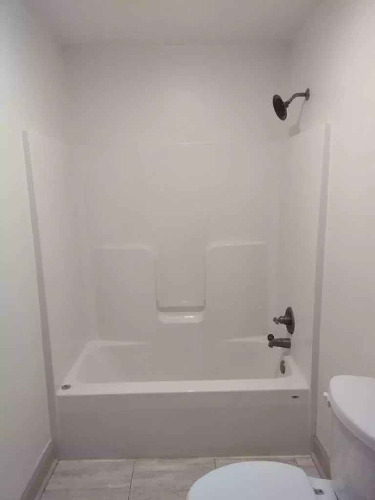
In practice, Dover White looks crisp and spa-like next to white fixtures, especially if paired with wood or marble accents. Designers often recommend Dover White for bathrooms to add light and warmth: in a north-facing bath its creamy tone shows nicely, while in a south-facing bath the color’s sunny side is revealed.
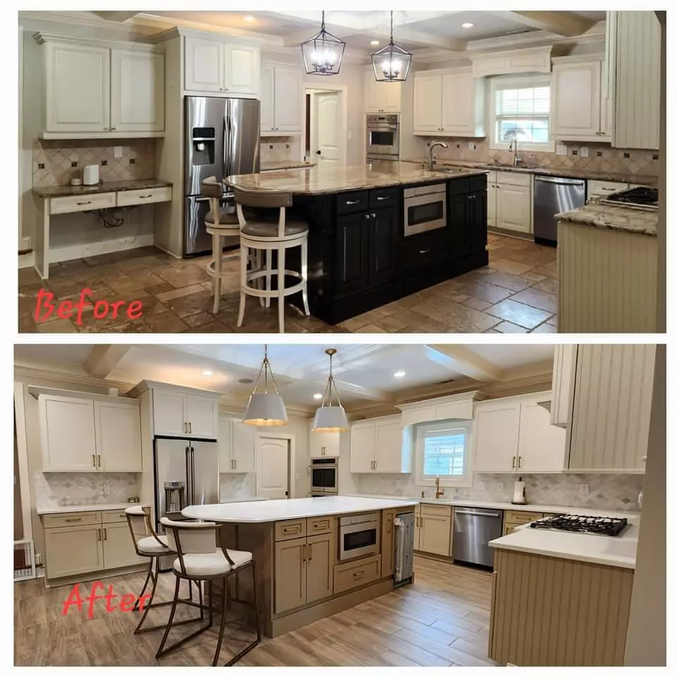
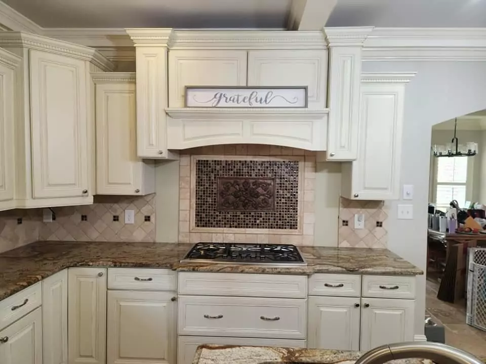
Cabinets with Dover White
Sherwin-Williams Dover White is often used on cabinets and trim. Its creamy warmth is “timeless” on kitchen or bathroom cabinets. Many homeowners choose Dover White for painted cabinets to achieve a soft, classic look.
However, caution is advised: Dover White has a strong yellow cast, which can complicate matching with other finishes. he “degree of yellow” in Dover White makes it “troublesome” when coordinating with countertops, walls, or backsplashes. In other words, Dover White cabinets can look dingy if neighboring surfaces are too cool or bright.
To counteract this, it’s helpful to pair Dover White cabinetry with contrasting elements. For example, a dark-colored island or bold hardware will make Dover White appear crisper, while a warmer-stone countertop will complement its tone.
Image: Kitchen cabinets painted in Sherwin-Williams Dover White (SW 6385). Dover White’s warm cream tone works with both the stainless steel fridge and the stone countertop here.

In summary, Dover White on cabinetry creates an elegant, soft effect, but one should plan accents carefully. It’s often best to ensure Dover White cabinets are the lightest surface in the space, or to use cool metallic hardware (black or brushed nickel) and warm stone or tile to balance the yellowish undertone.
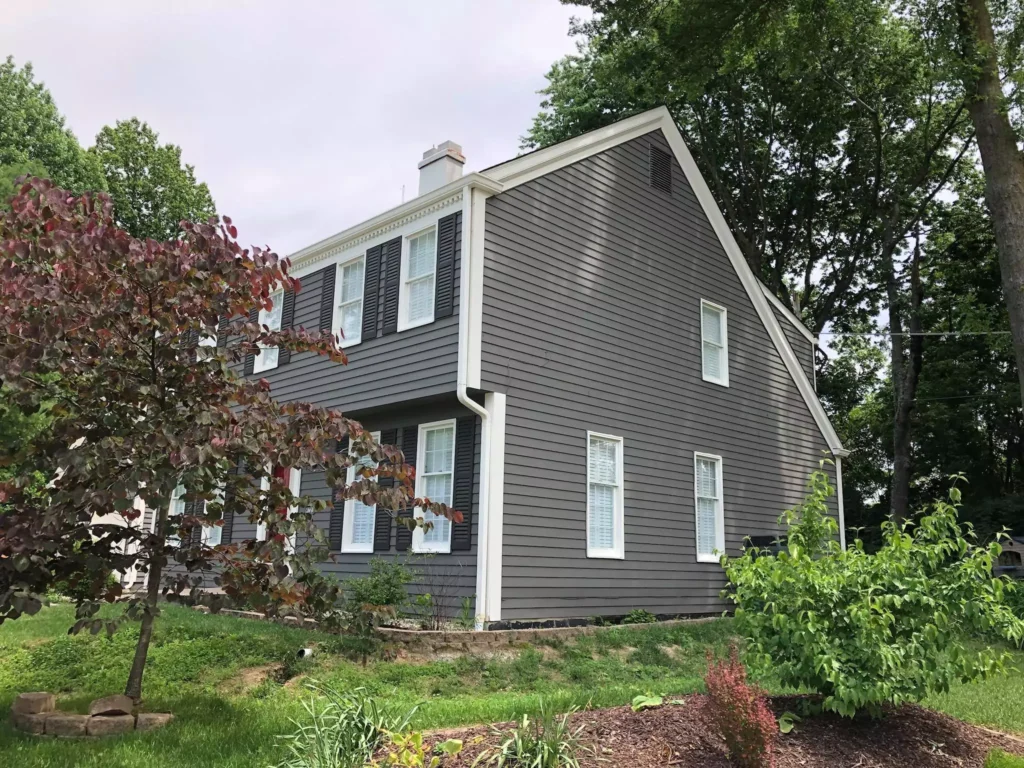
Exterior-Dover White
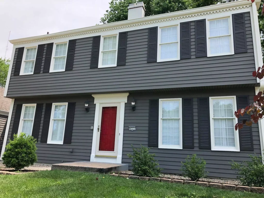
Dover White can also be used on home exteriors, especially in traditional or farmhouse-style designs. Its warmth makes it less stark than a true white when used on siding or trim.
According to my client, Dover White “can look stunning as a trim or primary color especially when it’s paired with dark accent colors and wood”. In other words, on a house Dover White is often paired with black or charcoal shutters/doors and natural wood beams to create a welcoming contrast.
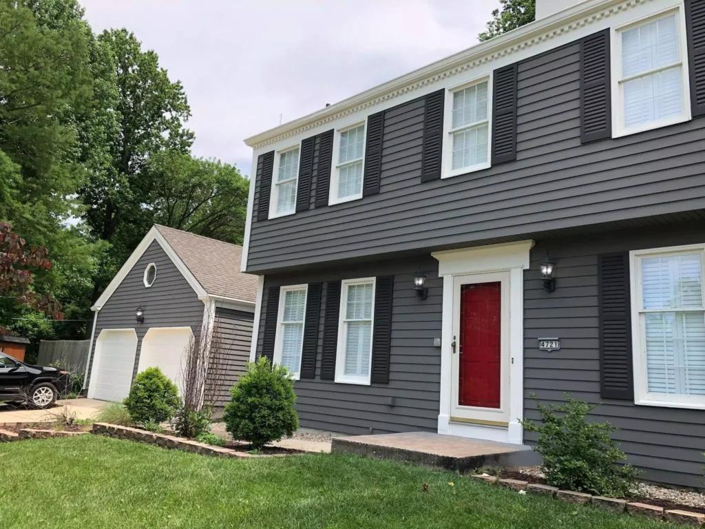
Because it’s softer than pure white, it avoids an icy look in sunlight. However, its yellow tint is still visible outdoors: “You WILL see that yellow” on a Dover White exterior.
For this reason Dover White is typically chosen for homes that can handle a creamy white façade (for example, homes with warm brick or stone trim). In sum, Dover White siding or trim gives a bright, cheerful look that is gentler than snowy white – just be prepared for its warm tone in sunlight.
Coordinating Colors
Dover White’s creamy warmth makes it versatile with many palettes. Here are some coordinating color ideas:
Soft/Neutral Palette: Pair Dover White with other warm neutrals. For example, Sherwin-Williams Accessible Beige (SW 7036) or Aesthetic White (SW 7035) are warm beiges/off-whites that harmonize beautifully with Dover White.
A soft gray like Mindful Gray (SW 7016) can also complement it, adding subtle depth without clashing. These muted neutrals form a soothing, monochromatic scheme around Dover White.
Bold Accents: For high-contrast drama, use rich colors against Dover White. Deep navy (Naval SW 6244) or jet black (Tricorn Black SW 6258) make the creamy Dover White pop and add sophistication.
Muted/Earthy Tones: Dover White also pairs well with warm earthy colors. Deep brown or bronze (like Urbane Bronze SW 7048) enriches its warmth and grounds the palette.
Soft sage or olive green (e.g. Sage Green Light SW 2851) introduces a natural, organic contrast that feels fresh. These muted, nature-inspired colors play nicely with Dover White for a calm, balanced look.
Each of these palettes leverages Dover White’s warm creaminess: neutrals and earth tones create a serene backdrop, while bold colors add punch. Testing samples is always recommended to see which harmonies appeal in your own light.
CREDIT OF IMAGES GOES TO OWNER-MAIL FOR CREDIT
Frequently Asked Questions
Does Sherwin-Williams Dover White look yellow?
Yes. Dover White has a noticeable yellow undertone. Color experts agree that a “strong hint of yellow” will show in the paint. It isn’t a bright, cool white – it’s a warm off-white.
In well-lit rooms or next to cooler surfaces, its creaminess becomes very apparent. If you want to minimize the yellow, pair Dover White with cooler elements (e.g. black or gray accents) and test it under your lighting.
What is Sherwin-Williams’ version of White Dove?
Benjamin Moore’s White Dove is a popular soft white, but SW Dover White is not the same color. Sherwin-Williams’ closest equivalents to White Dove (Benjamin Moore) are actually Alabaster (SW 7008) or Snowbound (SW 7004).
In other words, if you like BM White Dove and want a Sherwin color, try Alabaster or Snowbound – they are cooler and more neutral, whereas Dover White is warmer.
What is the Benjamin Moore equivalent of Dover White?
The Benjamin Moore shade that most closely matches Sherwin-Williams Dover White is Collector’s Item (AF-45). In a dupe comparison, Collector’s Item is described as “near perfect” for Dover White.
It is a similarly creamy off-white with strong warm undertones. (Another very close BM match is Ancient Ivory, though it leans even more yellow.) In practice, if you want Dover White but must use Benjamin Moore paint, Collector’s Item is the top choice.
Comparisons
Dover White vs. Alabaster (SW 7008)
Both are warm whites, but Alabaster is more neutral and less yellow. Alabaster has a slight beige undertone and is known to “not look yellow,” whereas Dover White’s golden warmth is obvious.
In fact, Alabaster’s calm neutrality makes it more adaptable to different styles, while Dover White will visibly appear yellow in comparison. In short, if you want a warm white that stays neutral, Alabaster is safer; Dover White will feel creamier and “yellower” on the wall.
Dover White vs. Simply White (BM OC-117)
Dover White is generally warmer and creamier than Benjamin Moore Simply White. Simply White is a very subtle warm white with only a hint of warmth, and it has a higher LRV (about 89.5%) compared to Dover White’s ~82.5%. This means Simply White will look a touch brighter and cleaner, with less yellow.
In practice, Dover White will appear slightly darker (more “muted”) and its yellow tint more noticeable next to Simply White.
Dover White vs. White Dove (BM)
These two are often confused by name, but they are quite different. Benjamin Moore White Dove is a soft white with gray-blue undertones – it reads as a cooler, more neutral off-white.
By contrast, Sherwin-Williams Dover White is warmer and significantly more yellow. “White Dove is a cool white with gray blue undertones while Dover White is warmer and leans creamy yellow”.
In other words, White Dove will look grayer and cooler, whereas Dover White looks creamier and sunnier.
Dover White vs. Creamy (SW 7012)
These Sherwin-Williams colors are very similar and often mistaken for one another. Both are warm off-whites with yellow undertones. The difference is subtle: Creamy’s yellow is more restrained, giving it a slightly softer, true-cream ambience.
Creamy’s yellow undertone is “more reserved and its room ambiance leans softer (and creamier) than Dover White”.
Thus, Creamy appears a bit more muted and gentle, while Dover White shows its warmth more strongly.
Dover White vs. Greek Villa (SW 7551)
Dover White and Greek Villa are both warm, creamy whites, but Greek Villa tends to be a touch brighter. In fact, numeric comparisons show Greek Villa’s LRV is about 84.2% versus Dover White’s 82.5%. Greek Villa is described as a “gorgeous rich, creamy white” that is slightly brighter (LRV ~86) than some warmer whites.
In practice, Greek Villa will read a bit whiter and cleaner, whereas Dover White will feel slightly deeper and yellower. Both are warm in tone, but Dover White leans more golden, while Greek Villa leans just a bit closer to neutral cream.
Each of these comparisons highlights how Dover White’s stronger yellow warmth sets it apart from other whites that are more neutral, cooler, or higher-reflectance. As always, it’s best to test paint in your own space to see these differences for yourself.


