Its not just Dover White vs Alabaster, Its actually creamy vs more creamier paint color.
I was soo confused cuz one of my friends suggested me to use Dover White in my bedroom,but you know what? When I went through the sample of Alabaster, I loved it more ,even i when i bought the Dover White paint for my room.Then I changed my mind and painted my room with alabaster by Sherwin-Williams.
But my friend still loves Dover White.hahhah.
I am not saying or persuading you to choose Alabaster cuz i love it , it’s my personal choice and eprience with both of these paints.So if you are confused and want to save money ,i am here to help you to find the difference between Dover White and Alabaster. No let’s start..!!!!!!!
Undertones of Alabaster sw 7008 and Dover White sw 6385
Dover White sw 6385 is warm and creamy. It has a big hint of yellow. It is not a pure white at all. You can see it looks a bit like soft butter or straw.
Alabaster sw 7008 is warm too, but more gentle.
It has a tiny bit of yellow and even a little gray. This makes Alabaster look more like a light cream with a soft beige tone.
In other words, Dover White will look more yellow-beige, while Alabaster will look more like an off-white cream.
Dover’s undertone is strong yellow. Alabaster’s undertone is very subtle beige.
LRV of Alabaster and Dover White
LRV is a number that tells how much light a color throws back. Dover White and Alabaster both have high LRV, meaning they are quite bright off-white colors.
Dover White’s LRV is about 82–83. Alabaster’s LRV is 82. Both values are high for paint, so both colors will brighten a room.
They are not stark bright white, but soft creamy whites. Because their LRVs are similar, rooms painted with either will feel open and light.
You won’t lose daylight – these colors reflect most of the light. Dover White might be just a hair brighter (82.5) than Alabaster (82.0), but to your eyes they both look like soft, bright white.
In case you missed the full review of both
Dover White SW 6385 Sherwin-Williams
How to Use Sherwin Williams Alabaster- Complete Review and Guide
Sherwin Williams Greek Villa vs Alabaster:Which One to Go With?
Quick Comparison Table
| Trait | Dover White (SW 6385) | Alabaster (SW 7008) |
|---|---|---|
| LRV | ~82–83 (soft white) | ~82 (soft white) |
| Undertone | Strong yellow | Subtle beige-yellow |
| Color Code | SW 6385 | SW 7008 |
| Family | Warm off-white/cream | Warm off-white |
| Temperature | Warm | Warm |
| Feel/Vibe | Cozy, creamy warmth | Calm, gentle bright |
How Alabaster and Dover White Look in Different Lighting
The way paint looks can change with light. Dover White will change more. In a north-facing room (less sunlight), Dover White looks warm and creamy. In east or west rooms, it will look soft at certain times (morning or late afternoon).
In a very sunny south-facing room, Dover White can look very yellow or too bright. In a small dim room, it still brightens the space. Alabaster stays more steady. It keeps a soft, clean look in any light.
Even on cloudy days or in evening light, Alabaster looks like a gentle white. In bright sun it stays soft and not glaring. In shade it still feels fresh and open.
Alabaster “stays true in sunny spots” and adds just a little warmth in darker corners.
So Dover White swings toward yellow in bright light, but Alabaster tends to look the same warm off-white no matter the lighting.
Coordinating Colors for Alabaster and Dover White
Dover White pairs best with warm, earthy colors. It goes nicely with beiges, tans, warm browns or gold tones – anything that matches its yellow warmth.
For example, Sherwin-Williams notes that a golden accent like Dakota Wheat (a warm yellow) can bring out Dover White’s color. Dark woods or metal can also look good.
If you use cool grays, blues or black near Dover White, they will make its yellow pop even more. You can use that on purpose to get a vintage or farmhouse vibe.
To calm down the yellow, you could add a lot of black or deep blue trim. Alabaster is more flexible. It looks good with both warm and cool tones.
Soft grays (like Agreeable Gray) or deep blues (like Naval) give a nice contrast.
Earthy browns, greenish-gray tones (like Sea Salt), even black or wood tones also go well. In short, Alabaster is like a team player: it works with grays, blues, browns, greens, black, and natural wood.
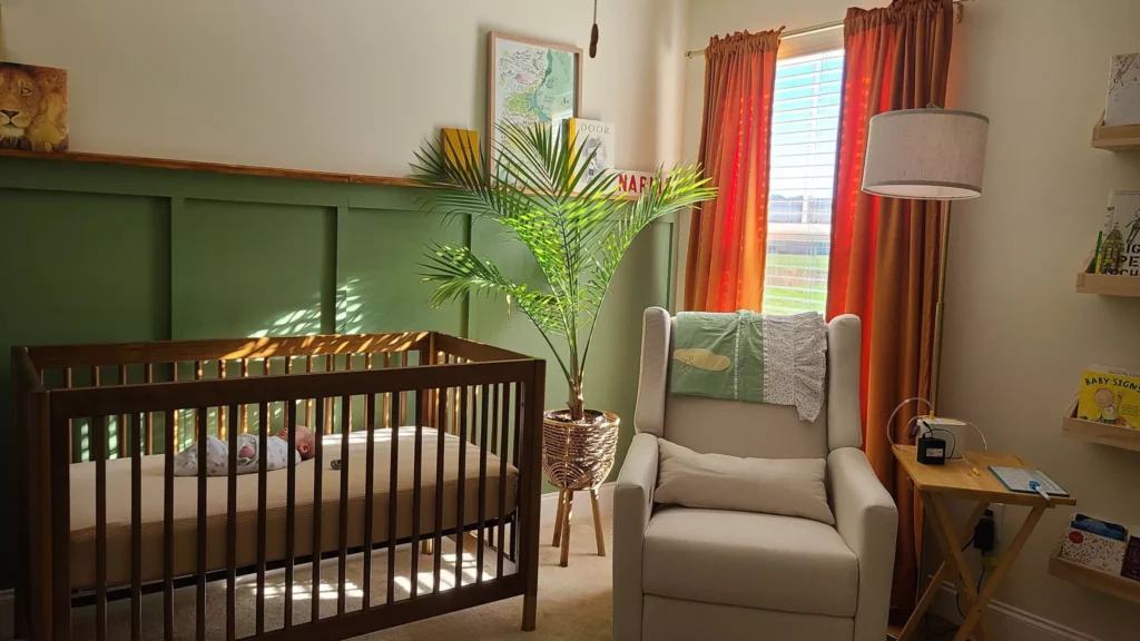
Use in a Bedroom-Alabaster vs Dover White
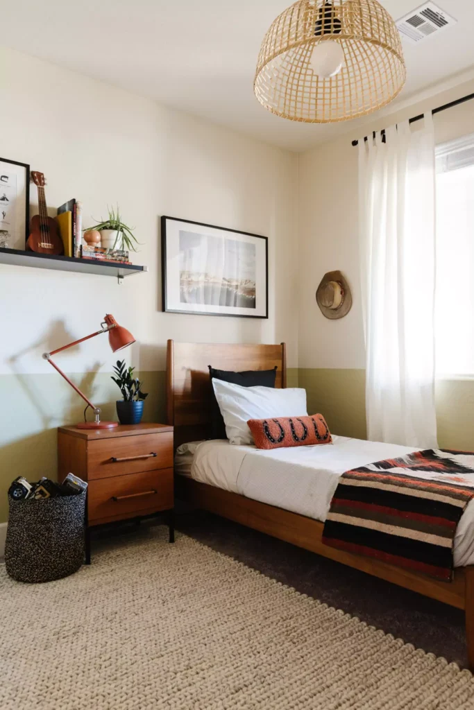
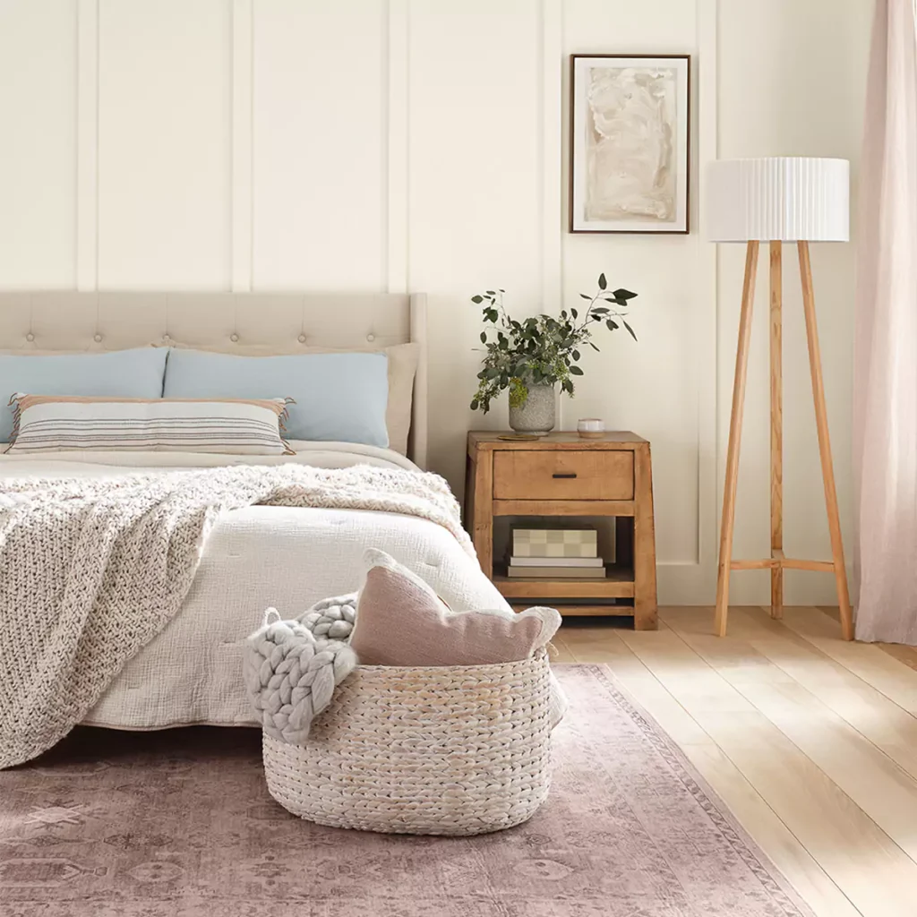
In a bedroom, Dover White makes a warm, cozy space. It can feel like a creamy yellow glow. For example, one home project showed Dover White on shiplap walls in a bedroom – it came off as a pale gold that feels cozy and calm.
Because it’s warm, Dover White can make the bedroom feel snug. But remember it will show its yellow; it won’t look like a clean white.
Alabaster in a bedroom makes the room feel soft and bright. Bedrooms painted Alabaster feel “cozy but bright”. It looks calm and clean, almost like gentle candlelight. Both colors can work, but Dover White will create a richer, more vintage look, while Alabaster will feel more neutral and restful.
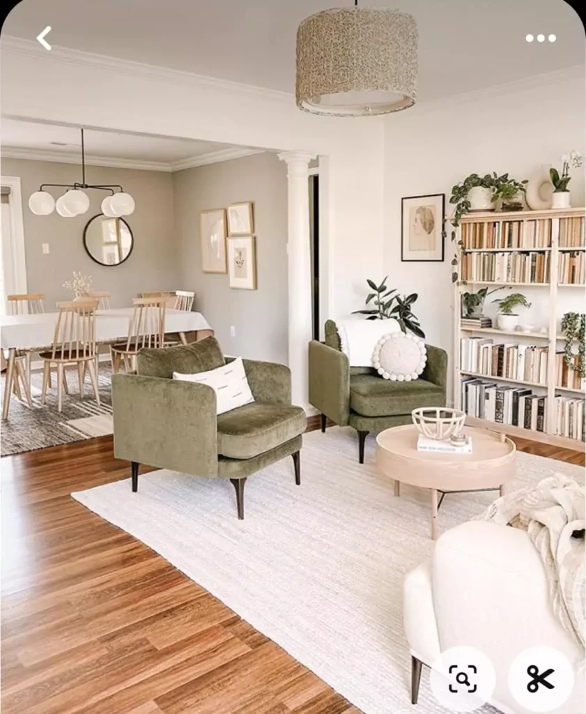
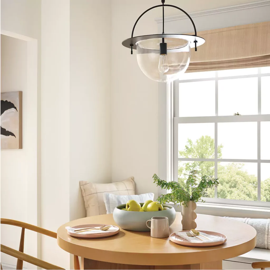
Use in a Living Room
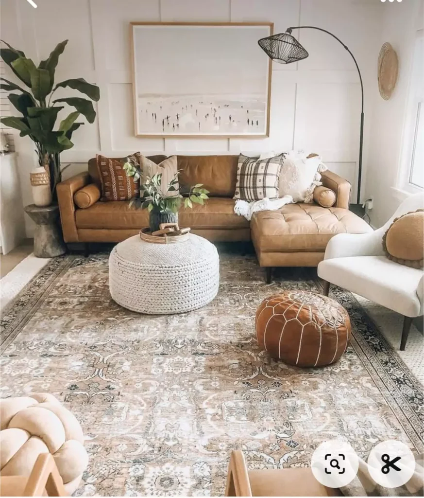
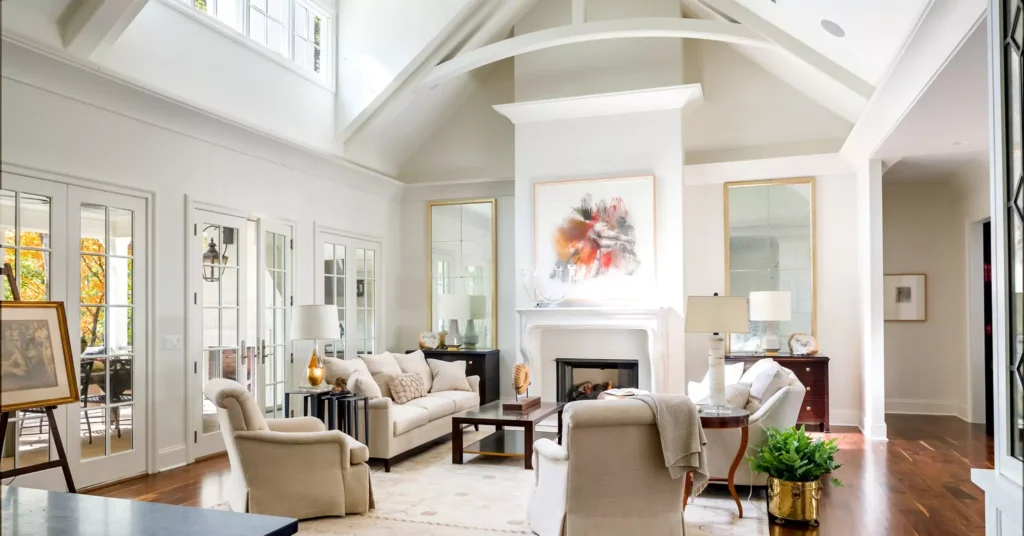
Dover White on living room walls can make a room feel cozy and inviting.
Some living spaces with Dover White walls paired it with crisp white trim and saw a very warm, comfortable feel. With other neutral or wood decor, Dover walls look homey.
Alabaster in living rooms gives a clean, fresh look. It still feels warm but won’t turn yellow. Living rooms painted Alabaster “stay fresh all day long” and feel spacious.
If you want a living room that is calm and bright, Alabaster is an easy choice. If you want a richer, homier feel, Dover White can do that too (especially if you like warm creams).
Use in a Kitchen
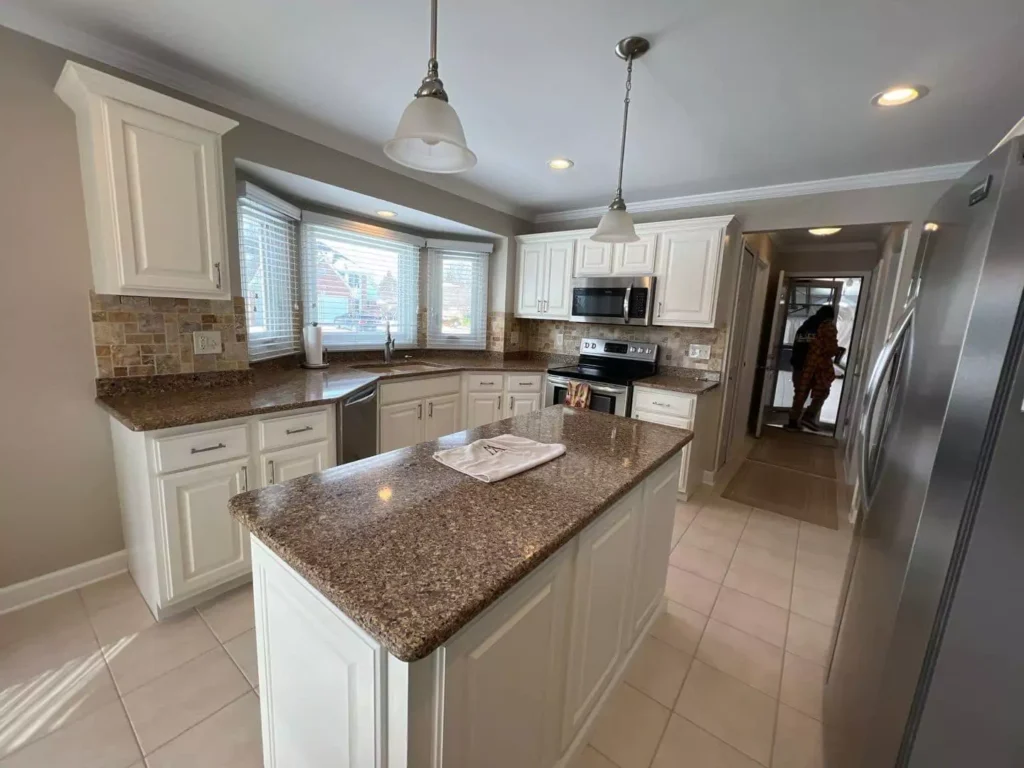
Dover White can be used on kitchen cabinets or walls. In one kitchen, people saw Dover White look very yellow-warm under warm light. In another example, against a blue island it actually looked cooler.
It can flip depending on other colors. If you want a creamy kitchen, Dover White works, but test it: under wood cabinets it will warm up the look, under cool colors it looks whiter.
Alabaster in kitchens is very popular. It helps make counters and appliances stand out. It bounces light around so the kitchen feels open. Small kitchens look bigger with Alabaster.
It’s also good on cabinets because it cleans easily and still feels warm. Overall, for kitchens, Alabaster is a safe bright choice. Dover White gives you a creamier vibe if you want that farmhouse or country style.
Use on Trim and Cabinets
Both colors are often used on trim or cabinets. Dover White on trim can look very crisp, especially in bright sunlight. Some homes with lots of natural light had Dover White trim that looked almost pure white.
But if light is low, you might notice its pale yellow. Alabaster on trim or cabinets gives a softer white look. It is cleaner than a stark white but still bright.
For example, kitchen cabinets painted Alabaster feel “fresh but homey”.
Alabaster works as trim if your walls are darker – it frames the walls nicely without high contrast. Dover White trim will also frame rooms, but expect it to carry its warmth.
If you have dark walls, Dover trim looks a bit yellowish in spots. Alabaster trim is a more neutral frame.
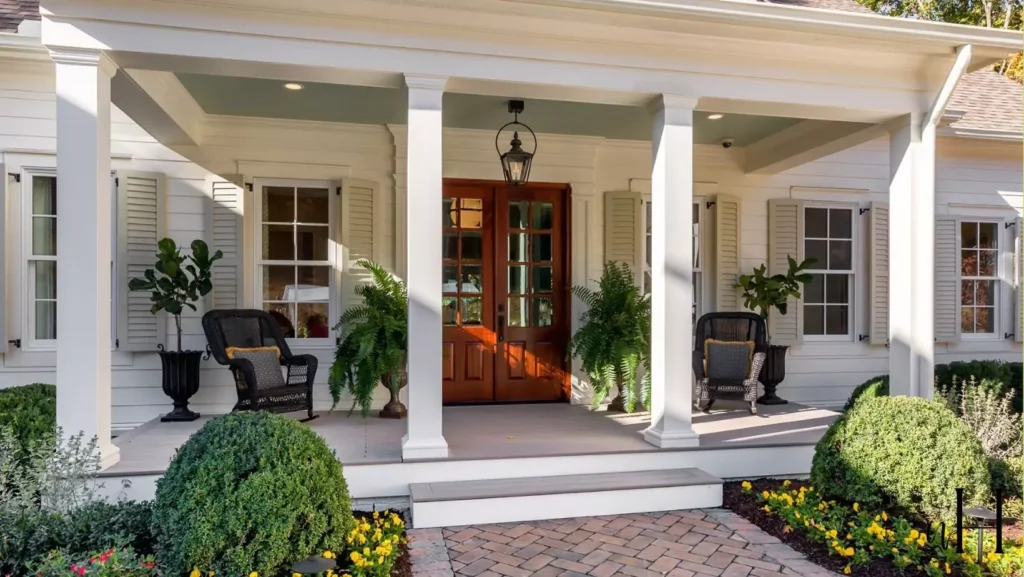
Use on Exterior
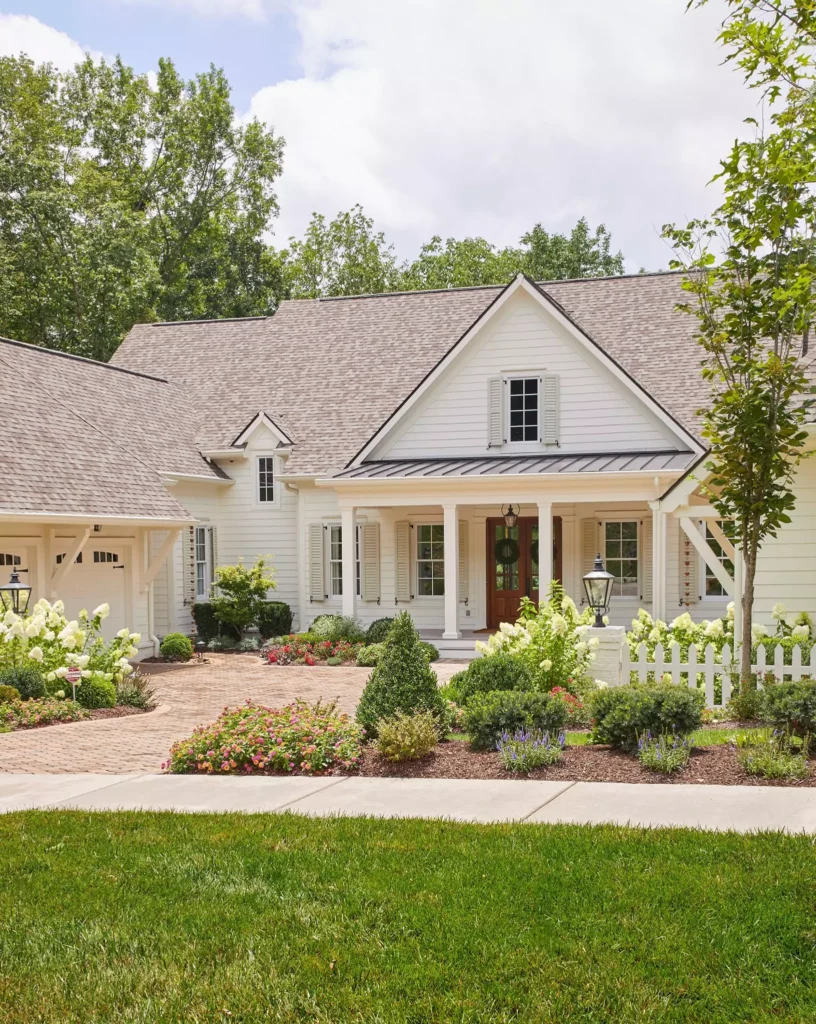
On a house exterior, Dover White can look great in the right style. It is often used on modern farmhouse homes. For example, Dover White siding or trim paired with dark accents and wood looks very classic.
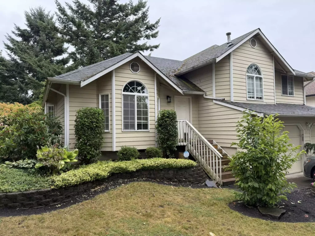
It stands out under the sun and warms up a stone or wood. Just know it will read as a creamy off-white outside.
Alabaster outside stays soft in sunlight and fits naturally in shady or green settings. If your home is surrounded by trees, Alabaster will look clean and blend softly with the greenery. It won’t look glaring even in full sun.
Both can work, but Alabaster tends to be seen as a more subtle neutral on exteriors, while Dover White makes a bolder warm statement.
Use in a Bathroom
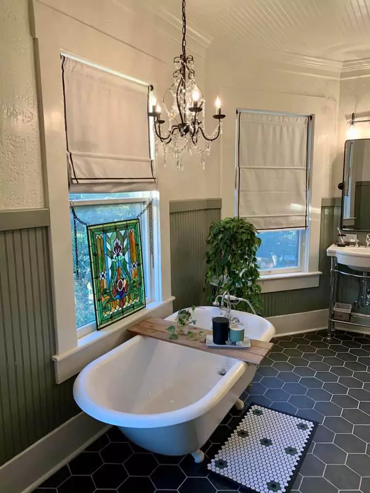
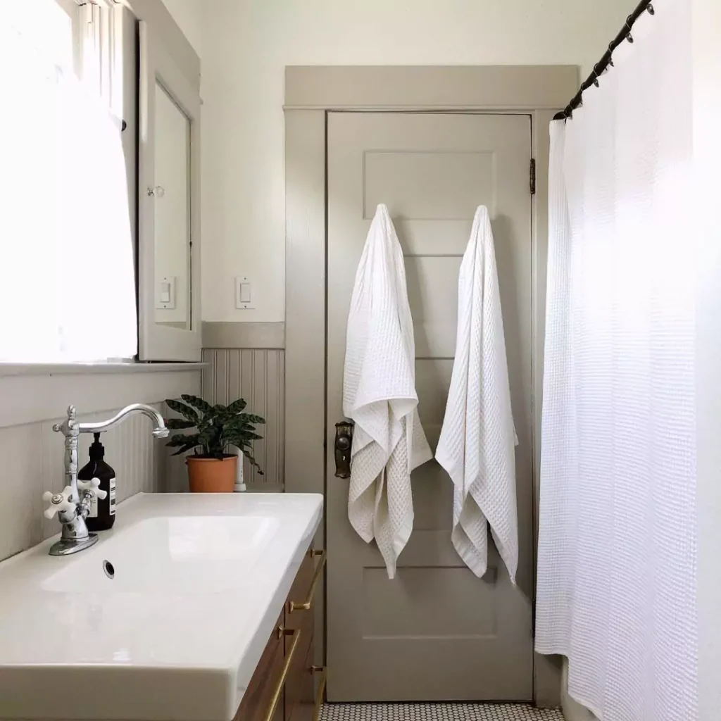
In bathrooms, both can work but feel different. Dover White in a bathroom will brighten it up even if there isn’t a lot of light.
It will give the space a warm glow, which can feel cozy like a spa in earth tones. Just remember the yellow tint – it might not look crisp white.
Alabaster in bathrooms adds warmth but stays clean.
Alabaster “adds warmth without feeling too yellow”. It keeps tiles and fixtures looking fresh. So if you want a soft white bathroom, Alabaster is very safe.
If you want that warm creamy look, Dover White will do it but expect a more buttery shade.
Decision-Making Tips
Test in Your Space
Try samples on your walls. Put them up in different areas and look at them in morning and evening light. Colors can change under your lights and next to your furniture.
Alabaster Is Safer
If you want a white that won’t surprise you with yellow, pick Alabaster. It is very easy to live with and works in most rooms.
Dover for Warmth
If you love warm creams and don’t mind yellow, Dover White can give a cozy feel. But test it in bright sunlight first, because south windows can make it look very yellow.
Think About Other Colors
If your home has a lot of cool grays or blues, remember Dover White will make them pop (and show its own yellow more). Alabaster will stay more neutral.
Use LRV as a Guide
Both colors have similar LRV (~82), so they both brighten rooms. Neither will make a space feel dark. If you need even brighter white, you’d look at higher LRV paints.
Each row above sums up the quick facts. Both are warm off-whites with high LRV, but Dover White leans more yellow, while Alabaster is more neutral. Feel and usage may guide your choice (warm cozy vs. soft bright).


