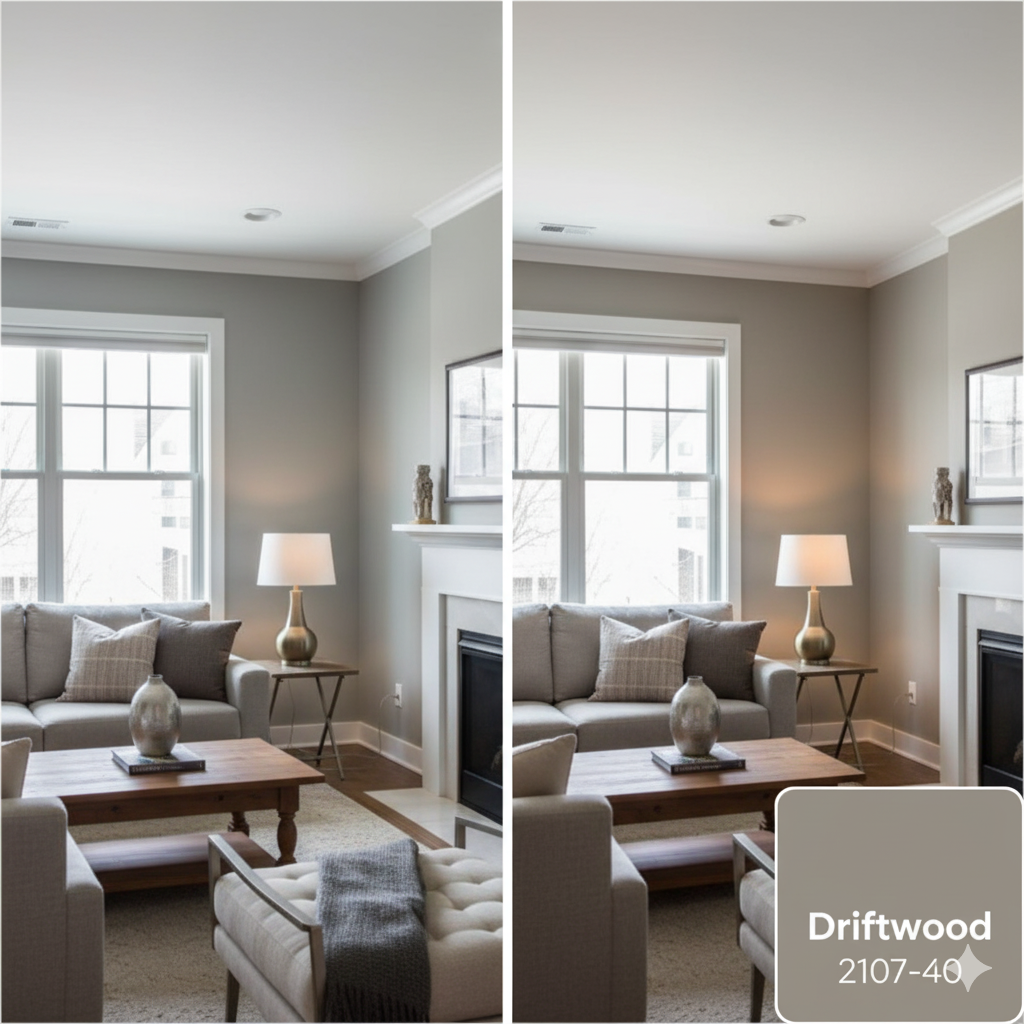
Benjamin Moore Driftwood 2107-40 is a warm, earthy paint color that reminds many people of beach wood washed by the waves.
It mixes brown, tan (taupe), and gray, which makes it a friendly, natural shade. Designers call it a “sophisticated, muted neutral” because it is not very bright or loud.
In short, this color is like a soft grayish-brown that feels calm, warm.
Driftwood 2107-40 has a balanced look. It is not too dark and not too light – I call it a medium neutral.
The official description says it has notes of brown, taupe (a tan-gray mix), and gray. This means you will see a bit of brown and a bit of gray in it. Because it has both, Driftwood never looks too cold or too yellow – it stays in between.
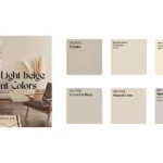
So in this blog, I am sharing undertones, light effect on Driftwood, a coordinate color palette, and a room-by-room comparison of Driftwood with REAL HOME IMAGES.
OTHER TAUPE/GREIGE COLORS:
- Divine White SW 6105 Sherwin Williams– Quick Review
- Mink SW 6004 Sherwin Williams-Review After Use
- Intellectual Gray SW 7045 -Sherwin-Williams
- Ashley Gray (HC-87) by Benjamin Moore
Undertones of Driftwood
Even though Driftwood looks like a plain gray-brown, it has some hidden hints of other colors under the surface. These hidden hints are called undertones.
Driftwood’s undertones are warm and earthy. That means it has a touch of beige and a tiny bit of brown inside the gray.
Specifically, Driftwood leans toward taupe, which is gray mixed with brown.
Because of this, rooms with Driftwood feel cozy instead of stiff. In some lights, Driftwood shows more of its beige-brown side, so it looks warmer and softer.
In other lights, you might notice a bit more of the gray. This subtle change happens because of those warm undertones. For example, in a bright sunny room, Driftwood might look like a warm gray; in a shady corner it may look slightly more tan.
Overall, Driftwood’s undertones make it a friendly neutral. It isn’t a pure gray (which can sometimes feel chilly), and it isn’t too yellow or pink.
The tiny bit of brown/gray inside gives it just enough warmth to keep a space feeling safe and comfortable. These small undertones are why Driftwood works so well in many rooms – it has a gentle warmth that adapts to different lights and colors.
LRV (Light Reflectance Value)
The LRV (Light Reflectance Value) of a paint color tells us how much light it bounces back. A higher number (closer to 100) means a very light color that reflects more light; a lower number (closer to 0) means a dark color that absorbs light.
Driftwood 2107-40 has an LRV of 25.29. This number is in the low to middle range. In simple terms, Driftwood is not very bright – it’s more on the darker, richer side of neutral.
An LRV of 25.29 means Driftwood reflects only about 25% of light. It absorbs the rest, which is why it appears a bit deeper.
To compare, pure white has LRV 100 (very bright), and pure black has LRV 0. Driftwood’s LRV shows it is definitely darker than light cream or white. It is not as dark as chocolate brown or charcoal (which have lower LRV).
Instead, Driftwood sits in the medium-dark neutrals range.
It won’t make spaces too dark on its own, but paired with light trim or good lighting, it gives a warm, enveloping feel.
Designers often use Driftwood where they want a calm, balanced light level – not stark bright, but not gloomy either. For example, if you paint walls Driftwood and use bright white trim, the room will feel cozy yet airy, thanks to that 25.29 reflectance.
Since Driftwood is moderate in reflectance, it looks best in rooms with some natural light or bright lamps. In a very dark room with no windows, it could look quite dim.
Driftwood In Different Lights
Driftwood’s color can shift a bit depending on the lighting. Light plays a big role in how we see any paint. For Driftwood, its warm taupe-gray mix means it behaves nicely under different lights.
In bright, sunny light, the walls painted Driftwood will show its warm beige side more. It might look like a light tan-gray that feels very warm and inviting. In softer or dim lighting, Driftwood can look a bit cooler or more muted, almost like a gentle gray.
Because Driftwood has those brownish undertones, it adapts.
In a room facing east or south (bright sun), expect it to glow warmly. In a north-facing or shady room (cooler light), it might look a touch grayer. In other words, under warm light (like evening lamps or sunset), its brown-beige notes become clear.
Under cool fluorescent light, the gray aspects stand out. This is why designers say Driftwood can appear as a “cozy greige in low light and a warm neutral in bright spaces.”
Some real-life tips: In a north-facing bedroom (cool light), Driftwood might keep the room peaceful and not too cold. In a bright kitchen with south windows, it will feel warmer and creamier.
If you use white or cream furniture, the contrast will highlight those warm undertones even more. In summary, Driftwood is flexible – it leans into the light it gets. This means before painting, look at a swatch in your own lights. You will see how the “hidden” brown and gray parts of Driftwood play out.
Hex Code
The hex code is the six-digit code used on computers to show this color on screens. For Benjamin Moore Driftwood 2107-40, the hex code is #988578. Each hex code has three pairs of characters for red, green, and blue light.
In #988578, the first two characters “98” stand for red, “85” for green, and “78” for blue.
This code translates to a mix of red, green, and blue that makes Driftwood’s exact shade. The hex doesn’t describe the mood, but it is useful for digital design or paint-matching apps.
For example, if you create a digital design board for your room, you could use #988578 to get the right color on your screen. It ensures consistency between online pictures and paint chip swatches.
To make #988578 more understandable: the red value is 152, green is 133, and blue is 120 (out of 255). This means it has a medium amount of each color, which blends into a brownish-gray.
The hex code also helps in comparing colors. Some websites say the hex is “Stonewall” or similar name, but the key is #988578 is Driftwood’s exact formula.
RGB
The RGB values show how much red (R), green (G), and blue (B) are mixed to make the color. For Driftwood 2107-40, the RGB values are R=152, G=133, B=120. These numbers are out of 255 (the highest for any channel). In simpler words, there is more red light in it, a bit less green, and even less blue. That combination creates the brownish-gray you see.
You can think of it like mixing paint: if you took 152 parts red, 133 parts green, and 120 parts blue, you’d get this Driftwood. Because the red amount (152) is slightly highest, the color leans warm. If blue or green were higher, it might look cooler or greener. But here the balance is such that it’s a muted, warm-tone neutral.
These RGB numbers are useful in design programs (like Photoshop) or LED lighting. For example, if you had smart lights and you wanted to match Driftwood, you could set them to R=152/G=133/B=120. Again, keep in mind screens vary, but RGB is a universal way to describe the color precisely.
So, the color Driftwood is made of roughly 60% red, 52% green, and 47% blue when normalized (if you divide each by 255). This blend explains why it looks like a warm gray. If you reduce the blue a little more, or add more red, the color would shift more brownish. The exact mix 152-133-120 is what gives Driftwood its unique calm tone. Even though we describe it simply as brownish-gray, these RGB numbers show exactly how the light combines to make that effect.
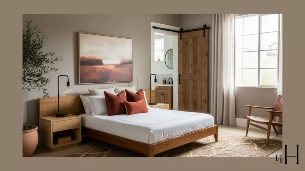
Driftwood Bedroom

Driftwood 2107-40 is a great choice for bedrooms because it creates a calm, grounded feeling. Bedrooms are meant for rest, and Driftwood’s warm gray-brown color makes the space feel peaceful and cozy.
Instead of a bright white that can feel too stark, or a bold color that might feel too loud, Driftwood is gentle and relaxing. Its medium depth gives a cocoon-like atmosphere, which helps people feel safe and comfortable.
Designers often use Driftwood in bedrooms because it balances warmth and neutrality. It pairs nicely with soft fabrics, white bedding, or wood furniture. For example, Driftwood walls with white sheets and a dark wooden bed frame create a classic cozy look.
Or you can add light beige curtains to blend with the warm undertones. Driftwood also works well with accent pillows in muted colors like dusty rose or sage green.
The LRV of 25.29 means the bedroom won’t feel too bright, which can be good for rest. At night, with soft lamps, Driftwood glows warmly. In morning light, it feels calm and natural. So, for anyone wanting a restful retreat, Driftwood is a perfect bedroom wall color.
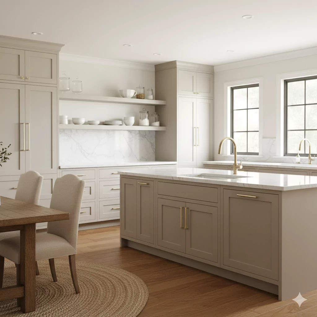
Driftwood in Kitchen
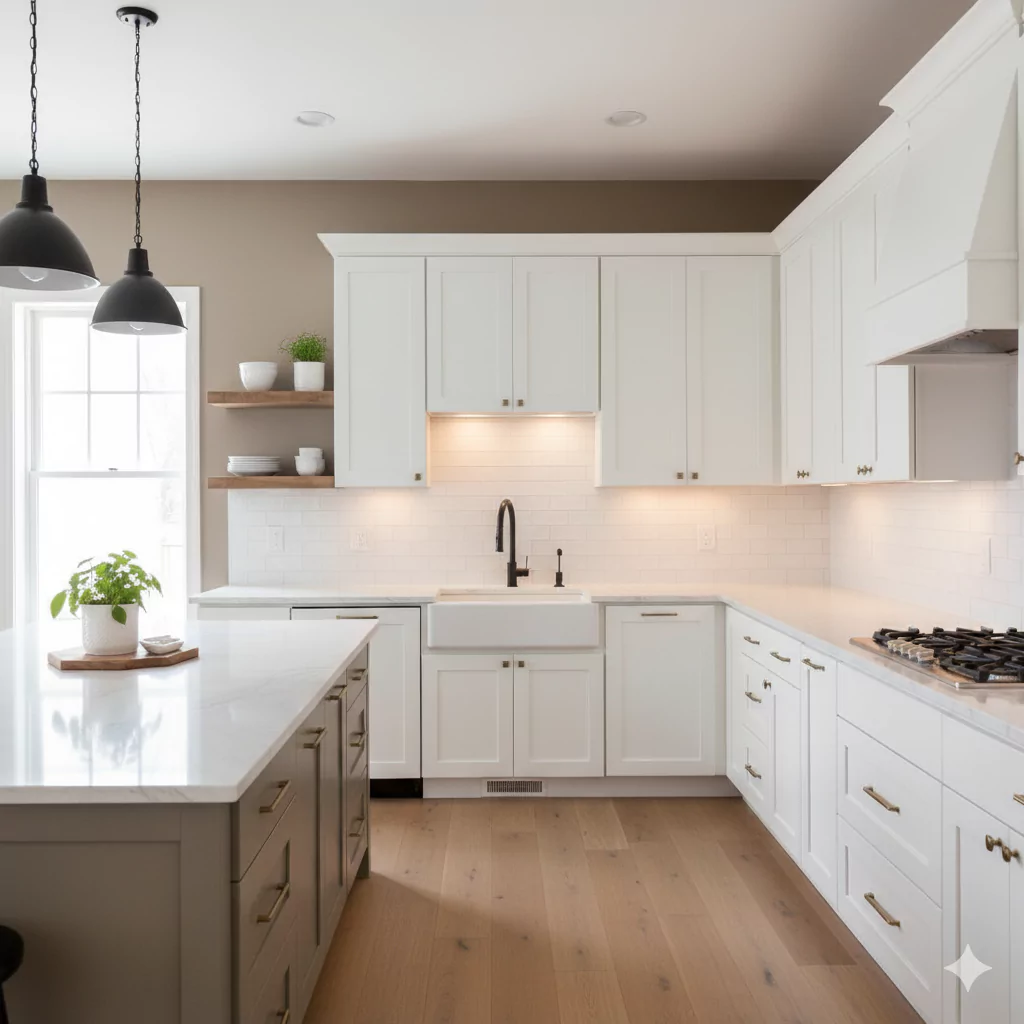
Kitchens painted with Driftwood 2107-40 feel earthy and stylish. This color complements many kitchen finishes, like stone counters, wood cabinets, or stainless-steel appliances.
Its taupe-gray mix makes it flexible. For example, Driftwood walls behind white cabinets create a rich contrast without feeling heavy. If you have wooden cabinets, Driftwood can blend smoothly, bringing warmth to the whole room.
Driftwood’s warm undertones prevent the kitchen from feeling cold. Sometimes gray shades can look industrial in kitchens, but Driftwood avoids that because of its brown tones. With natural light, it looks warm and inviting – a color that makes cooking and eating feel homey.
Designers say Driftwood works well as a backsplash wall color too. Against marble or granite counters, it highlights the natural stone. For a modern look, pair Driftwood with sleek black fixtures and white quartz.
For a rustic look, add open wood shelves and brass handles. In all cases, Driftwood makes the kitchen feel grounded and cozy.
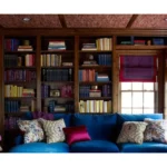
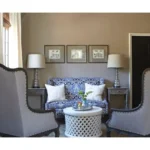
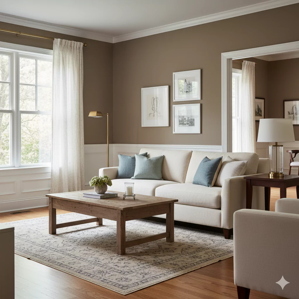
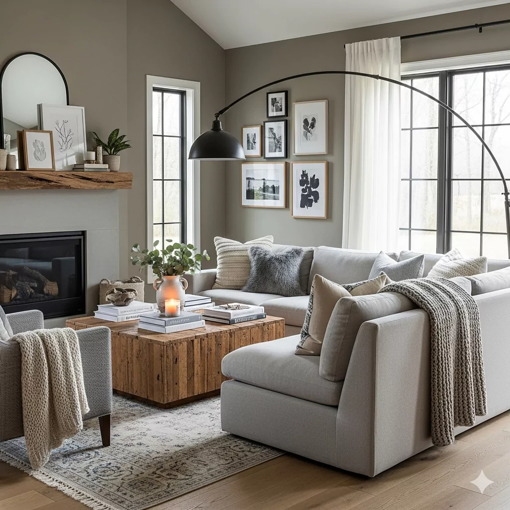
Driftwood in Living Room

The living room is often the heart of a home, and Driftwood 2107-40 sets a perfect mood there. Because it is warm yet neutral, it allows the furniture and decor to shine.
On large living room walls, Driftwood feels sophisticated and not too busy. Unlike very light colors that can fade away, Driftwood has enough depth to anchor the room.
Many designers recommend Driftwood for living rooms with large windows. In daylight, it reflects enough light to feel open, while still showing its earthy richness. At night, with lamps or a fireplace, it becomes warmer and more intimate. Families often like it because it’s practical too: medium neutrals like Driftwood hide small marks or dust better than white walls.
You can style a Driftwood living room in many ways. Pair it with soft beige or ivory sofas for a calm look.
Or add colorful rugs and pillows – Driftwood provides the neutral backdrop so colors like teal, mustard, or terracotta pop without clashing. Wooden coffee tables, black frames, or green plants also look very good with Driftwood walls. Overall, it creates a welcoming and flexible living room vibe.
In the Bathroom
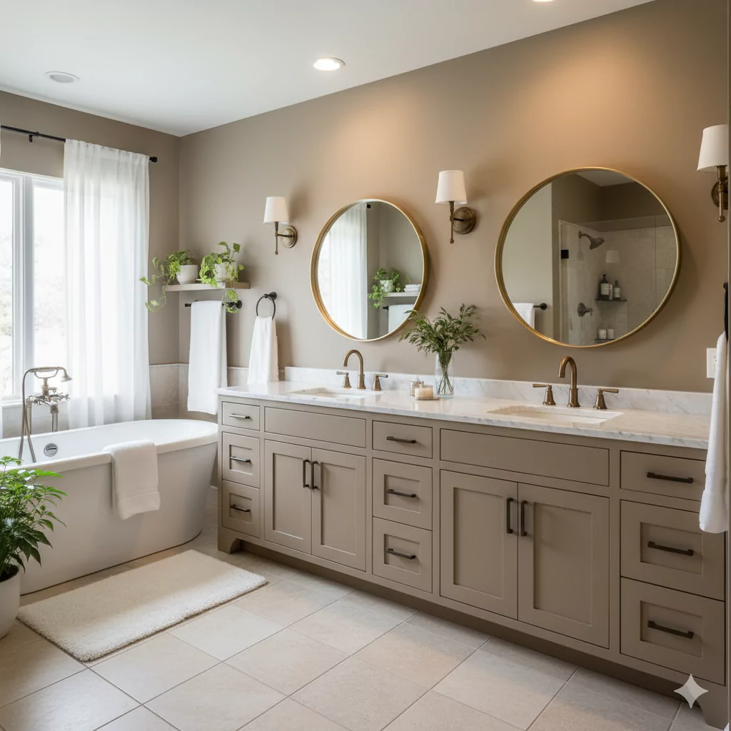
Bathrooms with Driftwood 2107-40 feel spa-like and earthy. Many people like neutrals in bathrooms because they feel clean but not too harsh. Driftwood gives exactly that: it looks grounded and natural. In a bathroom with white sinks and tubs, Driftwood walls create a soft contrast. The white fixtures stand out, while the walls stay warm and relaxing.
Because bathrooms are often smaller, the LRV of 25.29 makes the space feel intimate, not too bright. But with a good mirror and lighting, Driftwood still looks open. In fact, some designers pair Driftwood with gold or brass bathroom fixtures for a modern luxury look. Or with matte black faucets for a chic, balanced style.
Another advantage is that Driftwood pairs well with tile. Whether you have gray stone tiles or beige ceramic ones, Driftwood blends smoothly. It makes the room feel pulled together. Some people even paint bathroom cabinets in Driftwood for a calm, seamless look. Overall, Driftwood in a bathroom makes it feel like a relaxing retreat.
Driftwood On Cabinets
Driftwood 2107-40 can also be used on cabinets. Painted cabinets in this color give kitchens or bathrooms a warm, stylish vibe. Instead of pure white or dark navy, Driftwood offers something in between – a soft earthy tone that still stands out.
In kitchens, Driftwood cabinets pair beautifully with white or cream walls. The contrast feels warm and elegant. If you use Driftwood cabinets with marble or quartz counters, the look is very modern. With wood or butcher-block counters, it feels more rustic and cozy.
In bathrooms, Driftwood cabinets can make the vanity feel rich and inviting. The warm undertones match nicely with brass or bronze handles. Even with silver hardware, Driftwood looks balanced. Because it is a medium neutral, it won’t show wear as quickly as very light or very dark cabinets.
Overall, Driftwood is a versatile cabinet color choice for those who want something different from plain white, but still neutral and adaptable.
On Exteriors

Driftwood 2107-40 is also used on the outside of homes. As an exterior color, it looks natural and blends with many landscapes. Because it is earthy and warm, it pairs well with stone, brick, or wood siding.
One advantage of Driftwood outdoors is that it doesn’t look too washed out in the sun. Lighter colors sometimes disappear under bright daylight, but Driftwood keeps its presence. On the other hand, it’s not too dark, so it doesn’t make a house look heavy. Instead, it strikes a balance – warm, welcoming, and grounded.
Driftwood can be used as the main siding color, or as an accent on shutters, doors, or trim. With white trim, it looks fresh and crisp. With darker trim, like deep brown or black, it looks bold and sophisticated. Some homeowners even combine Driftwood siding with natural stone for a timeless earthy look. Overall, Driftwood makes exteriors feel natural and inviting.
Coordinating Colors
With Warm Neutrals
Driftwood pairs beautifully with other warm neutrals like beige, tan, and ivory. These combinations create a calm, layered look. For example, Driftwood walls with beige curtains and cream furniture feel soft and seamless.
With Deep Colors
Deep colors like navy blue, forest green, or charcoal pair nicely with Driftwood. These darker shades pop against Driftwood’s earthy warmth, creating contrast. For example, a navy sofa in a Driftwood living room looks sophisticated.
With Light Colors
Lighter shades like pale gray, blush, or soft sage green also work with Driftwood. These create a fresh, airy palette while keeping the room cozy. For instance, Driftwood walls with pale pink pillows look modern and soft.
With Whites
Bright whites or off-whites look clean and classic against Driftwood. White trim or ceilings next to Driftwood walls highlight the warmth of the taupe-gray. This is a common designer trick to make spaces look fresh but not stark.
Soft Palette
For a gentle and relaxing mood, pair Driftwood with other soft colors. Examples include pale beige, creamy ivory, light blush, or muted green. These colors stay in the same calm brightness range, making the room feel soothing. A Driftwood wall with ivory bedding and a soft green rug creates a peaceful palette.
Bold Palette
For more drama, Driftwood can handle bold accents. Jewel tones like emerald green, sapphire blue, or ruby red stand out against it. Even black accents work well. For example, a Driftwood living room with black-framed art and emerald pillows feels stylish and energetic.
Muted Palette
If you prefer understated elegance, combine Driftwood with muted colors. Soft grays, taupes, and greiges make the room feel balanced. For instance, Driftwood walls with Agreeable Gray trim or a taupe rug create a subtle, timeless look. This palette is great for people who want calm and sophisticated spaces.
Frequently Asked Questions
Driftwood vs Revere Pewter
How is Benjamin Moore Driftwood (2107-40) different from Revere Pewter (HC-172)?
A: Revere Pewter is one of the most popular greige colors. It has a higher LRV (55.05) than Driftwood (25.29), meaning it is much lighter. Revere Pewter looks like a soft light gray-beige, while Driftwood is much deeper and richer, closer to a medium-dark taupe. Driftwood feels more grounding and cozy, while Revere Pewter feels brighter and more versatile. Use Driftwood if you want a bold, earthy neutral; use Revere Pewter if you want a lighter, airy greige.
Driftwood vs Edgecomb Gray
Q: How does Driftwood compare to Edgecomb Gray (HC-173)?
A: Edgecomb Gray is another very popular Benjamin Moore neutral. Its LRV is 63.09, which makes it a light warm gray-beige. Compared to Driftwood, Edgecomb Gray looks much paler and softer. Driftwood is much darker, with an LRV of 25.29. Where Edgecomb Gray feels light and breezy, Driftwood feels earthy and cocoon-like. If you want light walls that blend easily, go with Edgecomb Gray. If you want depth and coziness, choose Driftwood.
Driftwood vs Chelsea Gray
Q: How is Driftwood different from Chelsea Gray (HC-168)?
A: Chelsea Gray has an LRV of 22.16, so it is slightly darker than Driftwood (25.29). Chelsea Gray is also a cooler gray, with less brown. Driftwood leans more taupe (brown-gray), while Chelsea Gray is a classic rich gray. Side by side, Driftwood feels warmer and earthier, Chelsea Gray feels sharper and cooler. Use Driftwood for warmth and natural tones; use Chelsea Gray for a more urban, modern vibe.
Driftwood vs Kendall Charcoal
Q: How does Driftwood compare to Kendall Charcoal (HC-166)?
A: Kendall Charcoal is much darker, with an LRV of 14.61. It is a deep, bold charcoal gray, while Driftwood is a medium taupe-gray. Driftwood feels softer and more versatile, while Kendall Charcoal feels dramatic and strong. If you want a cozy but still medium-toned neutral, Driftwood works well. If you want a striking, dark exterior or accent color, Kendall Charcoal is the stronger choice.
Driftwood vs Thunder
Q: How is Driftwood different from Thunder (AF-685)?
A: Thunder has an LRV of 48.05, making it much lighter than Driftwood’s 25.29. Thunder is a greige-gray color that works in many spaces. Compared to Thunder, Driftwood feels much deeper and richer. Thunder is better for small rooms or lighter looks, while Driftwood adds mood and coziness in larger rooms or accent walls.
Driftwood vs Worldly Gray (Sherwin-Williams)
Q: How does Driftwood compare to Sherwin-Williams Worldly Gray (SW 7043)?
A: Worldly Gray has an LRV of 57, which makes it much lighter than Driftwood’s 25.29. Worldly Gray is a soft, warm greige. Driftwood is much deeper, earthier, and browner. If you want light warm-gray walls, go with Worldly Gray. If you want a deeper, more grounding taupe, go with Driftwood.
Driftwood vs Agreeable Gray (Sherwin-Williams)
Q: How is Driftwood different from Sherwin-Williams Agreeable Gray (SW 7029)?
A: Agreeable Gray is one of Sherwin-Williams’ most popular neutrals. Its LRV is 60, which makes it very light compared to Driftwood. Agreeable Gray is a balanced greige – a soft, warm gray with beige undertones. Driftwood is much darker, with stronger brown tones. Agreeable Gray feels airy and flexible; Driftwood feels cozy and earthy.
Driftwood vs Accessible Beige (Sherwin-Williams)
Q: How does Driftwood compare to Accessible Beige (SW 7036)?
A: Accessible Beige has an LRV of 58, so it is also much lighter than Driftwood’s 25.29. Accessible Beige leans more beige with a soft gray undertone, while Driftwood is deeper and taupe-based. Accessible Beige works well in lighter, brighter rooms. Driftwood is better when you want depth, richness, and a stronger presence.