
Last updated on September 5th, 2025 at 01:42 pm
So,now we are gonna talk about the amazing cozy ,softy ,creamy white Frosty White by Sherwin Williams. Frosty White can bring the sense of crisp white and creamy white with some gray undertones at the same time, I’m telling you its the perfect creamy cool,cozy warm white in her collection of creamy whites.Like creamy ice cream loading out of the cup…..!
Sherwin-Williams Frosty White (SW 6196) is perfect balance between warm and cool white.
In this blog, I’ll tell you everything you need to know about Frosty White—from its undertones and how it looks in different lighting to its best use in bedrooms, kitchens, bathrooms, and cabinetry.
I ll also let you know coordinating color palettes (soft, bold, and muted), see how it stacks up against other popular whites, and answer common FAQs—like whether it looks yellow, how bright it is, and what the Benjamin Moore equivalent might be.
What are the Undertones of SW Frosty White

With some gray vibe Frosty White is generally seen as a cool white. Design experts describe it as “crisp, cool white with delicate gray undertones”. In practice, you can’t think of it as strongly warm or creamy – it maintains a clean, modern feel. Some users experience it as warm hint sometimes but its actually a cooler shade of white.
What is Light Reflectance Value of SW Frosty White


Frosty White has an LRV of about 72.0. In simple words, it reflects a lot of light – enough to make a room feel bright and airy – but it is not as stark as the very highest-reflectance whites. This mid-high LRV means Frosty White can make a space feel open and clean without appearing clinical.
Lighting Effects


Like most off-whites, Frosty White looks different under various lights.
In natural light, it feels so cool and more muted in north-facing or shaded rooms,with a crisp neutral look.
In sunny south- or west-facing rooms, it takes on a slightly warmer, brighter glow as the light gets intensified. Under warm artificial light (incandescent or warm LEDs), Frosty White will look softer and cozier, with cozy creaminess in the undertone.
Under cool or blue-toned lighting, it reads more crisp and bright. Designers note that in any light, Frosty White is bright ,and do not dull its appearance in any light condition.
GET YOUR SAMPLE HERE
Room Applications
Frosty White (SW 6196) in Bedrooms
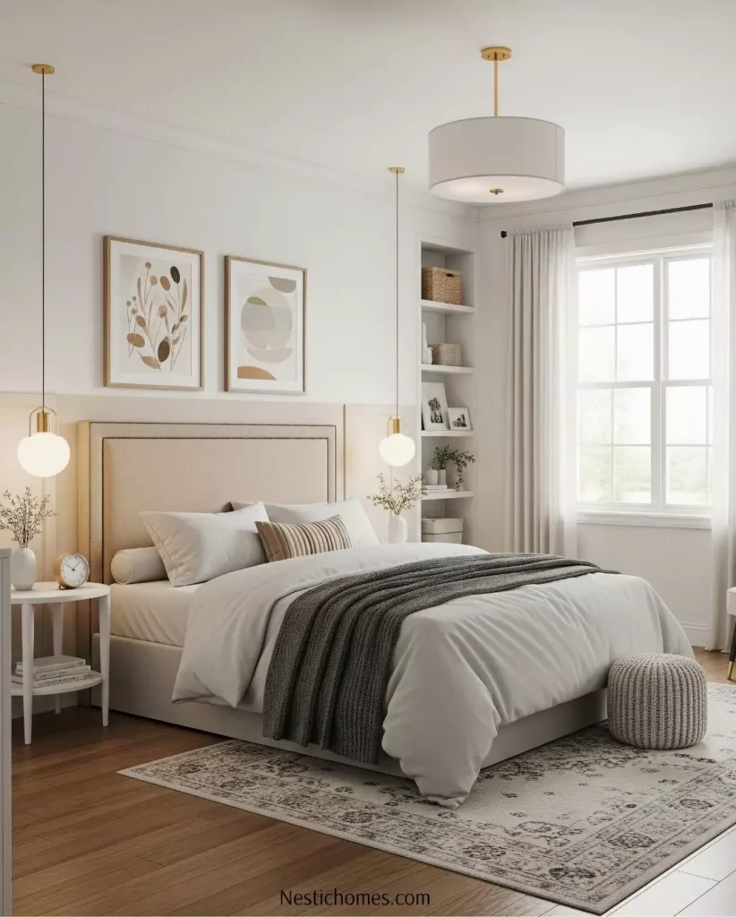
Because Frosty White feels so soft and cozy its the perfect choice for bedroom. It creates a serene, restful atmosphere, pairing nicely with soft pastels or natural tones for bedding and decor.
In smaller space bedrooms Frosty white can make it feel bigger without losing its pure color,That is why it is suitable for your small homes and big modern ones.
Living Rooms


In living and open-concept spaces, Frosty White provides a crisp neutral backdrop for furniture, artwork, and décor.It is best to use on main walls in living rooms because it “creates a crisp backdrop that allows furniture, artwork, and décor to stand out”.
Frosty White can easily go with both light and dark accents. For example, warm wood floors, colorful rugs or bold accent walls will pop against Frosty White walls. Its clean brightness makes living spaces feel open and inviting.


Kitchens and Bathrooms (including Cabinets)


Its cool undertones complement stainless-steel appliances, white or marble countertops, and light cabinetry, giving a crisp modern effect.
Designers note that Frosty White “helps create a bright and inviting space, especially when paired with stainless or wooden cabinets”.
On cabinets and trim, Frosty White provides a fresh, neutral finish that highlights hardware and details without overpowering the room. Literally, I can imagine my dream island kitchen with frosty white cabinets and marble countertop with stone backsplash,ummm some vintage frames tho.
As we know, how beautifully Frosty white reflects light, Frosty White can make small kitchens and bathrooms feel more spacious and airy. It works in almost every home styles – from farmhouse to contemporary – and easily coordinates with colored or white cabinetry for a cohesive look.
Coordinating Colors of Frosty White (SW 6196)
Soft/Muted Palette
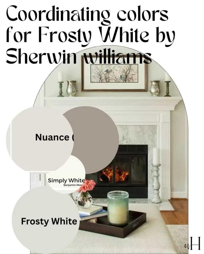
For a gentle, harmonious look, pair Frosty White with other light neutrals. Off-whites and soft grays like Fleur de Sel by SW 7666, Nuance (SW 7049), Moderne White (SW 6168) or Ethereal White (SW 6182) blend very well and without making you space dim.
These tones are close to Frosty White in value, so they create depth without heavy contrast. In my opinion, “pairing this cool, crisp white with other soft, muted shades helps maintain an overall light and airy feel”.
Bold Palette
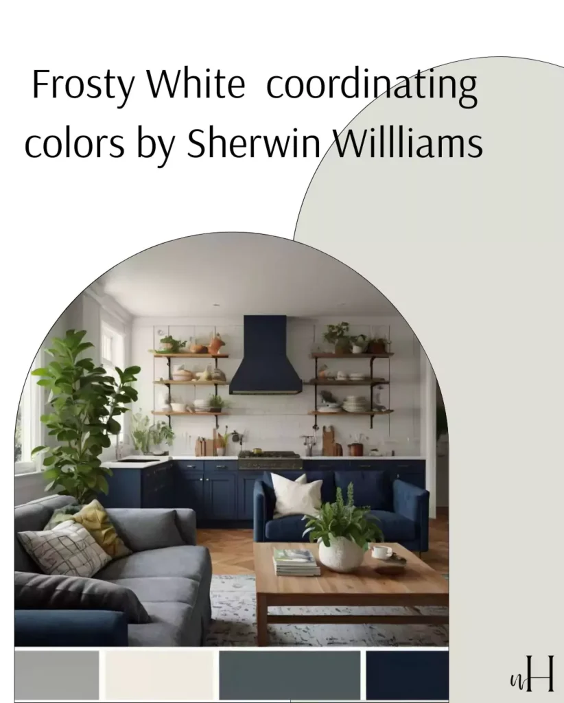
Use rich or dark colors to add the bold touch with frosty white. Like Deep blues and grays can work according to you expectations, examples include Naval (SW 6244, navy blue), Dovetail (SW 7018, deep charcoal gray) or Tricorn Black (SW 6258).
Earthy/Neutral Palette
Foe earthy vibe go with mute EARTHY palette. Tones such as Sensible Hue (SW 6198, a soft gray-green) or Thunderous (SW 6201, a warm medium gray) add gentle contrast without strong color. DecorCreek recommends Pure White (SW 7005) and Thunderous as complementary neutrals alongside Frosty White.
These colors keep the palette easy-on-the-eyes and bring subtle warmth or natural feel. Warm grays like Worldly Gray (SW 7043) or muted blues like Soulful Blue (SW 6543) also coordinate nicely for a subdued scheme.umm for me its the amazing combo to make earthy vibe.
Comparison with Other Sherwin-Williams Whites
Frosty White sits between a stark pure white and creamier off-white. Compared to bright “gallery whites,” it is slightly warmer and grayer; compared to creams, it is cooler. For example, First Star (SW 7646) is a true light gray, while Frosty White is a softer off-white with a touch more warmth
Likewise, Opaline (SW 6189) has a faint green undertone that Frosty White lacks; Frosty White will read as a pure cool white in contrast to Opaline’s subtle green cast.
In fact, Frosty White is almost identical to Fleur de Sel (SW 7666). These two have the same lightness (LRV) and are virtually the same hue, with Frosty White just a hair warmer.
On the other hand, warm neutrals make Frosty White’s coolness stand out. For example, Solstice (SW 9571) is a beige-with-yellow-tinge – Frosty White appears noticeably crisper and cooler against it.
Ethereal White (SW 6182) is another soft neutral, but with a subtle creamy warmth.In summary, Frosty White is less yellow than any cream-colored white, but not as stark as Sherwin’s brightest brights – it truly sits in the middle as a clean, slightly gray-tinted white.


FAQ
Which Sherwin-Williams white paints are not yellowish?
Many Sherwin-Williams whites are warm or creamy, but a few are very neutral. Notably, Pure White (SW 7005) has very little yellow undertone, which make it one of Sherwin’s “cleanest” warm whites. Extra White (SW 7006) and High Reflective White (SW 7757) are extremely bright, cool whites with minimal warm bias. In general, Pure White, Extra White and High Reflective White (and similar “bright” whites) are good choices when you want no obvious yellow tint.
What is the brightest white paint by Sherwin-Williams?
The brightest SW white is High Reflective White (SW 7757), which has an LRV around 93 omg so bright. This is Sherwin-Williams’ flagship ultra-white, formulated to reflect the most light. (For comparison, Extra White has an LRV of 86.) High Reflective White is described as “the brightest, cleanest white” in Sherwin’s palette and is often used on ceilings or trim to maximize light.
What is the Benjamin Moore equivalent to Sherwin-Williams Frosty White?
A close BM match is often cited as Benjamin Moore “Ice Fog” (CSP-575). Ice Fog is a cool off-white with gray undertones, very similar to Frosty White. In fact, one paint analysis lists Ice Fog as having “the same combination of white with gray undertones” as SW 6196. (Another near-match is BM “Decorators White” or “Nimbus Gray,” but Ice Fog is frequently recommended.)


