
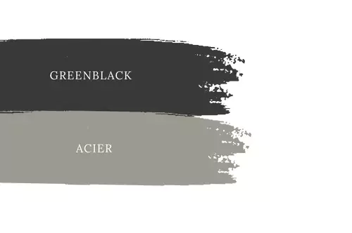
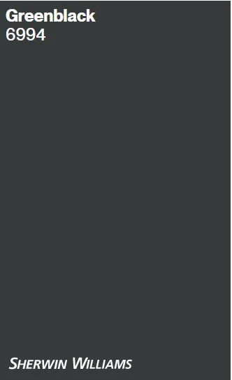
Sherwin-Williams Greenblack (SW 6994) is a very deep black with a subtle green tint.
It’s described by Sherwin-Williams as “black with a tinge of green undertone” that gives a deep, forest-like vibe.
In practice, Greenblack reads mostly like a rich black, but the faint green component adds depth and a calming, nature-inspired feel.
Designers often use Greenblack sparingly – for example on an accent wall or cabinetry – to add bold drama while avoiding an overly stark look.
Its blend of green and black makes it more lively than a pure black: it provides the “boldness of black and the calm, cozy nature of deep green”.
10 Popular Sherwin-Williams Black Paint Colors for Every Space-2025
Black Magic vs Tricorn Black-Which One is right for You?
Undertones of Greenblack
Sherwin-Williams Greenblack is fundamentally a cool-toned black paint. Its green undertone is very subtle, so in most lighting it appears as a true black. Only in bright natural light does the greenish cast become noticeable, giving a forest-like hint.
In other words, although Greenblack contains a warm green component, overall it reads as a cool, neutral black.
This means Greenblack pairs well with other cool neutrals (such as gray-blues) and crisp whites, though the hidden green can quietly tie into earthier elements if it shows.
LRV of Sherwin Williams Greenblack
Greenblack is an extremely dark paint color: its Light Reflectance Value (LRV) is only about 4. (For context, a perfect white would be LRV 100 and true black is theoretically 0.)
An LRV of 4 means Greenblack absorbs almost all light; it’s just one step lighter than Sherwin-Williams’ true black Tricorn Black (LRV 3). Because of this very low LRV, Greenblack looks almost black even in moderately lit rooms.
In practice this means you should use it with caution in dark, poorly-lit spaces – it will absorb light and look flat if not balanced by lighter tones. In a bright, sunlit room the tiny bit of green in Greenblack may peek through, but otherwise it reads as a deep neutral.
Appearance in Different Lights
In bright light (especially strong daylight or a well-lit room), the green undertone in Greenblack can become visible. In sunlight or under clear cool-white bulbs, Greenblack may reveal a faint deep emerald cast.
By contrast, in low or warm light (e.g. evening lamps, low light bedrooms), it will look nearly identical to a straight black.
In short, Greenblack’s appearance shifts with lighting: ample bright light will gently highlight its green cast, while dim light emphasizes the neutral black base.
Always test a large sample on the wall before committing, since its look can vary with the ambient light in a given room.
Greenblack In the Bedroom
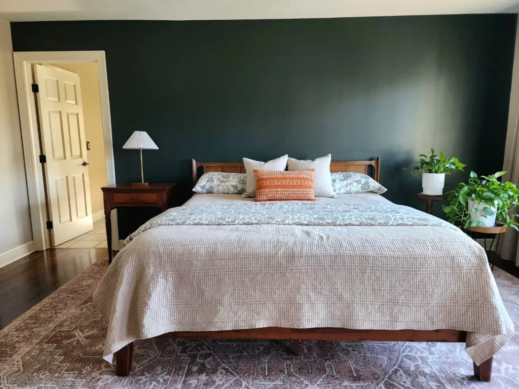
On bedroom walls, Greenblack can create a rich, enveloping ambiance. It’s ideal on one feature wall – for example, the wall behind a bed – to avoid making the whole room too dark.
In a master bedroom or large guest room, a Greenblack accent wall looks elegant, especially when balanced with crisp white trim, light bedding, or natural wood furniture.
One designer notes that SW Greenblack “offers the boldness of black and the calm, cozy nature of deep green,” making it great for striking statement areas.
If used on all four walls, be sure the room has plenty of light (natural or layered lighting) and include plenty of light-colored textiles to keep the space from feeling too closed-in.

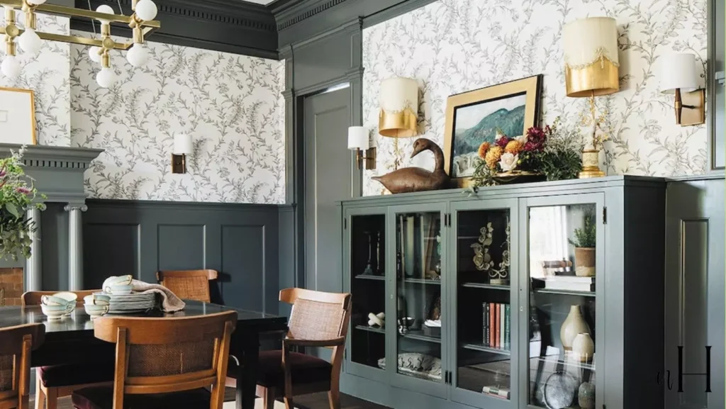
Greenblack In the Kitchen
Greenblack is often used on kitchen cabinetry or an island. For example, painting lower cabinets or an island in Greenblack, paired with white countertops and backsplashes, creates a dramatic modern look.
One real project showed Greenblack on bar cabinetry with white marble counters and backsplash, making a classic black-and-white contrast. In kitchens and bars, Greenblack works best as an accent (cabinets, island, or lower wall) rather than on every wall.
It provides a sleek, bold backdrop that makes metallic hardware and white countertops pop. As with all dark paints, ensure good overhead and under-cabinet lighting to keep the workspace bright.
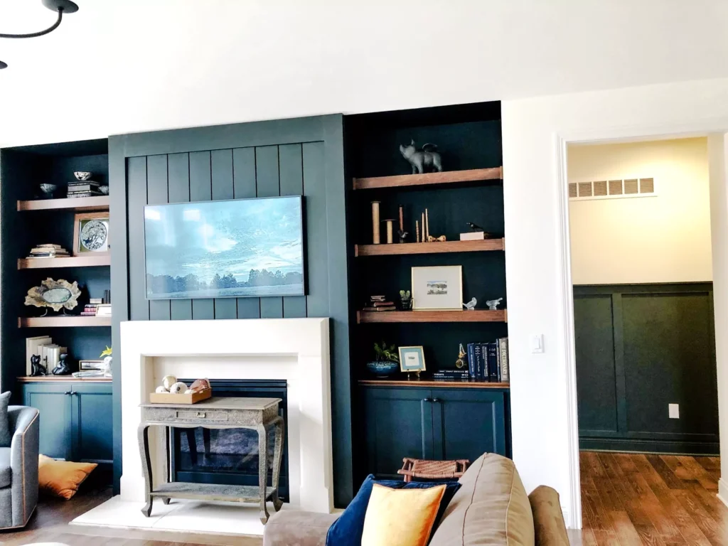
In the Living Room
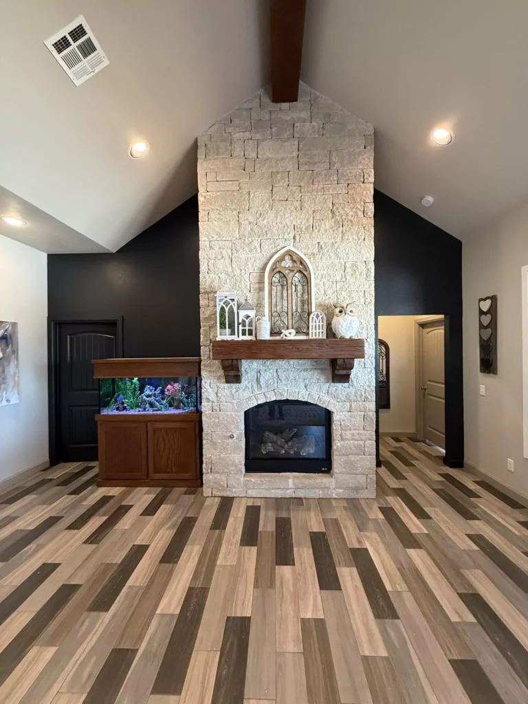
In a living or family room, Greenblack often appears as a fireplace surround or accent wall.
For instance, one designer featured Greenblack on the chimney wall of a historic home; the result was a “contemporary canvas” for traditional furnishings and a fireplace. Greenblack on built-in shelves or cabinetry (for books or media consoles) also adds depth and sophistication.
Because it is so deep, Greenblack accent walls in living areas are typically paired with plenty of white or light elements – white trim, off-white walls on other walls, light-colored rugs and upholstery – so the room stays balanced. (In that example above, Sherwin-Williams Pure White was used on the surrounding walls to make the Greenblack pop.)
Bathroom SW Greenblack
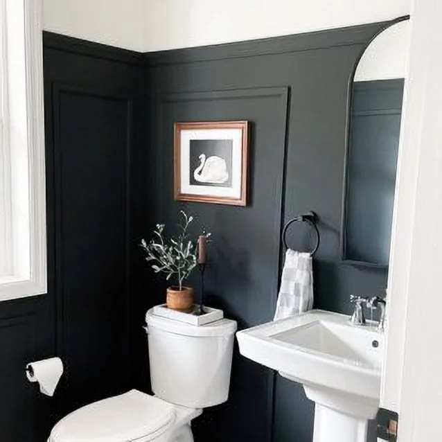
Surprisingly, Greenblack can even work on bathroom walls if handled carefully. In a small bath with ample white tile and fixtures, painting all four walls Greenblack still reads as a moody yet not claustrophobic space.
The key is plenty of reflective white surfaces (to bounce light) and good overhead lighting or a window.
For example, one designer showed a tiny bathroom fully painted Greenblack; the white sink, toilet, trim and ceiling created enough contrast that the room didn’t feel closed-in.
In practice, many people use Greenblack on just one wall or vanity base in a bath, but it can be used on multiple walls if the whites in the room compensate.
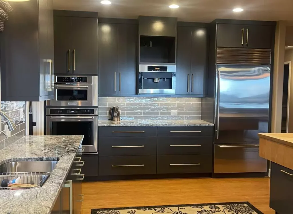
Greenblack on Cabinets
Greenblack is very popular for kitchen or bathroom cabinets. When used on cabinetry, it gives a space-rich contemporary feel. For example, pairing Greenblack lower cabinets with white marble counters/backsplash (as noted above) achieves a classic, upscale look.
It also works on painted shelving or built-in bookcases – the dark color makes decorative objects and hardware stand out.
In general, Greenblack cabinets should be contrasted with lighter countertops, backsplashes, or cabinet frames so the overall kitchen or bath doesn’t become too dark.
Greenblack “looks amazing on cabinets” when balanced with bright neutral colors.
Exterior Use of Greenblack
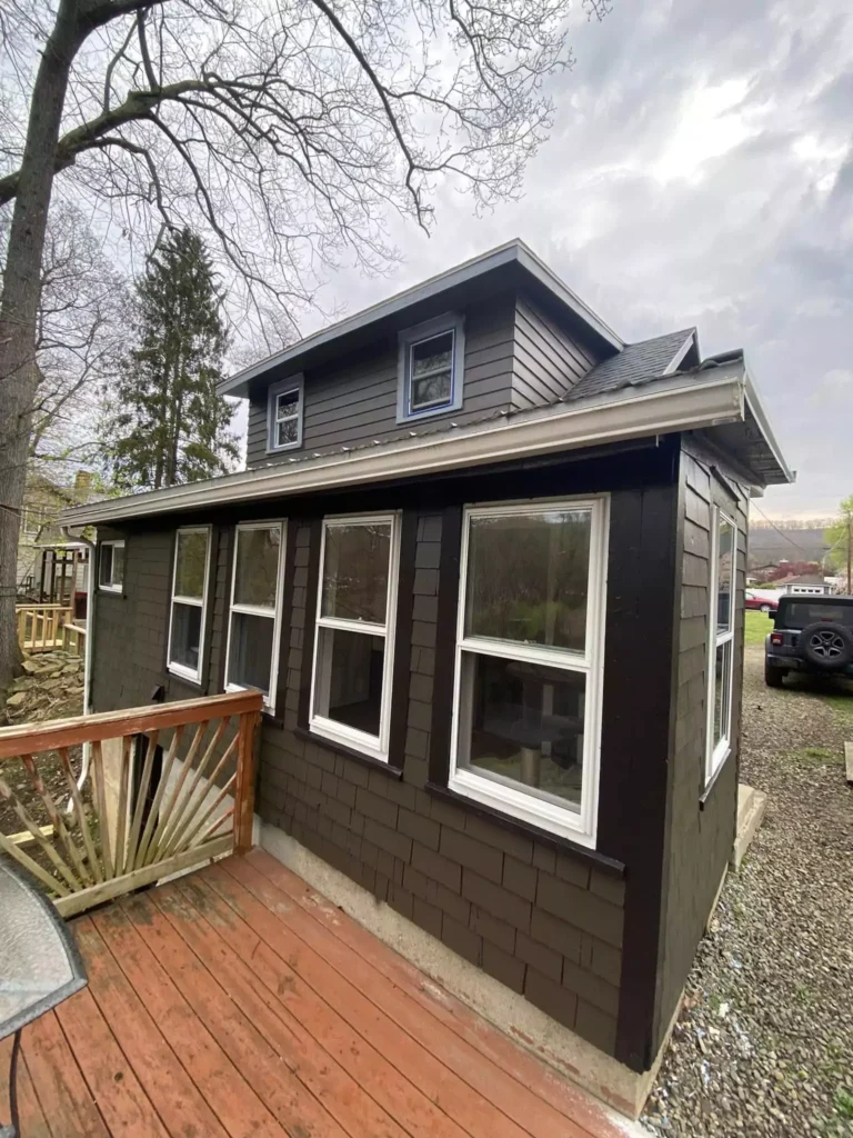
On a home’s exterior, Greenblack can create a striking, modern facade. Because it absorbs heat, it’s often paired with lighter trims and materials. For example, homes with Greenblack siding or trim often use crisp white or natural wood as contrasting elements.
In a few styled photos, houses painted in SW Greenblack really stand out against landscaping and white trim.
The very dark hue (LRV 4) means it will look nearly black in most light, but at night it can create a dramatic silhouette. Greenblack works especially well on brick homes or new builds aiming for a moody, “black-cedar” exterior look.
Coordinating Colors for Greenblack
To build a color scheme around Greenblack, pick lighter neutrals and a few accent hues:
Snowbound (SW 7004) – a soft warm off-white (LRV 83). This creamy white contrasts gently with Greenblack and can be used on ceilings or surrounding walls.
Extra White (SW 7006) – a crisp bright white (LRV 86). This very clean white (often used on trim or ceilings) gives the highest contrast with Greenblack.
Rave Red (SW 6608) – a vibrant warm red (LRV 11). Used as an accent, this energetic red adds cheer and warmth against the deep green-black background.
Rice Grain (SW 2849) – a light muted yellow (LRV 64) with a slight green cast. This pale warm neutral pairs softly with Greenblack, adding a gentle glow.
Silverplate (SW 7649) – a medium-light cool gray (LRV 53). It’s a versatile neutral that doesn’t compete with vivid colors, serving as a subdued backdrop with Greenblack.
Canyon Clay (SW 6055) – a mid-dark reddish-brown (LRV 13). This earthy terracotta hue with a violet undertone can be used as a bold accent in soft furnishing or decor.
These coordinating colors span light to bold. The whites (Snowbound, Extra White) ensure Greenblack doesn’t overwhelm, while accents like Rave Red or Canyon Clay inject energy.
Medium neutrals like Rice Grain and Silverplate keep the palette balanced. In any room, aim for at least one light and one accent color to complement Greenblack.
Soft Palette
For a gentle, serene palette with Greenblack, use pale neutrals and muted tones. Off-white shades soften the drama: for example, pairing Greenblack with the creamy Sherwin-Williams Snowbound (LRV 83) creates an elegant high-contrast look.
Muted pastels or light warm neutrals also work — a pale buttery yellow like Rice Grain (LRV 64) provides a soft glow next to Greenblack. Soft grays such as Silverplate (SW 7649, LRV 53) can also form a calm background that doesn’t compete with the intensity of Greenblack.
In a soft palette, Greenblack acts as the rich anchor color, while the surrounding tones are quiet and subdued, creating a relaxing atmosphere.
Bold Colors
For a dramatic, high-energy palette, use vivid accents with Greenblack. Bright saturated colors create a dynamic contrast.
The Sherwin-Williams Rave Red (LRV 11) is a perfect example: it’s a lively, cheerful red that pops boldly against Greenblack. Similarly, Canyon Clay (LRV 13) – a warm reddish-brown – adds an earthy intensity when paired with Greenblack.
Deep jewel tones also pair well: think emerald or teal accents (which echo Greenblack’s undertone) or a bright mustard. The key in a bold palette is using Greenblack as the deep backdrop and adding one or two saturated hues to energize the space.
Muted Colors
In a muted palette, stick to soft neutrals and grays that make Greenblack feel more subtle. For instance, use mid-tone grays or taupes instead of bright white.
\Sherwin-Williams Silverplate (LRV 53) is a cool gray that quietly complements Greenblack without high contrastblacksburgbelle.com. Warm grays like Repose Gray or Accessible Beige (not listed here, but similar idea) would also mute the look.
Even pale greens or olive tones that match Greenblack’s undertone can create a tonal scheme. The idea is to avoid any color that’s too bright; think dusty pastels or chalky neutrals.
This way, Greenblack blends into a calming monochrome palette rather than screaming for attention.
Sherwin-Williams Greenblack vs Iron Ore
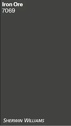

Sherwin Williams Iron Ore (SW 7069) is a dark charcoal-gray (LRV ~6) with virtually no strong undertones, whereas Greenblack is a deeper black (LRV ~4) with a subtle green bias. Iron Ore appears as a soft charcoal that can look almost neutral grey in some light.
By comparison, Greenblack reads closer to true black except under bright light (when its green hint shows). In other words, Iron Ore is a softer, grayer black, while Greenblack is a cooler black with a definite green tinge.
Both are popular for accents, but Iron Ore will feel more neutral, whereas Greenblack adds a hint of color depth.
Sherwin-Williams Greenblack vs Tricorn Black
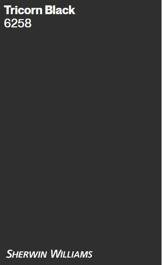
Sherwin Williams Tricorn Black (SW 6258) is the company’s standard true black (LRV ~3) with essentially no discernible undertones.
It’s very slightly darker than Greenblack (LRV 3 vs 4) and reads as a pure neutral black. In contrast, Greenblack’s one-percent green undertone makes it a bit cooler in appearance.
In practice, if you want the darkest pure black, Tricorn is the choice – it’s the “closest thing to a true black” in the SW palette.
If you prefer a deep black with more character, Greenblack provides that subtle hint of color. Tricorn goes with any color scheme (no weird tint), while Greenblack may lean slightly toward cooler or nature-inspired accents.
Frequently Asked Questions
What is a “green black” color?
A green black is simply a very dark color that combines black with a touch of green. In Sherwin-Williams terminology, “Greenblack” means a black base that has just enough green in it to warm it slightly
. In most lights it looks like a neutral black paint, but under certain conditions its green-leaning character can show through. In short, it’s essentially a black paint that reads dark, with a subtle green undertone.
What is the RGB for Sherwin Williams Greenblack?
The sRGB values for SW Greenblack are R 55, G 58, B 58. In hexadecimal form that’s roughly #373A3A. These numbers reflect the fact that it is nearly equal parts red, green and blue (very dark), with green and blue slightly higher than red.
(This is why on-screen swatches it looks like a nearly gray-black.) The very low values are why its LRV is only 4.
What is the difference between Jasper and Greenblack?
Sherwin Williams Jasper (SW 6216) is actually a very deep green paint, whereas Greenblack (SW 6994) is essentially black. Both are quite dark (similar LRV), but Jasper sits firmly in the green family.
In bright light Jasper reads as a saturated evergreen, while Greenblack still reads mostly black except for a hint of green.
In fact, Jasper can look almost black in a dim room because it’s so deep and saturated, but up close you’ll notice its true-green tone. By contrast, Greenblack appears more like a nearly neutral black with only a touch of green lurking in its depths.
In summary, Jasper is a dark green, Greenblack is a dark black (with just a bit of green).
What is the Benjamin Moore equivalent of Greenblack?
There isn’t an exact match, but a commonly cited close match is Benjamin Moore Black Knight (2136-10). Black Knight is a very dark gray-black (LRV ~5) that reads similarly deep.
Paint comparison charts list Black Knight as one of the closest Benjamin Moore paints to SW Greenblack.
Other similar BM colors include Blacktop or Black Panther, but Black Knight is often mentioned as the nearest equivalent. As always, for a perfect match you’d paint a test patch, since different formulations can shift slightly.


