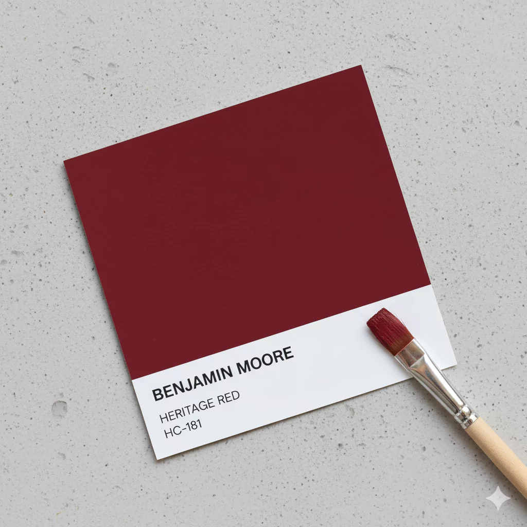
Benjamin Moore’s Heritage Red HC-181 is a deep, classic red paint color known for its warmth and vibrancy.
On the Benjamin Moore website it’s described as “a very classic shade of red that infuses a space with energy and personality.”
Heritage Red is part of BM’s Historical Colors collection (it was once called PM-18) and has a traditional, “barn-red” feel. In fact, this collection of 191 colors was launched for the U.S. Bicentennial in 1976, so each shade (including Heritage Red) was inspired by historic American themes.
Designers note that Heritage Red is “refined, elegant, and full of vibrant notes,” making it both timeless and bold. It’s often described as a blend of ruby and crimson – meaning it has both bright red and muted, deeper red qualities for a balanced look.
Heritage Red is quite rich and saturated. Because of its intensity, it works best when paired with lighter colors on other walls or decor so it doesn’t overwhelm a room.
For example, letting Heritage Red color one wall in a living room while keeping the others neutral can add energy without making the space too dark. In casual homes, the deep red can act as an accent or focal point.
Its classic tone fits well with traditional or colonial-style decor. The overall impression is warm and inviting, with Heritage Red bringing a sense of history and depth to a space.
OTHER BOLD RETRO COLORS:
- Secure Blue SW 6508 Sherwin Williams-Complete Guide
- Cerise SW 6580 Sherwin Williams
- Mulberry Color by Benjamin Moore 2075-20
Undertones of Heritage Red HC-181
Heritage Red’s undertones – the subtle colors you see underneath the main red – are mostly warm and earthy. This paint has noticeable brown undertones that give it a slightly rustic, barn-like quality. It also carries hints of muted pink and a tiny trace of gray in its depth.
In other words, it’s not a flat “cherry red”; the brown and pink tints make it feel richer and more complex. The brown note in particular makes the red feel warmer and deeper as light hits it.
Put simply, think of Heritage Red as a dark red painted over a bit of brown. Because of those brownish undertones, the color can change slightly under different lights (for example, sunlight might make the red look brighter, while a yellow lamp could bring out browns).
LRV of Heritage Red HC-181
Heritage Red HC-181 is quite dark in tone. Its Light Reflectance Value (LRV) is 10.26, which means it reflects only about 10% of visible light. (For context, pure white would be LRV 100 and pure black is 0.) An LRV around 10 places Heritage Red in the “dark color” category. This low LRV tells us that Heritage Red will absorb most light and make a surface look rich and deep. In a room, it can create a cozy, intimate feel because it doesn’t bounce much light around.
We can explain LRV simply: imagine shining a flashlight on the painted wall. A color with a higher LRV (like pale yellow) would look very bright because it reflects a lot of light. Heritage Red, with its 10.26 LRV, will look much darker by comparison.
Designers note that because of this, you often need extra brightness in the room (stronger lighting or sunlight) to keep a space with Heritage Red from feeling too dim. Despite its dark value, Heritage Red remains a very saturated, warm color. In other words, it’s dark but not dull – the intense red still pops out. Overall, the low LRV confirms that Heritage Red is a deep, dramatic red that will make walls stand out and rooms feel snug.
In Different Lights
Like all paints, Heritage Red will change appearance under different lighting. In strong daylight, the color often looks lively and vivid.
Natural sunlight, especially daylight from the south or west, will make the red’s vibrancy shine and reveal its warm highlights. Under bright sun, rooms painted Heritage Red feel energetic and bold.
In contrast, under warm artificial light (like incandescent or soft LED bulbs), Heritage Red can look a bit more muted and cozy. The lamp light tends to bring out the color’s brown undertones, making the red appear deeper and “warmer.” In very dim light (or in a north-facing room), it might even look almost brownish-red or burgundy.
In quick terms: bright cool light shows off the pure red side of Heritage Red, while warm or low light highlights its darker brownish side.
If the light is cool-blue (like from north windows or cool LEDs), the red might appear slightly sharper or slightly more pinkish. But if the light is yellowish (like sunset or a yellow bulb), the wall will look a deeper, golden-red.
This is why it’s often recommended to test Heritage Red in the actual room and lighting you have. Overall, Heritage Red is quite stable in color temperature (always warm) but will look richer and more subdued in soft light, and brighter in strong, cool light.
Hex Code
In digital terms, Heritage Red HC-181 is represented by the hexadecimal code #990A14. This six-character code tells computer screens how to show the color. The code starts with “#” and has three pairs of hex digits. For Heritage Red, #99 is the red component, 0A is green, and 14 is blue. #990A14 is a dark red color – you’ll notice it doesn’t have any high values in green or blue, emphasizing the red. This exact hex code is used in graphic design and web design to match Benjamin Moore’s Heritage Red precisely.
RGB
In the RGB color model (Red, Green, Blue), Heritage Red is made of 153 parts red, 10 parts green, and 20 parts blue. To explain in simple terms: imagine mixing lights – mostly red light, with tiny amounts of green and blue.
The green is so low (10) and the blue is low (20) that they hardly add any other color, so the mixture comes out as deep red. In even simpler language: Heritage Red’s RGB values are mostly “red with a dash of black” (because adding a little blue and green makes it darker). If you used this in a digital design, it would look the same deep red that Heritage Red is in real life.
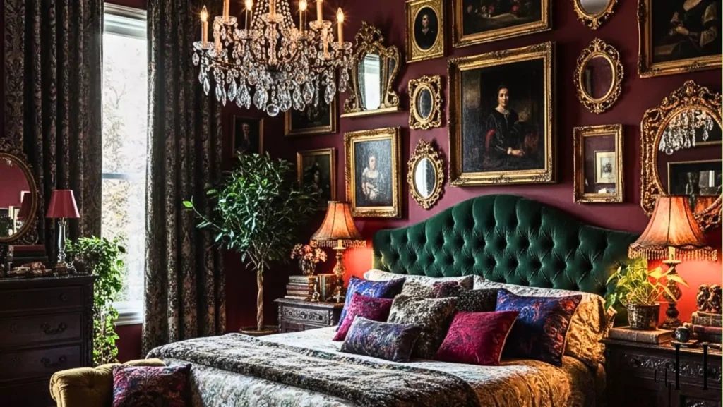
In the Bedroom
Heritage Red can create a cozy, intimate mood in a bedroom when used carefully. Because it’s a strong, dark color, it’s usually best for an accent wall rather than painting all four walls.
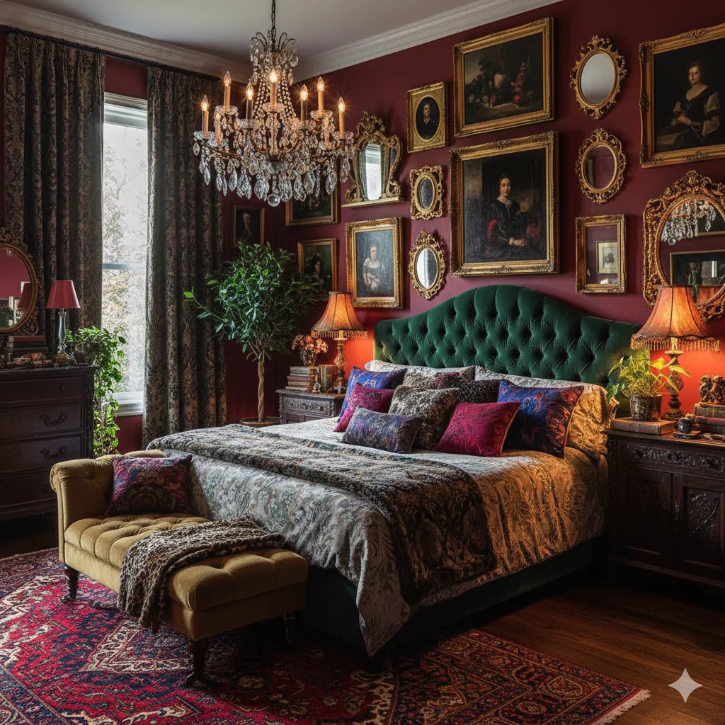
For example, painting the wall behind the bed in Heritage Red makes a bold focal point and feels warm. The deep red adds drama but also a comforting “cave-like” feeling that some people love in bedrooms.
To keep it from overwhelming the space, many designers suggest keeping bedding and curtains lighter. In fact, one guide notes that Heritage Red’s muted tones are perfect for a space that needs calm, and suggests pairing the red accent wall with contrasting bedding or pillows so that the wall stands out as intended. This contrast prevents the room from feeling “one-note.”
Because Heritage Red has brown undertones, it also matches well with warm wood furniture – think a wooden bedframe or nightstands next to a Heritage Red wall. Together, the wood and the wall color create a cabin-like cozy effect.
In the Kitchen
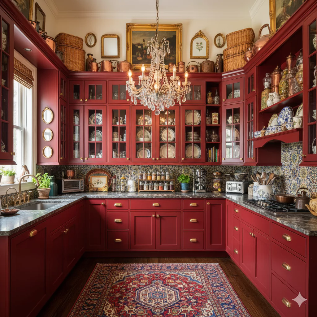
Heritage Red can add vibrancy to a kitchen, but it’s best used selectively. Painting all four walls of a small kitchen in Heritage Red might feel intense, so it’s common to see it on one accent wall or on an island cabinet.
For example, a wall behind the stove or sink painted Heritage Red can make that area pop against white cabinets. One style tip is to use Heritage Red on the lower island cabinets while keeping the upper cabinets or walls white or gray – this way the color is bold but not overbearing. The deep red color brings warmth and can stimulate appetite, which is nice for a kitchen.
Design experts suggest balancing it with neutrals: white countertops, gray backsplashes, or natural wood can keep the room light. Heritage Red’s brownish-red shade goes wonderfully with natural wood grains and earthy tones.
Another idea is to paint a dining nook or a breakfast banquette wall Heritage Red, with surrounding walls neutral – this adds personality without making the whole room dark. In any case, good lighting is important: under-cabinet lights or bright overhead lamps help Heritage Red shine without making the kitchen feel cramped.
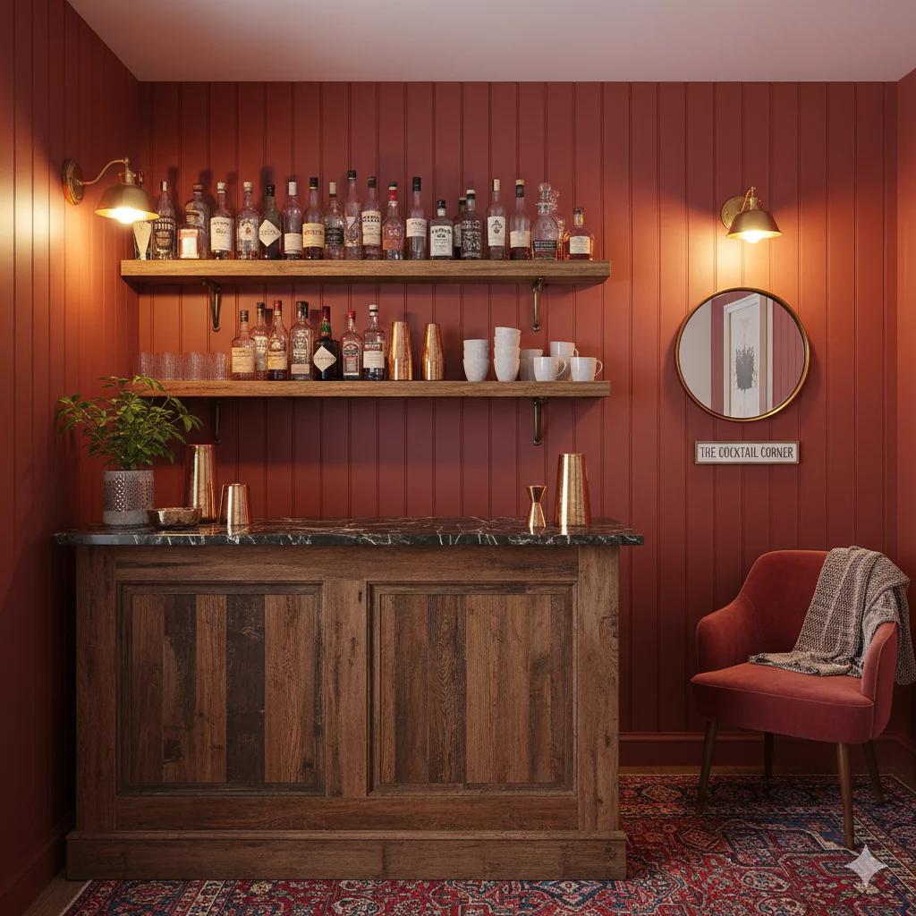
In the Living Room
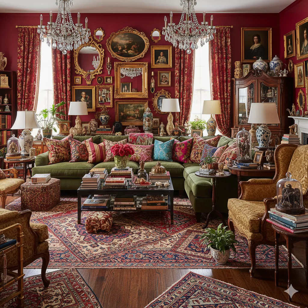
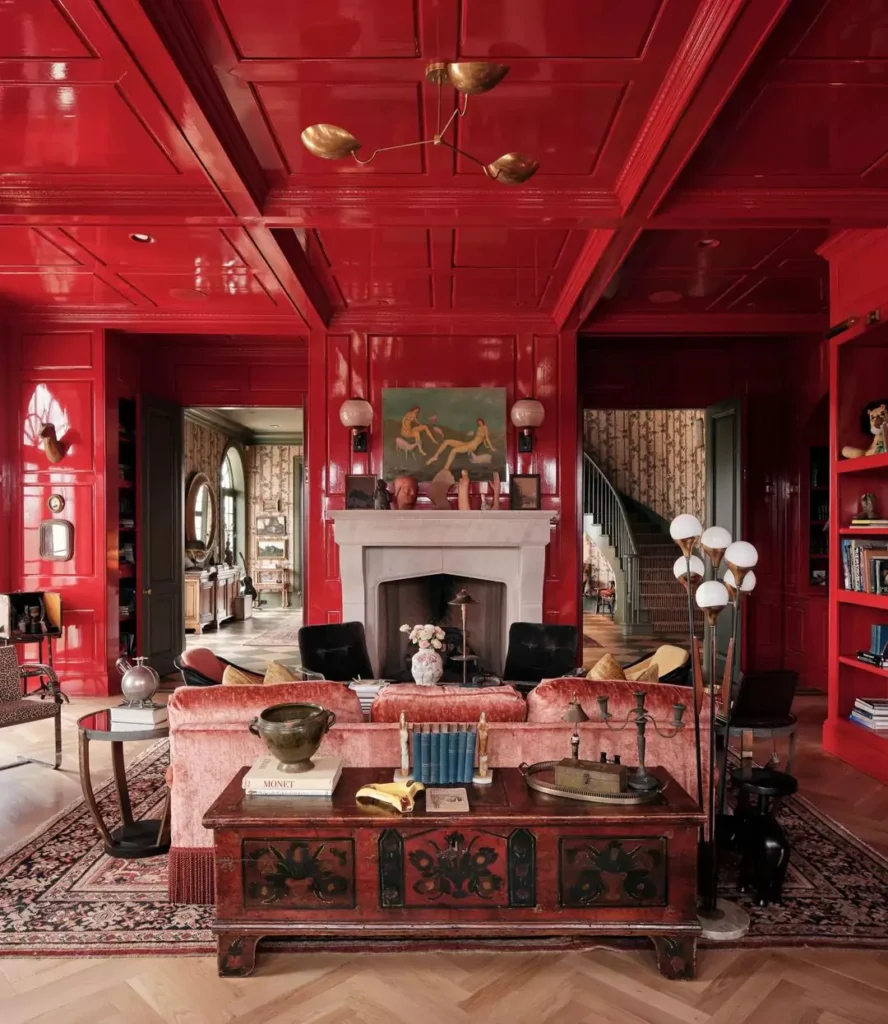
A living room painted in Heritage Red feels rich and dramatic. Used on an accent wall (or even an entire room, in large or well-lit spaces), it makes the space feel warm and energized.
A living room fully painted in Heritage Red can feel “surprisingly comfy” and free-spirited. The color creates a cozy atmosphere – imagine watching TV or reading by a fireplace in a deep red room. Because red is socially stimulating, it can encourage conversation, making it interesting for social areas. Designers sometimes use Heritage Red around a dining area of an open-plan living room to define that space and make it feel special.
To keep balance, it’s smart to furnish the room with some lighter or neutral items: for example, a gray or beige sofa, cream rug, or neutral art helps prevent the red from overwhelming the senses.
A few accents in Heritage Red (pillows, vases, art) can echo the walls. Overall, Heritage Red in a living room adds rich personality. It will likely make the room feel more enclosed and intimate, so many people use it on only one or two walls. In the right spot (like behind the TV or a sofa), it becomes a striking backdrop that makes the living room feel bold and inviting.
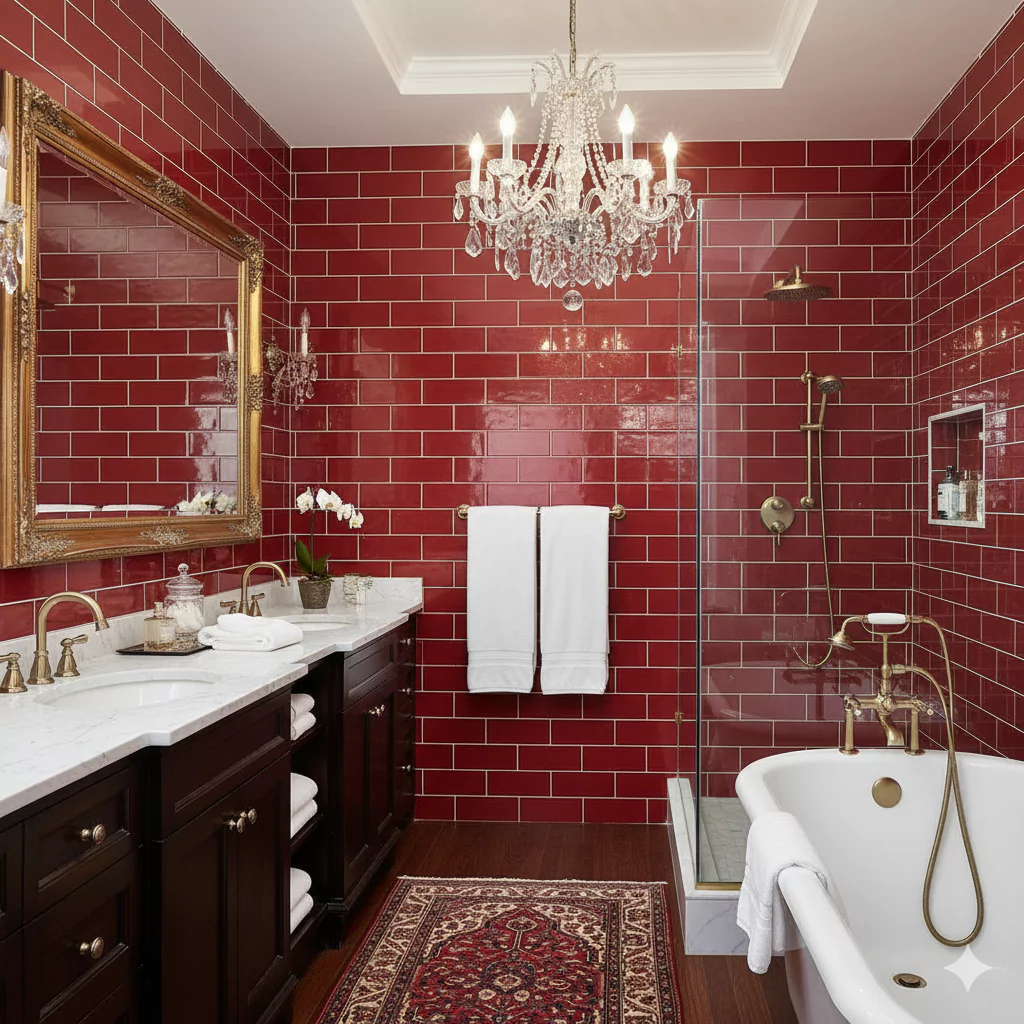
In the Bathroom
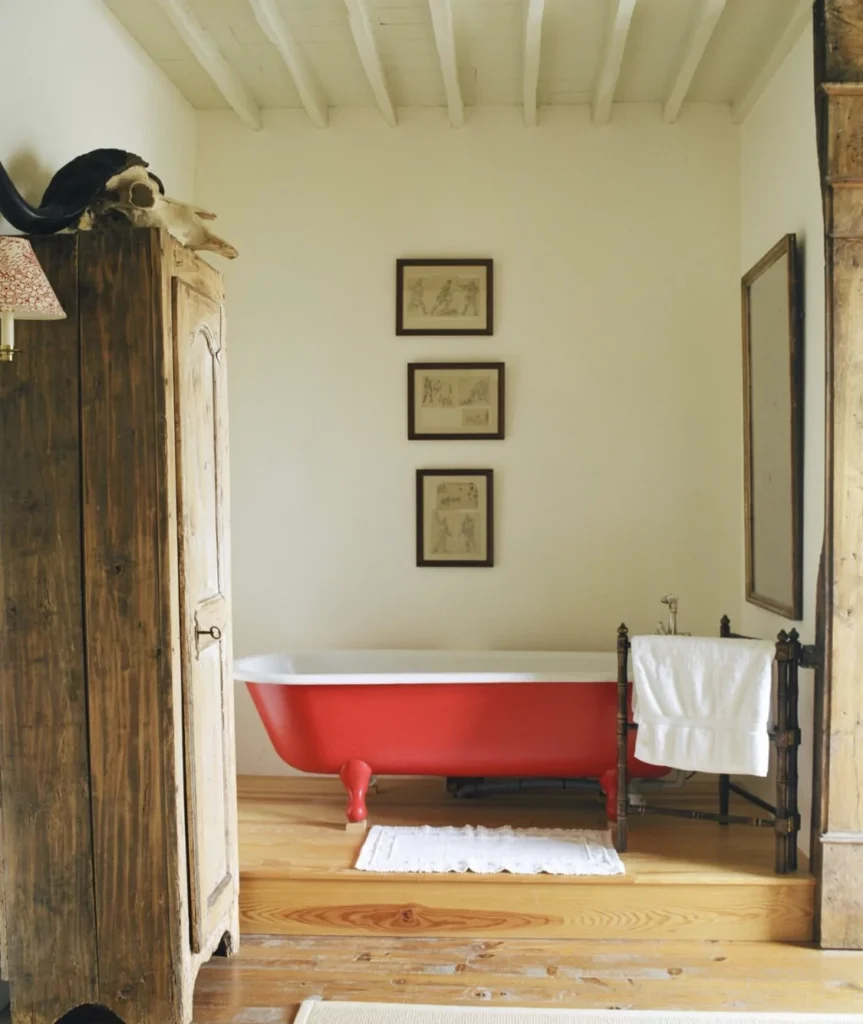
Heritage Red can look quite stylish in a bathroom, but it should be used carefully because bathrooms are often small. A little bit of Heritage Red goes a long way to add luxury and warmth
. Common uses include painting the wall behind a vanity or the wall next to the bathtub in Heritage Red, then surrounding it with white tile or fixtures. This classic red-and-white combo looks crisp and clean.
For example, painting just the lower half of a wall or a niche Heritage Red and the rest white can add color without making the bathroom feel too dark. Wood accents (like a small stool or frame) can tie in with the red’s brown undertone, making the space feel more natural.
Even a Heritage Red sink cabinet or set of bathroom cabinets can make a stunning focal point. Paired with marble or light quartz, the red stands out beautifully. One guide notes that red in a bath needs contrast – “paired with wood paneling” or white – to look right. In short, in a bathroom Heritage Red gives a dramatic, rich touch in small doses: think one red wall or piece of furniture rather than all red surfaces.
In Cabinets
Heritage Red can also be a bold choice for cabinets, especially in a kitchen or built-ins. Painting kitchen cabinet fronts (like an island, pantry door, or open shelving unit) in Heritage Red makes a strong style statement.
Because the color is dark, it works best on lower cabinets or islands so the eye isn’t overwhelmed at eye level. Pair red cabinets with a light countertop (white or beige) and backsplash (light tile or glass) to keep things bright.
Another approach is to use Heritage Red on furniture cabinets in the living or dining room – for example, a red china cabinet or TV console. Its warm hue can complement wood or neutral furniture, echoing any wood floors or trim.
If your existing cabinets are natural wood, Heritage Red accents (like one painted cabinet or shelf) will pick up the wood’s warm tones, highlighting the brown undertones in the paint. One note from design advice: using contrasting colors on cabinets is common with Heritage Red – for instance, one idea is to paint the island in red and the rest of the kitchen cabinets in gray or white. This way, Heritage Red stands out as an accent color.
In Exterior
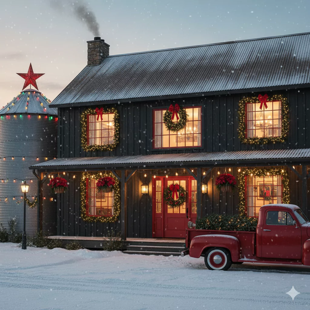
Outside the home, Heritage Red makes a cheerful, historic-looking accent. A little red goes a long way on a house exterior.
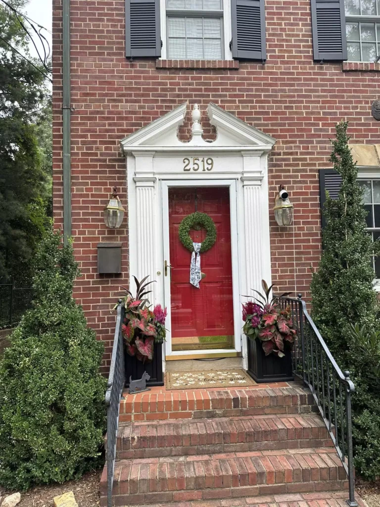
Painting an entire house in Heritage Red would be too overwhelming, but using it for the front door, shutters, or trim is perfect. A Heritage Red front door has a classic, welcoming look in many traditional homes. It pops nicely against cream, beige, gray, or even black siding.
For example, you might paint your entry door Heritage Red and keep the rest of the facade a neutral pale (off-white or gray). This was actually recommended: using Heritage Red on a front door and pairing it with neutral walls complements the home while letting the red door shine.
Heritage Red can also work on porch ceilings (for a bold statement) or on barn doors on sheds. Just be sure to use bright, durable exterior paint formula. Overcast light outside can sometimes make it look a bit brownish-red, whereas midday sun will make it look bright red. Overall, Heritage Red as an exterior accent color adds charm and warmth without overpowering the house’s architecture.
Coordinating Colors of Heritage Red HC-181
When decorating with Heritage Red, certain colors consistently complement it. Designers often recommend pairing it with neutrals and cool grays.
For example, Benjamin Moore suggests cool grays like Ashley Gray (HC-87) and warm grays or greiges like Balboa Mist (OC-27) and Fossil (AF-65) alongside Heritage Red.
These gentle gray-beige colors let the red stand out while keeping the look balanced. White and off-white trim colors (e.g. Crisp White or Chantilly Lace) also work as crisp backdrop shades.
Muted warm neutrals are another good match. Colors like Navajo White OC-95 (a creamy white) or Bleeker Beige HC-80 (a soft tan) complement Heritage Red’s warmth.
Pale lavenders or greens can also coordinate: for example, Benjamin Moore’s Sweet Naivete (light muted purple) or Lily Pad 480 (a sage green) are soft colors that contrast the red without clashing. For bolder schemes, even deep navy or teals look great. A very dark blue like Bold Blue 2064-10 can make a beautiful accent wall or sofa color next to Heritage Red.
In summary, Heritage Red “plays well” with both warm and cool tones. It pairs especially nicely with colors opposite it on the color wheel (greens and blues).
For example, one complementary scheme is to use a muted teal-green (close to Benjamin Moore’s Spring Breeze or Celadon) to contrast the red. The official expert palette for Heritage Red includes all of these: light neutrals, grays, and even some blues and greens.
Soft Palette
A soft palette with Heritage Red means using gentle, light colors so the red doesn’t overpower the space. Think of calm pastels or pale neutrals. Soft off-whites like Benjamin Moore White Dove (OC-17) or light greige shades like Stonington Gray (HC-170) are named as natural partners for Heritage Red.
Using these lighter tones on other walls or in furnishings (curtains, rugs) makes the red accent feel elegant and not too busy.
Another soft approach is to use very light versions of colors. For instance, a very pale green or pink. In fact, some designers even pair Heritage Red with a delicate pastel purple like Sweet Naivete, or a misty pale green like Lily Pad. These aren’t bright colors – they are “muted pastels” – so they keep the overall look soft. Creamy beiges and light tans (like Navajo White) also soften Heritage Red.
The key is that none of these background colors compete with the red; they let it be the star. For example, a living room might have Heritage Red on one wall and all other walls painted in a soft gray-beige. This combination feels gentle and balanced. Basically, a soft palette tames the boldness of Heritage Red by surrounding it with calm, pale hues.
Bold Palette
For a bold color scheme, pick other intense, rich colors that stand up to Heritage Red. Bold colors are typically vibrant and saturated. One popular choice is a deep green or teal: since green is opposite red on the color wheel, a rich teal or emerald green will really make the red pop.
In fact, Benjamin Moore’s Caliente (AF-290) and Heritage Red are often compared – Caliente is a very bright red (even Color of the Year in 2018) with similar warmth. While not exactly used together in one space, thinking of Caliente shows the energy of bright reds. Other bold pairing ideas: a strong navy blue (like Bold Blue 2064-10) or a saturated forest green. The plan-home guide even suggests lush greens like Spring Breeze or Celadon as high-contrast mates.
Warm bolds can work too: deep magentas or plums (like Raspberry Truffle) and dark browns (like Tudor Brown) are mentioned as accent ideas. These colors are close enough to red to feel harmonious but still very rich.
Think of a velvet plum sofa or jewel-toned pillows in a room with Heritage Red walls – it creates a luxurious, dramatic feel. A bold color scheme is energetic and daring. If you love bright, intense looks, matching Heritage Red with another strong color (especially a dark blue-green) will give a very vivid, statement-making palette.
Muted Colors
A muted palette means using colors that are toned-down or grayish, so they soften Heritage Red’s impact. These could be grayed-out versions of any color.
In practice, think of warm grays, taupes, or “dusty” shades. Benjamin Moore’s coordinating suggestions include colors like Bleeker Beige (HC-80) – a beige with gray undertones – which is very soft. Or a desaturated dark color like Plum Martini (CSP-540) – a nearly black plum shade – which can serve as a deep neutral. Using these muted shades around Heritage Red makes the overall look calm and subdued.
For instance, painting trim or adjoining walls in a gentle gray like Ashley Gray (HC-87) or Balboa Mist (OC-27) keeps the focus on the red but doesn’t add more brightness.
Even a faded denim blue or a soft olive-green (if grayed down) can count as muted. The goal is no extra “loudness.” A muted palette works well if you want Heritage Red’s warmth but prefer a more understated room. In other words, it’s the opposite of bright – everything else is low-key, almost pastel or near-neutral, letting the heritage red appear strong but not chaotic.
Frequently Asked Questions
Benjamin Moore Caliente vs Heritage Red
Caliente (AF-290) and Heritage Red (HC-181) are both warm reds, but Caliente is a livelier, more saturated red, while Heritage Red is deeper and more earthy. Caliente was even BM’s 2018 Color of the Year and is described as a “vibrant, charismatic red with rich undertones” .
Heritage Red, on the other hand, is noted as a “timeless barn-red” color .
In technical terms, Caliente has a lower light reflectance (around 6%) than Heritage Red (about 10%) making Heritage Red actually lighter in value. Both are warm reds, but Caliente often reads as brighter and more energetic, while Heritage Red feels warm, classic, and slightly more muted.
What does HC stand for in Benjamin Moore?
The “HC” prefix in BM paint codes stands for the Historical Colors collection . This is a special series of 191 colors Benjamin Moore introduced for the U.S. Bicentennial. Heritage Red’s code “HC-181” means it is color #181 in the Historical collection.
Every color in that line has the HC prefix and is meant to evoke a traditional or historic hue . What is the best Benjamin Moore red color? There’s no single “best” red – it depends on style – but some of the most popular BM reds are often mentioned together.
For example, Caliente (AF-290) is extremely popular for its bright, lively tone .Heritage Red (HC-181) itself is a top choice for a classic red .
Other favorites include Brick Red (2084-10) for a warm orangey-red vibe, and Cherry Wine (2080-30) for a deep wine-red elegance . Design blogs highlight Caliente’s energy and Heritage Red’s timeless feel