Last updated on August 27th, 2025 at 08:42 am
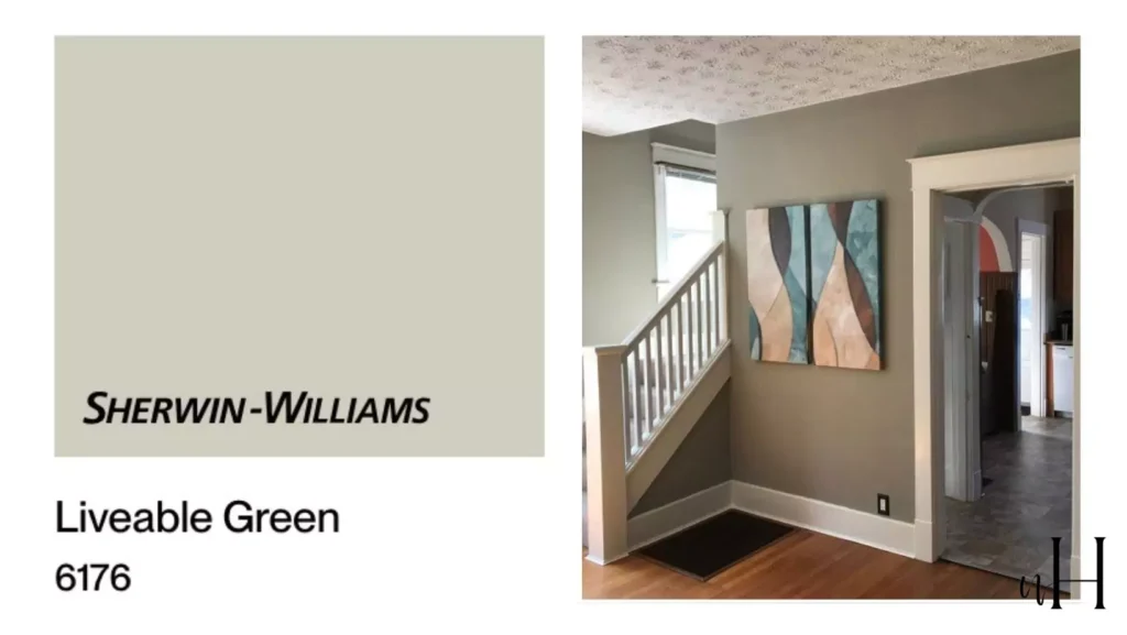
As Sherwin-Williams Liveable Green (SW 6176) is set right beside the Softened Green and Sagey ,and if you are confused between them,this blog is gonna be helpful.
Without wasting time , lemme tell you that i will share how it feels like in different lighting, in different rooms,your queries that does it look good in small room or just for an accent wall.
I am reviewing it after use on my cabinet.And also how it felt like in different homes of my friend and family.
Sherwin-Williams Liveable Green (SW 6176) is a soft, earthy green paint that creates a calm, nature-inspired atmosphere in any room.
It is described as a “gorgeous gray-green shade” that transforms ordinary spaces into peaceful, welcoming rooms.
22 Best Grey Green Paint Colors From Light to Dark
Part of SW’s “Subtle Warmth” collection, Liveable Green balances warm and cool elements – it’s versatile for both modern and traditional decor.
Homeowners use it on accent walls or whole rooms to add a fresh, grounding backdrop without overwhelming the space.
My Review:Softened Green SW 6177 Sherwin Williams
Undertones
Liveable Green has warm yellow-gray undertones that give it a muted, organic quality.
Design experts note its gentle gray undertones that keep the color refined and soothing. At the same time, it leans slightly warm – not a cool mint – so the green feels cozy and grounded.
This balance means the hue looks soft rather than bright, and it pairs easily with both warm neutrals and cooler accents.
One reviewer sums it up as “a soft, muted green with warm undertones,” making rooms feel calm and connected to nature.
21 Best Green Paint Colors with 5★ Ratings
Light Reflectance Value (LRV)
Liveable Green’s official LRV is 61 (on a scale of 0–100). This moderate value indicates it reflects a fair amount of light, giving it a medium-toned appearance. In practice, an LRV of 61 means the color brightens a space without being too pale.
It creates a cozy yet spacious feel – for example, designers note it “adds character without overwhelming” a room. In lighter formulations (like flat or matte), it stays warm and soft; in glossier finishes the hue may appear slightly brighter.
Different Lighting Conditions
Liveable Green shifts subtly with lighting. In bright natural light it often looks greener and fresher, while in lower light or evening it leans warmer and more muted.
For me, “Morning light reveals its fresh, nature-inspired qualities, while evening brings out warmer, earthier tones.”
Similarly, designers note that whether a room is flooded with daylight or lit by warm bulbs, Liveable Green “adapts beautifully,” taking on a cozier glow under artificial light.
Evergreen Fog SW 9130 Sherwin Williams:My Review After Use
In north-facing rooms (cooler light) it may read slightly grayer; in south-facing (sunny) rooms the yellow-tinge warms it up. Because of this flexibility, it’s recommended to test a sample in the actual room.
In the Bedroom
Liveable Green is ideal for bedrooms and other relaxation spaces.
Its soft tone creates a tranquil, restorative vibe that promotes sleep and stress relief. Reviews say it “alters bedrooms into tranquil retreats” and “wraps your bedroom in nature’s most calming hug.”
The color makes small rooms feel more open while still cozy, so even compact bedrooms feel airy.
For décor, it pairs beautifully with warm whites, navy blues or beige textiles – for example, crisp white bedding and muted gold/brass accents complement the gentle green. Styling tip: use natural woods (birch, walnut) and soft linens to enhance the serene feel.
Best Dark Green Cabinet Paint Colors
Light bedding and warm wood complement the shade. In the above bedroom, Liveable Green walls and trim combine with neutral bedding and light wood furniture for a cozy, restful feel.
In the Kitchen
Liveable Green brings a fresh, inviting mood to kitchens and dining areas. It creates a warm gathering spot without feeling too bold. If you want something bold in mute sahdes you can use tricorn black by Sherwin Williams ,i ve alsp reviewd it in my blog you can check.
Designers report that “kitchens painted in this hue feel fresh and natural without being too bright or overwhelming.”
Its muted tone makes even a busy kitchen seem spacious and airy.
In practice, Liveable Green pairs exceptionally well with white or cream cabinets and natural wood tones. For example, white subway tile or quartz countertops pop subtly against the green cabinetry.
The color encourages relaxation at the table – one of my friends noted it “feels more special against this soothing background.” Adding potted plants or botanical prints further emphasizes the organic vibe.
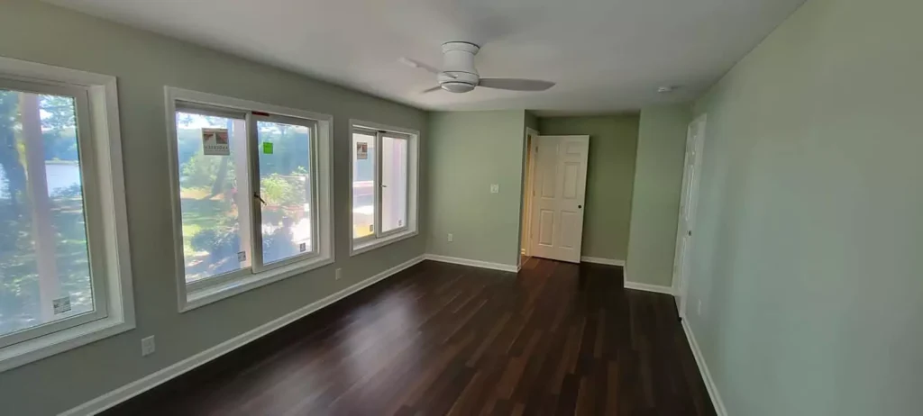
In the Living Room

As a living-room wall color, Liveable Green provides a soothing yet stylish backdrop. It makes the space feel grounded and comfortable. In family rooms it “creates a soothing backdrop that makes the room feel grounded and comfortable,” helping artwork and decor stand out.
The color works with a range of styles – rustic farmhouse to sleek contemporary.
23 Dark Green Bedroom Ideas that Never Go Out of Style
A common suggestion is to pair it with warm woods and light neutrals (cream sofas, beige drapes) to maintain an earthy yet polished look.
Designers also recommend combining Liveable Green with warm wood tones and natural textiles like linen or jute for a cozy, inviting living space.
In the Bathroom
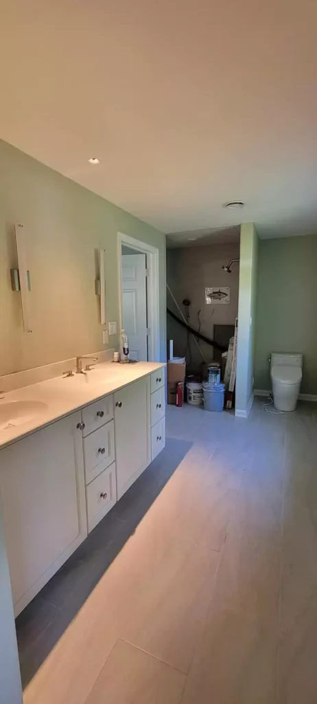
Liveable Green can transform a bathroom into a spa-like retreat. Its calming, muted quality is particularly nice in a small, tile-dominated space.
If you ask for my decorating guide I suggest pairing it with crisp white subway tile and brushed nickel or chrome fixtures for a refreshing feel. Soft gray towels or natural stone finishes complement the green nicely.
Because of its medium LRV, it still keeps the room bright even in lower ceilings. Overall, it adds warmth and tranquility, making a bath feel like a peaceful escape.
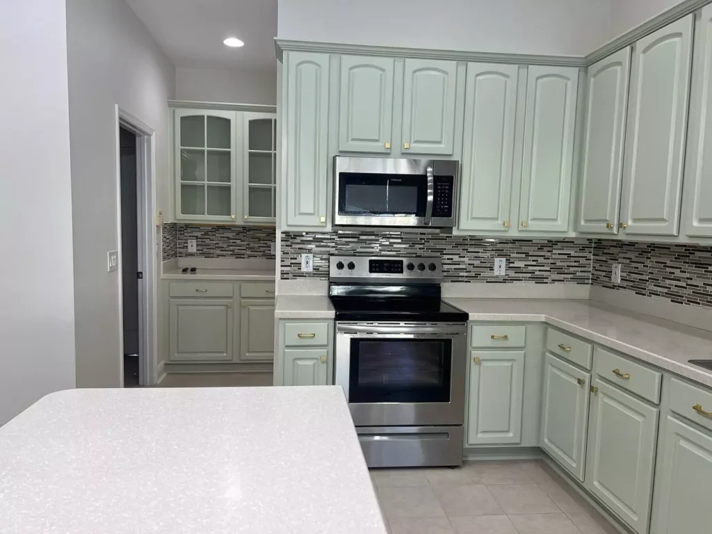
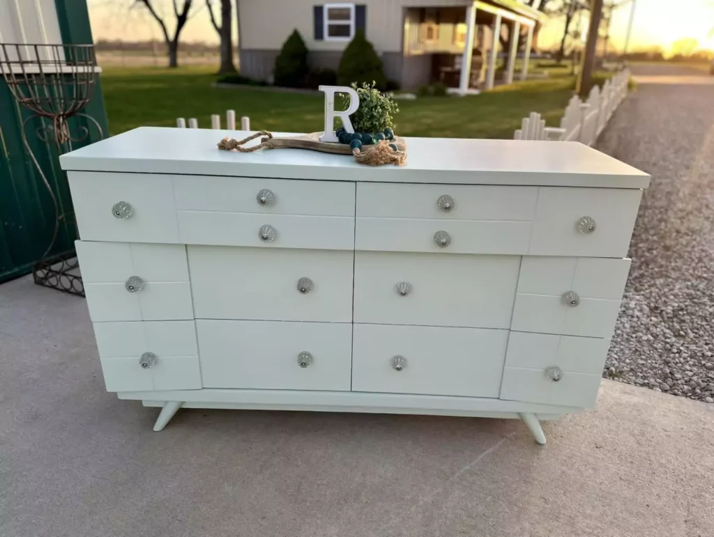
On Cabinets
Liveable Green makes a stylish and unexpected cabinetry color.
Painting kitchen or bathroom cabinets in this shade adds color without overpowering the room. The hue “complements white, cream, or natural wood cabinets perfectly,” offering design flexibility.
It creates a fresh look while still feeling warm.
Figure: Kitchen cabinets painted in Liveable Green (SW 6176). This gentle green flatters white backsplash and black appliances. In the kitchen above, the upper and lower cabinets are Liveable Green, paired with white tile and black hardware.
The result is modern yet cozy – the green ties in warm natural elements (wood floor, cutting board) and makes the cabinets pop against the light backsplash.

Exterior Use
Liveable Green is also used as an exterior paint color for homes. Its muted, earthy tone suits natural surroundings.
For example, a home exterior painted in Liveable Green presents a calm, organic appearance (see figure below). It’s described as adding a “calming, organic touch” to a house when used outside. The color’s warm undertones mean it often reads as a soft sage green outdoors, which harmonizes with landscaping.
Under bright sun, it may look slightly lighter (more yellow-green), while in shade or evening it deepens a bit. According to a color review, Liveable Green is warm (yellowish) compared to cooler blues like Sea Salt.
Home exterior painted in Liveable Green (SW 6176). Liveable Green on siding creates a welcoming, serene look.
Note the crisp white trim and deck accents – warm whites like these balance the green’s warmth. This exterior shot (from a modern farmhouse palette) shows how the color blends with natural wood furniture and brick patio to evoke an earthy feel.
Coordinating Colors
Liveable Green pairs well with a wide range of colors. Below are suggested palettes and accents:
Soft neutrals: Crisp, warm whites and creams create a light, airy scheme. Examples include Sherwin-Williams Alabaster or Shell White for trim and ceilings. Beige neutrals like Accessible Beige, Whole Wheat or Natural Linen work as companion wall or furniture colors. These light neutrals keep the look gentle and expansive.
Analogous greens: For a tonal palette, use deeper or lighter greens. For instance, Sherwin-Williams Sagey (SW 6175) or Clary Sage (SW 6178) are slightly richer green allies. Soft greens like Rainwashed (SW 6211) or Tradewind (SW 6218) can be used as accent walls or textiles for harmony with a hint of blue.
Bold contrasts: Darker, dramatic colors make striking accents. For bold trim or feature walls, consider Sherwin-Williams Iron Ore (deep charcoal) or Urbane Bronze (deep brown-gray). Black (e.g. Tricorn Black) or navy blue also contrast strongly.
Additionally, warm accent hues like burnt orange, golden yellow or terracotta bring vibrant energy; designers note that “warm colors like terracotta, golden yellow, and burnt orange create stunning focal points” against Liveable Green.
Cool, muted accents: Soft blues and lavenders work as gentle complements. For example, Sherwin-Williams Rainwashed or Tradewind (both muted blue-greens) blend seamlessly with Liveable Green. Pale lavender or soft gray introduce a spa-like calm. Creamy whites and natural textures (linen, wicker) also make serene, muted pairings.
Soft Palette
A Liveable Green interior door with neutral walls and decor. Light creams and beiges form a soft, tonal palette.
For a soft, monochromatic palette, pair Liveable Green with light neutrals. Think creams, off-whites, and warm grays.
For example, Sherwin-Williams Accessible Beige or Alabaster white trim keep the scheme gentle. The image above shows a room with beige walls and simple decor, allowing the Liveable Green door to be a subtle focal point.
Other warm-white trims (Shell White, Whole Wheat) blend smoothly with the green wall, creating an airy, cohesive look.
Bold and Muted Tones
For bold accents, introduce deeper or brighter hues. Dark charcoal or black trim (e.g. Iron Ore, Tricorn Black) will make the green pop with high contrast. Jewel tones like navy or emerald can also serve as striking furniture or accessory colors.
On the other hand, muted complementary shades soften the effect: dusty blues (Rainwashed, Tradewind) or pale lavender add subtle depth without clashing. For a punch of warmth, terracotta or mustard yellow accents (pillows, art) set off the green beautifully.
The key is balancing the calm green with either bright pops or subdued tones depending on the desired mood.
All credit goes to image owner.Mail @nestichomes@gmail.com
Frequently Asked Questions
Liveable Green vs. Sea Salt
Both are soft greens from Sherwin-Williams, but they have different undertones. Liveable Green (SW 6176) is slightly darker (LRV 61 vs. Sea Salt’s 63) and leans more yellow-green (warm).
Sea Salt (SW 6204) is lighter and cooler, with a more blue-green cast. In summary, Liveable Green feels earthier and warmer, while Sea Salt reads crisper and cooler in the same lighting.
Liveable Green vs. Softened Green
Softened Green (SW 6177) is the sister shade one number away from Liveable Green. It is darker and grayer, with an LRV around 49 versus Liveable’s 61. In practice, Softened Green will look more subdued and moody; Liveable Green is lighter and more cheerful.
If you prefer an airier, brighter green, Liveable Green is the better choice. Always compare swatches, as the difference can seem subtle in daylight.
Filmy Green vs. Liveable Green
Filmy Green (SW 6174) is another nearby green. It has a higher LRV (around 63) and is less saturated than Liveable Green.
This means Filmy Green appears lighter and slightly cooler. Liveable Green has a bit more depth and warmth, giving it a cozier feel. In short, Filmy Green is a very soft, pale minty-green; Liveable Green is richer and more yellow-tinged in comparison.
Which color complements green the most?
On the color wheel, the complementary color to green is red. In interiors, many designers use warm red-oranges or coral accents with green walls.
For instance, burnt orange, terracotta or golden yellows pair beautifully with Liveable Green (as noted by designers) to create a vibrant contrast.
Even a touch of blush-pink or deep burgundy can make the green pop. Neutral complements include warm whites and wood tones, which balance the green without clashing.
Is Liveable Green warm or cool?
Liveable Green is generally considered a warm green. Its yellow-gray undertones give it a cozy, earthy quality.
As one color expert notes, “It’s a warm green, thanks to its yellow and gray undertones.” In different light it can read neutral or slightly cool, but overall it sits on the warmer side of the spectrum.


