Last updated on September 5th, 2025 at 01:40 pm
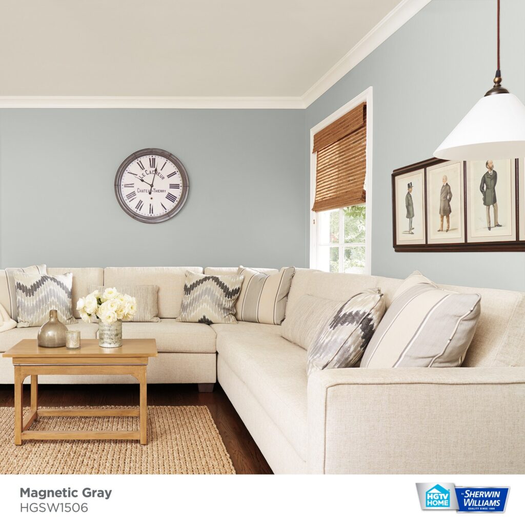
Sherwin-Williams Magnetic Gray (SW 7058) is a versatile mid-tone neutral gray. If i tell you honestly ,depends on what ive obesrved about Magnetic Gray in diffrent light s and homes ,it gives many colors undertones such as cool gray with subtle green/cyan undertones that add depth without feeling icy also it feels some kind of sage green underotones.
One of my client described Magnetic Gray’s as a slight greenish cast (almost a soft minty hue) gives it an “organic warmth,” helping it work in both warm and cool palettes.
According to me, Magnetic Gray serves as a “medium-toned gray” that brings a touch of warmth and sophistication to modern or traditional spaces.
In this BLOG i will share REAL HOME IMAGES using Magnetic Gray in diffrent rooms,how it gives undertones in diffrent lightning ,LRV ,coordinating colors ,what color trim with Magnetic Gray.
Some images are from my friends home Hanna ,You will read this name again and aganin in blog next ,I will tell her experience with Magnetic Gray.
Keep reading. OTHER GRAY COLORS
- Web Gray SW 7075 Sherwin-Williams-Review after My Clients Love it
- Gray Screen (SW 7071)Sherwin Williams Complete Guide+Real Homes Images
- Intellectual Gray SW 7045 -Sherwin-Williams
- Valspar Ashen Gray 6004-1C: Everything You Need to Know
Undertones of Magnetic Gray
Magnetic Gray is classified as a cool neutral. Its undertones lean toward green-blue (cyan) rather than warm yellow or red. For example, Wild Fox Painting notes it is a “cool-leaning gray with faint green undertones”.
Similarly, online paint experts list various hidden hues (mint, pale purple, etc.) that may peek out under different conditions. In practice, this means Magnetic Gray can look slightly bluish or sage-like in ample light, but it never reads truly warm.
Its cool-green hint helps it feel less sterile than a pure gray: one designer says those undertones prevent it from feeling “overly sterile or cold”. In neutral design schemes, Magnetic Gray can act as a bridge between true grays and gentle green-blues, pulling together warm and cool accents harmoniously.
What is the LRV of Magnetic Gray
The LRV (Light Reflectance Value) of Magnetic Gray is approximately 45–46. This places it on the darker end of mid-tone grays (0 = black, 100 = white).
DecorCreek reports Magnetic Gray’s LRV as about 45.8, while Sherwin-Williams documentation lists it as 46. A lower LRV means the color absorbs more light, so Magnetic Gray will not brighten a room like a pale gray would. In practical terms, a room painted Magnetic Gray will appear moderately deep and moody.
It’s dark enough to feel cozy, yet not so dark as to make a space feel tight. Designers note that because its LRV is under 50, Magnetic Gray will reflect only a moderate amount of light – enough to keep spaces from feeling too dim, but still giving a rich depth to walls.
You may need decent lighting to keep a Magnetic Gray room from feeling too dark, especially in rooms with little natural light.
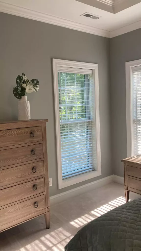
Magnetic Gray in Different Lighting
Lighting dramatically influences Magnetic Gray’s look. In bright natural daylight, it tends to appear cooler and truer to its gray-blue character.
One of the clients that in sunlight, Magnetic Gray “appears cooler and more neutral”. In northern light (cool, indirect light), the green/blue undertones become more prominent, making the color look even bluer.
Conversely, in warm southern light, Magnetic Gray can take on a slightly softer, warmer cast, as the sun’s yellow tones bring out its subtle green-yellow hints. In cloudy or low light, the gray will look deeper and muddier.
Artificial lighting also shifts the tone. Under incandescent or warm LED bulbs, the color warms up: the hidden yellow/pink notes may emerge, giving the room a cozier, almost brownish-gray glow.
Under cool fluorescent or daylight LEDs, the color looks crisper and cooler, emphasizing the blue-green side. For example, warm bulbs can make Magnetic Gray feel more “cozy,” while cool bulbs make it feel crisp.
As my client Hanna noted that in warm light the gray’s yellowish undertones “might surface, adding a cozy vibe,” whereas cool light highlights its minty-blue cast.
In summary, Magnetic Gray will look bluer and cooler in bright or north-facing light, and warmer and slightly lighter in strong, warm light. This variability makes it a dynamic choice that adapts to changing light (day vs. night, bulbs vs. sun).
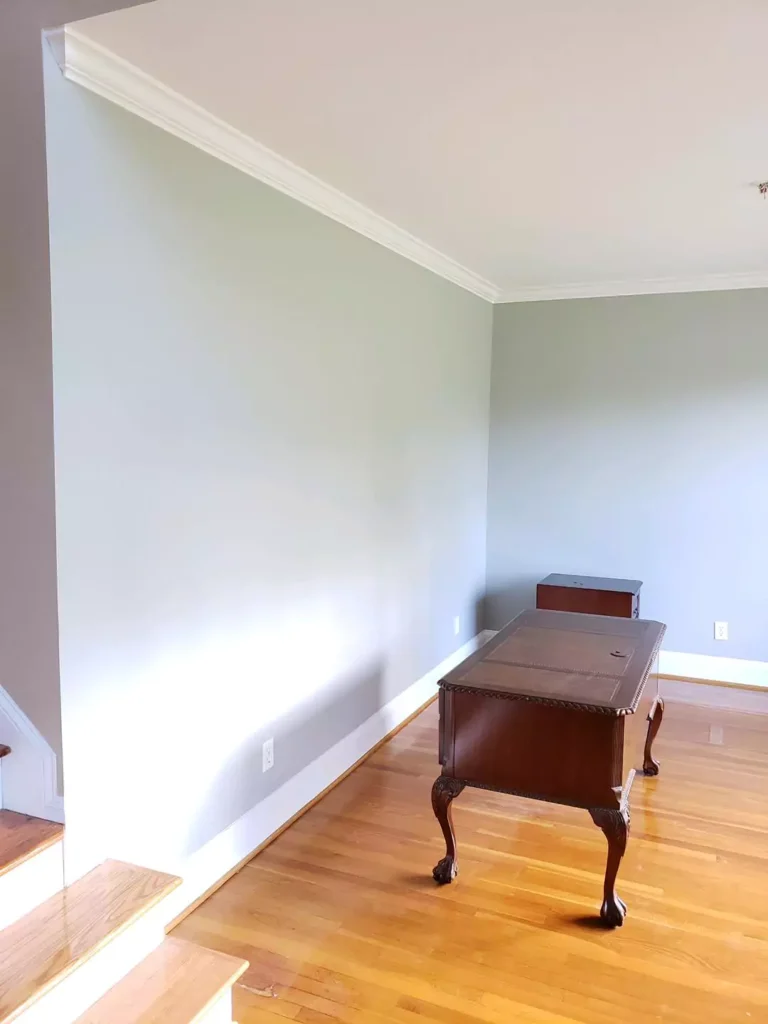
Bedroom with Magnetic Gray
Magnetic Gray can create a restful, cozy bedroom when used on walls or as an accent. Designers recommend it for bedrooms because it is dark enough to feel intimate yet not too oppressive.
For instance, a review notes that in bedrooms it “provides a restful atmosphere that isn’t too dark or heavy”. The color’s cool, muted quality promotes relaxation. Pairing Magnetic Gray with soft whites (like white bedding and trim) and warm wood tones enhances the calming effect.
BlacksburgBelle suggests using white curtains and throws against Magnetic Gray walls to brighten the space. Metallic accents (e.g. silver lamp or picture frames) also pop nicely against this gray, adding a touch of elegance.
Overall, Magnetic Gray makes a cozy backdrop for bedrooms: it feels warm and secure without turning the room too dark, especially when balanced with lighter linens and pillows.
Kitchen
Though gray isn’t a traditional kitchen color, Magnetic Gray has become a popular, contemporary choice for walls or cabinetry. Its muted green-gray tone adds warmth to the kitchen, turning away from the sterile feel of some grays.
For example, an expert notes that Magnetic Gray “will improve your cooking experience by offering familiar warmth” and is “a great choice” when paired with light woods or white cabinetry.
In practice, use Magnetic Gray on walls or lower cabinets with crisp white upper cabinets or marble counters. The gray provides a neutral backdrop for stainless-steel appliances and warm wood cabinets or floors.
In kitchens with plenty of natural light or warm pendant lighting, the green undertones will glow softly.
In contrast, in dimmer kitchens the gray will read more neutral. DecorCreek specifically praises Magnetic Gray in kitchen settings, noting it “shines” when used with white cabinets or brushed-nickel hardware.
This color also pairs well with wood or brown accents: as one source suggests, adding brown-handled hardware or wood shelving will “balance” and complement the gray.
Overall, Magnetic Gray can create a modern, lived-in kitchen look, especially when offset with white and natural textures.
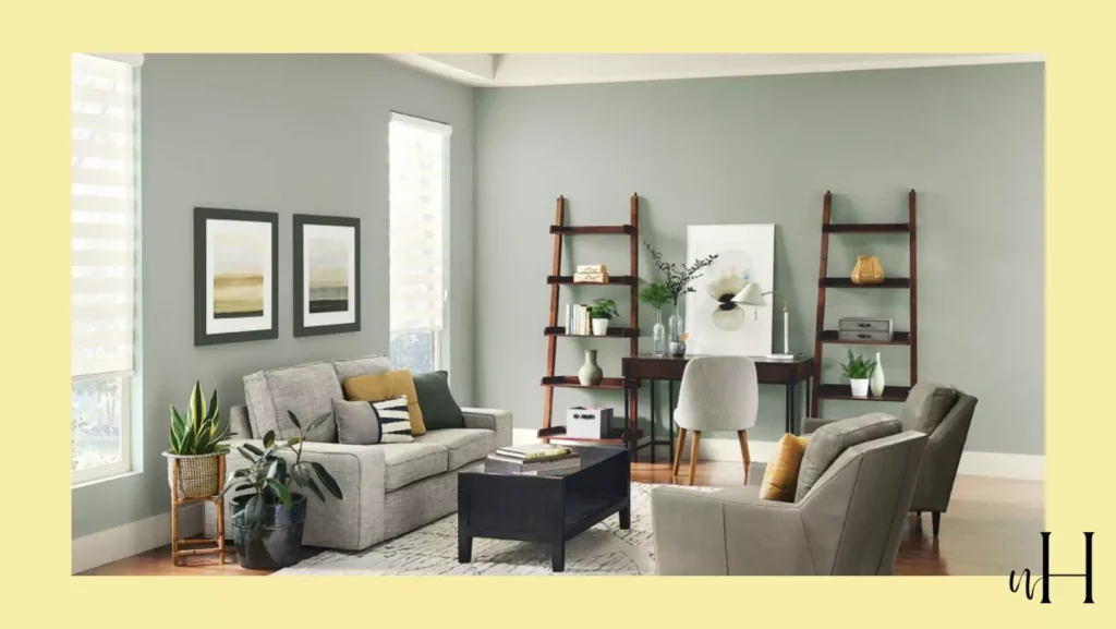
Living Room
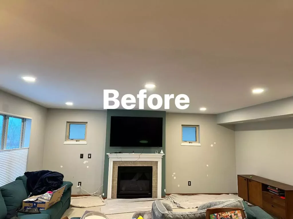
Magnetic Gray makes a stylish, versatile living room color. It is dark enough to anchor a seating area, yet neutral enough to accommodate many accent shades.
According to a Hanna review, Magnetic Gray “is a reliable and stylish choice for a living room” and works well with both warm and cool accent colors. You might paint a feature wall in Magnetic Gray or use it on trim or built-in shelves for contrast.
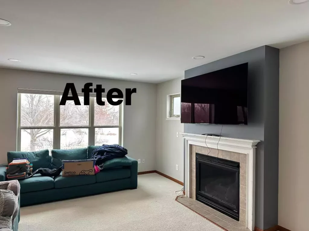
In general rooms, it provides a subtle backdrop that lets art, furniture, and textiles stand out.
For example, white trim and colorful pillows will pop against the subdued gray walls. Designers also pair it with wood furniture for a cozier vibe. Because it is neither stark nor too dark, Magnetic Gray can make a living room feel grounded without feeling gloomy.
If the space is large and bright, the gray can add sophistication; in smaller or darker living rooms, it brings a cozy intimacy. Either way, it pairs readily with most accent palettes – from cool blues to warm rusts or yellows – giving you flexibility to change decor while keeping the walls neutral.
Bathroom
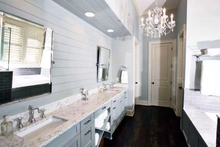
Magnetic Gray can create a spa-like bathroom with subtle drama. Its cool tone feels clean and modern, while its muted green hints add softness.
BlacksburgBelle recommends Magnetic Gray for bathroom walls, advising designers to “pair this cool color with warm lights, brown wooden shelves or cabinets, and white towels for a great contrast”.
In other words, mix in warm or natural elements: teak or walnut shelving, gold fixtures, or cream tiles will warm up the gray. White linens and fixtures (toilet, sink) will brighten the space and keep it feeling fresh.
The gray walls allow details (like brushed nickel hardware, veined stone, or shower tile patterns) to stand out. In well-lit bathrooms, Magnetic Gray will look crisp and elegant; under soft lighting it will read as a comforting neutral.
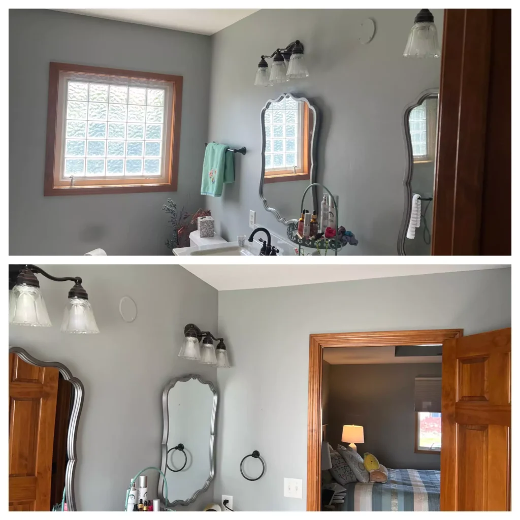
The same source notes that in a bathroom decked in Magnetic Gray “muted gray with rich green and blue undertones peeking through,” the effect is intimate and relaxing. Thus, Magnetic Gray can be ideal for making a bathroom feel both soothing and sophisticated.
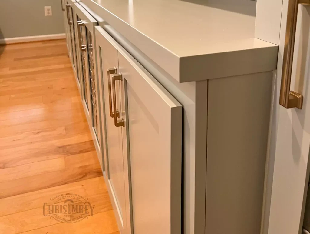
Magnetic Gray on Cabinets
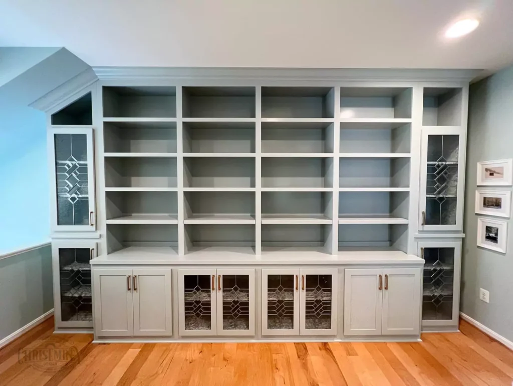
As a cabinet color (especially kitchen or built-in cabinets), Magnetic Gray is surprisingly appealing. It is dark enough to contrast with lighter countertops, yet neutral enough not to conflict with other finishes.
Reviewers have praised Magnetic Gray on cabinetry, noting that it “looks amazing on your kitchen or room cabinet, especially against stained wood”.
Because of its green-tinged gray, it reads as a deep neutral rather than an inky color, giving cabinets a rich tone without being too heavy.
Designers suggest adding brown or black hardware to these cabinets to complement the gray and keep the look cohesive.
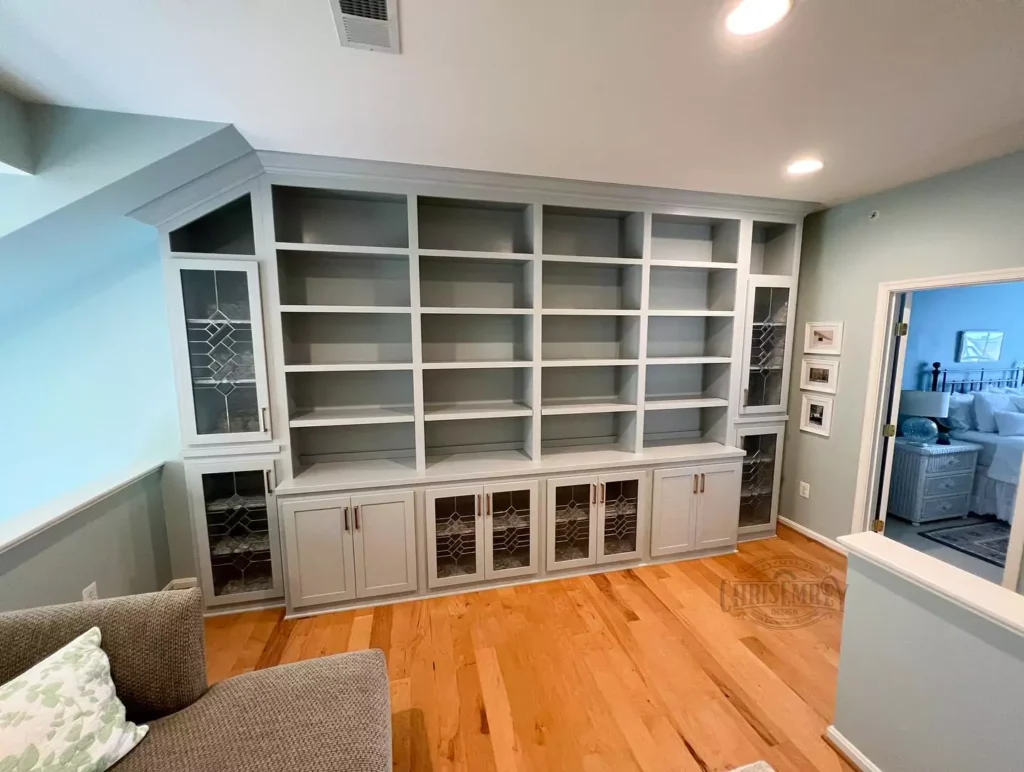
Because Magnetic Gray has a “homey, cozy feel” on cabinets, it can make a kitchen or built-in bookcase feel warm and inviting. In short, gray cabinets painted in Magnetic Gray will feel contemporary yet grounded – a step away from stark white or bold color cabinets – and they play well with natural wood and white accents.
Exterior
Magnetic Gray is also used on exteriors or front doors. Its medium depth and green undertones look quite different outside than inside.
Notably, because its LRV is low (around 46), the color will absorb a lot of sunlight on an exterior surface. This means in bright sun the painted surface will look deep and vivid, while in shade it will look like a dark gray.
According to experts, this is an advantage: Magnetic Gray “will absorb all the sunlight when you use it outside,” so it doesn’t wash out in bright light. Dark exteriors like this often “flourish in spaces with excessive light” because they retain richness.
In practice, a house painted Magnetic Gray will appear as a bold gray with subtle green hints during the day; at dusk or indoors it will mellow toward a deep charcoal. It pairs well with white or light trim, as the contrast defines architectural details.
Its subtle hue makes it more interesting than a flat black or charcoal, yet it remains a timeless neutral for facades or entry doors.
Coordinating Colors-Magnetic Gray
Because Magnetic Gray is neutral and adaptable, many color palettes coordinate well with it. Here are some general ideas:
Soft/Light Palette: Pair Magnetic Gray with light neutrals or pastels for an airy, gentle scheme. For example, a crisp white like Sherwin-Williams Pure White (SW 7005) or Reserved White (SW 7056) on trim and ceilings will brighten the room while complementing the gray.
Pale, muted colors like soft green-blue (Watery SW 6478) or light beige (Comfort Gray SW 6205) also work to keep the mood soft.
These combinations keep the palette light and serene. (Soft accent colors like blush pink or pale mint also play well against Magnetic Gray.)
Muted/Earthy Palette: Use other subdued tones for a calm, tonal look. Examples include sagey or silvery greens (like Silvermist SW 7621 or Oyster Bay SW 6206), warm beiges or greiges (such as Neutral Ground SW 7568 or Requisite Gray SW 7023), and mid-toned grays (like Dorian Gray SW 7017).
These colors share a neutral character with Magnetic Gray, so the overall feel remains balanced and cohesive.
For instance, Silvermist (a pale gray-green) echoes Magnetic Gray’s undertones, while a greige like Requisite Gray adds just a touch of warmth. This muted palette is peaceful and sophisticated – good for relaxed interiors.
Bold/Accent Palette: For a more dramatic look, introduce rich or saturated accents.
warm blacks (Tricorn Black SW 6258) pair strongly with Magnetic Gray. Earthy darks like Urbane Bronze (SW 7048) or rich navy blues also work as bold accents. Bright jewel tones (emerald green, mustard yellow, etc.) can also pop against the neutral gray.
Color Comparisons
Sherwin-Williams Comfort Gray (SW 6205) vs. Sea Salt (SW 6204)
While Magnetic Gray is itself a medium gray, it’s informative to compare similar popular neutrals. For example, Sea Salt (SW 6204) is a very pale green-gray, and Comfort Gray (SW 6205) is a light gray with green undertones.
A direct comparison shows Sea Salt is noticeably lighter than Comfort Gray. In fact, Plan-Home’s side-by-side data notes that Sea Salt “radiates a lighter essence” than Comfort Gray. Their LRVs bear this out: Sea Salt’s LRV is about 63, whereas Comfort Gray’s is 54.
This means Sea Salt will look much brighter, almost minty, while Comfort Gray appears creamier and slightly darker.
In saturation (intensity) they are similar, but because Comfort Gray has the lower LRV, it reads as more muted. In short, Sea Salt is the airier, lighter of the two, whereas Comfort Gray is a touch warmer and creamier by comparison.
Sherwin-Williams Comfort Gray (SW 6205) vs. Oyster Bay (SW 6206)
Oyster Bay (SW 6206) is a deeper green-gray compared to Comfort Gray. When comparing these, Plan-Home finds that Comfort Gray has the higher LRV (about 54%) vs. Oyster Bay’s ~44%.
In practical terms, Comfort Gray is lighter, and Oyster Bay is noticeably darker and richer.
Their hue and saturation values are similar (both are cool-toned green-grays), but Comfort Gray appears more muted and faded, while Oyster Bay looks more saturated and moody. The analysis notes that both have comparable saturation, but “6206 is being darker”.
Thus, Oyster Bay reads as a deeper forest-green gray, whereas Comfort Gray is the paler, gentler gray of the pair. If you painted two identical rooms, the one in Comfort Gray would definitely feel brighter than the Oyster Bay room.


