Last updated on September 5th, 2025 at 01:42 pm
Mulberry” thus words feels so sweet and spicy at the same time, like this Benjamin Moore Mulberry paint color is warm and cool in different lighting. Sometimes clients ask me to add something which is colorful and dramatic at the same time, then mulberry color is the best choice for hues of elegance in your home.
In this blog, I’ve covered everything about mulberry color in the home’s exterior and obviously, interior too. How you can use mulberry color in interior like bedroom, living room, and on furniture, complementary colors,trim, and exterior style with mulberry color.
If you wanna know Bugundy vs maroon read this blog.
For Pink and Brown bedroom inspo read this blog.
Undertones & LRV of Benjamin Moore Mulberry (2075-20)
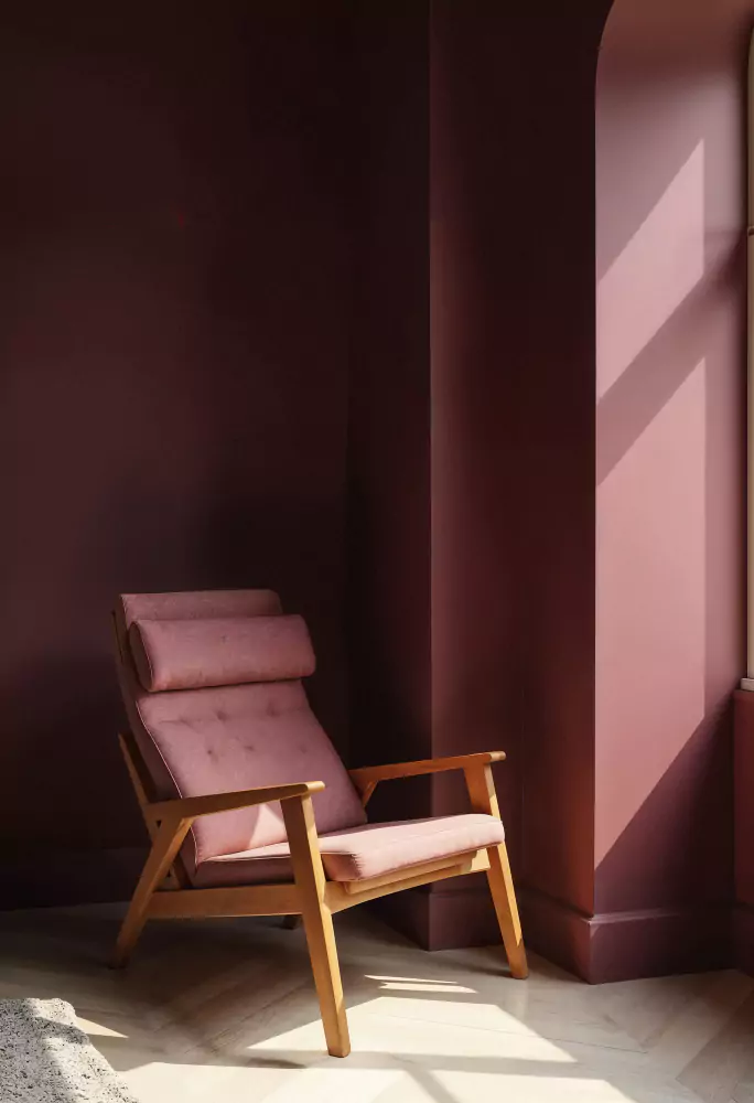
Benjamin Moore Mulberry (2075-20) feels very deep plum/berry in hue. Depending on lighting, it carries red and purple undertones, meaning it can appear slightly reddish-purple. Its Light Reflectance Value is 9.48 (on a 0–100 scale),it means its very dark, richly saturated color (lower LRV = darker color).
How does mulberry color feel in Different Lighting
As all colors shifts its appearance when light changes, so mulberry too. In warm indoor light (incandescent or warm LEDs) its red-plum feels very intensily, giving a cozy, reddish cast.
In cool daylight or cool LED light, the more bluish-purple aspects come forward. In practice, north-facing (cool) light makes Mulberry look bluer/warmer-tinged grey, while south or incandescent light brings out its burgundy, redder side. (Test samples in your own room to see this effect.)
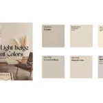
Coordinating Color Palette for Mulberry Color
Analogous palette:
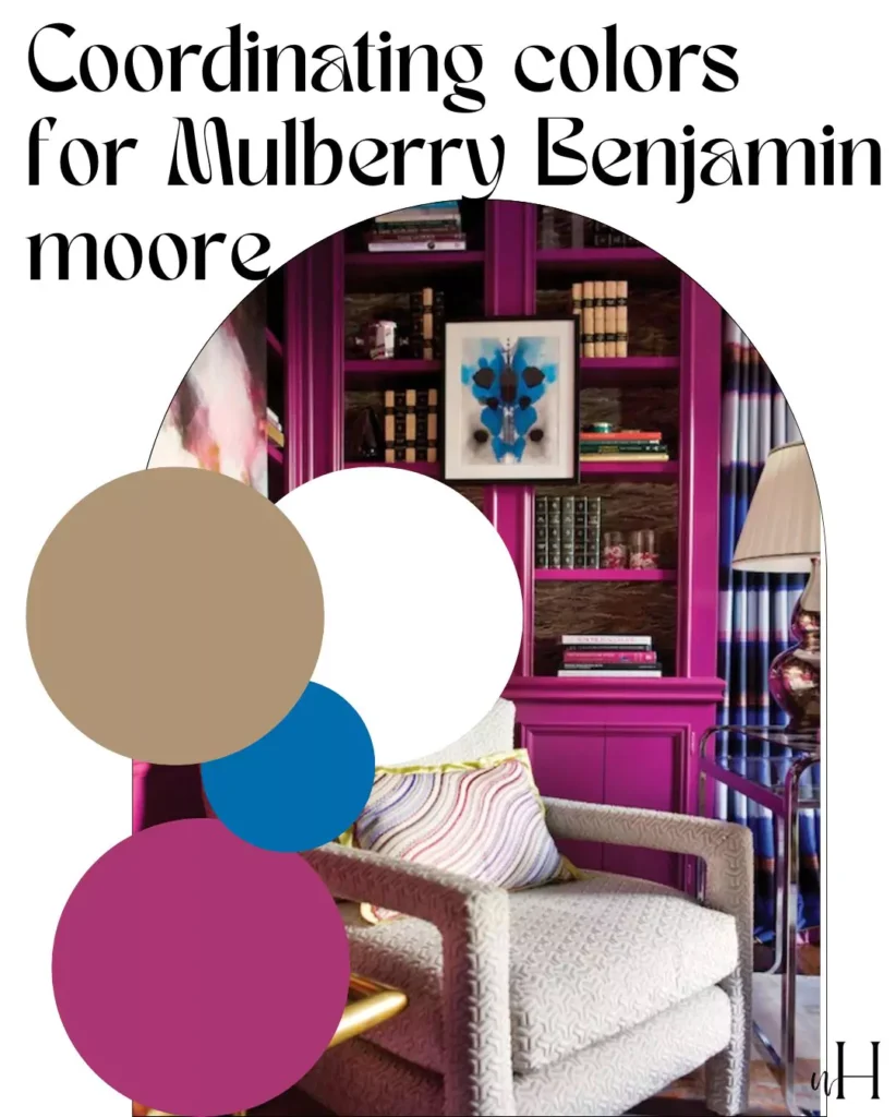
For Mulberry, this means other reds and violets. For example, a bright magenta-pink, I mean Benjamin Moore’s Pink Raspberry 2075‑40 and Dark Burgundy 2075‑10 (a very deep red-purple) sit nearby on the spectrum.
These are perfect to creat the warm look with Benjamin More Mulberry, also creating harmony in spaces. (Other nearby purples or raspberry tones work similarly.)
Light monochrome palette:
Use lighter tints of the same sahde. Benjamin Moore’s own 2075-series includes very soft variants: Charming Pink 2075‑70 (a light lilac‑pink), Passion Pink 2075‑60, and Pink Taffy 2075‑50.
Pairing Mulberry with these pale pink/mauve shades creates a gentle, tonal scheme.In case you want something pinkish and purplish,otherwise you can go for alabaster and some other whites of sherwin Williams and benjamin moore.
Dark monochrome palette:
Use deeper shades. A natural partner is BM Dark Burgundy 2075‑10, which is essentially a darker plum in the same family. Other very deep eggplant or near-black violets (e.g. BM Midnight 2131‑20) can also complement Mulberry in a moody palette.
Mulberry color -Room Applications
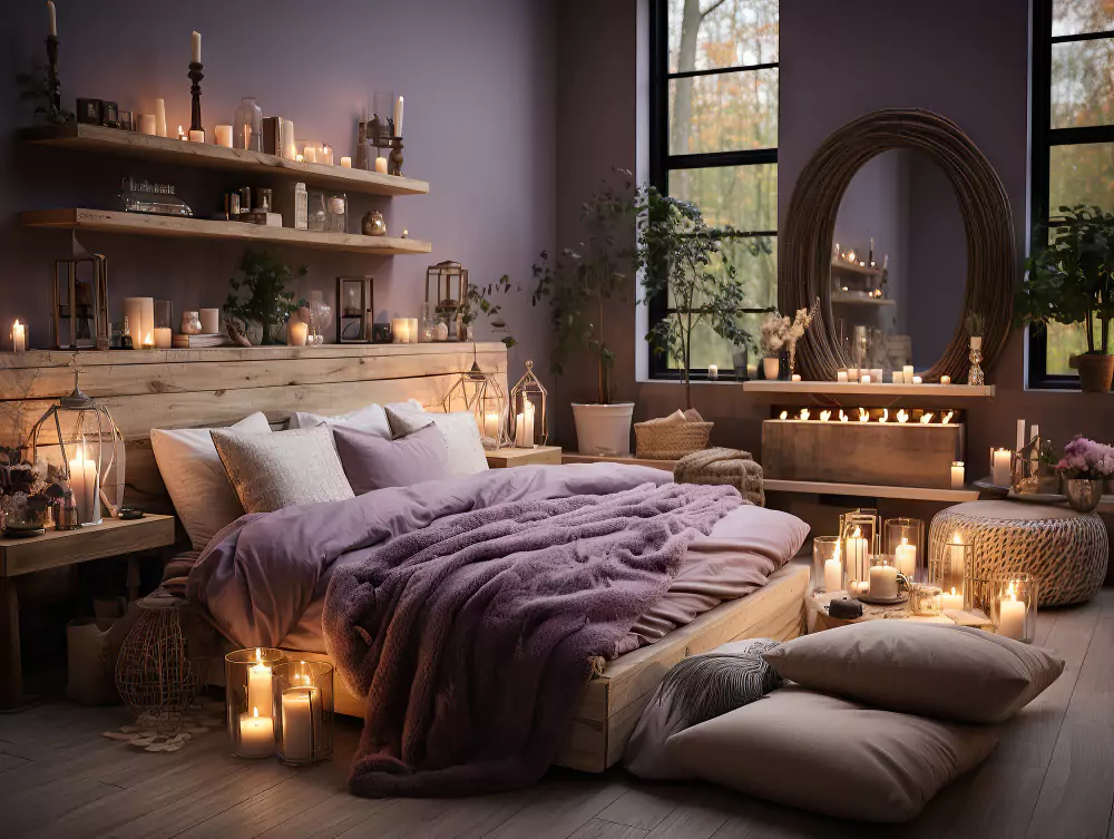
Mulberry color in the Bedroom

Mulberry creates a “cocooning” intimate bedroom. Use it upon all of the walls. For drama, it can be a feature wall behind the bed. It is its warm undertones that create such a cozy feel.
This is especially true when balanced against soft linens and neutral bedding. Designers suggest pairing it with pale grays or off-whites on trim and bedding to maintain serenity for example “crisp white curtains” plus bedding offset a “Mulberry” wall. Velvet pillows, wool throws, natural wood nightstands layer textures which add depth stopping the dark color’s overwhelming feeling.
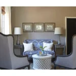
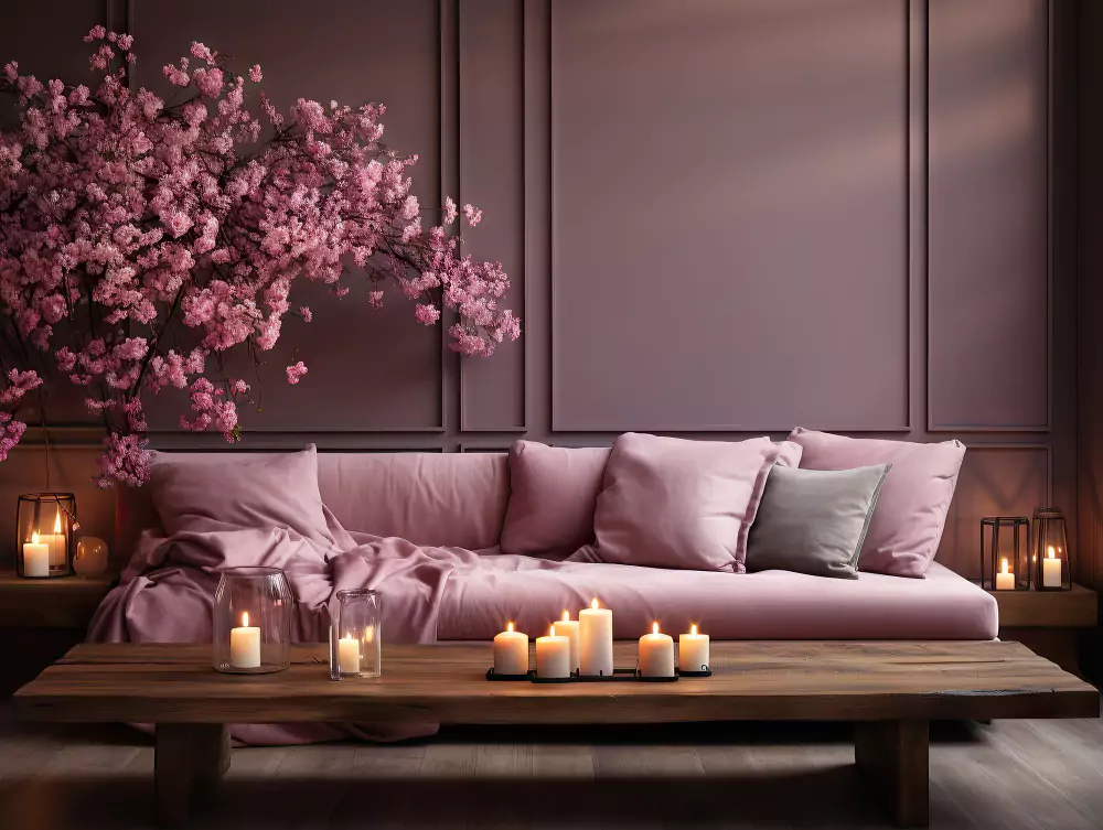
Mulberry color in Living Room (Accent Walls)
Mulberry is able to command attention as a statement accent wall within a living or dining area. For instance, if you paint the wall behind a sofa or fireplace in Mulberry, that adds instant warmth as well as character.
Keep walls and furniture surrounding in lighter neutrals like creams or warm grays to avoid feeling heavy. Golden wood floors, light-colored sofas, along with metallic accents like brass or gold lighting/frames echo that rich tone without competition. A bold focal point in what is an otherwise neutral room can be even smaller touches like a Mulberry-painted interior door.
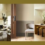
Mulberry color in Kitchen:
Mulberry either on cabinetry or on a kitchen island is able to give to a kitchen a luxe look. It does also offer up a custom look. Mulberry cabinets pop against warm wood floors within the example below and a white subway tile backsplash, tied together by brass hardware and stainless appliances.
Designers recommend Mulberry for an accent island or lower cabinets, paired with lighter upper cabinets or paint to maintain brightness. Gold or bronze fixtures and natural wood trim complement the hue’s warmth.
Mulberry color in Bathroom:
Mulberry makes an impressive style in a compact bath. This upscale style works well for a small bathroom. For a moody bath, its rich color can be used upon all walls or as an accent. Balance it with bright white fixtures, marble or light stone countertops, and plenty of lighting to prevent the room from feeling cave-like.
A gilded mirror and brass faucet will pick up the color’s warmth, as suggested for powder rooms. Even in a larger bathroom, consider Mulberry on cabinets or vanity sides: it will read as sophisticated and intimate against white tile or marble.
Each application above has been used successfully by designers. The images show Mulberry on kitchen cabinets and in a bedroom, illustrating how it reads as a deep berry tone (often with wine-red/eggplant cast) and how it can anchor a space. (Because Mulberry is so dark, it’s always wise to test it in your own room under your lighting before committing.)