You are here for some navy but royal navy shade, which means you know that charcoal blue can add character to any space ,without wasting time lemme explain you how Sherwin-Williams Charcoal Blue (SW 2739) can add character too.
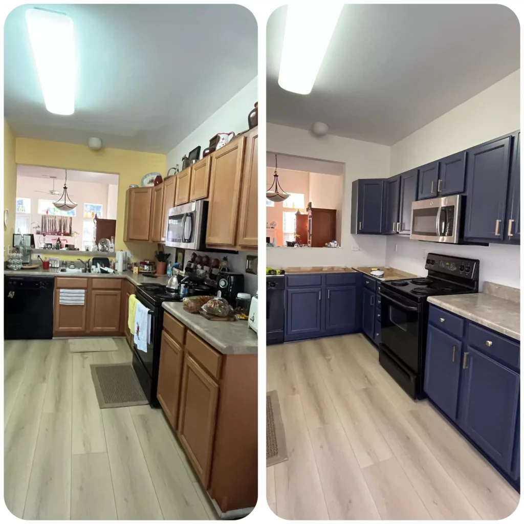
A year ago, I painted my kitchen cabinets and entryway console with Charcoal Blue by SW. Which went so perfectly over years.
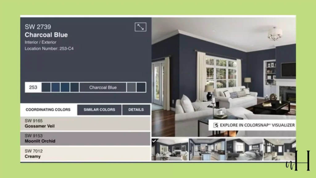
SW Charcoal Blue is a deep, dramatic shade that perfectly balances richness and coziness.
Falling somewhere between navy and slate, this blue-gray paint color offers incredible versatility—bold enough to make a statement yet muted enough to serve as a neutral backdrop.
With its low Light Reflectance Value (LRV), Charcoal Blue brings a cozy, moody ambiance that works beautifully in both modern and traditional spaces.
Whether you’re considering it for a bedroom accent wall, kitchen cabinets, or even your home’s exterior, this shade delivers timeless elegance.
In this review blog, I’ll break down everything you need to know about Charcoal Blue—its undertones, LRV, appearance in different lighting, room-specific applications, coordinating palettes, and comparisons with similar colors—so you can decide if this dramatic blue is the perfect fit for your home.
18 Blue-Gray Paint Colors by Sherwin-Williams & Benjamin Moore
What are the Undertones Charcoal Blue?
Charcoal Blue is a rich blue-gray shade with predominantly cool character. It combines the depth of navy with subtle gray undertones. Some reviewers even note a “whisper of green” in very soft light.
In short, it “walks the line between navy and slate”, making it versatile in both warm and cool décors.
Light Reflectance Value (LRV) of Charcoal Blue
This is an exceptionally dark color. Official data give Charcoal Blue an LRV around 5–6%. In practical terms, it reflects very little light, so it will make rooms feel cozy and intimate.
Because its LRV is so low (near 6%), Charcoal Blue can appear nearly black in dim light.
Designers caution that a low LRV means it “absorbs most of the light,” so it’s best used in well-lit spaces or as an accent rather than on all four walls.
15-Blue Gray Kitchen Cabinet Colors That My Clients Love This Year
In Different Lighting
Charcoal Blue shifts dramatically with light. In poorly-lit or north-facing rooms, it will read almost black. In bright, sunlit rooms it clearly shows its blue hue.
Decor experts note that under warm, artificial light the gray undertones become prominent, whereas in natural daylight it leans toward navy blue.
In practice, this means a Charcoal Blue wall may look deep black in evening or shadow, but reveal its true color as a rich blue-gray in daylight.
Charcoal Blue SW 2739 In the Bedroom
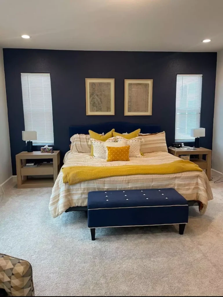
Charcoal Blue can create a cozy, serene bedroom when used carefully. Most experts recommend using it as an accent wall rather than all four walls, especially in average-sized bedrooms.
For example, a Charcoal Blue wall behind the bed paired with white bedding and light walls will feel dramatic yet restful.
ensuring plenty of natural light and white trim or linens when using it, to prevent the space from feeling too dark.
In practice, designers report it “works nicely on an accent wall” in bedrooms and pairs beautifully with soft neutrals and warm lighting for a calming effect.
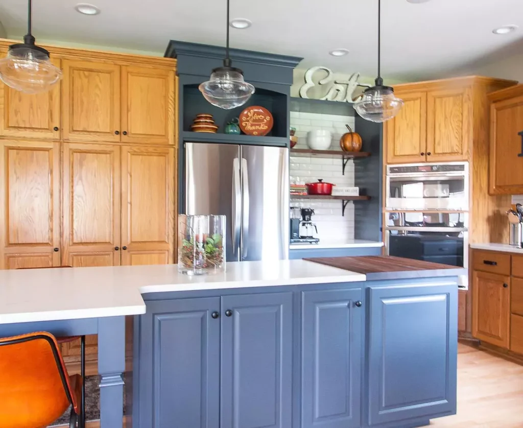
SW Charcoal Blue In the Kitchen
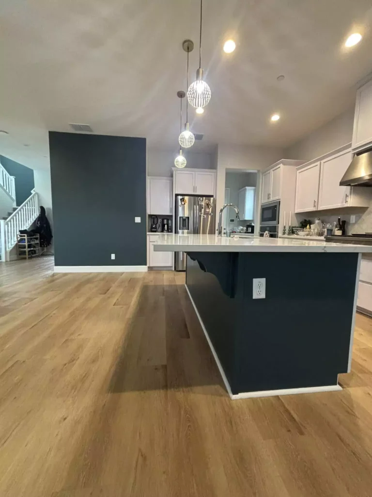
Charcoal Blue makes a bold statement in kitchens, especially on cabinets or accent walls. One review notes it “looks awesome on cabinets (upper or lower) or as an accent wall”.
I recommend balancing it with plenty of white surfaces – for example, white walls, backsplashes or countertops – to let the blue pop. It pairs exceptionally well with metallic hardware: brass, gold, or chrome fixtures add warmth and sheen against the deep blue.
In a typical design, one might paint lower cabinets Charcoal Blue and leave the island or upper cabinets white, or vice versa, always keeping surrounding walls light. This creates a modern, high-contrast look where the blue stands out as a focal color.
Living Room with SW Charcoal Blue
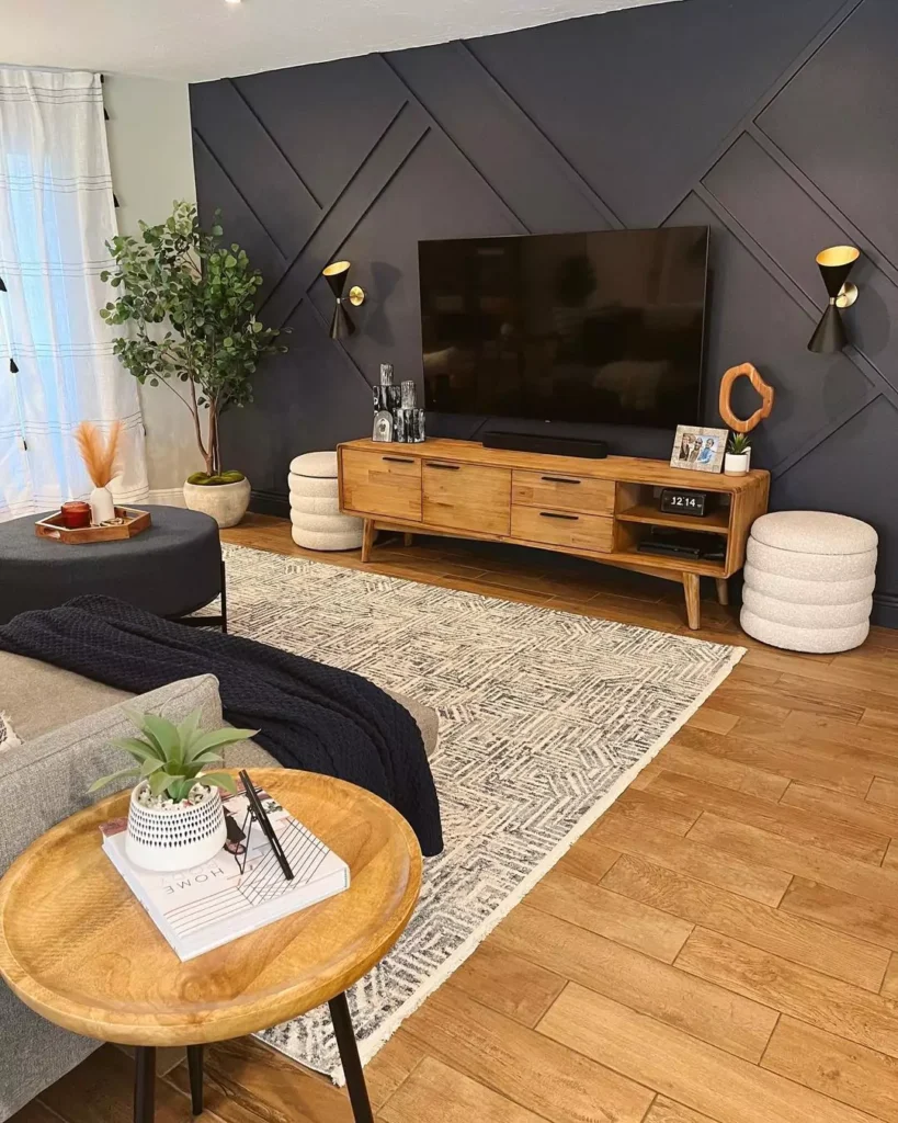
In a living or family room, Charcoal Blue adds depth and drama. It can be used sparingly or boldly, depending on space.
I found it “surprisingly suitable” on a living-room wall, noting it looks gorgeous on all walls if the room is large, well-lit, and has white trim and ceiling.
In smaller living rooms, it’s best as an accent wall. Paired with leather sofas, warm wood floors and white accents, it creates a sophisticated, moody backdrop. For example, designers often use it behind a media wall or fireplace and highlight it with light-colored furniture and metallic accents.
As one review says, Charcoal Blue “adds a calm and cozy feel” to living spaces and pairs well with light furniture and modern accents.
Painting Walls and Trim Same Color 5-Tips By Experts to Consider
Bathroom
Charcoal Blue can lend a spa-like, chic vibe to bathrooms. It is often used on vanity cabinets or an accent wall to great effect.
I suggests pairing it with crisp white walls, tiles or countertops and warm metallic hardware (e.g. brass or gold) for contrast. In practice, this means a Charcoal Blue vanity against white subway tile looks very sharp.
One review similarly notes it “adds a spa-like, calming vibe” when paired with white fixtures and wood accents. In small bathrooms, keep the other surfaces light to avoid a cave-like feel.
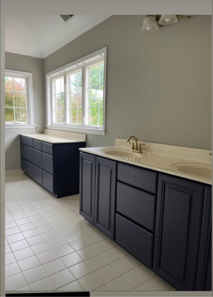
Charcoal Blue on Cabinets
Charcoal Blue is a popular cabinet color. Its deep navy-gray tone is a sophisticated alternative to black, it “provides a sophisticated alternative to traditional black or navy” for cabinets.
It looks especially elegant with brass or gold hardware and marble countertops. In essence, dark lower or island cabinets in Charcoal Blue can anchor a kitchen while paired with white upper cabinets or walls, creating a high-contrast, upscale look.
13-Coastal Farmhouse Entryway Styling Tips for a Breath of Fresh Air
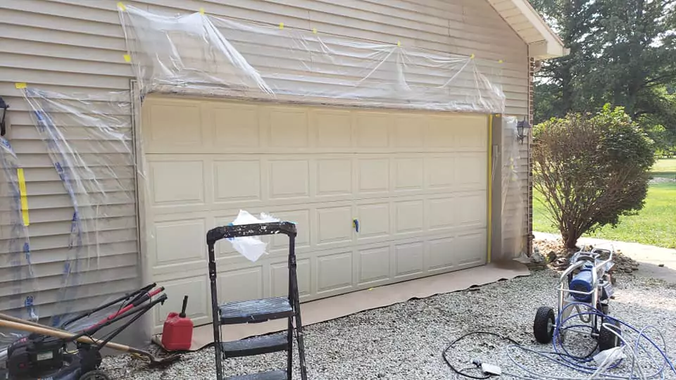
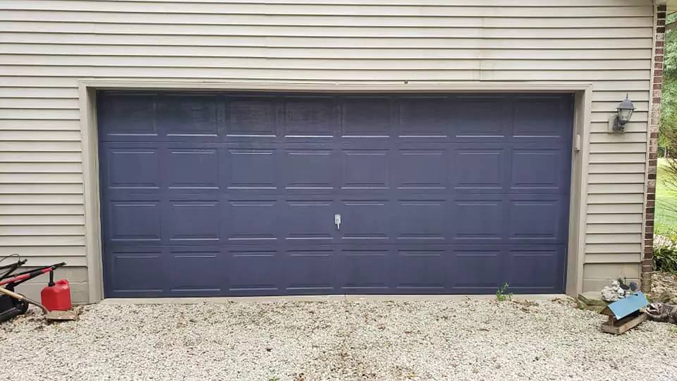
Exterior Use
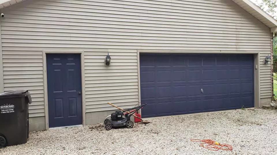
Charcoal Blue can be striking on building exteriors.
Using it on front doors or siding. For example, one might paint the front door Charcoal Blue with white trim and neutral siding for curb appeal.
I advise that when used on exterior walls, it looks great against white trim (or vice versa).
it’s suitable for many home styles (Victorian, Craftsman, modern farmhouse, etc.) when balanced with lighter trims. Overall, on exteriors Charcoal Blue reads as a dramatic, upscale hue – especially pleasing with crisp whites or lighter grays on trim and accents.
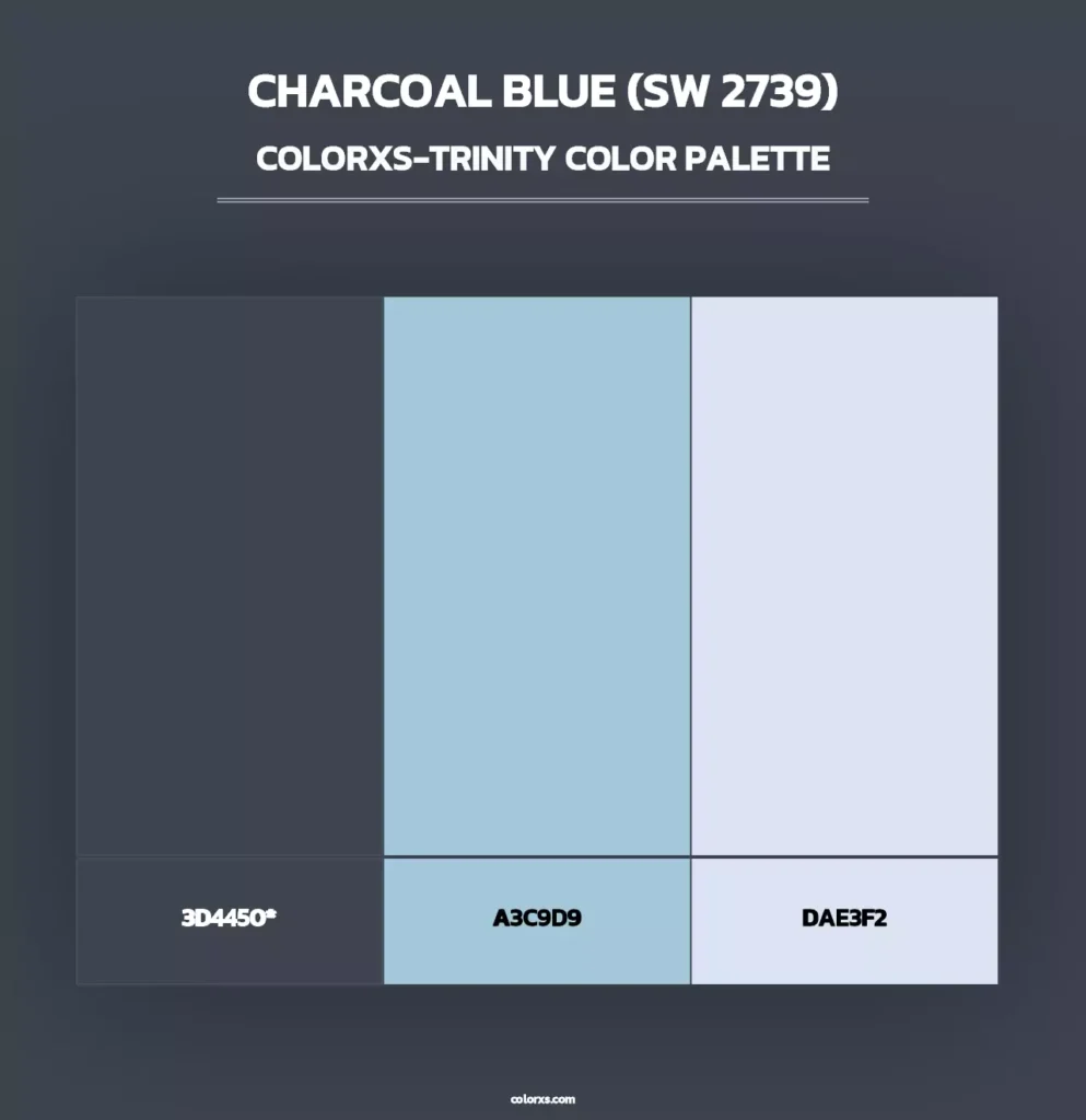
Coordinating Colors for Charcoal Blue
Designers offer several palettes for Charcoal Blue. Key coordinating colors include:
Light Neutrals: Soft off-whites or grays lighten the scheme. For example, SW Creamy or SW Gossamer Veil (very pale off-whites) will soften Charcoal Blue.
Monochromatic Blues: Medium blues create depth without clashing. Examples are SW Bracing Blue or SW Mineral Gray (both lighter blues), as well as SW Software or SW Gray Screen.
Earthy Contrasts: Warm beige and taupe can balance it. Colors like SW Virtual Taupe, SW Balanced Beige, or SW Cadet (a muted blue-gray) introduce warmth.
Accent Colors: For pops of color or metallic shine, try brass and gold accents (hardware, fixtures) or jewel tones like mustard yellow or deep burgundy – these aren’t listed above but are commonly paired. (For specific matchups, see below.)
Soft (Muted) Palette
For a gentle, muted look, pair Charcoal Blue with light, soothing tones. For example: white or off-white trim and furnishings – Benjamin Moore White Dove or SW Alabaster – brighten the space.
Pale gray-beiges like SW Silver Strand or SW Horizon create an airy backdrop. Even a crisp cool white (e.g. SW Pure White) makes the blue stand out cleanly. Overall, think light neutrals and soft grays: whites, creams, and pale grays gently offset Charcoal Blue.
Bold Palette
For a bold, dramatic palette, introduce rich accent colors. I suggests deep warm hues like SW Merlot (a dark wine red), SW Alaea (burnt orange), or SW Wheat Penny (rusty copper) to energize Charcoal Blue.
I also recommend warm metallics like SW Copper Pot (warm orange) or SW Goldenrod (mustard yellow) for a lively contrast.
For an all-navy scheme, pairing Charcoal Blue with a slightly darker navy like SW Naval adds a layered monochrome effect. In short, bold accent colors (deep reds, oranges, golds) make Charcoal Blue feel vibrant, while muted soft colors (whites, grays) keep it calm.
Comparisons with Similar Colors
Charcoal Blue vs Naval SW 6244
Both are very dark blues. Naval reads bluer and crisper, while Charcoal Blue’s gray undertones are more pronounced. In other words, Naval is a “true” navy, whereas Charcoal Blue feels slightly more muted. Use Naval if you want a classic, deep blue; use Charcoal Blue if you want added gray depth on walls.
Charcoal Blue vs Hale Navy SW 6240
This is nearly the opposite situation. Hale Navy is lighter and more blue, while Charcoal Blue is richer/darker. Charcoal Blue will look deeper; Hale Navy will look brighter and bluer. They are similar in tone but not usually used together, since one will always dominate the other.
Charcoal Blue vs Sea Serpent SW 7615
Sea Serpent has an LRV of about 7 (Charcoal Blue is ~6), so visually they appear almost the same darkness. The main difference is hue: Sea Serpent leans a bit teal-green, whereas Charcoal Blue is more pure blue-gray. You can often substitute one for the other, keeping in mind Sea Serpent will look slightly greener.
Charcoal Blue vs Cyberspace SW 7076
Cyberspace is a deep blue-gray with strong gray undertones. Placed side-by-side, Charcoal Blue actually looks bluer, since Cyberspace is grayer and almost black.
Both are very dark – in dim light Cyberspace can also look nearly black – but Cyberspace is cooler and grayer. In summary, Cyberspace feels moodier/colder, while Charcoal Blue retains a hint of navy blue when contrasted.


