
Night Owl (SW 7061) is a deep, moody gray with complex green and blue undertones that give it an earthy, sophisticated character.
In my opinion, its a “deep and delicate neutral” blending charcoal gray with touches of green and cyan (reflected in user experiences as hints of olive or teal).
Designers praise its velvety depth and versatility: it can serve as a dramatic accent or a grounding wall color.
In this blog I am gonna discuss everything about Night Owl by Sherwin Williams, like undertones ,LRV, coordinating colors ,how it looks in different lights,and also my personal experience with Sleepy Blue.Also I am sharing REAL HOME IMAGES do you can undertand better.
Black Fox SW 7020 Sherwin-Williams-Quick Review
Undertones of Night Owl
Although Night Owl is marketed as a neutral gray, it has complex undertones that shift with context. Many note green and earthy tones beneath its gray surface.
In clear light you may notice hints of olive green or brown, giving the color an organic warmth.
Others describe subtle blue-green or teal casts in bright light.
In practice, Night Owl often behaves like a cool gray–green: under daylight it reveals its bluish-green side, while under warm artificial light its undertones lean brownish.
Overall, you can think of Night Owl as a gray that is tinged with green and warm earthiness.
These nuanced undertones let Night Owl adapt: it can feel more like a true charcoal gray in some rooms, or take on a muted green hue in others.
Greenblack SW 6994 Sherwin Williams-Quick Review
LRV (Light Reflectance Value)
Night Owl is a dark color. Its LRV (Light Reflectance Value) is about 12–13 (on the 0–100 scale), meaning it absorbs most light.
By comparison, pure white is 100 and pure black is 0.
With an LRV around 12–13, Night Owl reflects only about 12% of visible light, putting it firmly in the deep gray category.
In practical terms, this means Night Owl will make a space feel enclosed and intimate – which can be very cozy in a large room, but may overpower a small, dim room.
For example, in low-light rooms Night Owl may appear almost black, potentially making the room feel somewhat closed in. To balance its darkness, designers often pair Night Owl with ample lighting or lighter trim.
Honest Review-Iron Ore SW 7069 by Sherwin Williams
Appearance in Different Lights
Night Owl’s look changes noticeably with lighting.
- Incandescent (warm) lighting: Night Owl takes on a cozy, warm cast as its brown undertones add softness.
- Fluorescent/cool lighting: The color appears more neutral/green-gray, as cool light brings out its cooler undertones.
- Natural light & orientation:
- North-facing rooms make Night Owl look darker/more muted.
- South- or east-facing rooms make it look lighter and reveal its green tint.
- West-facing light warms Night Owl up, highlighting its richer brown-green side.
By testing a sample in your room at different times of day, you can see Night Owl swing from deep charcoal to a softer greenish-gray.
This adaptability is why it’s often recommended for accent walls or cabinetry, where dynamic lighting can showcase the nuance.
10 Popular Sherwin-Williams Black Paint Colors for Every Space-2025
Hex Code of Night Owl
The official hex code for Night Owl SW 7061 is #63655F.
RGB Values
In the RGB color model, Night Owl is (99, 101, 95). That is, about 39% red, 40% green, and 37% blue. The balanced RGB values (all similar) reflect its status as a grayish color, and the slight green dominance (101 is highest) hints at the subtle green cast.
Night owl Use in Bedroom
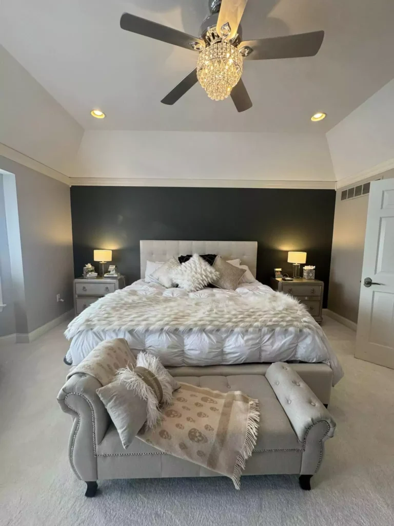
Night Owl makes a bedroom feel cozy and intimate. Its depth creates a restful cocooning effect, especially when used on all walls.
It works beautifully as a primary wall color in bedrooms, helping to create a calming ambiance. To keep the space from feeling too dark, designers pair it with crisp white or cream bedding and plenty of soft light (lamps or recessed lighting).
Night Owl also looks stunning on a single accent wall behind a bed: the strong color backdrop highlights light-colored linens or artwork.
It pairs exceptionally well with wood furniture (natural oaks or warm walnut) and metals (brushed nickel or antique brass), adding warmth and texture against the dark wall.
Use in Kitchen
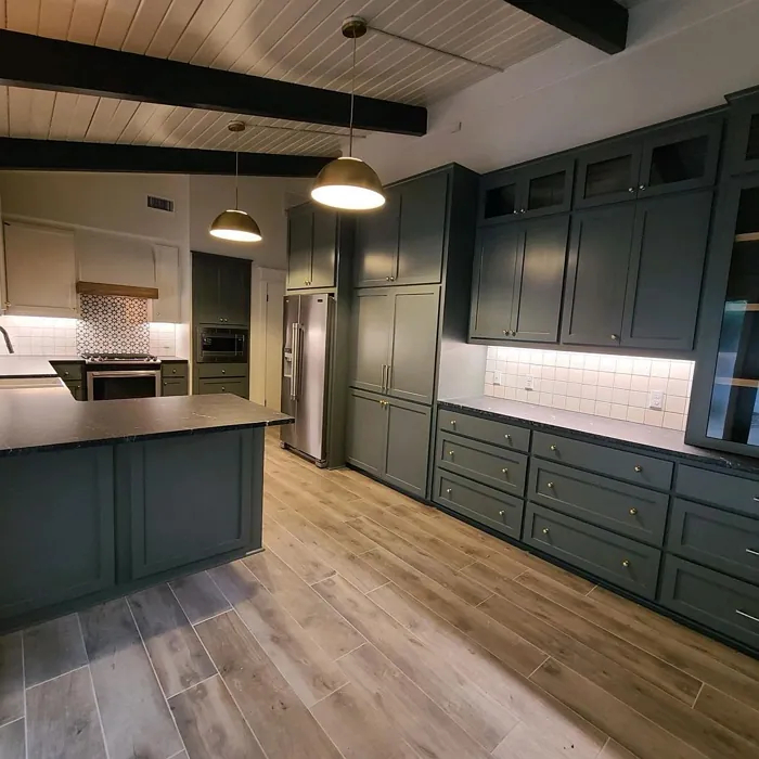
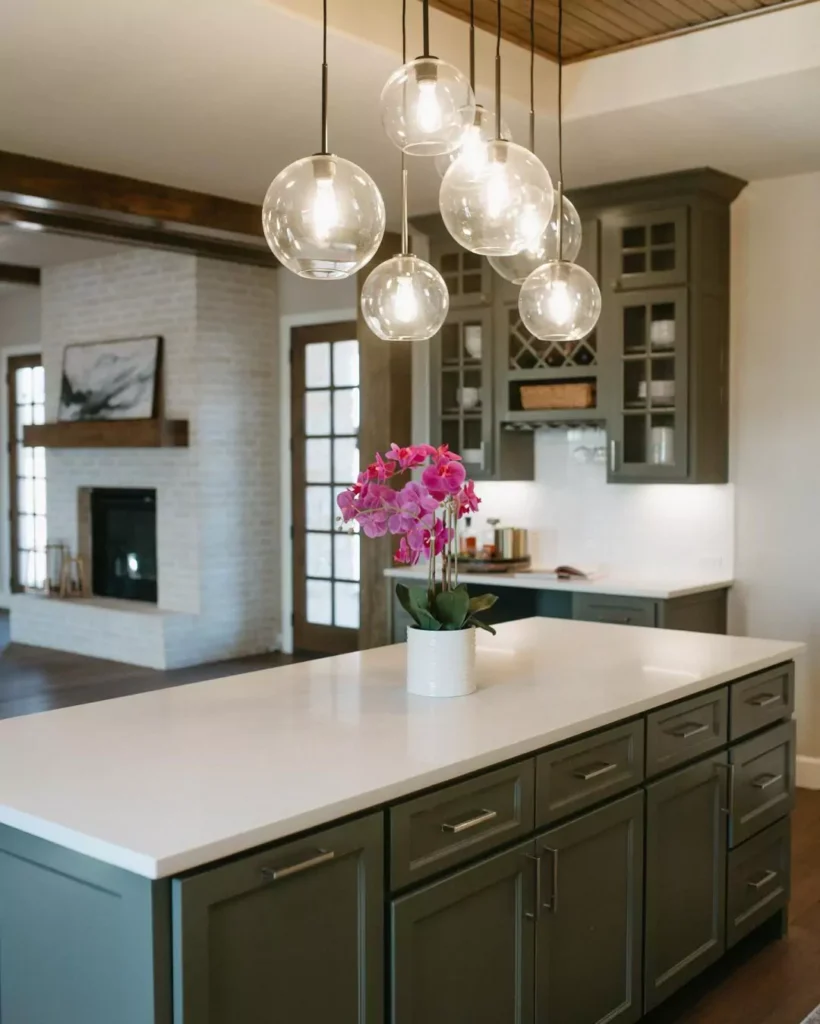
In kitchens, Night Owl is often used for cabinets or islands, lending a luxurious, dramatic look.
For example, Night Owl cabinetry paired with marble countertops and brass hardware yields a high-end vibe. It works beautifully with minimalist or contemporary kitchen styles: the deep hue lets glossy white tile, warm wood floors, or metallic fixtures pop.
Because it’s so dark, Night Owl on cabinets contrasts sharply with a lighter backsplash or wall paint, creating visual interest.
In kitchens with less light, keep other surfaces bright to prevent the room from feeling too dim.
Use in Living Room
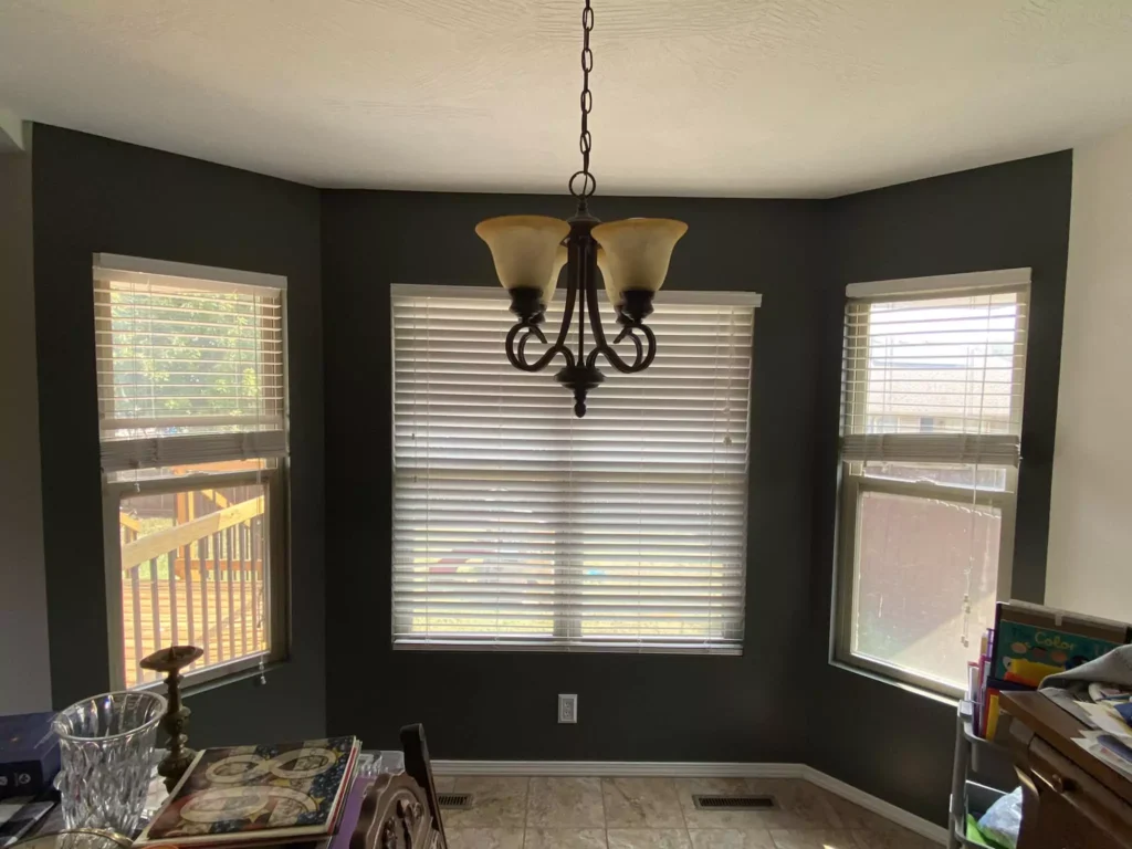
Night Owl lends sophistication and depth to living rooms. Using it on primary walls creates a cozy, cocoon-like atmosphere.
A living room painted Night Owl feels intimately modern, particularly when flooded with natural light or warmed by a fire’s glow in the evening.
It’s ideal for accent walls around a fireplace or media center: pairing Night Owl walls with a light-colored sofa or textured rug adds drama and contrast.
Use in Bathroom
Night Owl can make a bathroom feel spa-like and indulgent. It’s especially striking on lower cabinetry with a lighter countertop, or as an accent wall behind mirrors.
Night Owl pairs beautifully with white subway tile, marble, or brass fixtures: the dark paint highlights porcelain sinks and metallic hardware. In a powder room, even an entire Night Owl ceiling or one feature wall can add drama.
Night Owl on Cabinets
Night Owl is popular for cabinets and built-ins. Its rich tone adds an upscale feel to kitchen, bathroom, or even bedroom cabinetry.
On cabinets, Night Owl’s earthy-gray paint pairs particularly well with warm brass or gold hardware for a luxe touch, or matte black handles for modern contrast.
Use on Exterior
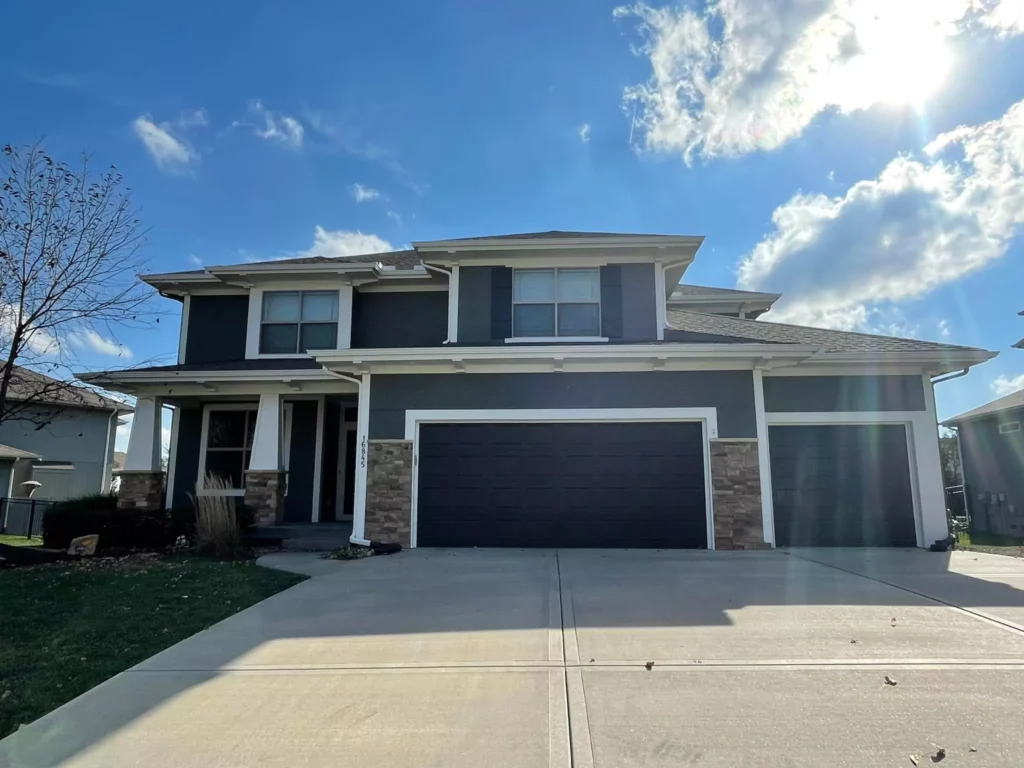
Night Owl is also suited for exterior use. As a siding or trim color, it gives homes a contemporary, elegant look.
Its deep gray-green appears almost black on facades, providing strong contrast against lighter elements. Night Owl is a good choice for siding on modern ranches or mid-century homes, where it reads as a rich charcoal.
Coordinating Colors (from Sherwin-Williams)
Sherwin-Williams suggests a palette of balanced contrasts for Night Owl. Three named coordinating colors are:
- SW 7580 Carnelian: a rich, red-brown (deep rusty plum) that provides a warm, energetic contrast.
- SW 9166 Drift of Mist: a very pale, warm gray that acts as a light neutral backdrop.
- SW 7056 Reserved White: a crisp off-white with a hint of gray, highlighting Night Owl’s cooler undertones.
Together these create a cohesive scheme: Reserve White and Drift of Mist soften Night Owl’s intensity, while Carnelian adds bold warmth.
Soft Color Palette
For a soft, soothing palette, pair Night Owl with gentle neutrals and pastels. Options include off-whites, light grays, warm creams, and pale blue-greys. Even a soft blush or pale lavender accent can lift Night Owl’s depth.
Bold Color Palette
For a vivid, dramatic palette, use high-contrast accents. Deep jewel or metallic tones complement Night Owl’s richness. Warm yellows, golds, or jewel-toned pillows and brass fixtures also work beautifully.
Muted Color Palette
A muted palette emphasizes subtle, nature-inspired tones such as muted sage, gray-greens, olive, or warm grays. Muted plums or dusky rose can add subtle color. The overall look is organic and serene.
Sherwin-Williams Night Owl vs Pewter Green
Both are deep, moody colors, but distinct. Night Owl is slightly lighter and cooler, while Pewter Green has warmer, earthy tones.
Night Owl feels like a serene slate-gray, while Pewter Green leans olive.
Sherwin-Williams Night Owl vs Iron Ore
Iron Ore is much darker than Night Owl. Night Owl’s LRV (~12.8%) is over twice that of Iron Ore (~6.0%), meaning Iron Ore is significantly deeper.
Night Owl is a rich gray-green with nuance, while Iron Ore reads as an almost-black charcoal.


