I think Porpoise SW 7047 the 2nd darkest greige color that i am gonna write about ,if you want somehthing moody for your accent wall ,ceilings or maybe for cabinets ,yes cabinets ,Porpoise SW 7047 looks amaizing on cabinets .
In this blog I am gonna share my personal experience about Porpoise SW 7047 by Sherwin Williams i will tell you how it transforemed my home in no cost ,cuz it makes the feel of room so much moody warm and cozyy too.
I just love its brownish and grayish and blackish shade.OMG how many shade does Porpoise SW 7047 actually have ,i am in love with Porpoise .
Porpoise SW 7047 is a rich, medium-dark warm gray (greige) from Sherwin-Williams.
Designers describe it as a sophisticated neutral with brownish undertones, making it both modern and inviting.
Its deep tone provides a grounded backdrop that feels elegant yet cozy. Many find Porpoise ideal for accent walls or full rooms, as it balances warmth and sophistication.
Porpoise’s “deep, complex tone” makes it a standout choice for creating spaces of understated elegance and comfort.
Tony Taupe (SW 7038) Sherwin Williams-Honest Review
Undertones of Porpoise SW 7047
Porpoise is fundamentally a greige (gray-beige) with warm brown undertones. However, it is multifaceted: subtle hints of green, blue, pink and yellow can appear under different conditions.
For example, the hue contains a spectrum of undertones from olive and dark turquoise to soft pink and warm yellow.
In natural light, its brown/beige aspect often shows through (making it feel a bit taupe), whereas in cooler or artificial light it can look more pure gray.
This chameleon quality means Porpoise can warm up a space (with its brown cast) or read as a sleek gray depending on lighting and surrounding décor.
LRV of Porpoise SW 7047
Porpoise has a fairly low LRV of about 13% (officially 12.953%). LRV measures how much light a color reflects (0% = black, 100% = white).
At LRV≈13, Porpoise is on the darker side: it absorbs most light and thus creates an intimate, cozy feel.
In practice this means Porpoise will make rooms feel smaller and moodier than a high-LRV color would.
Use it to add depth and contrast, especially in larger or well-lit spaces. But in a small or poorly lit room, Porpoise can make the space feel quite dim.
Appearance in Different Light
Porpoise’s look changes with lighting. In natural daylight, it tends to reveal its warmer undertones – the brown or beige cast becomes more noticeable, giving a slightly lighter and airier gray tone.
Under incandescent or warm artificial light, the color can deepen and feel cozier (the warm light accentuates the brown).
In cool or fluorescent light (or in north-facing rooms with less sun), Porpoise can appear cooler and more charcoal-gray.
In artificial light, Porpoise… tends to appear warmer and darker,” while in natural light it looks truer and more neutral. Thus, in a south- or west-facing room (lots of daylight),
Porpoise will be softened and warmer, whereas in north- or east-facing spaces it will read as a deeper gray. Overall, it “adapts well with various lighting conditions” but the brown vs. gray emphasis will shift.
Hex Code & RGB
The official color values for SW 7047 Porpoise are: HEX #6B645B, and RGB (107, 100, 91). In other words, it is composed of roughly 42% red, 39% green, 36% blue, yielding a medium-dark brownish-gray tone.
(For comparison, its neighbor Urbane Bronze SW7048 is HEX #54504A, RGB (84,80,74) – noticeably darker and grayer.) These numeric codes can be used in design software or digital renderings to approximate the color.
SW Porpoise Bedroom
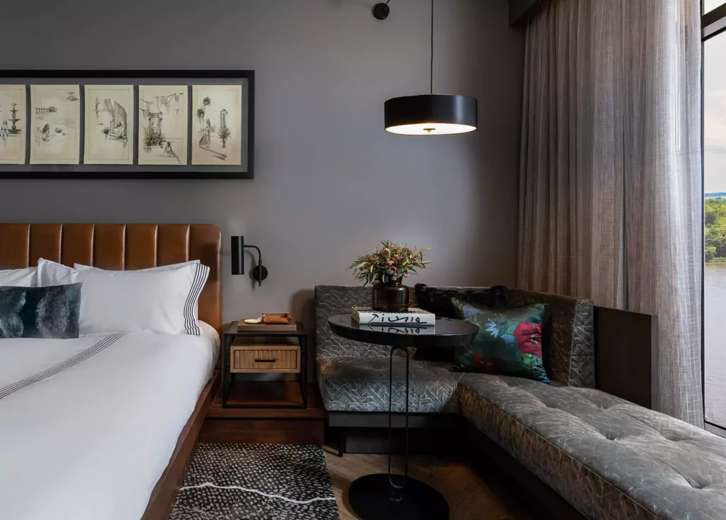
Porpoise makes an excellent bedroom color when you want a warm, restful environment. Its depth and warm undertones create a cozy, tranquil backdrop for a bedroom.
Use it on all the walls or as a single accent wall behind the bed. Paired with soft linens and warm woods, Porpoise promotes relaxation.
For example, designers note that Porpoise’s “warm undertones help create a calming atmosphere” when used behind a bed.
In practice, expect bedroom Porpoise to feel subdued and spa-like (especially with dim, warm lighting) – ideal for rest.
Porpoise SW 7047 Kitchen
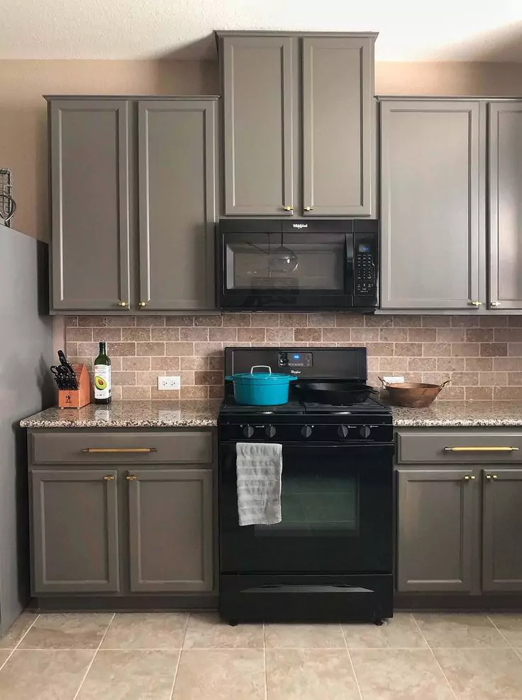
In kitchens, Porpoise adds depth and contrast. It pairs particularly well with white or light-colored cabinets and stainless appliances.
Painting the walls (or an island) in Porpoise will make white/cream cabinetry pop and give a modern look. One guide advises that Porpoise “adds depth to kitchens… especially when paired with white or cream cabinetry.”
It can also look striking on lower cabinets or an island against white uppers. With its rich tone, Porpoise helps ground a kitchen, making bright accents or metallic finishes stand out.
In short, use Porpoise for a bold statement island, accent wall, or full kitchen if you want a stylish, contemporary feel.
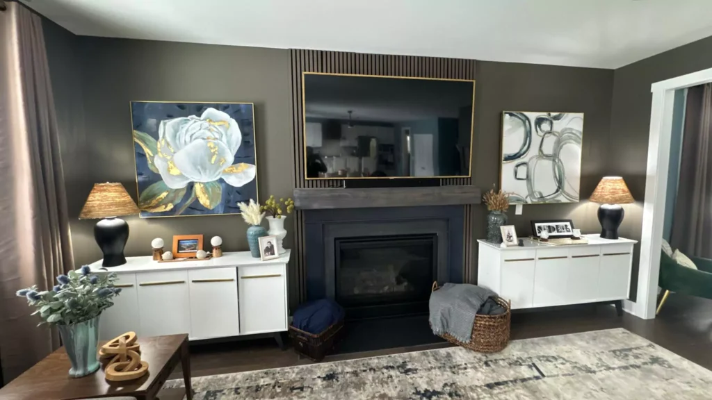
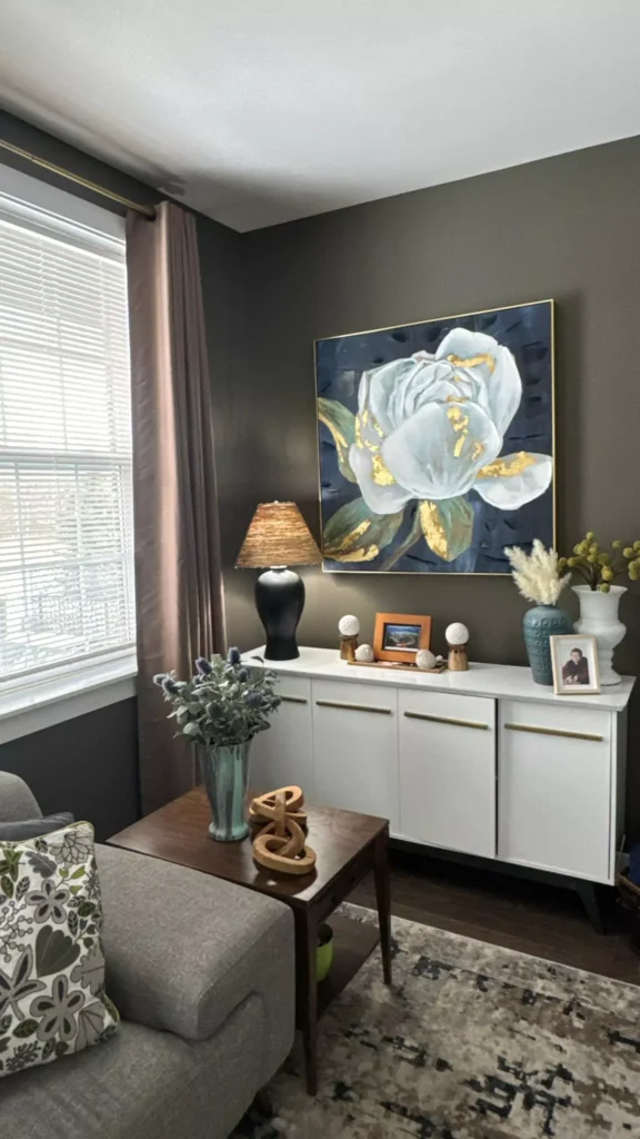
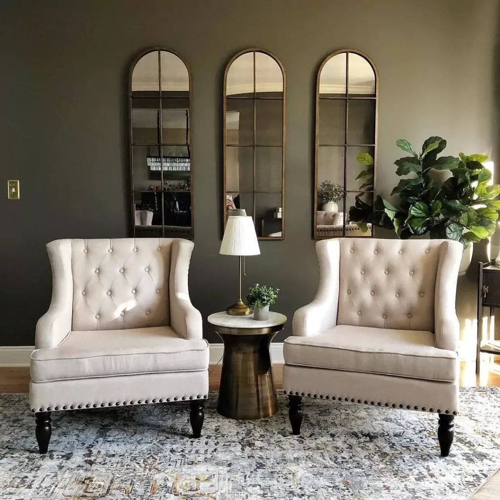
Porpoise SW 7047 Living Room
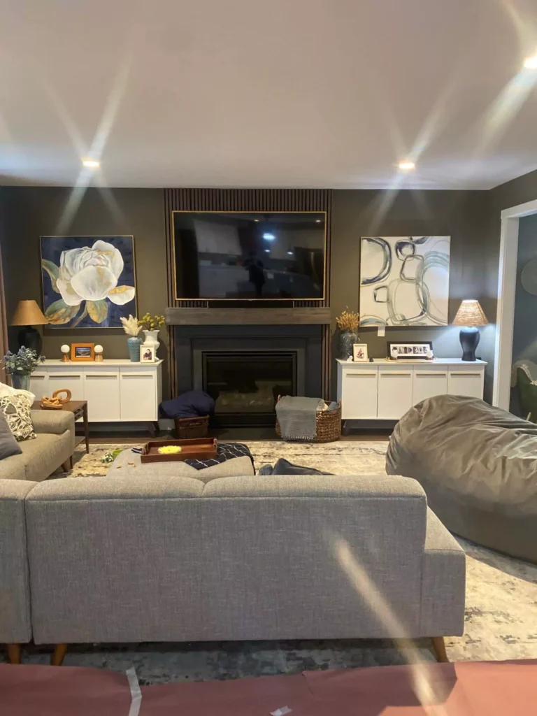
Porpoise is a warm, neutral backdrop for living rooms. It helps furniture and décor stand out without competing for attention.
For example, one source notes that in living areas Porpoise “can serve as a calming background, complementing both bold and muted furnishings.”
On sofa walls or around a fireplace, Porpoise will make lighter sofas, rugs and art pop. Paired with cream or off-white trim and accents, it creates an elegant, grounded atmosphere.
If the room is bright and spacious, Porpoise will feel rich and cozy; in a dimmer or smaller living room it will give a very moody, intimate vibe.
In the Bathroom
Porpoise lends a spa-like sophistication to bathrooms. Its warm gray tone brings a sense of luxury when paired with white tiles, marble and chrome fixtures. Use Porpoise on walls behind a vanity or tub for a cozy retreat feel.
Designers recommend combining it with bright whites or light stones: for instance, “pair it with white tiles, chrome fixtures, and soft lighting to create a luxurious space.”
In practice, Porpoise in a bathroom will feel modern yet calming – much like high-end hotel baths. Just ensure the room has enough light (natural or artificial) to prevent the gray from becoming too dark.
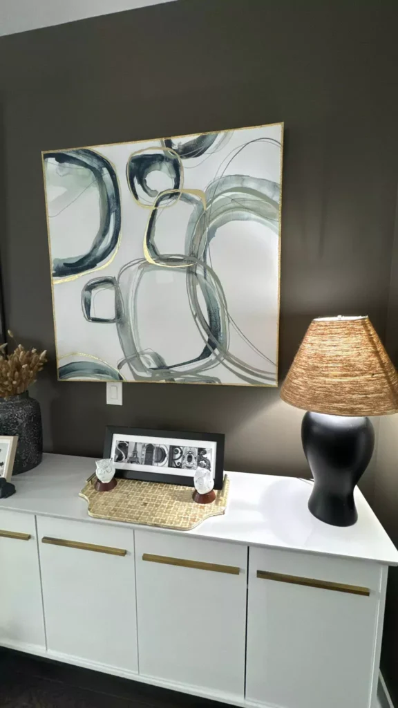
On Cabinets
Porpoise works well on or with cabinetry. If you paint cabinets (e.g. lower kitchen cabinets or a bathroom vanity) in Porpoise, the effect is chic and bold. It’s a popular choice for kitchen islands or lower cabinets against white uppers.
Conversely, if cabinets are white/cream, Porpoise walls complement them (as noted above).
In either case, Porpoise cabinets will look clean and modern, especially with simple hardware and countertops. The contrast of Porpoise cabinets with stainless or white elements gives a crisp minimalist look.
11-Best Sherwin Williams Paint for Cabinets and Trim+Side by Side Comparison
Exterior Use
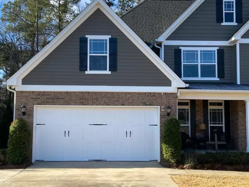
Porpoise can be used on a home’s exterior for a striking, modern look. Its warm gray tone “complements both natural and man-made materials like stone, brick, and wood.”
For example, a front door or shutters in Porpoise will pop against lighter siding or stone. The color’s depth adds curb appeal; one source calls it “a down-to-earth tranquility” on facades.
Because Porpoise reads differently in sun versus shade, it often looks warm and inviting on a sunny day but takes on a subtle pewter-gray cast in shadow.
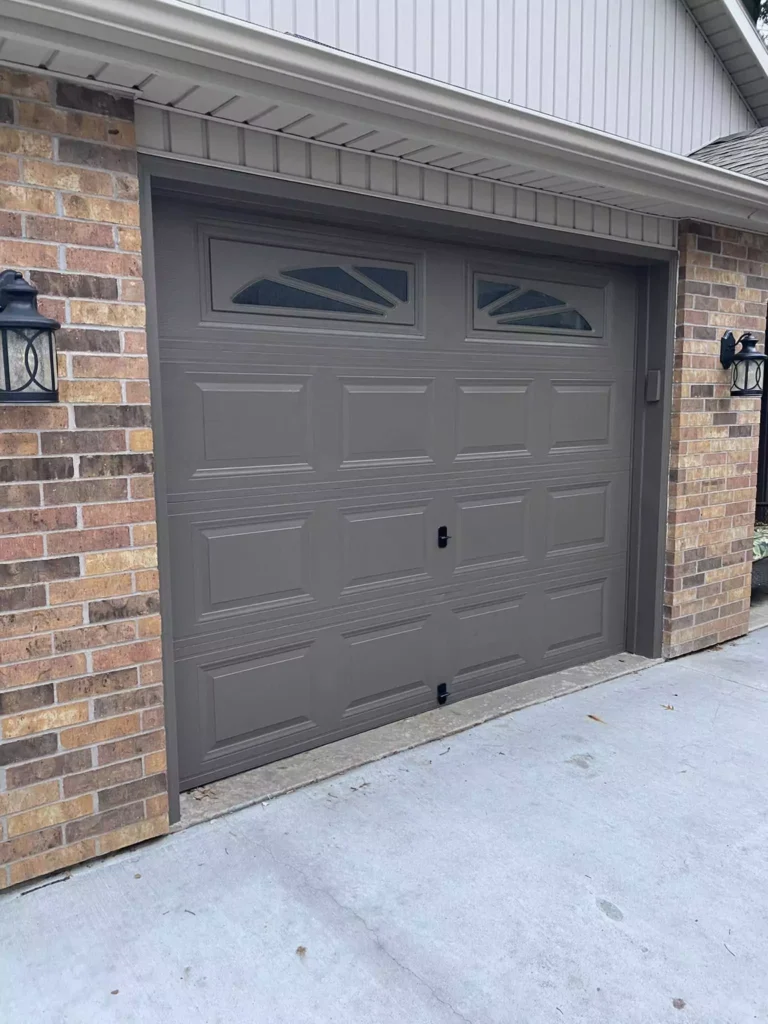
Many designers love Porpoise for exteriors because it remains sophisticated yet versatile across styles (modern, craftsman, etc.).
Coordinating Colors for Porpoise SW 7047
Porpoise plays well with a range of other colors.
Neutral complements include soft off-whites and light grays: for example, Sherwin-Williams Shoji White (SW7042) and Eider White (SW7014) add warmth and lightness, while Amazing Gray (SW7044) and Worldly Gray (SW7043) provide a gentle tone-on-tone backdrop.
Deeper or accent neutrals include Urbane Bronze (SW7048) or Felted Wool (SW9171) for dramatic contrast, and Anonymous (SW7046) or Intellectual Gray (SW7045) for subtle greenish or brownish accents
. For me if you pair Porpoise with Amazing Gray or Worldly Gray creates a cohesive look, whereas Urbane Bronze or Felted Wool “adds depth and sophistication”.
For color accents, Porpoise also works with greens and blues: for instance, Sea Salt (SW6204) – a soft seafoam green – adds a refreshing touch, and Limon Fresco (SW9030) – a muted green – can inject energy.
In fact, a coordinated palette suggested by experts includes Shoji White, Eider White and Limon Fresco alongside Porpoise to achieve a balanced, lively scheme. Below are examples of coordinating shades:
- Shoji White (SW 7042) – a warm off-white/beige that makes Porpoise feel lighter and brighter.
- Eider White (SW 7014) – a cool, crisp gray-white that softens the overall look.
- Amazing Gray (SW 7044) – a medium warm gray that forms a gentle, layered neutral palette.
- Worldly Gray (SW 7043) – a muted gray that harmonizes with Porpoise’s cool aspects.
- Urbane Bronze (SW 7048) – a rich, dark bronze-gray that provides bold contrast and depth.
- Anonymous (SW 7046) – a lighter greige with greenish undertones, for an earthy neutral touch.
- Intellectual Gray (SW 7045) – a slightly warmer taupe-gray, adding coziness.
- Felted Wool (SW 9171) – a deep, warm gray for a strong accent.
Each of these creates a cohesive look when used with Porpoise, whether on trim, furniture, or accent walls.
Soft (Light) Palette
For a soft, subtle palette around Porpoise, choose pale neutrals and gentle pastels. Light off-whites like Shoji White (SW7042) or Accessible Beige (SW7036) work beautifully to lighten the scheme.
Even light grays such as Mindful Gray (SW7016) or Repose Gray (SW7015) form a calm, monochromatic backdrop. These softer hues balance Porpoise’s depth without high contrast.
For example, WildFox Painting suggests pairing Porpoise with Shoji White or Accessible Beige for a gentle look. The result is a tranquil, airy palette ideal for serene interiors like bedrooms or living rooms.
Bold Palette
To create a bold or dramatic palette, accent Porpoise with deeper or vivid colors. Dark accents like Urbane Bronze (SW7048) or Tricorn Black (SW6258) will make strong focal points against Porpoise.
For pops of color, consider Coral Reef (SW6606) – a bright coral – or Naval (SW6244) – a rich navy blue. These vibrant tones contrast Porpoise’s neutrality, adding energy.
Additionally, jewel tones (emerald, deep teal) or rustic reds can work as accent pieces or furniture in a Porpoise room. In short, use bolder colors sparingly (pillows, art, an accent wall) to make Porpoise stand out even more.
Muted Palette
A muted, subdued palette around Porpoise keeps everything soft and tonal. This means pairing it with other gentle grays and greiges. Off-whites like Alabaster (SW7008) or pale grays like Repose Gray (SW7015) maintain a low-contrast look.
Likewise, warm neutral grays such as Mindful Gray (SW7016) or Agreeable Gray (SW7029) blend seamlessly.
Even a very light taupe or cream can work. The goal is a calm, monochrome feel – Porpoise remains the darkest shade, but everything stays in the gray/beige family.
According to one of my friends Porpoise “can pair with bolder colors or stand alone for a sleek, simple aesthetic”; here we choose the latter by sticking to subdued tones.
FAQ
Porpoise vs. Urbane Bronze
Porpoise (SW7047) is essentially a lighter version of Urbane Bronze (SW7048). One design guide notes that Porpoise has a higher LRV (about 13) compared to Urbane Bronze’s LRV (≈8), making it less intense.
In appearance, Urbane Bronze is deeper and richer brown-gray, whereas Porpoise is medium-dark with softer brown undertones.
In other words, Porpoise reads as a greige with just slightly less “oomph” than Urbane Bronze.
Porpoise vs. Anonymous
Although both are greiges, SW7047 Porpoise and SW7046 Anonymous differ in warmth and undertones.
Anonymous is slightly lighter overall (its RGB is about 129/122/110 vs. Porpoise’s 107/100/91) and carries subtle green-gray undertones.
Porpoise, by contrast, is a touch darker with more brownish undertones. In practical terms, Anonymous feels earthier or olive-tinged, while Porpoise feels a bit warmer and more purely brown-gray.
(Both adapt to light similarly, but you may notice Anonymous staying slightly greener and Porpoise browner.)
Shade lighter than Urbane Bronze
The shade immediately lighter than Urbane Bronze (SW7048) in the Sherwin Williams line is Porpoise itself (SW7047).
In fact, Porpoise is often described as the lighter counterpart to Urbane Bronze. If looking for a lighter color in the same palette, pick Porpoise SW7047 (or the even lighter Anonymous SW7046).


