Last updated on August 14th, 2025 at 07:22 am
Black paint never goes out of style. It’s daring, chic and luxury color too. It can add drama in your space the amazing thing is it can vary its undertones as the lightening conditions will vary. So fear not ,if you have open space or the small one.You can still use black.
Its just myth that that Black Paint makes the space more smaller ,but the truth is it can elongate you space too can make it feel more wider and open if you use it well.
Sherwin-Williams has a few of the best black paint choices for both homeowners and designers. Between rich, true blacks, soft charcoals and blackened blues, there’s a shade to fit every mood and every style.
Today i will tell you about Sherwin Williams best black paints with “why to use or why not to?”, also the feel, LRV , cordinating colors and where to use?.
Ive also wrote blogs on some of her black paints that you can check,if you want detailed information :
- Black Magic vs Tricorn Black-All You Need To Know Before Buying
- SW iron ore vs tricorn black-Which Is Best For Your Home
- What Colors go Well with Sherwin Williams Tricorn Black?9 Paints Approved by Interior Designers
- 9-Black Goes Well with Accessible Beige Sherwin Williams-Selected by Interior Experts
Why Choose Black Paint for Interiors or Exteriors?
Timeless
In a word: classic. It’s at home in traditional and minimalist design palettes and never goes out of style.
Versatility
If you think black is reserved for only the most dramatic moments, think again. The ultimate neutral, black is the perfect foil to any style or color.
| Paint Name | LRV (Light Reflectance Value) | Undertones | Feels Like |
|---|---|---|---|
| Tricorn Black | 3 | Neutral | Bold, classic, versatile |
| Black Magic | 3 | Warm | Cozy, inviting, intimate |
| Caviar | 3 | Warm | Rich, luxurious, elegant |
| Iron Ore | 6 | Warm, gray | Soft, modern, industrial |
| Inkwell | 4 | Blue | Moody, striking, artistic |
| Urban Bronze | 8 | Warm, brown | Cozy, earthy, grounded |
| Peppercorn | 10 | Gray | Sophisticated, subtle, versatile |
| Greenblack | 4 | Green | Organic, bold, sophisticated |
| Cyberspace | 6 | Blue, gray | Sleek, modern, contemporary |
| Jasper | 4 | Deep, green | Dramatic, natural, luxurious |
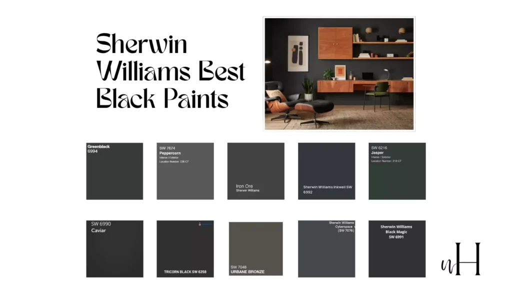
Top 10 Sherwin-Williams Black Paint Colors
Sherwin-Williams offers a variety of black shades that cater to different styles and moods. Here are 10 of their most popular black paint options, with breakdowns of undertones and ideal settings for each.
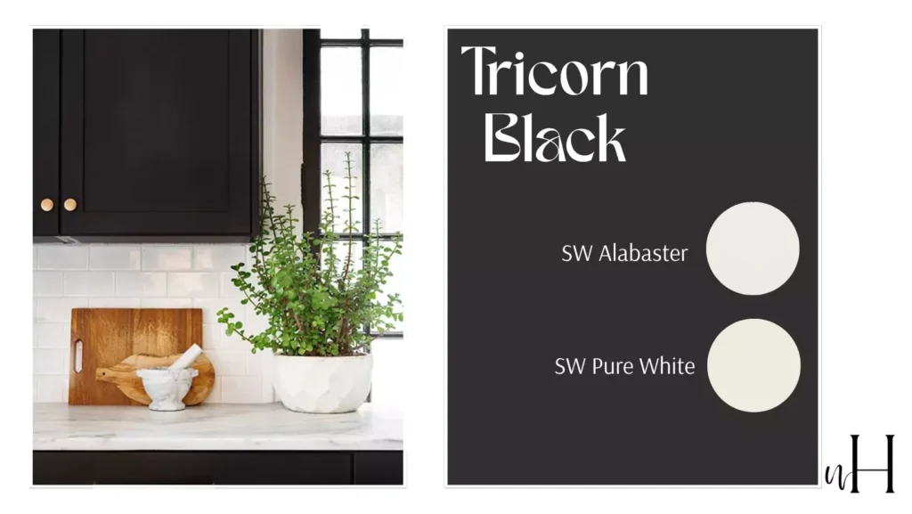
1. Tricorn Black (SW 6258)
Undertone of tricorn black
A true, neutral black with no noticeable undertones. It’s clean, crisp, and versatile.
Why tricorn black is Special
Tricorn Black is a go-to choice for designers because it works in a mini house or if youve a studio apartment, from ultra-modern exteriors to traditional interior trim.
Light Reflectance Value (LRV) of tricorn black
3-Tricorn Black absorbs almost all light, creating a rich, jet black effect.
Best For
- Exterior doors and shutters for minimal yet modern vibe.
- Interior trim, accent walls, or custom cabinetry also can work on backsplashs.
When NOT to Use tricorn black
Avoid using it in dim light or with mutiple color lights cuz it will feel more heavy and weird.
How tricorn black Works in Different Lighting
Tricorn Black can look very different depending on how it is lit. In bright, natural sunlight, this shade appears as a strong, real black with very little undertones and works well where sharp, contrasting colors are desired.
Under warm artificial light it adopts a softer, more welcoming hue that gives the room depth and character. However, in low-light or shadowy spaces Tricorn Black feels quite heavy and intense — good for a moody setting but should be balanced with lighter elements to prevent the space from feeling too much about itself.
Coordinating Colors of tricorn black
Pairs with Sherwin-Williams Alabaster (SW 7008) or Pure White (SW 7005) for a high-contrast look.
Feels Like
Modern and bold, yet timelessly classic.
2. Black Magic (SW 6991)
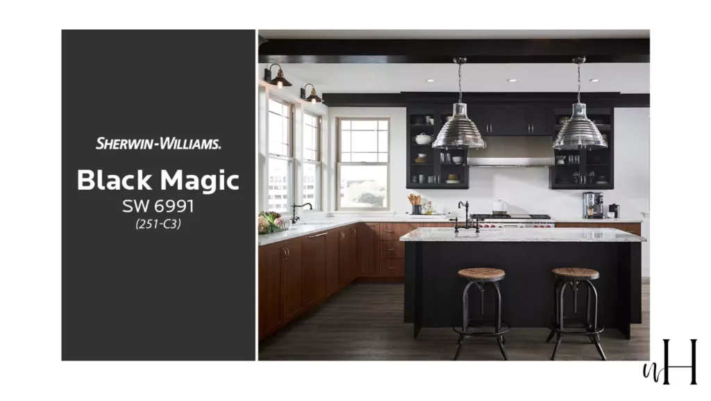
Undertones of black magic
Has warm brown undertones, creating a cozy mood.
Why black magic is Special
The warmth in Black Magic makes it perfect for spaces where you want rich depth without feeling stark.
LRV of black magic
3-Its low reflectance adds warmness but in a softer, approachable way.
Best For
- Living rooms or bedrooms with plenty of natural light.
- Exteriors to add depth and sophistication.
When NOT to Use black magic
Avoid spaces with cool-toned lighting, as it can clash with the warm undertones.
Coordinating Colors of black magic
Looks stunning with soft earth tones like Sherwin-Williams Accessible Beige (SW 7036).
How black magic Works in Different Lighting
Color looks different in varying lighting conditions which makes it perfect for your space. The bright natural light reveals more of its warm undertones, imparting a very inviting and cozy atmosphere. But under dim or artificial lighting, it seems to deepen and become more ‘dramatic’ in terms of intimacy and luxury.
This can be overruled by the cool-tone lighting, wherein the color can take on a slightly muddy appearance that’s at odds with its warmth.
Feels Like
Warm and enveloping, like a cozy hug.I think its best for winter.
3. Caviar (SW 6990)
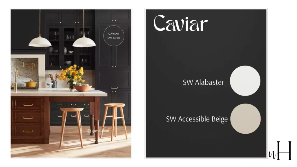
Undertones of caviar
Slightly warm with velvety, rich black depth somehow feels like Tricorn black but its warm and less reflecting as compared to the tricorn black.
Why of caviar is Special
This bold, dramatic black adds a timeless elegance to any space, making it perfect for creating contrast or grounding a room’s design.
LRV (Light Reflectance Value) of caviar
3-A very low LRV, meaning it absorbs most light, giving it a deep, rich appearance.
How It Works in Different Lighting
The beauty of caviar fall into the warmness of the color if you will pare it with the golden or dull golden lights than it will highlight the textures and other interior details.
When Not to Use
Avoid using in small bedroom and living room cuz it will make the room more uncomfortable and uninviting.
4. Iron Ore (SW 7069)
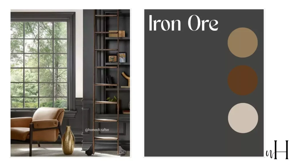
Undertones of iron ore
A deep, dark charcoal with slight gray undertones. Its gray undertones makes it feel like mate black with touch of coolness.
Why iron ore Special
Iron Ore is a standout for those drawn to industrial or modern farmhouse style. It has just enough softness to keep it versatile.
LRV of iron ore
6-Making it slightly lighter than a true black.
Best For
- Kitchen or bathroom cabinets for a modern edge.
- Front doors flanked by crisp white siding.
When NOT to Use iron ore
Avoid pairing it with loud, saturated colors, as it’s best complemented by neutrals.
Coordinating Colors of iron ore
Pairs seamlessly with whites like Sherwin-Williams Extra White (SW 7006).
Feels Like
Clean, confident, and modern.
5. Urbane Bronze (SW 7048)
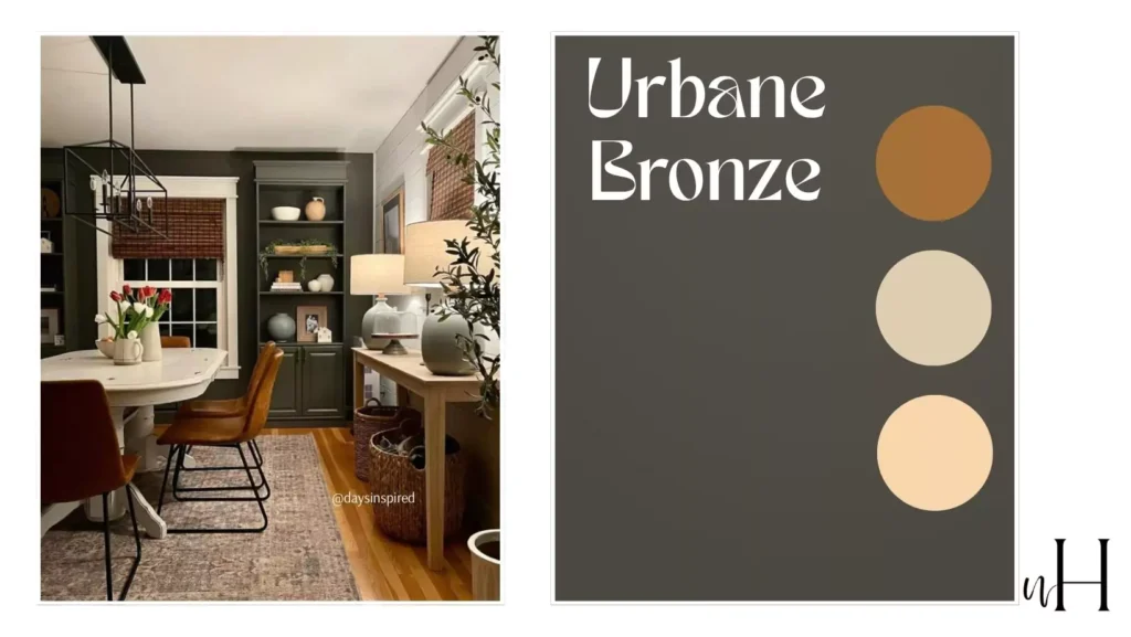
Undertones of urbane bronze
Urbane Bronze is deep brownish grayish black that give feel of metalic.
Why urbane bronze Special
This color combines the richness of brown with a modern edge of gray, creating a neutral that feels metalic touch of antique color .
Light Reflectance Value (LRV) of urbane bronze
8-A darker shade with low light reflectance, making it moody and dramatic.
Best For Interiors
I think it will work best if you will add vintage frames and vintage elements in your interior.Choose this black if you want something blacky paint for your vintage style home.
Coordinating Colors of urbane bronze
Pairs beautifully with warm neutrals like Shoji White (SW 7042) or creamy whites like Alabaster (SW 7008). For a bolder look, try contrasting it with a deep green like Evergreen Fog (SW 9130).
6. Peppercorn (SW 7674)
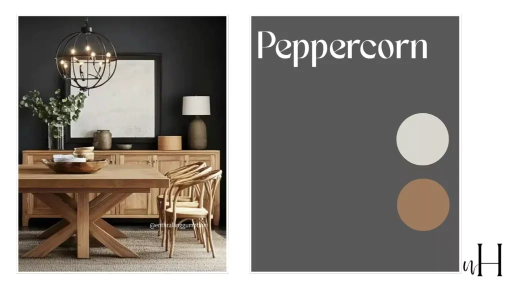
Undertones of peppercorn
A deep, rich charcoal with subtle dusty gray undertones.For this black i totally t=disagree to put it under the black colors collection because its more likely gray and cool undertones.
LRV (Light Reflectance Value) of peppercorn
10-A low LRV means it absorbs a lot of light, making it a cooler color option in black category.
Coordinating Colors of peppercorn
Works beautifully with crisp whites like Pure White (SW 7005) or warm, earthy tones like Accessible Beige (SW 7036).
7. Greenblack (SW 6994)
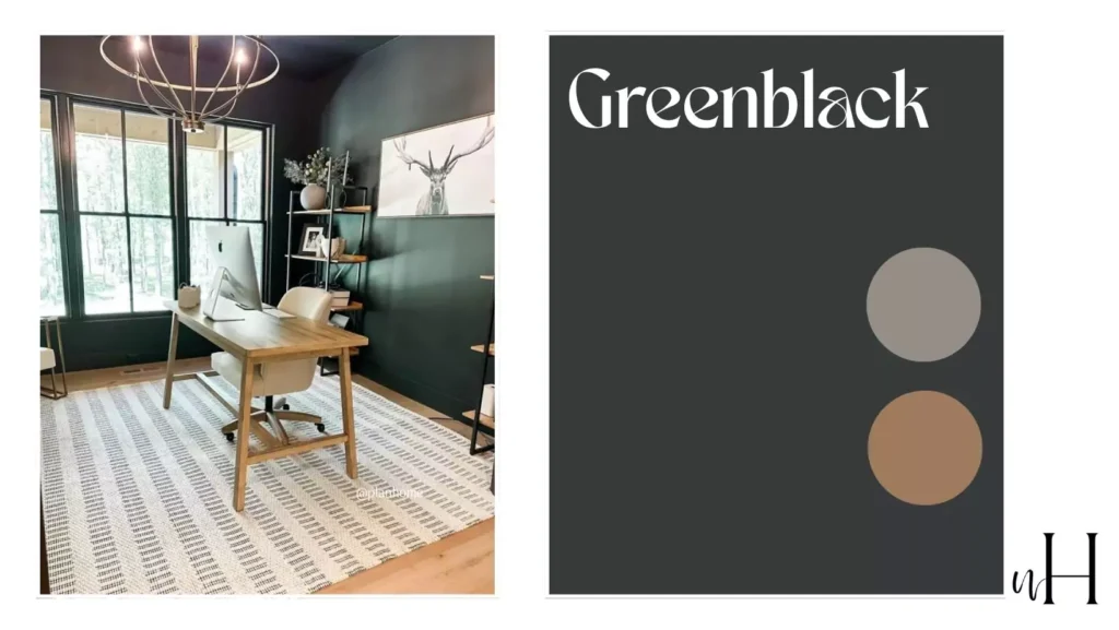
Undertones of greenblack
Hints of green that emerge beautifully in certain lighting conditions.
Why greenblack Special
Greenblack creates depth and confusion, making it ideal for spaces where you want a subtle pop of color without straying far from black. It works best in libraries with all wood furnishing.
How greenblack Works in Different Lighting
Greenblack (SW 6994) give both green and black tones.In natural lights its more like both green and black ,but not so far from the black collection.
In warm lightening it give more vibe of green but don’t completly subtle the black vibe. In cooler lightening its more like black ,reflect more of the black vibe.
When NOT to Use greenblack
Be cautious in spaces with overhead fluorescent lighting, as it can bring out green undertones too strongly.
Coordinating Colors greenblack
Pairs beautifully with jewel tones like deep emerald or brass accents.
Feels Like
Moody and mysterious, with a touch of elegance.
8. Cyberspace (SW 7076)
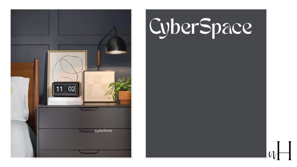
Undertones of cyberspace
Rich navy and charcoal tones give this black a cooler profile.
Why cyberspace Special
Cyberspace feels sleek and modern, making it a favorite for contemporary spaces.
LRV of cyberspace
6, creating a slightly softened effect.
Best For
- Bathrooms or kitchens with stainless steel finishes.
- Modern exteriors with clean lines.
When NOT to Use
Avoid using it in warm-toned spaces, as the cool undertones may create a jarring contrast.
Coordinating Colors of cyberspace
Pairs wonderfully with Sherwin-Williams Naval (SW 6244) or crisp whites.
How It Works in Different Lighting
In cooler lightening it give more softer look but in warm lightening it gives more conteporaary look. However, in spaces with minimal light or north-facing rooms, it may appear darker and more dramatic, emphasizing its bold and modern character.
9. Jasper (SW 6216)
Undertones of jasper
A rich, deep green with subtle earthy and muted gray undertones.
Why jasper Special
Jasper offers a grounded, sophisticated feel, creating an elegant and timeless atmosphere in any space. Its warm undertones bring depth and balance, making it imp for various design styles.
LRV of jasper
13 (Low Reflective Value, making it a bold and moody choice with less light reflection).
Best For Exterior and Other Rooms
Ideal for cozy living rooms, offices, or accent walls in bedrooms. On exteriors, it pairs beautifully with natural materials like stone or wood, adding richness to the façade.
How It Works in Different Lighting
Under artificial light it give you its own grounded color but sometimes a little warmer especially when you pair it with the vintage and antique pieces.
When Not to Use
Avoid in small, poorly lit spaces, as its depth can make the room feel overly dark or enclosed.
Coordinating Colors of jasper
Pairs well with warm neutrals like Shoji White (SW 7042) or creamy colors like Alabaster (SW 7008). For contrast, try brass or gold metallics for a luxurious touch.
10. Inkwell (SW 6992)
Undertones of inkwell
A rich, deep navy with subtle black undertones, creating an almost velvety depth.
LRV (Light Reflectance Value) of inkwell
4 – This is a very dark color that absorbs light, creating a cocoon-like atmosphere.
How inkwell Works in Different Lighting
The beauty of Inkwell lies in the way that it can change like a chameleon based on lighting conditions. Bright natural light makes its rich dark hue obvious. Also revealed are the color’s subtle undertones of blue or charcoal, and they add dimension.
It makes for a modern as well as advanced feel without it feeling flat. When Inkwell is placed inside rooms with soft, warm artificial lighting, it exudes a cozy, intimate appeal as it creates a space that feels welcoming yet dramatic.
How to Choose the Right Black Paint Color
With so many options, narrowing it down can feel daunting. Here are some expert tips to help simplify your decision-making process:
- Consider Lighting: A shade like Tricorn Black works anywhere, while warmer tones like Black Magic shine in low-light, cozy rooms.
- Test Swatches: Always test paint samples in your space to see how they look in different light throughout the day.
- Think About Undertones: Cool-toned blacks work well with modern or industrial styles, while warm hues complement rustic or traditional designs.
- Define the Mood: Decide what feel you want to create. Is it bold and contemporary, or warm and inviting?
Colors That Complement Black Paint
When working with black, pairing it with the right colors elevates the final look. Here are some foolproof combos that always work:
- Crisp Whites (like Sherwin-Williams Extra White) for timeless contrast.
- Earthy Greens to create an organic, natural vibe.
- Soft Blush tones for subtle, feminine touches.
- Warm Metallics like gold or brass to add elegance and glam.


