I wrote before in 2023 about Iron Ore and Black Magic when i first used it in my home office, i will also share images of my projects, that I’ve used Sherwin Williams Iron Ore SW 7069 in cabinets, front door, exterior i mean on trim, and on my office wall.
I love black with neutral shade paints ,cuz it pop your style. You must be looking for something that is jet black.Iron Ore is perfect choice for you .
I will share LRV ,undertones , coordinating colors, how to use it in different rooms and comparison with some other colors.
10 Popular Sherwin-Williams Black Paint Colors for Every Space-2025
SW iron ore vs tricorn black-Which Is Best For Your Home
What are the Undertones of Sherwin Williams Iron Ore SW 7069
Iron Ore is a warm charcoal with subtle undertones that can vary by light and setting.
Experts note it has a faint warm green cast – especially noticeable outdoors – though indoors this hint of green is very slight. Some reviewers even observe blue/navy undertones under bright light or in northern exposures.
In practice, Iron Ore often appears as a deep “soft black” or dark charcoal; its undertone may shift from greenish to bluish depending on lighting and adjacent colors.
LRV of Iron Ore SW 7069
Iron Ore has an LRV of 6, meaning it reflects very little light. On the 0–100 scale (black to white), Iron Ore is thus much lighter than a true black (which would be 0) but still very dark.
For context, SW Tricorn Black is below 3, so Iron Ore’s higher LRV makes it a noticeably softer, less stark black.
This LRV rating confirms why Iron Ore can look like a charcoal gray in brighter light rather than pure black.
Lighting and Appearance of SW Iron Ore
Iron Ore’s appearance changes with lighting. In bright or natural light it often reads as a deep charcoal with cooler blue or gray hints.
In dimmer or warmer light, it tends toward a rich chocolate or “soft black” look. Designers emphasize sampling: one blogger noted “lighting will play a big role on whether Iron Ore shows up more gray or black in a space”.
In my experience, an eastern-facing living room looked softer in morning light, then revealed blue/navy undertones in the afternoon sun.
In general, expect Iron Ore to look deepest and most saturated on overcast days or shaded walls, and cooler or slightly bluer in strong daylight.
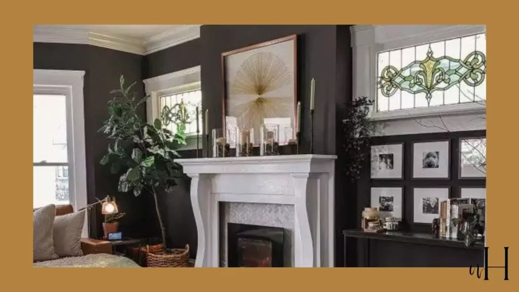
Iron Ore use in Bedroom
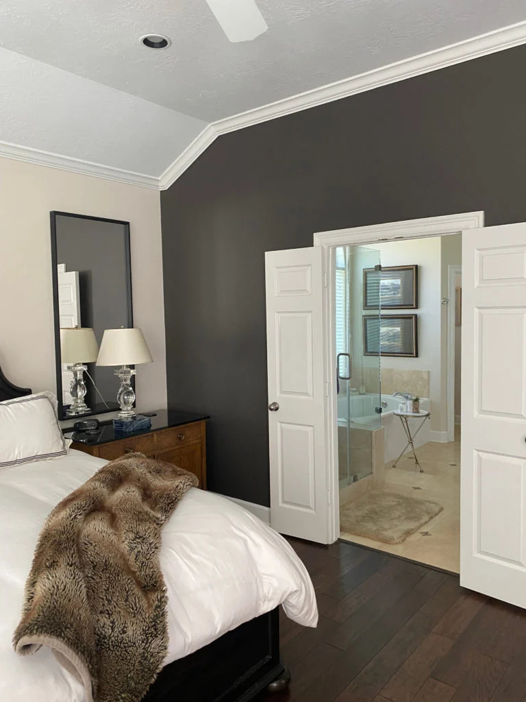
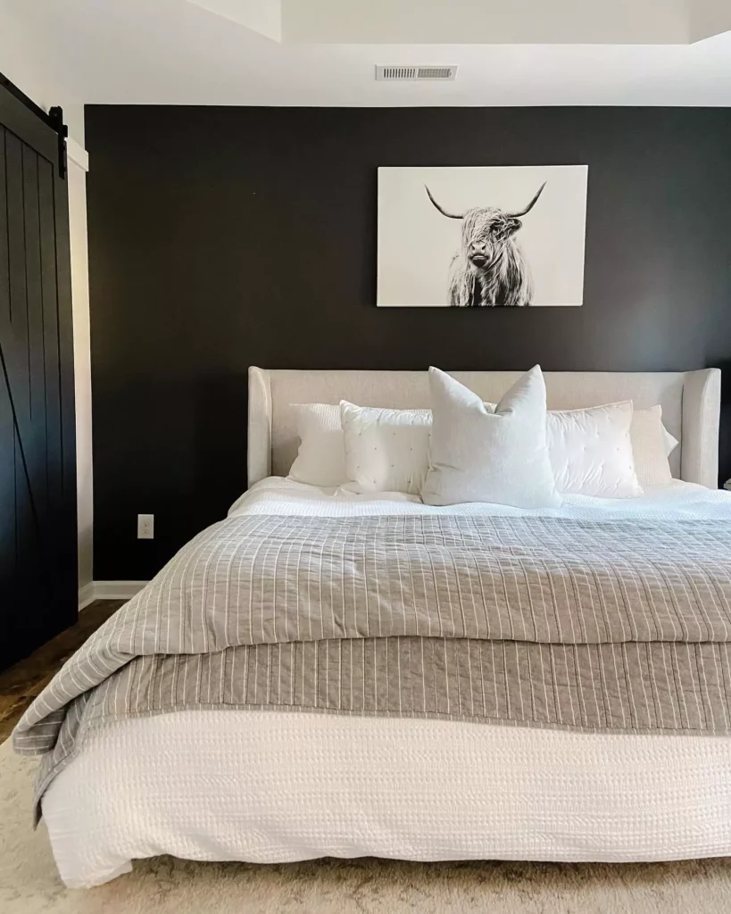
Painted bedrooms in Iron Ore become cozy and intimate. Used on all four walls, it creates a moody retreat that feels enveloping at night.
For example, one designer painted her son’s entire bedroom Iron Ore, calling it a “cozy space that is great for winding down”.
In practice, Iron Ore makes a bedroom feel dramatic yet warm – it’s like wrapping the room in dark charcoal fabric.
To prevent the space from feeling too cave-like, it’s usually paired with light-colored bedding, soft textures, and ample lighting.
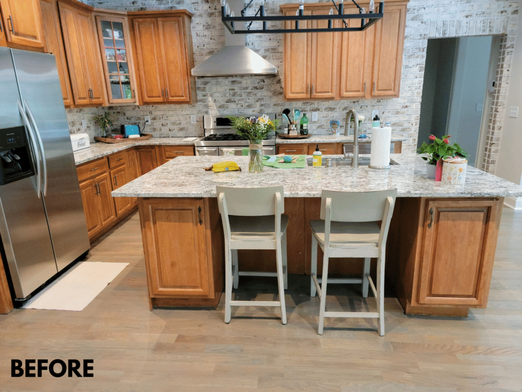
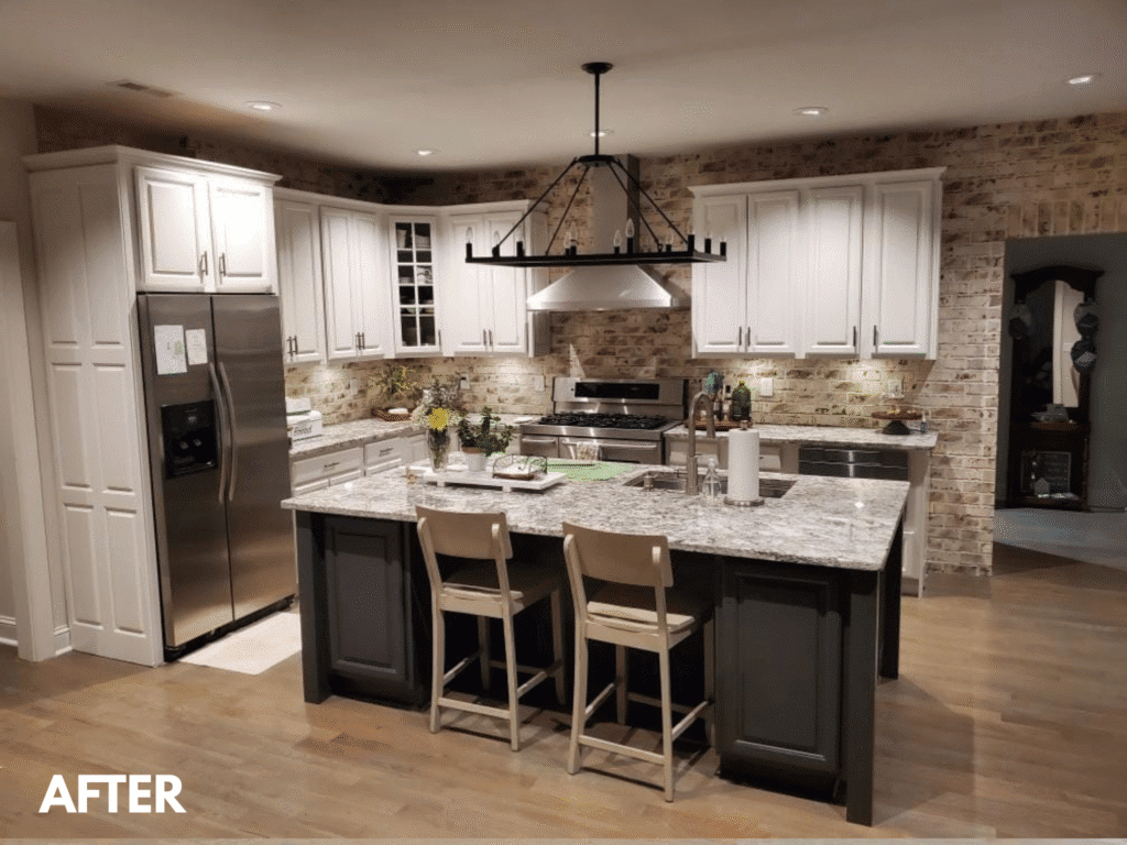
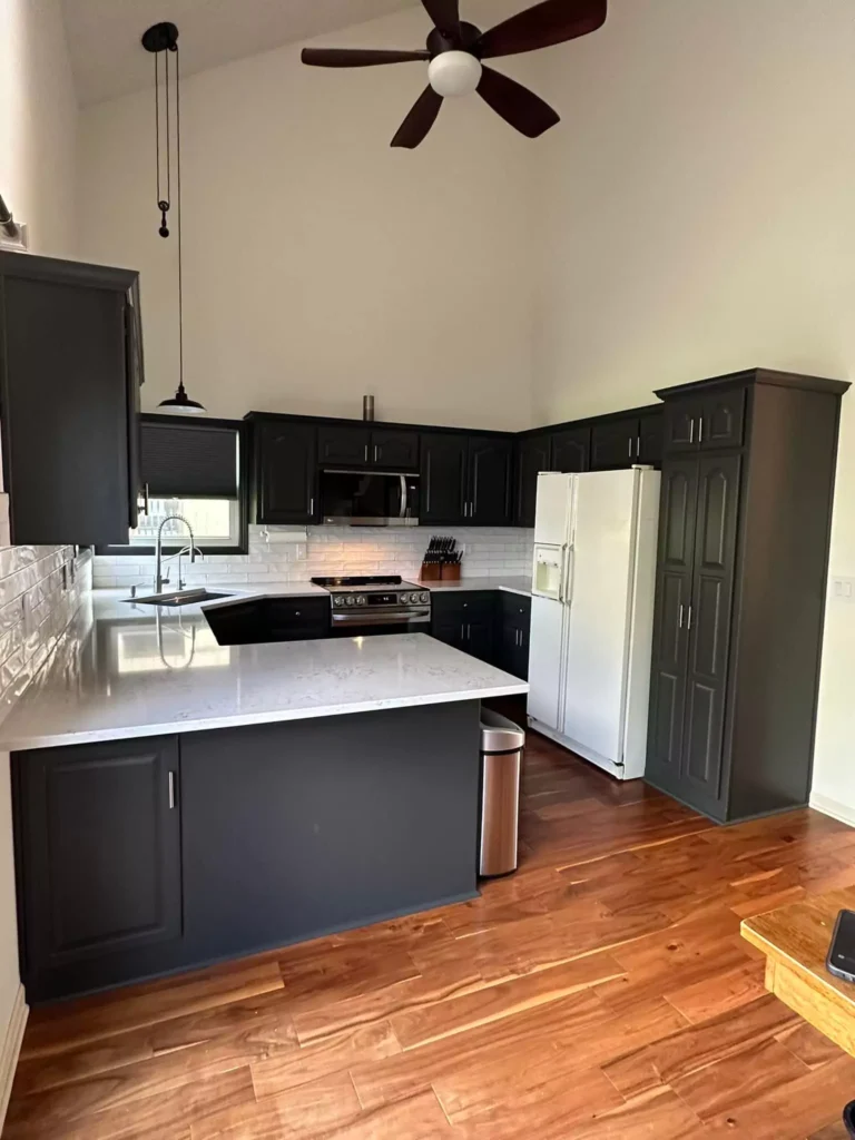
Kitchen with SW Iron Ore
In kitchens, Iron Ore is often used as a contrast color on islands or cabinetry. It pairs beautifully with white or light countertops and backsplashes.
One example described painting a custom plate rack and island Iron Ore against white tile walls; the designer found this combination of dark charcoal and warm woods to be striking and balanced.
Rich wood tones or brass accents further warm up the space. In general, Iron Ore kitchens feel modern and sophisticated – the dark paint highlights stainless or marble surfaces and makes light elements pop.
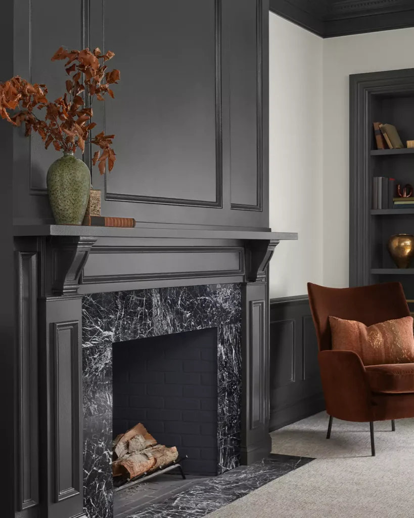
Living Room
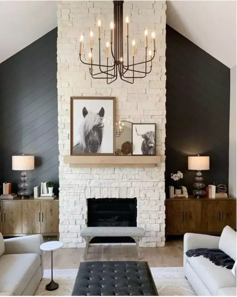
Iron Ore can anchor a living room or lounge area as a sophisticated accent. Used on a focal wall or across the whole room, it creates a clubby, intimate vibe.
In one case, a designer wanted a distinct lounge for watching TV and warmed by a fire; she painted the living room in Iron Ore to achieve a “cozy, sophisticated, moody” space.
The dark color visually recedes, letting furniture and artwork stand out.
To keep such a space inviting, decor typically includes light sofas, area rugs, or large windows to balance the depth of the walls.
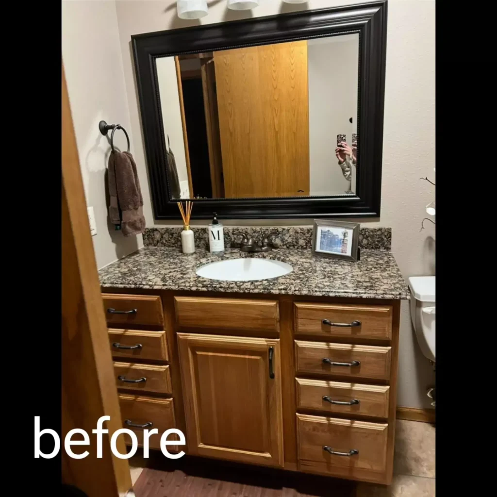
Bathroom
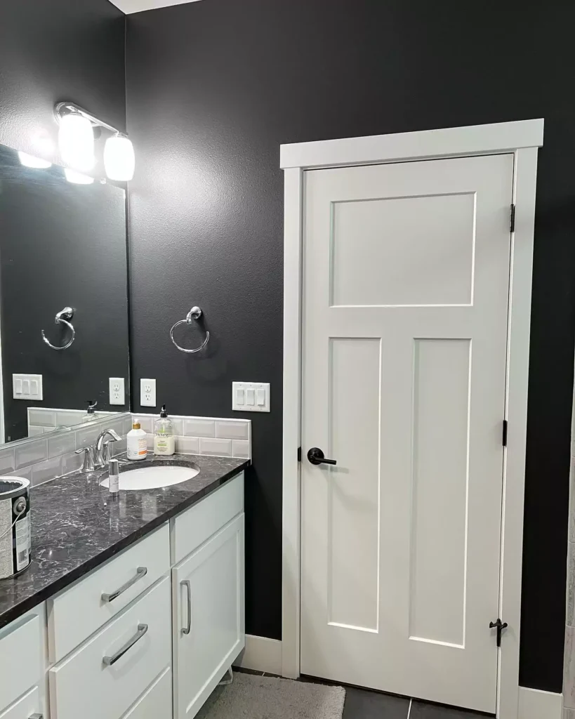
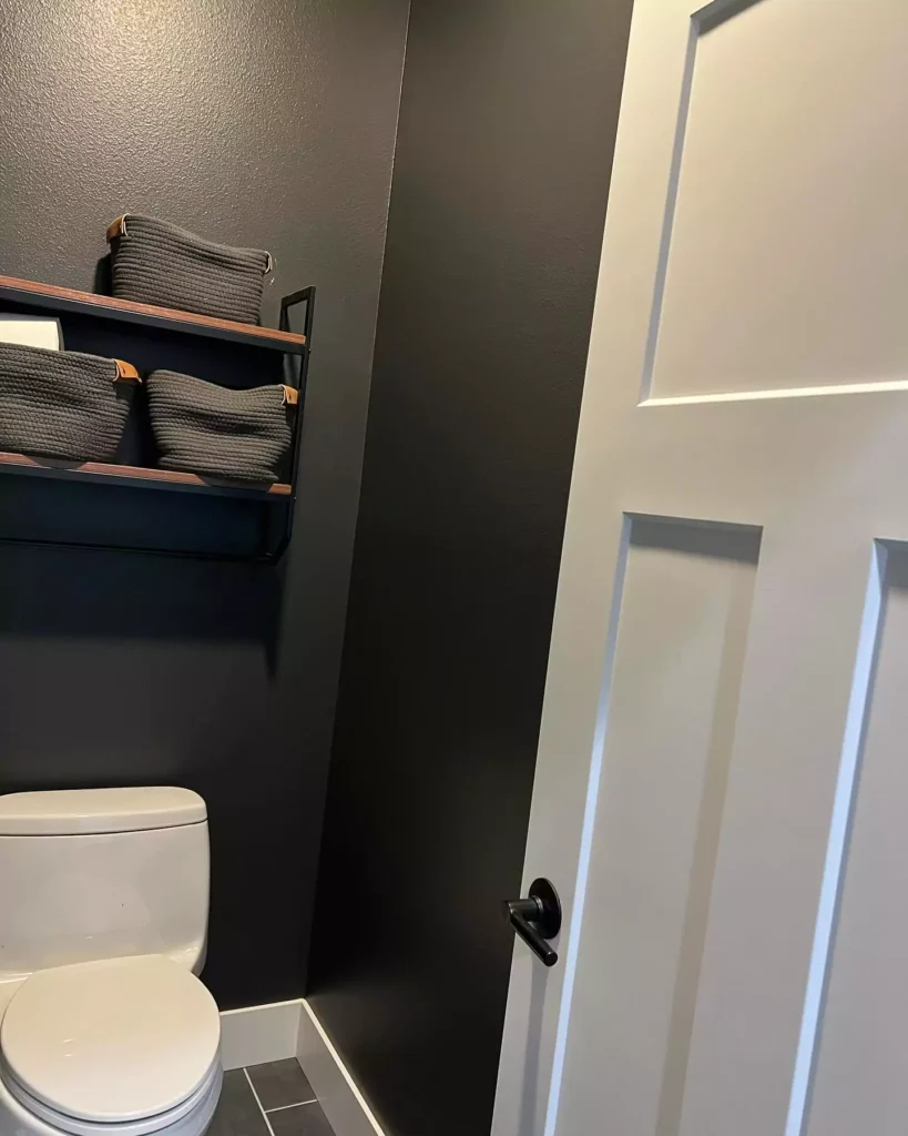
Designers report that Iron Ore works in bathrooms when used carefully. It is popular on vanity cabinets or an accent wall rather than on all surfaces.
For example, Iron Ore notes the color “adapts beautifully across various spaces, from kitchens and bathrooms to home offices…”.
In practice, Iron Ore used in a bath should be balanced with plenty of white or light tile and good lighting.
In a small bathroom it might feel dramatic but can also make the space seem smaller, so most use it sparingly (e.g. on cabinetry or as a backsplash) while keeping ceilings and larger walls light.
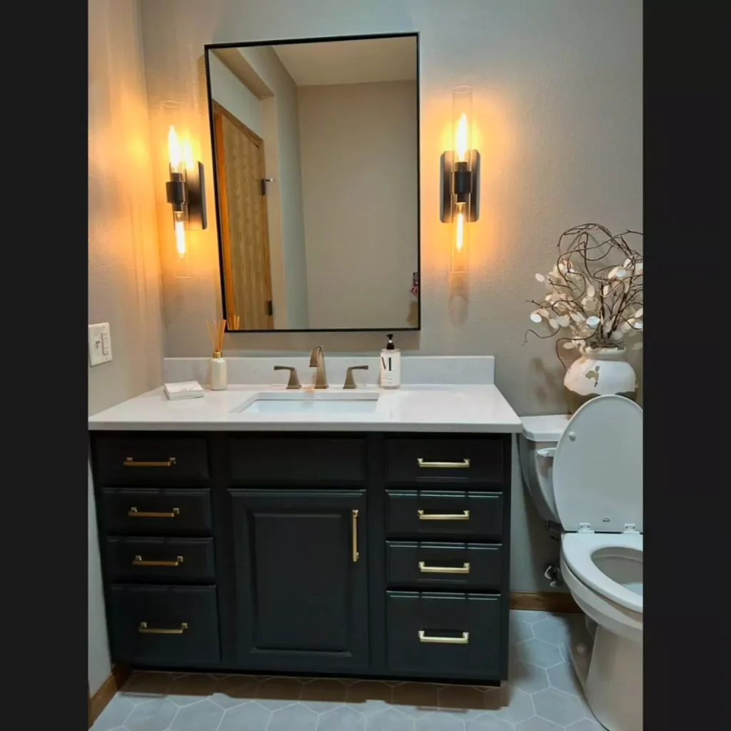
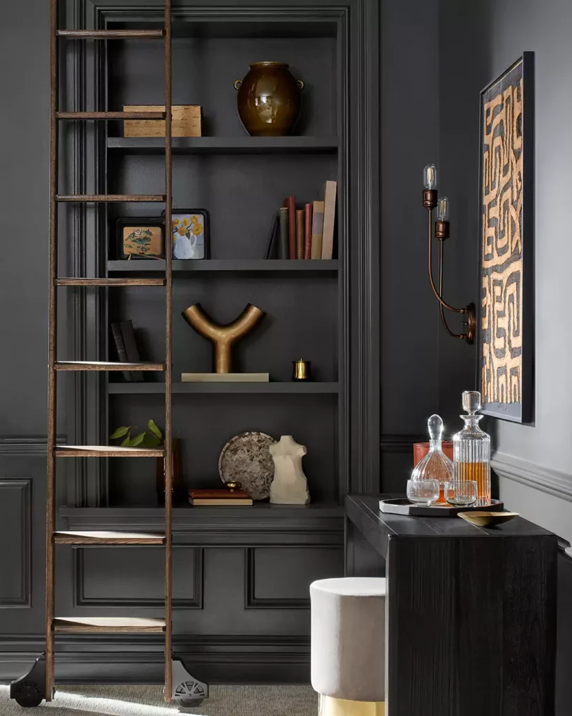
Iron Ore on Cabinets
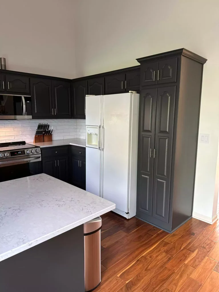
Iron Ore is a popular cabinet color. Its charcoal tone looks luxurious on kitchen or bathroom cabinets, especially in a satin or semi-gloss finish.
However, experts note that on cabinets the sheen can accentuate its warmth – for instance, Iron Ore can look “slightly greener due to the satin sheen”.
In other words, cabinet surfaces may reveal the paint’s subtle olive-green tint more than flat walls. Many decorators counter this by pairing Iron Ore cabinets with warm wood lowers or brass hardware to add warmth.
Overall, Iron Ore cabinets create a bold, high-contrast look (see a modern farmhouse kitchen example pairing Iron Ore cabinets with white shiplap walls and wood beams).
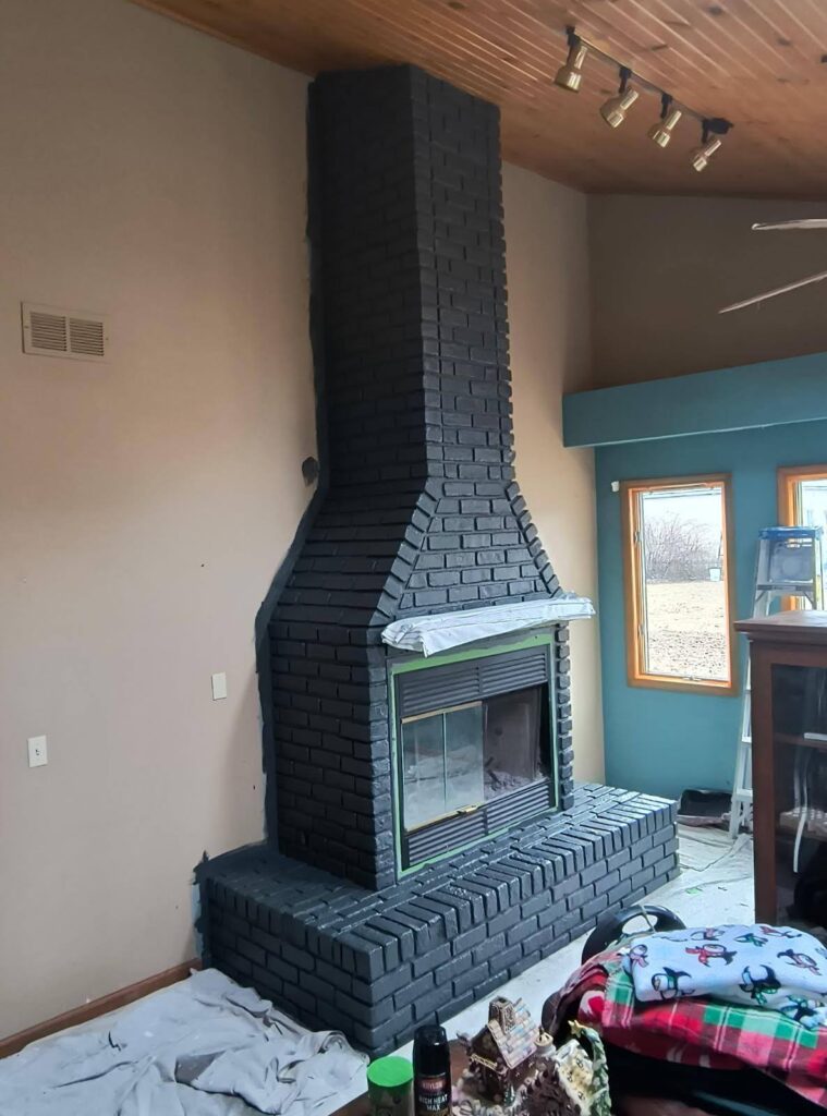
Exterior use of Iron Ore by SW
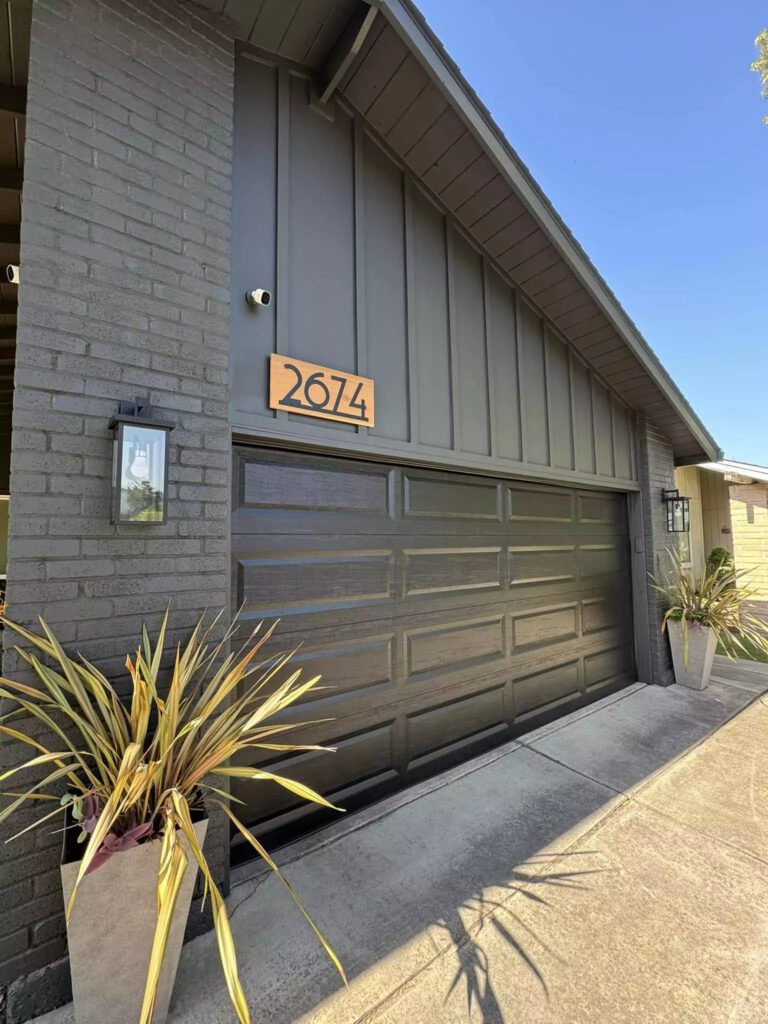
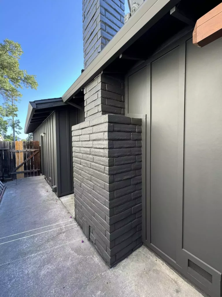
Iron Ore is well-suited for exteriors – on siding, trim, shutters or front doors – provided it harmonizes with your home’s materials. Its deep charcoal hue gives a home a modern, stately appearance.
One color consultant notes “Iron Ore is a great exterior color as long as it suits the finishes of your home (roof/stone/brick)”. The same source cautions that the warm green undertone “can pop up here and there” in sunlight.
In bright afternoon sun or on southern/exposed walls, expect to see more of that olive-green cast.
In most exteriors Iron Ore will read as a rich charcoal; for example, on a white or neutral background (like white trim or a pale siding) Iron Ore often appears almost pure black.
Coordinating Colors for Iron Ore
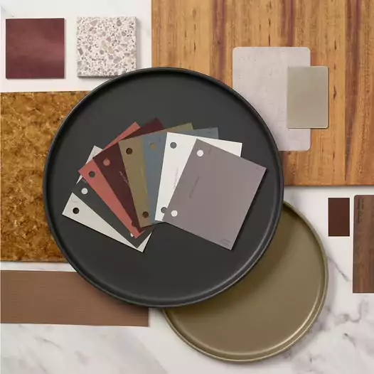
Iron Ore pairs best with warm neutrals and contrasting accents. Sherwin-Williams’ own palette for Iron Ore includes earthy rusts and whites – for instance El Caramelo (rust-red), Habanero Chile (orange-red), a cozy gray Felted Wool, and Alabaster white.
Designers advise matching Iron Ore with soft off-whites and greiges, stormy blue-greens, and warm earthy tones.
In practice, this means trim and walls in creams or beiges (Alabaster, Shoji White, Agreeable Gray) and natural materials like oak or stone.
Metal accents are chosen for warmth: brass or bronze fixtures are often recommended to complement the charcoal backdrop. Below are examples of palettes:
- Soft Neutrals: Light off-whites and pale grays (e.g. SW Alabaster or Agreeable Gray) provide gentle contrast without overwhelming Iron Ore. These muted tones let Iron Ore remain the focal point while keeping the space airy.
- Bold Accents: Deep, warm colors and crisp whites make Iron Ore pop. For example, SW Habanero Chile or rich jewel tones can serve as accent walls or decor, and pure bright white (SW Pure White or Extra White) creates a striking high-contrast look. Warm metals (brass, copper) or black details also add drama.
- Muted Tones: Dusty blues, greens, and earth tones also work beautifully. Think stormy slate grays with blue-green undertones, soft sage or taupe, and natural wood finishes. These colors pick up Iron Ore’s warmth and make for a cohesive, subdued palette.
Soft Palette
A soft palette around Iron Ore relies on gentle, pale tones. Trim, ceilings or adjacent walls in creamy whites (e.g. SW Alabaster 7008) or light greiges (SW Agreeable Gray) diffuse Iron Ore’s darkness.
Muted blushes or pastel blues can also work as accent colors.
My friend recommends “soft neutrals provide the perfect backdrop” for Iron Ore – Alabaster or Agreeable Gray are cited as ideal accompaniments. These subtle hues allow Iron Ore to anchor the room without feeling heavy.
Bold Palette
A bold palette embraces high contrast. Pairing Iron Ore with bright white or vivid color creates a dramatic statement. For instance, crisp white walls or cabinetry (SW Pure White 7005) sharply contrast the charcoal, making both colors pop.
Similarly, rich accent colors like deep red, navy or emerald green can be introduced via furniture, art or tiles. Sherwin-Williams suggests pairing Iron Ore with warm accent tones like SW Habanero Chile 7589 (a fiery orange-red) for a vibrant look.
In this scheme, metallic elements (brass hardware, matte black fixtures) are often added for a chic, modern edge.
Muted Palette
A muted or earthy palette keeps everything low-key and natural. Combine Iron Ore with soft grays (blue-grays or greiges), earthy greens, and wood or tan tones.
Designers note that Iron Ore “loves greiges – light and mid-toned” and a “wide variety of earth tones”. For example, a stormy gray-green (SW Rainwashed), a warm stone beige, or olive accents feel harmonious.
Natural wood floors or driftwood grays add warmth and texture. This subdued approach results in a calm, balanced interior where Iron Ore is bold yet integrated into a warm, natural color story.
ALL IMAGEA GOES TO THE OWNER-NO INTENT FOR COPYRIGHT.MAIL AT nestichomes@gmail.com FOR CREDIT.
FAQs
Is Sherwin Williams Iron Ore black or gray?
Iron Ore is best described as a very dark charcoal/soft black, not a true black. In one review: “Iron Ore isn’t a TRUE black…Iron Ore is actually a SOFT black”.
It often reads as a rich charcoal that can look nearly black, but it’s slightly lighter (LRV 6) and warmer than a jet-black.
Does SW Iron Ore look blue?
It can – especially under cool or northern light. Many users report blue/navy undertones when Iron Ore gets bright sunlight.
One reviewer notes the color “can read anywhere from a soft, milky black to a dark, warm charcoal to a deep navy blue,” depending on lighting.
In practice, expect Iron Ore to occasionally lean bluish-gray in certain lighting, though its underlying warmth usually comes through as the day changes.
What paint is similar to Iron Ore?
Iron Ore is fairly unique. According to experts, “Iron Ore is a creature unto itself.” Other dark paints tend to skew differently – for example, Sherwin’s Wrought Iron is lighter and bluer, while Iron Mountain (a Benjamin Moore color) is warmer.
The consensus: there is no exact equivalent to Iron Ore. Color matches often reveal noticeable shifts in undertone or depth.
What is the difference between SW Iron Ore and Urbane Bronze?
Both are deep neutrals with greenish warmth, but Urbane Bronze is lighter and warmer. Urbane Bronze has an LRV of about 8 (making it slightly lighter) compared to Iron Ore’s 6.
Crucially, both have green undertones, but Urbane Bronze’s green is stronger and more pronounced. In contrast, Iron Ore is darker and its green tint is much more subtle.
Is Iron Ore good for a front door?
Yes. Iron Ore is often used on front doors and exterior trim to make a bold statement. It provides strong contrast against light siding or stone.
In my experience “Iron Ore is a great exterior color” for siding or doors, as long as it fits the home’s overall palette. Its subtle green undertone may occasionally show in sunlight, but from a distance it usually reads as deep charcoal.
Iron Ore vs Tricorn Black
Sherwin-Tricorn Black (SW 6258) is a true, pitch-black deep black, whereas Iron Ore is a soft black.
The main difference is value and undertone: Tricorn’s LRV is around 2-3 (very nearly true black), while Iron Ore’s LRV of 6 makes it noticeably lighter. Under the same light, Iron Ore will appear as a dark charcoal compared to the absolute blackness of Tricorn.
Additionally, Tricorn has essentially no undertone, but Iron Ore carries a slight warm greenish tint. In summary, Tricorn Black is more stark and neutral, while Iron Ore is a warmer, softer black with subtle hue.
Iron Ore vs Peppercorn
Sherwin-Peppercorn (SW 7674) is a dark gray that is significantly lighter and cooler than Iron Ore. Peppercorn’s LRV is about 10, whereas Iron Ore is 6, so Peppercorn appears closer to charcoal gray.
Peppercorn can flash different undertones (it sometimes looks slightly green or even purplish), but on average it reads as a true dark gray. By contrast, Iron Ore is darker (closer to black) and consistently has a faint warm green cast.
Thus, Peppercorn is a rich gray, but Iron Ore is a deeper, warmer blackish charcoal.


