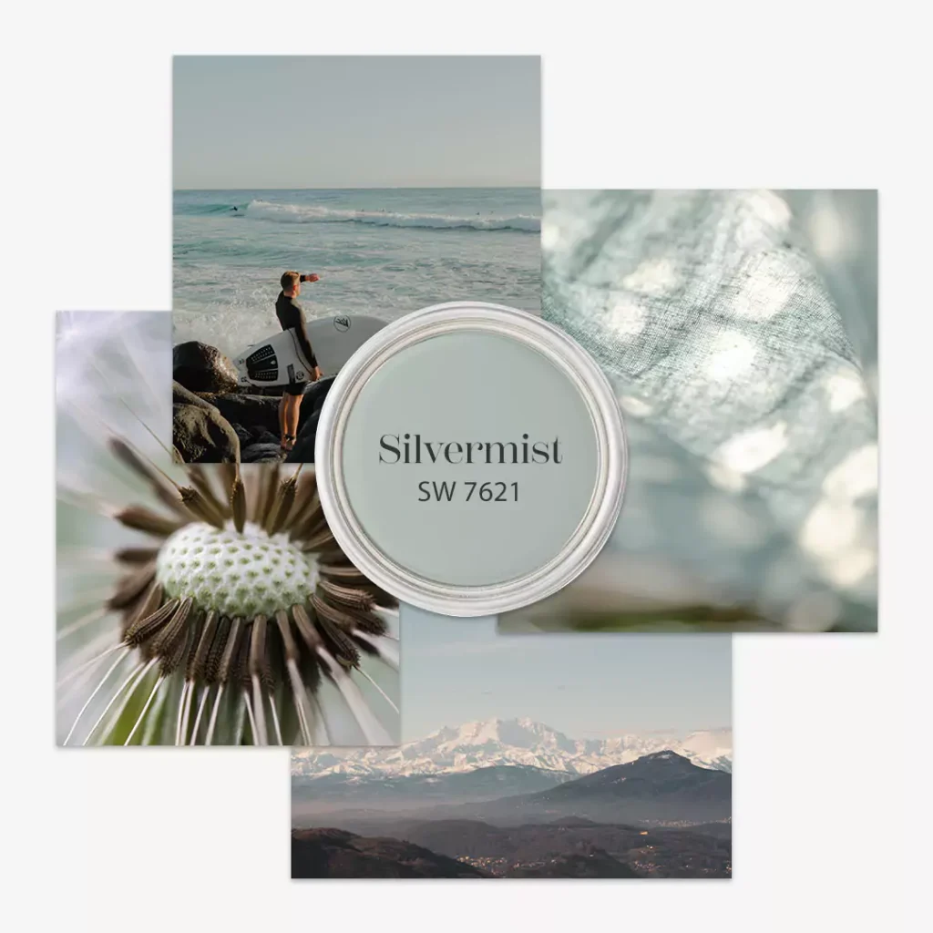
Sherwin Williams Silvermist (SW 7621) is a cool, calm blue-green-gray paint color with a serene, peaceful vibe. It was introduced in Sherwin-Williams’ Biome and Living Well collections, showing it’s a trendy choice.
I LOVE sharing REAL HOME IMAGES ,to make it easy for you to note the exact undertones of the Silvermist. In this blog i will share lightning effect,Silvermist in different rooms,and coordinate colors.
.All the images that I am gonna share are unfiltered and real homes.
Undertones of Silvermist
Silvermist’s hidden color undertones are mainly green and slate gray. That means underneath its blue-green look, there’s a soft gray keeping it grounded.
The gray undertone acts like a “blanket” that tames the blue-green, so the color never feels too bright or teal. In fact, one paint expert notes that Silvermist is mostly blue-green but with gray softly mixed in, giving it an earthy feel.
Because of these undertones, Silvermist leans slightly toward blue more than green, but the green is still there. In bright light it can flash a hint of green, while the gray keeps it looking elegant. Overall, Silvermist’s undertones make it more muted and soothing than a pure teal or pure gray.
LRV of Silvermist
LRV stands for Light Reflectance Value, a number from 0 to 100 that tells how much light a paint color bounces back. Silvermist SW 7621 has an LRV of 47. In plain terms, that’s about half-way – it reflects nearly half the light it gets.
A higher LRV (closer to 100) means a color is very light and makes a room brighter, while a lower LRV (closer to 0) means the color is darker and absorbs more light. With an LRV of 47, Silvermist sits in the middle range.
This means it’s medium-light; it will not look super dark, but it won’t be as bright as a white wall either. In practice, Silvermist’s LRV means it will make rooms feel balanced – not too dim, not too glaring.
For example, painters say it won’t wash out in sunlight nor will it make a room too shadowy. Thanks to LRV 47, Silvermist can work well in both well-lit and moderately lit rooms, keeping a calm, even tone.
18 Blue-Gray Paint Colors by Sherwin-Williams & Benjamin Moore
Silvermist In Different Lights
Light changes how Silvermist looks throughout the day. In a room with north-facing windows, where the light is cool and shaded, Silvermist tends to look more blue-gray.
It will feel very calm and cool in those north light conditions. With south-facing windows, which get bright warm light all day, Silvermist will shift to show more green tones.
So a sunlit south wall might appear a little greener than a shaded one. In east-facing rooms, morning sunlight brings out the green side of Silvermist, then by evening Silvermist drifts toward its cool blue-gray side. Similarly, west-facing rooms with late-afternoon sun make Silvermist look a bit warmer gray in the late day.
In summary: bright, warm light emphasizes the green in Silvermist, while cooler or dimmer light emphasizes the gray and blue. Because of this, Silvermist is very dynamic – it can appear slightly different depending on lighting, so always test a patch in your own space to see exactly how it shifts.
Other Sherwin Williams Blue colors
Sleepy Blue SW 6225 Sherwin Williams
Krypton (SW 6247) Sherwin-Williams-My Review
Topsail SW 6217 Sherwin Williams
Hex Code
Sherwin Williams Silvermist’s official hex code is #b0b8b2. This is the code you would use in a computer or design program to get the exact color on screen. The hex #b0b8b2 describes Silvermist as a pale, grayish-blue-green. (For context, a pure white is #FFFFFF, so Silvermist’s code is a mix of medium-light red, green, and blue values.)
You will sometimes see Silvermist’s hex written in design tools or color converters, but in painting it’s just shorthand. In any case, remember that real paint can look a bit different than on a screen – it usually looks slightly darker or warmer when dry. Still, knowing the hex is handy for matching digital samples or planning a palette.
RGB
In RGB (the Red-Green-Blue color model), Silvermist is R: 176, G: 184, B: 178. This means, out of 255, it uses 176 parts red, 184 parts green, and 178 parts blue.
Those numbers reflect a balanced mix – it has a little more green than red or blue. If you look at those values, you’ll see why the paint looks a gentle aqua-gray: the green (184) is slightly strongest, giving it that green-blue hint, while red (176) and blue (178) are nearly the same.
In simple terms: Silvermist’s RGB values show it’s not a bright color (all values are below 200) and it’s quite even between the channels, creating that soft muted look. These RGB numbers are useful if you’re matching colors on a computer, but remember, as with hex codes, paint on a wall may look a tiny bit different in person.
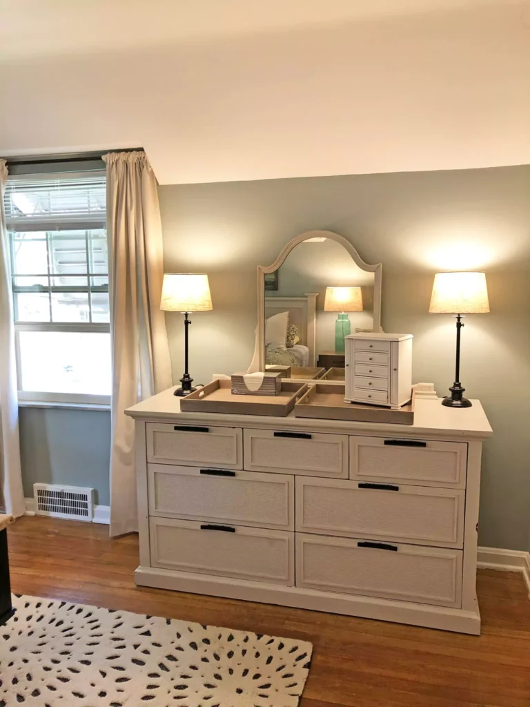
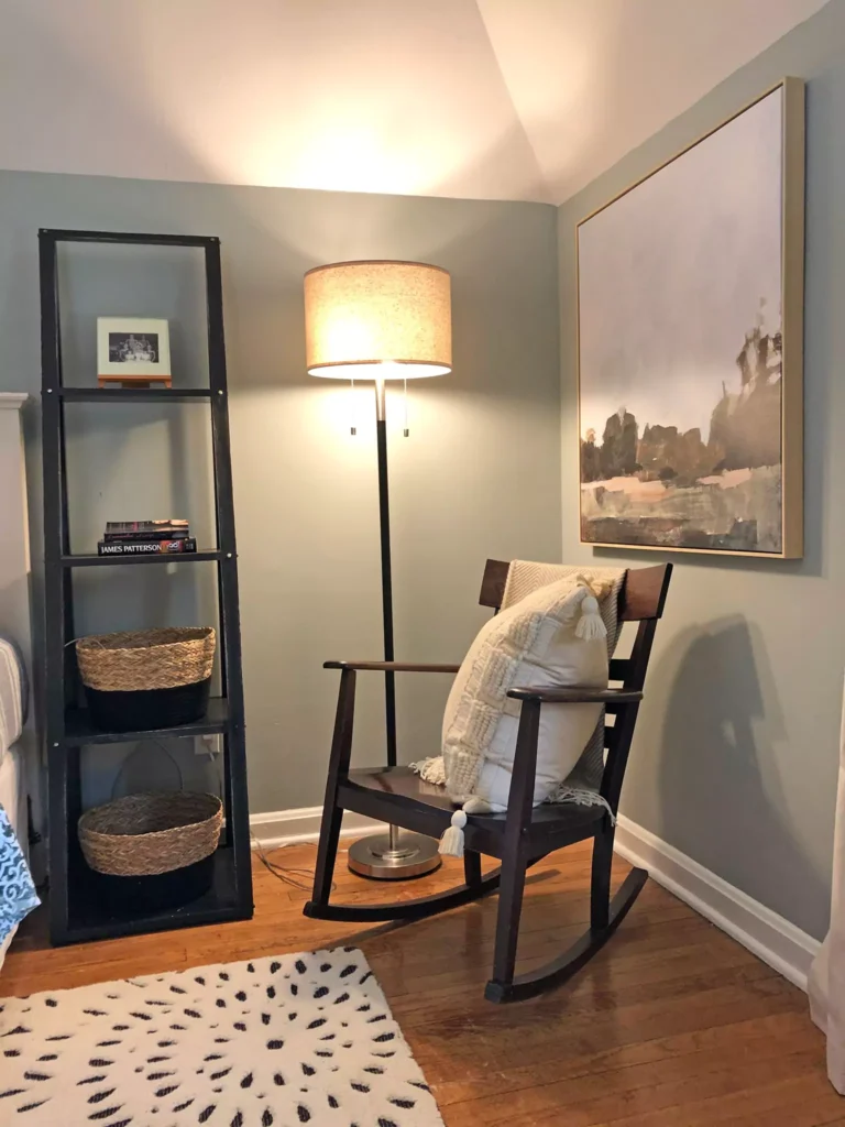
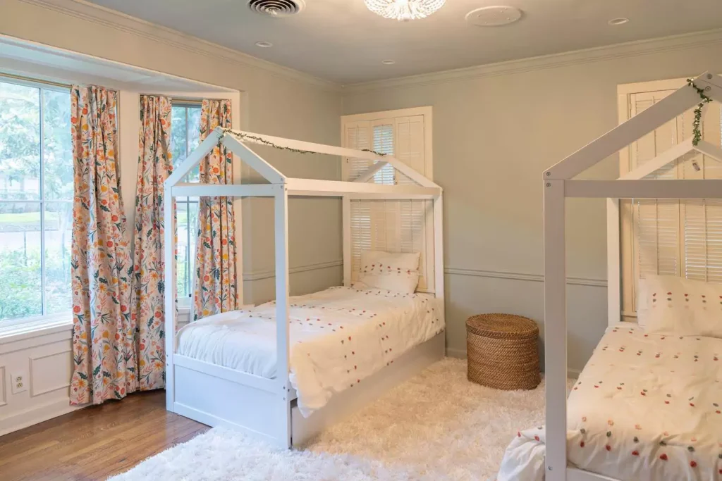
Silvermist Bedroom
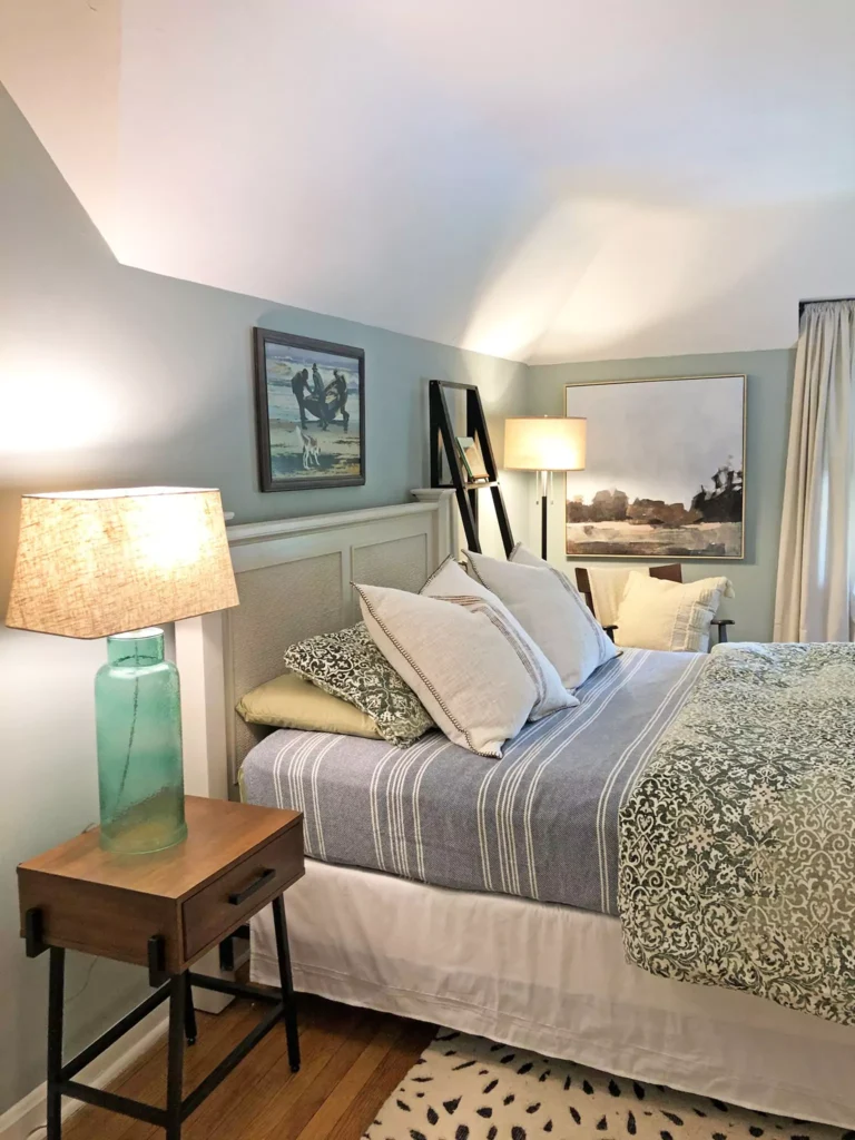
Silvermist is often chosen for bedrooms because it makes the space feel calm and restful. Its soft, cool tone is like a gentle blanket of color that helps you relax for sleep. In a bedroom, Silvermist walls can pair nicely with white or cream bedding and natural wood furniture to create a peaceful scene.
You might see it used with cozy textures – for example, light wood floors and soft gray curtains – making the room feel like a spa or a quiet sky. One designer notes that using Silvermist in a bedroom “can provide the calming atmosphere needed for restful sleep”.
This is because the color isn’t stimulating (it’s not bright red or busy); instead it’s soothing like a clear blue morning or a light green forest.
For a child’s or grown-up’s bedroom, Silvermist can promote a peaceful mood. Just be mindful: in a very dark north-facing bedroom, it might look a little cooler, so you might add warm lights or blankets to balance.
Overall, many find that Silvermist on bedroom walls helps you feel cozy and sleepy – it’s like painting the room in soft ocean breeze colors.
Silvermist In a Kitchen
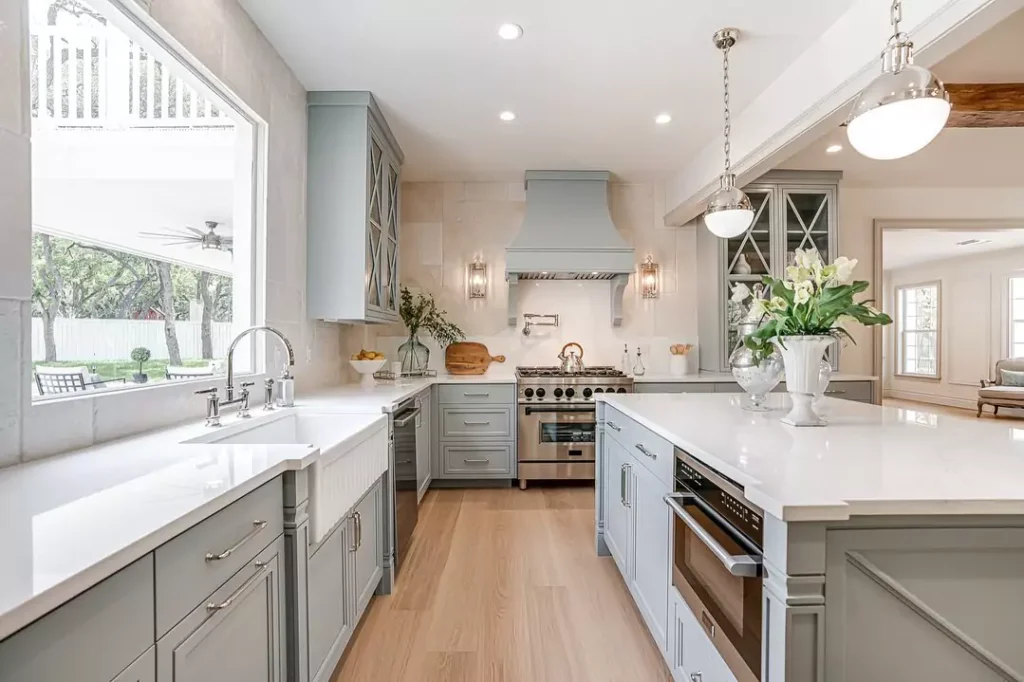
Silvermist can also work beautifully in a kitchen. Kitchens get a lot of use and sometimes a lot of natural light, so Silvermist’s medium lightness (LRV 47) keeps the room fresh without being too bright. Designers say Silvermist brings “calmness and serenity” to a kitchen. Imagine White cabinets with Silvermist walls, or vice versa.
Silvermist can make a kitchen feel clean yet inviting. For example, if you pair Silvermist walls with crisp white trim and a cheerful backsplash (like coral or teal tiles), it creates a balanced, friendly look.
It also goes well with wood tones or stainless steel appliances. Because Silvermist has a bit of green, it looks nice with plants or green herbs on the counter.
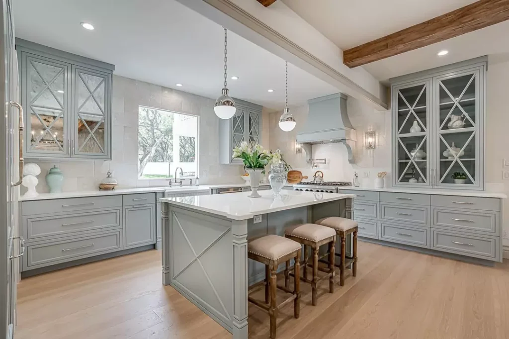
If your kitchen has lots of sunlight, the color will brighten a bit (showing its green side), making the space feel airy. If the kitchen is dim or north-facing, Silvermist will read a touch more gray-blue, still keeping it cozy.
Some people even use Silvermist on lower cabinets with a lighter or white upper cabinet color, for a modern feel. In short, Silvermist in the kitchen adds a gentle, relaxed vibe – as one source says, it’s an excellent choice for kitchens for its soothing effect.
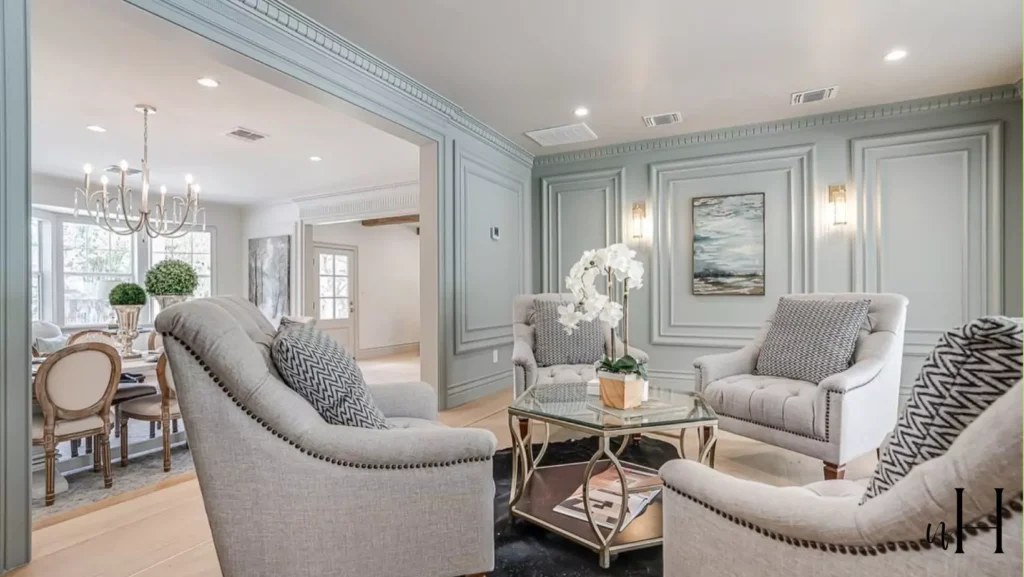
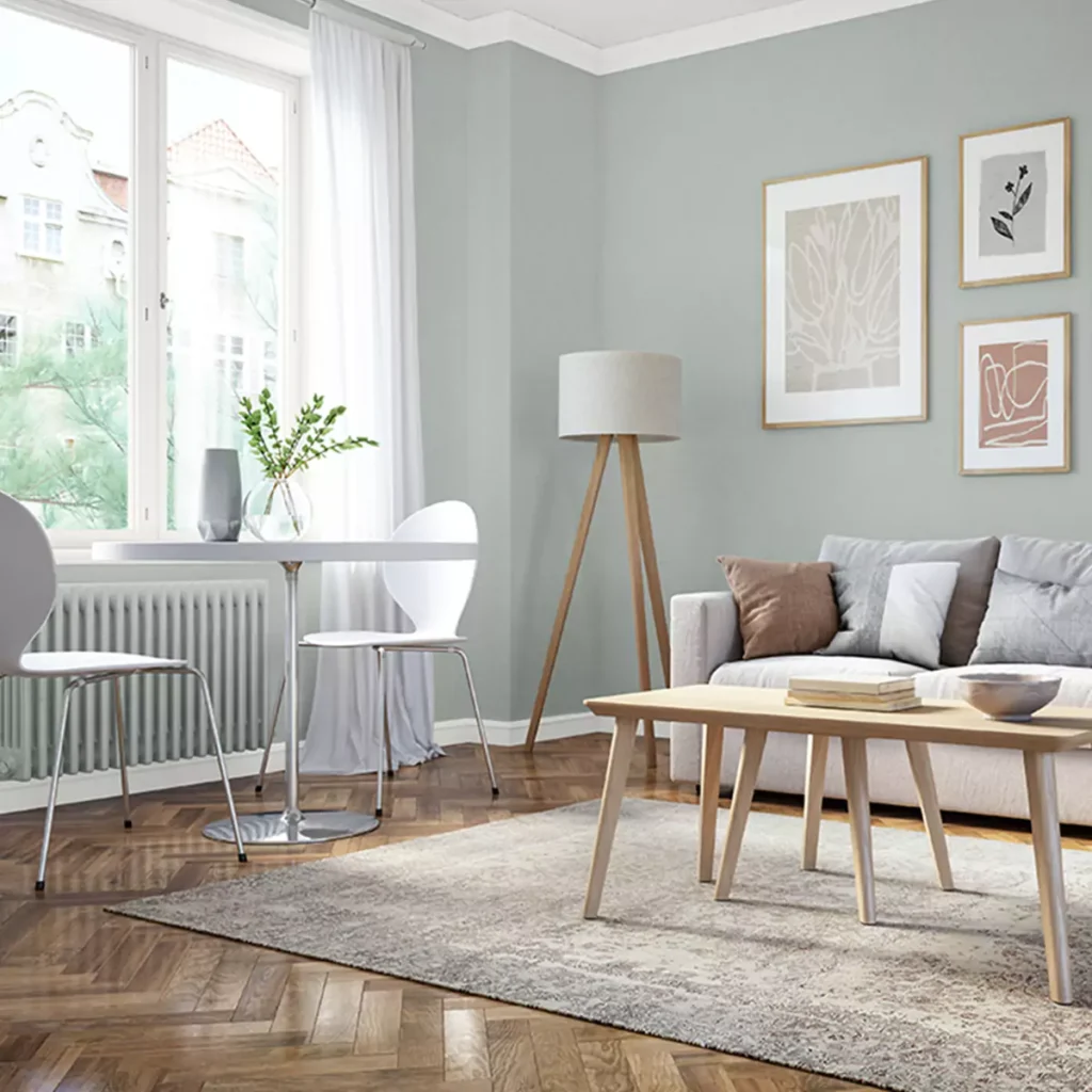
Silvermist In a Living Room
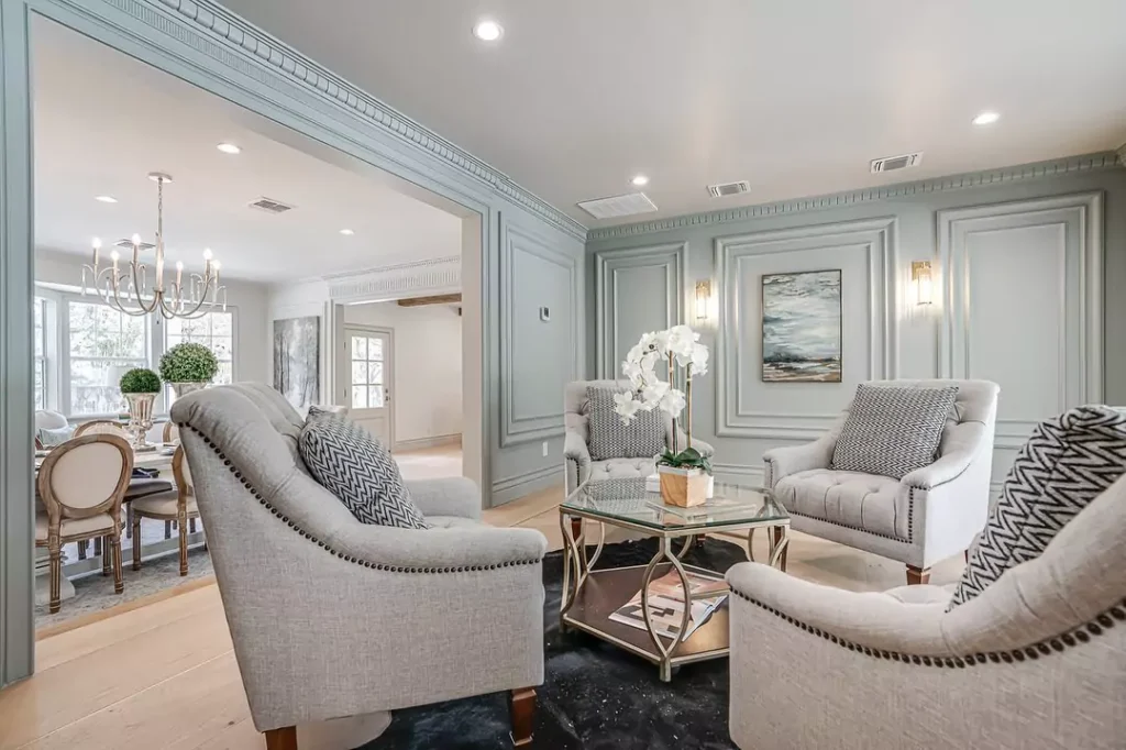
Silvermist creates a very inviting living room. Its cool blue-green-gray hue gives a living area a relaxed, open feel. In photo examples, you’ll often see Silvermist on living room walls paired with neutral sofas and natural light.
Because it’s not a loud color, it lets furniture and decor pop. For instance, imagine a gray or cream couch on Silvermist walls – the result is soft and welcoming. Designers report that Silvermist “offers an inviting ambiance that sparks relaxation and peaceful conversations” in living rooms.
It works well with white or light trim and also pairs nicely with deep wood or black accents. If you like accent colors, Silvermist goes with mustards, dusty pinks, or navy blue pillows and art for a cozy contrast.
In a living room with lots of windows, Silvermist will keep things feeling bright but calm; with fewer windows, its medium tone still keeps the space from feeling too dark. Overall, Silvermist on living room walls or ceilings makes a space feel both fresh and comfortable.
In a Bathroom
Silvermist can turn a bathroom into a spa-like retreat. Bathrooms are often smaller or have tiles and fixtures, so Silvermist’s cool tone brings a crisp clean look. It reads as a light aqua-gray, which suits bathroom settings perfectly. As one color review notes, even bathrooms “benefit from the serene energy of this color, transforming them into personal spa-like retreats”.
For example, light Silvermist walls paired with white tile, marble counters, or warm wood vanities can make a bathroom feel peaceful and bright. It also complements natural materials: think a pebble stone floor, green plants, or soft gray towels. Silvermist’s green-blue side pairs well with water themes (like ocean artwork or seashell accents).
Since it’s cool-toned, it goes with chrome or brushed nickel faucets and fixtures. If the bathroom has a window, the color will glow softly; if it’s windowless, Silvermist will prevent the room from feeling too dreary. In either case, Silvermist acts like a soothing wash of color, making showers and baths feel calm. Because of this calming vibe, it’s a popular choice for master baths or powder rooms when homeowners want a gentle, clean style.
Silvermist Cabinets
Silvermist can be used on cabinets themselves or paired with cabinet colors for a cohesive look. A popular pairing is Silvermist walls with Sherwin Williams Attitude Gray (SW 7060) on cabinets.
Attitude Gray is a soft, cool gray with a hint of teal, and using it on cabinets next to Silvermist walls creates a very modern, soothing kitchen or bathroom. In fact, paint experts recommend Attitude Gray for cabinets because it “pairs well with Silvermist’s slightly higher LRV”.
If you wanted the reverse (Silvermist cabinets), you could put a bright white or Reserved White trim on the walls for contrast. Silvermist works well with light wood cabinets too – for instance, natural maple or birch wood cabinets look fresh against Silvermist walls.
In bathroom vanities, painting the vanity Silvermist can give a nice touch of color that’s still neutral. Just be sure to balance it: for example, white or cream countertops look great with Silvermist cabinets. In short, Silvermist is flexible around cabinetry – it can be the cabinet color or a coordinating wall color, and either way it helps create a calm, unified feel.
Exterior
Yes – Silvermist SW 7621 can also be used outside on home exteriors. Its medium brightness and cool hue make it a lovely siding or stucco color. In bright daylight, Silvermist will look a bit lighter and more green-gray; in shade it will show more blue-gray. Designers say Silvermist has enough depth and character to highlight architectural details outside.
For example, one homeowner painted the exterior walls Silvermist with crisp white trim around windows, and used a coral-red door for a pop of color – the result was charming and unique. The contrast of Silvermist with a bright door color was playful yet balanced.
You could pair Silvermist siding with white or off-white trim for a classic look, or even with dark gray shutters or doors for a bolder statement.
Because Silvermist “has the uncanny ability to highlight architectural details”, it makes homes look fresh. It also looks good on outdoor structures like sheds or garden walls, blending well with trees and landscaping. Just remember that exterior lighting (sun vs shade) will affect how cool or warm the color reads, so it’s wise to sample it on the wall outside first.
Overall, Silvermist works beautifully on the outside – it’s versatile enough to suit many home styles, from cottage to modern.
Coordinate Colors of Silvermist
To build a nice color scheme with Silvermist, you can use coordinating and complementary colors. Sherwin-Williams and designers suggest pairing Silvermist with these hues:
Extra White (SW 7006)
A warm white (LRV 86) that isn’t pure bright white. It has subtle blue-gray hints. Using Extra White on trim or ceilings brightens Silvermist and makes its blue-green tones pop.
Reserved White (SW 7056)
A soft off-white with a tiny green tint (LRV 74). It’s gentle and elegant. On walls or trim, Reserved White brings out Silvermist’s calmness. It works well in bedrooms or living rooms next to Silvermist because it keeps the mood tranquil.
Attitude Gray (SW 7060)
A neutral gray with a slight cool-blue-green undertone. Its LRV is relatively low, so it’s a medium-dark gray. Attitude Gray makes a great cabinet or accent color alongside Silvermist walls. The cool undertone matches Silvermist’s vibe, and using it on cabinets or furniture creates a cozy contrast.
Chinchilla (SW 9164)
A rich charcoal-gray with just a hint of purple (LRV ~20). Chinchilla is from the opposite side of the color wheel. As an accent, it provides a bold pop. For example, a Chinchilla-colored pillow or vase on a Silvermist wall will stand out nicely. It won’t clash, because Silvermist is soft enough to handle this deep tone.
Lattice (SW 7605)
A pale gray-green (LRV 61) that is very close in hue to Silvermist but lighter. Lattice has a slight cyan (blue-green) undertone. It’s part of Silvermist’s color strip. Using Lattice on furniture, shiplap, or an accent wall next to Silvermist creates a monochromatic palette that feels very soothing and natural.
High Reflective White (SW 7757)
For a crisp trim color, this is nearly pure white (LRV 93). It has no noticeable undertone. Painting window and door trim in High Reflective White will make Silvermist walls look fresher.
Pure White (SW 7005)
Another clean white (LRV 84). Use it on trim, ceilings or cabinets for bright contrast. Silvermist with Pure White trim is a classic combo, where the white stays crisp and the Silvermist color doesn’t feel diluted.
These coordinating colors come from Sherwin-Williams’ palettes and have been recommended by designers for Silvermist. They either enhance Silvermist’s cool, greenish tones (like Reserved White and Attitude Gray) or contrast nicely (like Chinchilla and bright whites).
Soft Palette
For a soft, gentle palette, choose colors that are lighter or pastel-toned near Silvermist. A great soft color to pair is Sherwin Williams Sea Salt (SW 6204). Sea Salt is a lighter gray-green (LRV 63) with more muted green. It’s like Silvermist’s paler cousin.
On the same color strip as Silvermist, Sea Salt will give the room a tranquil, beachy feel without ever getting too bold.
Another soft choice is Sherwin Williams Filmy Green (SW 6201). Filmy Green has an LRV of 64, meaning it’s very light, and it has a slightly stronger green than Silvermist. It works as a delicate backdrop in sunny spaces.
Because both Sea Salt and Filmy Green are light and subtle, using them on walls or large areas will keep the mood quiet and airy. In a “soft palette”, you might paint most walls Silvermist, and use Sea Salt or Filmy Green on an accent wall or trim.
Add in creamy white or very light gray décor pieces (like off-white curtains or pale beige rugs) to complete a pastel-toned scheme.
Soft pinks (like blush) or pale corals can also be soft accents with Silvermist – for instance, a blush pillow on a Silvermist couch adds gentle warmth without overpowering the calm. These colors are soft cousins to Silvermist, so they maintain a relaxed, harmonious look in any room.
Bold Accents
To make Silvermist pop, use bold accent colors sparingly. Strong teals, corals, or purples can liven up the palette. For example, a bright coral or mustard throw pillow will stand out against Silvermist walls as a bold spot of color. One Sherwin-Williams recommended accent is Sherwin Williams Chinchilla (SW 9164), a deep charcoal-purple.
Though it’s actually dark, it has undertones that pick up Silvermist’s coolness. Using Chinchilla on a small accent piece (like an accent chair or wall art) will create a dramatic, cozy touch.
Navy blue or a rich teal lamp would also be bold choices. Essentially, any strong, saturated color (like burnt orange, fuchsia, or emerald green) will look vivid next to the muted Silvermist. The key is to use these in small amounts – for instance, one wall painted a bold color, or an accent piece.
Because Silvermist is quite subdued, it acts like a neutral base that allows bright colors to shine. Just be sure the accent color works with Silvermist’s cool tone (cool reds, deep blues, and purples are safe bets).
Muted Tones
If you prefer a more muted look (all colors soft and understated), choose grayish or earthy shades. For instance, Sherwin Williams Lattice (SW 7661) is a pale gray-green (LRV 61) that’s only a bit lighter than Silvermist. Using Lattice on trim or cabinets beside Silvermist walls keeps everything very tonal.
Another muted color is Sherwin Williams Attitude Gray (SW 7060). It’s a medium gray with a hint of blue-green. Painting cabinets or built-ins in Attitude Gray creates a gentle contrast without breaking the calm.
You could also use greiges like Sherwin Williams Repose Gray or SW Comfort Gray (these aren’t Silvermist coords, but they’re similar vibe) for furniture or rugs. Warm muted colors like a pale taupe or soft clay clay (e.g. SW Accessible Beige) can complement Silvermist nicely too.
The idea is to avoid anything too bright. Muted tones like silvery grays, stone beiges, or faded greens on pillows, furniture, or accent walls will harmonize with Silvermist, keeping the overall look mellow and sophisticated.
FAQ
Silvermist vs Silver Strand
Silvermist SW 7621 and Silver Strand SW 7057 are both blue-green-gray tones, but Silver Strand is lighter and more neutral. Silver Strand has a higher LRV (around 59), making it brighter than Silvermist (LRV 47).
Silvermist usually reads a bit cooler blue-gray, while Silver Strand tends to show softer green-gray undertones. In practice, Silvermist will look a little deeper and bluer on your wall, whereas Silver Strand looks slightly lighter and more neutral.
Both can appear differently with light, but if you want a moodier color, Silvermist is deeper; if you want a slightly airier color, Silver Strand is the lighter option.
Silvermist vs Sea Salt
Sea Salt SW 6204 is another popular pale green-gray. Compared to Silvermist, Sea Salt is much lighter and softer. Sea Salt’s LRV is about 63 versus Silvermist’s 47. Hex-wise, Sea Salt is #cdd2ca while Silvermist is #b0b8b2.
Sea Salt appears more minty gray, and it often looks almost neutral in shade, whereas Silvermist shows more blue-green.
In short, Silvermist is a deeper, bluish-green-gray, and Sea Salt is a paler gray-green. Use Sea Salt for an airy beachy feel and Silvermist for a slightly moodier, bluish-green vibe.


