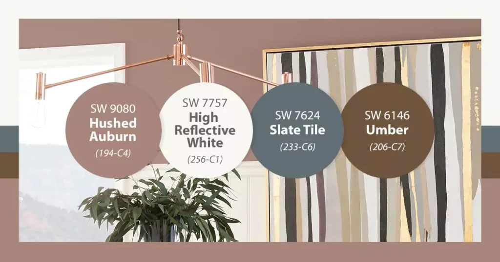
Slate Tile SW 7624 is a deep, muted blue-gray (often likened to charcoal) that adds a sophisticated, modern touch to interiors.
It as “refined… that exudes sophistication and versatility”. It’s a cool-toned neutral — dark yet unpretentious — that works well in both traditional and contemporary spaces.
Many homeowners find its rich tone ideal for creating a dramatic backdrop or focal point in a room.
Undertones of Slate Tile
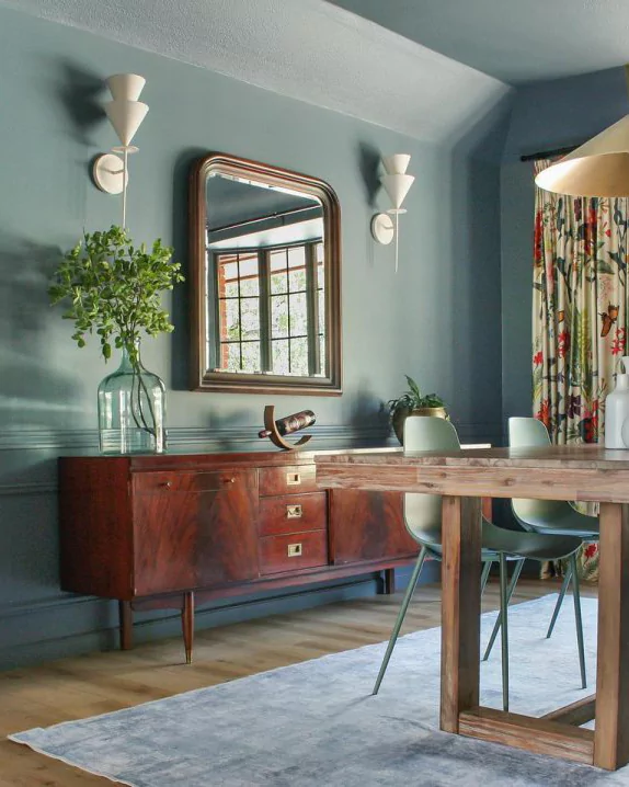
Slate Tile’s dominant base is gray, but it carries subtle cool casts. In practice it’s often called a blue-gray: essentially gray with a noticeable blue tint. The color also has a slight greenish cast in some lights.
Subtle blue/green undertones keep the shade from looking flat or too warm. Overall, Slate Tile reads as a sophisticated cool gray with a muted hint of blue/green (the word “slate” hints at its stone-like blue-gray character).
LRV of Slate Tile
Slate Tile’s LRV is 15, placing it firmly in the dark color range. (By comparison, high-reflectance whites are above 90.) An LRV of 15 means Slate Tile absorbs most light, creating depth and moodiness.
In practical terms, its low reflectance makes rooms feel cozier or more dramatic – which is why many designers recommend using it as an accent (e.g. on one wall or a set of cabinets) rather than painting an entire bright room in this hue.
OTHER POPULAR BLUE PAINT COLORS
- Sleepy Blue SW 6225 Sherwin Williams
- Krypton (SW 6247) Sherwin-Williams-My Review
- My Review:Charcoal Blue SW 2739 Sherwin Williams
Behavior in Different Lighting Conditions
Slate Tile’s appearance can shift with lighting. In bright natural light or cool LED lighting, its blue undertone becomes more apparent, giving the wall a crisp, almost teal-tinged blue-gray look.
Under warm incandescent light or in dimmer spaces, Slate Tile reads as a softer charcoal gray with its blue/green hints subdued.
Because of this variability, it’s always wise to sample the paint on your own walls before fully committing, to see how your specific light sources affect the color.
Hex Code and RGB Values
The exact color values for Slate Tile SW 7624 are:
Hex: #606E74
RGB: (96, 110, 116)
These codes reflect a medium-dark gray-blue. In digital tools or when matching paint, use #606E74 or the RGB values (96,110,116) for a true representation of Slate Tile.
18 Blue-Gray Paint Colors by Sherwin-Williams & Benjamin Moore
Slate Tile Use in the Bedroom
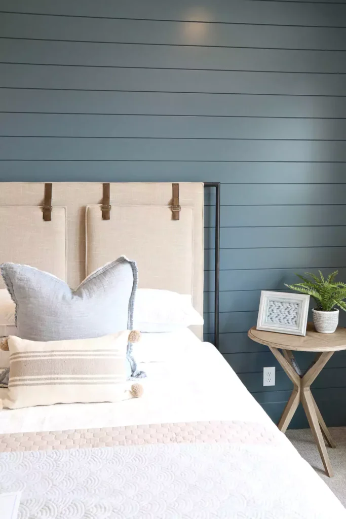
In the bedroom, Slate Tile can create a calm yet stylish retreat. Its depth adds drama behind a bed or on a feature wall, while lighter bedding and wood tones keep the room feeling restful.
Because its LRV is low, many designers use Slate Tile on just one accent wall or headboard wall to avoid overpowering the space.
In practice, it brings a sense of coziness and tranquility; Slate Tile (and similar hues) as popular in bedrooms “where calmness and tranquility reside”. Pair it with crisp white trim and soft linens to balance the drama.
Slate Tile Kitchen
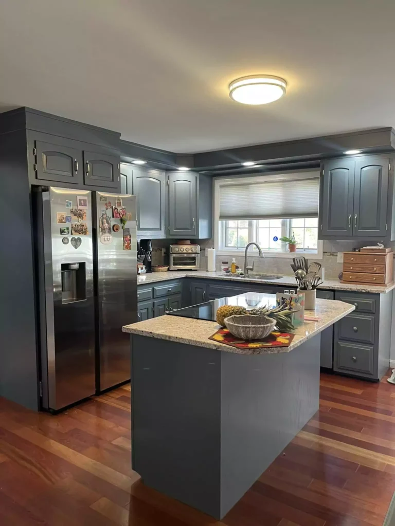
Slate Tile creates a sleek, contemporary feel in a kitchen. It’s often applied to cabinetry or islands, where its rich tone stands out against white or light countertops.
For example, painting a kitchen island or lower cabinets in Slate Tile while keeping upper cabinets white offers high contrast and visual interest.
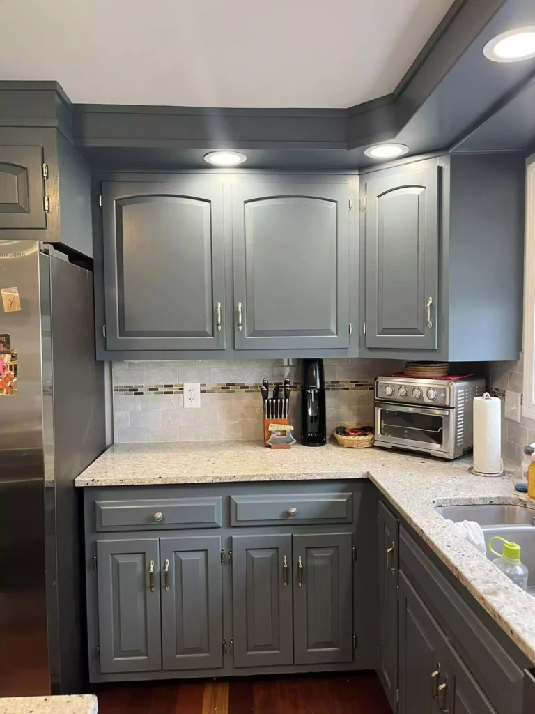
The color complements marble or quartz counters and tile backsplashes, and it looks especially striking with mixed-metal fixtures (brass, gold, nickel). Even in smaller kitchens, Slate Tile on one wall or on a pantry can create a bold focal point without needing an abundance of natural light.
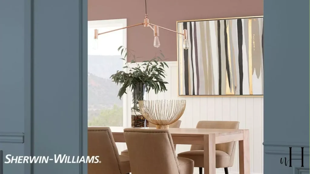
Slate Tile Living Room
Slate Tile works wonderfully in living rooms or dens as a sophisticated neutral. Use it on an accent wall, around a fireplace, or on built-in shelving to add depth without feeling heavy. It pairs nicely with lighter sofas and wood furniture, helping “achieve a cozy yet polished” look.
Because the color is dark, it’s often balanced with plenty of natural light or bright furnishings. Designers also mention Slate Tile on interior doors or trim as an easy way to give a modern edge to a living space. Overall, it acts as a timeless backdrop that allows furniture and decor to pop.
Use in the Bathroom
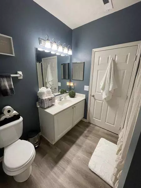
In bathrooms, Slate Tile lends a clean, spa-like vibe. It looks crisp and contemporary on vanity cabinets or as an accent wall. For instance, painting a bathroom vanity or lower cabinetry in Slate Tile contrasts beautifully with white subway tile, marble countertops, and chrome fixtures.
The cool gray-green undertones of Slate Tile harmonize with stone and porcelain, and the deep color makes fixtures and hardware stand out. Even on small walls, Slate Tile feels intentional – it gives bathrooms a modern, tailored look rather than feeling dark or dingy.
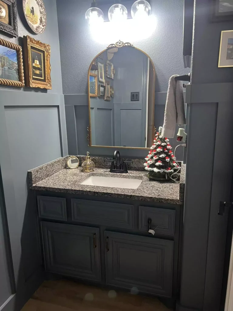
Use on Cabinets
Slate Tile is a popular cabinet color choice for a dramatic, luxurious look. In kitchens, painting cabinets or an island in Slate Tile instantly modernizes the space; its deep hue creates sleek contrast against light countertops (marble, quartz, butcher block) and white walls.
15-Blue Gray Kitchen Cabinet Colors That My Clients Love This Year
Pair it with warm gold or copper hardware to add glam. Similarly, in bathrooms a Slate Tile vanity or storage cabinet adds depth – one blogger noted that “one coat of paint can completely transform” kitchen cabinetry when using this shade. Even laundry rooms or built-in bookshelves can benefit from this moody tone.
The key is to balance the darkness: plenty of light or reflective surfaces (mirrors, gloss tiles) help Slate Tile cabinetry shine rather than swallow the room.
Slate Tile Exteriors
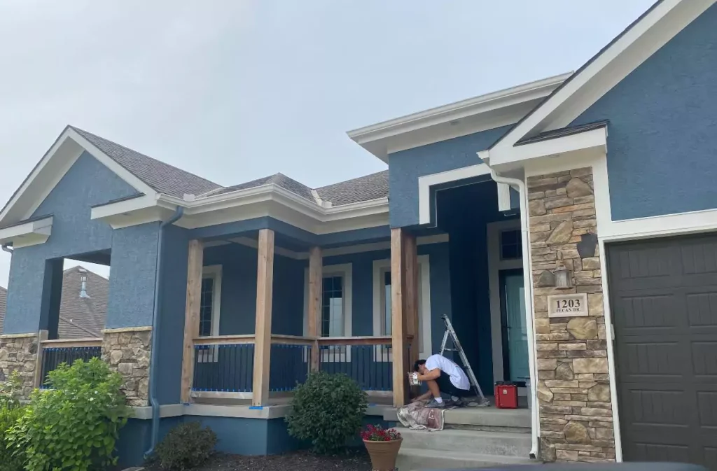
Slate Tile can also make a striking exterior finish. It works well on siding, shutters, or entry doors to give curb appeal with a modern edge. Its cool undertones complement both natural materials (stone, brick, wood) and clean white trim.
For example, pairing Slate Tile siding or shutters with crisp white trim and accents of black or woodgrain creates a timeless look.
A front door painted Slate Tile makes a subtle statement against a lighter house color. In all cases, its deep hue reads as a sophisticated gray on the exterior, providing depth and contrast to landscaping and architectural details.
Coordinating Colors Slate Tile
Slate Tile is versatile and pairs with many palettes. Some strong options include:
Whites/Off-Whites
Clean, bright whites like SW Pure White or off-whites like Alabaster highlight Slate Tile’s richness by contrast. These light neutrals prevent the room from feeling too dark.
Blues/Grays
Deeper blues like Naval (SW 6244) or Smoky Blue (SW 7604) harmonize with the blue undertone. For a monochromatic look, lighter blue-grays such as Reflection can work well.
Greens
Soft, muted greens like Evergreen Fog or Sea Salt add an earthy balance to the cool gray-blue. These nature-inspired tones warm up the palette gently.
Warm Neutrals
Taupey beiges and greiges (for example, Accessible Beige SW 7036 or Repose Gray SW 7015) complement Slate Tile without high contrast. These create a cohesive, calming backdrop.
Black & Metallic Accents
Deep black (Tricorn Black SW 6258) on trim or furniture adds drama and sharpness. Metallics – brass, gold or copper hardware – introduce warmth and sophistication.
Each of these choices can be used in paint, furnishings or accents to coordinate seamlessly with Slate Tile’s elegant depth.
Soft Color Palette
A soft palette around Slate Tile uses light neutrals and pastels to soften its intensity. For example:
Off-White/Cream: Pure white or creamy tones (SW Pure White, Alabaster) on walls and trim to brighten the look.
Pale Pastels: Muted mint, sky blue or blush pink accents (pillows, art) add subtle color without strong contrast.
Light Grays: Very light grays or greiges (SW Repose Gray, Eider White) keep the room airy.
This approach highlights Slate Tile as the focal color while maintaining a gentle, airy feel in the room.
Bold Color Palette
A bold palette pairs Slate Tile with dramatic contrasts or jewel tones:
Black & Metallics: Use SW Tricorn Black for trim, doors or fixtures along with brass or copper hardware for a high-contrast, sophisticated look.
Vibrant Accents: Introduce rich accent colors like emerald green, mustard yellow or coral in décor pieces (cushions, rugs, artwork). These vivid hues energize the space against the deep blue-gray of Slate Tile.
This creates a lively, energetic scheme where Slate Tile’s neutrality anchors the bold accents.
Muted Color Palette
A muted palette emphasizes earthy, subdued tones with Slate Tile:
Warm Neutrals: Colors like Accessible Beige or a warm taupe provide a gentle background tone. These warm greiges make the overall look soothing.
Dusty Naturals: Soft olive green, muted lavender or dusty rose (think aged clay or weathered wood hues) echo Slate Tile’s depth in a low-key way.
This scheme feels cozy and harmonious, using Slate Tile as the main dark anchor and surrounding it with gentle, nature-inspired colors.
FAQ
Is Slate Tile Gray or Blue?
Slate Tile is a deep blue-gray. Its base reads mostly as gray, but it clearly has cool blue-green undertones.
In bright/cool light the blue hint becomes more noticeable, while in warm light it looks more neutral charcoal. In short, it straddles gray and blue but is often classified as a blue-gray neutral.
Sherwin Williams Slate Tile vs Smoky Blue
Both SW 7624 (Slate Tile) and SW 7604 (Smoky Blue) are dark blue-grays, but Smoky Blue leans more teal-green, whereas Slate Tile reads more as a neutral gray-blue.
Slate Tile tends to be grayer (with a slight green cast), while Smoky Blue has a pronounced teal undertone. (Emily Henderson notes that Slate Tile has “more green in it” than Smoky Blue, even though they appear similar)


