Sherwin Williams Sleepy Blue SW 6225 is a soft, muted blue in the Sherwin-Williams palette. It’s often described as a “gentle blue” with a calming, dreamy quality.
The color evokes tranquility and serenity, making it ideal for restful spaces like bedrooms and nurseries. In design contexts, it’s noted as “serene and timeless”, a “soft, airy blue” that brings calm and understated elegance to a room.
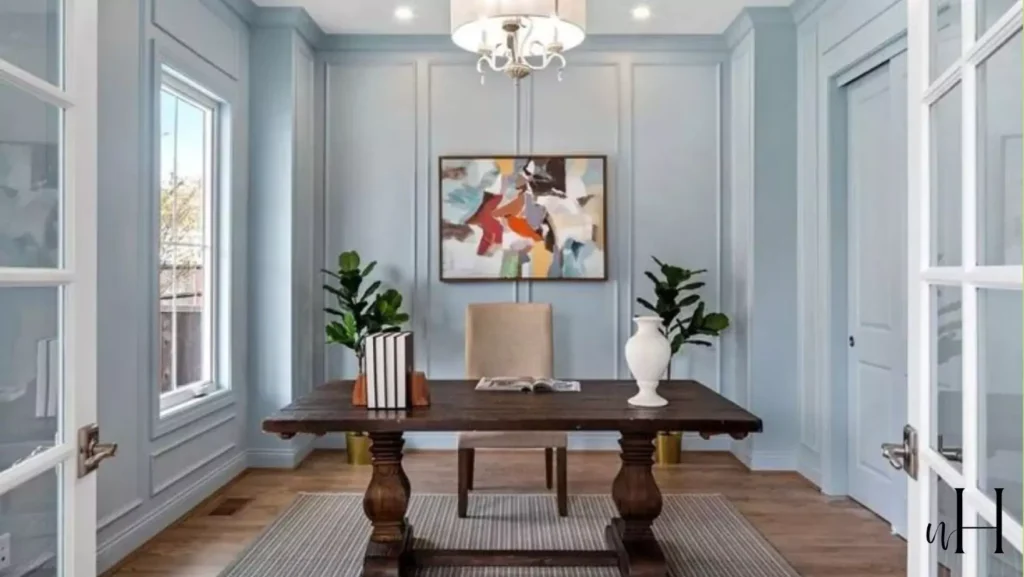
In this blog I am gonna discuss everything about Sleepy Blue, like undertones ,LRV, coordinating colors ,how it looks in different lights,and also my personal experience with Sleepy Blue.Also I am sharing REAL HOME IMAGES do you can undertand better.
Sherwin Williams Morning Fog (SW 6255)+My Home Images
Krypton (SW 6247) Sherwin-Williams-My Review
Undertones of Sleepy Blue
Sleepy Blue is fundamentally a true blue with very subtle undertones.
Color analysis finds almost no strong color bias – its underlying hue is pure blue. However, observers note a slight influence of gray and even a hint of green under certain lighting.
In bright light, its undertone can look a bit cool or greenish, whereas in warmer light its gray cast is more apparent. In practice, Sleepy Blue remains light, muted and grayish-blue, not leaning strongly warm or yellow.
In short, it’s a quiet mid-tone blue that stays fairly neutral, with only a whisper of gray/green in its base.
18 Blue-Gray Paint Colors by Sherwin-Williams & Benjamin Moore
Light Reflectance Value of Sleepy Blue
Sleepy Blue has a Light Reflectance Value of about 58.
On Sherwin-Williams’ scale of 0 (black) to 100 (white), an LRV of 58 means Sleepy Blue is a light-to-medium blue – not extremely pale, but decidedly not dark.
This relatively high LRV means it reflects a good amount of light, helping spaces feel bright and open.
In other words, Sleepy Blue bounces enough light to keep rooms feeling airy rather than cave-like, even when used on multiple walls.
Appearance of Sleepy Blue in Different Lighting
How Sleepy Blue looks can shift with light.
In rooms with abundant natural sunlight (especially southern exposure), it tends to look lighter, fresher and even a touch greenish-blue, emphasizing its cool side.
With bright daylight, the color appears lively and slightly more saturated. By contrast, in north-facing or dimmer rooms it will look cooler and more gray.
Under warm artificial light (incandescent/LED), Sleepy Blue can soften further and reveal its gray/green hints. In short, test panels at different times of day – the color can lean blue-green in strong light and subdued gray-blue in low light.
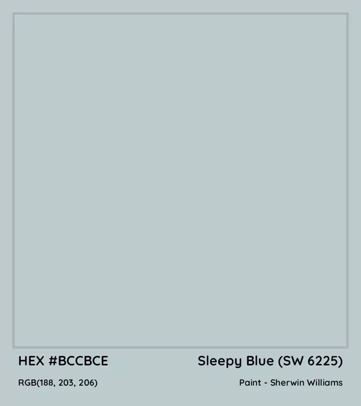
Hex Code and RGB
In digital terms, Sherwin’s Sleepy Blue SW 6225 corresponds to Hex #BCCBCE. Its RGB color values are 188, 203, 206, meaning Red=188, Green=203, Blue=206 on a 0–255 scale.
These numbers confirm it’s a light blue with green (203) and blue (206) components slightly stronger than red.
Because R, G, and B are all fairly high and close together, the result is a soft pastel blue (rather than a saturated or dark tone).
In the Bedroom
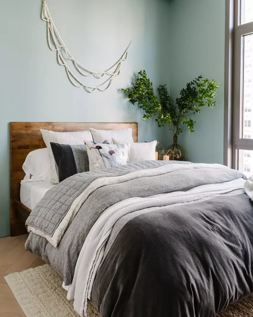
Sleepy Blue is made for bedrooms and nurseries because of its tranquil quality. In sleeping spaces it fosters relaxation and rest, making it easier to wind down.
Designers often pair Sleepy Blue bedroom walls with crisp white bedding, warm wood furniture and soft gray accents to create a cozy yet airy retreat.
For example, a navy or gray upholstered headboard, white linens and honey-colored wood nightstands look lovely with Sleepy Blue walls.
This blue’s gentle tone won’t overwhelm the eye, so even on all walls it keeps a bedroom feeling light. In fact, decorators say it “drifts off into a gentle blue” that feels “heavenly in bedrooms.”
Sleepy Blue In the Kitchen
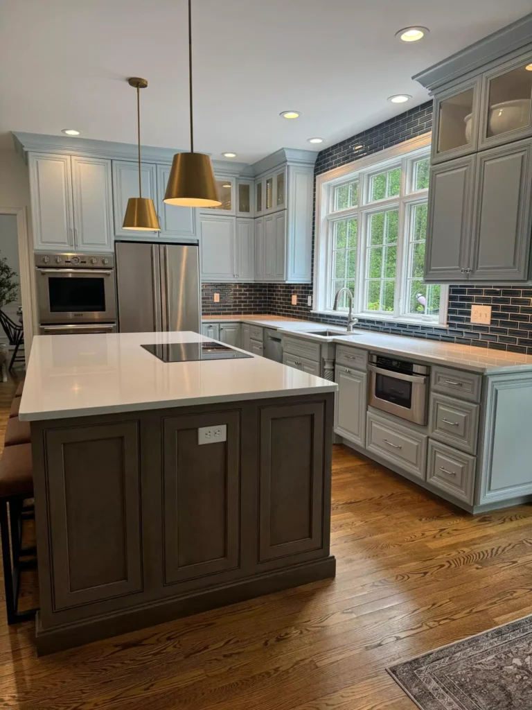
While less common than in a bedroom, Sleepy Blue can make a delightful kitchen color, especially for cabinets or accent walls. Its light, airy vibe brings a sense of freshness to the space.
For instance, painting lower cabinets in Sleepy Blue paired with white countertops and warm wood accents (like butcher-block counter or floating shelves) creates a modern farmhouse feel.
In kitchens, this hue adds an unexpected pop of color without feeling jarring. It works particularly well with stainless steel or brushed nickel hardware, white subway tile backsplashes and natural stone.
Some designers even use it on an island or pantry door – it makes the room feel bright and clean.
As one of my client noted, Sleepy Blue “can be used in kitchens for an unexpected pop”, giving an “airy feel, especially with white countertops and brushed nickel hardware.”
In the Living Room
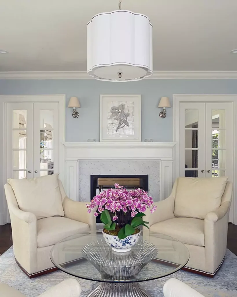
In living rooms, Sleepy Blue creates a calm, welcoming ambiance. It’s soft enough to use on all walls, yet interesting enough to serve as an accent wall color.
For example, a living area with Sleepy Blue walls can be grounded with neutral sofas (cream or light gray), natural-wood floors and plenty of green plants. The overall effect is fresh yet cozy.
Sleepy Blue pairs beautifully with warm wood tones (like oak or walnut furniture) and soft textiles (beige rugs, gray throw pillows).
It also works well on upholstered furniture or built-ins as an accent.
According to designers, using Sleepy Blue in a living room “brings a sense of calm” and allows neutral furniture and greenery to pop.
In short, it helps living spaces feel collected and inviting.
In the Bathroom with Sleepy Blue
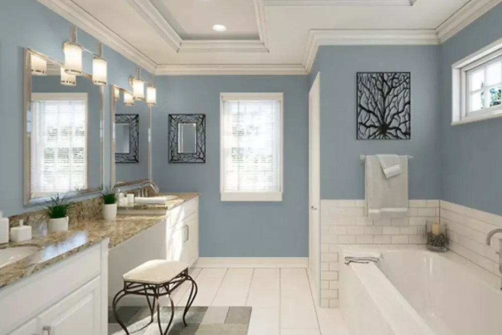
Sleepy Blue is an excellent choice for bathrooms because of its spa-like quality. Its cool, light hue makes small baths seem more spacious and clean.
In a bathroom, Sleepy Blue walls or cabinetry pair beautifully with white subway tile, marble or quartz surfaces, and chrome fixtures.
Think of a serene master bath: pale blue walls, white vanity, glass shower doors and natural stone.
The blue softens the look and evokes water and sky. Style guides note it’s “perfect for a light-hearted bathroom” because its undertones are so gentle.
You can also use Sleepy Blue on vanity cabinets or accent walls in a bath. In any case, it lends a crisp, refreshing feel – like being at a calm seaside retreat.
Sleepy Blue On Cabinets
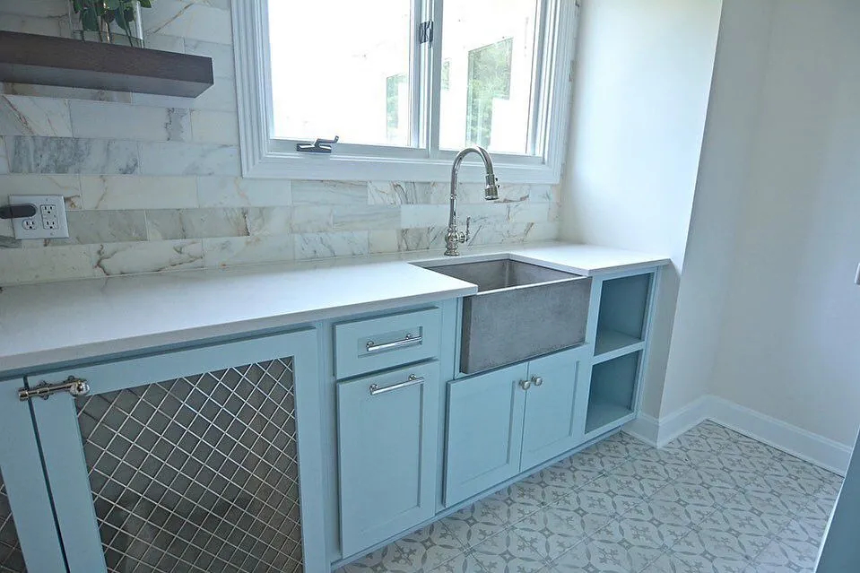
Sleepy Blue is not just a wall color – it looks great on cabinets and trim. In kitchens or bathrooms, painting cabinets in Sleepy Blue adds a subtle color without overwhelming the room.
The slightly cool tone can act almost like a neutral. For example, a Sleepy Blue kitchen island with white surrounding cabinets can serve as a gentle focal point.
It also makes for an elegant closet door or built-in cabinet color in bedrooms and living rooms.
Because of its versatility, designers often recommend Sleepy Blue for any millwork: it plays nicely with both light and dark hardware and any countertop.
In short, Sleepy Blue cabinet color work brings warmth and color while keeping the space feeling unified.
Exterior
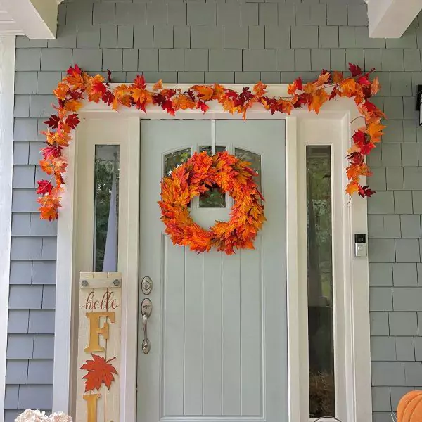
Sleepy Blue can be used on exteriors too, though homeowners should be mindful that it is a lighter, more muted shade of blue.
It can work on siding or trim for a coastal or cottage look.
For example, Sleepy Blue on shutters, doors or porch ceilings against white or light gray siding gives a serene seaside vibe. Some painters even use it on an entire small house to stand out subtly.
Because it has some gray in it, it won’t compete with brick or stone. In bright daylight, it will read as a soft pale blue. According to design blogs, Sleepy Blue “is a must in every corner of your home,” including exteriors – especially for coastal, Caribbean or Floridian styles.
Just test swatches on the actual siding (and remember it looks lighter outdoors) to be sure it achieves the desired look.
Coordinating Colors of Sleepy Blue
Sleepy Blue coordinates beautifully with both cool and warm neutrals.
A classic pairing is bright white trim (SW Pure White 7005) – this crisp white makes Sleepy Blue pop and keeps a room feeling clean.
Soft grays and greiges like SW Agreeable Gray (7029) or SW Repose Gray (7015) also harmonize well, creating a monochromatic, calm effect.
Warm neutral accents – for example pale beige, sandy taupe or light mushroom – add coziness. Earthy tones like Accessible Beige (SW 7036) or Studio Taupe (SW 7039) give a grounded, inviting vibe when used alongside Sleepy Blue.
For contrast, bold dark colors work too: a deep Navy (SW 6244) or even black (SW 6258) on an accent wall or furniture piece provides dramatic impact against Sleepy Blue.
Other complementary shades include blue-greens like Rainwashed (SW 6211) or Sea Salt (SW 6204) for a layered coastal palette.
In general, Sleepy Blue is so versatile that muted pale yellows, soft blush tones, dusty greens or richer colors (teals, warm gray-browns) can all blend well, depending on the mood you want.
Soft Color Palette
A soft palette built around Sleepy Blue emphasizes light, pastel-like colors. Think of pale neutrals and gentle pastels.
For example, pairing Sleepy Blue with off-whites (ivory, cream) and very light grays yields an airy scheme.
Soft yellows (buttery or custard tones) and muted greens (sage or seafoam) are also excellent – they create a soothing, harmonious feel.
Light blush-pink or peach accents can add a hint of warmth without overwhelming the eye.
In practice, designers suggest coordinating Sleepy Blue with “soft grays, muted greens, or pale yellows” for a gentle, inviting look.
This type of palette keeps everything light and “coastal” feeling: imagine pale blue walls with ivory furniture and pale mint or lemon accents.
Bold Color Palette
For a bold palette, choose strong, saturated colors that really pop next to Sleepy Blue. Deep navy blues (e.g. SW Naval) or charcoal grays provide striking contrast and anchor the space.
Black accents (on furniture or picture frames) also appear crisp against Sleepy Blue.
Vibrant accent colors like mustard yellow, burnt orange or teal can energize the palette. For instance, a bright gold throw pillow or a teal accent chair would be lively against Sleepy Blue walls.
Designer sources note that Sleepy Blue “allows bold pairings” such as painting Naval or Tricorn Black nearby, creating drama.
Essentially, any rich color – brick red, emerald green, or a warm terracotta – can work as a bold accent when used sparingly.
The key is keeping Sleepy Blue as the background so these strong hues become eye-catching focal points.
Muted Color Palette
A muted palette uses Sleepy Blue with other soft, subdued tones. These might be earthy or pastel hues that don’t compete strongly.
Good examples are greige (warm gray-beige) and earth tones like taupe, sand, or olive. Soft sage-green or dusty lavender, for instance, harmonize as muted complements.
Greys like SW Accessible Beige or Quixotic Plum (SW 6269) pair nicely, giving a naturalistic feel.
Wood tones (light oak, weathered gray) fit into this muted scheme too. Essentially, muted accents would not stray far from neutral: think pale clay, oatmeal, or stone colors.
The result is a very serene, cohesive look. In advice for Sleepy Blue, decorators even suggest pairing it with “warm neutrals like beige and taupe” for a cozy yet calm atmosphere.
Sleepy Blue vs Sleepy Hollow (SW 9145)
Sleepy Blue (SW 6225) and Sleepy Hollow (SW 9145) are close cousins but not identical. Sleepy Hollow is a slightly deeper, grayer blue-green.
In fact, metrics show Sleepy Blue has an LRV about 57.8% while Sleepy Hollow’s LRV is about 56.7%, meaning Sleepy Hollow is a touch darker overall.
Sleepy Hollow’s undertones are subtly more greenish and it is more saturated (its saturation is around 22 vs Sleepy Blue’s 16). In practice, Sleepy Blue reads as the lighter, purer blue, whereas Sleepy Hollow feels dustier and moodier.
Use Sleepy Blue when you want a lighter, airier blue; use Sleepy Hollow when you want a deeper, misty bluish-green.
Sleepy Blue vs Upward (SW 6239)
Sherwin-Williams Upward (SW 6239) is another soft blue often compared with Sleepy Blue.
Upward is very similar in lightness (its LRV is about 57 versus Sleepy Blue’s 58), but there’s a subtle difference: Upward tends to look cooler and crisper, almost with a hint of gray, whereas Sleepy Blue feels a bit warmer and more forgiving.
In homes, designers note that Upward can come across as slightly brighter and more clinical, while Sleepy Blue leans a tad cozier.
Essentially, if you find Sleepy Blue somewhat warm or creamy in your space, Upward will appear the cleaner, more silvery blue. Both work similarly in rooms, but Upward will feel a hair colder and more muted.
Sleepy Blue vs Tradewind (SW 6218)
The difference between Sleepy Blue and Tradewind is more pronounced in undertones. Tradewind (SW 6218) is lighter (LRV ~61) and has a clear green-teal undertone. In contrast, Sleepy Blue is a truer blue-gray.
In practical terms, Tradewind will look more teal-tinged and tropical, whereas Sleepy Blue remains a soft baby-blue.
For example, Tradewind might read as a pale aqua or ocean blue on walls, while Sleepy Blue reads as a pale sky blue.
Designers note: “Sleepy Blue is a true blue with little deflection, whereas Tradewind has warmer blue appearances with deep green undertones.
” Thus, if you want a hint of green, go with Tradewind; if you want a purely sky-blue tone, stick with Sleepy Blue.


