
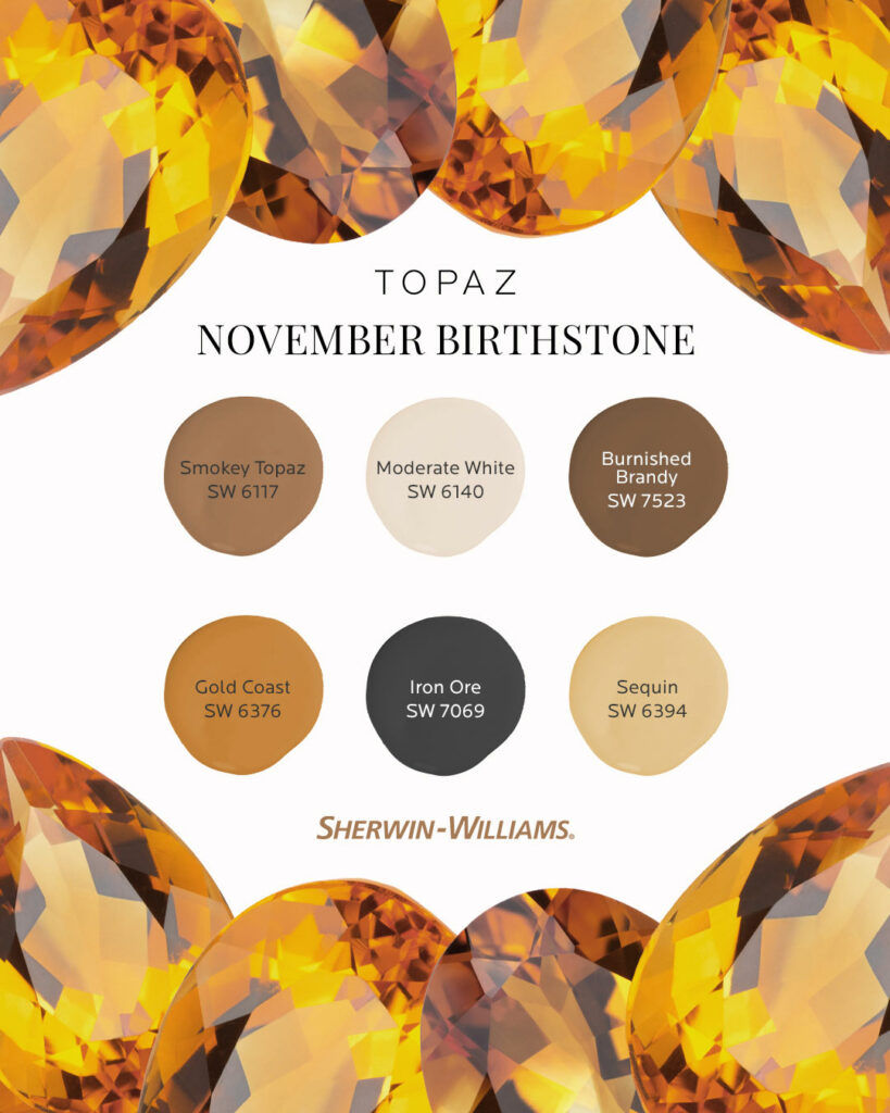
Sherwin-Williams Smokey Topaz (SW 6117) is described as a sophisticated, earthy neutral that blends warm brown tones with a subtle gray undertone.
It has a grounded, warm character, making it versatile for modern, rustic, or transitional designs.
In practice, Smokey Topaz creates cozy, inviting spaces with understated elegance; designers note it “brings depth and warmth to your palette.” (Sherwin-Williams classifies it in its warm neutrals family.)
In this Blog I am sharing REAL HOME IMAGES that are using Smokey Topaz SW 6177 Sherwin-Williams.
I will share my personal experience with Smokey Topaz SW 6177 Sherwin-Williams,its coordinate colors ,undertones and where it can show its best color.
8 Colors that go Well with Terracotta According to Interior Designers
Undertones of Smokey Topaz 6177
Smokey Topaz leans warm but carries a soft gray undertone that balances its richness. In other words, it’s fundamentally a warm brown, yet the gray undertones give it a slightly muted, smoky quality.
This combination means it never feels overly bold; instead it adds depth and dimension without dominating a room.
15 Earth Tone Color Palettes Trending In 2025 According To Designers
Smokey Topaz 6177 LRV
The LRV (Light Reflectance Value) of Smokey Topaz is 22.28. This low-to-mid LRV indicates Smokey Topaz absorbs a fair amount of light (a pure white has LRV 100 and pure black 0).
In practical terms, Smokey Topaz will appear darker and more saturated in dim lighting, and slightly lighter under bright light. (LRV measures how much visible light a color reflects: the lower the number, the darker/deeper it will look on walls.)
Appearance Under Different Lighting
Because of its balanced undertones, Smokey Topaz is relatively chameleon-like in different light.
In bright daylight it reads as a warm brown, while under softer evening light the gray undertones may peek through, making it seem slightly cooler.
Designers note that the interplay of warm brown and gray lets it “work well in rooms with varied lighting conditions, seamlessly adapting from bright daylight to soft evening illumination.”
In artificial (incandescent) light, Smokey Topaz can look very warm and rich; under cool fluorescent light it may look a touch grayer.
Always test a sample on your specific wall to see how daylight and interior lights affect it.
11 Irreristable 70s Colors Palette for Cozy yet Modern Home
Hex Code and RGB Values
In digital terms, Smokey Topaz is HEX #A57954 and RGB (165, 121, 84). These values confirm a medium-light brown with a bit more red (165) and green (121) than blue (84).
The HEX and RGB above come from Sherwin-Williams’ official color match.
Smokey Topaz 6177 Bedroom
Smokey Topaz works beautifully in bedrooms as a warm, relaxing wall color. It’s often recommended for a bedroom retreat because of its cozy, calm vibe.
For example, one designer advises, “This color is perfect for a relaxing bedroom retreat. Combine it with plush textiles, such as cream or taupe bedding, and metallic accents for an elegant and serene vibe.”
In practice, pairing Smokey Topaz with soft off-white or taupe on trim and bedding creates a restful, layered look.
Accent pillows in muted gold or dusty rose can complement the warm tone without clashing.
Smokey Topaz 6177 Kitchen

While specific design guides rarely mention Smokey Topaz in kitchens, its warm brown hue can enrich a kitchen space. It pairs especially well with natural materials: for example, using it on walls or an island can warm up white or wood cabinetry.
Designers often suggest that a color like Smokey Topaz makes wood grain pop – it’s reminiscent of warm wood or stone.
In a kitchen, try using it as an accent wall or on lower cabinets, balanced by lighter upper cabinets or countertops. (No official Sherwin source was found for kitchens, but home designers note that a warm brown like this can look sophisticated and “rich” against cream tiles or stainless appliances.)
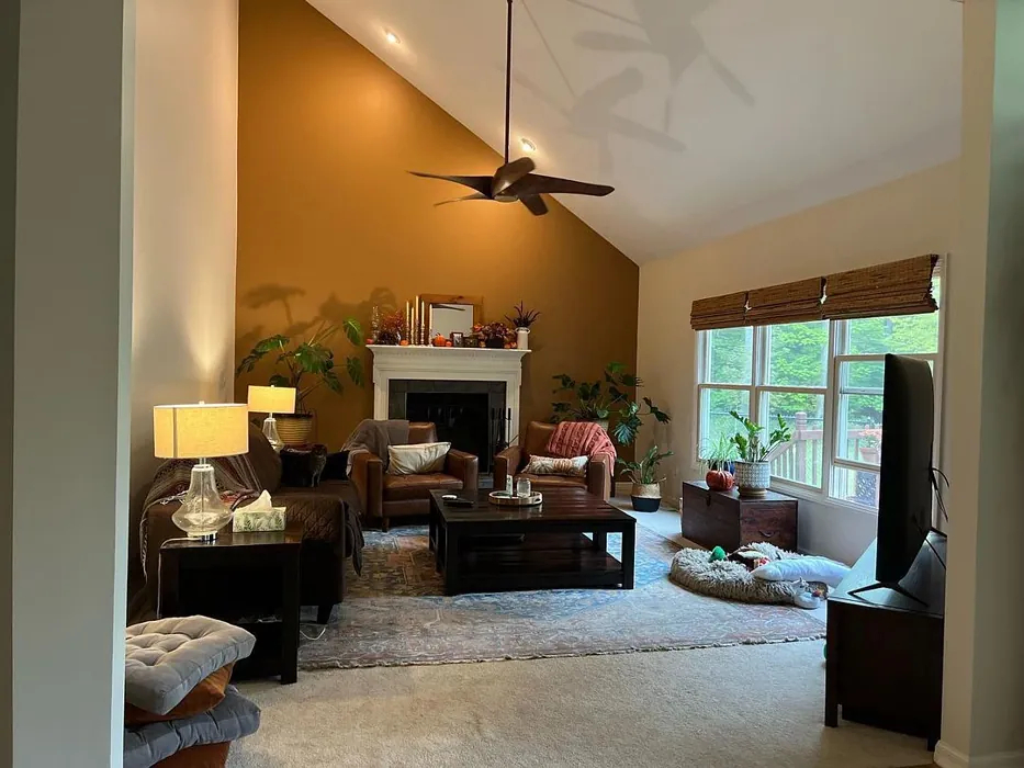
SW 6177 Living Room
Smokey Topaz is excellent for living and family rooms, where its warm undertones create an inviting atmosphere. Designers recommend using it on all walls to cozy up a space: “Use Smokey Topaz on the walls to create a cozy and inviting atmosphere.
Pair it with soft beige or off-white trim and warm wood furniture for a classic look.”
It works well with warm woods (oak, walnut) and natural textiles. In practice, a living room with Smokey Topaz walls feels anchored and intimate, especially when contrasted with light upholstery or a cream rug.
In the Bathroom
Smokey Topaz can also bring warmth to bathrooms, though it’s less common. It behaves like it does in other rooms – making the space feel rich and spa-like when paired with crisp whites and warm metallic fixtures.
A popular approach is to paint a vanity cabinet or an accent wall in Smokey Topaz, with other walls in white or light gray.
Because of its depth, it’s best used in bathrooms with ample natural or bright light. (We found no direct citations for bathrooms, but by analogy to bedroom and living uses, it creates a cozy, classic look, especially against white subway tile or marble.)
On Cabinets
Painting cabinets Smokey Topaz can create a dramatic, custom look.
For example, kitchen or bathroom cabinets in this color would stand out against neutral walls. Its warm brown tone can complement wood or stone surfaces.
As a rule, use Smokey Topaz on cabinets with careful balance: pair it with lighter counters or backsplashes so the space doesn’t feel too dark. (Again, specific sources for cabinets weren’t found; this guidance follows general design practice for deep neutrals.)
On the Exterior
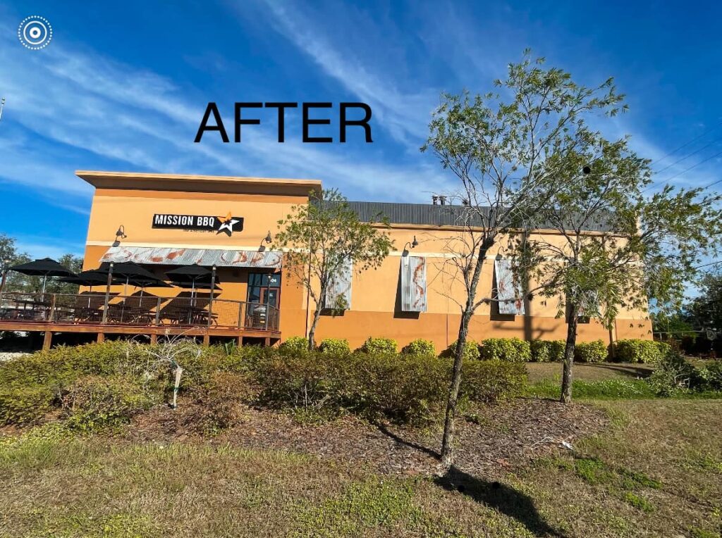
Smokey Topaz can be used as an exterior paint, typically on accent features (like shutters, doors, or trim) rather than all walls. Its earthy brown tone pairs naturally with wood, stone or muted siding colors.
For example, a Smokey Topaz front door or garage door can warm up a gray or cream house. In harsh sunlight, test a sample: the color can look deeper and more orange-brown in bright sun.
(No official Sherwin guidance was found for exterior use of this color, but it’s categorized as suitable for both interior and exterior in the Sherwin lineup, indicating it can be used outside.)
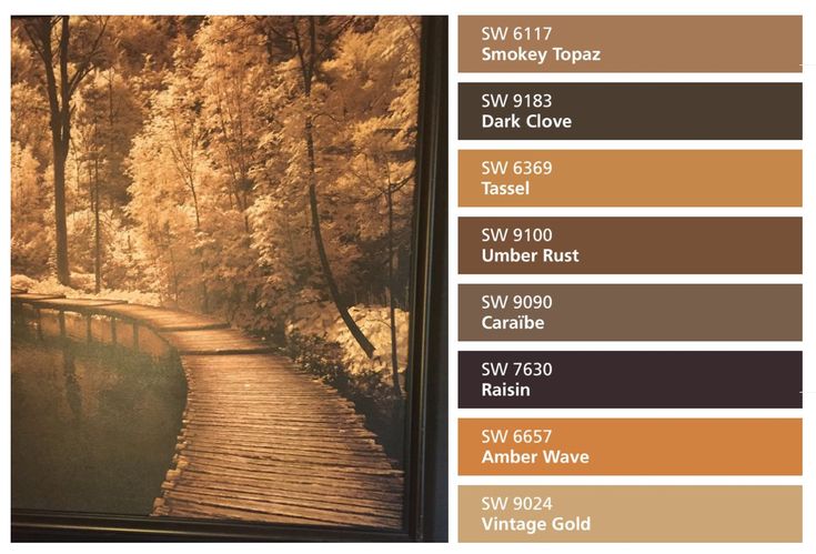
Coordinating Colors
Smokey Topaz pairs well with both neutral and contrasting colors. For a cohesive look, designers suggest:
- Neutral Complements: Alabaster (SW 7008) or Accessible Beige (SW 7036) provide soft, creamy contrast. Pairing Smokey Topaz with these off-whites/beiges layers warm neutrals.
- Bold Accents: Deep hues like Naval (SW 6244, navy blue) or Urbane Bronze (SW 7048, dark bronze) create dramatic contrast. These rich colors enhance Smokey Topaz’s warmth and make an accent wall or furniture pop.
- Soft Pastels: Muted shades like Sea Salt (SW 6204, soft green-gray) or Rainwashed (SW 6211, light blue-green) add calm tranquility. These gentle colors keep the palette light and airy when paired with Smokey Topaz.
Many bloggers use each of these coordinating schemes: for example, Alabaster and Accessible Beige as harmonizing with Smokey Topaz, and notes navy (Naval) and bronze (Urbane Bronze) as dramatic complements. Sea Salt and Rainwashed are listed as soothing accent pastels.
Soft Palette
For a soft, muted palette, stick with pale neutrals and gentle colors. Good examples include warm whites, creams, or very light grays to keep the room feeling airy.
In practice, a “soft palette” might use Sea Salt (SW 6204), a muted sage-green gray, or Accessible Beige (SW 7036) alongside Smokey Topaz walls.
These soft colors don’t compete with Smokey Topaz, but echo its warmth lightly. As one source notes, pairing Smokey Topaz with Sea Salt or Rainwashed produces a tranquil, calming scheme.
Bold and Muted Palettes
Bold Palette: Choose striking, saturated colors for contrast. For example, a deep navy (SW 6244 Naval) or a dark metallic bronze (SW 7048 Urbane Bronze) are named specifically as bold partners.
Using Smokey Topaz on walls with navy accent pillows or bronze light fixtures gives a dynamic, high-contrast look.
Muted Palette: If you prefer subtlety, use earthy neutrals and grayed tones. A muted palette might pair Smokey Topaz with colors like Sea Salt (SW 6204) — described as a “muted green-gray.” Similarly, gentle tans and beiges (Accessible Beige, Woven Wicker, etc.) keep the space calm.
In effect, the room feels monochromatic but with a bit of color—leveraging the gray undertones of Smokey Topaz. The key is low-saturation colors: as one source puts it, Sea Salt adds “a touch of tranquility” without overpowering Smokey Topaz.
FAQs
Is there a difference between smoky quartz and smoky topaz?
Yes. Smoky quartz is a genuine gemstone (a brownish variety of quartz), whereas “smoky topaz” is not a real mineral but often a misleading term for smoky quartz.
In gemology, no distinct “smoky topaz” stone exists; the term is sometimes used in marketing, but experts clarify it is simply smoky quartz.
Is topaz a warm or cool color?
Topaz (the color, like in “Pantone Topaz” or gemstone descriptions) is considered a warm color. For example, Pantone’s “Topaz” (a golden-orange) is explicitly called a warm color.
This makes sense since many topaz gemstones are golden or brownish—colors on the warm side of the spectrum.
What other paint colors are equivalent to Smokey Topaz?
There are several very similar shades in other brands. For instance, Benjamin Moore’s “Glazed Pear” (HC-57) and “Maryville Brown” (HC-75) are often listed as close matches. Others include BM’s “Café Au Lait” (OC-50).
In general, look for warm tans or medium browns with subtle gray–tones in other paint lines for a similar effect.


