If you want something that is purely white, no other undertones, then Super White OC-152 Benjamin Moore is perfect ,cuz its not warm and nor cool,its just perfectly white, that brings freshness in your home.
I used this in my bathroom in 2022,when we moved to Texas,it was soo refreshing all summer and also I felt that it exudes some coolness in hot temperatures.
If i talk about winter,its also perfect and gives you more reflection of light in limited natural light.
Benjamin Moore Super White OC-152 is a bright “true” white with a very subtle cool cast.
The manufacturer describes it as “a radiant, slightly cool shade of white that suggests clarity and simplicity”.
In this blog i am sharing Super White OC-152 Benjamin Moore Review ,undertones ,LRV ,where it shows its best,coordinate colors ,and some general queries.
Undertones of Super White OC-152
Super White is essentially neutral with only a whisper of coolness.
You’ll “hardly see any undertones” – just a tiny “wink of blue” when lighting is very cool.
Benjamin Moore itself groups it with Chantilly Lace as having “little to no visible undertone”.
In practice, Super White’s undertones are so minimal that yellow or beige hues won’t show; it reads as a crisp, clean white with only very faint gray/blue hints.
LRV of Super White OC-152
Super White’s official LRV is 87.36, which is very high for a paint color.
This puts it near the range of true “bright white” paints (generally 90+), so it reflects most of the light that hits it.
For comparison,even though it’s slightly below the very whitest (93+ LRV), Super White still “acts like a bright white” because of its cool tone. In a nutshell, this high LRV means Super White will make rooms feel very light and open.
In Different Lights
Like all whites, Super White shifts with lighting. In cool north-facing light or shade, its slight blue/gray undertone becomes noticeable, giving a crisp, cool appearance.
It won’t turn icy or blue, but you will feel the coolness. In warm afternoon or western light, or under warm (2700K) bulbs, it softens – the white reads a bit warmer or grayer.
For example, in strong sunlight Super White “will look warmer and softer”. In summary: north light = crisper/cooler white; south/warm light = slightly creamier tone.
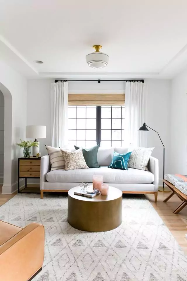
Super White OC-152 Bedrooms
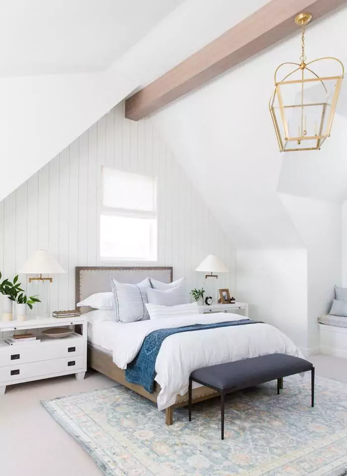
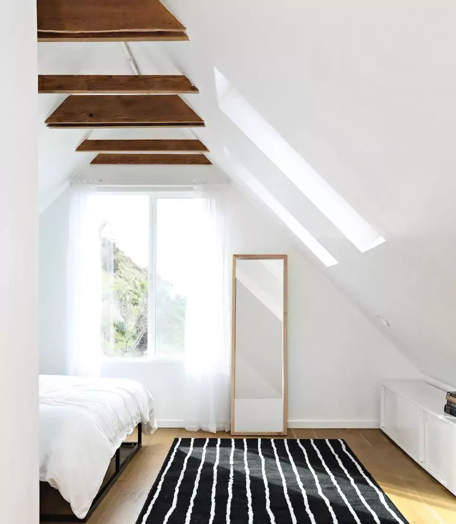
In a bedroom, Super White creates a bright, airy backdrop. Its high LRV (87.36) helps small or dim rooms feel more spacious. Because it is very neutral, it works with any decor – from rustic to modern.
Many designers treat it as a “true white” that recedes, providing contrast against bedding and trim.
In practice, if the bedroom faces north it will look crisp, while south/lighted rooms will see a softer off-white. To avoid a chilly feel, I recommend adding warmer textiles or wood tones. Overall, Super White makes a bedroom feel clean and open.
Super White OC-152 Kitchens
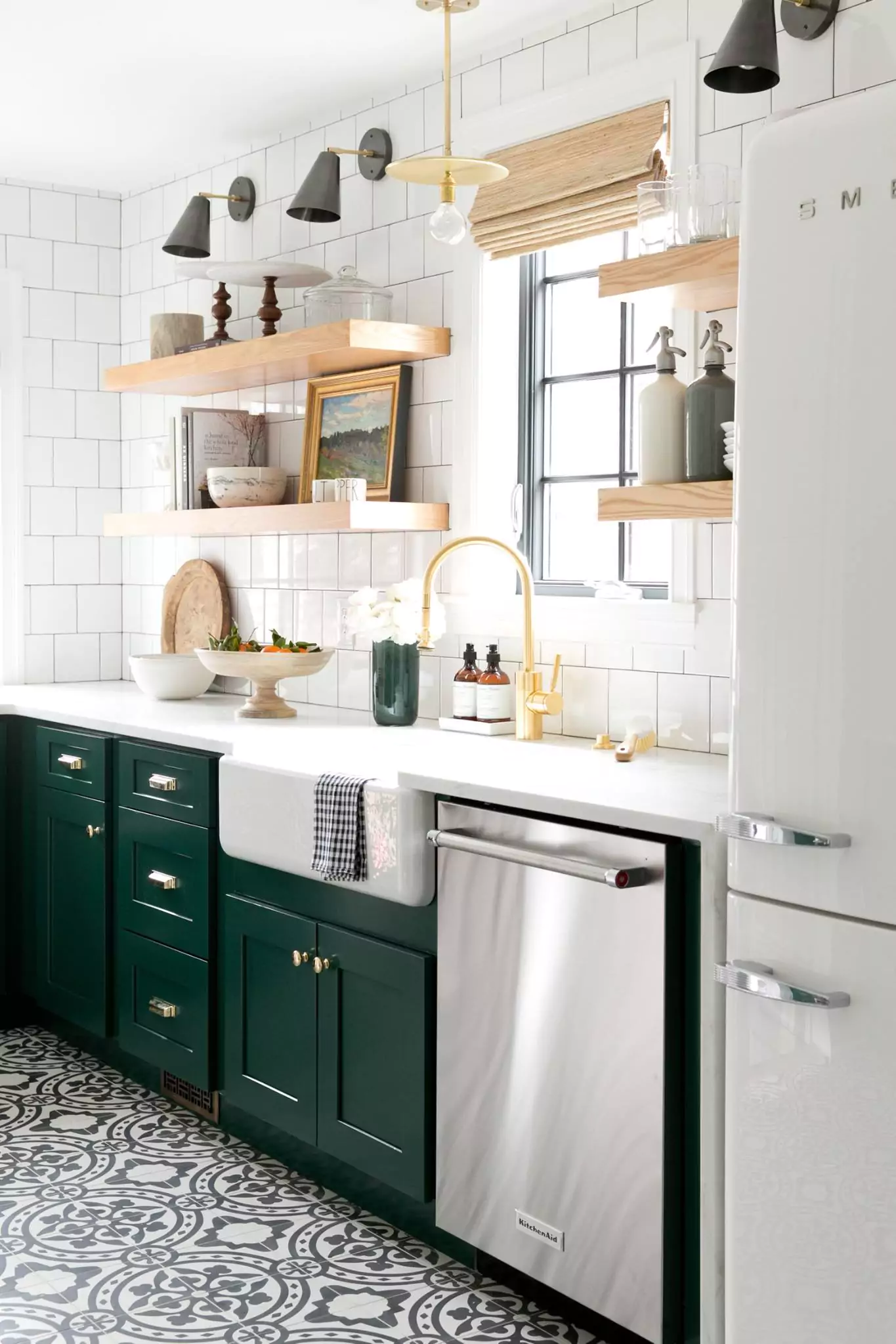
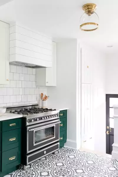
Super White is a popular choice for kitchens. It looks “wonderful on both walls and cabinets,” giving the space a soft, simple look.
Its brightness makes countertops, backsplashes and islands pop – for instance, white quartz or marble gains contrast against Super White cabinetry.
Benjamin Moore even lists Super White under “Popular White Kitchen Cabinet” colors on its site. In cabinets or walls, this white creates a clean backdrop that works with both cool and warm accents (e.g. stainless steel or wood trim). In short, Super White kitchens feel fresh and modern, yet not stark.
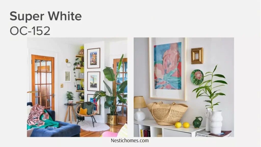
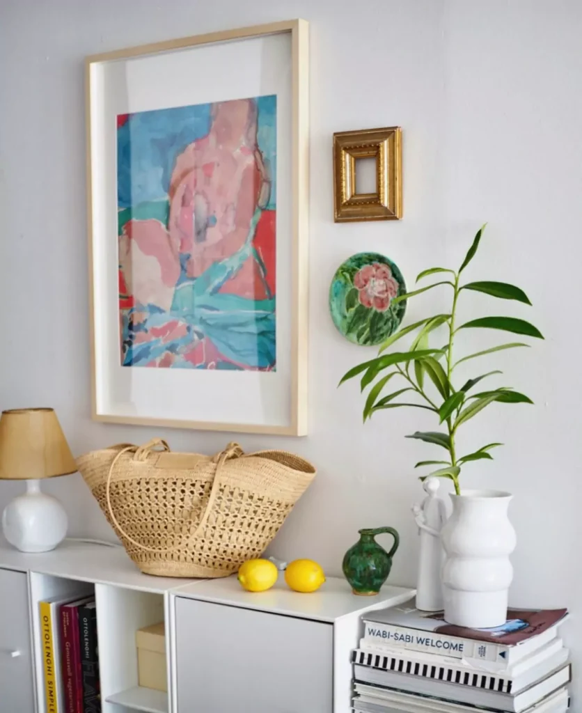
Super White OC-152 Living Rooms
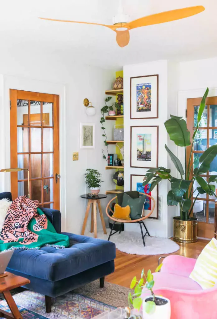
In living rooms and foyers, Super White brings clarity and light.
it “brightens up any living room” and provides a clean, crisp atmosphere. Its neutral tone adapts to many styles – it can look ultra-modern with minimalist furniture or cozy with warm textiles. In a north-lit living room it will appear crisp and cool; in a sunnier space it will be a warm-white without obvious yellow.
Overall, Super White walls make rooms feel open and let furniture/finishes stand out.
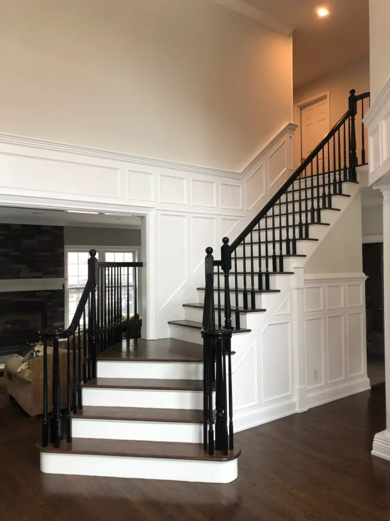
In Bathrooms
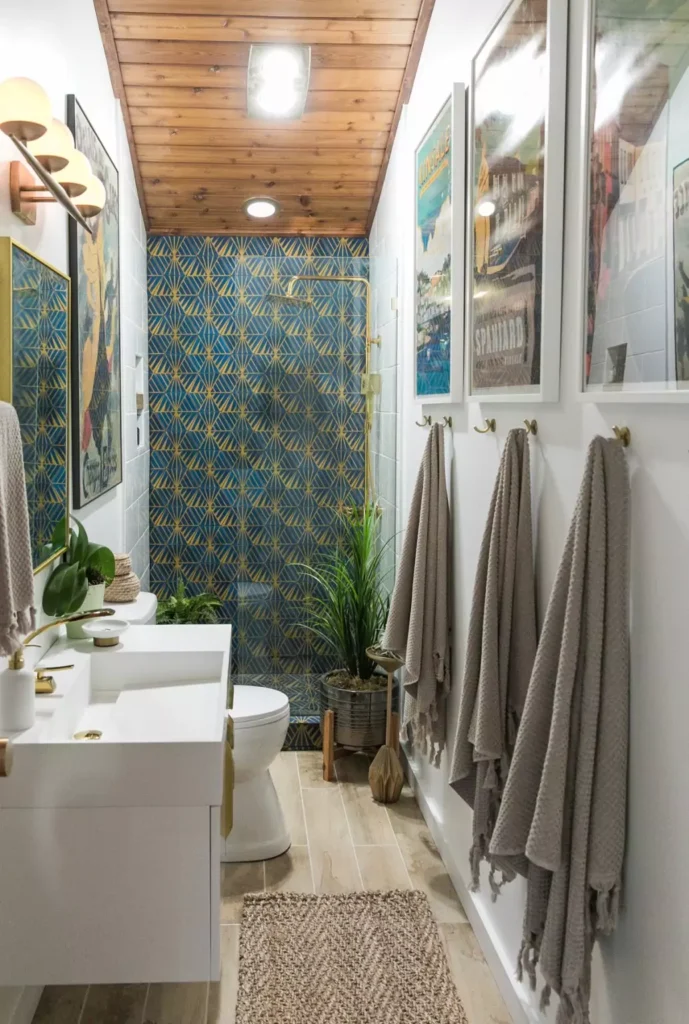
White is a common choice in bathrooms, and Super White’s high reflectance makes small bathrooms feel larger.
In artificial or west-facing light, Super White will take on some of that warmth: under a 2700K bulb it “picks up some of that warmth”, becoming a soft, creamy white. Under cool light it stays clean and bright.
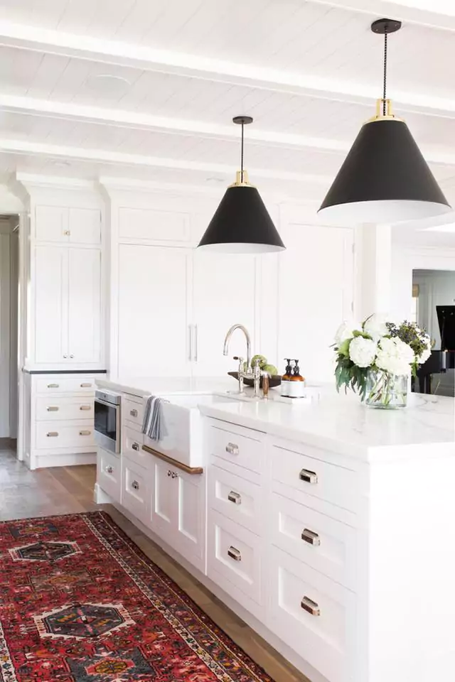
The result is a crisp backdrop for tile and fixtures. For example, Super White with black hardware (as shown) creates a sharp, modern look. It pairs well with cool stone and chrome, yet will not appear stark or clinical because of its very slight warmth in most interiors.
On Cabinets
Super White is also widely used on cabinets and trim. Benjamin Moore explicitly highlights it among its top cabinet whites. On woodwork, it adds a bright, uniform finish that complements any countertop or floor.
Because it’s so clean, details like hardware or beadboard pop.
Paint kitchen cabinets, bathroom vanities, or built-in shelves in Super White to get a classic, “white-washed” look that remains fresh. Its consistency (walls vs cabinets) can create a seamless feel, and using a semi-gloss on cabinets ensures durability while matching trim.
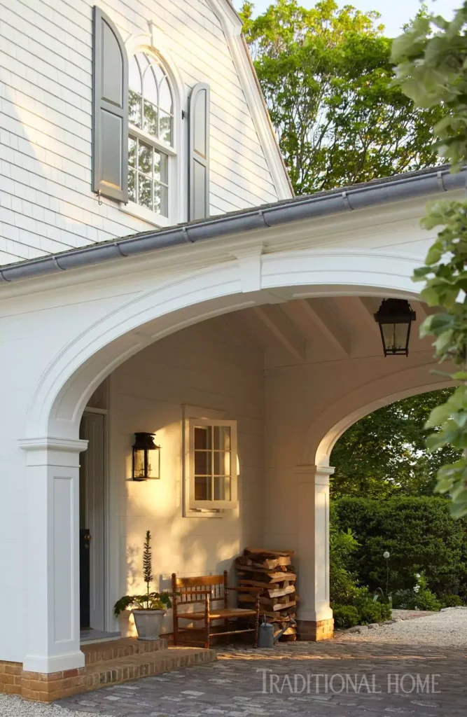
Exterior with Super White OC-152
For exteriors, Super White is a double-edged sword. On large surfaces (stucco, siding) it can look very stark and almost glaring in bright sunlight.
Many suggest using it sparingly outdoors (e.g. trim, doors, garage) rather than on the whole facade.
On exterior walls Super White delivers “a simple, bright look” that is “sophisticated and stylish”, but others caution it can feel unfriendly on siding.
In practice, if used on the exterior it’s often best as trim or accents; homeowners often prefer a slightly warmer white for entire walls to reduce glare.
Dover White SW 6385 Sherwin-Williams
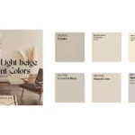
Coordinating Colors of Super White OC-152
Super White pairs with virtually any color. Expert palettes often include:
Benjamin Moore Pure White (OC-64)
A cool white with just a hint of gray, for an all-white scheme.
Benjamin Moore Hale Navy (HC-154)
A deep, rich blue – provides dramatic contrast.
Benjamin Moore Horizon (OC-53)
A soft gray-white; another neutral that adds depth.
Benjamin Moore Juneau Spring (2041-40)
A muted teal; works well for a calm accent.
These coordinating colors show how Super White can be a backdrop for both strong brights and other neutrals. Other popular accents include grays and pastels.
Soft Palette
Benjamin Moore Pale Oak (OC-20): A light warm beige/taupe – adds gentle warmth and lets Super White shine.
Benjamin Moore Silver Satin (OC-26): A very soft gray – creates a serene, monochromatic scheme.
A soft palette means using muted neutrals and pastels.
For example, pairing Super White with these greige tones keeps a room light and airy without stark contrast. Even pastel accents (pale blues or greens) would fit this gentle look.
Bold Palette
Benjamin Moore Hale Navy (HC-154): A very dark navy blue – creates a strong nautical/contemporary look.
Benjamin Moore Kendall Charcoal (HC-166): A deep charcoal gray – adds sophistication and drama.
Benjamin Moore Wrought Iron (2124-10): A soft black – for a moody, graphic contrast with Super White.
In a bold scheme, Super White is the bright foil to saturated hues. For example, a single navy accent wall (Hale Navy) or dark charcoal furniture really pops against Super White walls. Jewel tones or blacks are similar “bold” complements.
Muted Palette

Benjamin Moore Horizon (OC-53): A cool off-white/gray (subtle and soothing).
Benjamin Moore Breath of Fresh Air (806): A pale aqua-blue – a muted pastel that harmonizes with white.
A muted palette uses soft, understated colors. Horizon is a quiet gray-white that keeps a room calm.
A color like Breath of Fresh Air (a gentle blue-green) also works as a low-key accent. Together, these give color without overpowering Super White’s purity.
FAQs
Does Super White have yellow undertones?
No – it is neutral-cool. Experts say it shows virtually no warm cast. In fact, blogs describe Super White as having just a “wink of blue” rather than any yellow. Benjamin Moore groups it with Chantilly Lace as a white with “little to no visible undertone”.
What is the difference between Benjamin Moore Chantilly Lace and Super White?
Both are very bright whites, but Chantilly Lace OC-65 is slightly brighter (higher LRV) and purer. Chantilly Lace is “just a tad bit brighter”, whereas Super White is ever so slightly softer and “has more balanced undertones”.
In practice, Chantilly Lace reads a bit cooler/bluer, while Super White comes across as a more neutral white.
Which is brighter, Super White or Chantilly Lace?
Chantilly Lace is brighter. It has the higher LRV (~90 versus 87) and reflects more light. Super White is almost as bright, but Chantilly Lace just edges it out.
Benjamin Moore Super White vs. Simply White
Simply White OC-117 is a warmer white – it has subtle yellow/cream undertones and an even higher LRV (89.52).
In contrast, Super White is cooler/clearer. Simply White looks softly warm (cozy) in low light, whereas Super White stays very clean and crisp.
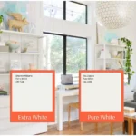
Benjamin Moore Super White vs. Sherwin Williams Extra White
These two are extremely close matches. SW Extra White (SW 7006) has LRV 86 versus BM Super White’s 87, making Super White just a hair brighter.
They have similar neutral tones, though some report Extra White can sometimes show a faint greenish-yellow cast that Super White doesn’t. In short, either works as a bright white, with BM Super White a shade lighter.
Benjamin Moore Super White vs. Decorator’s White
Super White OC-152 is cleaner and brighter. Decorator’s White OC-149 is a cooler, slightly grayer white.
As one review puts it, Super White is “cleaner and brighter” with fewer visible undertones, while Decorator’s White leans gray (and sometimes violet). In other words, Super White reads more like a neutral true white, whereas Decorator’s White has a noticeable cool/gray cast.