You might be confused in soo much black paint options ,if we talk about only Sherwin Williams Black paint colors ,theres soo much and i guess most of them looks so much same,I went through this confusion once than i studied and used some of them in my house and recommended my friends and family.
I am also linking other black paints that look like Tricorn Black ,you can just click and read the that specific blog.
Tricorn Black (SW 6258) is a very dark paint color from Sherwin-Williams. It is one of the blackest blacks you can get for your walls or furniture. Designers call it a “true black” because it looks the same in almost any light.
Tricorn Black has become extremely popular for both inside and outside a home. It works on walls, doors, cabinets, and even outdoor trim.
Because it has no strong color tint, it goes well with almost any other shade. In this guide, I will explain everything about Tricorn Black in simple terms.
I will cover its undertones, light reflectance (LRV), how it looks in different lighting, its HEX and RGB values, and tips on using it in the bedroom, kitchen, living room, bathroom, cabinets, and exterior.
I will also suggest color palettes that match this bold color, including soft, bold, and muted palettes. Finally, I ll answer common questions about Tricorn Black.
Throughout, I give easy explanations and cite experts and my personal experience so you can trust the facts.
10 Popular Sherwin-Williams Black Paint Colors for Every Space-2025
Undertones of Tricorn Black Sherwin Williams
Tricorn Black is known for having no obvious undertones. This means it doesn’t lean slightly blue, brown, green, or any other color. It stays a pure, deep black no matter what colors or light are around it.
Tricorn Black is “one of the most versatile black paints” because it has no detectable undertones. That makes it easy to use with any style: modern, traditional, or even rustic. Other blacks might look a bit warm (brownish) or cool (slightly bluish) in some rooms, but Tricorn Black does not do that.
It stays neutral. In fact, designers often say you can pair it with any color and it will look good. This neutrality is special: under different lighting or next to different wall colors, Tricorn Black still looks like true black. So you don’t have to worry that it will suddenly look purple or green in your room.
LRV of Tricorn Black Sherwin Williams
Tricorn Black is extremely dark in terms of LRV (Light Reflectance Value). LRV is a number from 0 (pure black that reflects no light) to 100 (pure white that reflects all light). Tricorn Black has an LRV around 2–3. In other words, it absorbs about 97% of the light that hits it. This makes it one of the deepest blacks you can buy.
By comparison, pure white has an LRV of about 84 or more, so Tricorn Black is many times darker. A low LRV like this means rooms painted with Tricorn Black will feel very dark and cozy. It creates a lot of contrast.
For instance, if you paint one wall Tricorn Black and keep the other walls white or light gray, the black wall will really pop out and become a focal point. Designers like this effect.
However, because it absorbs so much light, you need to plan carefully. In a room without much natural light, using Tricorn Black on all walls could make it feel too small or gloomy. That’s why people often use it for accent walls, trim, or cabinetry instead of whole rooms. In practical terms, Tricorn Black’s LRV around 2–3 means almost all light is gone.
If you shine a flashlight on it, you will barely see any reflection. This low reflectivity gives Tricorn Black its rich, matte-like depth. It’s why designers call it “the blackest black” and love it for dramatic accents.
In Different Lights
The way Tricorn Black looks can change a little depending on the light. In bright daylight, it looks like a true, pure black because the light is even and strong. In warm incandescent or soft lamp light, Tricorn Black can look a bit softer or warmer. In cool fluorescent or LED light, it can appear extra deep or crisp.
However, unlike some blacks, Tricorn Black itself is neutral, so these changes are very subtle. It will never clearly shift toward blue, brown, or green by itself. You might notice that morning sun versus evening light makes it seem lighter or darker, but that’s due to lighting, not the paint color changing.
Sherwin-Williams experts suggest testing Tricorn Black under your specific lighting before painting a whole wall. They say to try warm bulbs, cool bulbs, and natural daylight, just to see if you like the effect. In general, it is very forgiving: even under different weather and times of day, Tricorn Black stays a consistent neutral black.
Hex Code
When using Tricorn Black in digital design or on computers, its HEX code is #2C2B2C. A HEX code is a six-character code that represents a color on screens. #2C2B2C means the red, green, and blue values are all very low (near black). Digital designers use this code to match the exact Tricorn Black color in graphics or websites.
In simple terms, #2C2B2C is just a way of writing the deep black color that Tricorn Black is. If you type #2C2B2C into a paint or design program, you get this Sherwin-Williams black. (Another source gave #2F2F30, which is very close, since on screens the difference is tiny.) Either way, the HEX code confirms that Tricorn Black is almost pure black in the digital color world.
RGB Values
The RGB values for Tricorn Black describe how much red, green, and blue light combine to make it. Tricorn Black is (R: 44, G: 43, B: 44). This means each of the red, green, and blue channels is about 44 out of a maximum 255. Since all three numbers are nearly equal, the color is neutral (no single color dominates).
In simpler terms, if you imagine mixing paints or lights, you add a little red, a little green, and a little blue in equal parts, and you get Tricorn Black. For reference, a slightly different source gave (47, 47, 48), which is effectively the same result: all channels roughly equal.
The small differences (44 vs 47) are due to how people or computers measure the color, but the idea is the same. Both show Tricorn Black is balanced black. In code or on a monitor, using R=44, G=43, B=44 (or around 46 each) will reproduce this color.
SW iron ore vs tricorn black-Which Is Best For Your Home
Black Magic vs Tricorn Black-Which One is right for You?
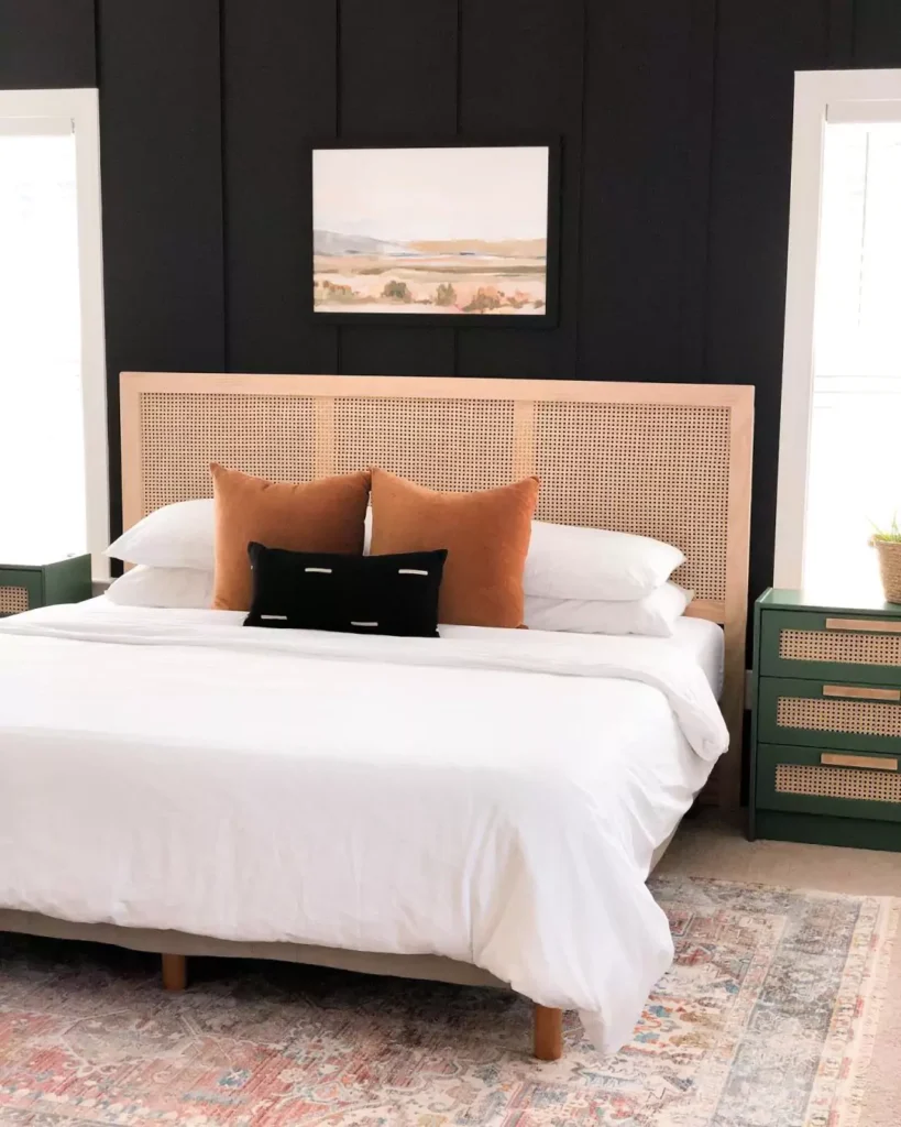
Tricorn Black In the Bedroom
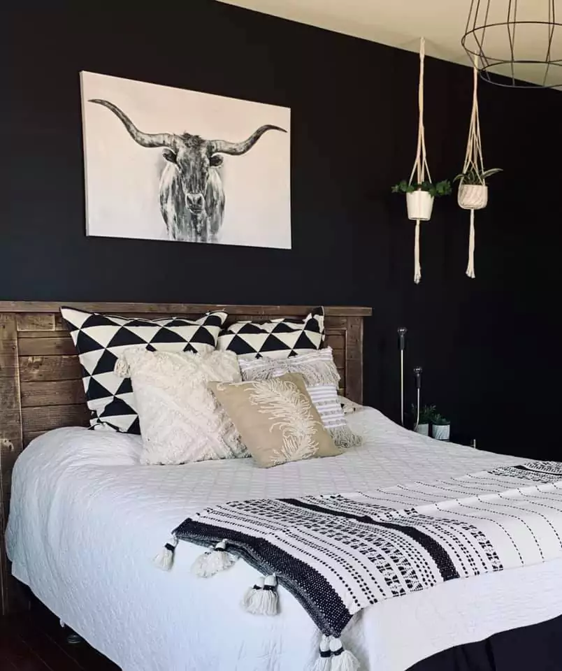
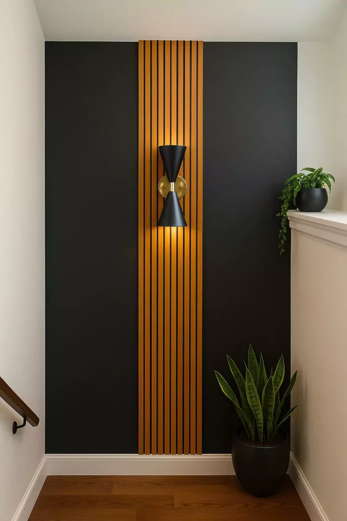
Using Tricorn Black in a bedroom adds instant drama and coziness. One popular way is to paint a single accent wall behind the bed. This makes the bed pop against the black.
Designers say bedrooms can “benefit from the depth and sophistication” of one Tricorn Black wall. You would usually pick the wall that gets good light or has a focal point like a headboard or artwork. On that wall, Tricorn Black will look deep and rich. You can keep the other walls light (like off-white or pale gray) so the room doesn’t feel too dark overall.
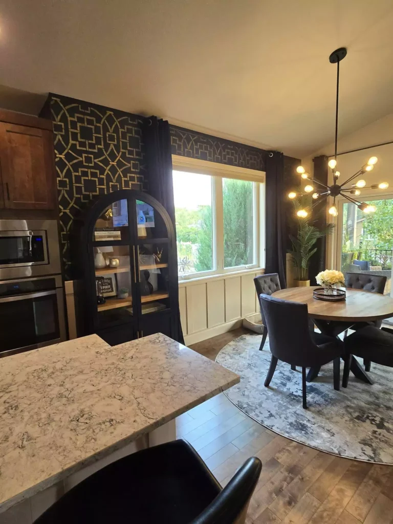
Tricorn Black Kitchen
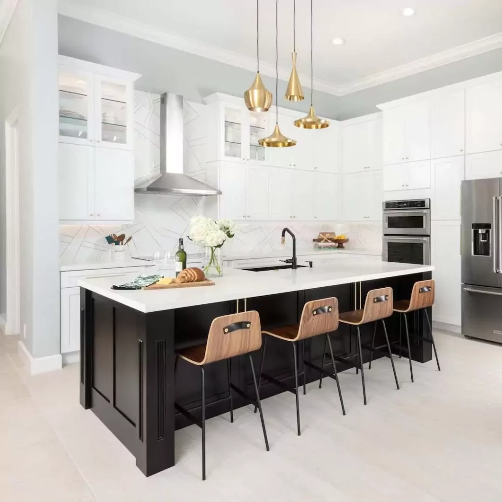
Tricorn Black looks stunning on kitchen cabinets and islands. In kitchens, it is often used on lower cabinets or an island to create a bold modern look. For example, painting kitchen lower cabinets Tricorn Black and leaving the upper cabinets white creates a clean contrast.
This makes the kitchen feel sleek and contemporary, especially with lots of natural light or good lighting above the counters.
According to design guides, Tricorn Black is perfect for kitchen cabinets. It “transforms ordinary Shaker-style doors into sophisticated, high-end looking cabinetry.” Pairing it with a light-colored countertop (like white or light wood) and backsplash helps it really stand out.
The white counter and light walls bounce light back, so the black looks crisp but not too dark. You can also paint a kitchen island Tricorn Black while keeping the rest of the kitchen light.
This two-toned effect is very on-trend. The Tricorn Black island becomes a centerpiece that grounds the space. Designers recommend using a semi-gloss finish for easy cleaning on cabinets, and making sure the kitchen gets enough light (under-cabinet lights help a lot). Black cabinets with gold or brass hardware (handles, faucets) add a luxurious feel.
The metal pops against the black. Tricorn Black can also be used on kitchen walls or trim for a high-contrast look. For instance, an accent wall of Tricorn Black behind floating shelves or a breakfast nook gives a dramatic backdrop for art and dishware. In short, Tricorn Black in the kitchen delivers a modern, sophisticated look.
It works beautifully for cabinets or even a painted wood floor (in small kitchens). Just remember to balance it with lighter surfaces and good lighting so the room stays bright enough to cook in.
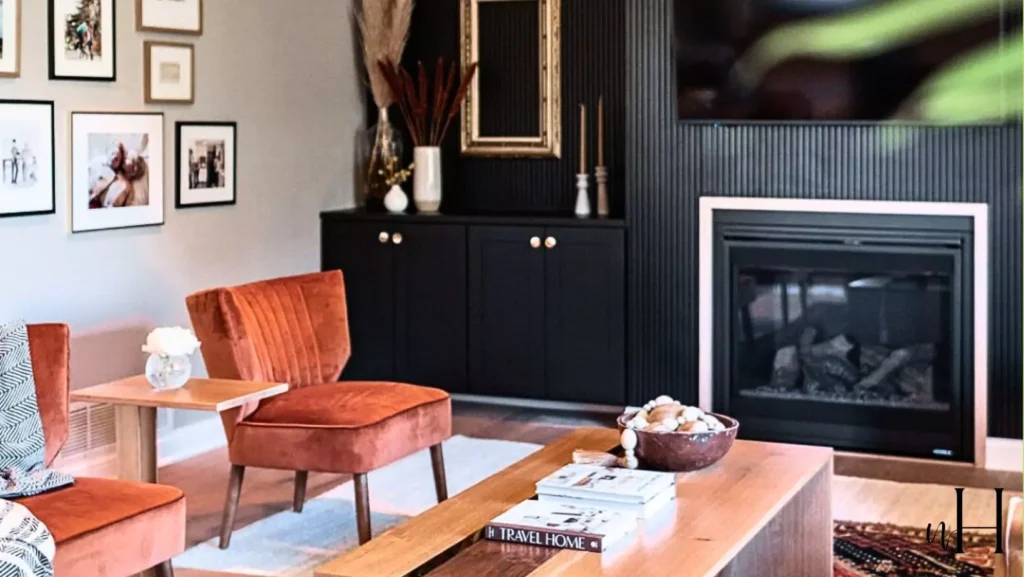
Tricorn Black Living Room
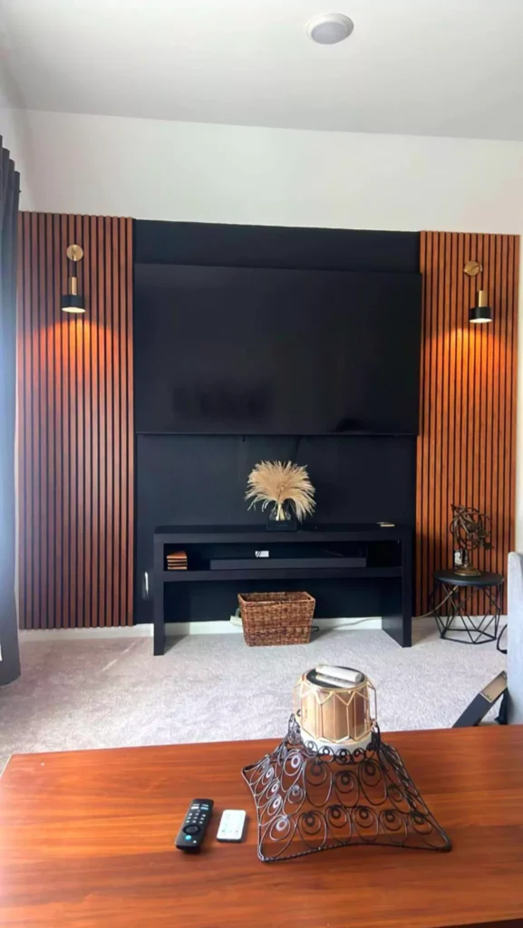
In a living room, Tricorn Black can be used for an accent wall, built-in shelves, or even trim. A common approach is to paint one wall (often the wall behind a TV or fireplace) Tricorn Black.
This instantly creates a focal point. The color makes furniture and décor stand out, and it gives the room an elegant, cozy feel. According to design experts, living rooms benefit from depth and sophistication when one wall is Tricorn Black. For example, a white sofa or light rug against a black wall really pops.
You can place artwork or picture frames on the black wall – they will seem to glow. Besides walls, living room furniture pieces can be painted Tricorn Black. For instance, a cabinet or built-in bookshelf in black against a lighter wall will look sleek. Black trim or built-in window seats in a light room can add a modern edge without overwhelming the space.
Lighting is key: Pair Tricorn Black with plenty of lamps or large windows. When the sun shines in, it adds sparkle to the black surfaces. In evening, warm-toned lamps (like amber or gold light bulbs) will make the black look soft and inviting.
You can also blend styles: In a modern living room, use black with crisp white ceilings or moldings for a high-contrast, clean look. In a more traditional room, use black on furniture and wood accents to highlight classic details. Overall, Tricorn Black in the living room gives drama and elegance while keeping the space feeling connected and grounded.
In the Bathroom
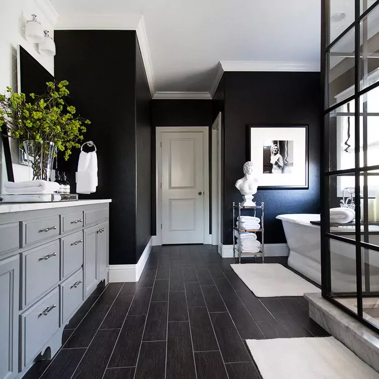
Using Tricorn Black in a bathroom creates a luxurious, spa-like effect. One idea is to paint the vanity cabinets black. This makes a white sink and marble countertop really stand out. Black cabinets paired with brass faucets look upscale. Designers say Tricorn Black on bathroom elements can give a “spa-like luxury” when done carefully.
Another option is an accent wall behind a mirror or bathtub. For example, the wall behind a floating vanity painted Tricorn Black will draw the eye to the mirror and sink. It makes the bathroom feel intimate and dramatic. If you use black walls, it’s important to have bright lights and maybe a white ceiling so you can still see well.
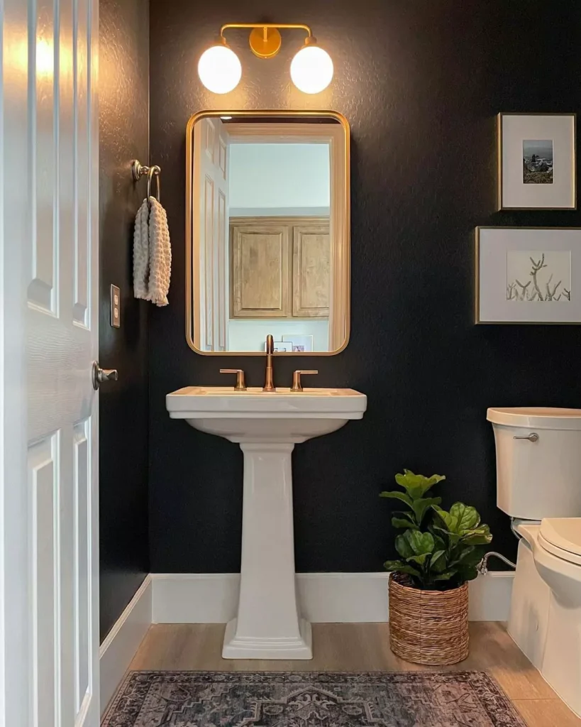
You can also use Tricorn Black on bathroom trim or paneling, especially in bigger bathrooms. Or paint a door black for contrast. Even accessories like towel racks, light fixtures, or hardware in black can tie into a black-themed design. Because bathrooms have moisture, a satin or semi-gloss paint in Tricorn Black is best – it wipes clean and holds up to humidity. Make sure the ventilation is good (so condensation dries).
In general, Tricorn Black makes a bathroom feel like a chic boutique hotel. It works well with white subway tiles or cream walls and natural wood accents. The result is bold, but also calm and sleek.
Tricorn Black On Cabinets and Furniture
Tricorn Black is extremely popular for cabinets and built-in furniture. Kitchen cabinets were covered above, but other cabinets and furniture also benefit. For example, a media console, bookshelf, or built-in shelving painted Tricorn Black becomes a striking feature. Designers note that Tricorn Black “transforms ordinary … doors into high-end looking cabinetry.”
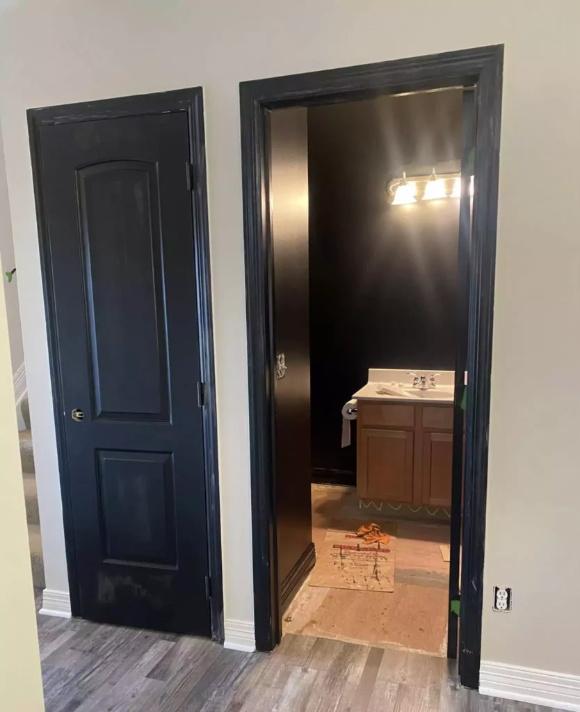
For bathroom vanity cabinets, black cabinets paired with light or gold hardware look very fancy. It can make the space feel custom-built. Interior doors painted black (like closet or bedroom doors) are a modern trend. A Tricorn Black door pops against white walls and adds a chic touch.
It’s less common than white doors, so it instantly makes the room feel unique. Even things like dresser drawers or wardrobes can be painted Tricorn Black. It pairs especially well with wood knobs or metal handles for contrast. In all these cases, the key is lighting and balance.
Tricorn Black cabinets need good lighting so you can see items inside. Lighting inside the cabinets or under them helps. Painted furniture in black looks very polished, but dust might show more, so be ready to wipe it down. Finally, the finish (sheen) matters: Most experts say use semi-gloss for cabinets and furniture, because it cleans easily and shows the black’s depth. Matte finishes on furniture can look blurry or show fingerprints.
Exterior -Tricorn Black
Tricorn Black is also used outside and looks great on homes. One classic use is as a front door color. A Tricorn Black front door against a white or light-colored house creates “instant curb appeal.” The black door looks bold and elegant.
It works with many house styles, from modern to colonial. For example, white siding with a black door and black trim looks timeless. Shutters painted Tricorn Black can highlight windows and architecture. Black shutters on a brick or light house make the windows pop. They add contrast and interest. Designers say black shutters give “dramatic contrast and architectural interest.”
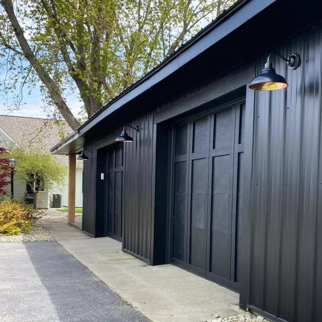
Garage doors in black can be striking, too. A garage painted black can either blend into driveway (if it’s set back), or stand out as a feature (if it’s on the front). Many new homes use black on the garage door with the rest of the facade in lighter shades.
Exterior trim or fencing: In some designs, black trim around windows, railings, or a fence looks sharp and modern. For instance, a white house with black window frames and railing is a popular style (often called “black trimmed farmhouse” look).
When using Tricorn Black outside, you usually pick a satin or semi-gloss paint for durability. These finishes handle weather and resist dirt better than flat paints.
Also, because exterior light is bright, Tricorn Black can look very crisp outdoors. It pairs beautifully with greenery (plants, trees) – the green makes the black look even darker.
Overall, on the outside Tricorn Black gives a home a bold, high-end look. It never goes out of style. Whether on doors, shutters, trim, or even entire facades (think modern black houses), it makes the home feel sophisticated.
Coordinating Colors of Tricorn Black
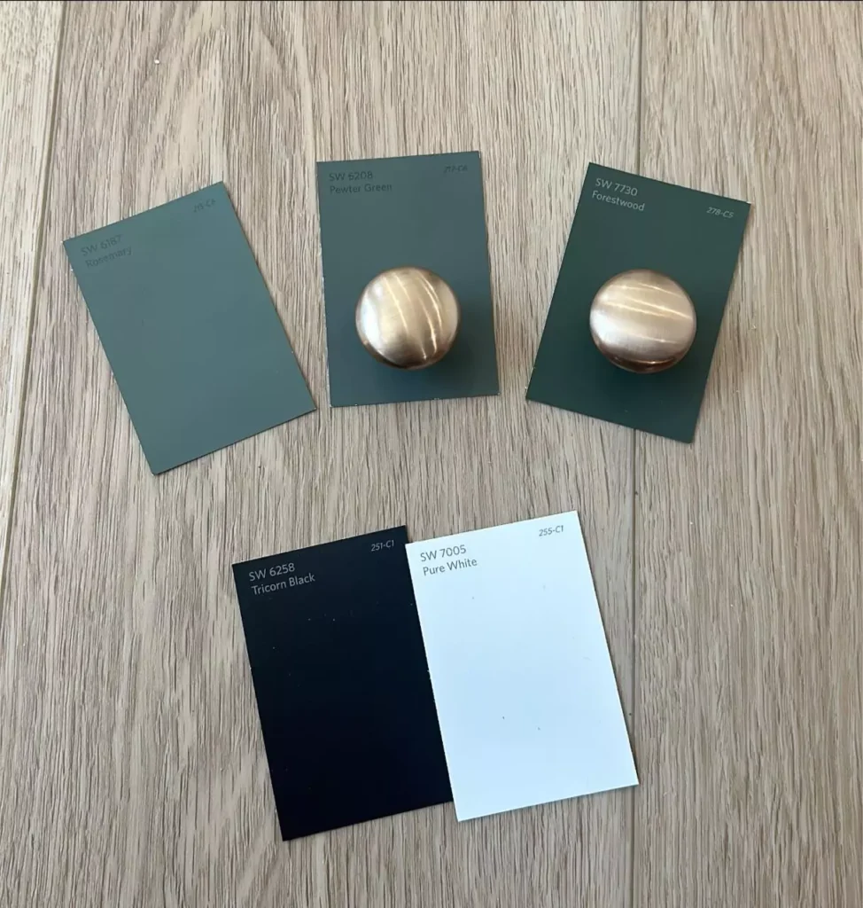
Tricorn Black is so neutral that it goes with almost any color. Because it reflects so little light, it makes other colors around it seem brighter and fresher. Here are some coordinating color ideas:
What Colors go Well with Sherwin Williams Tricorn Black?9 Paints Approved by Interior Designers
Crisp Whites (High Contrast)
Pair Tricorn Black with a true white like Sherwin Williams Extra White or Pure White. This creates a classic black-and-white look with maximum contrast. For example, black cabinets with white countertops and white walls will look very clean and modern.
Warm Creams and Neutrals
For a softer look, use warm off-whites or beiges on walls around the black. Colors like Alabaster or Accessible Beige work well. The warm neutrals make the black pop less sharply and feel cozy. Imagine cream walls, light wood floors, and black trim – it’s still elegant but warmer.
Grays and Greiges
Tricorn Black also works with gray tones. Light gray walls (e.g., Agreeable Gray) or darker charcoal accents create a monochromatic palette. Layering gray with black gives depth. A room with dove gray walls and Tricorn Black accent pieces (pillows, picture frames) feels harmonious.
Rich Jewel and Accent Colors
Don’t be afraid of bold colors with Tricorn Black. Deep navy, emerald green, or burgundy look luxurious against black. Even bright pops like coral, yellow, or turquoise can be used as accents on a black background for a vibrant, balanced look. For example, a teal pillow or gold mirror on a black wall stands out brilliantly.
Metallics
Black is a perfect backdrop for metals. Shiny brass or gold fixtures and hardware look especially striking on Tricorn Black cabinets or walls. Silver, chrome, or nickel also add a contemporary flair. A black painted door with polished chrome handle looks very sleek, while brass lighting with black walls feels warm and upscale.
Natural Wood & Greenery
Earth tones and nature shades complement black beautifully. Wood furniture or floors (walnut, oak) bring warmth to black-heavy rooms. Plants with green leaves also contrast nicely with black surfaces.
This creates an organic, grounded feel. Overall, you can’t really go wrong with Tricorn Black in a scheme. It either anchors the palette or provides contrast for any colors you love. The most important thing is balance – often designers suggest a 60-30-10 rule (60% light neutral, 30% black, 10% accent color) to keep things harmonious.
Soft Palette
A soft palette with Tricorn Black means using gentle, warm, or muted tones to balance the intensity of the black. For example:
- Creams and Beiges: Use creamy wall colors like ivory or beige around Tricorn Black accents. This creates a calm, cozy look. For instance, a bedroom with warm beige walls, a Tricorn Black headboard, and soft white bedding will feel restful.
- Earthy Neutrals: Soft grays or greiges (gray-beige) on walls with black trim or furniture make the space feel sophisticated but not harsh. Add wood accents (rattan, oak furniture) and natural fibers (wool rugs) for warmth.
- Leather and Natural Textures: Soft brown leather chairs or wood furniture pieces can go in a room with black cabinets or walls. The natural material softens the black and adds texture.
- Subtle Pastels: Though black is dark, you can pair it with very light pastel accents. Think pale pink, mint, or baby blue pillows on a black sofa. The softness of pastels keeps the overall feel gentle.
- Warm Whites: Instead of pure bright white, use off-white or warm white (like Alabaster or Creamy White) so the space feels soft rather than stark.
In all these soft palettes, Tricorn Black is usually an accent (wall, trim, or furniture) while the majority of the room is painted in light, warm colors. This way, the black adds elegance without overwhelming. Designers often pair black with soft beiges and lightly colored accessories for a “dramatic yet cozy” effect.
Bold Palette
A bold palette means high contrast and rich, dramatic colors. Tricorn Black works wonderfully in bold schemes. For example:
Black & White Contrast
The boldest palette is simple black and white. Tricorn Black walls with Pure White trim and decor create a very modern, graphic look. Adding a bit of metallic (gold or chrome fixtures) makes it feel even more dramatic and elegant.
Bright Accents
Use vibrant colors as “pops” against black. For instance, a Tricorn Black accent wall with a bright yellow or red couch against it makes a loud, fun statement. Bold jewel tones like emerald or sapphire in a black room give a luxurious vibe.
Gold and Brass
Metallics are inherently bold. A black kitchen with bold brass hardware and black marble is a statement. Black walls with a large gold-framed mirror feel very glamorous.
Geometric Patterns
Black with high-contrast patterns (like black and white stripes or checks) is bold. For instance, a black room with a black-and-white geometric rug and colorful cushions is very eye-catching.
Bold palettes often use Tricorn Black on the main surface (wall or large furniture) and incorporate one or two strong colors for energy. The key is to keep some balance with whites or neutral areas so it’s exciting but not chaotic. Designers call Tricorn Black a “drama queen” in bold designs because it confidently holds the deep end of the contrast.
Muted Palette
A muted palette uses subtle, toned-down colors along with black for a chic, subdued look. Ideas include:
Layered Neutrals
Use shades of gray and beige together. For example, a room with light dove gray walls, darker charcoal accents, and Tricorn Black details is calm and sophisticated. The black provides depth, while the muted grays keep it gentle.
Monochromatic Black & Gray
Another approach is monochrome: different tints of black and gray throughout a room. A dark charcoal sofa, mid-tone gray walls, and Tricorn Black throw pillows or rugs make a coordinated look. Adding textures (wool, linen) gives interest.
Soft Warm Tones
Pair black with muted warm colors like clay, muted terracotta, or olive green. These earth tones are not too bright, so with black they create an elegant, earthy feeling. For instance, black trim with walls in a warm taupe or soft olive.
White & Warm Gray
A soft white (like cream) combined with a very pale gray on another wall can act like a muted scheme with Tricorn Black trim or furniture.
Muted palettes often include only one accent color at about 10% of the room. For example, a mostly gray and beige bedroom might have a single mustard yellow pillow or art piece. The idea is calm elegance. Tricorn Black still gives definition in a muted scheme but the overall effect is gentle. The combination of black with silvery grays or warm neutrals “creates a cozy, inviting space” that is still chic.
FAQ
Why is Tricorn Black so popular?
Tricorn Black is extremely popular because it is a true neutral black that works well anywhere. It has no color tint, so it doesn’t clash with other colors or lighting. People love it because it consistently delivers a classic, sophisticated look.
Experts call it “one of the most popular black paint colors” due to its versatility. Its popularity comes from the fact that it makes bold design easy — whether on a single wall or all cabinets, it always looks sharp.
What is the most popular black from Sherwin-Williams?
Tricorn Black itself is one of Sherwin-Williams’ top-selling black paint colors. Many designers consider SW 6258 (Tricorn Black) to be the go-to black for reliable, high-impact results. It often ranks above other blacks in customer surveys. So, when people ask for the most popular SW black, the answer is usually Tricorn Black.
Does Tricorn Black look blue?
No, Tricorn Black does not have a blue cast. It is a neutral black. Some very dark grays can look bluish in certain lights, but Tricorn Black has no inherent blue undertone. Under cool (blueish) light, any dark color might appear extra deep, but Tricorn Black stays true black. Its neutrality means you will not see a blue tint like you might in other blacks.
Tricorn Black vs Other Colors
Tricorn Black vs Iron Ore
Tricorn Black (SW 6258) is a pure, deep black with no color bias. Iron Ore (SW 7069) is actually a very dark gray, not pure black. It has subtle green or warm undertones that can peek out, especially in sunlight. In practice, Iron Ore looks lighter and grayer, whereas Tricorn Black looks darker and richer. For example, Iron Ore’s Light Reflectance Value is higher (it reflects more light) so it won’t look quite as pitch-black as Tricorn Black.
Honest Review-Iron Ore SW 7069 by Sherwin Williams
Tricorn Black vs Black Magic
Black Magic (SW 6991) is another very dark black. It is similar in depth, but it has a slight purple undertone. This means in some lights Black Magic can look a bit warmer or have a faint color. Tricorn Black, by contrast, remains purely neutral. If you put them side by side, Tricorn Black will look the more “flat” or neutral black, while Black Magic might have a hint of richness or warmth under certain lighting.
Tricorn Black vs Peppercorn
Peppercorn (SW 7674) is actually more of a charcoal gray than true black. Its LRV is around 10%, so it reflects more light and appears much lighter than Tricorn Black (LRV ~3%).
Tricorn Black is darker (appearing almost true black), while Peppercorn has a smoky gray look. Both are technically “neutral,” but Peppercorn is closer to very dark gray and can look a little softer, whereas Tricorn is intense black.
Tricorn Black vs Caviar
Caviar (SW 6990) is a very deep black, but with a warm brownish or charcoal undertone. It feels cozier and less stark than a true black. Tricorn Black is pure neutral black with no undertone. It looks sharper and “purer” black. Both have about the same LRV (around 3), but Caviar’s slight warmth makes it feel softer. So use Caviar for a warm, inviting black, and Tricorn for the ultimate crisp black.
Tricorn Black vs Urbane Bronze
Urbane Bronze (SW 7048) is a dark taupe-gray. It is much lighter than Tricorn Black (its LRV is about 8% vs 3%) and has a warm, earthy tone. It appears brownish-gray in most light. Tricorn Black is deeper and pure black. In comparison, Urbane Bronze looks muted and brownish, while Tricorn Black looks like true black. Urbane Bronze works as a dark neutral that isn’t as severe as black.
Urbane Bronze SW 7048 Sherwin Williams
Tricorn Black vs Black of Night
Black of Night (SW 6993) is another very dark black. According to Sherwin-Williams, it has a slight cool green undertone. This means it can look a tiny bit bluish/greenish under certain lights. Tricorn Black remains neutral with no color.
So Black of Night may feel a bit different if you look for it (especially if bright light hits it), but Tricorn is steady black. If you want absolutely no tint at all, Tricorn Black is more guaranteed to be 100% black.
Tricorn Black vs Onyx
If by “Onyx” you mean Benjamin Moore Onyx (BM 2133-10) or similar deep black, the comparison is: Onyx is also a very dark black. Many designers say Onyx is extremely close to Tricorn Black but slightly lighter. In fact, one analysis notes Onyx has a slightly higher LRV (meaning a bit more lightness) than Tricorn Black. So Onyx might not feel quite as intense; Tricorn Black will look the deeper black.
In all these comparisons, the key is that Tricorn Black is about pure, deep neutrality, while the others may introduce warmth, coolness, or a bit more light. This is why Tricorn Black is often described as a true black that pairs well with almost anything.


