Secure Blue is a medium blue color by Sherwin-Williams. It looks calm and strong at the same time. People describe it as a “serene and calming hue.” It is bold yet balanced, so it gives a room a peaceful feeling.
Some designers say it makes a space feel like a modern sanctuary or a tranquil retreat. Secure Blue works well with many other colors, such as whites, light grays, and warm creams. In simple words, it is a nice blue that can make rooms feel cozy and stylish at once.
Undertones of Secure Blue
Secure Blue has a small touch of gray mixed into it. In paint terms, this is called a gray undertone. The gray makes the blue a bit softer and not too bright. Because of this, Secure Blue is not an electric bright blue. It is more like a gentle dusty blue.
The gray undertone helps the color feel calm and balanced. In fact, experts say the gray softens the blue so it doesn’t feel too loud. This also makes Secure Blue very versatile: it looks good in classic or modern rooms, and in cozy or cool styles. For a third-grader, you can think of the gray undertone as if someone mixed a little bit of gray paint with blue paint to make it more gentle.
OTHER BLUE THAT LOOKS LIKE Secure Blue
LRV of Secure Blue
LRV stands for Light Reflectance Value. It is a number from 0 to 100 that tells us how much light a paint color reflects. A white paint has LRV close to 100 (it reflects almost all light), and black is 0 (it reflects almost no light).
Secure Blue has an LRV of about 22. This means it is on the darker side. In other words, Secure Blue absorbs a lot of light and does not reflect a lot back.
Because of its LRV, a wall painted Secure Blue will look relatively deep or dark. Rooms with Secure Blue walls will feel cozy and maybe a bit smaller than if the walls were white.
That’s why people often add more lighting (like lamps or windows) when they use it. In design terms, an LRV around 22 is considered medium-dark. This tells us Secure Blue is not a pale blue – it’s a richer, deeper blue. Remember: lower LRV = darker color; higher LRV = lighter color.
In Different Lights
Secure Blue can look a bit different depending on the lighting. Under bright natural sunlight, the color can appear more vibrant and clear. In shady light or at night, it might look deeper or even slightly gray. If you use warm yellowish light (like a cozy lamp), Secure Blue may seem a little greener or softer. Under cool white light (like daylight bulbs), it looks more true blue.
Secure Blue is a cool blue color (with a hue around 198° on the color wheel). Cool blues often feel calm and fresh. For example, using Secure Blue in a bedroom or bathroom (with lots of cool light) makes the space feel sleek and peaceful. In any case, it’s always a good idea to test the paint on your own wall, because real rooms can change how the color looks.
Hex Code
The hex code is a way computers and digital tools know the color. Secure Blue’s hex code is #5389A1. This code means that on screens (like your phone or computer), the color is defined by those numbers.
You won’t usually use the hex code when painting your room with real paint, but it’s useful for designers or websites so they can match the color exactly.
RGB
RGB stands for Red, Green, Blue – it’s another way to describe colors on screens. Secure Blue’s RGB values are (83, 137, 161). This means if you mix 83 parts red light, 137 parts green light, and 161 parts blue light, you get this color. In simpler terms, Secure Blue has more blue and green in it than red. This makes it a cool bluish color on digital displays.
In a Bedroom
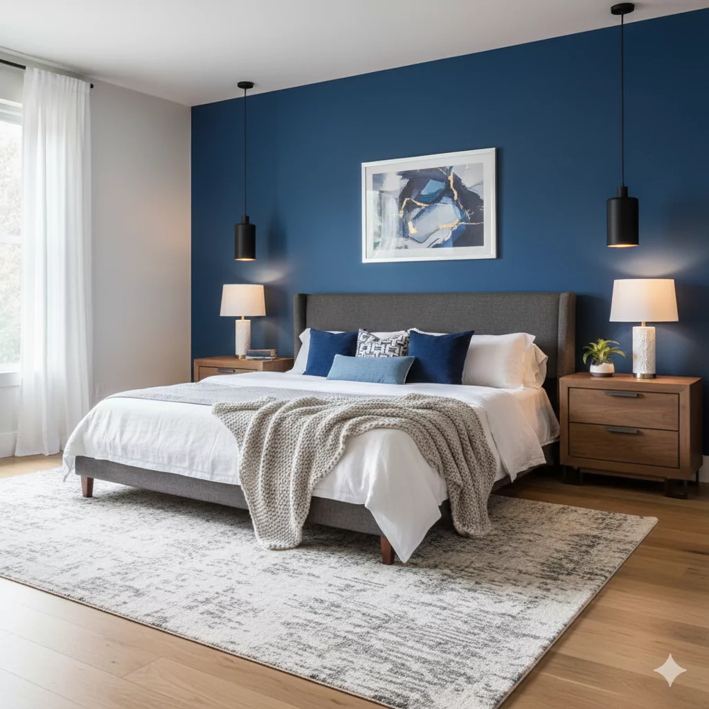
In a bedroom, Secure Blue can make the room feel calm and peaceful. It is often used on one or more walls to create a cozy retreat. For example, Secure Blue can transform a bedroom into a peaceful retreat, promoting relaxation. People often paint a bedroom wall Secure Blue and use white bedding or curtains with it.
\You might have a wooden bed or floor with it to add warmth. All in all, Secure Blue in the bedroom makes you feel safe and relaxed, like a calm evening sky. Designers recommend pairing it with crisp white sheets and light gray curtains for a serene look. Sometimes a pillow or blanket in a soft yellow or coral can add a nice pop of color, but mostly white and wood tones keep it restful.
In a Kitchen
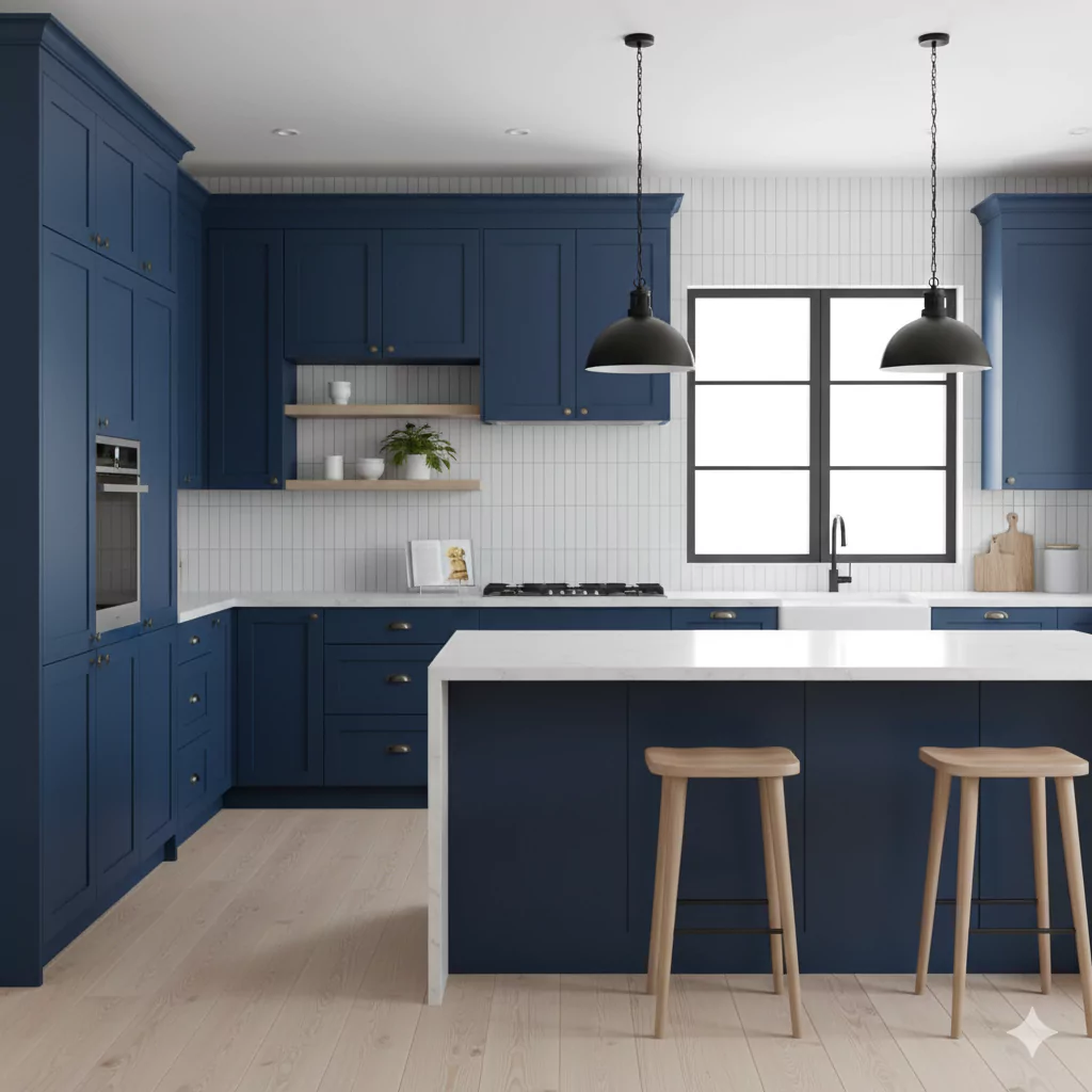
Secure Blue can look very stylish in a kitchen. It can be used on walls or on cabinets. For example, you could paint the lower kitchen cabinets Secure Blue and keep the upper cabinets white for a modern two-tone look. This makes the kitchen feel both bold and not too dark. When Secure Blue is in the kitchen, it goes well with white or light-colored counters and stainless steel appliances.
You can also add warm touches like wooden countertops or brass hardware to make it feel cozier. In short, Secure Blue in a kitchen gives a clean, fresh look. If you use it, think of pairing it with shiny silver fixtures (for a modern feel) or natural wood (for a warm feel). In designs, people sometimes describe this blue as bold yet soothing in a kitchen setting.
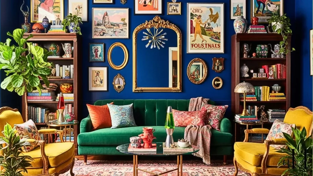
In the Living Room
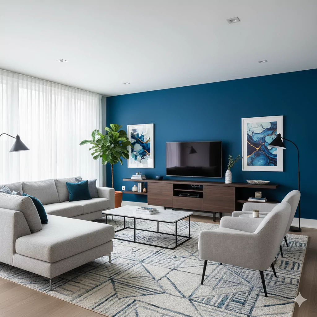
In a living room, Secure Blue makes a room feel both calm and sophisticated. It can be a feature wall behind the sofa, or even on all the walls for a dramatic look. Designers suggest putting Secure Blue on one big wall and using light-colored furniture (like a beige or gray couch) in front of it.
This highlights the blue nicely. You can also use wooden furniture, indoor plants, or a white rug to balance the color.
For a little color contrast, adding warm accessories like a mustard-yellow or coral throw pillow can make the room pop. Overall, Secure Blue in a living room feels like a deep ocean – calm and inviting.
It pairs well with creamy whites and light woods, but a few bright accents (like gold or orange) can make the space exciting too.
In a Bathroom
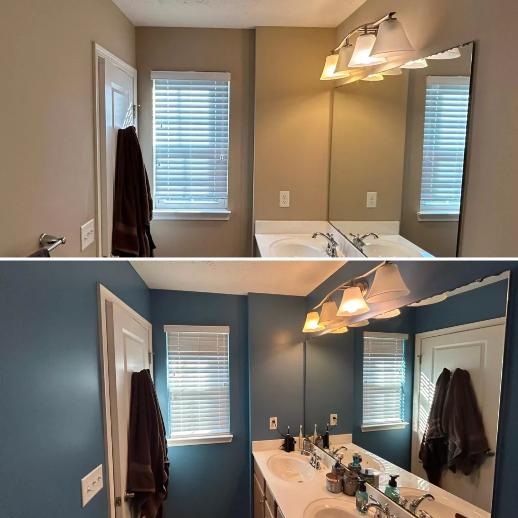
Secure Blue is great for bathrooms because it feels spa-like and fresh. When you use it on bathroom walls, it often is paired with white tiles and shiny chrome fixtures for a clean look.
Think of it like the color of clear ocean water. The cool blue tone makes the bathroom feel cool and clean. Designers often add some warmth by using wooden shelves or gold/brass hardware with it. This way it doesn’t look too cold.
One idea is to paint the walls Secure Blue and use a white sink, white tub, and white tile – this combination looks very crisp. Another idea is to use Secure Blue on just one wall (like an accent wall) and white on the others. Either way, Secure Blue makes a bathroom feel tranquil and stylish, like a luxury spa.
On Cabinets
Secure Blue can make cabinets stand out. Many people paint kitchen or bathroom cabinets this color to add style. For example, you could paint lower kitchen cabinets Secure Blue and leave the upper cabinets white. This two-tone look keeps the room bright while adding depth. If you paint all the cabinets Secure Blue, use white walls and a light floor so it doesn’t feel too dark.
Secure Blue cabinets look very striking and modern. You can add shiny nickel or chrome handles for a sleek look, or brass/gold handles for a warm, classic feel. In a bathroom, Secure Blue vanity cabinets can also look nice with white countertops. In short, Secure Blue on cabinets makes those pieces pop and adds color without being too flashy.
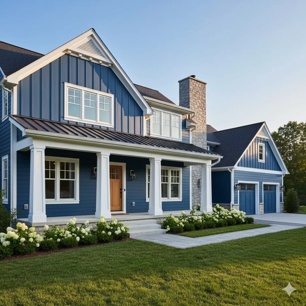
Exterior
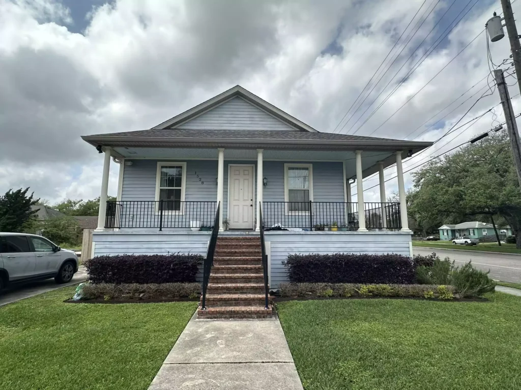
Outside the home, Secure Blue adds charm and a modern feel. For example, you might paint the front door or trim Secure Blue, or even use it on siding (depending on your home style). It looks good with white or off-white trim and a lighter roof color for a clean, classic look. If you want a beachy vibe, Secure Blue pairs nicely with sandy beige or light gray on other parts of the exterior.
In a green yard, the blue will really stand out. If your house is in town, you could also use other cool colors like soft gray or navy on nearby parts to match it. People say that Secure Blue on the outside makes a house look welcoming and slightly coastal. It gives a pop of color without being too dark or too bright.
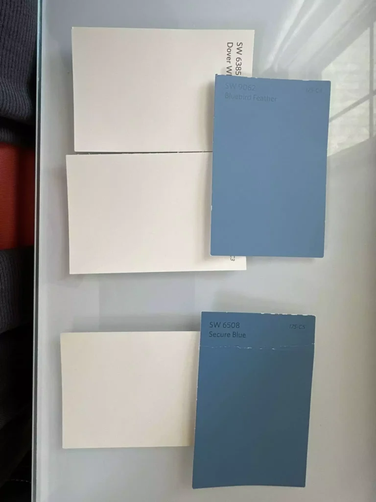
Coordinate Colors
Here are some colors that go well with Secure Blue:
- Whites and light neutrals: Crisp white or very light gray keep the look bright. (For instance, SW Snowbound or Pure White are good picks.) These colors make Secure Blue stand out and keep the space feeling light.
- Warm yellows and oranges: Soft golds or warm oranges add energy. (SW Honey Bees or Cavern Clay are examples.) These warm colors contrast nicely with blue and make a room feel cozy and fun.
- Cool soft colors: Pale greens or teal-blues blend smoothly. (SW Sea Salt or Silver Strand work well.) These keep the atmosphere calm and spa-like, complementing the blue’s cool tone.
- Dark accents: Deep navy or black make the blue pop. (SW Naval or Tricorn Black are good choices.) Using a bit of dark color as furniture or frames adds drama and richness.
Soft Palette
For a gentle, soft palette, use pale and light colors with Secure Blue. Think of colors you might see in a sky with soft clouds. Good choices are: very light cream or beige, soft mint green, pale aqua, or a blush pink.
These colors are not bright; they are almost like pastel versions of others. For example, a pale gray-green or a light buttery yellow would keep things easy and dreamy. You could paint the walls Secure Blue and use pale off-white trim and furniture. You might add gentle pastel pillows (like pale mint or peach) so nothing is too strong. A soft palette makes the room feel friendly and cozy, almost like a calm watercolor.
Bold Palette
For a bold palette, choose some bright or deep colors that stand out against Secure Blue. Good options are rich mustard yellow or coral-orange accents. These warm colors make a strong contrast and draw the eye. You could use a bright throw pillow or a piece of orange wall art. Another bold choice is a deep navy or black accent (such as a black side table or picture frames).
These dark accents make the blue look even deeper. Bright turquoise or chartreuse green could also add a fun pop. The idea is to use colors that grab attention. For example, adding a mustard-yellow chair or bold red ornament will make Secure Blue feel even more vibrant.
Muted Palette
A muted palette means using colors that are similar in softness or tone. You might pick other subdued blues, grays, or greens. For instance, a muted teal, slate gray, or olive-green cushion could match nicely.
Beige or a dusty rose are also muted and blend gently with Secure Blue. In a muted scheme, you avoid bright contrasts and keep everything calm. Picture the color names like “smoke,” “sage,” or “stone.” Using these kinds of colors with Secure Blue will make the room feel peaceful and harmonious, without any harsh colors. (Think of a quiet forest with blue sky – all the colors are gentle.)


