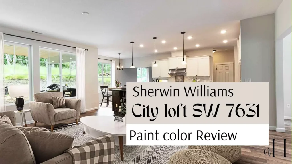
Sherwin-Williams City Loft (SW 7631) is a warm, light neutral paint color. It’s like a soft, cozy hug in a can – not stark white, but a warm off-white with a hint of beige.
Sherwin-Williams describes City Loft as “a warm off-white with beige and red undertones,” meaning it has a gentle beige-tan base with a touch of red/pink warmth. In practical terms, City Loft is slightly darker than pure white (LRV 70) but much lighter and warmer than a true gray.
It works beautifully on walls in living rooms, kitchens, and even on exteriors to make a home look inviting. Because of its warmth and softness, City Loft is often used when white feels too cold or gray feels too dull. It makes rooms feel cozy and welcoming without adding a strong color.
Undertones of Sherwin Williams City Loft
City Loft’s undertones are warm and gentle. As Sherwin-Williams notes, the paint has beige and red (pinkish) hints in it. This means that while City Loft looks mostly creamy gray or beige, it carries a slight peach or warm beige cast.
Its a peachy greige (a mix of gray and beige). Because of these warm undertones, City Loft never looks icy or cold. Instead it feels soft and slightly warm. It won’t pull green or bright yellow – instead it may show a whisper of pink or peach in some lights.
These undertones help City Loft coordinate well with many colors and prevent it from feeling flat. In sunlight or paired with cool blues, City Loft reads as a cozy light gray-beige; in warmer light, its pink-beige warmth becomes more obvious.
OTHER FAMOUS CREAMY BEIGE PAINT COLORS I USED:
- Nacre SW 6154 Sherwin Williams
- SW 7526 Maison Blanche Sherwin Williams
- Benjamin Moore 281 Citronée
- Wool Skein SW 6148 Sherwin-Williams
LRV of Sherwin Williams City Loft
City Loft has an LRV of 70. LRV (Light Reflectance Value) is a number from 0 (very dark) to 100 (pure white) that tells us how much light a color reflects. An LRV of 70 means City Loft is quite light and bright, but not as bright as a pure white (which would be closer to 90–100).
In practice, LRV 70 means City Loft reflects a lot of light, keeping rooms feeling open and airy, but it still holds enough pigment to see some warmth and color. For comparison, Sherwin’s popular white Alabaster has an LRV around 82, while a medium gray like Repose Gray is about 58.
So City Loft is closer to white than to gray. With an LRV of 70, City Loft is classified as a light color – it won’t make a space feel small or dark. It strikes a balance: bright enough for a big open feel, yet warm and soft on the eyes.
Appearance in Different Light
City Loft can look slightly different under various lighting. In bright natural sunlight, it often looks very pale – almost like a soft white with a warm glow.
On an exterior wall in sunlight, City Loft “shines” and looks like a clean, creamy white. In shaded or north-facing rooms, it will lean more gray, though still warm.
For example, in a bedroom lit by natural morning light and lamps, City Loft appeared as a creamy, almost buttery-yellow tone. This is because warm light can pull out its beige-yellow tint.
Under cool fluorescent or north-facing light, City Loft shows more of its gray-beige side, but because of its warm undertones it never looks like a stark cool gray. In interior living spaces with neutral furniture, City Loft often looks simply soft and cozy.
In summary, City Loft adapts: warm lighting makes it look cozier and creamier, cool lighting makes it look a clean light gray-beige.
Hex Code
For digital use or precise reference, Sherwin-Williams City Loft’s hexadecimal color code is #DFDAD1. Hex codes are a way to specify colors in computers and design.
The code #DFDAD1 corresponds to a very light gray-beige color. In CSS or design software, using #DFDAD1 will display a color almost identical to City Loft paint on a painted wall.
RGB Values
The RGB values for City Loft are R: 223, G: 218, B: 209. This means on a digital screen it is made from 223 parts red, 218 green, and 209 blue (on a 0–255 scale). Those values also produce a warm gray-beige: a lot of each color (since 223/218/209 are high numbers) which is why it looks so light. In short, City Loft is pale with a little more red than blue or green, giving it its gentle warm hue.
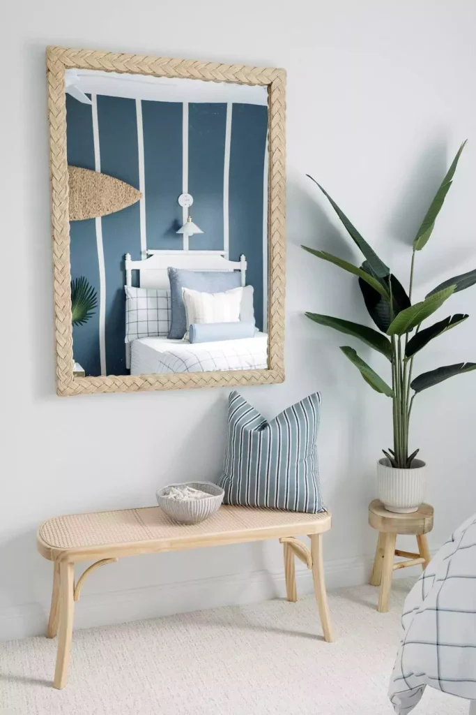
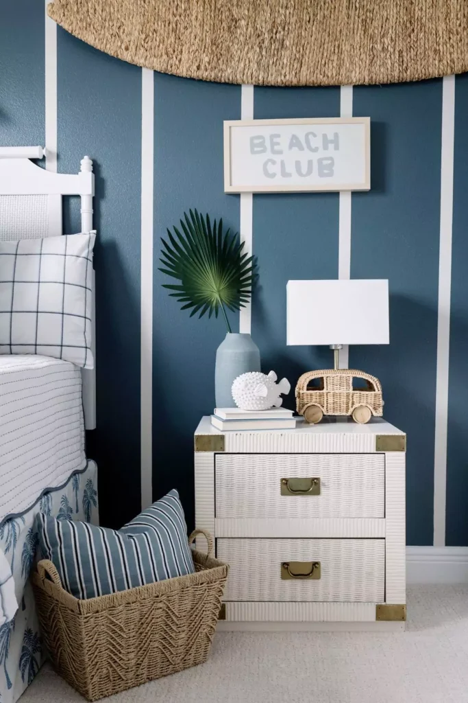
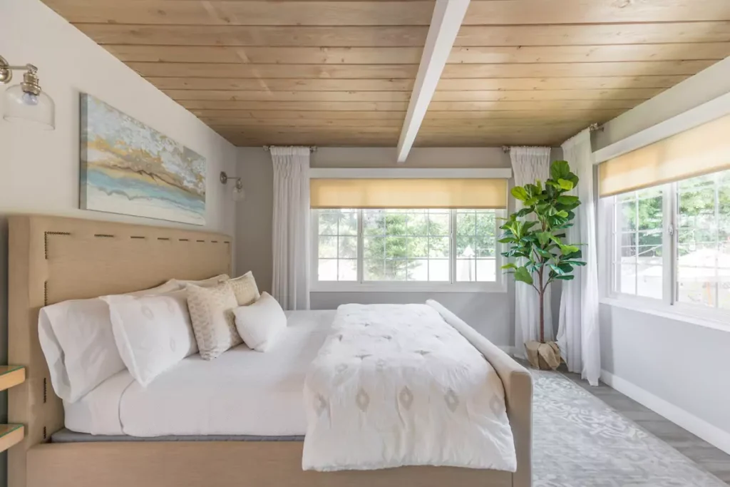
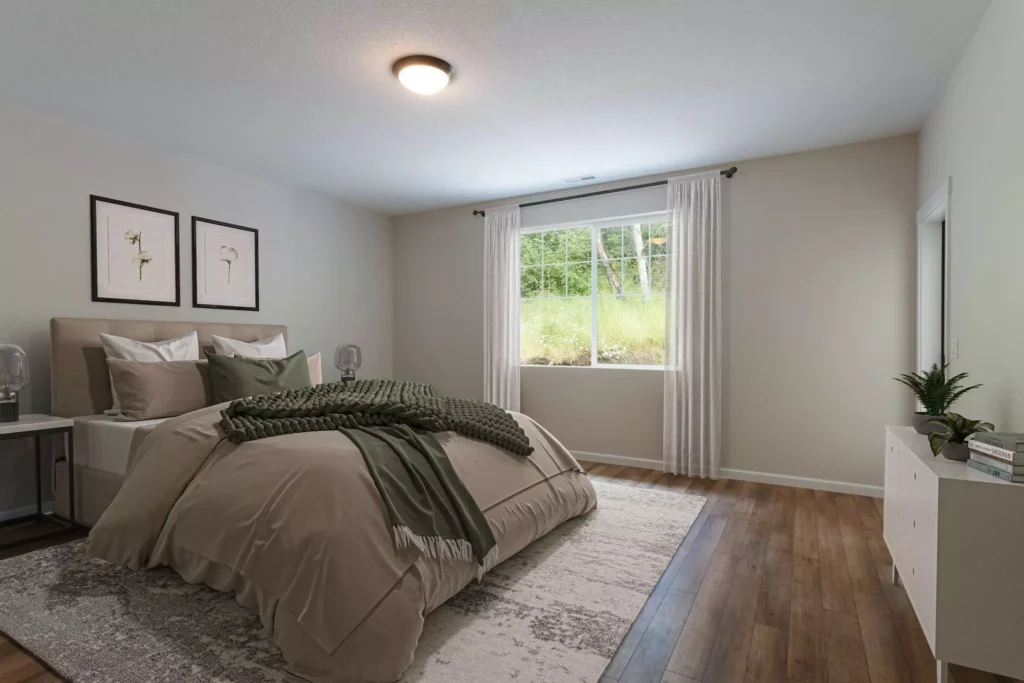
Sherwin Williams City Loft In the Bedroom
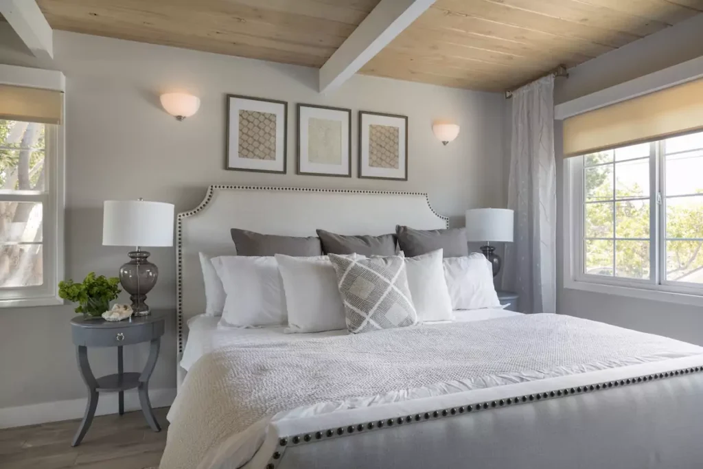
In a bedroom, City Loft creates a calm, soothing atmosphere. Its light value keeps the room bright, but its warmth adds coziness. For example, one styling of a bedroom showed City Loft walls under a mix of natural morning light and lamp glow; the color looked slightly creamy-yellow.
This soft yellow-cream tint made the space feel gentle and serene, perfect for sleeping. City Loft also pairs nicely with bedroom decor: it was shown complementing blue-green pillows and bedding without clashing.
In short, City Loft in a bedroom feels like a warm, comforting neutral. It won’t disturb sleep as a bright white might, but it still reflects light so the room doesn’t feel dark. Its subtle beige tone goes well with most bedding colors (blues, greens, wood tones, etc.), making it a versatile choice for bedrooms.
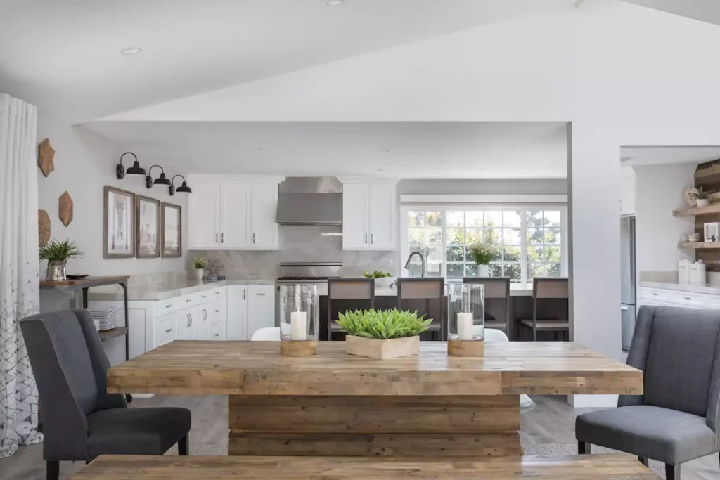
In the Kitchen
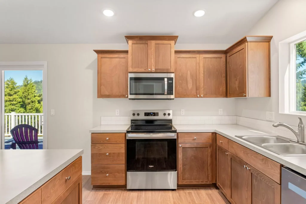
City Loft works very well in kitchens, whether on walls or cabinets. On walls, its warm light tone can make a kitchen feel open and friendly. On cabinets, City Loft offers a nice alternative to pure white or cool gray.
For painted cabinets, City Loft is especially popular: it’s light enough to brighten the space but has just enough beige warmth to feel custom and rich. In real kitchens, City Loft cabinets still look very bright, but their warm undertones keep them from feeling sterile. The warm beige-gray stops them from appearing washed out against countertops.
In one kitchen example, City Loft cabinets paired beautifully with cool granite and marble countertops. People say “City Loft cabinets would be gorgeous!” and indeed it gives a soft but clean look. Overall, in kitchens City Loft maintains a clean brightness (thanks to its high LRV) while adding a homey warmth – ideal for family kitchens or open plan layouts.
11-Best Sherwin Williams Paint for Cabinets and Trim+Side by Side Comparison
Sherwin Williams City Loft In the Living Room
In living rooms, City Loft creates an inviting, modern look. Because it’s so light, it brightens large spaces and reflects natural light. For instance, one living room was painted entirely in City Loft; daylight made the walls glow warmly. Neutral furniture (wood tones, off-white sofas) worked very well against it.
The color’s warmth prevented the room from feeling cold even with gray decor. Under warm afternoon sun, City Loft showed its beige-peach side, making the space feel cozy. Under cool or diffuse light, it appeared as a pale gray-beige.
In every case, City Loft acted as a smooth backdrop: it doesn’t fight with bright art or colored furnishings. Instead, it lets accent colors pop while still feeling soft. Because of its balance of gray and beige, City Loft living rooms can feel both fresh and homey. It’s a very versatile neutral for living areas.
In the Bathroom
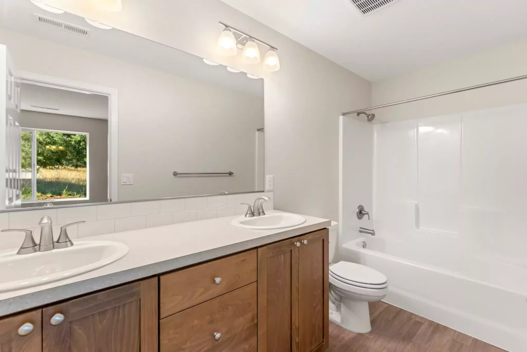
City Loft also suits bathrooms nicely. Its high reflectance (LRV 70) helps small or dim bathrooms feel open and bright. At the same time, its warmth avoids the sterile feeling that pure white can sometimes have.
In a bathroom, City Loft looks clean and spa-like but with a gentle glow. Under bathroom lighting (often cool white lights), City Loft tends to lean a very light gray-beige, keeping the space fresh. If natural light enters, its warm undertones can make tiles and fixtures feel a bit cozier.
It pairs well with white trim and cabinetry, and it matches many tile colors – whites, creams, soft blues or greens. Overall, using City Loft in a bathroom means a bright, airy space that still has a bit of warmth and softness, making the bathroom feel welcoming instead of cold.
On Cabinets
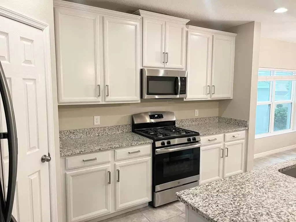
City Loft is an excellent choice for painted cabinets (kitchen cabinets, bathroom vanities, built-in shelves). It gives a crisp yet warm look.
Because City Loft is very light, it can make cabinets feel almost white at first glance, but its beige tone gives them depth. Designers praise City Loft for cabinets: on sample boards, City Loft looks similar to Benjamin Moore’s Balboa Mist but a tad lighter. In practical use, City Loft cabinets pair beautifully with stone countertops or wood. The warm undertones mean cabinets won’t look flat or washed out.
For example, in a mudroom, City Loft cabinets looked soft and clean, not dull. In short, on cabinets City Loft reads as a warm off-white: it brightens the room and provides a subtle warmth that pure white cabinets don’t have, making cabinetry feel custom and cozy.
Exterior with Sherwin Williams City Loft
City Loft is very popular as an exterior paint color (for house siding, trim, etc.). Its warm gray-beige tone can look like a classic cream or soft white on the outside. Because it has more depth than pure white, it resists looking washed out in sun. In bright daylight a City Loft exterior can appear very white and fresh.
On a sunny day, the house looked like a light cream; on a cloudy day its gray-beige tint became a bit more noticeable. City Loft also works well with brick, stone, or wood: it’s neutral enough to blend nicely with natural materials.
Designers often recommend it for a subtle farmhouse or cottage look. In summary, City Loft as an exterior color reads as a warm white – bright and light in sunlight, with a touch of warm beige visible in softer light. It makes homes look clean and inviting while avoiding a stark glare.
Coordinating Colors of Sherwin Williams City Loft
City Loft is very versatile with other colors. Its gentle warm neutral base means it can work with lots of palettes. In general, it pairs beautifully with both other neutrals and more vibrant hues.
Creamy Whites & Neutrals
Soft whites and creams enhance City Loft’s warmth. Colors like Sherwin-Williams Dover White or Creamy (warm pale whites) and Benjamin Moore Chantilly Lace can be used for trim or walls in an adjacent room. These light neutrals keep a calm, monochromatic look.
Warm Grays & Taupes
Greige and gray-taupe colors work well. For instance, Sherwin-Williams Mindful Gray (a warm gray) or Taupe Tone (a companion greige) complement City Loft’s undertones. They add contrast without clashing, ideal for furniture, trim, or an accent wall.
Cool Blues & Greens
Cooler colors can pop against City Loft. Navy blue (e.g. SW Naval) or deep teal will stand out vividly on a City Loft background. Muted blue-greys (like SW Delft) or soft greens (like SW Retreat) also coordinate – these colors bring a cool contrast that highlights City Loft’s warmth.
Bold Accent Colors
Rich jewel tones make great accents. Deep greens (emerald) or purples (plum) are particularly striking with City Loft. For example, City Loft pairs nicely with Sherwin’s “Cyberspace” (a very deep blue-gray) or Benjamin Moore’s Twilight Mauve. These bold colors create drama while City Loft keeps surrounding walls calm.
Earthy Tones
21 Mixing Eras Trends Design Ideas That Designers Love in 2025
Earthy beige, brown, or olive tones match City Loft’s warmth. Colors like SW Drift of Mist or SW Coastal Plain (muted green) can give an organic feel.
Each of the above uses reflects how City Loft “plays with most colors” as a neutral base. Designers often recommend accenting City Loft with “clean white” trims (like SW Extra White or Pure White) to make walls pop. The key is that City Loft goes with both warm schemes (creams, beiges) and cool ones (navies, grays, greens) – it’s truly versatile.
Soft Color Palette
A soft palette with City Loft focuses on gentle, muted tones. Think pastel or pale colors alongside City Loft. For example, pairing City Loft with a light gray-blue (like Sherwin-Williams Silvermist) or a pale sage green gives a subtle, calming effect. Light beiges, pale pink-beige, or blush colors also work well (City Loft itself is like a soft peachy beige)
You could also add a pale gray (such as BM Classic Gray or SW Snowbound) for a touch of contrast that’s not too stark. In summary: for a soft palette, use City Loft with gentle neutrals like cream, light gray, pale peach or blue. These colors keep the space feeling light and balanced. The result is a room that feels very calm, like a quiet beach or a softly lit sunrise.
Bold Accent Colors
For a bold look, use City Loft as a neutral background and add rich, intense colors as accents. Deep navy or midnight blue (like SW Naval) is a classic choice – it looks crisp against City Loft and highlights its warmth.
A forest green or teal accent wall or cabinet (SW Green Onyx, for example) would pop beautifully. Other bold options include burgundy or plum (SW Peppercorn or BM Studio Taupe) for a moody contrast. Even a bright coral or mustard can work to create an energetic vibe. The idea is City Loft’s light, warm tone allows darker/brighter colors to shine.
Designers often say City Loft pairs surprisingly well with strong colors – for instance, navy, deep greens, or even dark purples can look sophisticated. So when going bold, think rich jewel tones or saturated colors on a City Loft canvas. The neutral base keeps the bold hues from feeling overwhelming and makes them the star of the room.
Muted Colors
City Loft naturally fits into a muted palette as well, since it itself is a muted greige. It pairs nicely with other subdued, earthy hues. Muted greens (like SW Retreat or SW Dried Thyme) create a calm, natural feel with City Loft.
Soft blues and gray-blues (such as SW Delft or SW Rainwashed) are gentle companions that won’t clash. Warm grays with brown undertones (like SW Mindful Gray) also match well. Even dusty mauve or lavender-gray tones can complement City Loft’s warmth without overpowering it.
The key is to use colors that aren’t too bright – think of your palette as a sandy beach of soft tones. For example, a living room with City Loft walls, a muted green sofa, and a driftwood-gray rug would feel harmonious. In short, muted colors (soft, nature-inspired shades) work great with City Loft when you want a subdued, organic look.
Frequently Asked Questions
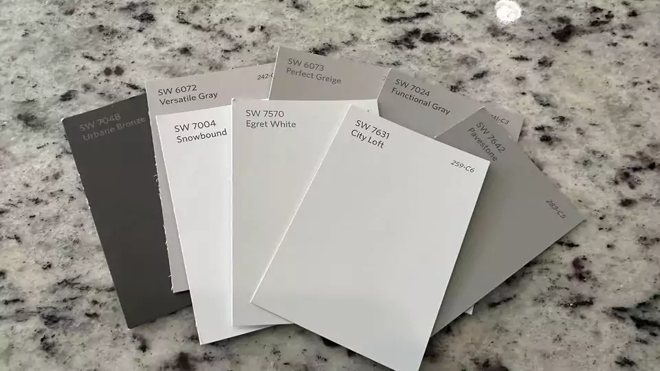
Is City Loft lighter than Agreeable Gray?
Yes. City Loft is noticeably lighter than Sherwin-Williams Agreeable Gray. In fact, City Loft has an LRV around 70, while Agreeable Gray’s LRV is about 60. That means City Loft reflects more light and looks a bit brighter on the wall. In practice, City Loft feels like a lighter, airier color compared to the deeper taupey-beige of Agreeable Gray.
Does City Loft look yellow?
Not really. City Loft is not a true yellow; it’s a warm beige-gray. However, its warm beige undertones can sometimes give a creamy or golden tint in certain lighting.
For example, in one bedroom photo, a mix of natural light and ambient light made City Loft look a little buttery-yellow. In cooler light it reads more gray-beige. So while City Loft itself isn’t a yellow paint, warm indoor lighting or sunshine can make it appear slightly yellow-cream. Overall it stays more beige than yellow.
Which is better, Drift of Mist or City Loft?
Neither is strictly “better” – they just suit different needs. Both are light, warm neutrals. City Loft is a warm off-white greige with beige/pink undertones and an LRV of 70. Drift of Mist (SW 9166) is also a light warm gray (LRV ~69) but with very muted greenish undertones.
In short, City Loft has a bit more peachy warmth, while Drift of Mist leans cooler/greener. If you want a cozier, creamier look, City Loft might feel better. If you prefer a slightly more neutral or grayish look, Drift of Mist could be the choice.
Both are popular for whole-house use, but they do have that subtle difference: City Loft reads warmer (pink-beige), and Drift of Mist reads a bit more cool and subdued.
City Loft vs. Agreeable Gray
City Loft and Agreeable Gray can look similar at a glance, but City Loft is lighter and warmer. City Loft’s LRV is 70; Agreeable Gray’s is 60. Also, City Loft has a pinkish-beige undertone while Agreeable Gray has more green or true gray undertones.
In practice, City Loft feels airier and slightly more tan, whereas Agreeable Gray feels deeper and more neutral-gray. If you want a soft warm gray, City Loft is more “cream-grey”; if you want a mid-tone greige with a slightly cooler look, Agreeable Gray is darker and grayer.
City Loft vs. Alabaster
City Loft and Alabaster are both warm off-whites, but Alabaster is much lighter. Alabaster’s LRV is around 82–83, while City Loft’s is 70. City Loft therefore looks noticeably darker and more gray/beige than Alabaster.
In one comparison, City Loft appeared as a peachy greige, while Alabaster was a lighter grayish cream. In other words, City Loft gives a soft taupe-gray look; Alabaster reads almost like clean white with just a hint of beige. If you need a gentle contrast, City Loft will show more color; Alabaster will be nearly white.
City Loft vs. Drift of Mist
City Loft and Drift of Mist (SW 9166) are similar warm neutrals. Both border on off-white in lightness, but they differ in undertones. City Loft tends to show pink-beige (sometimes described as a violet-pink cast), whereas Drift of Mist has a vague greenish cast.
In practice, City Loft will feel warmer and more peachy, while Drift of Mist will feel cooler with a hint of sage. Both have similar brightness (LRV 69–70), but City Loft suits warm palettes (creams, warm woods) and Drift of Mist suits slightly cooler palettes (soft blues, minty greens).
City Loft vs. Repose Gray
Repose Gray (SW 7015) is a deeper, cooler gray than City Loft. City Loft’s LRV is 70; Repose Gray’s is only 58, so Repose Gray is notably darker. City Loft has warm beige and pink tones, while Repose Gray is a true gray with slight violet hints.
In fact, Repose Gray can sometimes flash purplish in cool light, whereas City Loft can flash a peach tone in warm light. In simple terms: City Loft is lighter and more beige; Repose gray is deeper than city loft.


