Last updated on September 5th, 2025 at 01:40 pm
A lot of my readers were asking about the perfect creamy neutral shades, So after looking at a lot of creamy neutral I can say that Wool Skein SW 6148 is a perfect creamy neutral, sometimes khaki and sometimes tan.
In this blog post, I will share real home images so you can understand the LRV and undertones of Wool Skein SW 6148, also how it behaves in different lighting and coordinating colors that are mute, earthy, bold and sometimes neutral to give your home a minimal look.
7 Best Sherwin Williams Beige Colors
Undertones of Wool Skein SW 6148
Wool Skein (SW 6148) is a warm beige paint with subtle khaki/greenish-yellow undertones. Sherwin-Williams describes it as “a beige with khaki undertones”. In practice its yellow base is balanced by a faint green cast, giving it a soft, muted character.
For example, one designer notes that what looks like plain beige can “pull a faint greenish tint” under certain lighting.
My mother-in-law explicitly calls out a hidden green hue: “Wool Skein is… a tan that leans slightly into yellow…but there’s green hiding in there too”.
In short, Wool Skein is a warm neutral that reads as a beige/tan but with a dusty green-yellow undertone rather than pink or orange.
SOME OTHER NEURAL SOFT COLORS
- Tony Taupe (SW 7038) Sherwin Williams-Perfect Taupe Color
- Ashen Tan 996:Benjamin Moore-Reasons Why its PERFECT Choice
LRV of Wool Skein SW 6148
Wool Skein has an LRV (Light Reflectance Value) of about 63, putting it in the light category of paint colors. This means it reflects a moderate amount of light: it’s not as bright as a true off-white, but it won’t overly darken a room either.
With an LRV around 62.7%, Wool Skein will lighten a space without making walls starkly white. In bright, sunny rooms it may look washed out at times, but on a gray day or under warm indoor light it remains visibly colored.
Because of its lightness, Wool Skein can brighten a mid-sized room fairly well, but it won’t perform like a pure white – it retains its beige warmth even in abundant light
Wool Skein SW 6148 in different Lighting
Wool Skein’s appearance shifts with light direction and bulb type.
In sunlit (south- or west-facing) spaces, the color looks warmer and more golden, offering “soft warmth without overheating” a room Under warm artificial light (incandescent or warm LED), the beige tones deepen and the green undertone is subdued .
Conversely, in cooler or low natural light (north-facing rooms or cool LED lighting), its greenish tint can become more noticeable For example, one sample photo shows Wool Skein “leaning warmer in sunny spaces and more neutral in cooler light”.
In summary, Wool Skein remains a warm neutral in any light but will skew gently greener in cool conditions and cozier-yellow under warm light.
11 Best Swiss Coffee Paint Color That I recommend My Clients
Bedroom with SW 6148
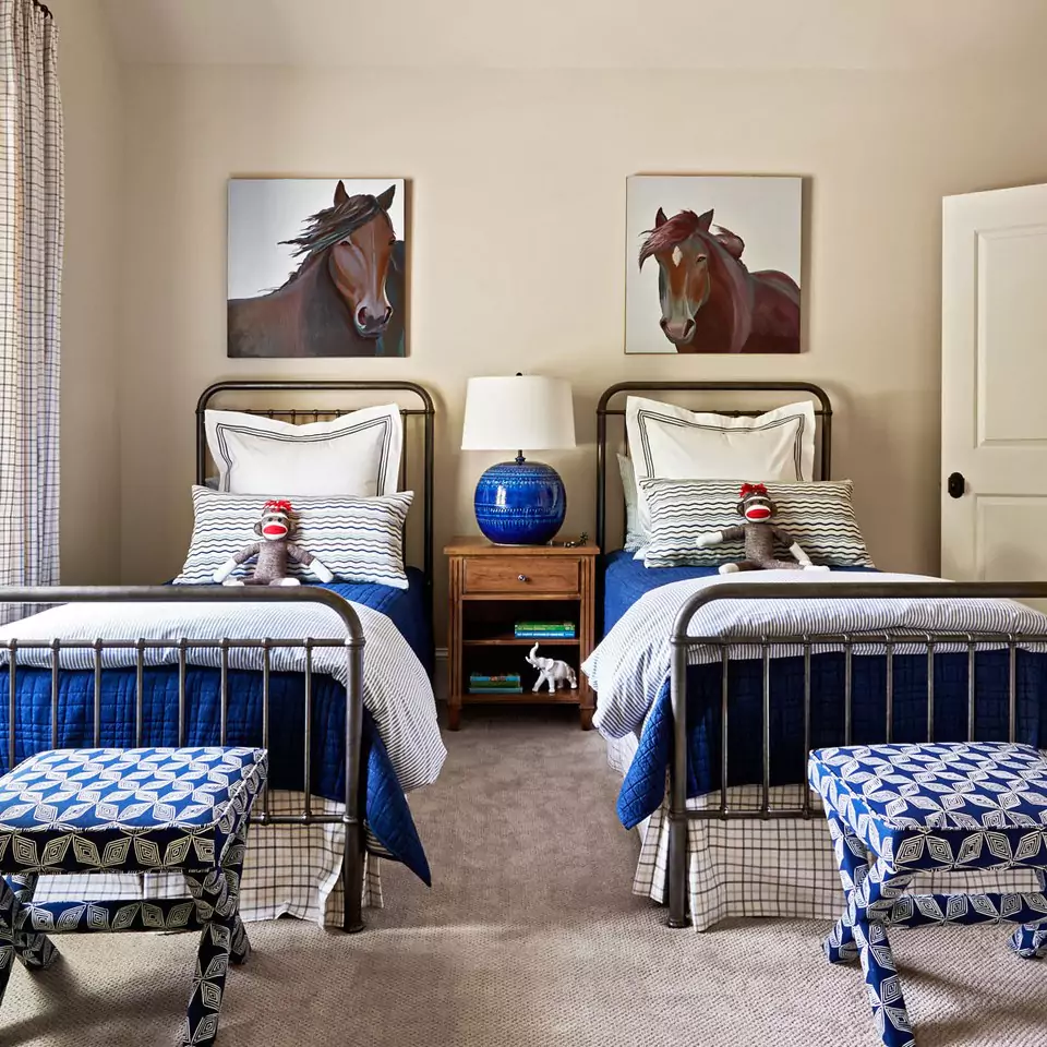
Wool Skein works very well in bedrooms, creating a soft, cozy atmosphere. Its gentle warmth and light tone make a space feel inviting and restful.
As one client notes, on bedroom walls Wool Skein feels “soft, warm, and cozy—perfect for creating an inviting atmosphere” . The color’s subtle nature means it doesn’t overwhelm, so bedding and decor can add pattern or color contrasts.
In a master or guest bedroom, Wool Skein provides a neutral backdrop that complements natural wood floors and furniture. Its warmth also pairs nicely with white or cream trim to keep the room feeling light and spacious.
11 Best Light Beige Paint Colors According to Interior Designers
Kitchen
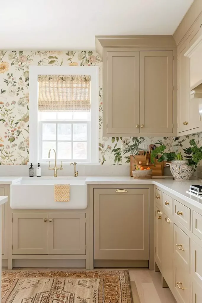
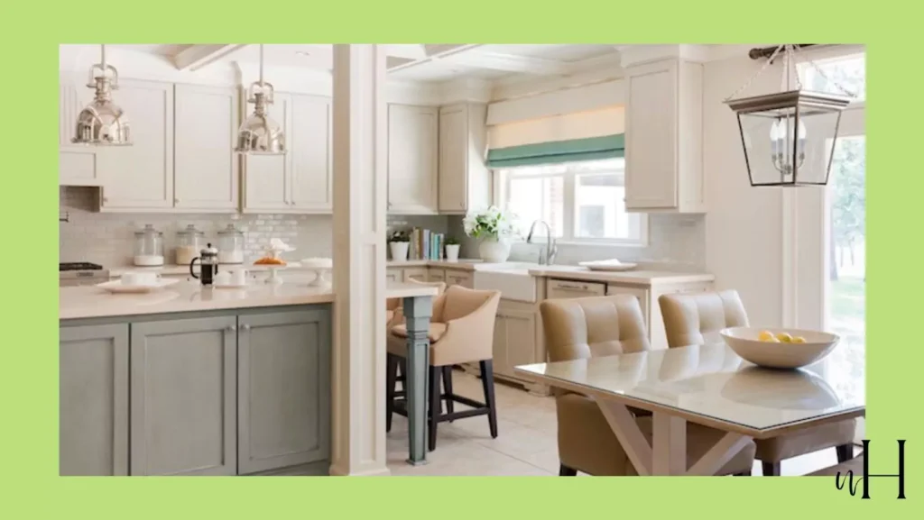
In kitchens, Wool Skein is popular as both a wall color and cabinet finish. On walls it warms up white cabinetry and stone countertops, giving the room a welcoming feel.
On kitchen cabinets in particular, designers call Wool Skein “sophisticated” and “timeless” When used on cabinetry with light countertops (e.g. marble or quartz) and stainless appliances, Wool Skein looks clean yet warm . Many kitchens combine it with crisp white trim and cabinetry accents for contrast.
One caveat: in kitchens with red or orange wood tones (cherry cabinets, for instance), Wool Skein’s greenish undertone might clash or become more visible, so it’s advised to sample first .
Overall, Wool Skein in the kitchen reads as a warm cream that keeps the room bright but less stark than pure white.
Wool Skein SW 6148 in Living Room
For living rooms or family rooms, Wool Skein provides a versatile neutral backdrop. It reflects enough light to keep the space airy, yet its warm beige tone makes the room feel cozy.
In fact, experts describe Wool Skein in living areas much like in bedrooms: “soft, warm, and cozy—perfect for creating an inviting atmosphere”. This makes it well-suited for spaces with wood furniture or earthy décor.
In an open-plan living/dining area, Wool Skein flows effortlessly into adjoining rooms (like hallways), ensuring a smooth, cohesive look It pairs equally well with both dark accent pieces (e.g. charcoal gray sofa) and lighter furnishings, thanks to its balanced mid-tone.
In bright sunlit living rooms, it warms up the space; in dimmer north-facing rooms, it holds its own as a true light neutral without looking dull.
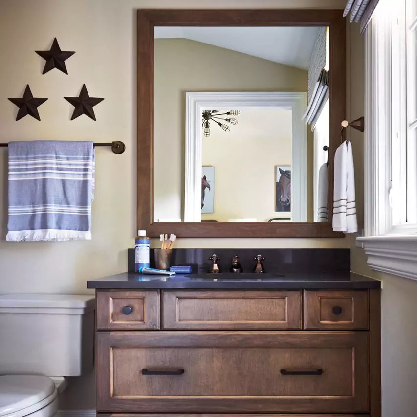
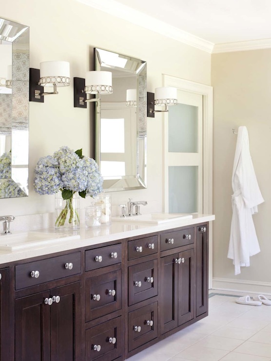
Bathroom

Wool Skein is also a good choice for bathrooms, especially when paired with white or warm-toned accents. On bathroom walls it provides a soothing neutral, and on cabinets it looks fresh and bright (similar to kitchens).
Like kitchens, bathrooms often feature Wool Skein on cabinetry; designers note it “looks stunning on cabinets, especially when paired with crisp white trim”. In a bathroom with white tile or countertops, Wool Skein adds warmth so the room doesn’t feel cold.
Its light reflectance keeps small bathrooms feeling open.
As always, keep an eye on lighting: strong yellow or cool lighting may reveal the undertone, so test samples under your bathroom lights before committing.
Overall, Wool Skein brings a spa-like calm to bathrooms, complementing both white and natural stone elements.
Cabinets
Wool Skein is frequently used on cabinetry (kitchen or bathroom) due to its warm, complementary tone. On cabinets it looks crisp yet cozy. One expert notes that “Wool Skein on cabinets offers a sophisticated, timeless look” .
Because it isn’t a flat white, it hides smudges well but still brightens a room. It works beautifully with light countertops (white or pale beige) and metallic hardware.
For a two-tone kitchen, Wool Skein is often chosen for upper cabinets, paired with a deeper color (like Urbane Bronze) on lowers for contrast. Just be cautious: if your cabinets or floors are a vivid orange-toned wood, Wool Skein’s slight green cast can be emphasized.
In most cases, though, it pairs harmoniously with wood grains and white surfaces.
Exterior


Wool Skein can also work well as an exterior house color. Its light beige tone reads warmly in sunlight and gives a home a friendly, inviting look.
For example, one of my friends states that on home exteriors, Wool Skein “offers a soft, welcoming vibe” and coordinates with darker trim or shutters . It looks especially good with stone or brick accents in neutral gray or tan.
Dark charcoal or espresso shutters (e.g. SW Iron Ore) provide a striking contrast to Wool Skein siding or trim. Because exterior lighting changes throughout the day, it’s wise to view it in morning and afternoon light.
Overall, it’s seen as a versatile exterior neutral that flatters both architectural details and natural surroundings.
Coordinating Colors for Wool Skein SW 6148
Palette: Sherwin-Williams Wool Skein (center) paired with Alabaster, Urbane Bronze, Accessible Beige, Shoji White, and Canvas Tan (adapted from a design guide). Wool Skein blends smoothly with many warm neutrals and natural accents.
For a cohesive palette, pair it with creamy whites (e.g. Sherwin Williams Alabaster or Eider White), medium-beige tones (Accessible Beige, Balanced Beige, Canvas Tan), and even some deeper hues for contrast.
For instance, a “Warm & Cozy” palette uses Wool Skein on walls with Alabaster trim and an accent wall or furniture in Urbane Bronze, while Accessible Beige and Canvas Tan are used on other surfaces.
Similarly, a coastal-inspired set might use Wool Skein with Sea Salt or Rainwashed on accents for a soft blue-green touch. In general, designers recommend:
- Bold contrast: deep neutrals like Iron Ore or Urbane Bronze provide drama
- Coastal/serene palette: pale blues or greens like Sea Salt or Rainwashed add freshness
- Classic pairing: other warm greiges (e.g. Accessible Beige, Balanced Beige) keep the scheme unified
- Soft neutrals: off-whites such as Eider White or Agreeable Gray keep things light and airy
In practice, Wool Skein also harmonizes with natural earth tones and greens. One color consultant suggests surrounding it with a range of subdued neutrals and nature-inspired hues: soft greiges, stormy gray-blues, muted green accents, and stone-like tans work well .
For example, adding a sage-green or olive accent pillow, or a medium-gray-blue throw, can complement Wool Skein’s undertone without clashing . Warm cream or ivory trim (not pinkish whites) also maintains cohesion.
In summary, Wool Skein is flexible: it anchors a palette of warm neutrals but also plays nicely with gentle color accents.
Soft (Muted) Palette
For a soft, harmonious look, pair Wool Skein with other gentle neutrals and pastels. Muted colors keep the room tranquil. Good choices include pale beiges (like Sherwin Canvas Tan), light grays, or pastel blues/greens with gray undertones.
For example, painting all trim and ceilings a soft cream (e.g. Alabaster or Cloud White) and using off-white or very light beige accents yields a seamless “all-beige” effect. In a bedroom or nursery, accenting Wool Skein with a very light gray-green or blue (such as Sea Salt or Rainwashed at low saturation) can add just enough contrast while staying subtle.
One suggested soft palette uses Wool Skein on walls with trim in Shoji White and accent pieces in Accessible Beige or Agreeable Gray . The key is to avoid any highly saturated or bright colors – the whole idea is a gentle, understated scheme. This soft look is ideal for a soothing bedroom or a traditional living room where nothing should “pop” too harshly.
Bold (Accent) Palette
For more drama, introduce deeper or richer accent colors alongside Wool Skein. Deep charcoal or blackish-brown tones (like SW Iron Ore or Urbane Bronze) make striking contrasts that still read as sophisticated.
Jewel-toned blues or greens (think a deep teal or forest green) can also serve as bold complements – for instance, a velvet armchair in teal-green will stand out crisply against Wool Skein walls.
Another approach is to pick a mid-tone accent: for example, a rich olive-green (Pewter Green by SW) or slate-gray (Dovetail) adds depth without overwhelming the warmth of Wool Skein.
According to designers, pairing Wool Skein with a moody blue-green (SW Silvermist) or a soft deep brown (Urbane Bronze) creates a cozy, grounded effect. In a kitchen, a bold accent might be a brightly colored backsplash tile; in a living room, a strong-color sofa or curtains. The point of a bold accent is to give visual interest – Wool Skein’s neutrality will balance it out.
Wool Skein vs. Accessible Beige
Accessible Beige (SW 7036) is another popular warm neutral, so it’s useful to compare the two. Both are warm “greige” tones, but Accessible Beige is deeper and slightly more gray.
Numerically, Accessible Beige has an LRV around 58% versus Wool Skein’s ~63%, meaning Wool Skein is noticeably lighter and airier. Accessible Beige tends to look more saturated and rich, whereas Wool Skein reads more subdued.
In practice, Wool Skein will appear a bit cooler (greener) in undertone, while Accessible Beige can swing a touch pink or brown in some lights.
One homeowner noted that Wool Skein is “really a pale neutral” and the “lightest cream” they would choose, whereas Accessible Beige is “a bit darker and warmer”.
In short, if you want a very light, gentle beige, Wool Skein is the milder choice; if you prefer a mid-tone greige with more depth, Accessible Beige is darker.
Wool Skein vs. Agreeable Gray
Agreeable Gray (SW 7029) is a cool-toned greige, whereas Wool Skein is warmer. Both reflect light similarly (LRV ~60 for Agreeable Gray vs ~63 for Wool Skeinplan-home.com), but the undertones differ.
Agreeable Gray is a “green gray” – it has a neutral gray base with just a hint of green. Wool Skein, by contrast, is more of a “green beige”: it has a creamier base with the same subtle green cast.
This means Agreeable Gray will appear slightly grayer (cooler) than Wool Skein.
One expert succinctly put it: “Agreeable Gray… is a Green Gray and Wool Skein is a Green Beige” In practice, walls of Agreeable Gray can look a touch more slate or mushroom in tone, while Wool Skein walls stay noticeably warmer.
So if you want a warm beige-with-green effect, choose Wool Skein; if you prefer a neutral gray-beige with just a whisper of warmth, Agreeable Gray is the pick.
Behr Equivalent Colors for Wool Skein SW 6148
If you’re considering other brands, some Behr paints closely resemble Wool Skein. According to paint match guides, Behr Bell Tower (often S340-1) and Behr Stucco Tan are among the closest analogs.
Both are warm beige hues similar in feel and reflectance. In fact, one matching tool lists Bell Tower as a top Behr match for Wool Skein . Other Behr neutrals like Spanish Sand or Natural Almond also share the dusty, earthy tone of Wool Skein .
As always, different brands can vary in finish and exact shade, so testing a sample is wise.
Benjamin Moore Equivalent Colors for Wool Skein SW 6148
Benjamin Moore also has many warm beige neutrals akin to Wool Skein. A frequently mentioned match is Benjamin Moore Temporal Spirit (approximately OC-37), which sits in the same tan/greige family.
Manchester Tan (BM HC-81) is another very similar color; in fact, Manchester Tan is often described as nearly the same hue as Wool Skein.
Other BM options include Natural Linen and Muslin, which have a comparable lightness and warmth Paint-match tools also list neutrals like Clay Beige or Jute as close peer If looking at BM color chips, focus on pale beiges with a hint of gray-green; most of those will behave similarly to Sherwin’s Wool Skein.


