Last updated on December 2nd, 2024 at 02:34 pm
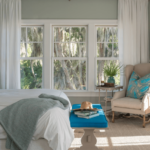
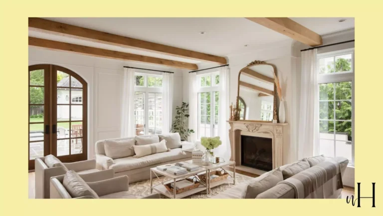
As we all know Sherwin William’s paint colors got hype after covid-19, which is very true her paint colors literally deserve that kind of hype.As SW accessible beige is a neutral and more likely to be like her old paint color agreeable gray which is also a popular choice on Pinterest.One of the question which is most asked by people around USA is Sherwin Williams Accessible Beige is a outdated color? Sherwin Williams Accessible Beige (SW 7036) is a warm, neutral color that strikes a perfect balance between beige and gray. This versatile hue offers a soft, muted appearance that can adapt to various architectural styles and environments. Its subtle warmth makes it an excellent choice for exterior applications, providing a welcoming and sophisticated look to homes.
What are the undertones of Accessible beige?
Accessible Beige’s versatility stems from its ability to harmonize with a wide range of complementary undertones. This adaptability makes it an ideal base color for various exterior color schemes. Some complementary undertones that pair well with Accessible Beige include:
| Undertone | Examples |
|---|---|
| Cool grays | Repose Gray, Agreeable Gray |
| Warm browns | Urbane Bronze, Sealskin |
| Soft whites | Pure White, Alabaster |
| Muted greens | Sage, Evergreen Fog |
RELATED BLOG
- Accessible Beige vs Agreeable Gray
- 9 Reasons Shoji White Sherwin Williams Paint Color is Best For Small Spaces
Why accessible beige is popular for exteriors
Accessible Beige has gained popularity as an exterior color choice for several reasons:
- Timeless appeal: Its neutral tone ensures longevity in design trends.
- Versatility: Works well with various architectural styles, from traditional to modern.
- Curb appeal: Provides a sophisticated and welcoming appearance to homes.
- Low maintenance: Hides dirt and imperfections better than lighter or darker colors.
- Light reflectivity: Helps in energy efficiency by reflecting some sunlight.
With its ability to complement a wide range of exterior elements and its enduring appeal, Sherwin Williams Accessible Beige has become a go-to choice for homeowners and designers alike. Its versatility allows for countless creative color combinations, making it an excellent foundation for any exterior color scheme.
Sherwin Williams Accessible Beige Exterior Color Combinations
1-Navy Blue with Accessible Beige
Pairing Sherwin Williams Accessible Beige with navy blue creates a stunning coastal-inspired exterior. This combination evokes images of sandy beaches and deep ocean waters, perfect for homes near the coast or those wanting a nautical feel.
- Main exterior: Accessible Beige
- Shutters and front door: Navy Blue (e.g., Naval SW 6244)
- Trim: White (e.g., Pure White SW 7005)
2-Soft Gray Pairings for a Modern Feel

For a contemporary look, combine Accessible Beige with soft grays. This pairing creates a subtle, sophisticated exterior that’s both calming and modern.
- Main exterior: Accessible Beige
- Accent areas: Soft gray (e.g., Agreeable Gray SW 7029)
- Trim: White (e.g., Extra White SW 7006)
3-Dark Brown Accents with Accessible Beige

Adding dark brown accents to Accessible Beige creates a warm, earthy exterior with just the right amount of contrast.
- Main exterior: Accessible Beige
- Accent areas: Dark brown (e.g., Turkish Coffee SW 6076)
- Trim: Creamy white (e.g., Alabaster SW 7008)
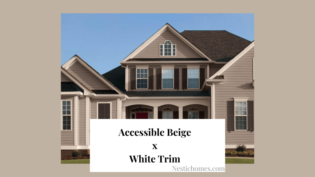
4-White Trim for a Timeless Look

A classic white trim paired with Accessible Beige creates a timeless and elegant exterior that will never go out of style.
| Element | Color Suggestion |
|---|---|
| Main Exterior | Accessible Beige |
| Trim | Pure White SW 7005 |
| Front Door | Choose a bold accent color |
Bold Color Pairings with Accessible Beige Exteriors
5-Charcoal Gray for Sophistication

Pairing Accessible Beige with charcoal gray creates a sophisticated and modern exterior. This combination exudes elegance and provides a perfect balance between light and dark. Consider using charcoal gray for:
- Shutters
- Front door
- Trim
- Roof
| Element | Color |
|---|---|
| Main Exterior | Sherwin Williams Accessible Beige |
| Accents | Charcoal Gray |
| Trim | White or Off-White |
6-Rich Burgundy for Elegance

For a touch of luxury and warmth, combine Accessible Beige with rich burgundy accents. This pairing adds depth and character to your home’s exterior, creating a welcoming and sophisticated appearance. Use burgundy for:
- Front door
- Window frames
- Decorative elements
7-Deep Green for a Nature-Inspired Palette
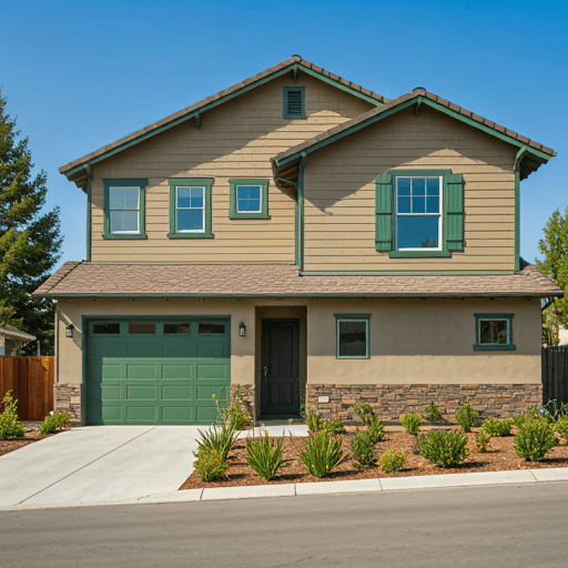
Create a harmonious, nature-inspired exterior by pairing Accessible Beige with deep green. This combination evokes a sense of tranquility and connection to the outdoors. Incorporate deep green in:
- Shutters
- Garage door
- Landscaping elements
Monochromatic Schemes with Accessible Beige
Monochromatic color schemes offer a sophisticated and cohesive look for your home’s exterior. When working with Sherwin Williams Accessible Beige, you can create a stunning visual impact by focusing on varying shades and textures within the same color family.
8-Creating visual interest with textures
To avoid a flat appearance when using a monochromatic scheme, incorporate different textures throughout your home’s exterior. Consider the following options:
- Rough-cut stone accents
- Smooth stucco finishes
- Textured siding materials
- Decorative trim work

| Texture | Visual Effect |
|---|---|
| Rough-cut stone | Adds depth and rustic charm |
| Smooth stucco | Creates a sleek, modern look |
| Textured siding | Provides dimension and character |
| Decorative trim | Enhances architectural details |
9-Darker shades for depth
Incorporate darker shades of Accessible Beige to add depth and dimension to your home’s exterior. Some options include:

- Sherwin Williams Mega Greige (SW 7031)
- Sherwin Williams Intellectual Gray (SW 7045)
- Sherwin Williams Ethereal Mood (SW 7639)
Use these darker shades for:
- Shutters
- Front door
- Garage door
- Trim work
10-Lighter shades for highlights
Balance the darker shades with lighter tones to create highlights and accentuate specific areas of your home’s exterior. Consider:
- Sherwin Williams Shoji White (SW 7042)
- Sherwin Williams Alabaster (SW 7008)
- Sherwin Williams Pure White (SW 7005)
Apply these lighter shades to:
- Fascia and soffits
- Window frames
- Porch ceilings
- Decorative columns
Is Tony taupe the same as accessible beige?
No, Tony Taupe and Accessible Beige are not the same color.
While both are neutral tones, Tony Taupe is a deeper, darker shade with richer taupe undertones. Accessible Beige, on the other hand, is a lighter, more subdued color with balanced gray and taupe undertones.
Coordinating Exterior Elements
When using Sherwin Williams Accessible Beige for your home’s exterior, it’s crucial to consider how other elements of your property will complement this versatile color.
Landscaping to enhance the color scheme
Landscaping plays a vital role in enhancing your home’s exterior color scheme. With Accessible Beige as your base, consider the following plant options:
- Evergreen shrubs for year-round color
- Purple or lavender flowers for a subtle contrast
- White blooms to brighten the overall appearance
- Ornamental grasses for texture and movement

| Plant Type | Examples | Effect |
|---|---|---|
| Evergreens | Boxwood, Yew | Provide structure and consistency |
| Purple/Lavender | Lavender, Russian Sage | Create gentle contrast |
| White Flowers | Hydrangeas, Gardenias | Brighten and highlight |
| Ornamental Grasses | Fountain Grass, Maiden Grass | Add texture and movement |

Shutters and accent pieces
Shutters and other accent pieces can significantly impact your home’s appearance. For Sherwin Williams Accessible Beige exteriors, consider:
- Dark brown or black shutters for a classic look
- Navy blue shutters for a coastal vibe
- Sage green accents for a nature-inspired palette
- White trim to create a crisp, clean appearance
Front door options
Your front door is an excellent opportunity to make a statement. Complementary colors for an Accessible Beige exterior include:
- Deep red for a bold, welcoming entrance
- Charcoal gray for a modern, sophisticated look
- Teal or turquoise for a pop of unexpected color
- Dark wood stain for a natural, earthy feel
Roof color considerations
The roof is a significant part of your home’s exterior and should harmonize with Accessible Beige. Consider these options:
- Charcoal or dark gray shingles for a contemporary look
- Brown or tan shingles to create a warm, cohesive appearance
- Slate blue for a subtle contrast that complements the beige tones
By carefully coordinating these exterior elements with Sherwin Williams Accessible Beige, you can create a harmonious and attractive home exterior that stands out in your neighborhood.
Lighting and Accessible Beige
When choosing Sherwin Williams Accessible Beige for your home’s exterior, it’s crucial to consider how lighting affects its appearance. This versatile color can transform dramatically under different lighting conditions, making it essential to understand its behavior throughout the day and seasons.
Seasonal changes in appearance
Accessible Beige undergoes subtle shifts as the seasons change:
- Spring/Summer: Appears lighter and warmer
- Fall: Takes on a slightly golden hue
- Winter: Can look cooler and more gray-toned
| Season | Appearance |
|---|---|
| Spring/Summer | Lighter, warmer |
| Fall | Slightly golden |
| Winter | Cooler, more gray |
Artificial lighting considerations
The type of artificial lighting you use can significantly impact how Accessible Beige looks on your home’s exterior:
- Warm white LED lights: Enhance the beige undertones
- Cool white LED lights: Bring out the gray notes
- Halogen lights: Create a warmer, more inviting appearance
- Sodium vapor lights: May cause the color to appear more yellow
How natural light affects the color
Natural light plays a crucial role in how Sherwin Williams Accessible Beige appears throughout the day:
- Morning: Soft, warm glow
- Midday: Brightest and most neutral appearance
- Afternoon: Takes on a slightly warmer tone
- Evening: Deepens and becomes more muted
To ensure you’re happy with your color choice, it’s recommended to observe Accessible Beige at different times of day and under various lighting conditions before committing to it for your home’s exterior. This will help you anticipate how the color will look year-round and ensure it meets your expectations.
Practical Tips for Using Accessible Beige
Now that we’ve explored various color combinations and considerations for Accessible Beige, let’s dive into some practical tips to ensure you make the most of this versatile exterior color.
Maintaining the color over time
Accessible Beige, like any exterior paint, requires proper maintenance to retain its beauty. Here are some tips to keep your home looking fresh:
- Clean the exterior annually with a pressure washer or soft brush
- Touch up any chips or scratches promptly
- Apply a fresh coat every 5-7 years, depending on climate conditions
Neighborhood and HOA considerations
Before committing to Accessible Beige, consider these factors:
- Check HOA guidelines for approved colors
- Observe neighborhood trends to ensure your choice complements surrounding homes
- Consider the resale value impact of your color choice
Considering your home’s architecture
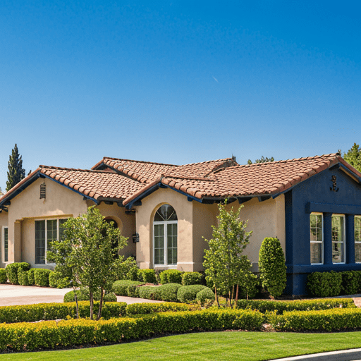
Accessible Beige works well with various architectural styles, but here’s how to optimize its use:
| Architectural Style | Recommended Approach |
|---|---|
| Colonial | Pair with crisp white trim |
| Mediterranean | Use with terra cotta accents |
| Modern | Combine with dark gray or black trim |
| Craftsman | Accent with earthy greens or browns |
Testing samples on your exterior
Before making a final decision, follow these steps:
- Purchase sample sizes of Sherwin Williams Accessible Beige
- Paint 2-3 foot squares on different sides of your home
- Observe the color at various times of day and in different weather conditions
- Compare with trim and accent color samples
- Take photos to review and share with family or designers