I know you must be feeling so overwhelmed about what Sherwin-Williams neutral shade you should pick.Dont worry I was too before painting my room. Swirling through popular choice and expert advice can make you feel so confused. Or you are just confused about choosing Sherwin Williams Accessible Beige or Sherwin Williams Agreeable Gray.Read through …!! You will find you answer.
These two neutral shades are widely used, but are they truly “ruining homes?” They can if you choose the wrong color with them or don’t match the rest of your theme accordingly.
RELATED BLOG
- 9-Black Goes Well with Accessible Beige Sherwin Williams-Selected by Interior Experts
10 Popular Sherwin Williams Accessible Beige Exterior Color Combinations
Base Colors & Undertones
Sherwin-Williams Accessible Beige is a warm greige paint (beige with gray undertones). On the wall it reads as a soft, warm beige with just a touch of gray/green (no yellow or orange).
On the other side, Agreeable Gray is a true greige that “favors gray over beige”. It appears as a light warm gray with soft beige/taupe undertones. In short, AB is a beige base with grayish-green cast, on other side Agreeable gray is a gray base with a little warm beige tint. (For reference, SW Accessible Beige’s hex is #D1C7B8 and SW Agreeable Gray’s is #D1CBC1.)
Light Reflectance (LRV) and Brightness
Accessible Beige has an LRV of 58, placing it in the middle of the light range. Agreeable Gray’s LRV is 60, making it very slightly lighter. What I observed is this both agreeable gray and accessible beige reflect good amount of light as both are neutral colors ,but not that much white.I mean they are far away from white.
Because Accessible beige can appear little darker than Agreeable gray in the same light because of its lower Lrv. Both seems neutral in dim light but if the light is bright the accessible beige is little darker than we expect it to be in the light.
Effect of Lighting
Both paints are famously chameleon‑like under different light. In bright south- or west-lighted rooms, each will warm up slightly – AG takes on a bit more beige/warmth (sometimes looking similar to a warmer gray like Edgecomb Gray), while AB will appear lighter and creamy.
In north-facing or low-light spaces, the opposite happens: AG “cools down slightly” (its gray side becomes more obvious), and AB “grays out” just enough to stay cozy but never cold.
In very dark or artificial-light rooms, both can look muddy or drab. One blogger notes that AG “looked dark and dreary” in poorly lit hallways and needed bright white trim to pop. Similarly, Accessible Beige “can look a bit dull and murky” if there isn’t adequate light. In summary: use the lighter room for either, and be aware that AB will maintain warmth in north light better than many cool grays.
Room Suitability
Both neutrals are extremely rich. Accessible Beige is often used in living rooms, bedrooms, kitchens, and bathrooms where a warm, and homey feel is desired. Its warm-beige feel makes a room feel cozy (good for bedrooms and lounges), but it’s also bright enough for open-plan kitchens and halls.
Agreeable Gray can be used virtually anywhere – living rooms, kitchens, bedrooms, nurseries, even basements. It’s light enough for a kitchen or hallway (where it provides subtle contrast against white cabinets or trim) but not so pale as to read “just off-white” in a bedroom or living space.
In practice, AG is a favorite for main living areas and open-concept homes (it “creates a cool, blank slate” for decor), whereas AB is popular in spaces where a warm neutral backdrop is wanted (and is even used on kitchen walls to pair with white cabinets).
Style Compatibility
For traditional, farmhouse, and transitional, accessible beige works very well. It creates a classic vibe for wood tones, brass accents, and vintage or cottage furnishings. It also works in contemporary or minimalist spaces when paired with crisp whites and clean lines.
If you are thinking that agreeable gray will mostly go with industrial style than you are totally wrong cuz its everywhere as I said before .It can be used in farmhouse ,modern ,sleek , even boho homes also in transitional.I m just so socked by Sherwin Williams this paint color that its actually everywhere and, Iif you ask me than its my favorite one.I just love it….!!! no debate .
Pros and Cons
Both paints share versatility, but differ in strengths.
Accessible Beige
Pros: It is a true warm greige that never looks cold or stark. It can be used whole-home (interior or exterior) to create a cohesive warm backdrop. It keeps spaces feeling bright yet warm and inviting.
Cons: Its relatively low LRV (58) means it can look a bit heavy in low light or small spaces. It may come across muddy in dark rooms, so it’s not ideal for windowless areas. Also, being on the warmer side, it won’t fit a very cool, modern or industrial scheme. It’s generally not recommended as an interior trim color (too deep for trim).
Agreeable Gray
Pros: Its “non-committal” undertones make it extremely flexible, working in almost any room or style. With LRV 60 it’s a good mid-tone that reflects ample light. It “suits a wide range of exterior finishes” and is forgiving with popular white trims. Its popularity means lots of design ideas and paired colors.
Cons: In very low-light rooms it can look “drab, dingy and flatter”. It can also pick up a slight green or violet cast under certain conditions (though this is rare). If your furnishings have strong purple/pink undertones, Agreeable Gray might clash (it shows green relative to violet). But overall, AG’s biggest drawback is only that it may be too neutral – some people find it lacks the warmth of a true beige.
Comparison Summary
| Feature | Accessible Beige (SW 7036) | Agreeable Gray (SW 7029) |
|---|---|---|
| Base Color | Warm beige (greige): a soft beige with subtle gray/green undertone | Cool gray (greige): a warm gray with slight beige/taupe undertone |
| LRV (Light Value) | 58 (mid-range) – on the lighter side but not bright white | 60 (mid-range) – slightly higher, very light gray |
| Appearance in Light | Warm and creamy in sunlight; grays down in shade/north light (but stays warmer than pure gray Can look dull in very low light | “At its best” in south light (soft greige/taupe) cools noticeably in north light. Tends to look darker/muddy in dim light. |
| Rooms/Use | Excellent for living rooms, bedrooms, open kitchens/dining, even baths – any space needing cozy warm. Works whole-home for flow. | Great for all rooms: living rooms, kitchens (makes white cabinets pop)bedrooms, offices, basements, etc Works as a whole-house neutral. |
| Styles | Traditional, farmhouse, transitional, cozy/cottage. Complements wood, brass, and warm whitesNot typical for stark modern/industrial. | Extremely versatile: modern, transitional, farmhouse, boho, minimalist, etc Provides a neutral backdrop for art and furnishings. |
| Trim/Accents | Best with warm whites (Alabaster SW 7008, Aesthetic White, Extra White) on trim/cabinets Contrasts nicely with medium grays (Dovetail SW 7018) or blues (Cadet SW 9143). Natural wood and brass also pop against it. | Pairs well with bright whites (Pure White SW 7005, Extra White SW 7006) to keep spaces crispAccents in dark gray/black (Iron Ore, Tricorn Black) or jewel tones (navy SW 6244, forest green) complement it. |
| Pros | Warm and friendly; makes spaces feel inviting. Good for whole-home coordination. Resists appearing cold. Works beautifully with warm wood and white trim | Exceptionally versatile; one of SW’s most popular neutrals. Flexible undertones work in any decor.Great mid-tone LRV (60) gives good light without looking washed out. Elevates white trim. |
| Cons | LRV 58 may be too dark in small/dim areas Can look “muddy” without enough light. Too warm for ultra-modern/industrial schemes. Not ideal as interior trim (too deep) | In low light can look muddy/drab. Slight green/purple flash possible in certain light (rare). May be too cool (gray) for those wanting a true beige. |
What colors go well with Sherwin Williams Accessible Beige (SW 7036) paint color?
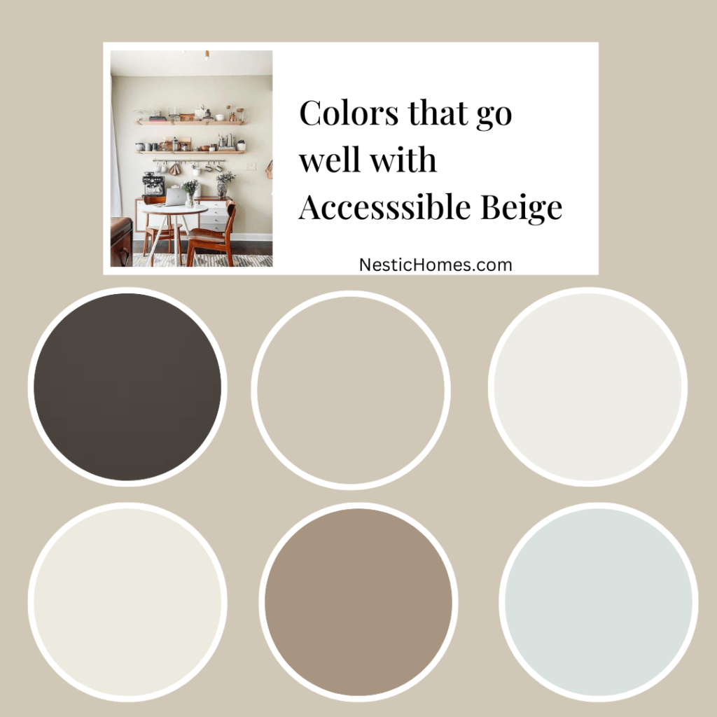
Pure white with Accessible Beige
- Pure White (SW 7005): This clean white creates a bright and airy feel, ideal for trim, ceilings, and accent walls.
- Alabaster (SW 7008): A softer white option, Alabaster offers a touch of warmth while remaining light and versatile.
Bold Accents with Accessible Beige
- Sea Salt (SW 6217): This calming, muted blue-green adds personality without being overwhelming.
- Black Fox (SW 9000): A dramatic black creates a statement and adds depth when used sparingly as an accent.
Earthy Tones with Accessible beige
- Sanderling (SW 7513): This light, warm gray complements the beige beautifully and creates a cozy atmosphere.
- Agreeable Gray (SW 7036): Yes, even Agreeable Gray can work! Paired with Accessible Beige, it creates a sophisticated and cohesive look.
What colors go well with Sherwin Williams agreeable gray?
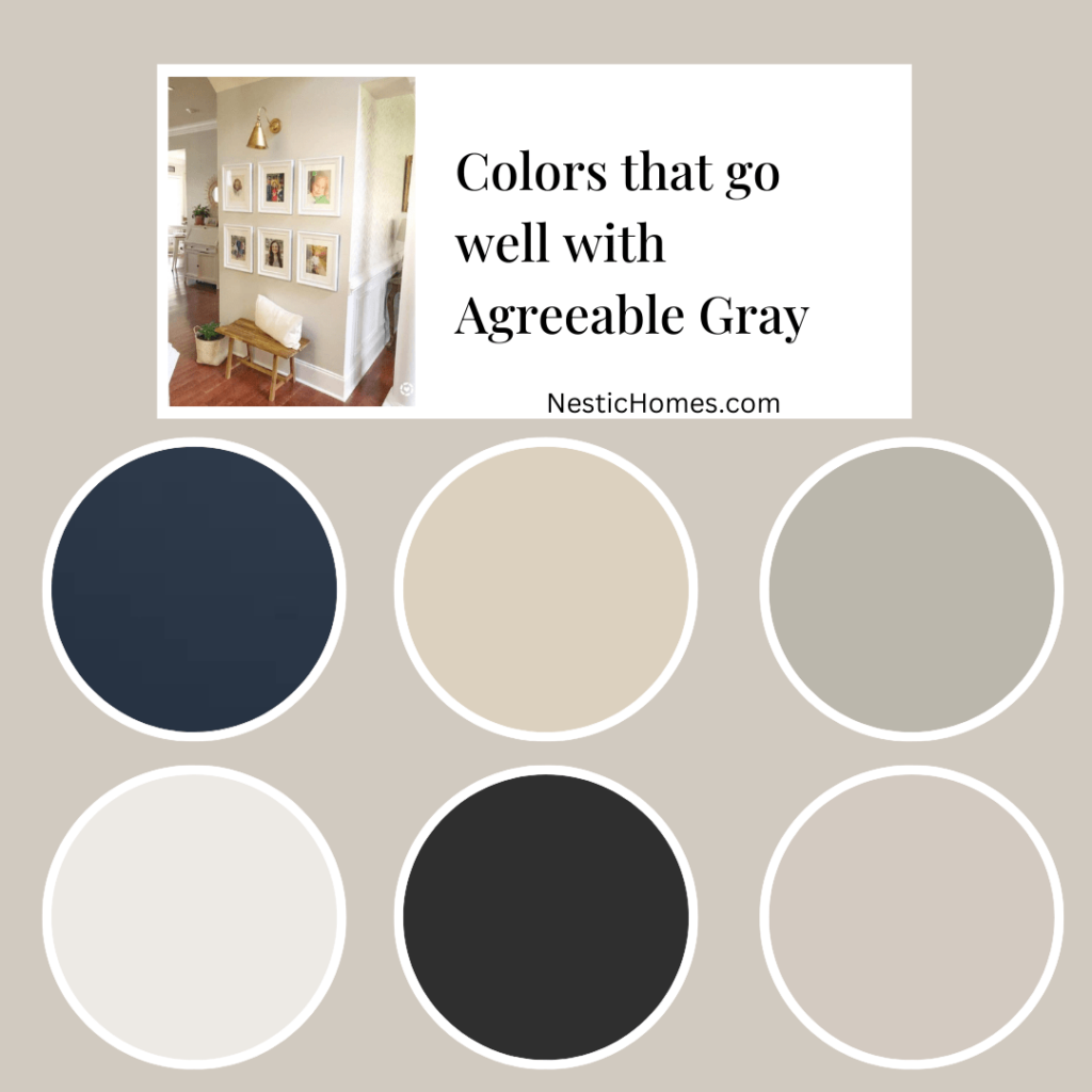
- Pure White (SW 7005): This classic white creates a clean and modern aesthetic, perfect for trim and ceilings.
- Snowbound (SW 7004): A cooler white than Pure White, Snowbound offers a crisp and contemporary feel.
Accent colors with agreeable gray
- Hale Navy (SW 6244): This rich navy blue adds a touch of sophistication and drama, ideal for accent walls or furniture.
- Black Magic (SW 6258): Similar to Black Fox, Black Magic provides a dramatic statement but with a slightly cooler undertone.
Warmer Tone
- Mindful Gray (SW 7039): This warmer gray complements Agreeable Gray nicely, creating a cozy and inviting atmosphere.
- Creamy (SW 7531): This soft cream adds a touch of warmth and richness, making it ideal for accent walls or furniture.
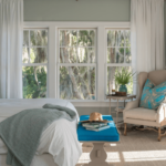
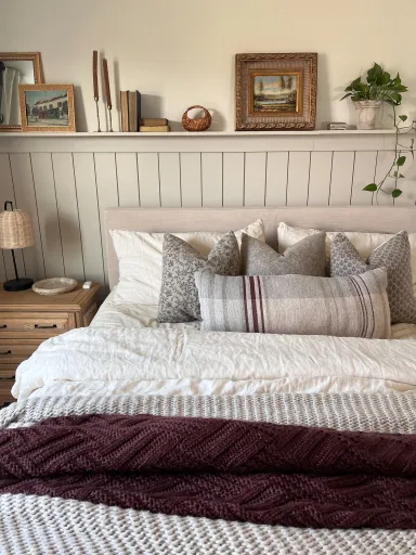
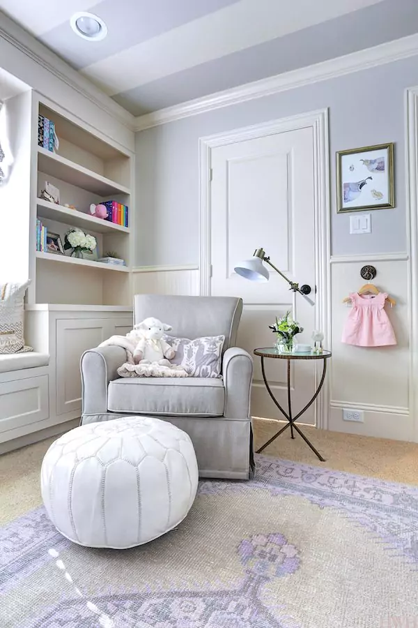
Accessible Beige vs Agreeable Gray Bedroom
Accessible Beige
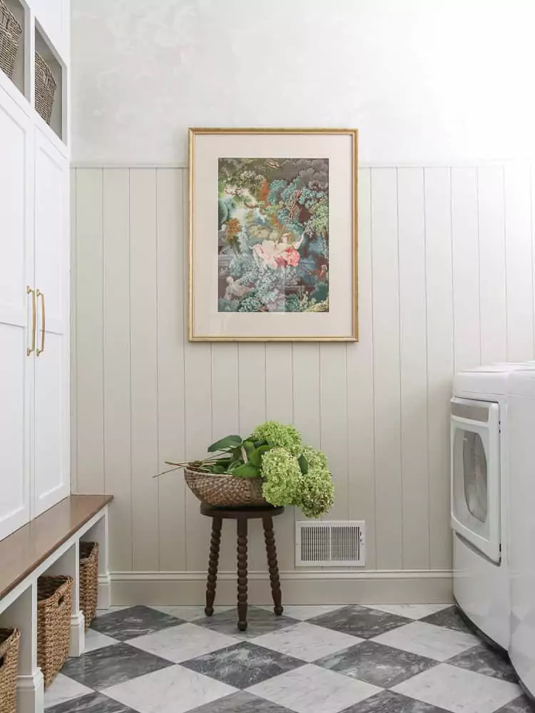
Agreeable Gray
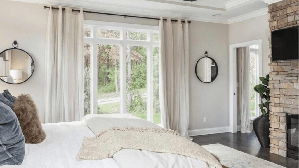
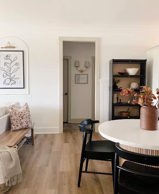
Accessible Beige vs Agreeable Gray livingroom
Accessible Beige
Agreeable Gray
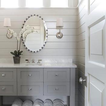
Accessible Beige vs Agreeable Gray Bathroom
Accessible Beige
Agreeable Gray