Last updated on July 19th, 2025 at 10:52 am
Minor differences between Iron Ore and Tricorn Black can make a significant impact on your space. Whether you’re planning to refresh your living room, add drama to your exterior, or create a statement wall, understanding these nuances is crucial.
Sherwin-Williams Iron Ore (SW 7069) is a deep charcoal gray (LRV ~6) with little cool/greenish undertones.In good light it feels like a rich, dark gray; in dimmer light it can nearly look black, though it always retains a charcoal cast .
Sherwin’s Tricorn Black (SW 6258) is the company’s blackest black (LRV ~3). It is a true neutral black with virtually no visible undertone In practice, Tricorn Black appears an uncompromising, inky black in virtually any lighting, whereas Iron Ore will often reveal a slight blue-green or olive tint under certain conditions.
In this Blog post I will tell you about the main and important differences of Tricorn black and iro ore like undertones,lrv,color effect in light also use in different spaces like bedroom ,livingroom ,bathroom and also on cabinets and exterior with coordinating colors.
What are the undertones of SW Tricorn black SW iron ore?
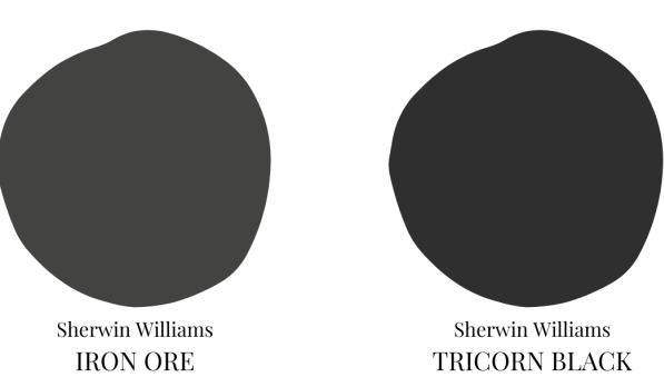
Iron Ore reflects more light than Tricorn. Its LRV is about 6 (on a 0–100 scale), versus Tricorn’s 3. That means Iron Ore appears a touch softer – it can look like a charcoal gray – while Tricorn absorbs most light and reads as an intensely saturated black.
Lightning effect on Tricon black and Iron ore
Under natural light, Iron Ore usually shows its gray-blue character, becoming a deep charcoal. Under artificial or low light, it can look almost black or with a muted greenish cast. Tricorn Black, by contrast, “maintains a true black appearance” in most lights. Its neutral undertone means it never shifts toward brown or blue; it simply stays black.
| Lighting Condition | SW Iron Ore | Tricorn Black |
|---|---|---|
| Natural Light | Deep charcoal gray | True black |
| Artificial Light | Softer, muted tone | Slightly cooler black |
Light Reflectance (LRV) – Iron Ore LRV ≈6 vs. Tricorn Black LRV ≈3. Lower LRV means darker color.
Undertones – Iron Ore often has subtle blue-green (sometimes warm-olive) undertones; Tricorn Black is a true neutral with no obvious undertones.
Appearance by lighting – In bright light Iron Ore reads as a sophisticated dark gray; in dimmer light or heavy shadow it can read nearly black. Tricorn Black remains consistently very dark across lighting conditions.
Overview of each color:
| Characteristic | SW Iron Ore | Tricorn Black |
|---|---|---|
| LRV (Light Reflectance Value) | 6 | 3 |
| Undertones | Subtle brown | Neutral |
| Intensity | Strong | Very strong |
| Mood | Dramatic, grounding | Bold, sophisticated |
10 Popular Sherwin-Williams Black Paint Colors for Every Space-2025
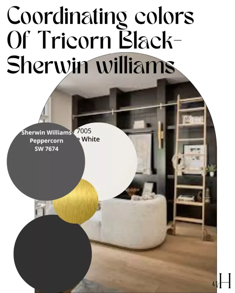
Coordinating Colors for Tricorn black and Iron Ore
Both Iron Ore and Tricorn Black pair beautifully with a range of colors. Here are some palette ideas:
Soft / Muted Palettes
Use gentle neutrals and earth tones to soften the intensity. For Iron Ore, pair it with greige neutrals and light pastels: colors like Agreeable Gray (warm light gray), Pure White, or a muted blue-green (Sea Salt) create a harmonious, soothing scheme. (Iron Ore + Agreeable Gray, for example, warms up the charcoal slightly.)
For Tricorn Black, softening colors include crisp off-whites (e.g. High Reflective White or Soft Cotton), warm creams, or light tans (Classic Light Buff). These light neutrals offset the black and keep spaces feeling open. Muted accent colors like pale sage or blush can also complement both Iron Ore and Tricorn.
Bold / High-Contrast Palettes
Make a statement by contrasting with bright or saturated colors. With Iron Ore, use stark white trim or furnishings to accentuate its depth, and consider bold accent pieces (deep navy pillows, mustard rug, emerald art) for pops of color. Metallic accents (brass hardware, gold lighting) enhance Iron Ore’s warmth.
With Tricorn Black, pair it against pure white for maximum impact – high contrast black-and-white schemes are very striking. Vivid jewel tones (deep blue like SW Waterloo, rich emerald or ruby) will “pop” dramatically against Tricorn Black.
For a modern look, Tricorn Black also complements cool metals (chrome, stainless steel, polished nickel) and bold graphic patterns.
Coordinating Palettes (Examples):
- Iron Ore + Peppercorn + Agreeable Gray + Pure White (a monochromatic, layered gray palette).
- Iron Ore + Sea Salt (soft gray-green) + natural wood + brass (earthy, organic feel).
- Tricorn Black + Snowbound White trim + Classic Light Buff walls (warm neutral scheme).
- Tricorn Black + crisp White + bold accent color (deep blue, emerald, or bright yellow) for a lively contrast.
In short, Iron Ore is versatile with both warm and cool tones – it works well with earthy greens/blues and metallic golds, while Tricorn Black excels as a neutral base that can support any accent color or style (from minimalist white to vibrant jewel tones).
| Color | Contrast Effect | Best Paired With |
|---|---|---|
| SW Iron Ore | Softer, more subtle | Light grays, creams, whites |
| Tricorn Black | Bold, striking | Bright whites, vibrant accents |
Black Magic vs Tricorn Black-Which One is right for You?
Ideal spaces for Tricorn Black and Iron Ore
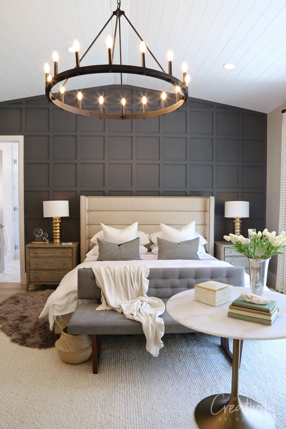
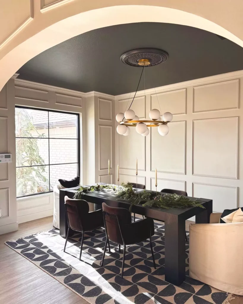
Living Rooms / Bedrooms
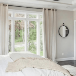
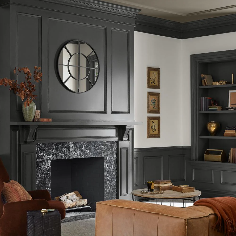
Iron Ore provides a moody backdrop in living areas or master bedrooms. Designers often paint one wall or a fireplace wall in Iron Ore to create drama without overpowering the space .
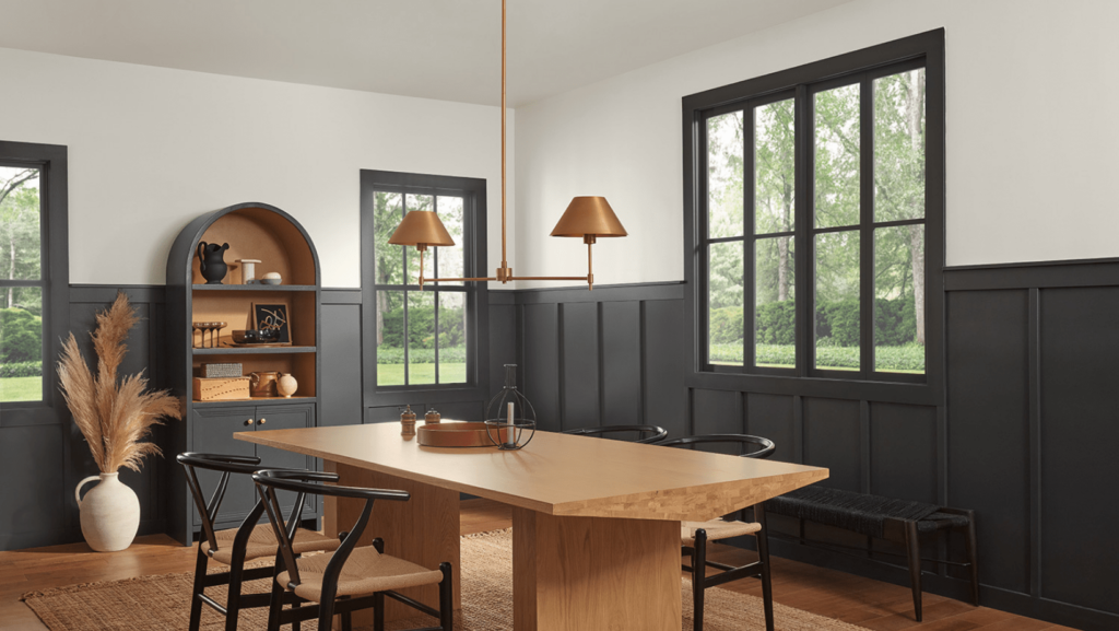
Tricorn Black, being deeper, is typically used as an accent (e.g. a single wall or built-in cabinetry) to give a bold statement. Accent walls in living rooms or bedrooms look striking in Tricorn Black. (Avoid painting an entire small room black—Tricorn can feel heavy on all walls
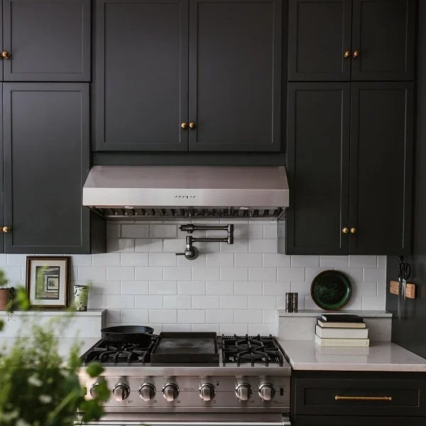
Tricorn black and iron ore in Kitchens
Tricorn Black is popular for modern cabinetry or islands. It is often used on kitchen cabinets or an island for a sleek, contemporary look. Iron Ore can also be used on lower cabinets or an island; one designer notes “Iron Ore is a great choice for your kitchen island.
it gives the same effect and pop [as navy] in a more neutral way”. Both colors pair well with light countertops (e.g. white or marble) for contrast.
Iron Ore and Tricorn black on Cabinets & Furniture
Tricorn Black is frequently chosen for doors, trim, built-ins and painted furniture because of its neutrality. Iron Ore is slightly lighter, so it’s sometimes used on interior doors or shelves to warm up a space.
One reviewer suggests Iron Ore is “a little less trendy and more neutral than… navy” but still provides strong contrast.
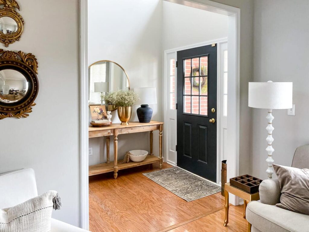
Doors (Interior & Exterior)
Both colors are excellent for doors. Tricorn Black is a classic choice for interior or exterior doors, offering a crisp contrast to white trim. Iron Ore on doors gives a softer, charcoal look.

SW Iron Ore Libraries or reading nooks .
Bathrooms
Similar logic applies to bathrooms. Tricorn Black can be used on vanities, cabinetry or even a bathroom accent wall to add depth. Iron Ore can lend a spa-like charcoal tone on walls or vanity surfaces. Either color should be balanced with ample lighting or lighter tile/wall surrounds to avoid a cave-like feel.
Exterior Uses
Both colors are popular on modern exteriors, but their roles differ:
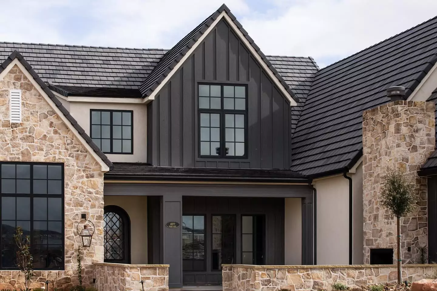
- Iron Ore: This deep gray (with a hint of brown-green) is commonly used as a primary siding color on homes. It “works great as a whole-home neutral” and complements greenery and natural materials. One designer calls Iron Ore “a superb choice for exteriors if you want a rich charcoal color”. It’s durable and more forgiving of dirt than pure black. Iron Ore is often paired with lighter trim (white or off-white) for contrast on exteriors.
- Tricorn Black: This true black is typically used for trim, shutters, doors and accents, not usually the entire façade. It adds bold, sophisticated contrast – ideal for front doors or exterior details. In fact, Tricorn Black is “in high demand as an exterior trim color, particularly on the front door”. It works beautifully on modern homes (sharp window trim, railings, planters, etc.) to provide dramatic definition. However, keep in mind pure black shows dirt more than Iron Ore.
Examples: Tricorn Black front doors are a classic choice on both historic and contemporary homes. Iron Ore exteriors often appear in homes with natural stone or wood accents, as the charcoal grounds the palette without feeling stark. Both colors can be used for siding, shutters, trim, doors and even metal roofs or gutters for a cohesive exterior scheme.
Both colors can be used for a variety of exterior applications, including:
- Trim
- Accents
- Doors
- Shutters
- Siding
In summary, Iron Ore often serves as a deep gray accent (especially in dining rooms, hallways, libraries, entryways), whereas Tricorn Black is used when maximum contrast is desired (accent walls, cabinetry, trim, door frames).
Durability and Maintenance Considerations
- Tricorn Black: Tricorn Black is a very dark color, which can show dirt and wear more easily than lighter colors. If you are concerned about maintenance, you may want to consider a lighter color.
- SW Iron Ore: SW Iron Ore is a more forgiving color than Tricorn Black. It is less likely to show dirt and wear, and it is also easier to touch up if necessary.
Tricorn Black for Trim and Accents
Tricorn Black is a great choice for trim and accents. It can add a touch of drama and sophistication to your home’s exterior. It is also a good choice for modern homes with clean lines.
SW Iron Ore for House Exteriors
SW Iron Ore is a popular choice for house exteriors. It is a versatile color that can complement a variety of architectural styles. It is also a good choice for homes with a lot of greenery.
Color Comparisons
Iron Ore vs. Peppercorn (SW 7674)
Peppercorn is a softer charcoal with LRV ~10 (Iron Ore ~6). Peppercorn is a pure gray with no strong undertones (RGB=88,88,88), so it usually looks more like a medium charcoal. Iron Ore is darker and can show subtle color shifts (bluish or olive). In practice, Peppercorn will not look truly black in any light; Iron Ore can appear almost black in some settings. Peppercorn is often chosen as a lighter “companion” or monochromatic partner to Iron Ore.
SW Iron Ore vs. BM Iron Ore (and other Benjamin Moore dupes)
Benjamin Moore’s “Iron Ore” is actually a different color (a warm reddish-gray) and not a match. However, BM offers colors similar to SW Iron Ore: for example, BM Notre Dame (CSP-570) is considered the closest match. BM Deep River (1582) is also close but leans a bit greener than Iron Ore. Another close BM alternative is BM Wrought Iron (2124-10). These BM colors have LRVs in the 7–8 range (vs 6 for Iron Ore) and reproduce the deep charcoal look.
Iron Ore vs. Urbane Bronze (SW 7048)
Urbane Bronze is a warm, brown-tinged gray (SW’s 2021 Color of the Year), whereas Iron Ore is a cooler gray-blue charcoal. Urbane Bronze usually reads as a brownish charcoal and sometimes greenish; Iron Ore tends to look gray-blue. The two can be similar in certain lights, but Urbane Bronze is noticeably browner and often appears warmer overall.
Iron Ore vs. Black Magic (SW 6991)
Black Magic is a true black with a high saturation (LRV ~3), only slightly softer than Tricorn Black. It never shows gray, brown, or blue undertones like Iron Ore can. In other words, Black Magic is very black, while Iron Ore is decidedly a dark gray. Black Magic’s LRV (3) is much lower than Iron Ore’s (6), so Black Magic will appear deeper and more absolute in color.
Tricorn Black vs. Caviar (SW 6990)
Both Tricorn and Caviar are true black paint colors (LRV ~3). The key difference is undertone: Caviar has a tiny warm brown undertone, so in some light it can read slightly brownish, whereas Tricorn Black has no detectable undertone.
This makes Tricorn somewhat more versatile; it will never shift color depending on lighting or decor, whereas Caviar might pull a touch warm. In practice, Tricorn Black and Caviar look almost identical at a glance, but designers note that Tricorn is the “cleanest” neutral black.
Frequently Asked Questions
What is Sherwin-Williams’ darkest black?
Tricorn Black (SW 6258) is Sherwin-Williams’ deepest black. According to SW, it is one of their “truest blacks” and their darkest shade of black, with almost no undertones. It has the lowest LRV (3) of any standard SW black.
Is Tricorn Black a true black?
Yes. Tricorn Black is essentially as close as you can get to a “true black” in paint. It is a neutral black without noticeable warm or cool tints. Designers describe its lack of undertones as what makes it so flexible and foolproof.
Why is Tricorn Black so popular?
Its popularity stems from its versatility and neutrality. Because it’s a pure black with no obvious undertones, it pairs with any color scheme and style. It provides dramatic contrast (especially with white) and looks sharp anywhere.
Many modern homes use it on trim or accent features. One SW blog calls it the “go-to hue that can do anything,” while designers note it never clashes with other colors.
Can Tricorn Black be used on a front door?
Absolutely. Tricorn Black is highly favored for front doors and exterior accents. Its depth adds instant curb appeal and formality. For example, a design guide notes Tricorn Black is “in high demand as an exterior trim color, particularly on the front door”. It works equally well on modern and traditional homes, and its neutral tone ensures it complements the surrounding facade colors.
Is Iron Ore gray or black?
Iron Ore is a very dark gray, not a pure black. In natural light it reads as a charcoal or deep gray-blue, and even at its deepest (like in shadow or on accent walls) it retains a gray cast.
One paint expert emphasizes that Iron Ore “will never predictably look black” – in good lighting it will always show as some shade of charcoal gray. So while it’s often used as a nearly-black hue, it’s fundamentally a dark gray with subtle undertones.
What Benjamin Moore colors compare to Black Magic or Tricorn Black?
Benjamin Moore’s lineup of very dark neutrals includes “Black” (2132-60) and “Black Beauty” (2128-10). According to a color-matching resource, BM Black (HC-190) is very similar to Sherwin’s Tricorn Black.
For Black Magic, there is no exact BM equivalent cited, but BM Black Beauty (2128-10) is one of BM’s deepest blacks and often mentioned alongside SW’s darkest blacks (though it is slightly lighter than Black Magic). In general, the darkest BM blacks (Black, Black Beauty) are the closest matches to Sherwin’s “true black” shades.