Last updated on August 14th, 2025 at 07:23 am
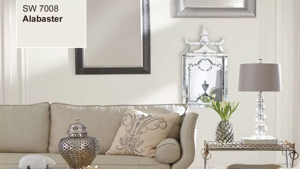
Do you have any idea what that timeless white paint color does to instantly enhance a space and make everything appear effortlessly fashionable? That’s Sherwin Williams Alabaster (SW 7008) for you. This site is the best place to learn about and utilize Sherwin Williams Alabaster to give your home personality, warmth, and light.
Alabaster may be used to create any style you want, whether it’s cozy, modern, or historic. What sets it apart, compare it to similar whites, such as Sherwin Williams Pure White, and demonstrate how to use it in different settings.
What is Sherwin Williams Alabaster?
The past couple of years have seen a BIG surge in white walls – Sherwin Williams Alabaster (SW 7008) is the creamy, perfect, neutral white. In 2016, Sherwin-Williams went so far as to name it the Color of the Year. But why is this pretty color so loved by both homeowners and designers alike?
Alabaster is in Sherwin Williams’ “Whites and Pastels” collection, and it’s not your typical white. Far from appearing cold, however, this light slope of warm gray and clean white appears anything but sterile, although lighting plays a role in the perception of these hues.
Here’s why Alabaster is gaining so much attention:
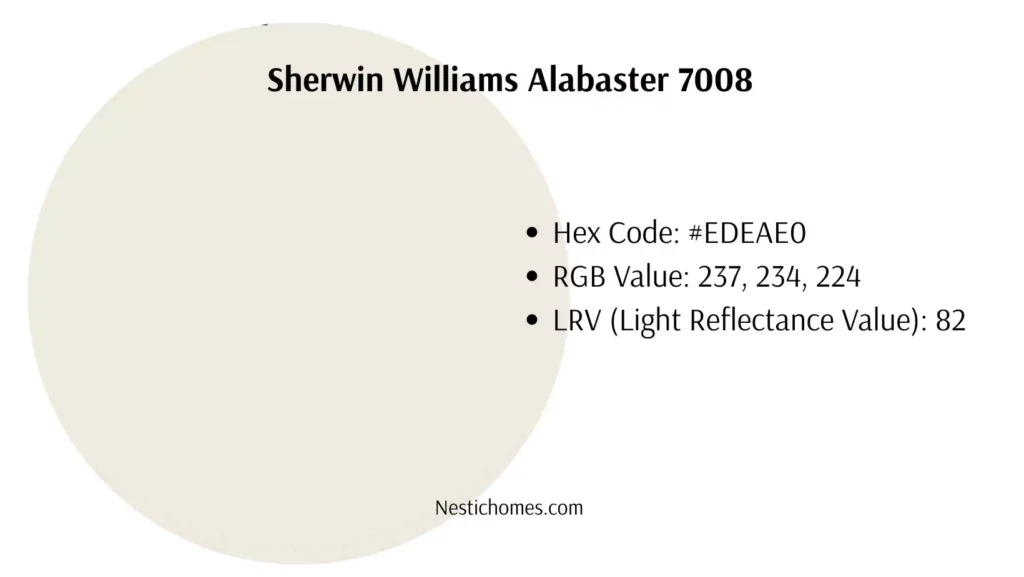
- Hex Code: #EDEAE0
- RGB Value: 237, 234, 224
- LRV (Light Reflectance Value): 82
The LRV is particularly important because it tells you how much light the color reflects. With a high LRV of 82, Alabaster bounces light around beautifully without being overly bright or blinding.

Where to Use Sherwin Williams Alabaster
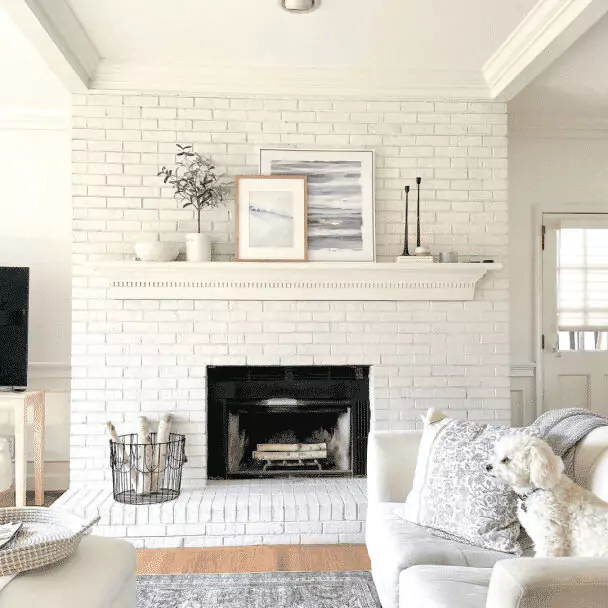
Alabaster shines in a variety of rooms and spaces. Whether it’s your bedroom, living room, kitchen, or even your home’s exterior, this versatile color creates a calm, clean backdrop that complements virtually any design style.
Why Choose Alabaster Over Traditional Whites?
Alabaster is your answer if you’ve been avoiding white because you don’t want your home to look like a surgical room. It’s a very soft white which gives great cozy warmth, compared to stark whites.
When you tire of white, and want a pared down palette that feels cozy, but can instantly be transformed into a wallpapered room by adding a mural, this “livable white” is the perfect choice.
How Alabaster Compares with Other Whites
When choosing a white paint, it can be overwhelming. There are hundreds of shades, and they all look similar on a paint chip. So how does Sherwin Williams Alabaster compare with other popular Sherwin Williams whites, like Pure White (SW 7005) or Extra White (SW 7006)? Here’s a side-by-side breakdown:
1. Sherwin Williams Alabaster (SW 7008) vs Pure White (SW 7005):
- Undertones: Alabaster has warm beige undertones, while Pure White leans cooler with subtle gray undertones.
- Use Case:
- Alabaster is better for creating cozy interiors with warm vibes.
- Pure White is a go-to for modern, sleek spaces.
- Best For:
- Alabaster works well in living rooms and bedrooms.
- Pure White shines in kitchens and bathrooms with stainless steel or cool tones.
2. Sherwin Williams Alabaster (SW 7008) vs Extra White (SW 7006):
- Brightness:
- Extra White is brighter with an LRV of 86 compared to Alabaster’s 82.
- Look:
- Extra White appears crisp, making it great for trim and ceilings.
- Alabaster brings subtle warmth for walls.
- Best For:
- Choose Extra White for contemporary designs with bold accents.
- Use Alabaster for a timeless, soft look across large spaces.
SW Pure White vs. Alabaster
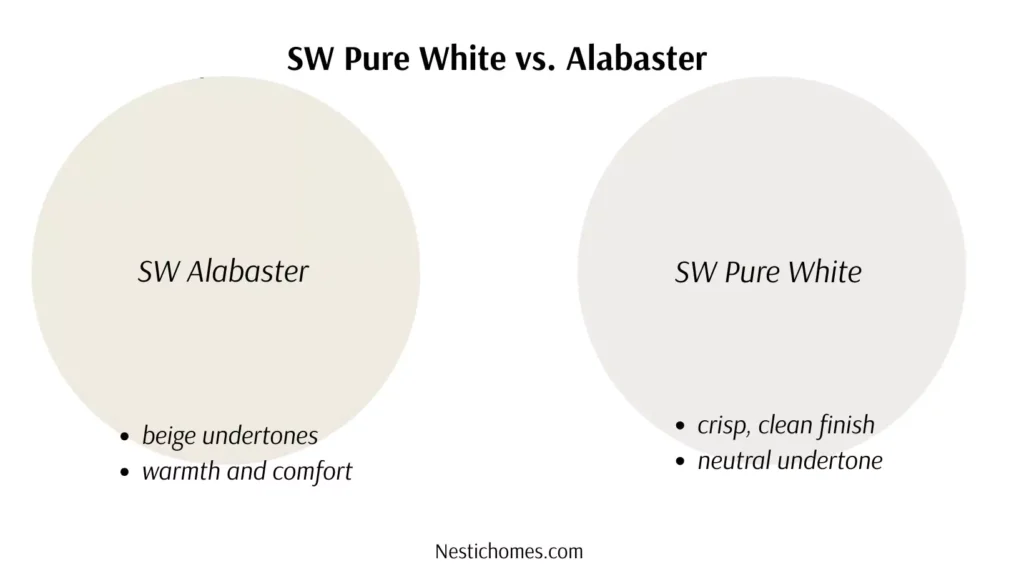
Considering the overall feel and look you want to accomplish in your room should play a part when selecting between SW Pure White and SW Alabaster. SW Pure White is also known for its crisp, clean look which pairs nicely with contemporary styles and complements cool greys or bold accents. It’s a favorite solid choice for today’s kitchens, baths and workstations due to its neutrals and undertones that deliver as a versatile color without being too harsh.
Alabaster, on the other hand, is perfect for rooms that radiate coziness and warmth because of its delicate beige overtones, which give it a softer, creamier appearance. It produces a warm, welcoming ambiance that is ideal for living rooms or bedrooms where a calm, peaceful mood is sought. Alabaster’s subtle refinement promotes calm, while Pure White brings brightness and clarity..
Alabaster vs Swiss Coffee
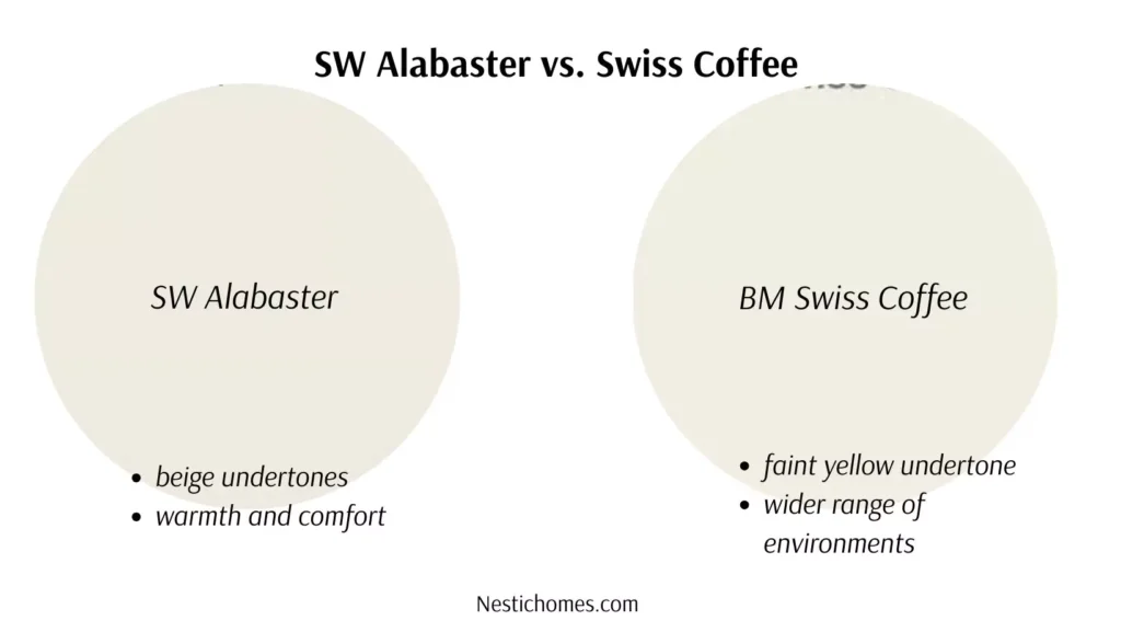
When you put Alabaster next to Swiss Coffee, you notice that both exude a warm, inviting charm, but they really serve different preferences and design aspirations. Alabaster has this soft beige hint that really gives off a cozy, creamy vibe.
In contrast, Swiss Coffee brings a deeper warmth to the table, featuring a hint of yellow that lends itself well to varied styles, perfect for those looking to add a hint of quiet sophistication to their rooms.
While Alabaster excels in settings where relaxation and comfort are prioritized, Swiss Coffee works beautifully in a wider range of environments, pairing effortlessly with both traditional and modern design elements.
Greek Villa vs Alabaster
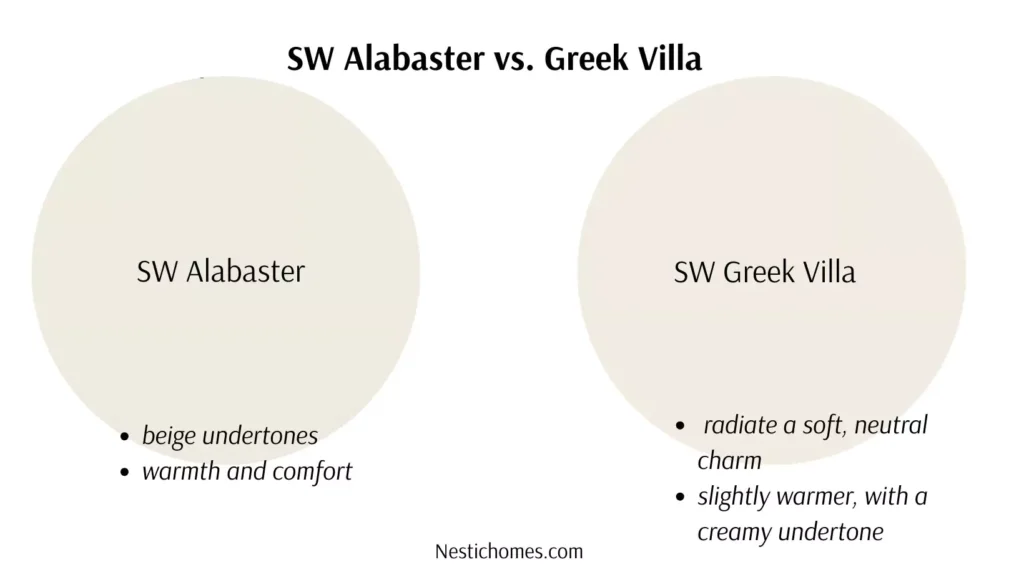
Alabaster and Greek Villa both have a gentle, neutral charm, but they also have particular personalities that set them apart from one another. Greek Villa is a wonderful option for areas that want warmth and brightness because it leans somewhat warmer and has a creamy undertone that produces an inviting, sunlit environment.
Alabaster, on the other hand, has a more subdued tone that promotes sophistication and tranquility and radiates a delicate blend of warmth and coolness. Alabaster looks great in areas that want a calm, classic vibe, while Greek Villa is ideal for establishing a warm, inviting ambiance.
How to Use Sherwin Williams Alabaster in Your Home
Now that you know why Alabaster is so special, how do you bring it into your home? Below are tips for using SW Alabaster to refresh your interiors and exteriors.
1. What Color Trim Works Best with Alabaster Walls?
Choosing the right trim color to pair with Alabaster walls can make all the difference in achieving a polished and harmonious look. For a seamless, monochromatic design, consider using Extra White (SW 7006) as the trim color. Its crisp, clean tone beautifully contrasts Alabaster’s warm softness, creating subtle definition without overpowering the space.
If you prefer a slightly darker, more dramatic effect, try pairing Alabaster with neutral grays like Mindful Gray (SW 7016) or light taupes. These shades add depth while maintaining an elegant, cohesive aesthetic.
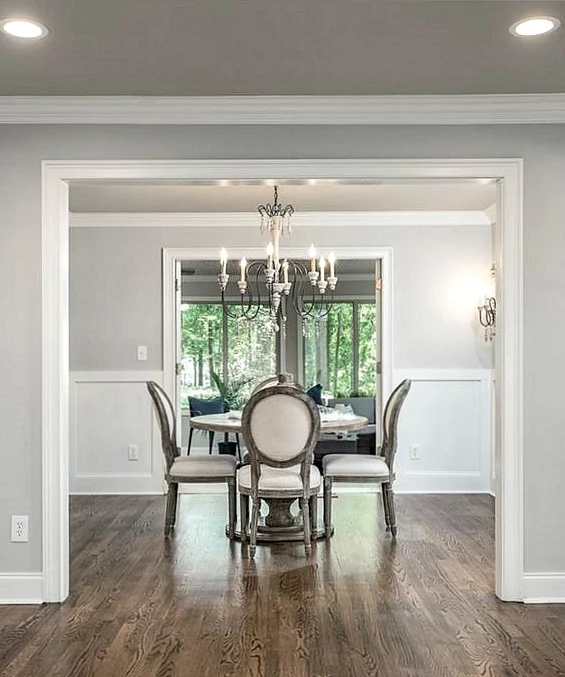
2. Sherwin Williams alabaster in Living Rooms
Alabaster can create a serene yet inviting living room. Pair it with warm wood tones, soft beige accents, and green plants for a cozy, earthy vibe. It’s also a great choice for open-plan living spaces where natural light floods in. The high LRV ensures your room will feel bright and airy without overexposing the light.
- Pro Tip: Use Alabaster on your walls and pair it with Sherwin Williams Pure White for the trim to create a subtle contrast.
3. Sherwin William Alabaster in Kitchen and Cabinets

Want that farmhouse kitchen look? Alabaster is perfect for cabinets or walls paired with brass or black hardware. It complements natural wood or marble countertops beautifully.
- Pro Tip: Combine Alabaster-painted cabinets with a subway tile backsplash in a similar shade for a cohesive, timeless kitchen.
4. Sherwin Williams alabaster in Bedrooms
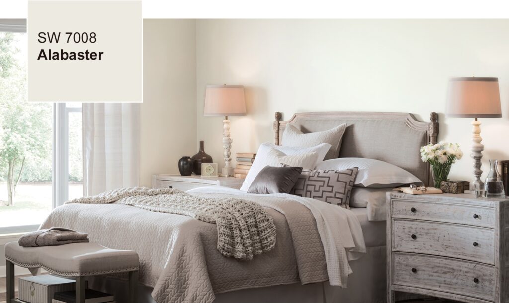
Transform your bedroom into a tranquil retreat by using Alabaster as the primary wall color. Add layers of texture with soft linens, wool throws, and warm metallics like gold or bronze for a touch of luxury.
- Pro Tip: For a monochromatic look, pair Alabaster walls with bedding in shades of cream and light taupe.
5. Sherwin Williams alabaster for Exteriors
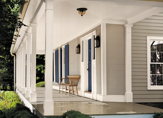
The warmth of Alabaster extends beyond interiors. It makes for a stunning exterior paint color, especially when paired with dark shutters or trim in colors like charcoal or navy.
- Pro Tip: Use Alabaster for the main body and Sherwin Williams Tricorn Black (SW 6258) for shutters and accents for a classic curb appeal.
Cordinationg Colors with Sherwin Williams Alabaster
Choosing the right complimentary colors makes all the difference. Here are some tones that pair beautifully with Alabaster:
Neutrals colors with SW Alabaster
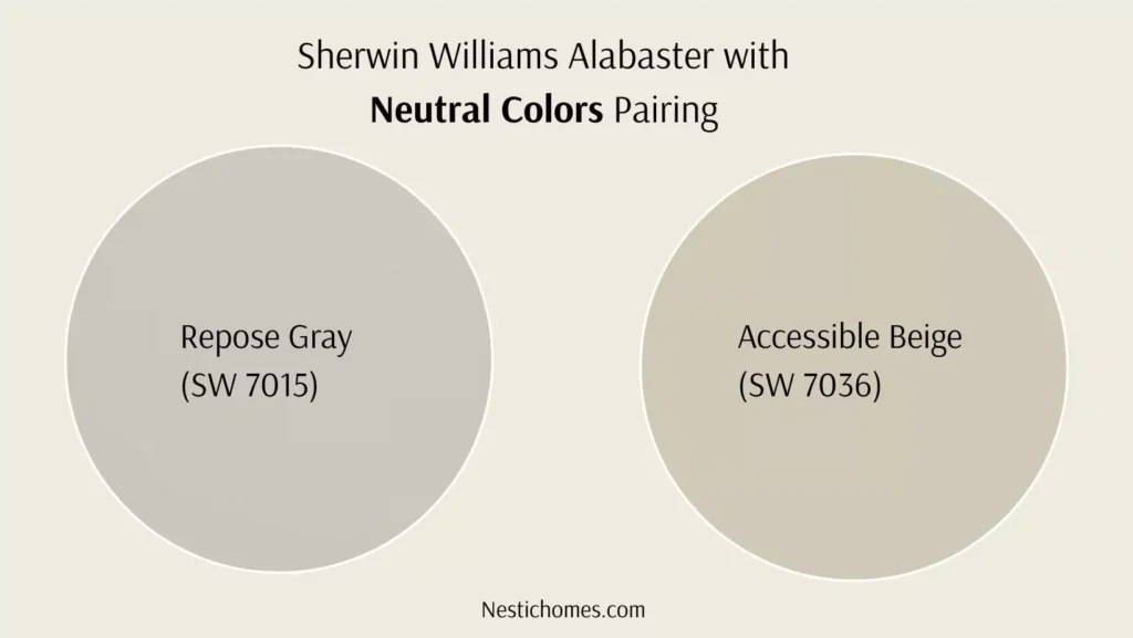
- Accessible Beige (SW 7036)
- Repose Gray (SW 7015)
Accent Colors with SW Alabaster 7008
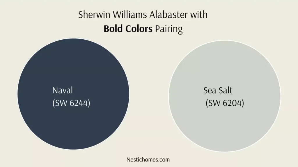
- Naval (SW 6244) for bold contrast
- Sea Salt (SW 6204) for a serene, coastal vibe
Trim Colors with SW Alabaster
- Pure White (SW 7005) for clean contrasts
- Extra White (SW 7006) for crisp, detailed finishes
FAQ
Is Sherwin Williams Alabaster white or cream?
Alabaster by Sherwin Williams is a gentle white with hints of warmth. It’s a well-balanced neutral that adds warmth and brightness to a room without feeling unduly yellow or beige. It’s neither completely white nor cream.
Does Sherwin Williams Alabaster look yellow?
Alabaster isn’t usually yellow-looking, but its warm undertones can sometimes appear a little different depending on the lighting in your space. It has a gentle, creamy white vibe that stays pretty neutral without leaning too much into yellow territory.
Why is Sherwin Williams Alabaster so popular?
The popularity of Alabaster lies in its versatility and timeless charm. It works beautifully across a variety of styles—modern, farmhouse, minimalist, and traditional. Its soft, inviting color creates a cozy ambiance while maintaining a clean, fresh look, making it a go-to choice for many homeowners and designers.
What colors pair well with Sherwin Williams Alabaster?
Sherwin Williams Alabaster is incredibly versatile and pairs well with lots of different colors. If you’re going for a timeless look, try combining it with warm beiges, soft grays, or even greiges like SW Repose Gray.
Want something with more contrast? Darker shades like navy or charcoal gray can really make Alabaster stand out, creating a striking yet balanced feel. It’s also a great match with natural wood finishes, giving your space an earthy, organic vibe.
Why does Alabaster turn yellow?
Although alabaster does not naturally turn yellow, it may appear to do so over time due to many circumstances such as fading paint, exposure to specific lighting, or surrounding design. Maintaining its original color can be aided by selecting premium paint finishes and suitable lighting.
What color group is Alabaster?
Alabaster belongs to the off-white or soft white color group. It’s known for its warm, neutral undertones that offer a welcoming and versatile appearance.
Is Alabaster a good white?
Of course! Many people agree that Sherwin Williams Alabaster is an excellent white option for trim and walls. It complements almost any room or design style because to its harmony of warmth and freshness.
Is Alabaster gray or beige?
Alabaster is neither gray nor beige, but it does carry subtle beige undertones. These warm undertones give it depth and prevent it from feeling too cold, making it a perfect middle ground between gray and cream.


