Last updated on August 14th, 2025 at 07:21 am
Beige isn’t as boring as much we think it of—it’s the quiet backbone of interior design. Beige can hold the harmony of every corner of your home doesn’t matter it’s the entryway or your bedroom, or even the exterior.
Sherwin-Williams, known for its high-quality paints and rich color palette, offers multiple options of beige colors that vary from light to deep and warm to cool undertones.
In this blog, I’ve covered the 7 best Sherwin Williams beige colors that are always popular and loved by customers with 5 stars.I’ve also considered the effect of each color in lighting, from soft greiges to warm taupes and sunlit neutrals.
Each color has been carefully selected for its adaptability, undertones, and how it complements a wide variety of furnishings and finishes.

I’ll break down what makes each shade unique, how it behaves in different types of light, which rooms it works best in, and the perfect colors to pair it with—so you can confidently choose the ideal beige for every corner of your home.
Accessible Beige (SW 7036)
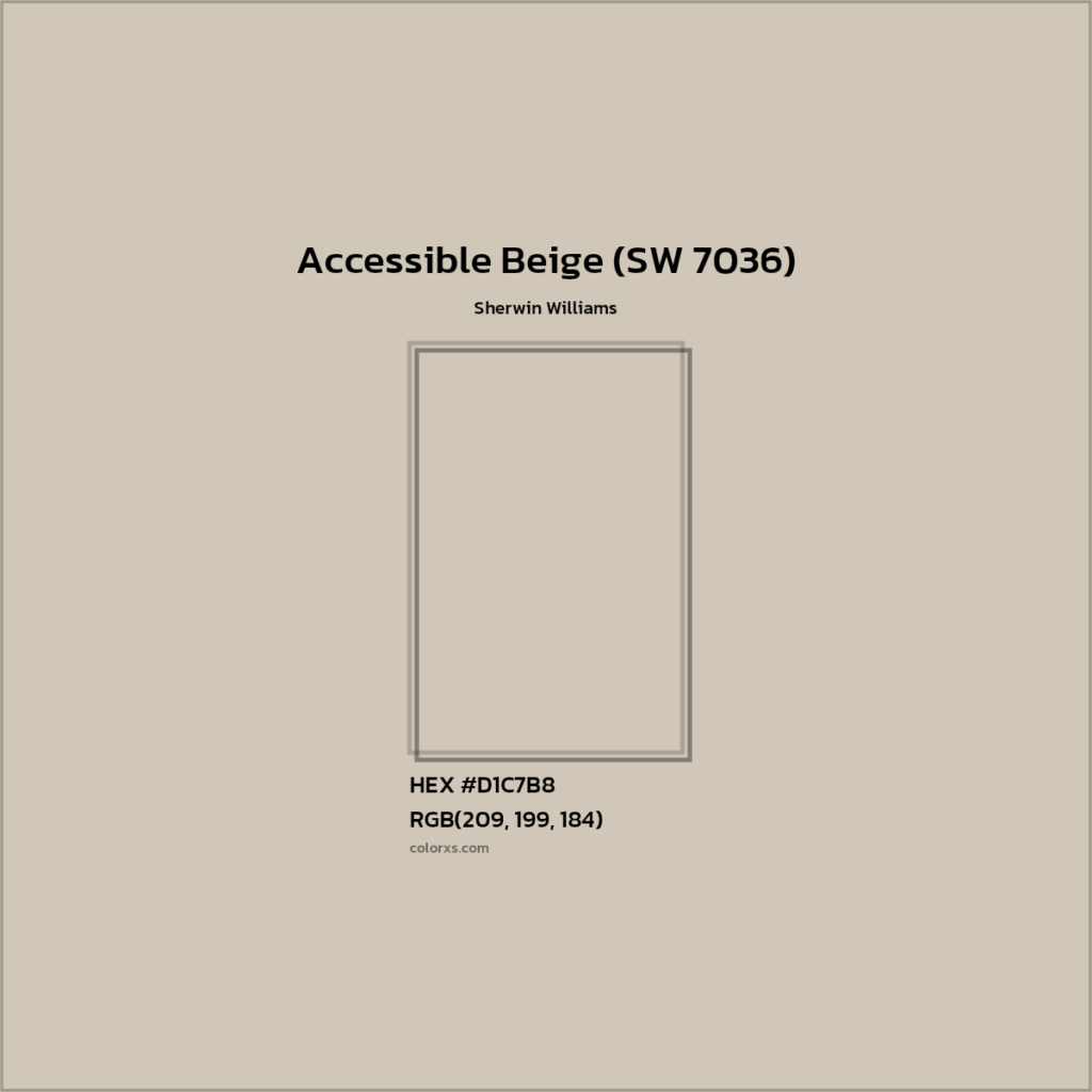
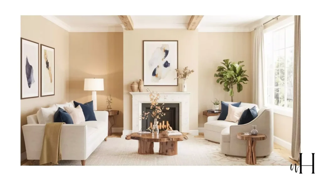
Accessible Beige is an extremely popular warm greige from Sherwin-Williams. A year ago, I also used it in my bedroom cuz after work of all I wanted something that is cozy for me in winter and makes me feel warm but not too lazy, hahaha kidding its perfect. The hype is not fake.
It’s perfectly neutral, warm beige with light gray undertones. With an LRV of 58, it reflects all of the light and also makes your room warm and cozy but still shines in every corner. Reviewers note that it works in a wide variety of spaces – for example, on kitchen cabinets, trim, and walls – giving a cozy, traditional feel.
Accessible beige in different lightening conditions :
In warm lightning, its real side of beige I mean warm beige comes out,but in cool or white lights gives the shade of gray a cooler effect to your mood.Mean when you want to wake up, turning on the light will wake you up, but if you turn off the lights, it will also make you feel like in a cozy, soft furr blanket.
Complementary colors for accessible beige:
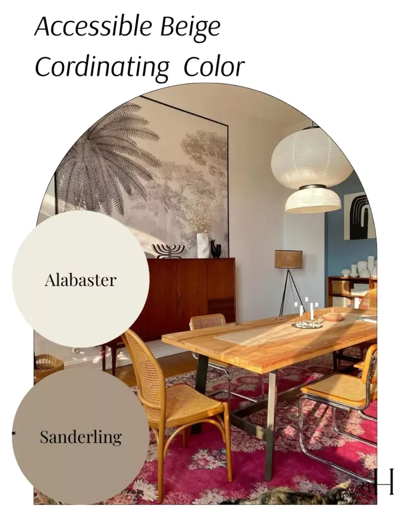
Pairs beautifully with crisp off-whites and warm neutrals. I used it with SW Alabaster (7008) trim and warm wood or brass accents.
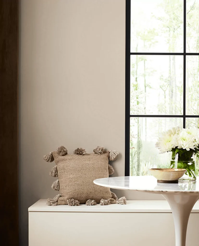
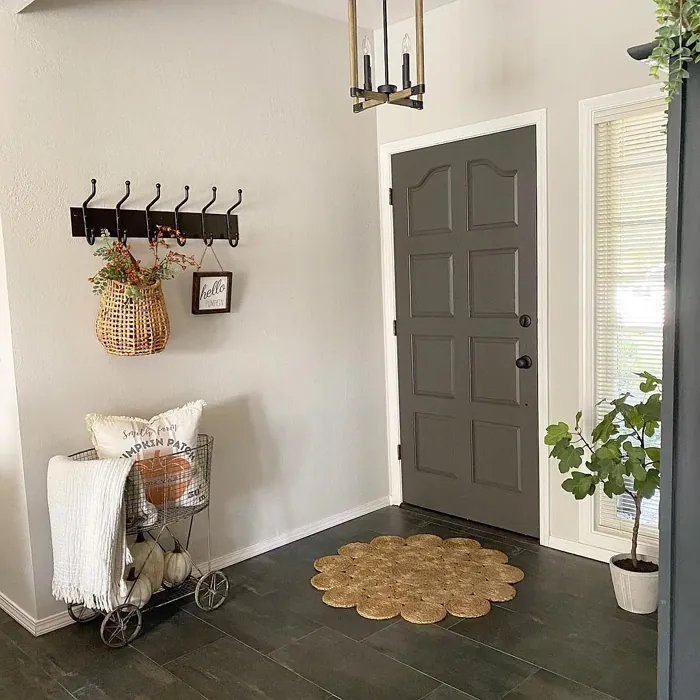
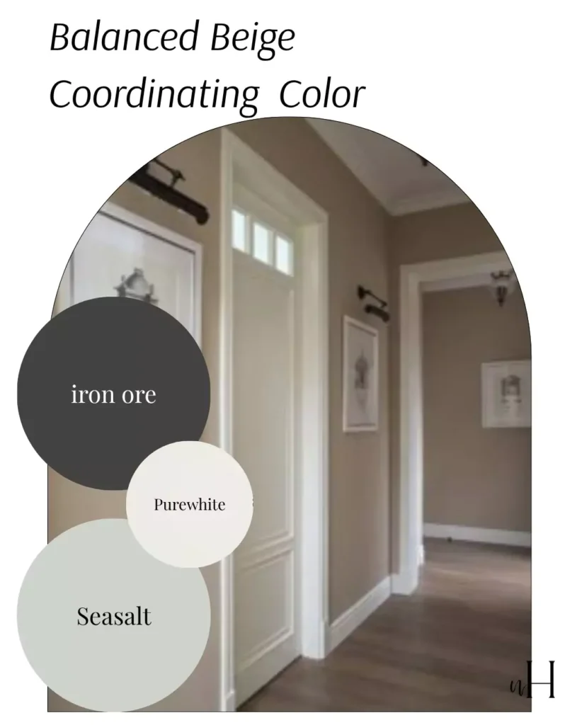
Balanced Beige (SW 7037)
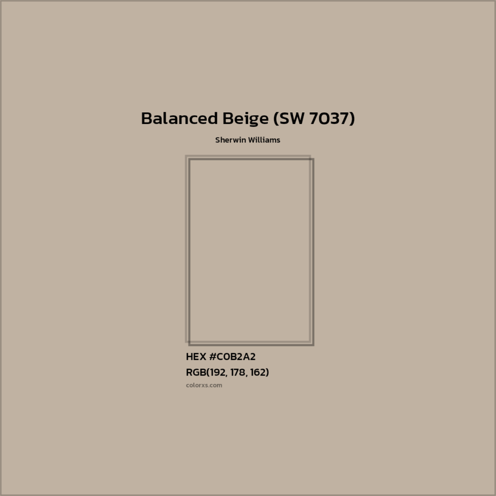
Balanced Beige, the name is clear its a perfect beige mixture of gray and beige, not that much taupe, not grayish beige. This color is often praised for being “true” to its name: it’s neither too yellow nor too gray, so it feels consistent in many rooms.
It gives a balanced gray and taupe look when used in rooms. It is best used in kitchens (cabinets), living rooms, dining rooms, bedrooms, hallways, etc. Designers note it works in virtually every main living area because of its neutrality.
Lighting: Generally stable. In bright, cool light it can lean slightly greyer, but its inherent warmth remains. In natural light the warm beige shows softly. (As with any greige, test samples under your own lighting.)
Complementary colors : Looks great with crisp whites and cool accents. For example, trim or adjacent walls in SW Aesthetic White (SW 7035) or Pure White (SW 7005) add bright contrast. It also pairs well with deeper neutrals or muted blues/greens as accents.
Agreeable Gray (SW 7029)

Agreeable Gray is Sherwin-Williams’ best-selling greige, known for its ultra-neutral appeal. It’s a light gray with a hint of warm beige, giving it broad versatility. Home experts call it a “perfect greige” – mostly gray in appearance, but with enough warmth to avoid feeling cold.
Undertones: Predominantly gray with a soft warm beige undertone. This subtle beige tint makes it very “flexible” in different schemes.
Best for rooms: Ideal for bright, well-lit spaces – living rooms, kitchens, bedrooms, entryways. It’s widely used in home staging and new homes because buyers find it soothing. (One reviewer notes it looked great in her sunny kitchen and living room.)
Lighting: Relatively high LRV (60), so it reflects light well. In strong natural light it looks like a pale warm gray. But be warned: in dim or north-facing rooms it can appear muddy or a bit brownish. Under cool or artificial lighting, its violet-gray undertones may emerge, sometimes giving a slight purple cast.
Complementary colors for agreeable gray
Pairs cleanly with crisp whites and cool accents. Designers suggest it with SW Pure White (7005) or Alabaster (7008) trim. It also harmonizes with soft blues/greens like Sea Salt (6204) or Rainwashed (6211), and even deep grays like Iron Ore (7069) for contrast.
Designer tips: Agreeable Gray is extremely popular because it “goes with everything.” It’s an excellent choice if you want a very safe neutral. (However, if your space has minimal light, test first – some folks repaint dark hallways bright white because Agreeable Gray can look too dark when light is scarce.)
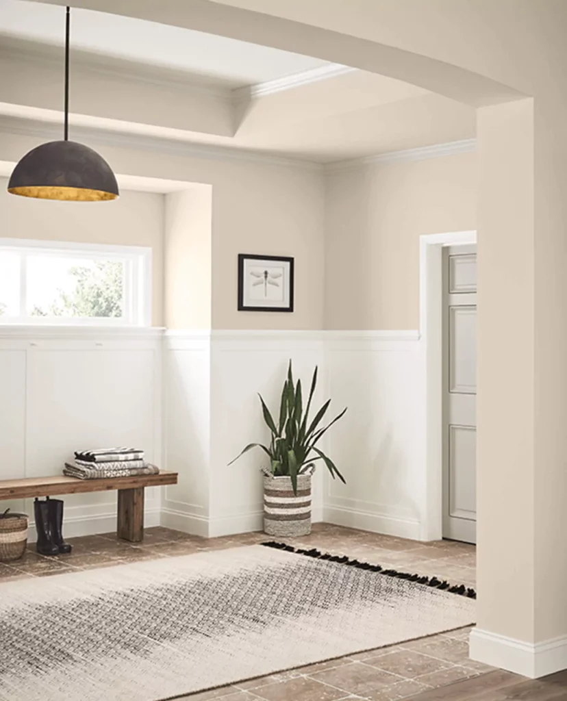
Natural Linen (SW 9109)
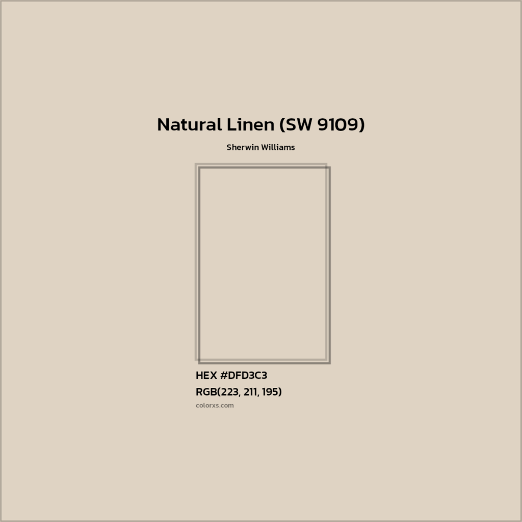
Natural Linen is a very light, warm beige often called “breezy” or “sunwashed.” It sits in the yellow/beige family (hue angle ~86°, near yellow-orange). Its warm creamy tone is toned down with a bit of gray, making it calmer than a golden beige.
Undertones of Natural Linen (SW 9109)
Soft yellow/beige with subdued peach or pinky hints in some lights. It has a lower saturation than many beiges, so it feels gentle and modern.
Best for rooms: Very versatile – great in living rooms, bedrooms, bathrooms, laundry rooms, or any space needing a light warm neutral. Because its LRV is 66, it brightens darker rooms without feeling stark. One staging designer calls it a comeback warm color, popular for creating a flexible, contemporary beige backdrop.
Lighting: Very reflective. In soft or north light it shows a hint of warmth, while in strong afternoon sun its golden undertones pop more. In intense sunlight it may look slightly more yellow, but in gentler light it retains its full gentle hue.
Complementary colors for Natural Linen (SW 9109)
Looks beautiful with light wood tones and crisp whites. Many suggest pairing it with SW Pure White (7005) or Extra White (7006) trim for contrast. (Avoid creamy/off-white trims, as Natural Linen is already warm – a too-yellow white can blend in and lose definition.) It also works well next to soft grays and muted blues/greens.
Designer tips: Because it’s warm and low-chroma, Natural Linen can look dingy against buttery whites. Use a true white trim for best contrast. It’s excellent for open, airy interiors or spaces with wood and rattan accents. As always, sample it on your walls – it “may look a bit peachy or even a wee bit pink or yellow” depending on your light.
Kilim Beige (SW 6106)

Kilim Beige is a richer, deeper beige leaning slightly toward orange-taupe. It’s warmer and darker than many standard neutrals, giving rooms a cozy, earthy feel without reading strongly pink or yellow.
Undertones: Warm orange-taupe. It has more orange/brown than yellow in it, so it stays natural-looking.
Best for rooms: Excellent in cooler-light rooms. Because of its warmth, it “loves north-facing” spaces – the cooler natural light balances its richness. It’s often used in family rooms, dining rooms, or offices for a grounded feel.
Lighting: In natural or north light it appears as a warm taupe-beige. In bright southern light it can look quite amber or burnt-sienna due to its strong warm undertones.
Complementary colors Kilim Beige (SW 6106)
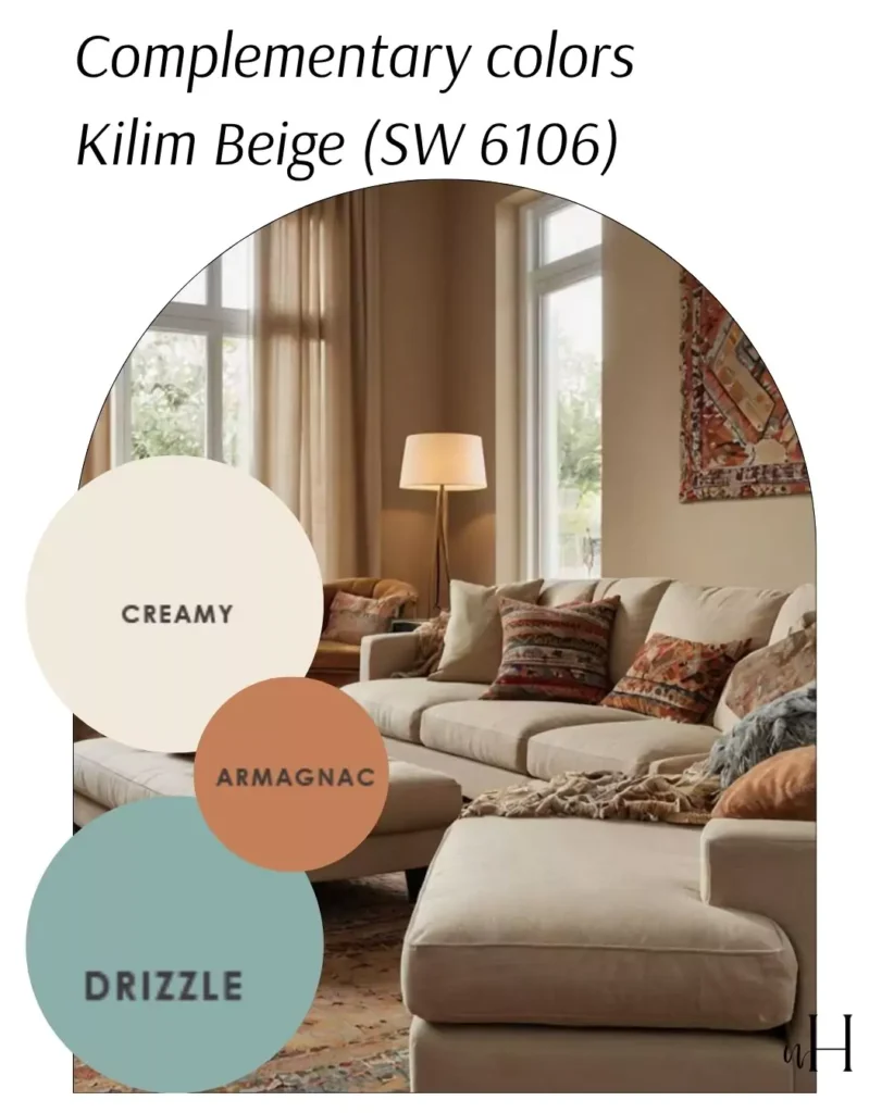
Works well with most brown woods and muted palettes. Designers note it pairs with neutral furnishings and wood trims. (However, avoid pairing with very yellow-stained woods or peachy decor, as Kilim can clash with overt yellows.)
Designer tips: With an LRV around 60, Kilim adds depth; it’s great on accent walls or full rooms. It was a “2000s favorite” beige – you can still use it today for a warm, earthy backdrop. Balance it with off-whites and natural textures for a refined cozy space.
Nomadic Desert (SW 6107)

")
Nomadic Desert is a warmer, mid-tone beige (LRV ~50) that evokes a sunlit desert landscape. It’s notably richer (“more meat on its bones”) than typical beiges, giving it a grounded, sophisticated look.
Nomadic desert gives you little golden undertones with beige/tan color not too yellow to avoid not too golden, set the balance between.That’s why Sherwin Williams colors are so popular cuz every color is balanced and beautifully sets in every light.
Best for rooms: Highly versatile – touted for living rooms and family rooms (warm and inviting) as well as restful bedrooms. It also looks great in kitchens and dining areas, especially with white or off-white cabinets, and even home offices for a professional-yet-warm tone.
Lighting: In bright natural light its golden warmth shines through, giving a sunny glow. Under low or artificial light it deepens to a cozy brown-beige. In other words, plenty of sun makes it light and inviting; dim light makes it rich and enveloping.
Complementary colors for Nomadic Desert (SW 6107)
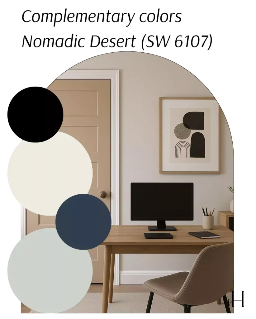
Extremely flexible. Use SW Wool Skein (6148) or SW Latte (6108) for a layered neutral scheme. As accent colors, it pairs beautifully with a soft green (SW Sea Salt 6204) or a bold navy (SW Naval 6244) for contrast. For trim, crisp whites like SW Alabaster (7008) or Extra White (7006) keep the look fresh.
Designer tips: Because it’s on the darker side of beige, Nomadic Desert works especially well with white/off-white cabinetry and warm metals (brass, bronze). One painter recommends SW Dover White (around trim) to brighten ceilings and trim. It’s great for a cohesive earth-tone palette (think wood furniture, leather, natural fibers).
Shiitake (SW 9173)
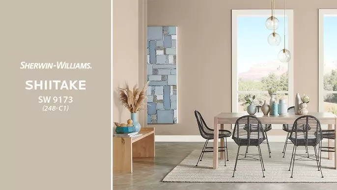
Shiitake is Sherwin-Williams’ new (2025 Color of the Month) greige. Described as an “adaptable stone gray,” it has a soft, warm neutral tone. It’s essentially a light warm gray – more cozy than pure gray, and lighter than tan.
Undertones of Shiitake (SW 9173)
Balanced gray-beige. It’s lighter and warmer than a cool gray, with very subtle beige tints. (Think a comforting “mushroom” or driftwood hue.)
Best for rooms: Excellent for creating calm, serene spaces. Sherwin-Williams recommends it for living rooms through bedrooms – anywhere you want a soft, relaxed backdrop. Its nod to coastal design (“like salty New England air”) makes it perfect for casual family rooms or tranquil bedrooms.
Shiitake (SW 9173) in Lighting:
The term “stone gray” suggests it holds up well in varied light; it won’t dramatically shift like some greiges. Its warm neutrality should stay even, offering a gentle light reflection.
Complementary colors for Shiitake (SW 9173)
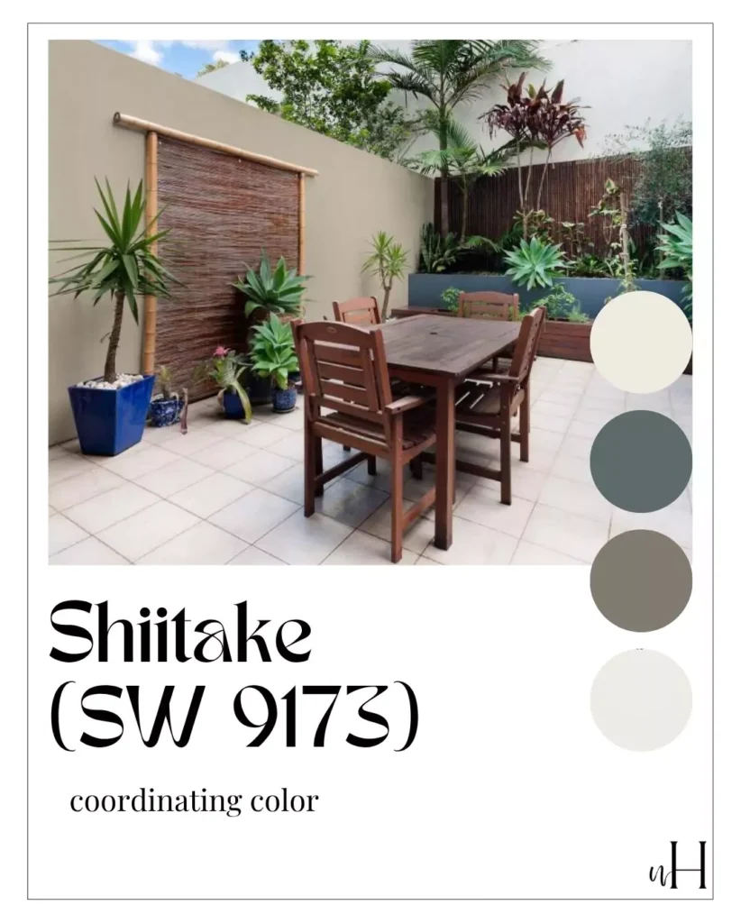
Pairs with clean, light trim and muted accents. On their site, Sherwin suggests SW Alabaster (7008) as a crisp white trim. Nearby accent colors include SW Solitary Slate (9598) and SW Mountain Pass (9655) (soft grays/greens) or SW Big Dipper (9645) (a rich charcoal), which add depth without overpowering.
Designer tips: Use Shiitake where you’d like a cozy, elegant neutral. Its balanced warmth means it works with white trim and even with brass or dark wood accents. It’s lauded for longevity – a safe backdrop if you want a bit more warmth than a cool gray.


