Last updated on August 16th, 2025 at 12:02 pm
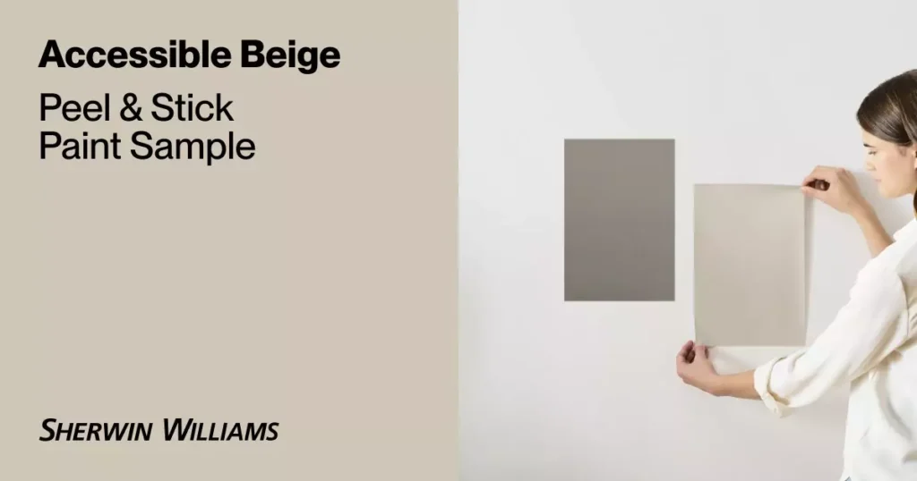
Accessible Beige (SW 7036), with its hex #D1C7B8 and RGB 209, 199, 184, is a warm greige with LRV of around 58—Its the perfect balance between gray ,cool and beige warmer look.
Its unique mix of cozy yellow-beige with soft gray-green undertones makes it beautifully adaptable, shifting slightly cooler in north- or east-facing light and glowing warmly in sunny south- or west-facing rooms (sherwin-williams.com).
In this blog post I will share everything about accessible beige that when it goes warmer beige ,cooler and even when it is balanced beige ,I mean beige and gray at same time. Also which colors goes with accessible beige and where to use accessible beige.
Read my this blog Best light beige paint colors for every season to choose the best beige amoung thousands of beige shade .
Available in finishes from flat to gloss, this color is ideal on walls (eggshell or satin) and trim or cabinetry (semi-gloss) for durability and sheen.Accessible beige can be used with both cool and warm pallet, from crisp whites like Pure White or Alabaster, richer accents like Urbane Bronze or Dovetail, and complementary tones such as navy, sage, or muted blue-greens.
Accessible beige as I told before is forever beige color ,either you want farmhouse look ,some industrial and modern look it can go with all the interior styles.As if you pair it with farmhouse style it ll become cozy and warm ,for indrustrial look its gray with wakeup.So it depends on you how you use.
Undertones of Accessible Beige
Accessible Beige carries subtle yellow-warm undertones along with a very faint green-gray hint. It avoids the pink or gold cast of some beiges.
Light changes its look. In north- or east-facing light (cooler daylight), it tends to gray out slightly, whereas in bright south/west light it stays warm and looks lighter/more luminous. In other words, it “greys out just enough” in cool light, but “appears lighter and more luminous” in sunny light. Overall it remains a warm beige in all conditions.
Some people complains that accessible beige give pink undertone sometimes that is totally wrong it may be due to artifacial lightening or maybe not good placement of lights and scoones. So accessible beige dont give the pink undertones.
Is Accessible Beige warm or cool?
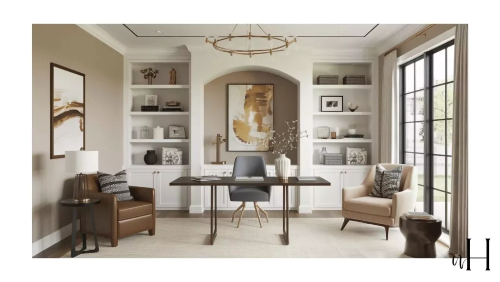
Bedroom in this image is south-west facing ,that why its giving a brighter and warmer look . My furniture is off-white furniture ,I always wanted something that is not too cool to make my room look gray not too warm to make it look yellow.
So Accessible beige was a perfect choice that worked well in my bedroom.
Summary: It’s best described as a warm greige – a true beige base with balanced gray and green hints. Because of this complexity, it complements both cool and warm schemes.
Accessible Beige vs other beige colors
1. Behr Even Better Beige (DC‑010) vs Accessible Beige
What color is lighter than Accessible Beige? You must be thinking that question ,So according to me Behr Even Better Beige is the one lighter than the Accessible beige.
- Color Profile: Warm greige with tan, gray, and yellow undertones; LRV ≈ 60, slightly lighter than Accessible Beige .
- Lighting Behavior: Greiges in cool north light; warms up under southern daylight .
- Usage: Ideal for walls, cabinets, exteriors—very versatile.
- Pairings: Creamy whites, rich browns, coastal blues, soft pinks.
2. Sherwin‑Williams Balanced Beige (SW 7037) vs Accessible Beige
- Color Profile: Richer, earthier tone than Accessible Beige with brown-gray warmth; LRV 46 .
- Lighting Behavior: Appears cooler and grayer in north light, warmer in bright interiors.
- Usage: Great for living rooms, bathrooms, kitchens; works as whole-house neutral.
- Pairings: Dark greiges (e.g., Urbane Bronze), light blues/greens (Sea Salt, Misty) .
To read full information about SW Accessible beige vs Agreeable Gray read my blog .
3. Sherwin‑Williams Aesthetic White vs Accessible Beige
- Known among decorators as a crisp neutral-white with a touch of beige—excellent for trim or cabinets .
- Warmer and slightly toned compared to pure whites like Pure White or Extra White.
4. Sherwin‑Williams Bungalow Beige (SW 7511) vs Accessible Beige
- Color Profile: Warm tan (LRV ≈ 53); slightly deeper and richer than Accessible Beige’s more balanced greige .
- Usage: Casual dining rooms, relaxed living spaces; offers cozy, informal warmth .
- Application Tip: Available in full finish range; choose sheen based on surface.
5. Sherwin‑Williams Barcelona Beige (SW 7038) vs Accessible Beige
- Color Profile: Neutral beige with minimal gray; medium tone (LRV ~47) .
- Lighting Behavior: Stays neutral throughout the day and across orientations .
- Usage: Excellent wall color with nearly universal decor compatibility .
6. Benjamin Moore Litchfield Gray (HC‑84) vs Accessible Beige
- Color Profile: Warm greige; slightly darker (LRV ~59) with lavender-pink undertones .
- Comparison: Warmer and more nuanced than Accessible Beige.
- Usage: Tops for walls, cabinetry, trim; popular and versatile across styles .
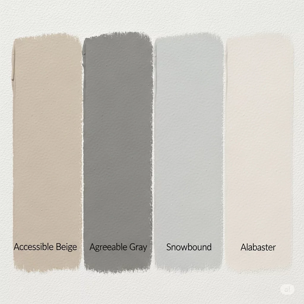
7. Sherwin‑Williams Agreeable Gray (SW 7029) vs Accessible Beige
- Color Profile: Cool greige leaning more gray than Accessible Beige; LRV ≈ 60 .
- Lighting Behavior: Reads gray in bright light, but retains subtle warmth.
- Usage: Neutral for modern minimalist spaces; pairs excellently with blue and green accents .
8. Accessible Beige vs Revere Pewter
Comparison between Sherwin-Williams Accessible Beige (SW 7036) and Benjamin Moore Revere Pewter (HC‑172) — two of the most popular greige (gray-beige) neutrals:
Color & Undertones
Accessible Beige has warm greige with subtle green and taupe undertones, that is more beige than gray on the other side Revere Pewter is a warm gray-greige with green undertones, but its more gray and deeper in gray in different conditions. Revere Pewter has LRV ≈ 55, giving it marginally more depth and richness .
Behavior in Lighting
Revere Pewter can be green, gray, or even pewter-blue hues depending on light and surroundings; it may appear dingy in low-light or north-facing rooms while accessible is warm and cool only.
Ease of Use & Versatility
Accessible Beige is consistently praised for its reliability and “safe” beige look, especially in homes with wood accents; it rarely shows undesirable pink or purple undertones.
Revere Pewter is loved for its adaptability to both warm and cool décor, but some users note occasional blue or green casts in certain rooms .
Which One Should You Choose?
| Preference | Choose This |
|---|---|
| Warm, cozy beige with consistent warmth | Accessible Beige |
| Neutral gray-greige with a richer feel and design flexibility | Revere Pewter |
Quick Comparison Table
| Color | LRV | Undertone Lean | Similar to AB? | Best Use |
|---|---|---|---|---|
| Even Better Beige | ~60 | Warm greige | ✔️ Slightly lighter | All-purpose walls/exteriors |
| Balanced Beige | 46 | Brown-gray | ✔️ Deeper | Cozy rooms, accent walls |
| Aesthetic White | High | Neutral-white w/ beige | ✔️ Crisp trim/cabinets | Trim, cabinetry |
| Bungalow Beige | 53 | Warm tan | ✔️ Warmer | Casual living/dining |
| Barcelona Beige | 47 | Neutral beige | ✔️ True neutral | Universal wall color |
| Litchfield Gray | ~59 | Warm greige w/ lavender | ✔️ Similar-depth | Walls/cabinets |
| Agreeable Gray | 60 | Cool greige | ✔️ Grayer cousin | Modern neutral base |
Choosing the Right Match
- For a slightly lighter, warmer, and equally versatile option: go with Behr Even Better Beige.
- Prefer a richer, deeper feel? Balanced Beige adds depth without too much darkness.
- Want something softer/cleaner for trim or minimalist spaces? Aesthetic White is perfect.
- Need a warmer, more casual tan? Try Bungalow Beige.
- For a pure, neutral beige with no color shifts: Barcelona Beige is a go-to.
- Enjoy a cooler greige with subtle undertone drama? Test Litchfield Gray or Agreeable Gray.
What colors go well with Accessible Beige
Trim/Whites
Off-whites create a soft, classic look. Common trim colors are SW Alabaster or Greek Villa (warm creamy whites), which blend softly. For high contrast, a crisp bright white (e.g. Pure White or Aesthetic White) works well. Pairing it with warm whites keeps the palette light and airy.
Accent Colors:
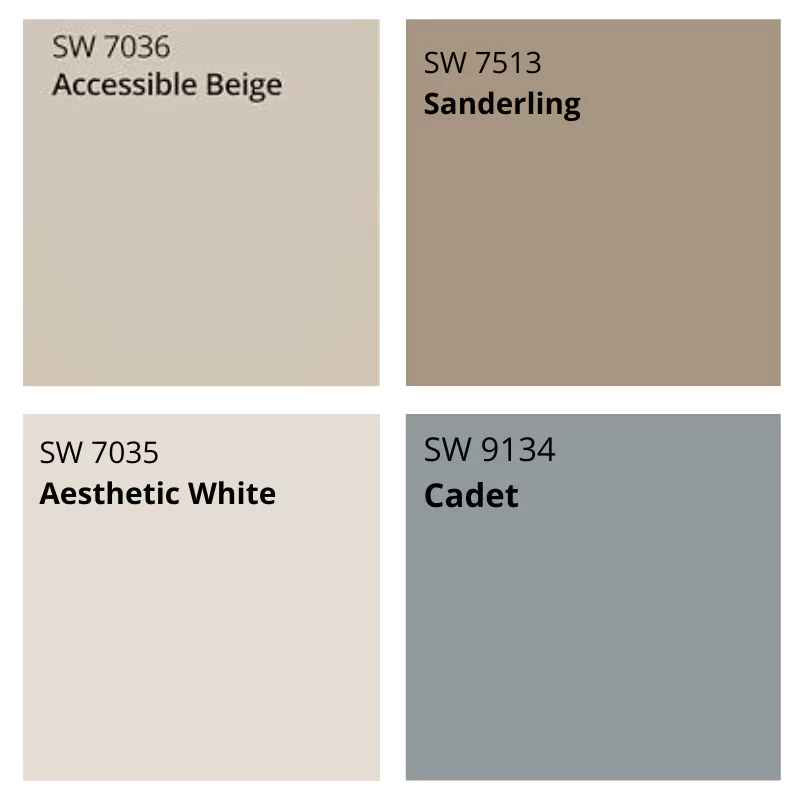
Accessible Beige pairs beautifully with earthy and muted tones. Designers suggest darker grays (like SW Dovetail), blues (navy or muted Cadet blue), and greens (sage or SW Sea Salt) as accents.
It also harmonizes with rich neutrals like Urbane Bronze (deep taupe) or Sanderling (warm sand) for depth. In general, avoid another color too close in LRV – instead choose noticeably darker or more colorful accents. For example, a slate blue or forest green accent wall will pop against AB.
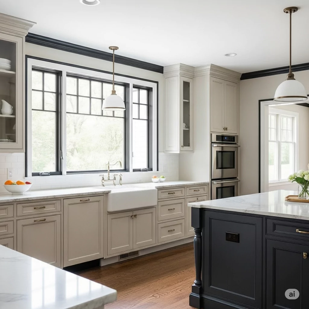
For me I used the tricorn black as my trim cuz i wanted some crisp in my style ,i used it in kitchen trim with accessible beige cabinets .
Accessible Beige in a modern farmhouse kitchen: the warm beige walls balance the white cabinets and natural wood floors, demonstrating how this neutral ties together a contemporary/traditional space.
Where to use Accessible Beige
Rooms:
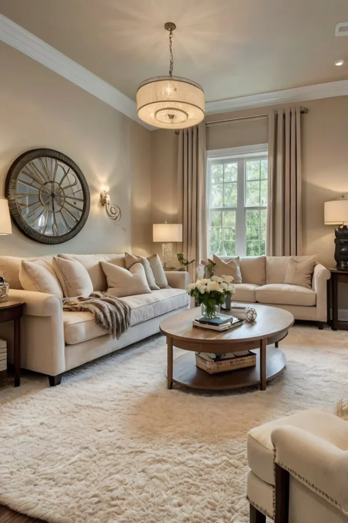
Very versatile – suitable anywhere. It’s used on bedroom and living area walls, kitchens, bathrooms (walls or cabinets), entryways, and even on exteriors. Its warm, mid-tone value makes spaces feel cozy without darkening them.
Design Styles:
Extremely adaptable. It’s often featured in modern farmhouse interiors (pairs with white trim and wood accents), traditional/transitional homes (serves as a soft backdrop for antiques and classic decor), contemporary/minimalist schemes (adds warmth to sleek lines), and even coastal palettes (complements blues and greens). In short, AB’s “chameleon-like” neutrality means it works with rustic, classic, modern or coastal décors.
Surfaces: Besides walls, it’s popular on cabinetry and millwork. In kitchens or built-ins, Accessible Beige cabinets lend a soft warm tone (often with white walls/trim). It’s also seen on exterior trim/siding – in daylight it looks like a light creamy limestone or pale sand.
Accessible Beige on cabinetry: the kitchen below uses SW Accessible Beige on the cabinets, paired with crisp white walls and trim. The finish (typically satin or semi-gloss on cabinets) gives the look a smooth, warm neutrality.
Popular Finishes & Surfaces
- Finishes: For walls, eggshell or satin is most common (for washability). Ceilings typically use flat/matte. For trim and doors, semi-gloss or gloss is often chosen for durability and a touch of sheen. On cabinets, a satin enamel is a popular finish.
- Surfaces: Aside from standard interior surfaces, AB is also used on doors, built-in cabinets, and woodwork. Southern Living reports it’s a designer favorite on cabinetry and trim. Outdoors, it appears as a soft cream – think pale limestone – on siding or exterior trim.
Design & Homeowner Insights
Popularity: Accessible Beige consistently ranks among SW’s top neutrals. Bloggers and designers call it “warm and inviting,” a “chameleon-like” neutral that’s easy to live with. It was literally the “first pick” beige for many designers and remains very popular in 2024–2025.
Character: Critics emphasize it is not the bland builder-beige of decades past. One blogger exclaimed it’s “bodacious, beautiful” rather than boring. Compared to grays, it adds more warmth while still coordinating with modern neutrals. In fact, compared side-by-side with Benjamin Moore’s Revere Pewter, AB looks warmer and creamier (often RP reads grayer).
Living With It: Many homeowners note that in very dim or north-light rooms, AB can look a bit dull or grayish. Conversely, in well-lit or south-facing rooms it reads as a soft creamy beige. Its slight greenish hue is usually imperceptible, but it can appear very subtle under certain lights (especially with a lot of greenery outside). Overall, its understated green-gray bias just keeps it from feeling too warm/yellow.
Sum Up: It’s a warm neutral greige that “works anywhere” – it brightens space without starkness. As one source put it, it creates a “soft, warm backdrop” that lets furnishings and accents shine.
Frequently Asked Questions
Is Accessible Beige still popular?
Absolutely. Beige has returned as a top neutral trend in 2025, and SW’s Accessible Beige remains a designer favorite. For years it has been the “go-to” beige for homes, and its popularity continues.
Is it more gray or beige?
It’s more beige than gray. Despite gray undertones, it reads as a warm tan. (For comparison, Agreeable Gray is its cooler, grayer sibling – AB will look noticeably warmer.).
Does accessible beige go with alabaster?
Yes! Accessible Beige (SW 7036) and Alabaster (SW 7008) make a classic, serene pairing: Accessible Beige brings a warm, earthy greige tone to walls, while Alabaster—soft, creamy white—offers just enough contrast without feeling harsh (heytherehome.com). Many designers recommend this combo, using
What color cabinets go with accessible beige walls?
Yes—Accessible Beige and Alabaster make a beautifully balanced duo: Accessible Beige brings a warm, earthy greige base, while Alabaster—a soft, creamy white—adds just the right amount of contrast without feeling stark.
Is it a good choice for small or dark rooms?
It’s mid-range lightness (LRV ~58), so it tends to read as light to medium in most rooms. In a very dark, windowless space it could lean muddy, so ensure adequate lighting. However, in typical small rooms it usually works fine, adding warmth without darkening. Sampling is key in marginal-light spaces.


