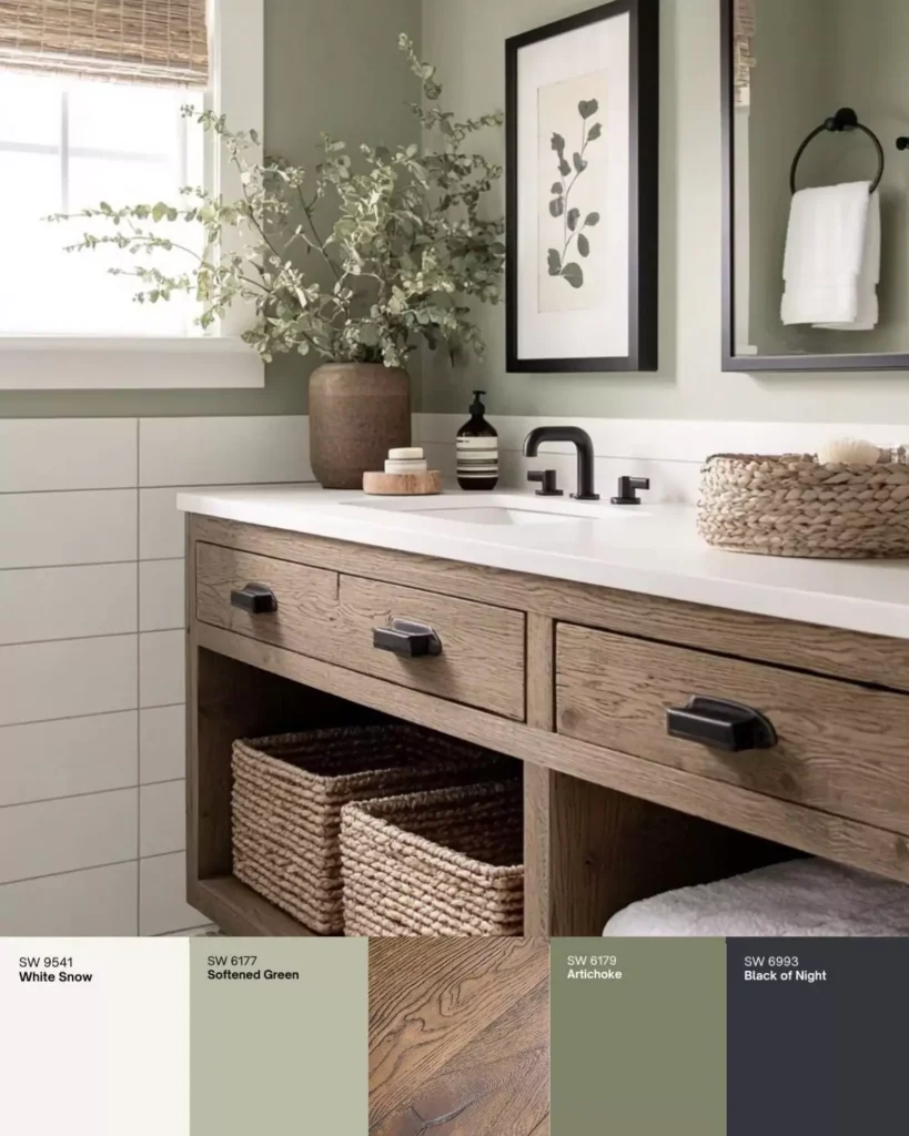
Hii ,Today I’m telling you about Softened Green (SW 6177) by Sherwin-Williams, which is not olive, not even sage green.
Softened Green on one wall can change the whole look of your room. It’s a muted, yellowish-green with a subtle gray undertone, giving it a balanced, soothing vibe.
In terms of light reflectance, Softened Green has an LRV ≈ 49 – roughly mid-range – so it’s not too dark or too bright. Its official digital values are RGB(187,188,167) or HEX #BBBCA7, confirming a soft olive-green appearance.
In this blog post I’ve attached TONS OF REAL HOMES images for you to understand the lrv ,light effect ,undertones easily.
- 23 Dark Green Bedroom Ideas that Never Go Out of Style
- 21 Sage Green Kitchen Cabinet Ideas Choosed by Experts for 2025

What are the Undertones of Softened Green (SW 6177) ?
Designers note Softened Green’s faint gray-yellow bias, which “tempers the vibrancy of green” for a muted effect. its a “yellow hue” in pure color space.it feels like a neutral-leaning green but warm without being bright, and not too cool to feel like gray.
LRV (Light Reflectance Value) of Softened Green
It has mid range of LRV 49.That make it bright and not too dark ,if your room has some sunlight it can keep your room bright and airy ,for cabinets it also works the same.
Digital Color Match
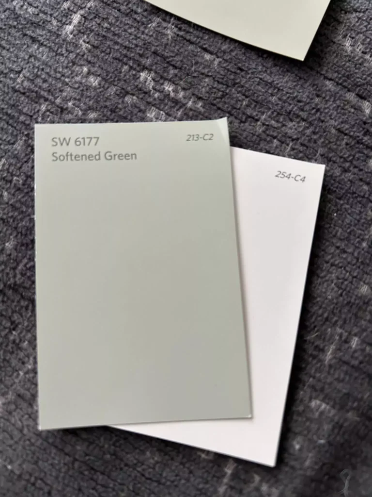
Softened Green’s HEX #BBBCA7 can be used in digital designs or to find matches. Its RGB values (187,188,167) confirm a nearly even mix of green and red, with a touch less blue – hence a gentle yellowish-green.
In color- matching charts, nearby Sherwin-Williams shades include Clary Sage (SW6178) and Liveable Green (SW6176).
Appearance in Different Light
Natural daylight:It shows softened Green’s true character – a fresh, gentle green. In bright, neutral light it looks like a soft green like green of spring, make the room calming without shouting.
Warm (incandescent) light: The tiny gray-beige undertone surfaces more, giving a cozier, earthier tone. Under warm bulbs, Softened Green it feels like a brownish minor touch of brown and creamish color like your DIOR counter powder.
Cool (blue/LED) light: The green-yellow aspect comes forward. In cooler light it will read a bit brighter and bluer than under warm light. (Tip: Because of these shifts, always test Softened Green in your room’s actual lighting.)
Softend Green in different spaces
Bedroom
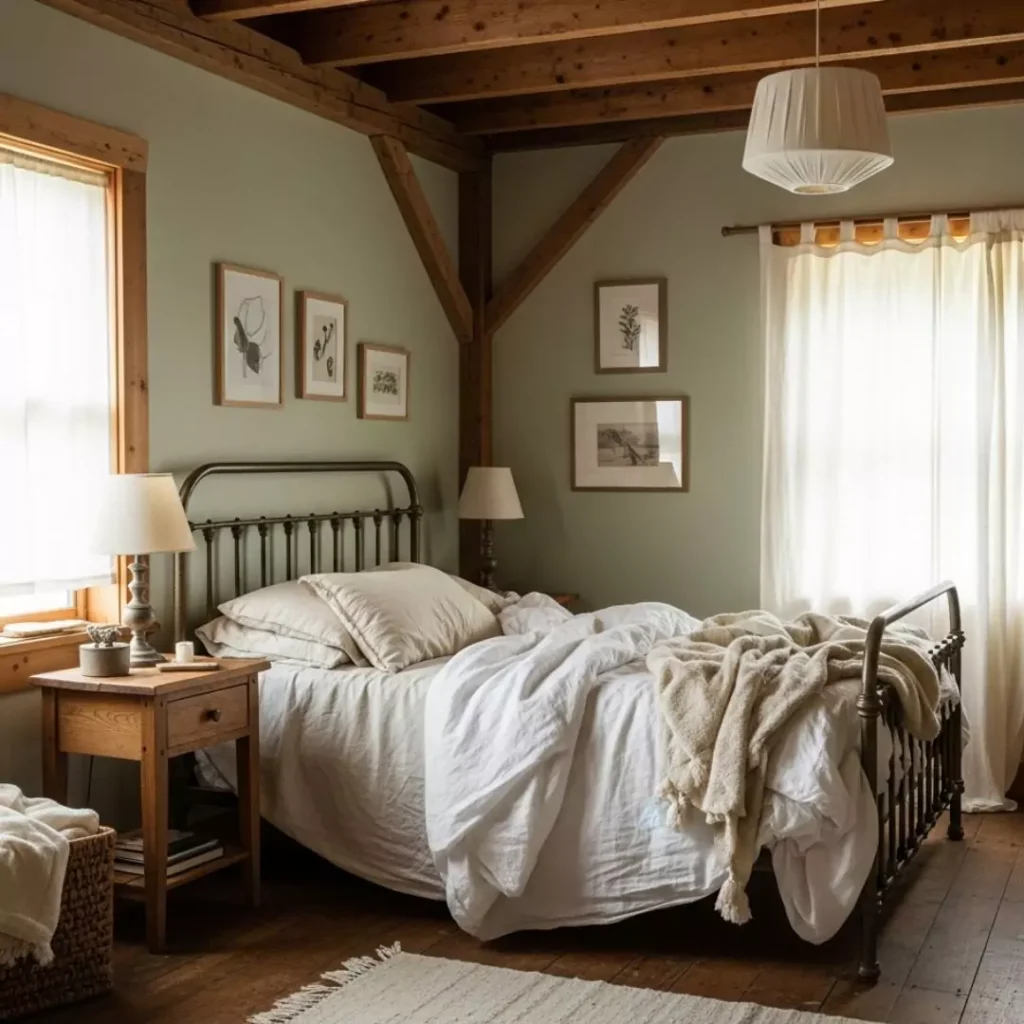
The calm tone of Softened Green gives you relaxation. White or extra white trim with gray or terracotta color bedding makes it look more beautiful. Natural wood accents (e.g. oak floors or a rattan headboard) warm the look, making the room cozy yet airy.
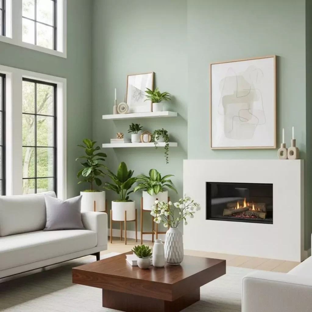
Living Room
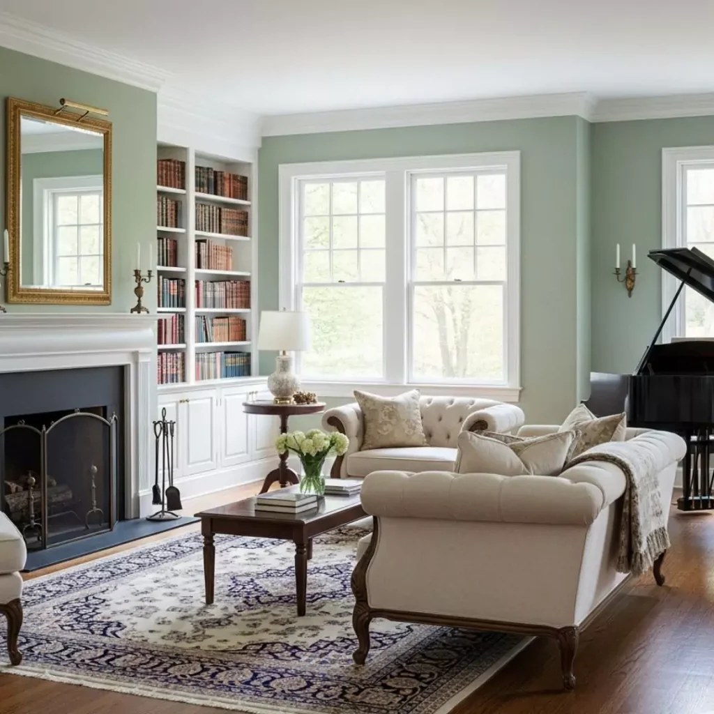
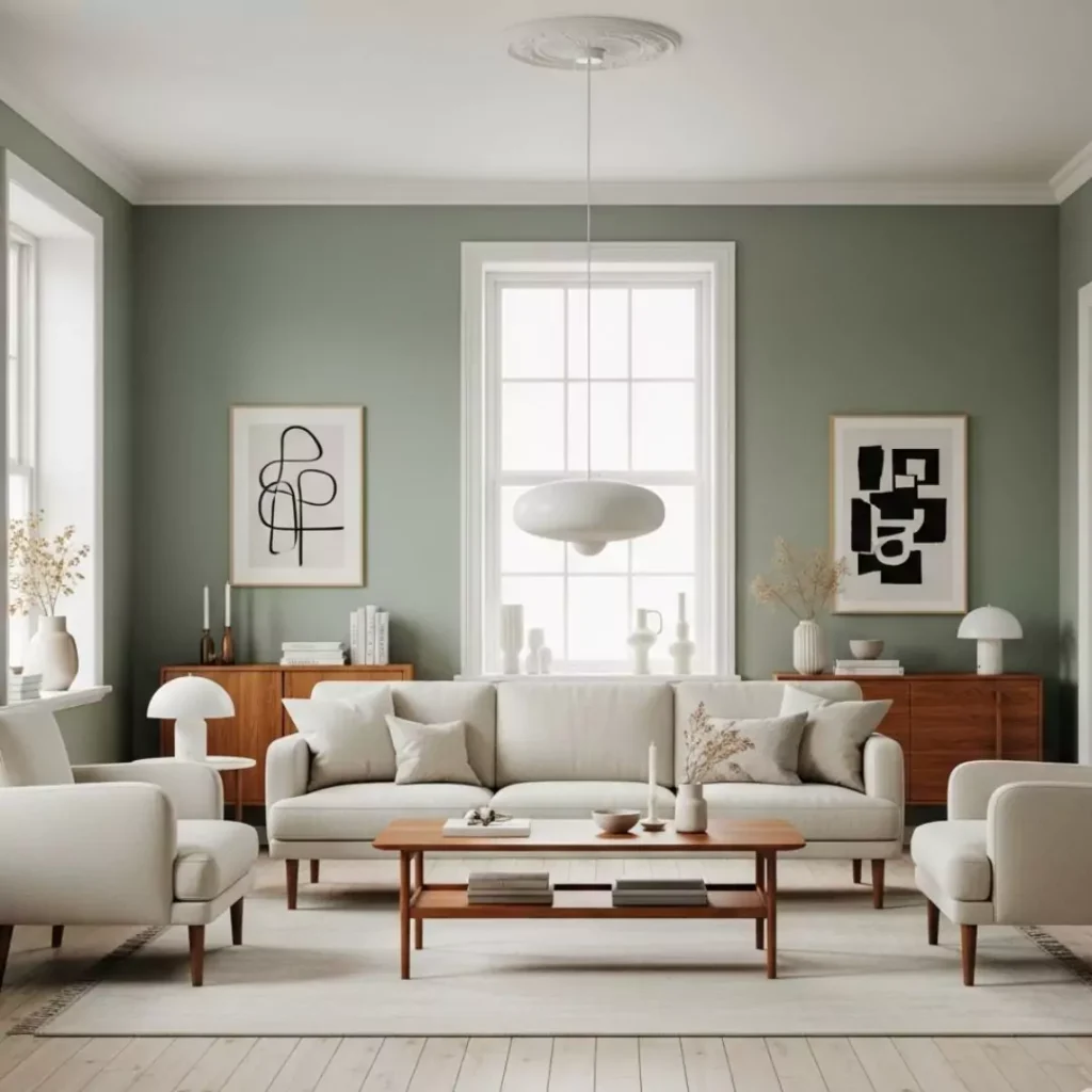
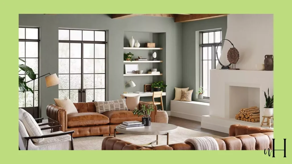
On living-room walls, Softened Green sets a serene mood for gatherings or quiet evenings. It works nicely with beige upholstery and textured throws. Accent it with warm metals (brass lamp, bronze frames) or deep neutrals (navy pillow) for contrast.
Kitchen
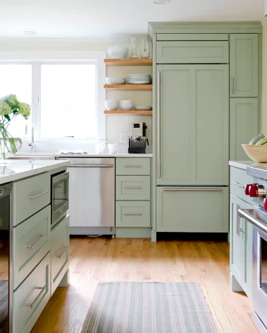
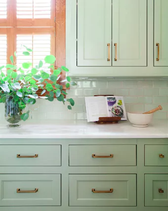
Works well on cabinets or walls. Softened Green kitchen cabinets look fresh and organic, especially with white subway tile or marble counters. Pair it with wood cabinetry/flooring to balance its coolness, or stainless/black hardware for a modern touch. (It’s lighter than most whites, so it won’t overwhelm a small kitchen.)
Bathroom
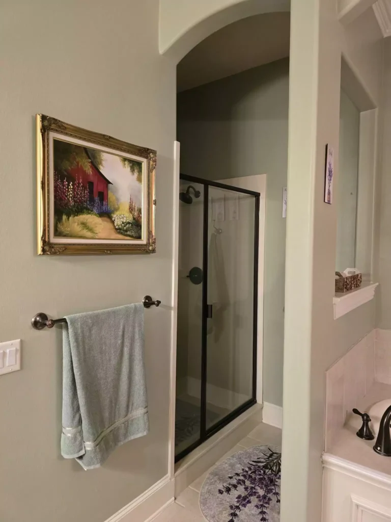
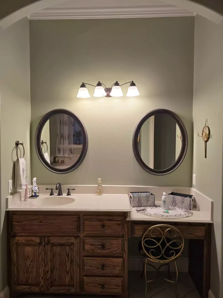
As a wall color, Softened Green feels clean ,sleek and modern. It harmonizes with white fixtures and stone countertops. Add natural elements (driftwood shelves, pebble floor mat) to amplify its soothing vibe.
Cabinets
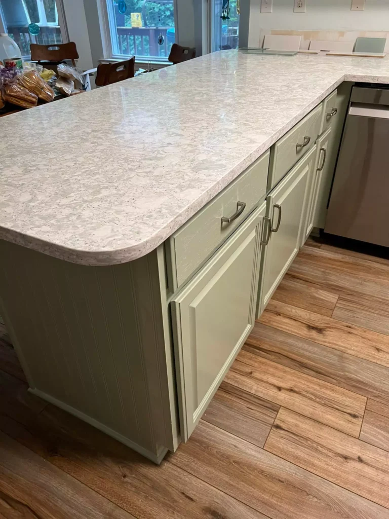
Painted cabinets (e.g. kitchen or bathroom cabinetry) in Softened Green make a subtle statement. The color is rich enough to anchor a space yet neutral enough to blend with surroundings. It particularly complements warm woods and brass or nickel hardware.
Coordinating Color Palettes
Soft/Neutral Palette
Pair Softened Green with pale creams and graysto keep the room light and airy . For example, Sherwin SW 7008 Alabaster (#EDE8DC) or Accessible Beige SW 7036 (#D1C7B7) on trim/walls provides a warm white canvas, while Eider White SW 7014 (#E1DDD6) adds a cool, silvery counterpoint.
Bold/High-Contrast Palette
Black or navy act as anchors: try Black Fox SW 7020 (#514A44) or Naval SW 6244 (#2F3D4C) on an accent wall or cabinets. For vibrant pops, use coral or gold: e.g. Coral Reef SW 6606 (#D9766C) or Goldenrod SW 6677 (#F2AF46) as accessories (pillows, art) to “lighten” the green with warm energy.
Muted/Earthy Palette:
Soft beiges and warm greens reinforce a gentle, grounded look. For example, pairing Softened Green with Accessible Beige SW 7036 (#D1C7B7) or Repose Gray SW 7015 (a light gray-beige) keeps it understated.
Introduce an olive or khaki green such as Dried Thyme SW 6186 (#7B8070) for depth. Emphasize the organic feel with natural textures – wood, stone, jute – which enhance Softened Green’s earthy side.
Softened Green vs. Clary Sage (SW 6178)
Softened Green and Clary Sage are often compared. Both are gentle greens, but Clary Sage is darker and earthier.
In fact, Clary Sage’s LRV is about 41 (deeper) compared to Softened Green’s ~49. Clary Sage leans more olive-gray-beige, giving it a richer, mossy feel. Softened Green is lighter, a bit brighter and more yellow-green by comparison.
| Feature | Softened Green (SW 6177) | Clary Sage (SW 6178) |
|---|---|---|
| Hue/Undertone | Gentle yellow-green with soft gray undertones | Warm, earthy sage-green with subtle gray/beige undertones |
| Lightness (LRV) | ~49 (mid-light) | ~41 (medium) |
| Color Mood | Airy, balanced neutral-green; reads fresh | Muted, grounded; more olive/brown feel |
| Typical Use | Versatile (brightens rooms like bedrooms or baths) | Cozy accent (deepens space; great for living rooms, kitchens) |
In practice, Softened Green feels airy and serene, ideal for small or light-filled rooms that need a whisper of color. Clary Sage feels earthier and cozier, anchoring a room with its deeper tone. Both promote calmness, but Clary Sage will read more brownish in dim light, whereas Softened Green stays closer to a pastel green.
FAQ
What is the difference between Sherwin-Williams Livable Green and Softened Green?
Softened Green (SW 6177) is slightly darker and warmer than Livable Green (SW 6176). Livable Green has a higher LRV (~61 vs 49) and a cooler, more minty cast, whereas Softened Green looks a bit deeper and more yellow. In short, Livable Green appears a lighter, bluer-green; Softened Green feels more muted and creamier.
What are Sherwin-Williams’ best light green paint colors?
Popular choices include Liveable Green SW 6176 (a soft spring-like green), Ancient Marble SW 6162 (a warm greige-green), and Sea Salt SW 6204 (a pale aqua-green). These and similar shades (Softened Green, Oyster Bay SW 6206, etc.) are valued for their fresh, airy feel.
What is the closest Benjamin Moore equivalent to Softened Green?
Many designers point to Benjamin Moore’s October Mist (1495) as a close match. Another similar BM color is Croquet (AF-455). Both have the same soft green-gray character, with October Mist being slightly more muted.


