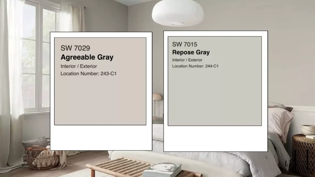
With so many hues of gray available, picking the ideal paint color for your house can be difficult. Repose Gray and Agreeable Gray, two of Sherwin Williams’ best-selling shades, are frequently at the top of homeowners’ lists because of their adaptability, style, and classic appeal.
But which one is better? The truth is, it depends! To keep things real, I’ll tell a quick story about my friend Stefana, who recently faced the same decision when updating her 1950s farmhouse.
After a lot of research and experiencing the fuss of two grays in my friend’s home, I can finally break down these colors room by room, season by season, and even mood by mood. I’ll also share coordinating palettes, an expert opinion, and a fun fact about Joanna Gaines’ favorite.
What Are Repose Gray and Agreeable Gray?
- Repose Gray (SW 7015) is a warm, soft gray along with cool blue undertones slightly. It tends toward being gray. It is comfortably in the middle of gray, along with greige (a combination of gray and beige). It works very well indeed for both modern and transitional environments because it is subtle and it is classy.
- Agreeable Gray (SW 7029) is a real greige having warm beige undertones, thus making it a most flexible Sherwin Williams neutral. It can be a popular choice for those people who do want just a cozy inviting look since it can be a bit more warm than Repose Gray.
Undertones
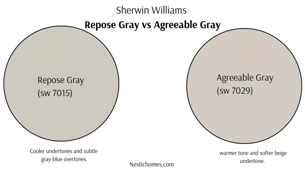
Cooler undertones and subtle gray-blue overtones give Repose Gray (SW 7015) a more modern, slightly sharper vibe. On the other hand, Agreeable Gray (SW 7029) appears nicer and more approachable due to its warmer tone and softer beige undertone.
Light Reflectance Value (LRV)
The Light Reflectance Value (LRV) matters when paint colors get chosen as they are considered. With an LRV of 58, Repose Gray is in fact a color for light reflection. It works nicely within spaces holding much natural or artificial light. Because its LRV, a somewhat brighter 60, measures slightly lighter, Agreeable Gray suits rooms needing more brightness, yet maintaining balance or warmth.
Aesthetic Personality
Choose Repose Gray because of how it is chic and calm, how it feels cool, and how it suits modern interiors, minimalist styles, or spaces someone designs so they feel polished and advanced. Agreeable Gray gives off both warmth and versatility. It suits perfectly cozy, transitional, or farmhouse-inspired designs. It ideally creates a sense of comfort as well as relaxation.
“Paint colors are deeply personal; what works in one person’s home may feel completely different in another,” says interior designer Lisa Morgan. “But both Repose Gray and Agreeable Gray are timeless choices that can elevate any space, as long as lighting and decor are carefully considered.”
My related blog to read -Sherwin Williams Paint
- Sherwin Williams Greek Villa vs Alabaster:Which One to Go With?
- Accessible Beige vs Agreeable Gray-Popular Paint Color Could RUIN Your Home
- SW iron ore vs tricorn black-Which Is Best For Your Home
Best Places to Use Agreeable Gray and Repose Gray
- Agreeable Gray is perfect for living rooms, bedrooms, or family spaces where you want a warm, inviting ambiance. It pairs beautifully with wood tones, earthy accents, and creamy whites for a harmonious look. It’s also great for open-plan layouts due to its ability to complement multiple color schemes.
- Repose Gray shines in offices, kitchens, or bathrooms where a crisp, clean, and modern vibe is desired. It looks stunning with bold accents or contrasting darker colors, like navy or black, for a striking and balanced design.
Room by room comparison of Repose Gray vs Agreeable Gray
Living Room
Stefana’s living room was her priority space; it’s where she spent time with her kids, entertains friends, and mostly kicks her feet up with a book. Large windows allowed plenty of natural light, but something didn’t feel right. “It felt cold in the mornings despite the beautiful light,” she explained.
Repose Gray looked sleek and modern and yet her south-facing windows leaned quite too cool. The blue undertones became more noticeable, especially in the morning because the room felt less cozy.
On the other hand, Agreeable Gray did soften up that space quite beautifully. The warm with beige undertones did create a truly welcoming vibe. They balanced the natural light perfectly so the vibe was welcoming then. Her oak furniture was more noticeable. The color was not beige in excess.
Agreeable Gray wins for Living Room because it works with mixed decor and is warmly versatile here.
Bedroom
When it came to the primary bedroom, Stefana wanted a serene retreat. Bedrooms need to feel calm and relaxed, and wall color plays a big role.
Repose Gray delivered for us a calm sense. Restful as well as tranquil the slight blue undertones created such a spa-like atmosphere. Crisp white bedding plus subtle metallic accents made the room an oasis.
Gray was lovely too indeed. It did lean a bit warmer than what Stefana envisioned for her retreat though. Even if perfect for casual, cozy spaces, it did not quietly provide the elegance that she wanted for sleeping quarters.
Winner for Bedroom: Repose Gray wins here since it has a cool, calming vibe, perfect for winding down.
Kitchen
Since natural as well as artificial lighting mixes, plus countertops, cabinets, and hardware finish variety exists, choosing paint colors in kitchens may be tricky.
For Stefana’s white shaker cabinets and quartz countertops, a paint color that felt fresh was something that was needed, but it also wouldn’t clash with the cool tones of the marble backsplash.
Here, Repose Gray worked wonderfully indeed! Its slight coolness complemented the marble backsplash. The space also received a new modern look.
Gray was not a terrible selection. It skewed a bit too warm for the clean, crisp look Stefana wanted in her kitchen.
Exterior (Winter vs. Summer)
- Repose Gray on a home exterior looks chic and modern in summer’s bright sunlight, but during gloomy winter months, it can sometimes appear too cold, especially against snowy backdrops.
- Agreeable Gray shines in any season. Its warm undertones brought depth and dimension to Stefana’s home, making it feel inviting in winter while maintaining its neutrality in summer.
Psychological Effects on Mood
Colors can influence how we feel in a space:
- Repose Gray’s blue undertones work toward evoking calm with tranquility, so that makes it a fantastic choice to use for spaces in which you want to feel relaxed, such as a bedroom or a spa-like bathroom too.
- The warmth that is within Agreeable Gray is ideal for use in social spaces that are like living rooms and even dining rooms for gatherings of people with true comfort and also coziness.
You can think about this helpful hint: If light variations greatly impact upon you each day, use both of the colors on your walls. You should observe them during morning, afternoon, and evening lighting. This one small test can now make all of the difference for us.
Coordinating Colors for Each Hue
Repose Gray Coordinators
- Trim Color: Pure White (SW 7005)
- Accent Colors: Naval (SW 6244), Silver Strand (SW 7057)
- Pop of Color options from warm to bold and cool vibe are:
- Warm Pop of Color:
- Cavern Clay (SW 7701): A warm terracotta shade for a cozy, earthy vibe.
- Spice Berry (SW 7600): A rich, deep red with a sophisticated touch.
- Cool Pop of Color:
- Aqueduct (SW 6758): A vibrant teal that pairs beautifully with Naval and Silver Strand.
- Lime Rickey (SW 6717): A bold, fresh green for a lively and energetic feel.
- Soft and Subtle Pop:
- Blushing (SW 6617): A soft blush pink for a gentle, romantic accent.
- Lavender Mist (SW 6542): A light lavender for a calming and elegant touch.
- Bold and Dramatic Pop:
- Raspberry (SW 6583): A striking raspberry pink for a bold statement.
- Goldenrod (SW 6677): A rich golden yellow for a cheerful and sunny accent.
- Warm Pop of Color:
Agreeable Gray Coordinators
- Trim Color: Alabaster (SW 7008)
- Accent Colors: Sea Salt (SW 6204), Rainwashed (SW 6211)
- Pop of Color: Urbane Bronze (SW 7048)
These palettes set the stage for cohesive, designer-worthy outcomes.
Joanna Gaines’ Favorite Gray
If you’ve followed Joanna Gaines from Fixer Upper, you probably know she’s a champion of all things neutral. While she’s been known to use both colors, Agreeable Gray remains her go-to for its chameleon-like ability to work in any setting. She famously used it in her farmhouse projects, as it complemented rustic and modern decor seamlessly.
Nearby Colors From Other Brands
If you adore Repose Gray (SW 7015) or Agreeable Gray (SW 7029) but want to explore alternatives from other top paint brands, here are some stunning nearby shades:
Benjamin Moore
- For Repose Gray: Gray Owl (OC-52) – A light, crisp gray with a subtle warm undertone.
- For Agreeable Gray: Revere Pewter (HC-172) – A soft, warm gray with classic appeal.
Behr
- For Repose Gray: Silver City (MQ2-59) – A soft, versatile gray with a balanced feel.
- For Agreeable Gray: Silver Drop (790C-2) – A light gray with a touch of warmth.
Valspar
- For Repose Gray: Filtered Shade (4007-1C) – A neutral light gray with a modern vibe.
- For Agreeable Gray: Gravity (4005-1B) – A soothing, neutral gray that complements diverse styles.
PPG
- For Repose Gray: Flagstone PPG1001-4 – A balanced gray with subtle warmth.
- For Agreeable Gray: Toast of the Town (PPG1015-2) – A warm greige perfect for balanced settings.
Rust-Oleum
- For Repose Gray: Castle Gray – A flexible, warm gray with an inviting tone.
- For Agreeable Gray: Country Gray – A versatile neutral with slightly beige undertones.
Trim Color with Repose Gray and Agreeable Gray
For Repose Gray:
- Ultra White (PPG1001-1) – A crisp, classic white that brings a clean and polished look to the trim, effortlessly complementing Repose Gray.
- Antique White (PPG1024-2) – A soft, creamy white that adds warmth and depth while maintaining a subtle contrast.
For Agreeable Gray:
- Pure White (SW 7005) – A timeless white that enhances the warm undertones of Agreeable Gray, creating a harmonious pairing.
- Snowbound (SW 7004) – A subdued, off-white shade that balances perfectly with the versatile appeal of Agreeable Gray.
What’s the Verdict?
There’s no definitive “better” between Repose Gray and Agreeable Gray, but there is a better choice depending on your needs:
- Choose Repose Gray if you prefer a cooler, more modern look with a serene edge that works best in bedrooms, kitchens, or spaces with predominantly cooler tones.
- Choose Agreeable Gray if you want a warm, cozy vibe that makes everyone feel welcome. Perfect for living rooms, exteriors, or any multifunctional area.
FAQs
What is Sherwin-Williams’ most popular gray color?
There are a number of popular gray hues within Sherwin-Williams, but the most popular frequently is Agreeable Gray. It acts as an option for settings because it merges warmth along with delicate chilly undertones in a flawless manner.
What is SW City Loft vs Repose Gray?
With warm undertones, City Loft (SW 7631) is a gentle, light beige-gray color. This makes it ideal for the creation of a homey and a spacious atmosphere. Repose Gray (SW 7015) has a neutral gray basis also it leans a bit colder so it suits balanced contemporary aesthetics better.
What is the most popular exterior gray color?
Sherwin-Williams’ Mindful Gray (SW 7016) is a popular choice for exteriors. Its neutral, medium-toned personality easily blends in with outdoor settings and goes well with a variety of trims.
What color cabinets go with Repose Gray?
Repose Gray pairs wonderfully with crisp white cabinets coupled with this creates a clean advanced look. Think about darker cabinets in shades such as navy blue or charcoal gray in order to add contrast to make walls that are neutral pop.
Which one is darker, Repose Gray or Mindful Gray?
Repose Gray is a bit lighter. Mindful Gray exists a bit darker. Gray’s mindful deeper tone, with its sharing of a neutral versatile quality, makes it be a great choice for such moody dramatic spaces.
Is Agreeable Gray too beige?
Agreeable Gray strikes a beautiful balance in between the gray and the beige since it is of a “greige” shade. It tends to adapt itself to both the lighting and decor that’s in the room, but it is not all that beige and has some warm undertones to it.
Why does Agreeable Gray look green?
Agreeable Gray can occasionally reflect green undertones within surrounding light as well as decor. It is key to test a sample where you are. Often, natural light or nearby colors influence it.
What are 4 colors that Joanna Gaines never uses?
Joanna Gaines prefers subdued and classic color schemes to ones that are too vivid or strong. She loves softer, neutral, and earthy tones that create a peaceful atmosphere, so you won’t typically see neon tints, glaring red, aggressive orange, or extremely bright yellows in her works.


