Last updated on August 27th, 2025 at 08:41 am
Grey-green paint colors are some of the most versatile and timeless choices in interior and exterior design. They balance the calm neutrality of gray with the refreshing, natural qualities of green, making them perfect for creating serene and sophisticated spaces.
Whether you prefer a soft, airy sage for a bedroom, a deep moody tone for cabinetry, or a balanced neutral for exterior walls, these shades adapt beautifully to different lighting and design styles.
From light and breezy to rich and dramatic, grey-green hues can feel coastal, earthy, or elegant depending on undertones and finishes.
In this guide, I’ve gathered the 22 best grey green paint colors some of them I personally observed and some I observed in my friends and family’s homes, so I feel able to review all the best grey-green colors.
These paints are from Benjamin Moore, Sherwin-Williams, and Farrow & Ball—covering both warm and cool tones, with details on undertones, LRVs, and where each works best.
18 Blue-Gray Paint Colors by Sherwin-Williams & Benjamin Moore
Sherwin-Williams Sea Salt SW 6204
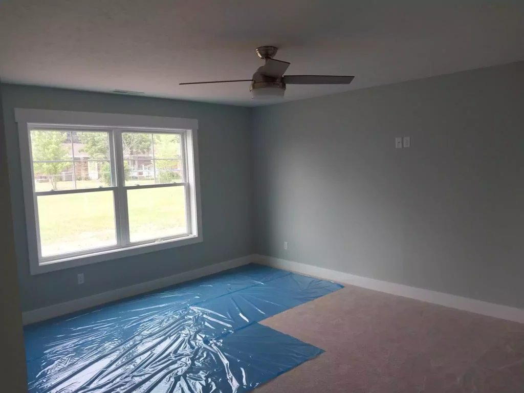
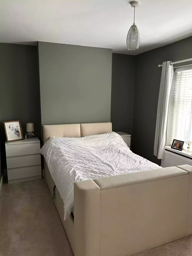
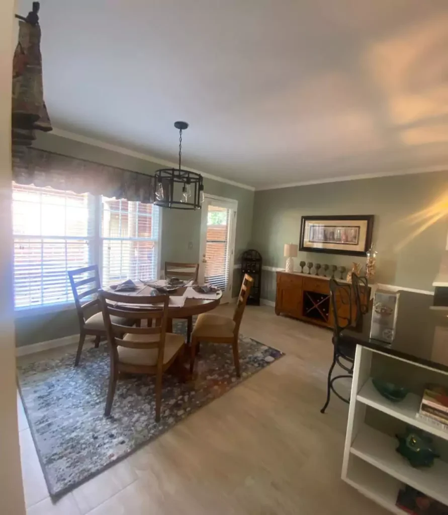
It has “cool, muted green with blue undertones” that evokes a relaxing beach-day feel. I used this in my lake house wainscoting, which went so perfectly.For me its cool and with gray undertones and warm with green undertone.
It’s a soft pale blue-green that feels light and airy. LRV is ~63. Undertones are blue-leaning green-gray.
Use on walls, cabinets or bathrooms for a spa-like, coastal calm. Pairs with white and neutrals, and highlights oak or light woods.
Benjamin Moore Misted Green 2138-50
A soft sage green with a soothing gray cast. It reads calm and airy, evoking a soothing, tranquil vibe. Light Reflectance Value (LRV) is 46.44. which is not that much ,means its between cool and warm. It best combo of light grey green paint color.
Undertones are green-tinged gray (sage), giving a cool, gentle feel. Ideal for bedrooms, living rooms, or nurseries where a relaxed atmosphere is desired.
Benjamin Moore Silver Sage 506
As you cna feel the vibe of paint with its name Silver Sage ,silver graish color with sage undertone.
“A hint of sage green lends an ethereal quality to this light gray.” The color feels light, fresh and airily elegant. LRV is 63.26. Undertones are cool sage-green.
It’s perfect on walls or cabinetry to brighten spaces (e.g. kitchens, bathrooms) without stark brightness, adding a subtle organic calm.
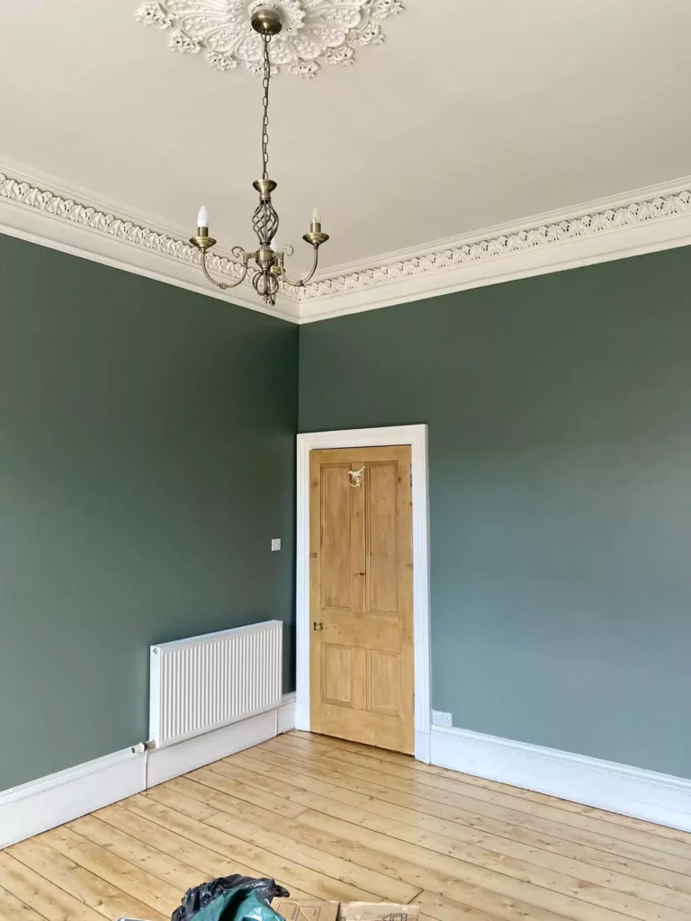
Sherwin-Williams Evergreen Fog SW 9130
“A timeless hue that adds a touch of serenity to any space.” A gray-green that is both moody and calm. LRV is 30. Undertones are subtle blue-gray. Ive reviewd this before, you can go and check it for a detailed overview of Evergreen Fog.
Evergreen Fog SW 9130 Sherwin Williams:My Review After Use
It feels tranquil and restorative, perfect for bedrooms, home offices or bathrooms as a meditative backdrop. Coordinates with whites, golds and wood tones for a balanced, peaceful palette.
Pigeon No.25
“A strong blue grey.” A cozy, almost smoky gray with blue-green depth. It’s described as cosy and nostalgic, invoking classic English interiors.Farrow and Balls is not behind in making the perfect grey green colors .
With an inky quality, it works beautifully in smaller or panelled spaces (boot rooms, studies) or as an accent (e.g. kitchen island). It pairs especially well with brass, wood and warmer neutrals, adding richness without harshness.
Fieldstone 1558
“An organic neutral with an earthy green undertone by Benjamin Moore.” It appears as a mid-gray that flexes green, giving a warm, grounded feeling. LRV is 42.73. Undertones are warm/earthy green.
Works well on accent walls, cabinets or trim to create a cozy, nature-connected look. Complements wood tones and natural textiles for an organic, serene decor.
Benjamin Moore Creekside Green 2141-40
“Hazy green tones lend a moody, enigmatic quality to this dark gray.” It’s a rich, deep gray-green that feels mysterious and soothing. LRV is 31.43. Undertones are cool gray-green. A little dark as LRV is 31,make it perfect contrast between grey and green.
Ideal for accent walls, entryways or exterior shutters to create a dramatic, enveloping mood. Pairs beautifully with crisp whites and metallics for a moody modern look.
Farrow & Ball French Gray No.18
Described as “A soothing green grey.” It shifts between green and gray in different lights, creating a relaxed, classic ambiance.
It works beautifully on both interiors and exteriors; use on woodwork, furniture or walls. It is particularly calming and elegant, pairing nicely with off-whites and deeper neutrals for a timeless, grown-up look.
Benjamin Moore Arctic Shadows 1559
“An icy, mid-tone neutral with hints of green in its undertone.” This mid-gray-green is cool and calming, with a crisp, contemporary feel. LRV is 32.48. Undertones are subtle blue-green.
Suited to living rooms, bedrooms or bathrooms for a tranquil backdrop. Complements warm neutrals to balance its coolness and enhance the serene effect.
Rainwashed SW 6211
A “light and airy bluish green” with a serene, natural feel. It’s firmly a cool blue-green. LRV is 59. Undertones include balanced blue and green with some gray, giving it a fresh feel.
Suited to bathrooms, bedrooms or kitchens to brighten and calm a space. Paired with whites or coastal accents, it creates a spa-like, open feel.
Rolling Hills 1497
Rolling Hills 1497 by Benjamin Moore. “The color of wet, verdant earth, this hue features a versatile mix of green and gray tones.” A dark, foresty green-gray that feels earthy and enveloping. LRV is 24.55 (dark).
Undertones are warm-green; it feels like rich earth. Best as an accent (walls, bookshelves, cabinets) or on an exterior door/fence, lending a grounded, nature-inspired feel. Works beautifully with wood tones and brass accents.
Benjamin Moore Nantucket Gray HC-111
“A stylish gray-green reminiscent of fog settling over grassy fields.” A light warm gray with a green cast that feels soft and classic. LRV is 39.83. Undertones are greenish-gray (warm green in sunlight).
Ideal for living spaces, kitchens, exteriors – it works as a neutral backdrop with subtle color. Provides a cozy coastal/English cottage vibe, especially good on shiplap, siding, or trim.
Comfort Gray SW 6205
“True to its name, Comfort Gray is a calming color that adds coziness and softness to any room.” A light green-gray with cool blue undertones that feels warm and inviting. LRV is 54.
Undertones are green-gray with a hint of blue. Ideal for bedrooms, nurseries or living rooms to create a soothing, spa-like atmosphere. Looks great with cream whites and natural textures for a “quietly sophisticated” scheme.
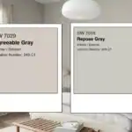
Liveable Green SW 6176 Sherwin-Williams
“Create an inviting, organic vibe with this cool green. Its warm yellow-gray undertone gives it balance.” A muted sage-green that feels cozy yet fresh. LRV is 61. Undertones are warm yellow-gray.
Best on whole rooms, kitchen cabinets or exterior doors for a homely, down-to-earth feel. Works as a neutral green, pairing well with creams and warm woods.
Quietude SW 6212
A “cool, light hue with complex blue-gray undertone” that is very calming. Quietude is definitely a cool paint color (blue-green blend).
LRV is 48. Undertones are green with a muted gray (and some blue). This mellow blue-green is great in living areas or bedrooms for a serene, airy feel that doesn’t feel icy. Use it with crisp white trim or warm woods for a balanced look.
It quite dark grey green paint color combo that i love personally.
Pewter Green SW 6208
A deep, muted green that feels rich and grounded. It’s “muted by the presence of cool undertones which allow it to act as a neutral.” LRV is very low (12), making it dark.
Undertones are predominantly warm gray (with a hint of blue). It evokes a cozy, intimate atmosphere; perfect for accent walls, cabinetry, shiplap or exteriors. Think moody sophistication – pair with creamy whites or brighter tones on trim to balance the darkness.
Farrow & Ball Blue Gray No.91
“A cool blue grey which creates the most relaxed of rooms.” It’s a gentle gray with blue (and a bit of green) undertones that shift like silver in the light.
Feels peaceful and weathered, ideal for bedrooms, living rooms or libraries in a classic/Scandinavian scheme. Its calm, muted tone (evoking sea glass) makes it suitable as a neutral wall color. Use with crisp whites or muted blues to enhance its tranquil quality.
Castle Gray No.92
“A versatile grey-green” historically used on exteriors. This mid-gray with green hints feels solid and timeless. It’s striking on indoor features like kitchen islands or bookcases. Undertones are green-gray. It conveys an understated sophistication, perfect for interior woodwork or whole-room walls when paired with warm trim (Shaded White). Great for traditional or modern spaces needing a grounding neutral.
Card Room Green No.79
“A dark grey green.” A deep greenish-gray with a strong, stately presence. It’s unapologetically bold, “coming alive when contrasted with warm neutrals.” Undertones are cool gray.
Use it on accent walls, cabinetry or accentuating architectural details (e.g. paneling) to create drama. It feels sophisticated and intense, evoking Victorian-era studies.
Green Smoke No.47
“A dark and smoky green.” A muted green-blue-gray reminiscent of weathered patina. It has an inviting depth and calmness. Undertones are blue-green (smoky).
It looks different in light – outdoors it feels weathered and rustic, indoors it is calming and serene. Great for accent pieces or whole rooms (especially bedrooms or living rooms) to impart a cozy, refined mood. Pair with neutrals or moody jewel tones for an elegant atmosphere.
Cromarty No.285
“A very light green grey named after the Cromarty Firth estuary… a neutral yet atmospheric color.” It reads as a pale, soft green-gray, muted and fresh.
It has “a perfect balance between muted and fresh” and brings a “muted softness.” Undertones are warm gray with green (more green than gray). LRV is high (about 60).
Use it in bedrooms, bathrooms or living spaces as a gentle neutral that still carries color, creating a peaceful, nature-inspired glow. It works well on entire rooms paired with warm neutrals for a soft, airy effect.
All images goes to the owner of the images.No intent to copyright.Mail for credit and removal.